


Your Proposal — Title Slide
Quality
Certified
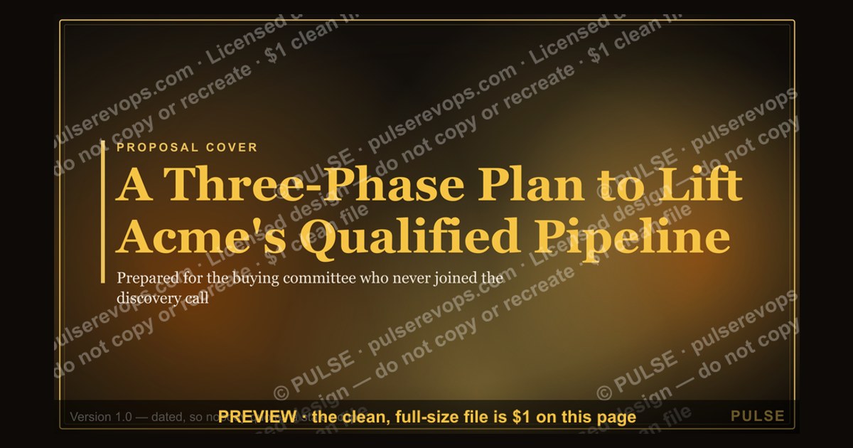

A proposal title slide should carry four things: the client's name, a specific benefit-oriented title, your organization, and a dated version line. Keep it to three or four elements on generous whitespace. Its only job is to earn the next page — not to summarize the deal or preview the revenue math.
What a title slide actually is and why it moves deals
A title slide is the cover page of a proposal deck or PDF — the first surface a buyer sees before any pricing, scope, or timeline. In practice it functions less as decoration and more as a credibility filter. Buyers who receive several competing proposals for the same scope use the opening frame as a fast sorting mechanism: is this tailored, or is it a template with a name swapped in?
The distinction matters because most proposals are not read linearly. In B2B cycles, the person who receives the proposal is rarely the only person who reads it. The champion forwards the PDF to a finance lead, a security reviewer, and often an executive sponsor who never attended a discovery call. Those secondary readers open the file cold. The title slide is the only context they get before they hit scope and price. If it says "Marketing Proposal," they arrive at your pricing page with zero framing. If it says "A Three-Phase Plan to Lift Acme's Qualified Pipeline in Two Quarters," they arrive with a benefit already anchored.
There are three jobs a strong title slide performs at once. Authority — logo, organization name, and a clean typographic hierarchy that signals you have done this before. Relevance — a subtitle that echoes the buyer's own words from discovery, ideally language you can trace back to a call transcript or a written RFP. Curiosity — a specific enough promise that turning the page feels necessary rather than optional.
The most common structural error is treating the slide as a branding surface. When your logo is the dominant visual element, the implicit message is that the proposal is about your company. Placing the client's logo first, or both side by side with the client's on the left, reframes the document as a joint plan. That is a one-minute edit with outsized effect on how the rest of the deck reads.
Adjacent to the proposal cover sits a whole family of title slides that follow the same rules: QBR openers, sales kickoff decks, board review packets, and renewal business cases. All of them face the same problem — an audience deciding in seconds whether the document deserves attention. The mechanics transfer almost unchanged, which is why building one strong title-slide template pays off across your entire deck library.

One more upstream consideration: the file name. If your PDF is saved as Proposal_v3_FINAL(2).pdf, that string appears in the email attachment preview and in the reader's downloads folder, long before your carefully composed slide renders. Name files Client_ProposalType_Month-Year.pdf. It costs nothing and it protects the impression the slide is trying to build.
The step-by-step process for building one
Building a title slide well is a repeatable sequence, not a design exercise. Run it in this order and the whole thing takes fifteen to twenty minutes once your template exists.
Step 1 — Pull the buyer's own language. Before you open the deck, reread the discovery notes, the RFP text, or the email thread. Extract the exact phrase the buyer used to describe the problem. If they said "our handoff between SDRs and AEs is leaking," that phrase — or a tightened version — belongs in your subtitle. Borrowed language reads as understanding in a way that your own framing never will.
Step 2 — Write the title as a claim, not a label. A label names the document type. A claim names the outcome. Draft three candidates, then cut each to under twelve words. If a title cannot be read aloud in one breath at 48-point type, it is too long for a cover.
Step 3 — Decide the element set. Standard set: client logo, proposal title, subtitle, your organization name, date, and an optional confidentiality line. That is six elements maximum, and four is usually better. Anything beyond that — website URL, social handles, taglines, phone numbers — belongs in a footer or a back page.
Step 4 — Set the hierarchy. On a 16:9 slide, the title sits at 44–60 points, the subtitle at 18–24, and everything else at 12–16. That gap is deliberate. A three-times size ratio between title and metadata means the core message survives being viewed as a 200-pixel email thumbnail or across a conference table.

Step 5 — Lay out on a grid, then subtract. Align every element to a consistent left edge or center axis. Left-aligned text scans faster and reads as more direct. Then remove one element. Nearly every draft title slide has one thing on it that is doing no work.
Step 6 — Date it specifically. "March 2027" or "Prepared for the 12 March review" both signal that this document was assembled for this moment. A bare year, or no date at all, signals a template.
Step 7 — Test it small. Export to PNG, shrink it to thumbnail size, and look at it. If the title is unreadable at that scale, your hierarchy is wrong. Most proposals are first seen as a preview tile in an email client or a document-sharing link.
Step 8 — Save it as a reusable master. Once a title slide passes, promote it to a template slide in your deck library with placeholder tokens for client name, title, and date. The point of doing the work carefully once is never doing it from scratch again.
Costs, timelines, and what the effort actually buys
The honest accounting here is that a title slide costs almost nothing to do well and almost nothing to do badly — which is exactly why it gets neglected.
Time. A first-time build from a blank slide runs 45–90 minutes if you are also settling type, color, and grid decisions. Once a locked template exists, per-proposal customization is 10–15 minutes: swap the client logo, rewrite the title and subtitle from discovery notes, update the date, re-export. Teams that skip the template step pay the 45-minute cost repeatedly, which is why title slides degrade over a quarter — the third rushed proposal inherits shortcuts from the second.
Tooling. PowerPoint, Google Slides, Keynote, Canva, and Figma all handle this. There is no tool that makes a weak title strong. The only genuine tooling decision is vector versus raster: an SVG or native slide object scales to any projection size without softening, while a PNG dropped into a deck will blur when someone presents it on a large display. Keep the master as vector and export raster only at the last step.
Approval overhead. In organizations with brand review, expect one to three business days for a new template to clear. Per-proposal instances usually do not require review if the template is pre-approved — worth negotiating explicitly, because a two-day review cycle on every cover slide is where good practice dies.

What it buys. Be careful here: nobody can credibly attribute a closed deal to a cover page. What the title slide reliably buys is reduced friction — fewer clarifying questions about what the proposal covers, a cleaner forward to executives who lack context, and a document that survives being read out of order. Those are real but modest effects, and they compound across a proposal library rather than showing up in a single deal.
Where cost is genuinely justified. For a high-value enterprise pursuit or a formal RFP response where you are one of five vendors, spending an extra hour on the cover is defensible — the reviewers are explicitly comparing documents side by side. For a routine renewal or a small expansion, use the template as-is and move on. Match effort to stakes.
Adjacent spend to watch. Custom photography or illustration for a cover can run into real money, and it rarely earns it back. Generic stock imagery of handshakes and glass conference rooms actively lowers perceived value because reviewers have seen those exact frames dozens of times. A typographic cover with strong whitespace outperforms a cover with irrelevant imagery, and it costs nothing.
Where teams get it wrong
Over-branding. Logo, tagline, URL, three brand colors, and a decorative pattern on one slide. The reader's takeaway is that this proposal is about the vendor. One tasteful logo placement is enough; secondary branding goes in a footer at 10 points or lower.
Generic titles. "Proposal for Services," "Partnership Overview," "Marketing Plan." These are document labels, not titles. They tell a reader nothing and they signal that the same file went to four other prospects. The test: if you could send the title unchanged to a different company in a different industry, rewrite it.
Putting the summary on the cover. Bullet points, a table of contents, a scope preview, or a revenue projection on the title slide. Each of these belongs on a later page. The cover's only job is to earn page two; loading it with detail defeats the hierarchy that makes it scannable.
Clutter disguised as thoroughness. Strong covers tend to run 60–70% whitespace. Filling that space reads as insecurity about the content underneath. Whitespace is not wasted — it is the signal that you know which four things matter.

Sloppy alignment. A two-pixel misalignment between the logo and the title block is not consciously noticed, but it registers. Readers who spot carelessness on the cover carry that suspicion into your assumptions and your pricing. Use guides; do not eyeball it.
Mismatched typography. More than two font weights on one slide breaks the hierarchy. Sans-serif faces read as modern and efficient; serif faces read as established and traditional. Pick to match the buyer's context — a serif cover on a fintech compliance proposal lands differently than the same cover on a growth-marketing pitch.
Color chosen by habit. Blue defaults to trust and stability, green to growth, orange and red to urgency. Those associations are broad conventions rather than laws, but the practical rule holds: pick one dominant color and one accent, keep the background light and clean, and ensure text contrast is high enough to survive a washed-out projector.
Stale dates and version numbers. A proposal dated three weeks before it arrives suggests it sat in a queue. A missing version number makes it impossible for the buyer's team to know which file is current when three copies are circulating in email.
Forgetting the second audience. The people who most need the title slide to work are the ones who were never on a call. Write the cover for the CFO who opens the PDF cold, not for the champion who already knows the story.
Decision framework: which cover to use when
Not every document needs the same treatment. The useful variable is stakes crossed with audience familiarity.
Competitive RFP, five vendors, formal scoring. Maximum effort. Client logo prominent, benefit-specific title referencing the RFP's own stated objective, submission date, RFP reference number, and a confidentiality line if the process requires one. Reviewers here are literally comparing covers side by side.
Enterprise pursuit, warm champion, executive committee will see it. High effort on the title and subtitle, moderate on visual polish. Optimize for the executive who opens it cold — the subtitle should carry enough context that page one makes sense without a preamble.
Mid-market proposal, single decision maker who ran discovery with you. Template with customized title and date. Fifteen minutes. Over-designing here signals you have time on your hands.

Renewal or small expansion. Template as-is. Update the date and the amount referenced downstream. The relationship is already established; a heavily designed cover reads as odd formality.
Internal document — QBR, board packet, kickoff deck. Same structural rules, different emphasis. Drop the persuasion, keep the specificity: period covered, owner, date, version. Internal readers need to know which quarter and which version they are looking at more than they need to be sold.
A last note on downstream effects. The cover sets a visual contract for the rest of the document. Whatever accent color, type scale, and grid you establish on the title slide should carry through every section divider, table, and pricing page that follows. Readers register consistency as rigor. A polished cover attached to an inconsistent body is worse than a plain cover attached to a coherent one — the mismatch reads as a document assembled from parts, which invites the question of whether the thinking behind it was assembled the same way.
Related questions
Should the client's logo appear on my proposal cover?
Generally yes, if you have permission and a clean asset. Placing it left of or above your own logo frames the proposal as a joint plan rather than a vendor pitch. Use the official version from their brand kit — a stretched or low-resolution logo does more harm than omitting it.
How long should a proposal title be?
Under twelve words, readable in one breath at 48-point type. Longer titles force smaller type, which collapses the hierarchy that makes a cover scannable. Move any additional context into an 18–24 point subtitle beneath it.
Do I need an image on the title slide?
No. A typographic cover with strong whitespace consistently outperforms one with generic stock imagery. Only include an image if it is specific to the client's context or industry challenge. When in doubt, leave it out.
What should the date on a proposal cover say?
A specific month and year at minimum — "March 2027" rather than "2027." If the proposal is tied to a scheduled review, name it: "Prepared for the 12 March review." Add a version number when multiple drafts will circulate.
Does the same structure work for a QBR or board deck?
Yes, with the persuasion removed. Keep the period covered, the owner, the date, and the version. Internal readers need orientation more than they need a benefit claim, but the hierarchy and whitespace rules are identical.
FAQ

What is the purpose of a proposal title slide?
It establishes credibility and frames what follows before the reader encounters scope or price. Practically, it answers three questions in one glance: who this is from, what it covers, and why the reader should care. It is not a summary and should not preview revenue figures or scope detail.
How many elements should a title slide contain?
Four to six at most: client logo, title, subtitle, your organization, date, and optionally a confidentiality line. Four is usually better than six. Every additional element competes for the same attention and dilutes the hierarchy that makes the slide readable in seconds.
Can I reuse the same title slide across clients?
Reuse the template, never the content. Keep the grid, type scale, and color system fixed; rewrite the title, subtitle, and date for each buyer using their own language from discovery. A cover that could be sent unchanged to a different company in a different industry is a cover that needs rewriting.
What font and color scheme work best?
Two font weights maximum, from one family. Sans-serif reads as modern and efficient; serif reads as established. Pick one dominant color and one accent, keep the background light, and verify contrast holds up on a dim projector. Match the buyer's context rather than defaulting to your own brand palette.
Should the title slide include a call to action?
No. The cover's only job is to earn the next page. Action-oriented language belongs in the next-steps section at the end of the proposal, where the reader has the context to act on it.
Vector or raster for the finished cover?
Keep the master as vector — an SVG or a native slide object — so it scales cleanly to any projection size or print format. Export to PNG or PDF only at the final step. A raster cover pasted into a deck will soften noticeably when presented on a large display.
Sources
- https://hbr.org/ — Harvard Business Review: business communication, persuasion, and executive decision-making research.
- https://www.nngroup.com/articles/ — Nielsen Norman Group: eye-tracking studies on F-pattern and Z-pattern scanning behavior.
- https://www.nngroup.com/articles/first-impressions-human-automaticity-aesthetics/ — Nielsen Norman Group on rapid aesthetic judgment of visual interfaces.
- https://support.microsoft.com/en-us/powerpoint — Microsoft PowerPoint documentation: slide masters, layouts, and type sizing.
- https://support.google.com/docs/topic/1382883 — Google Slides help: themes, master slides, and export formats.
- https://www.w3.org/WAI/WCAG21/quickref/ — W3C WCAG 2.1 quick reference: text contrast minimums for legibility.
- https://developer.mozilla.org/en-US/docs/Web/SVG — MDN Web Docs on SVG, for understanding vector scaling behavior.
- https://www.sba.gov/ — U.S. Small Business Administration: guidance on preparing business proposals and bids.
- https://www.acquisition.gov/far — Federal Acquisition Regulation: formal proposal submission and labeling requirements.
Related on PULSE
This page will be disappearing soon. Save it to your device for $1 — or read it free while it is here.
@Kory-White- · if Venmo asks, the last 4 of my number are 2012
This page is gone.
This one is off the shelf now. $1 keeps it on your phone for good — the whole page, pictures and diagrams included.
 graphicQuestions? — Closing Slide
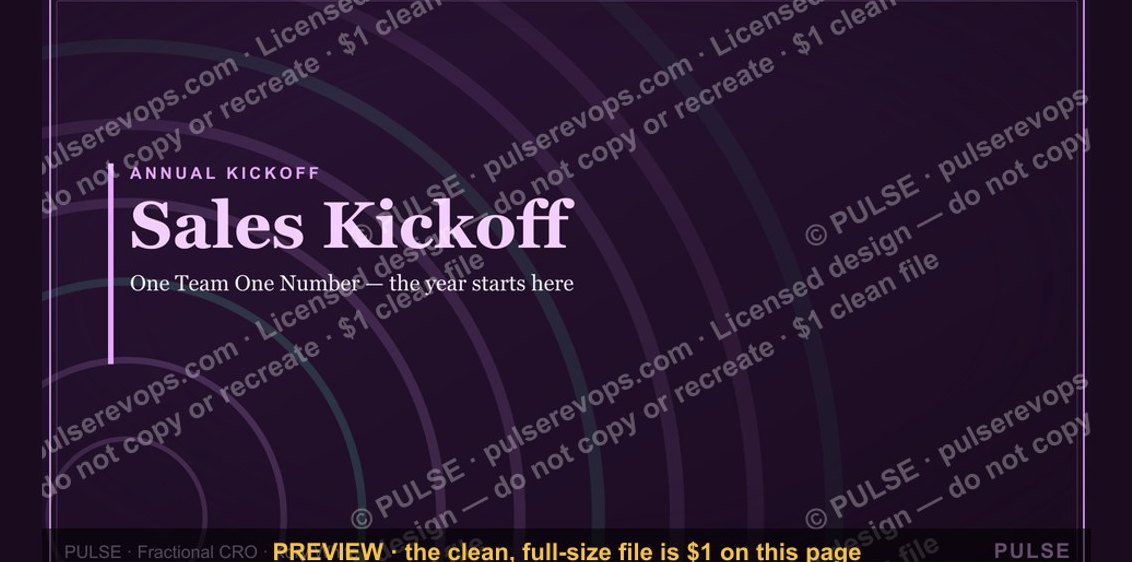 graphicSales Kickoff — Title Slide
 graphicThe Ask — Section Divider Slide
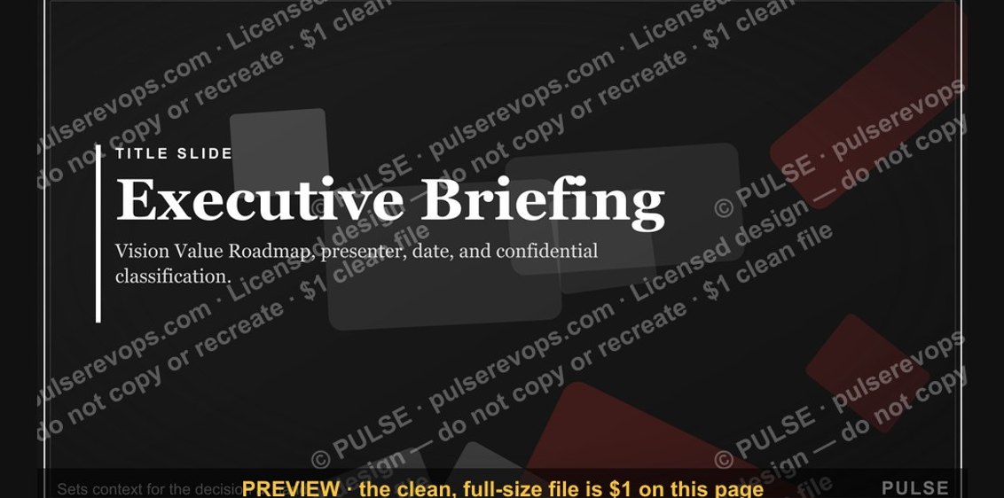 graphicExecutive Briefing — Title Slide
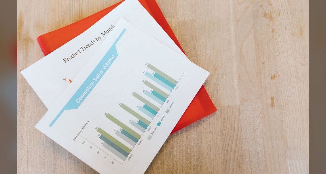 gbAnnual Sales Planning — Title Slide
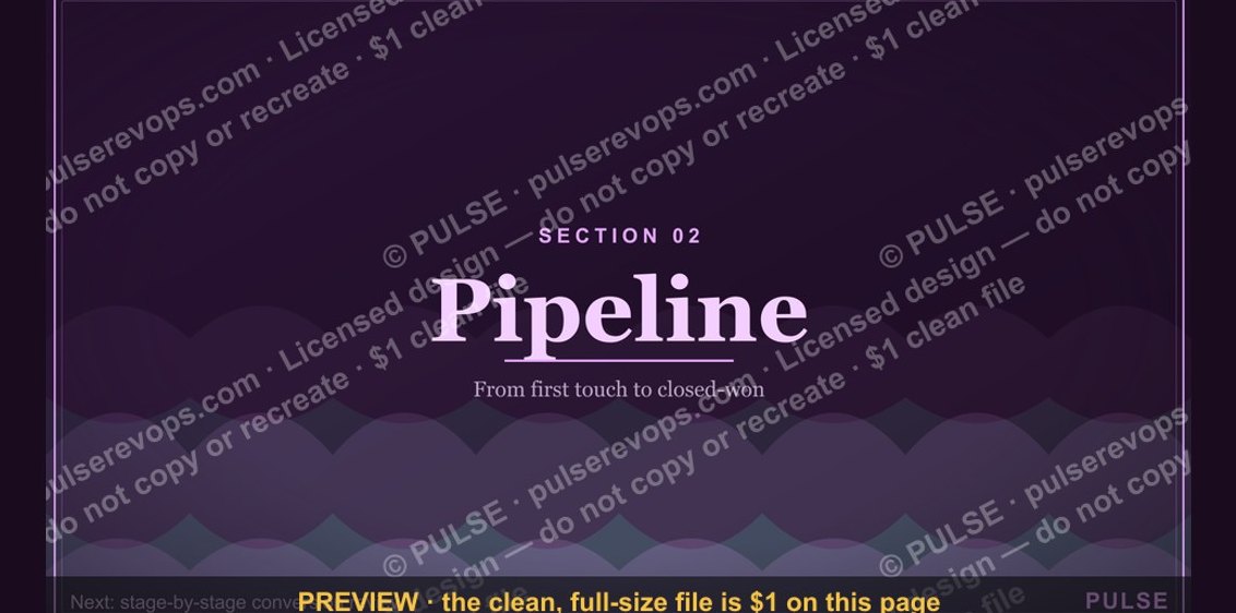 graphicPipeline — Section Divider Slide
 graphicNext steps. — Closing Slide
 graphicForecast Call — Title Slide
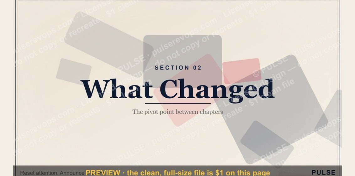 graphicWhat Changed — Section Divider Slide
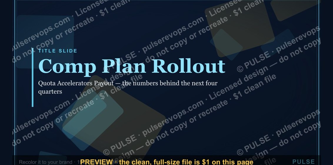 graphicComp Plan Rollout — Title Slide