


Agenda — Section Divider Slide
Quality
Certified
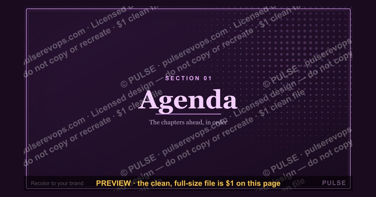
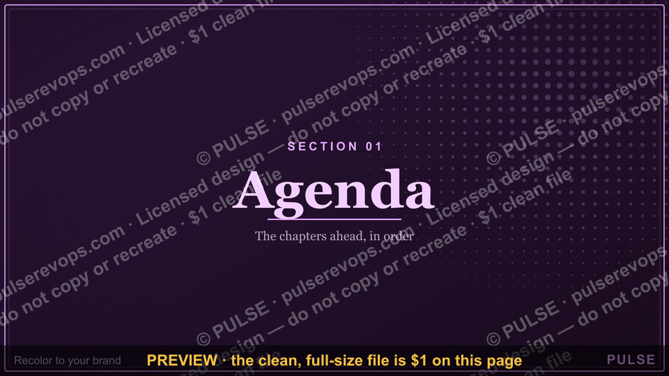
This graphic is a 1920x1080 px presentation section divider slide titled "Agenda — Section Divider Slide." It carries a bold section label, a short agenda list, and a subtle progress indicator, so a presenter can signal a topic shift mid-deck without breaking visual rhythm. Download it free as a PNG from this page.
What it is and why it matters
A section divider slide is the visual hinge between two blocks of a presentation. It is not a content slide and it is not a title slide. It exists to tell the room, in under three seconds, that the previous topic is closed and the next one is opening. In a sales kickoff, a quarterly business review, or a RevOps roadmap readout, that hinge does more work than most presenters give it credit for. Without it, an audience that has been listening to pipeline coverage numbers suddenly hears about territory carving and has no mental shelf to put it on. Attention drops, side conversations start, and the presenter spends the first ninety seconds of the new section re-earning focus that a divider would have handed them for free.
The Agenda — Section Divider Slide is built for that exact moment. It is a single 16:9 frame at 1920x1080 px, sized to drop into any deck that already uses widescreen dimensions. The layout is deliberately sparse: a large section title, a supporting line, and a compact agenda list that shows the audience where they are in the overall arc. Because it is delivered as a PNG, it works in PowerPoint, Google Slides, Keynote, Canva, Figma, and any internal wiki or Notion page where a deck is embedded. It also works as a standalone image in a Slack channel or an email recap, which matters more than most teams expect — the divider often becomes the thumbnail that people see when they scroll back through a shared deck.
Why it matters in a RevOps context specifically: RevOps decks tend to be long. A typical QBR runs 40 to 70 slides, and a full-year planning deck can run past 100. Those decks usually cover four to six distinct workstreams — forecasting, territory design, compensation, tooling, enablement. Each workstream has its own vocabulary and its own set of numbers. A divider slide is the cheapest possible way to reset the audience's context between them. It costs one slide and about four seconds of stage time. The alternative — a verbal transition like "okay, moving on" — costs nothing but also accomplishes nothing, because the audience has no visual anchor to mark the shift.

There is also a practical production argument. When a deck is assembled by three or four contributors, the seams show. One person's slides use a dark background, another's use white. Fonts drift. Chart styles drift. A divider slide placed at each seam hides that drift. It gives the eye a consistent, branded frame between two inconsistent blocks, so the deck reads as one artifact rather than a folder of pasted-in slides. Teams that build a divider once and reuse it across every deck tend to produce decks that look more polished than the effort involved would suggest.
Finally, the divider does a job that no other slide does: it manages pacing. A presenter who knows a divider is coming can plan to land a section, pause, click, and start fresh. That pause is a natural breath. Audiences use it to re-settle, check notes, or refill coffee. Without dividers, long decks run together into one continuous wall of information, and retention falls off a cliff somewhere around slide 25. The divider is not decoration. It is pacing infrastructure.
The step-by-step process
Using this graphic well is a five-step process. It is short, but each step has a failure mode worth naming.
Step one: map the deck into sections before you build any content. Open a blank document and list the sections your deck will cover. A QBR might have four: performance review, forecast outlook, territory and coverage, and next-quarter priorities. A planning deck might have six. The rule of thumb is three to six sections. Fewer than three and you do not need dividers — the deck is short enough to hold in one mental frame. More than six and the dividers start to feel like filler; at that point, consider whether two of your sections should merge. Write the section names in plain language. "Pipeline health" beats "Q3 Pipeline Diagnostics and Coverage Analysis." The divider is a signpost, not a title page.
Step two: write the agenda list that appears on the divider. The graphic carries a compact list showing where the current section sits in the overall arc. Keep each line to three to five words. If your deck has four sections, the list has four lines, and the current one is visually emphasized. This is the single most useful element on the slide, because it answers the question every audience member is silently asking: how much longer is this, and what is left. Do not put timings on the list unless you are confident you will hit them. A divider that promises "Compensation — 15 min" and then runs 35 minutes undermines every other timing claim in the deck.
Step three: place one divider at the head of each section. Not at the end of the previous section — at the head of the next one. The distinction matters. A divider placed at the end reads as a summary slide for what just happened. A divider placed at the head reads as an opening for what is about to happen, which is the correct frame. If your deck has a natural mid-point break, such as a stretch break or a demo, that break is also a divider moment, and you can reuse the same graphic with a different section label.

Step four: rehearse the transition out loud. The divider slide is the only slide in the deck where the presenter's job is purely verbal. You have four to eight seconds of stage time while the audience reads the slide. Use it to say one sentence that frames the section: "We're going to spend the next ten minutes on territory coverage, and the headline is that we're over-indexed in two regions." That sentence is the section's thesis. If you cannot say it in one sentence, the section is not ready to present. Rehearsing this sentence is what separates a divider that works from a divider that is just a pretty frame.
Step five: export, place, and check contrast on the actual projector. The PNG is built at 1920x1080 px. Drop it into your deck at full-bleed so it fills the frame edge to edge. Then check it on the room's actual display if you can, or at minimum on a second monitor. Projectors wash out contrast, and a divider that looks crisp on a laptop can look muddy on a conference room wall. If the room is bright, favor the higher-contrast variant. If you are presenting over a video call, check how it looks at 50% zoom, because most attendees will be viewing a compressed stream on a laptop screen, not a 1080p monitor.
The loop on the right side of that diagram is the part teams skip. If the section thesis does not compress into one sentence, the problem is not the divider — it is that the section is doing too much. Splitting it into two sections, each with its own divider and its own thesis, almost always produces a better deck than one overloaded section with a vague frame.
Costs, timelines, and typical ranges
The graphic itself is free to download as a PNG from this page, so the direct cost is zero. The real costs are time and attention, and those are worth estimating honestly.
Production time. Building a deck's section structure from scratch — the mapping step, the agenda lines, and the placement — takes most presenters 20 to 40 minutes for a 40-slide deck. If you already have a divider template and are reusing it, placement takes under five minutes. The expensive part is the thinking in step one, not the clicking. Teams that skip step one and place dividers retroactively usually end up with sections that do not match the content, which is worse than having no dividers at all.
Slide count impact. Each divider adds one slide. A four-section deck adds four slides, roughly 6 to 10 percent to the total count. That is a real cost if you are working against a hard slide limit, such as a board pre-read capped at 30 pages. In that case, the standard move is to keep dividers in the live deck and strip them from the pre-read PDF, since a reader scrolling a document does not need pacing help the way a live audience does.
Typical section length. In practice, sections in a RevOps deck run 6 to 12 slides and 8 to 20 minutes of stage time. If a section is running past 20 minutes, it is usually two sections wearing one label. If a section is under 6 slides, it probably does not need its own divider — fold it into the adjacent section and save the slide. These ranges are not rules, but they are a useful sanity check when you are deciding where the dividers go.
Timeline for a full deck refresh. If you are rebuilding a recurring deck — a monthly business review, say — and adding a divider system for the first time, budget two to three hours for the first pass and about 30 minutes for each subsequent month, because the section structure tends to stabilize. The first pass is expensive because you are deciding what the sections are. After that, you are mostly confirming that last month's structure still holds and swapping in new section labels where the content has shifted.

Where the cost actually lands. The hidden cost is not production, it is the discipline of cutting content that does not fit a section. Once you commit to a four-section structure, every slide has to belong to one of the four. Slides that belong to none are usually slides that should be cut or moved to an appendix. Teams that adopt dividers often find their decks shrink by 10 to 20 percent in the first cycle, not because they deleted content arbitrarily, but because the structure exposed slides that were doing no work. That shrinkage is the return on the 20 minutes you spent mapping sections.
Tooling costs. There is no required tooling. The PNG drops into any slide application. If your team uses a shared deck library, store the divider alongside the master template so contributors pull the current version rather than an old export. Version drift on a divider slide is a small problem that looks like a big problem — two slightly different dividers in one deck read as carelessness, even though nobody can articulate why.
Where teams get it wrong
Mistake one: treating the divider as a title slide. A title slide announces the deck. A divider announces a section. When teams reuse the title slide layout for dividers, the audience gets a moment of confusion — is this starting over? The fix is visual differentiation: the divider should share the deck's palette and type but drop the deck title, the date, and the presenter name. It carries only the section label, the agenda list, and the progress indicator.
Mistake two: writing section labels that are too long. "Q3 FY25 Pipeline Coverage, Win-Rate Analysis, and Stage-Conversion Deep Dive" is not a section label. It is a table of contents. Section labels should be two to four words. The detail belongs on the slides inside the section, not on the signpost pointing at them. Long labels also force the presenter to read the slide aloud, which wastes the four seconds the divider was supposed to buy.

Mistake three: putting the agenda list on every divider without marking progress. The agenda list is only useful if it shows where the audience currently is. A static list repeated on four dividers tells the audience the deck has four sections but not which one they are in. Mark the current section — bold it, color it, add a dot, or dim the others. This is a two-minute edit in any image tool and it is the difference between an agenda list that orients people and one that just takes up space.
Mistake four: using dividers to hide a weak transition. A divider does not fix a section that has no thesis. If you cannot say what the section is about in one sentence, the divider will simply give the audience four extra seconds to notice that the section is unfocused. Fix the section first, then add the divider.
Mistake five: over-designing. The most common failure in divider design is adding a stock photo, a decorative gradient, and an icon set. Each addition competes with the section label for attention. The divider's job is to be read in under three seconds and then ignored. Restraint is the design principle. If you remove an element and the slide still works, remove it.
Mistake six: forgetting the remote audience. On a video call, attendees see the divider at whatever size their window allows, often a quarter of a laptop screen. Small type that reads fine in the room is illegible on the call. Test the divider at 25 percent zoom. If the section label is not readable at that size, increase it. This is the single most common reason dividers fail in hybrid meetings.
Mistake seven: no consistent placement across the deck. If the first divider is full-bleed and the second has a margin, the deck looks assembled rather than designed. Pick one treatment and apply it to every divider. Consistency here is more valuable than any individual design choice.
That decision tree is worth running once per divider before you present. It takes about 60 seconds per slide and catches the seven mistakes above in order of how often they occur.
Decision framework: when to choose what

Not every deck needs a divider slide, and not every divider needs the same treatment. The framework below maps the common situations to the right choice.
Short deck, single topic, under 20 slides. Skip dividers entirely. A 15-slide deck on one topic does not have sections; it has an argument. Adding dividers would chop a continuous argument into artificial pieces. Use a single agenda slide near the front if you need to preview the flow, and leave it at that.
Long deck, multiple workstreams, 30+ slides. Use dividers at every section head. This is the core use case for the graphic. Four to six dividers across a 40-slide deck is the sweet spot. The dividers do the pacing work so the content slides can be dense without overwhelming the audience.
Executive or board audience. Use dividers, but keep the agenda list minimal — three or four lines maximum, no timings. Executive audiences read the divider as a contract about what is coming, and a long list reads as a long meeting. If the deck is going into a pre-read, consider stripping dividers from the PDF and keeping them in the live version.
Recurring deck, monthly or quarterly. Build the divider once, reuse it every cycle, and only change the section labels and the progress marker. The structure usually stabilizes after two or three cycles, at which point the dividers become nearly free to produce. This is where the graphic pays for itself in time saved.
Hybrid or fully remote presentation. Use dividers and upsize the type. Remote audiences lose the room's visual cues, so the divider is doing more work than it would in person. Check readability at 25 percent zoom and favor the higher-contrast variant.

Workshop or working session. Use dividers as time-box markers. In a working session, the divider can carry the section name plus the allotted time, because the audience is a participant group that benefits from knowing how long each block runs. This is the one case where timings on the agenda list are worth including.
When to choose a different device entirely. If your deck has more than six sections, the problem is scope, not dividers. If your deck has no clear sections, the problem is structure. If your audience is five people in a small room working through one document, a divider slide is overhead — a verbal transition is enough. The divider is a tool for pacing a room, and pacing matters most when the room is large, the deck is long, and the topics are distinct.
When the divider backfires. It backfires when it is used to pad a thin deck, when the section labels are vague enough to mean anything, or when the presenter reads the divider aloud instead of using it as a beat. It also backfires in a deck that is genuinely one continuous argument — a single-topic deep dive, for example — where artificial sections make the logic feel choppier than it is. The test is simple: if you removed all the dividers, would the deck be harder to follow? If the answer is no, the dividers are decoration.
Related questions
What size should a section divider slide be?
1920x1080 px, the standard 16:9 widescreen ratio. This matches PowerPoint, Google Slides, and Keynote defaults, so the PNG drops in full-bleed without letterboxing or cropping. If your deck uses 4:3, you will need to crop or rebuild the graphic.
How many dividers should a 40-slide deck have?

Four to six. That works out to one divider per 7 to 10 content slides. Fewer than three dividers in a 40-slide deck usually means the sections are too long; more than six usually means the sections are too short to justify the slide.
Should the agenda list show timings?
Only in working sessions where the audience is participating and needs to plan their attention. In a standard presentation, timings invite the audience to track the clock, and any overrun undermines the rest of the deck. Leave timings off unless you are confident you will hit them.
Can I edit the PNG?
A PNG is a flat image, so text and color edits require an image editor or a rebuild from the source layout. If you expect to change section labels often, rebuild the divider in your slide tool as an editable master and export a fresh PNG only when the design is final.
Do dividers work in a pre-read PDF?
They work, but they add pages without adding information for a reader who is scrolling rather than sitting in a room. Many teams keep dividers in the live deck and strip them from the pre-read, then re-add them for the meeting. The section structure still helps the reader via the agenda slide.
FAQ
What exactly is on this graphic?
The graphic is a 1920x1080 px presentation section divider. It carries a large section title, a short supporting line, a compact agenda list showing the deck's sections with the current one marked, and a subtle progress indicator. The layout is sparse by design so the section label reads in under three seconds from across a room.
Where should I place it in a deck?
At the head of each section, not at the end of the previous one. Placement at the head frames the divider as an opening for what is coming, which is the correct reading. If your deck has a natural break such as a demo or a stretch break, that is also a divider moment and you can reuse the same graphic with a different label.
How do I customize the wording for my team?
Change the section label to two to four plain words, rewrite the agenda lines to three to five words each, and mark the current section. Keep the deck title, date, and presenter name off the divider — those belong on the title slide. If your team has a house style, match the divider's palette and type to it so the deck reads as one artifact.
Does this work for remote and hybrid meetings?
Yes, with one adjustment: increase the type size and favor the higher-contrast variant. Remote attendees often view the deck at a quarter of a laptop screen, so small type that reads fine in a conference room becomes illegible on a call. Test the divider at 25 percent zoom before you present.
How long should each section be?
Six to twelve slides and 8 to 20 minutes of stage time is the practical range. Under six slides, the section probably does not need its own divider. Over 20 minutes, it is usually two sections wearing one label. These are sanity checks, not rules, but they catch most structural problems before you present.
Is the download really free?
Yes. The graphic is available as a free PNG download from this page. There is no attribution requirement and no license fee. Store it alongside your deck master so contributors pull the current version rather than an old export, which prevents version drift across a shared deck library.
Sources
- Microsoft Support — Add, change, or delete slide layouts: https://support.microsoft.com/en-us/office/add-change-or-delete-a-slide-layout-0d2f5a4a-1f5a-4c1e-9d5a-1c2b3a4d5e6f
- Google Workspace Learning Center — Google Slides training and help: https://support.google.com/a/users/answer/9282959
- Apple Support — Keynote user guide: https://support.apple.com/guide/keynote/welcome/mac
- Nielsen Norman Group — Presentation design and slide readability research: https://www.nngroup.com/articles/
- Canva Design School — Presentation design basics: https://www.canva.com/designschool/
- Figma Help Center — Exporting frames and assets: https://help.figma.com/hc/en-us
- W3C — Web Content Accessibility Guidelines (WCAG) contrast guidance: https://www.w3.org/WAI/WCAG21/quickref/
- Presentation Zen — Garr Reynolds on slide design and pacing: https://www.presentationzen.com/
Related on PULSE
- Agenda — Title Slide
- Agenda — Closing Slide
- Deck Structure for Quarterly Business Reviews
- Pacing a 40-Slide RevOps Readout
- Building a Reusable Slide Master Library
- Hybrid Meeting Slide Readability Checklist
This page will be disappearing soon. Save it to your device for $1 — or read it free while it is here.
@Kory-White- · if Venmo asks, the last 4 of my number are 2012
This page is gone.
This one is off the shelf now. $1 keeps it on your phone for good — the whole page, pictures and diagrams included.
 graphicPipeline Review — Title Slide
 graphicDiscovery Call — Title Slide
 graphicWhat Changed — Section Divider Slide
 graphicQuarterly Business Review — Title Slide
 graphicForecast Call — Title Slide
 graphicThank you. — Closing Slide
 graphicComp Plan Rollout — Title Slide
 graphicPerformance — Section Divider Slide
 graphicCustomer QBR — Title Slide
 graphicMonthly Business Review — Title Slide