


The Sales Hiring Funnel — Infographic
Quality
Certified
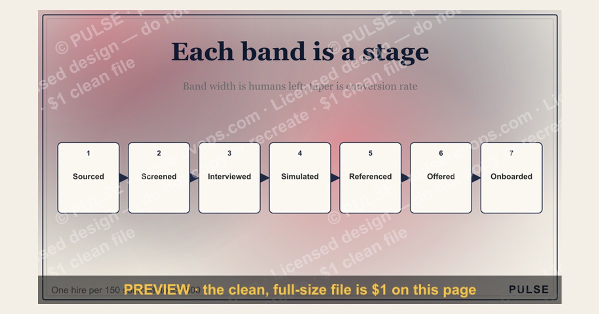
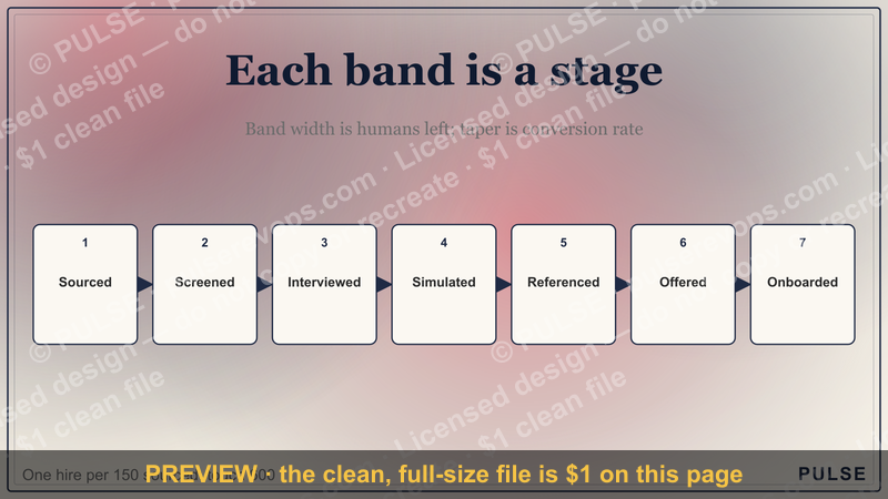
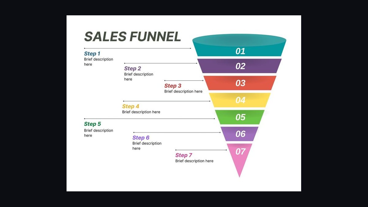
This is a process flowchart titled "The Sales Hiring Funnel — Infographic," sized 1600x900 px and free to download as a PNG from this page. It maps the Sales Hiring Funnel stage by stage — sourcing, screening, interviewing, offer, and ramp — so a hiring manager can see where candidates drop out and where to fix the process.
What it is and why it matters
This process flowchart is a single-screen visual that turns the Sales Hiring Funnel into something a team can point at during a hiring review. Instead of a spreadsheet of applicant counts or a paragraph in a recruiting doc, it shows the funnel as a sequence of stages with the candidate volume narrowing at each step. The title carries the exact wording "The Sales Hiring Funnel — Infographic" so it reads as a named artifact, not a generic recruiting slide.
Why a funnel and not a pipeline? A pipeline implies steady flow; a funnel implies deliberate narrowing, and sales Hiring really is a narrowing exercise. You start with a wide pool of applicants, then progressively remove people who cannot do the job, will not do the job, or are not available to do the job. Each removal is a decision point, and each decision point is where the Infographic earns its keep: it forces the team to name the stage where candidates are lost rather than blaming "the market" in general.
The practical value shows up in three places. First, forecasting: if you know your historical pass-through rates, you can work backward from a quota gap to a required applicant volume. Second, diagnosis: when Hiring slows, the funnel tells you whether the problem is top-of-funnel volume, mid-funnel conversion, or offer-stage losses. Third, alignment: Sales leaders, recruiters, and finance all read the same picture, which reduces the "we can't find anyone" versus "we're too picky" argument that stalls hiring cycles.

It also matters because sales roles have unusually high failure rates in the first year, and much of that failure traces back to a funnel that was never designed — it just happened. A rep who looked strong in a 30-minute screen but could not run a discovery call is a screening-stage defect, not a training problem. The Infographic makes those defects visible by stage, which is the first step to fixing them.
The step-by-step process
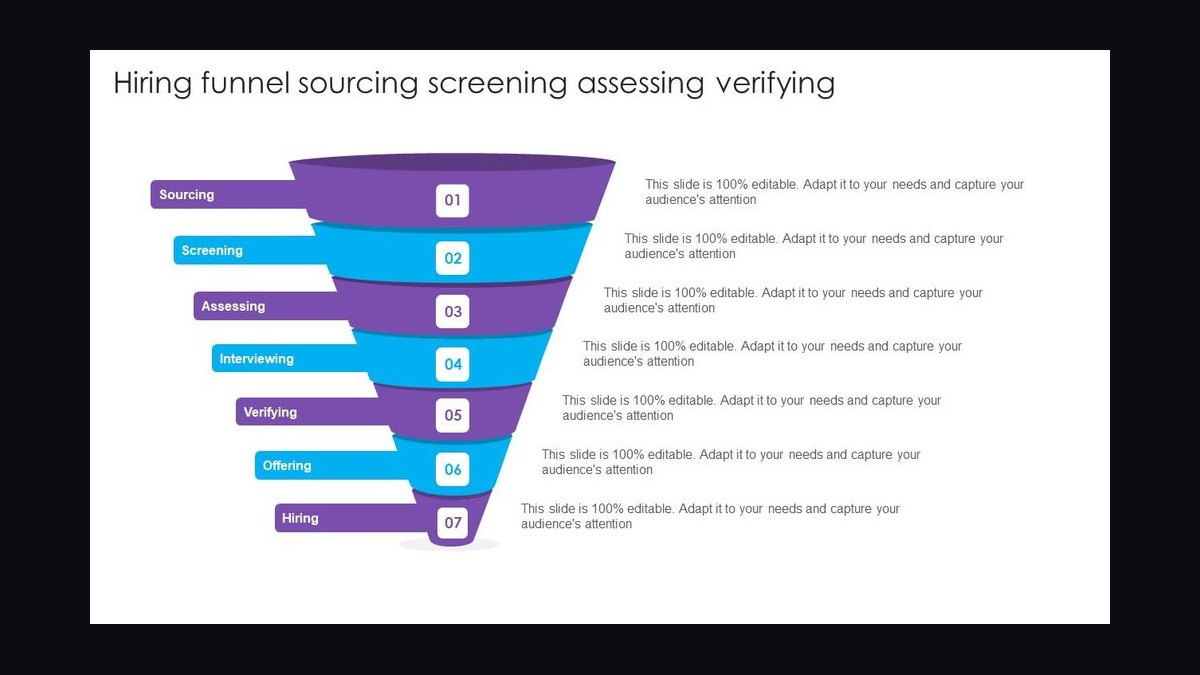
The flowchart reads top to bottom, with the candidate pool widest at the top and narrowest at the bottom. Here is the sequence the graphic depicts, stage by stage, with the kind of numbers a mid-market SaaS team might actually see.
Stage 1 — Sourcing and inbound. This is the widest band. Candidates arrive from job boards, LinkedIn outreach, referrals, inbound applications, and recruiter-sourced lists. For a single Account Executive opening, a typical mid-market company might see 150–400 raw applicants and sourced names combined, though the split varies wildly by brand strength and geography. Referrals usually convert far better than cold inbound, which is why many teams weight referral sourcing heavily at this stage.

Stage 2 — Resume and application screen. A recruiter or hiring manager scans for baseline qualifications: years of relevant selling experience, industry fit, quota attainment evidence, and role-level match (SMB versus enterprise). Expect to advance roughly 20–35% of the top-of-funnel pool here. This is the cheapest stage to be strict, because you have spent almost no human time yet.
Stage 3 — Recruiter phone screen. A 20–30 minute call covering motivation, compensation expectations, timeline, and a light behavioral check. Pass-through is often 40–60% of those screened. The main failure modes are compensation mismatch and candidates who interview well but have no real interest in the role.
Stage 4 — Hiring manager interview. A deeper conversation about selling motion, deal examples, and how the candidate handles objections. This is where weak discovery skills surface. Pass-through commonly lands around 30–50%.
Stage 5 — Skills assessment or role-play. A mock discovery call, a written deal plan, or a take-home exercise. This stage is the strongest predictor for sales roles because it tests behavior rather than narrative. Expect 40–60% to clear it, and expect the ones who fail to fail on structure, not charisma.

Stage 6 — Panel or cross-functional interview. Peers, a sales engineer, or a customer success lead probe collaboration and handoff behavior. Pass-through is typically 50–70% because the pool is already thin and vetted.
Stage 7 — Offer and close. Compensation, start date, and negotiation. Acceptance rates for sales roles commonly run 60–85% depending on market heat and how competitive the package is. Declines usually trace to a competing offer, a counteroffer from the current employer, or a late-stage concern about quota realism.
Stage 8 — Ramp and validation. The funnel does not end at signature. The first 30–90 days determine whether the hire was real. Many teams track a 90-day checkpoint — pipeline generated, first closed deal, or certification completed — and treat a miss there as a funnel defect that should feed back into the earlier stages.
The key insight the diagram carries: the funnel is not a straight line, it is a loop. A failed ramp is information about the earlier stages, not just about the individual. Teams that treat it as a loop improve their screening criteria; teams that treat it as a straight line keep repeating the same hiring mistake.
Costs, timelines, and typical ranges

The cost of a sales hire is not the salary line alone. It is the sum of sourcing spend, recruiter time, interviewer hours, and the opportunity cost of a seat sitting empty or ramping slowly. Breaking that out helps a team decide where to invest in the funnel.
Time to fill. For a mid-market Account Executive role, a realistic time from opening to accepted offer is 30–60 days, with enterprise or specialized roles running 60–90 days or longer. The biggest single delay is usually scheduling — panel interviews that require four calendars to align can add a week or more per stage.
Cost per hire. Fully loaded recruiting cost for a sales role commonly falls in the range of $4,000–$15,000 when you account for job board spend, sourcing tools, recruiter time, and referral bonuses. Agency-assisted hires push the top of that range much higher, often 15–25% of first-year base salary, which is why many teams reserve agency use for the hardest-to-fill roles.
Interviewer hours. A single hire can consume 8–15 hours of combined interviewer time across screens, panels, and debriefs. Multiply that by the loaded hourly cost of a sales manager and a couple of peers, and the internal cost is often larger than the external recruiting spend.
Ramp cost. A new sales rep typically takes 3–6 months to reach full productivity, and during that window they are drawing salary while producing little or no revenue. For a rep carrying a $750,000 annual quota, a six-month ramp means roughly $375,000 of unrealized pipeline capacity, which is the real cost of a slow or wrong hire.

Cost of a bad hire. When a sales hire fails within the first year, the direct costs — salary, onboarding, tools, and the recruiting spend to replace them — commonly land between 50% and 200% of annual salary once you include the disruption to territory and pipeline. That is the number that justifies spending more time and money on the front of the funnel.
Volume math. If you need to hire 5 reps and your historical pass-through from applicant to accepted offer is roughly 2–4%, you need somewhere between 125 and 250 qualified top-of-funnel candidates. That math is the single most useful output of the funnel: it converts a hiring goal into a sourcing target.
Where teams get it wrong
Most sales Hiring problems are not market problems. They are funnel design problems, and they cluster in a handful of predictable places.
Optimizing the wrong stage. Teams often pour effort into sourcing more candidates when the real leak is at the offer stage or the ramp stage. If your acceptance rate is 50% and your ramp failure rate is high, adding applicants just adds cost without adding hires. Measure pass-through at every stage before deciding where to invest.
Screening for charisma instead of behavior. A candidate who interviews smoothly can mask weak discovery, poor follow-up, and thin deal history. The fix is a structured role-play or written exercise at the mid-funnel, scored against a rubric, so the decision rests on observed behavior rather than interview presence.

No shared definition of a qualified candidate. If the recruiter screens for one profile and the hiring manager interviews for another, the funnel leaks at the handoff. A one-page scorecard with three to five must-have criteria, agreed before sourcing begins, closes that gap.
Slow scheduling. Every day between stages costs candidates. Strong sales candidates are often in multiple processes, and a two-week gap between the phone screen and the manager interview is enough to lose them. Batch interviews, pre-book panel slots, and set a service-level target for each stage.
Ignoring the candidate experience. Sales candidates talk to each other, and a slow, disorganized process signals a slow, disorganized sales org. The funnel is also a marketing asset — the people you reject may become customers, referrers, or future hires.
Skipping the ramp checkpoint. If the funnel ends at signature, you never learn whether the process works. A 30/60/90-day checkpoint with defined milestones turns each hire into a data point that sharpens the next search.
Over-indexing on one source. Referrals are high quality but limited in volume. Job boards are high volume but low conversion. A healthy funnel blends sources and tracks conversion by source so you can shift spend toward what actually produces hires, not just applicants.
Decision framework: when to choose what
Not every sales opening deserves the same funnel. The right design depends on role seniority, market heat, and how much the role varies from your existing team. The framework below maps common situations to the funnel choices that fit them.
High-volume, junior roles. For SDR or inbound rep openings, lean on a fast, standardized funnel: a short screen, a group or recorded role-play, and a quick manager conversation. Speed matters more than depth because the role is learnable and the cost of a miss is lower.
Specialized or senior roles. For enterprise AEs or sales engineers, slow down. Add a panel, a written deal plan, and a reference conversation with a former manager. The cost of a bad senior hire is high enough to justify a longer process and, often, agency support.
Urgent backfill. When a territory is uncovered, the temptation is to compress the funnel and skip stages. A better move is to keep the assessment stages and compress the scheduling instead — batch interviews into two days rather than spreading them across three weeks.
Competitive market. When candidates have multiple offers, shorten the gap between final interview and offer to 24–48 hours, and have compensation pre-approved so you are not waiting on approvals while a competitor closes.
Internal mobility. For promoting an SDR into an AE role, the funnel is shorter but the assessment should be heavier on role-play, because you already know the person's work ethic and only need to test the new skill set.
The framework is not a rulebook; it is a starting point. The point is to choose the funnel deliberately rather than defaulting to whatever the last hire used, because the last hire's context may have been completely different.
Related questions
What is the Sales Hiring Funnel?
It is the sequence of stages a sales candidate passes through — sourcing, screening, interviewing, assessment, offer, and ramp — with the candidate pool narrowing at each stage. The Infographic visualizes that sequence as a process flowchart so teams can see where candidates drop out.
Why does the funnel narrow so much?
Because each stage applies a filter: qualifications, motivation, skill, collaboration fit, and compensation alignment. Pass-through rates of 20–60% per stage compound quickly, which is why a few hundred applicants may yield only a handful of hires.
How many applicants do I need per hire?
It depends on your pass-through rates, but a common rule of thumb is 25–50 qualified top-of-funnel candidates per accepted offer. If your conversion is lower, either widen sourcing or tighten your screening criteria earlier.
Where do most sales funnels leak?
The most common leaks are at the resume screen (too loose or too strict), the offer stage (slow process, uncompetitive package), and the ramp stage (weak onboarding). Measuring pass-through at each stage shows which one is actually costing you hires.
Does the funnel apply to internal promotions?
Yes, though it is shorter. For an internal promotion, you can skip sourcing and baseline screening, but you should still run a structured role-play or skills assessment, because the new role demands skills the old one did not test.
FAQ
What exactly is on this process flowchart? The graphic is titled "The Sales Hiring Funnel — Infographic" and shows the funnel as a top-to-bottom flowchart. Each node names a stage — sourcing, resume screen, phone screen, manager interview, skills assessment, panel, offer, and ramp — with the candidate pool narrowing at each step and a feedback loop from ramp back to screening.
Who is this Infographic for? It is built for sales leaders, hiring managers, recruiters, and RevOps teams who own or influence sales Hiring. It is also useful for founders hiring their first sales rep, because it makes the full sequence visible before they commit to a process.
Can I download and use it in my own deck? Yes. The graphic is free to download as a PNG from this page. You can drop it into an internal hiring review, a recruiting kickoff, or a board update. If you customize the wording, keep the stage names consistent with your own process so the diagram stays accurate.
What are the exact dimensions and format? The graphic is 1600x900 pixels, a 16:9 aspect ratio that fits standard slide decks and widescreen displays. It is delivered as a PNG, which renders cleanly in presentations, documents, and internal wikis without font substitution issues.
How do I customize it for my team? Start with the stage names, since those vary most between companies — some teams split sourcing and screening, others merge them. Then adjust the pass-through percentages to your own historical data, and swap the role title in the caption. Keep the funnel shape intact; the narrowing is the message.
Does the funnel guarantee a good hire? No. It is a diagnostic and planning tool, not a predictor. It helps you see where candidates are lost and where to invest, but the quality of each stage's criteria and the rigor of the assessment still determine whether the hire works out.
Sources
- https://www.linkedin.com/business/talent/blog
- https://www.shrm.org/topics-tools/tools/hr-answers
- https://hbr.org/topic/subject/hiring
- https://www.gartner.com/en/sales
- https://www.salesforce.com/resources/articles/sales-recruiting/
- https://www.gallup.com/workplace/insights.aspx
- https://www.bls.gov/ooh/sales/home.htm
- https://www.mckinsey.com/capabilities/growth-marketing-and-sales/our-insights
Related on PULSE
- Sales Hiring Scorecard: Criteria That Predict Performance
- Time to Fill: Benchmarks for Sales Roles
- Ramp Plans for New Sales Reps: A 90-Day Structure
- Offer Acceptance Rates: Why Sales Candidates Decline
- Sourcing Mix: Referrals vs Inbound vs Outbound for Sales Roles
- Interview Loops for Sales: Designing the Panel Stage
This page will be disappearing soon. Save it to your device for $1 — or read it free while it is here.
@Kory-White- · if Venmo asks, the last 4 of my number are 2012
This page is gone.
This one is off the shelf now. $1 keeps it on your phone for good — the whole page, pictures and diagrams included.
 graphic4 Forecast Categories — Infographic
 graphicMEDDIC Qualification — Infographic
 graphicThe Ideal Customer Profile — Infographic
 graphic6 Sales Email Rules — Infographic
 graphicThe RevOps Funnel — Infographic
 graphicPirate Metrics (AARRR) — Infographic
 graphic4 Types of Buyers — Infographic
 graphicThe Lead Lifecycle — Infographic
 graphic5 Steps to Handle Any Objection — Infographic
 graphicSPIN Selling — Infographic