


4 Forecast Categories — Infographic
Quality
Certified


This is a 1080×1620 px portrait infographic titled "4 Forecast Categories," built for sales and RevOps teams to standardize how deals get labeled during pipeline reviews. It breaks every open opportunity into four buckets — Commit, Best Case, Pipeline, and Omitted — each shown with its own color block, a plain-English definition, and a typical close-probability range, so a rep, a manager, and a CFO all read the same forecast the same way.
What it is and why it matters
The infographic is a single vertical panel divided into four stacked color bands, read top to bottom in order of certainty. The top band is labeled "COMMIT" in bold white text on a solid green field, with a subhead reading "Will close this period — no material risk remains." The second band, "BEST CASE," sits on amber and reads "Could close this period if 1-2 things go right." The third band, "PIPELINE," sits on blue and reads "In active motion, not yet forecastable with confidence." The bottom band, "OMITTED," sits on gray and reads "Excluded from the number — stalled, disqualified, or pushed." Each band carries a small percentage range printed in a lighter weight beneath the definition, and a thin sidebar down the left edge lists the one CRM field every category maps to: the Salesforce or HubSpot "Forecast Category" picklist, distinct from the deal stage.
The reason this graphic exists at all is that "forecast category" and "deal stage" get conflated constantly, and that confusion is expensive. A deal can sit in the "Negotiation" stage and still belong in Pipeline, not Commit, if the champion has gone quiet. A deal can sit in an early stage and still belong in Best Case if a verbal agreement exists but paperwork hasn't started. Stage measures where a deal is in the sales process; forecast category measures how confident the team is that money lands this period. Those are two different axes, and most CRM implementations only train reps on the first one. The infographic exists to give a manager something to point at in a forecast call — "why is this Commit, walk me through it" — instead of relitigating the definition of Commit itself every week.

Because the four categories are the same ones built natively into Salesforce's Opportunity object (Pipeline, Best Case, Commit, Omitted, plus Closed as a fifth state once revenue lands), the graphic doubles as onboarding material for any org running that CRM, and as a translation layer for orgs on HubSpot, Pipedrive, or a spreadsheet-based forecast that use different labels but the same underlying logic. The word "Forecast" appears in the graphic's title bar exactly once, deliberately — the design avoids repeating category names in the header to keep the visual hierarchy simple: title, then four bands, nothing else competing for attention.
The step-by-step process
The infographic represents a single decision path: as a deal moves through a sales cycle, a rep re-evaluates which of the four categories it belongs in — usually during a weekly pipeline review, not continuously. The flow below is the same one visualized in the graphic's color order, extended to show the movement between categories rather than just the static states.

A deal enters the pipeline as soon as it's qualified and typically starts in the "Pipeline" category by default — this is the CRM's resting state for anything without an explicit override. As the deal progresses and a rep gains specific signal (a verbal yes, a signed mutual close plan, budget confirmed in writing), the rep manually recategorizes it to Best Case. That reclassification is a judgment call, not a stage-triggered automation, which is exactly why teams need a shared visual reference — without one, one rep's Best Case is another rep's Commit.
Once a deal is marked Commit, the manager treats it as money already accounted for in that period's number — this is the category that rolls up into the "commit number" reported to leadership, distinct from the wider "pipeline coverage" figure used for capacity planning. If a Commit deal doesn't close, that's treated as a forecasting miss and usually triggers a deal review, not just a shrug — the whole point of the category is that it should rarely be wrong. Best Case deals, by contrast, are expected to have a real miss rate; a team whose Best Case category converts at 95% is almost certainly sandbagging (holding deals in Pipeline that should already be Best Case) rather than forecasting accurately. Omitted deals stay visible in the CRM but drop out of every rollup report — they aren't deleted, just excluded, so a deal that revives later (a stalled buyer comes back six weeks after go-dark) can be pulled straight back into Pipeline without re-entering data from scratch.
The step-by-step logic the infographic encodes is this recategorization discipline happening on a fixed cadence — most commonly every Monday before a Tuesday pipeline review — rather than left to happen "whenever a rep remembers." Teams that skip the cadence end up with forecast categories that are stale by weeks, which defeats the purpose of having four buckets instead of one.
Costs, timelines, and typical ranges

There's no cost to use this infographic — it's a free download from this page, delivered as a single PNG at 1080×1620 px (a 2:3 portrait ratio that fits cleanly into a Slack pin, a Notion page header, a slide in a QBR deck, or a printed one-pager taped to a wall near a sales floor). At that resolution it holds up at full size on a 27-inch monitor and still reads clearly shrunk to a Slack thumbnail, which is the main practical test for any internal reference graphic — if it turns to mush at thumbnail size, nobody actually opens it.
On the timeline side, the relevant clock isn't "how long to make the graphic" (it's already made) but "how often should the categories themselves get reviewed." Most RevOps teams run forecast category recalibration in three rhythms: a weekly pass where reps individually reclassify deals ahead of a manager 1:1, a monthly pass where the sales leader audits category assignment against actual close outcomes from the prior month to catch drift, and a quarterly pass where the percentage ranges attached to each category get revisited against real historical conversion data. That last one matters because the ranges printed on the infographic are starting defaults, not laws of physics — they're meant to be recalibrated once a team has two or three quarters of its own data showing what its Best Case category actually converts at.

Typical starting ranges look like this, and they're what the graphic prints by default: Commit sits at roughly 90% or higher confidence of closing in the stated period, Best Case sits in the 50-89% band, Pipeline covers 10-49%, and Omitted effectively sits at or near 0% for the current period (the deal may still close eventually, just not now). These bands are intentionally wide because probability in sales forecasting is a directional signal, not a precise measurement — nobody is claiming a deal is exactly 62% likely to close, only that it belongs in a band where roughly that range of outcomes has historically played out. A team with a longer sales cycle (enterprise, multi-stakeholder, 6+ month deals) tends to keep more deals in Pipeline and Best Case longer, moving fewer into Commit until very late; a team with a short-cycle transactional motion moves deals into Commit earlier because the whole cycle is short enough that "imminent" means days, not months.
The one true cost worth flagging is organizational, not financial: adopting a four-category forecast only works if category definitions are enforced the same way across every rep and every manager. A single rep who treats Best Case as "anything I'm hopeful about" rather than "anything meeting the specific criteria on this infographic" breaks the aggregate number for the whole team, because forecast roll-ups assume consistent inputs. That enforcement cost — training time, periodic audits, and the occasional uncomfortable conversation about an inflated Commit list — is the real price of using this system, and it's ongoing, not one-time.
Where teams get it wrong

The most common failure is sandbagging: a rep deliberately under-categorizes healthy deals, keeping a near-certain close in Pipeline instead of Commit, to build a cushion for next quarter or to avoid the appearance of an aggressive number that draws scrutiny. This looks conservative on paper but actually destroys forecast accuracy in both directions — it understates the current period and then creates an artificial spike when the sandbagged deals all "surprise" close, making trend data useless for capacity and hiring decisions built on top of it.
The opposite failure is just as damaging: happy-ears forecasting, where a rep (or a manager under pressure) marks deals Commit based on enthusiasm rather than the specific criteria the category requires — a friendly call gets read as a signed deal. This is the failure mode that makes the infographic worth pinning somewhere visible, because the fix isn't more diligence, it's a shared, visible definition that a manager can point to during a 1:1: "show me where this deal meets the Commit bar on the board," not "I have a good feeling about it."
A third mistake is conflating forecast category with deal stage in the CRM configuration itself — setting up an automation that force-assigns a forecast category purely based on which stage a deal sits in. This defeats the purpose of having two separate fields. Stage should track process (discovery, demo, proposal, negotiation); forecast category should track confidence, which doesn't move in lockstep with process. A deal can regress from Best Case to Pipeline without changing stage at all — the buyer's champion left the company, budget got frozen — and a CRM that only lets category follow stage can't represent that regression, so the forecast silently goes stale.

A fourth mistake is letting the Omitted category become a dumping ground nobody revisits. Because omitted deals drop out of every rollup, they're easy to forget entirely — but a meaningful share of omitted deals aren't dead, they're paused, and a pipeline that never re-audits its Omitted bucket misses real revenue that was sitting there the whole time, uncontacted for months. The discipline that fixes this is a monthly "graveyard review" specifically of the Omitted category, treating it as a distinct queue to work rather than a category to forget.
Finally, teams frequently skip recalibrating the percentage ranges themselves. An org that copies the 90/50-89/10-49/0 split from a template (including this infographic) and never checks it against its own historical win rates by category can end up with numbers that look precise but are quietly wrong — if a team's actual Best Case deals close at 30% instead of the assumed 50-89% band, every forecast built on that category is inflated, and nobody notices until the miss shows up at quarter-end.
Decision framework: when to choose what
The infographic is meant to be read left-to-right as a decision aid in the moment a rep is unsure which category a deal belongs in, not just as a static reference chart. The underlying question at each fork is "what specific, verifiable thing would have to be true" rather than "how do I feel about this deal" — that's the discipline the whole system is trying to enforce.

Reading this against the infographic itself: the graphic's color bands are the four terminal boxes in this tree, and the diamonds represent the questions a manager should actually ask out loud in a pipeline review instead of accepting a category assignment at face value. A deal that can't clearly answer "yes" to the Commit question but keeps getting reported as Commit anyway is the single most common red flag a sales leader catches by walking this framework live with a rep, deal by deal, rather than trusting a CRM report in isolation.
Where this framework changes by team: a heavily regulated or procurement-heavy sales motion (enterprise software, healthcare, government) often adds a fifth informal checkpoint before Commit — "has procurement/legal signed off" — because in those motions a verbal yes from the economic buyer still leaves real risk sitting in a legal review queue that can slip a close by a full quarter. Lighter-touch, high-velocity motions (SMB, PLG-assisted sales) often collapse Best Case and Commit into a much shorter window because the entire cycle from verbal yes to signature can be under a week, making the distinction between the two categories almost cosmetic for that segment.
Related questions
What's the difference between forecast category and deal stage?
Stage tracks where a deal sits in the sales process (discovery, proposal, negotiation); forecast category tracks how confident the team is that it closes this period. They move independently — a deal can regress in confidence without changing stage.
How often should reps update forecast categories?

Weekly, ahead of the pipeline review where a manager checks category assignments against actual deal evidence — monthly and quarterly passes then audit whether the category definitions themselves still hold.
What is sandbagging in sales forecasting?
Deliberately under-categorizing a healthy deal (keeping it in Pipeline instead of Commit) to build a cushion against future quarters, which distorts trend data even though it looks conservative in the current period.
Can a deal move backward through the categories?
Yes — a deal can slip from Commit to Pipeline or straight to Omitted if a champion leaves, budget freezes, or a signature date slips, and the CRM should let category move independently of stage to capture that.
Why does the Omitted category matter if it's excluded from the forecast?
Because omitted deals aren't dead, just paused — a monthly review of that bucket recovers real revenue that would otherwise sit uncontacted and forgotten.
FAQ
What are the four forecast categories shown on this infographic? Commit, Best Case, Pipeline, and Omitted — four buckets that rank every open deal by how confident the team is it closes in the current forecast period, independent of what CRM stage the deal is sitting in.
Is this the same system Salesforce uses natively?

It matches Salesforce's built-in Opportunity forecast category field (Pipeline, Best Case, Commit, Omitted, plus Closed once revenue lands), which is why the infographic works as onboarding material for teams on that CRM, and as a translation reference for teams on other platforms using equivalent labels.
What size and format does the infographic download in? A single PNG at 1080×1620 px, a 2:3 portrait ratio sized to hold up as a full-screen reference, a printed one-pager, or a Slack-pinned thumbnail without losing legibility.
Can I change the percentage ranges to match my own team's data? Yes, and it's recommended after two or three quarters of real close data — the printed 90/50-89/10-49/0 split is a common starting default, not a fixed rule, and should be recalibrated against your own category-level win rates.
What's the biggest mistake teams make with forecast categories? Letting category assignment be driven by feeling rather than specific, verifiable criteria — the fix is enforcing the same definition across every rep, which is exactly what a shared visual reference like this is for.
Does a deal in the Omitted category ever come back? Often, yes — a stalled or disqualified deal can be pulled back into Pipeline the moment the buyer re-engages, without losing any prior CRM history, which is why a periodic audit of the Omitted bucket is worth doing rather than skipping.
Sources
- https://help.salesforce.com/s/articleView?id=sales.forecasts_overview.htm&type=5
- https://www.gartner.com/en/sales
- https://www.hubspot.com/sales/sales-forecasting
- https://www.clari.com/resources/
- https://www.forrester.com/blogs/category/sales/
- https://hbr.org/topic/subject/sales
- https://www.salesforce.com/resources/articles/sales-forecasting/
- https://www.pipedrive.com/en/blog/sales-forecasting
Related on PULSE
- What is pipeline coverage ratio and why does it matter for forecasting?
- How do CRM deal stages differ from forecast categories?
- What causes sandbagging in sales forecasts and how do you stop it?
- How often should a sales team run a pipeline review?
- What's a realistic win rate by forecast category for a B2B sales team?
- How do you build a weighted pipeline forecast in a spreadsheet?
This page will be disappearing soon. Save it to your device for $1 — or read it free while it is here.
@Kory-White- · if Venmo asks, the last 4 of my number are 2012
This page is gone.
This one is off the shelf now. $1 keeps it on your phone for good — the whole page, pictures and diagrams included.
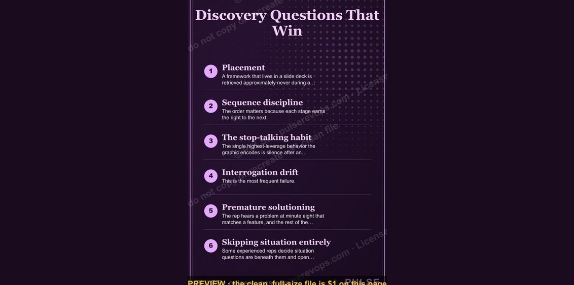 graphicDiscovery Questions That Win — Infographic
 graphicBANT Qualification — Infographic
 graphic5 Dysfunctions of a Team — Infographic
 graphicThe Cold Call Framework — Infographic
 graphicThe Value Selling Ladder — Infographic
 graphicThe Customer Journey — Infographic
 graphicThe Weekly Rep Cadence — Infographic
 graphicThe Sales Funnel — Infographic
 graphicThe Renewal Playbook — Infographic
 graphicThe RevOps Funnel — Infographic