


“OWN THE NUMBER” — Sales Floor Print
Quality
Certified

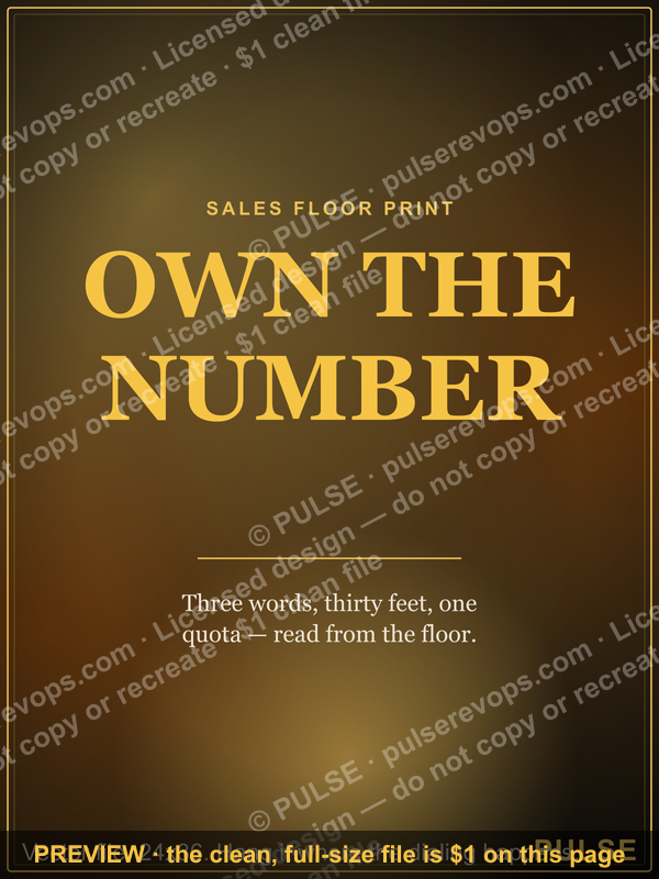
"OWN THE NUMBER" is a sales floor print — a large-format motivational poster hung where reps work, usually 11x14 to 24x36 inches, printed from a vector file so it scales cleanly. It costs a few dollars to produce and functions as a persistent visual cue reinforcing individual accountability for quota, pipeline, and activity targets.
What a sales floor print is and why teams still hang them
A sales floor print is a physical, large-format poster mounted in the room where selling happens — bullpen, pod cluster, war room, or the wall behind the leaderboard monitor. The "OWN THE NUMBER" version is a three-word mantra set in heavy display type, typically stacked over a gradient or solid accent field so it reads from thirty feet away. That distance requirement is the whole design constraint. A print meant to be legible across a room needs cap heights in the neighborhood of two to three inches on a 24x36 sheet, which is why these designs carry three or four words and never a paragraph.
The file format matters more than most people expect. An SVG — scalable vector graphics — stores the letterforms as mathematical curves rather than a grid of pixels, so the same file that renders crisply as a 400-pixel thumbnail on a Slack channel also prints at 2400x3000 without a single soft edge. A JPEG or PNG at the same nominal dimensions is locked to its pixel count; blow it up past its native resolution and the letter edges turn to mush. If you are handing a file to a print shop, a vector source removes an entire category of "can you send a higher-res version" email threads.
Why teams still bother in an era of dashboards: a physical print is unignorable in a way a browser tab is not. A CRM dashboard requires a login, a tab switch, and an act of will. A poster on the wall requires nothing. It sits in peripheral vision during every call, every stand-up, every walk to the coffee machine. Environmental cues that live in the room operate on a different attention channel than software notifications, which reps learn to dismiss reflexively within about two weeks of any new rollout.
There is also a plainer organizational reason. Sales floors are noisy, high-rejection environments. Outbound cold outreach converts at low single-digit rates in most B2B segments, which means the modal experience of a rep's day is being told no. A shared mantra on the wall is a cheap way to give that experience a frame — the number is yours, the outcome is yours, the recovery is yours. Whether that frame is psychologically load-bearing or merely decorative depends almost entirely on whether leadership behaves consistently with it, which is the failure mode discussed further down.

The "OWN THE NUMBER" phrasing specifically is doing work that "HIT YOUR NUMBER" does not. "Hit" describes an event; "own" describes a relationship. One is about a moment at the end of the quarter, the other is about the posture you hold on a Tuesday morning in week three. Sales leaders who choose ownership language over achievement language are usually trying to shift the conversation from outcome (which reps only partly control) to input and agency (which they control almost entirely). That distinction shows up in how the print gets used in practice: as a prompt for "what did I do about it," not "did I make it."
How the print goes from file to wall
The workflow from digital file to mounted poster is short but has three or four places where teams lose a day or waste money. Below is the practical sequence, and after it the same flow as a diagram.
Step one — pick or produce the source file. Start from a vector (SVG, AI, EPS, or a PDF with live vector content). If someone hands you a screenshot of a poster, stop and get the original; upscaling a screenshot is the single most common cause of a fuzzy final print. If you are recoloring to brand, do it at this stage in the vector, not by applying a filter to an exported raster.
Step two — set the physical dimensions and bleed. Decide the finished trim size first (11x14, 16x20, 18x24, and 24x36 are the standard sizes essentially every print vendor stocks). Then extend background color 0.125 inches past the trim on every edge — that margin is called bleed, and it exists because industrial cutters drift by a hair. Without bleed you get a thin white sliver on one edge of a poster whose background was supposed to run edge to edge. Pull critical elements — the letterforms themselves — at least 0.25 inches inside the trim so nothing important sits near the blade.

Step three — convert color intent. Screens are RGB (additive light); presses are CMYK (subtractive ink). Saturated gradients and electric accent colors are the ones that shift most visibly. A vivid on-screen magenta or a punchy cyan-to-violet gradient will come back duller than expected from a CMYK press. If the accent color is a brand color that matters, ask the vendor whether they support a spot color, or at minimum request a proof before committing to a large run.
Step four — export at the right resolution. For raster export from a vector, 150 DPI at final size is the practical floor for something viewed from several feet away; 300 DPI is the safe standard and what most vendors ask for. A 24x36 poster at 300 DPI is 7200x10800 pixels — a large file, and worth confirming your vendor's upload limit before you start.
Step five — choose stock and finish. Matte hides glare, which matters enormously in a room with overhead fluorescents or a wall of windows. Semi-gloss looks richer and makes gradients pop but throws reflections. Poster stock in the 200–300 gsm range feels substantial without needing mounting; anything thinner will curl and ripple on the wall within a month. Canvas and foam-core mounting cost more but survive being knocked into.
Step six — mount it where it will actually be seen. Eye level for a standing adult puts the vertical center around 57–60 inches from the floor, the standard gallery height. On a sales floor the better placement is often slightly higher, above monitor tops, so it clears the visual clutter of desks. Put it in the sightline of the stand-up huddle, not on the wall behind everyone's back.
The whole sequence is a day of work if you already have the file and a week if you are ordering framed pieces for multiple offices. The step teams skip most often is the proof, and the step they regret skipping most often is also the proof — specifically when the accent gradient comes back looking washed out and the reorder costs more than the proof would have.
Costs, sizes, and realistic timelines
Cost breaks into four buckets, and the spread between the cheapest and most expensive path is roughly twenty to one.
The file itself. Free if you are using a downloadable graphic released for open use. A custom design from a freelance designer is a modest project — a few hours of work for a three-word typographic layout. If you are recoloring an existing vector to your brand palette, that is a fifteen-minute task in any vector editor, or seconds in a browser-based recolor tool that lets you swap fill values and export SVG or PNG directly.
Unframed printing. This is the cheap end. A single 11x14 or 18x24 poster from a consumer print-on-demand service or a local shop lands in the low tens of dollars. Larger 24x36 sheets cost somewhat more but not proportionally — the paper is a small share of the cost versus setup. Per-unit price drops sharply with quantity; a run of ten identical posters for ten pods will cost meaningfully less per piece than one-off ordering, and a local shop will often quote better than a national service once you are past a handful.
Framing and mounting. This is where budgets escape. A ready-made standard-size frame from a general retailer is inexpensive. Custom framing at a specialty shop can cost several multiples of the print itself, especially at 24x36 with glass. Middle path: mount on foam core or gatorboard with a simple float mount, or use a magnetic poster hanger — two wooden rails that clamp top and bottom. Poster hangers look intentional, cost far less than framing, and make swapping the print trivial when the quarter's theme changes.

Turnaround. Same-day is realistic at a local shop for a simple unframed poster if you walk in with a print-ready PDF. National print-on-demand services typically run several business days to produce plus shipping. Custom framing adds one to two weeks. Plan backward from the date you want it on the wall — if you want it up for a kickoff, order three weeks out, not three days.
Size guidance by room. For a single home office or a small huddle room, 11x14 to 16x20 is proportionate; anything bigger dominates the wall. For an open floor of 20 or more desks, 24x36 is the minimum that reads from the far end. If the wall is very large, two or three prints in a series — "OWN THE NUMBER" alongside adjacent mantras like "NEXT CALL WINS" or "ONE TEAM ONE NUMBER" — fill the space better than one oversized piece and give you a rotation.
A note on the digital-first path. Because the source is vector, the same asset does double duty. Export a wide crop as a PNG for a LinkedIn banner, a 16:9 version for a slide deck cover, and a portrait version for a phone wallpaper. For distributed teams this is often the higher-value use — a print on a wall reaches the people in that room, while a shared banner reaches everyone. Teams running hybrid schedules frequently do both: prints on the office wall, matching wallpaper distributed to remote reps.
Where the ROI question actually lands. A poster is not a performance intervention and should not be budgeted as one. The honest framing is that it costs roughly the price of a team lunch and functions as a cultural artifact — it signals what the room values. If the print is the only thing carrying accountability culture, it will not carry it. If it is one visible expression of a system that already includes clear quota logic, honest pipeline reviews, and managers who model ownership, it reinforces something real. Budget it as decor with a purpose, not as a lever.
Where teams get this wrong
Hanging a mantra the leadership does not practice. The fastest way to make a sales floor print corrosive is to hang "OWN THE NUMBER" in a room where numbers are assigned without conversation, changed mid-quarter without explanation, or used punitively in pipeline reviews. Reps read the gap instantly. A poster preaching ownership above a culture of blame reads as management irony, and it will get mocked — sometimes literally defaced. If you cannot honestly say reps have input into their targets and visibility into the math behind them, fix that before you order the print.
Confusing a slogan with a system. Ownership language only means something when a rep can point to a specific number they own. "The number" in the abstract is a company revenue target no individual controls. The useful version is granular and tiered: the activity number they fully control (dials, sequences completed, meetings requested), the pipeline number they mostly control (qualified opportunities created, deals advanced a stage), and the revenue number they partly control (closed-won, expansion). A print works when each rep can name their three; it is wallpaper when they cannot.
Overloading the wall. A room papered with a dozen competing slogans has no message. Visual cues work through salience, and salience is a scarce resource — the fifth poster dilutes the first four. One dominant print per sightline, rotated quarterly, beats a gallery. If you want a series, space them across distinct zones rather than clustering.
Letting it go stale. A poster that has hung in the same spot for three years becomes furniture; the eye stops registering it entirely. This is ordinary habituation and it is unavoidable. The counter is rotation — swap the print at the start of each quarter or each new campaign, which is exactly why poster hangers beat permanent framing. Rotation also gives you a small ritual: the new print goes up at kickoff, which links the object to a moment.
Printing from the wrong file. Covered above but worth repeating because it is the most common practical failure: someone screenshots the design from a webpage, sends the screenshot to the printer, and a 24x36 poster arrives with visibly jagged letter edges. Always print from vector or from a raster export generated at final size.
Bad placement physics. Semi-gloss stock directly opposite a window is unreadable for half the day. A print mounted behind the row of desks faces no one. A poster hung above a doorway sits outside normal sightlines. Walk the room and stand where reps actually stand before you pick the wall.
Treating it as a substitute for remote inclusion. If a third of the team works from home, a poster on the office wall creates an in-group the remote reps are outside of. The fix is trivial — distribute the same artwork as a downloadable file so anyone can print it, set it as a background, or use it as a video-call backdrop — but it has to be deliberate. Otherwise a unifying object becomes a dividing one.
Skipping the honest conversation about metrics. Adjacent but essential: "own the number" is only fair if the number is ownable. Quota logic that ignores territory quality, inbound distribution, or product-market fit differences across segments makes ownership a fiction. Before hanging the poster, sanity-check that attainment distribution across the team looks like performance variance and not territory variance. If the bottom quartile is bottom-quartile because of route assignment, no poster fixes that.
Choosing the right format for your situation
The decision tree below covers the common branches: physical print versus digital asset, framed versus hung, single versus series, and standard versus recolored.
The core question is who needs to see it and how often the message should change. Frequent change plus a distributed audience points toward digital-first — banners, slide covers, and wallpapers distributed as files. Stable message plus a co-located team points toward a mounted print, and the higher the stability, the more framing makes sense. Mixed teams should do both, and should use the same artwork in both so the message is visually continuous across contexts.

A few branch notes worth stating plainly. Recoloring is nearly free when the source is vector — you are editing fill values and gradient stops, not redrawing anything — so there is little reason to hang a generic accent color if you have a brand palette. Check contrast after recoloring: a mantra in a mid-tone brand color on a mid-tone background loses legibility at distance even though it looks fine on a monitor at arm's length. Aim for a strong lightness difference between type and field, not just a hue difference.
Series versus single comes down to wall geometry. A long open floor with distinct pod clusters supports a series — different mantra per zone, which also gives pods a small identity. A single focal wall behind the huddle spot supports one large piece. Do not try to do a series on one wall; it reads as clutter.
Framed versus hung is a rotation question disguised as a budget question. If you know you will swap the print every quarter, framing is actively counterproductive — you will not swap it, because unframing feels like undoing work. Rails and hangers keep the swap to two minutes, which is what makes rotation actually happen.
Digital-only is the right answer more often than people assume, particularly for teams under about fifteen people with no dedicated floor. A wallpaper and a Slack channel header cost nothing to distribute, update instantly, and reach everyone regardless of location.
Getting real use out of it once it is on the wall
A print does nothing on its own; it works as a prop in a ritual. Three practical ways teams operationalize it, each cheap and each independent of the others.
Anchor the daily stand-up to it. Run the morning huddle facing the print and have each rep state one number they own for that day — not the quarter, the day. Five discovery calls. Two demos booked. One stalled deal moved or killed. The specificity is the point; "I'll work my pipeline" is not a number. This takes about four minutes for a team of eight and converts the poster from decoration into a recurring commitment device. The verbal statement in front of peers is what does the work — public commitment is stickier than private intention.
Pair it with a physical scorecard. Hang a whiteboard or a printed grid next to the print with three columns: activity owned, pipeline owned, revenue owned. Update it weekly, by hand, with a marker. Handwriting matters here for a mundane reason — writing a number in front of the team is a small public act, while typing it into a CRM field is invisible. The pairing also solves the abstraction problem: the print says "own the number" and the board next to it says which number, for whom, right now.
Use it as a quarterly self-audit prompt. Once a quarter, have each rep write private answers to three questions: which owned number am I proud of, which one do I need to improve, and which one have I been avoiding. The third question is the valuable one — nearly everyone has a metric they have quietly stopped looking at, usually the one where the news is bad. Run this as a private written exercise or in pairs, not as a manager-led review, or the honesty evaporates.
Adjacent uses worth knowing about. The same asset works as a customer-success or support floor print with different wording, as a slide divider in QBR decks, and as a backdrop on video calls. Some teams print a small desk-card version — 5x7 on card stock — for each rep, which travels to home offices and solves the hybrid inclusion problem cheaply. Others print the mantra at banner width above the leaderboard display, so the two are read together: the slogan and the standings in one glance.
What to measure, honestly. Do not try to attribute revenue to a poster. What you can reasonably watch is whether the rituals attached to it are running — huddle attendance, scorecard currency, whether reps can name their three owned numbers without checking. Those are process metrics and they are the ones actually under your control. If the rituals lapse, the print reverts to wallpaper, and no amount of design quality prevents that.
Related questions
What size should a sales floor poster be?

For an open floor of 20+ desks, 24x36 inches is the practical minimum for cross-room legibility. Small huddle rooms and home offices are better served by 11x14 to 16x20. Match size to viewing distance, not wall size.
Should I print from SVG or PNG?
Print from the SVG or another vector source whenever you have it — vector scales to any size without quality loss. Use PNG only if it was exported at final print dimensions and 300 DPI. Never print from a screenshot.
Matte or gloss for an office poster?
Matte, almost always. Offices have overhead lighting and windows, and gloss throws glare that makes text unreadable from oblique angles. Choose semi-gloss only in controlled lighting where you want maximum gradient saturation.
How often should we change the print?
Quarterly is a reasonable default — it matches sales cadence and beats habituation, where the eye stops registering an unchanged object. Use poster rails rather than frames so swapping takes minutes and actually happens.
Does a motivational poster actually change behavior?
On its own, no. It works as a prop in a ritual — a stand-up commitment, a scorecard pairing, a quarterly audit prompt. Without an attached practice and consistent leadership behavior, it is decor.
FAQ
What does "OWN THE NUMBER" mean on a sales floor?
It means treating your quota and its component metrics as something you are personally responsible for rather than something assigned to you. In practice it points at three tiers: the activity number you fully control, the pipeline number you mostly control, and the revenue number you partly control. The phrasing deliberately emphasizes posture over outcome.

What file format should the print be in?
Vector — SVG, AI, EPS, or a PDF with live vector content. Vector stores letterforms as curves rather than pixels, so a single file prints crisply at any size from a thumbnail to 24x36 or larger. If a vendor requires raster, export at 300 DPI at the final trim dimensions.
Can I recolor it to my company's brand palette?
Yes, and it is easy when the source is vector — you are changing fill values and gradient stops rather than redrawing artwork. Browser-based recolor tools let you swap colors, change or remove the background, and export SVG or PNG. Check contrast after recoloring; mid-tone type on a mid-tone field loses legibility at distance.
What paper stock and weight should I ask for?
Matte poster stock in the 200–300 gsm range is the standard for wall display — heavy enough to hang flat without curling, matte enough to avoid glare. Lighter stock ripples within weeks. For high-traffic areas where the poster gets bumped, foam-core mounting or canvas is more durable than paper.
Is this useful for a home office or a remote team?
Yes. Scale down to 11x14 or 16x20 for a desk-adjacent wall. For distributed teams, the higher-leverage move is distributing the same artwork as a wallpaper, video-call backdrop, or Slack header so remote reps share the visual identity rather than being outside an office-only in-group.
Does it work as part of a series with other mantras?
It does, and a series generally works better across distinct floor zones than clustered on one wall. Pair it with adjacent mantras — team-unity or activity-focused lines — so each pod has its own focal print. Rotate the set quarterly to counter habituation.
Sources
- https://www.adobe.com/creativecloud/file-types/image/vector/svg-file.html
- https://developer.mozilla.org/en-US/docs/Web/SVG
- https://www.w3.org/Graphics/SVG/
- https://helpx.adobe.com/illustrator/using/printing-color-separations.html
- https://www.nngroup.com/articles/visual-hierarchy-ux-definition/
- https://www.ada.gov/resources/2010-standards-for-accessible-design/
- https://www.osha.gov/laws-regs/regulations/standardnumber/1910/1910.145
- https://www.sba.gov/business-guide/manage-your-business/marketing-sales
Related on PULSE
This page will be disappearing soon. Save it to your device for $1 — or read it free while it is here.
@Kory-White- · if Venmo asks, the last 4 of my number are 2012
This page is gone.
This one is off the shelf now. $1 keeps it on your phone for good — the whole page, pictures and diagrams included.
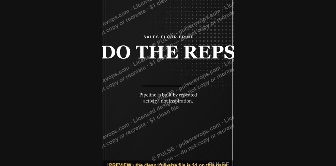 graphic“DO THE REPS” — Sales Floor Print
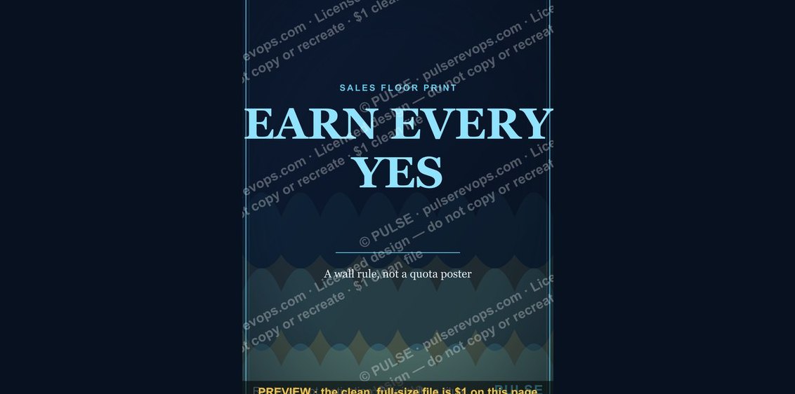 graphic“EARN EVERY YES” — Sales Floor Print
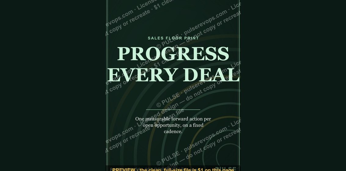 graphic“PROGRESS EVERY DEAL” — Sales Floor Print
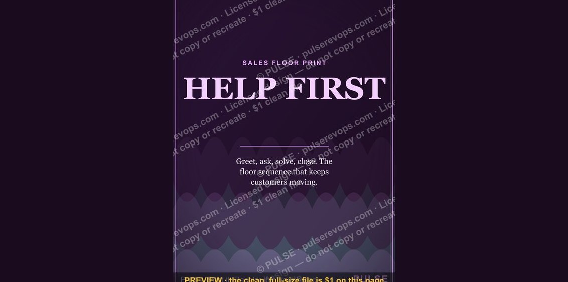 graphic“HELP FIRST” — Sales Floor Print
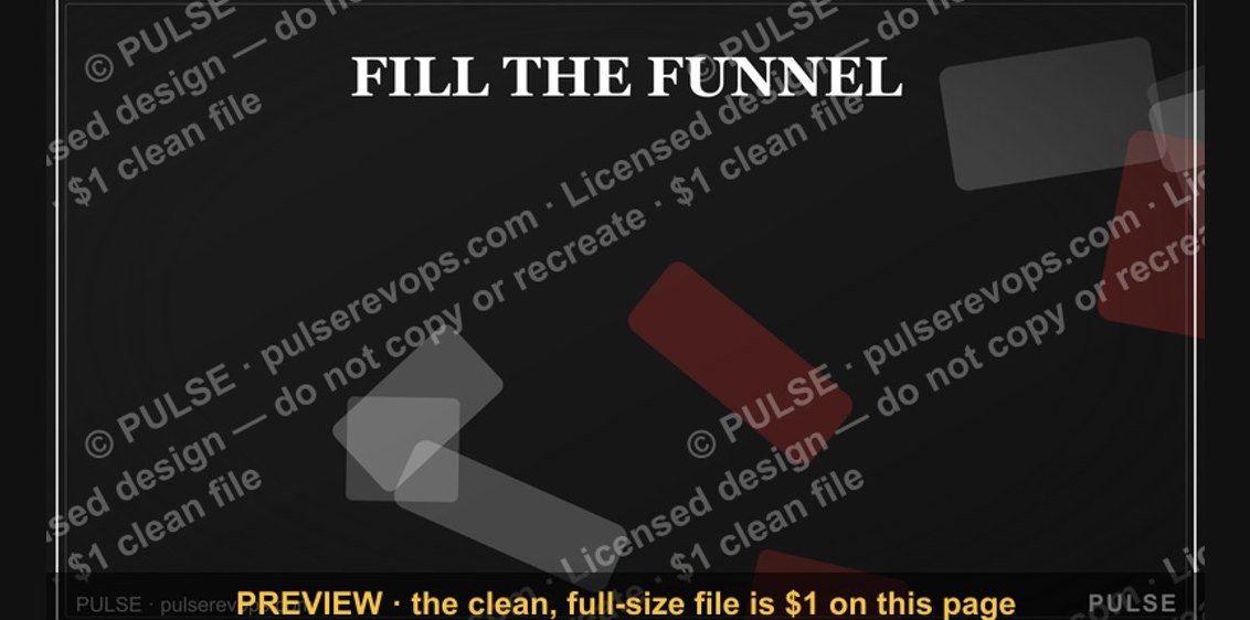 graphic“FILL THE FUNNEL” — Sales Floor Print
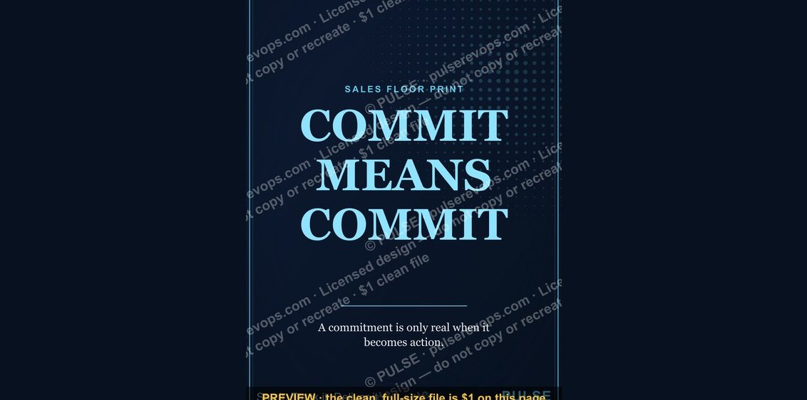 graphic“COMMIT MEANS COMMIT” — Sales Floor Print
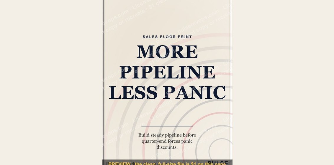 graphic“MORE PIPELINE LESS PANIC” — Sales Floor Print
 graphic“Always Be Closing” — Sales Floor Poster
 graphic“TRUST COMPOUNDS” — Sales Floor Print
 graphic“WIN THE DAY” — Sales Floor Print