


Sell the future. — LinkedIn Wallpaper
Quality
Certified
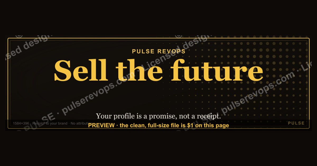
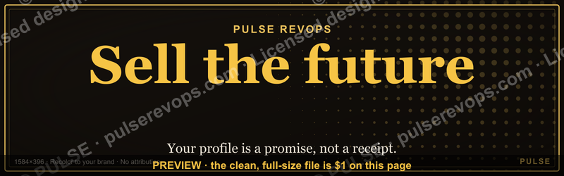
The "Sell the future." LinkedIn Wallpaper is a 1584×396 SVG cover banner carrying a dark monogram backdrop, the "Sell the future." line, and the Pulse mark. It signals forward-looking positioning on your profile, is free to use with no attribution required, and can be recolored to your brand before download.
The profile that reads like a receipt instead of a promise
Picture a fractional RevOps consultant — call her the archetype, because the pattern repeats across thousands of profiles — who has spent eleven years cleaning up broken pipeline hygiene at mid-market SaaS companies. Her LinkedIn profile is honest and completely inert. The headline reads "RevOps Consultant | Salesforce | HubSpot | Ex-Acme." The banner is the default LinkedIn blue-gray gradient that ships with every new account. The About section opens with "I am a results-driven revenue operations professional with a passion for data." A visitor lands, scans for four seconds, and leaves with a mental note that says *this person did things*. Nothing in that four-second window says *this person will do something for me*.
That four-second window is the whole problem, and it is where a wallpaper earns its keep. The cover image occupies roughly the top third of the visible profile on desktop and pushes the headline down on mobile. It is the single largest uninterrupted piece of visual real estate you control, and on the overwhelming majority of profiles it is doing nothing at all — either the default gradient, a stock photo of a city skyline, or a conference selfie cropped badly. When you drop a banner that states a philosophy in three words, you convert dead pixels into a positioning statement. "Sell the future." is not a description of what she sells. It is a declaration of *how* she sells, which is a far more differentiating claim in a market where every consultant lists the same four platforms.
The mechanic here is cheap and unglamorous: the banner sets a frame that the rest of the profile then either confirms or contradicts. If the banner says "Sell the future." and the headline underneath still says "RevOps Consultant | Salesforce | HubSpot," the visitor experiences a small, unnamed dissonance. They will not articulate it. They will just bounce a half-second earlier. But if the banner says "Sell the future." and the headline says "I help B2B SaaS teams shorten their sales cycle before their next board meeting," the two elements compound. The visual makes a promise about orientation; the text makes a promise about outcome. The visitor's read of the profile shifts from archive to proposal.
This is why the wallpaper is best treated as the first move in a three-move sequence rather than a standalone decoration. Move one: the banner establishes the frame. Move two: the headline names the specific future state. Move three: the About section describes the world after the engagement, in concrete terms, with a timeline. Skip any of the three and the banner reverts to wallpaper in the pejorative sense — something on the wall that nobody reads. The same logic applies to adjacent surfaces: a company page banner, a Sales Navigator profile, a conference speaker card, the header slide of a pitch deck. Anywhere a visitor gets a four-second impression before they get any prose, a declarative frame outperforms a decorative one.
There is a downstream effect worth naming. Sales development reps who prospect on LinkedIn increasingly check the profile of anyone who accepts a connection request before they write the first message. A banner that states a philosophy gives them a hook that is not "I saw you went to State." Recruiters do the same thing in reverse. And when someone screenshots your profile into a Slack channel to say "this is who I'm talking to," the banner is what appears in the screenshot. The asset travels further than the page it lives on.

How the banner file actually works, from download to profile
The file is an SVG — a scalable vector graphic — sized to 1584×396 pixels, which is the LinkedIn personal profile cover dimension. Vector matters more here than it first appears. A raster file (JPG or PNG) is a fixed grid of pixels; enlarge it and it softens. A vector file describes shapes mathematically, so the same file renders crisply at 1584 pixels wide on a laptop and at whatever pixel density a high-DPI phone demands. That is why the source is offered as SVG with a PNG export path rather than as a PNG alone.
The practical flow has two branches. The fast branch: recolor in the picker on the page, export PNG, upload directly to LinkedIn. The slow branch: download the SVG, open it in Figma, Canva, Illustrator, Inkscape, or PowerPoint, add your name or a second line of text, then export PNG at 1584×396 and upload. The slow branch takes about ten minutes and is worth it if you want the banner to carry your name as well as the line.
One detail catches people every time: LinkedIn's cover crop is unforgiving at the edges. On mobile, the profile photo circle overlaps the lower-left region of the banner, and the app crops the vertical edges more aggressively than the desktop web view does. The practical rule is to keep anything you actually need read — text, a logo, a URL — inside a horizontally centered safe zone roughly 1200 pixels wide, and to keep the lower-left corner clear of anything important. Test it by uploading, then viewing your own profile in the LinkedIn mobile app rather than trusting the desktop preview.
The license terms are the other half of "how it works." The graphic is free to use with no attribution required, which means you can put it on a personal profile, a company page, a deck, or a printed one-pager without a credit line and without a licensing conversation. That is deliberately simpler than the terms attached to most stock imagery, where free tiers frequently carry attribution requirements, restrictions on modification, or prohibitions on use in anything resembling a logo. No attribution required removes the friction that stops most people from ever using a free asset in a client-facing context.
Recoloring deserves a specific note because it is the difference between a borrowed asset and a branded one. The default is dark with the Pulse mark. Swap the fill to your brand color, set the background to transparent if you are dropping it into a deck with its own background, and the banner stops reading as someone else's template. Transparent background export is the underused option: it lets the same file sit on a white slide, a dark slide, or a colored section without a visible rectangle around it.
What the numbers actually justify — and what they don't
Be careful here, because this is the part of the topic where invented statistics breed fastest. There is no credible, verifiable figure that says a particular banner increases profile conversion by a specific percentage. Anyone quoting one is either citing their own unaudited sample or making it up. What can be stated with confidence are the platform's own published specifications and the structural math of attention.
The verifiable specifications: the LinkedIn personal profile cover slot is 1584×396 pixels, a 4:1 aspect ratio. Company pages use a different cover dimension, so a personal banner dropped onto a company page will crop badly — check LinkedIn's current help documentation for the company page number rather than assuming they match. LinkedIn accepts JPG, PNG, and GIF for cover uploads with a file size ceiling; SVG is not an accepted upload format, which is precisely why the export-to-PNG step exists in the flow above. Export at exactly 1584×396 rather than letting a tool guess, and you avoid the platform's own resampling.
The structural math is more useful than any invented conversion stat. A 4:1 banner at the top of the profile occupies a large share of the above-the-fold area on a desktop viewport and is the first element rendered on mobile. Whatever the exact dwell time on a profile — and it is short, measured in seconds, not minutes — the banner gets a disproportionate share of it because it is the largest object and it loads first. You do not need a study to justify the claim that the biggest thing on the page influences the impression. You need a study to justify a specific percentage, which is why you should not claim one.
Where you *should* use numbers is in the messaging the banner frames. This is the discipline that separates credible future-selling from vapor. "We help businesses grow" is a future claim with no shape. "We help B2B service firms add recurring revenue inside a twelve-month engagement" has a shape, a segment, and a horizon. The general rule practitioners land on is to sell a future that is roughly six to eighteen months out — near enough that the buyer can picture their own calendar, far enough that it is not just this quarter's task list. A five-year vision is a keynote, not a sales conversation. A next-week vision is a to-do item.
Anchor forward claims in backward evidence, and be honest about the sample. "Across the engagements we have run in this segment, the pattern we typically see is X within Y months" is a defensible construction. It states a range, names the population, and does not promise. "I will 10x your revenue in 90 days" is the same sentence with the honesty removed, and experienced buyers have been trained by a decade of LinkedIn to discount it to zero on sight. The banner says "Sell the future." — it does not say "make any claim you like."
Budget-wise, the arithmetic favors the free asset heavily. A custom banner commissioned from a designer typically runs from a modest flat fee for a template tweak up to a meaningful project rate for original brand work, and it takes days of back-and-forth. Recoloring an existing SVG takes minutes and costs nothing. For a solo consultant or a small team standardizing twenty profiles at once, the second path is obviously correct until the brand is mature enough to justify original work. The place to spend money is the headline and About copy, which do the actual persuading — not the rectangle above them.
Where a declarative banner is the wrong call

A banner that states a philosophy is not universally correct, and pretending otherwise is how you end up with a profile that reads as louder than its owner. There are at least four situations where a different choice wins, and it is worth walking the trade-offs honestly.
When your credibility gap is the binding constraint. If your profile shows a short tenure history, a recent pivot, or a gap you have not framed, a bold declarative banner amplifies the dissonance rather than covering it. The visitor reads "Sell the future." and then reads a work history that does not yet support a forward claim, and the mismatch registers as overreach. In that case the stronger move is a banner that carries proof — a client logo strip, a credential, a specific named outcome — because your constraint is belief, not orientation. Fix the gap in the About section first, then upgrade the banner.
When you are the buyer, not the seller. Procurement leaders, engineering managers hiring contractors, and anyone whose inbound is mostly vendors are actively filtering *for* signal that a profile is not a sales surface. A sales-philosophy banner invites more pitches, which is the opposite of what they want. Neutral or personal imagery serves them better.
When you are inside a company with a brand system. If your employer publishes an approved banner set, use it. A personal philosophy banner on an enterprise sales team's profiles fragments the brand and, in regulated industries, may run into review requirements for anything that reads as a claim. Check before you upload.
When the line does not match how you actually sell. This is the honest one. "Sell the future." is a specific stance. If your practice is remedial — you come in and fix a broken system that is on fire — then a future-oriented banner mispositions you to the exact buyers you want. Someone with a burning problem is not shopping for vision; they are shopping for a fire extinguisher. "Sell the problem." or an outcome-first line serves that positioning better, which is why the sibling variants exist.
The broader trade-off is between distinctiveness and safety. A default gradient banner is never wrong and never memorable. A declarative banner is memorable and occasionally wrong. If you sell to a narrow segment where being remembered by the right forty people matters more than being inoffensive to four hundred, take the distinctive option. If you are job-hunting broadly across industries with different norms, the safer option costs you less. Most people default to safe without ever making the decision consciously, which is the actual failure mode — not choosing wrong, but not choosing at all.
Pitfalls that turn a good banner into a liability
Uploading the SVG directly. LinkedIn does not accept SVG for cover images. Export to PNG at exactly 1584×396 first. People hit this, assume the file is broken, and abandon the asset.

Letting the export tool pick dimensions. Figma and Canva will happily export at 2x or at whatever the artboard happens to be. If the aspect ratio drifts from 4:1, LinkedIn crops it, usually by chopping the sides where your text lives. Set the export size explicitly.
Ignoring the mobile crop. The desktop preview lies. The mobile app crops tighter and the profile photo covers the lower-left region. Upload, then open your own profile on a phone. If the last word of the line is clipped, pull the text further toward center and re-export.
Low contrast after recoloring. The default dark background carries light text at high contrast. Recolor the background to a mid-tone brand color without adjusting the text and you get a banner that is legible on your calibrated monitor and mush on someone's phone in daylight. Keep a strong luminance gap between text and background, and check it on an actual device rather than by eye in the editor.
Cramming. The banner works because it says one thing. Adding your name, your title, your website, your phone number, a QR code, and three client logos turns a statement into a business card rendered at eye-chart size. If you need more than a line and a mark, you need a different asset — a featured-section image, a slide, a one-pager.
Treating the banner as the strategy. This is the expensive one. A banner that says "Sell the future." above a headline that says "Sales Professional | Open to Work" does not create a future-oriented impression; it creates a contradiction. The banner is a frame. The frame is worthless if the picture inside it is unchanged. Budget the ten minutes for the banner and the hour for the headline and About rewrite, in that ratio.
Overpromising because the banner gave you permission. The line is a stance on *orientation*, not a license for unverifiable claims. Ground every forward claim in something you have actually done, state ranges rather than guarantees, and name the population the range comes from. The fastest way to make a future-oriented profile backfire is to pair it with numbers you cannot defend when someone asks on the call.
Never revisiting it. Positioning changes. A banner uploaded three years ago that reflects a service line you no longer offer is actively misleading. Put a recurring reminder on the calendar — twice a year is enough — to look at the profile as a stranger would and ask whether the frame still matches the business.
Related questions
Can I use this wallpaper on a company page?
Not at this size. LinkedIn company pages use a different cover dimension than personal profiles, so a 1584×396 file will crop badly. Re-export the SVG at the company page dimensions listed in LinkedIn's current help documentation before uploading.
Do I need to credit Pulse if I use it?
No. The graphic is free to use with no attribution required. Put it on a profile, a deck, or a printed piece without a credit line. Recoloring and editing are expected uses, not exceptions.
What is the difference between the SVG and PNG versions?
The SVG is the editable vector source — open it in Figma, Canva, Illustrator, Inkscape, or PowerPoint to change colors, add text, or adjust layout. The PNG is the flat export you actually upload, since LinkedIn does not accept SVG for covers.
Should the banner text match my headline exactly?

No. Repeating the same words twice wastes the second slot. The banner states orientation; the headline states the specific outcome and segment. Complementary, not identical — that pairing gives a visitor two pieces of information in four seconds instead of one.
How often should I change my cover image?
Only when your positioning changes. Frequent swaps confuse returning visitors and gain nothing algorithmically. A twice-yearly review — does this frame still match what I sell — is enough for most people.
FAQ
What does "sell the future" actually mean in practice?
It means positioning your offer as the bridge to a state the buyer has not reached yet, rather than as a list of present capabilities. Instead of leading with features, you lead with the transformation — the quarter after the problem is solved — and then work backward to show why your approach makes that state reachable on a specific timeline.
How is this different from ordinary solution selling?
Solution selling starts from an existing pain and offers a known remedy for it. Future-selling starts from the buyer's aspiration — what they are trying to become — and works backward. Both are legitimate. Future-selling fits earlier-stage conversations and strategic buyers; pain-first selling fits urgent, remedial situations where the buyer already knows what is broken.
Is a wallpaper really worth this much thought?
The wallpaper takes ten minutes. The thinking is about the profile, not the file. The banner is only valuable because it forces the question of what your profile claims, and most profiles have never had that question asked of them. If the banner prompts a headline rewrite, it has already paid for itself.
Can I edit the SVG in PowerPoint, or do I need design software?
PowerPoint handles it. Insert the SVG, right-click, convert to shape, and you can edit colors and text directly. Figma, Canva, Illustrator, and Inkscape all open it too. Export at 1584×396 regardless of which tool you use.
What if my brand color makes the text hard to read?
Adjust the text color rather than the background. Keep a wide luminance gap between the two and verify on a phone in daylight, not just on a calibrated monitor. If your brand color is a mid-tone that fights both light and dark text, use it as an accent on the mark and keep the background at either end of the range.
Does changing my cover image affect how LinkedIn ranks my profile?
Treat that as unknown rather than assuming a benefit. LinkedIn does not publish ranking mechanics for profile media, and any specific claim about it is speculation. Choose the banner for what it communicates to a human in four seconds, which is the effect you can actually observe.
Sources
- https://www.linkedin.com/help/linkedin — LinkedIn Help Center, official image specifications and profile settings
- https://developer.mozilla.org/en-US/docs/Web/SVG — MDN Web Docs, SVG format reference and browser support
- https://www.w3.org/Graphics/SVG/ — W3C, the SVG specification
- https://hbr.org/ — Harvard Business Review, positioning, strategy, and buyer psychology
- https://www.mckinsey.com/capabilities/growth-marketing-and-sales — McKinsey, B2B sales and go-to-market research
- https://www.gartner.com/en/sales — Gartner, B2B buying behavior and sales research
- https://www.nngroup.com/articles/ — Nielsen Norman Group, attention, scanning behavior, and visual hierarchy
- https://www.w3.org/WAI/WCAG21/quickref/ — W3C WAI, contrast and accessibility guidance
- https://help.figma.com/ — Figma Help Center, SVG import and export settings
- https://www.pewresearch.org/internet/ — Pew Research Center, social media and professional platform usage data
Related on PULSE
This page will be disappearing soon. Save it to your device for $1 — or read it free while it is here.
@Kory-White- · if Venmo asks, the last 4 of my number are 2012
This page is gone.
This one is off the shelf now. $1 keeps it on your phone for good — the whole page, pictures and diagrams included.
 graphicSpeech-to-Text Operator — LinkedIn Banner
 graphicPredictable revenue, by design. — LinkedIn Wallpaper
 graphic"Pipeline is the product." — LinkedIn Banner
 graphicRegional Sales Director — LinkedIn Banner
 graphicHow do you build a Champions sell motion from scratch in 2027?
 graphic“Join a team that runs on pipeline.” — LinkedIn Banner
 graphic“Speed to lead wins.” — LinkedIn Banner
 graphicSales Recruiter — LinkedIn Banner
 graphic“Process over pressure.” — LinkedIn Banner
 graphicLLM Builder AI Engineer — LinkedIn Banner