


SDR Manager — LinkedIn Banner
Quality
Certified
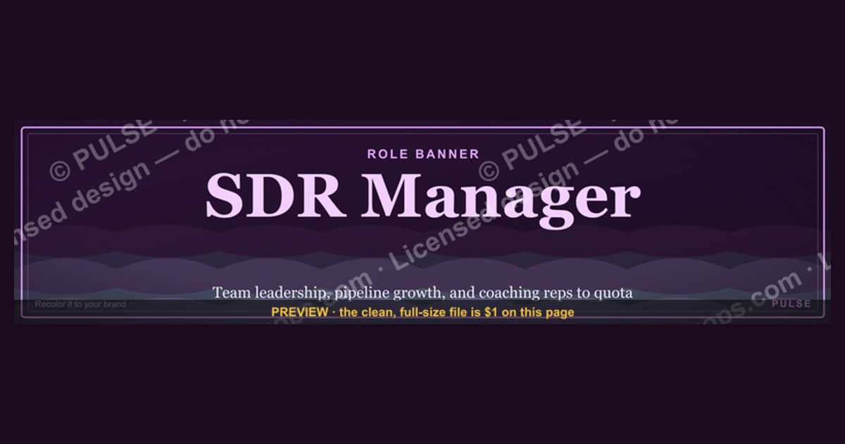
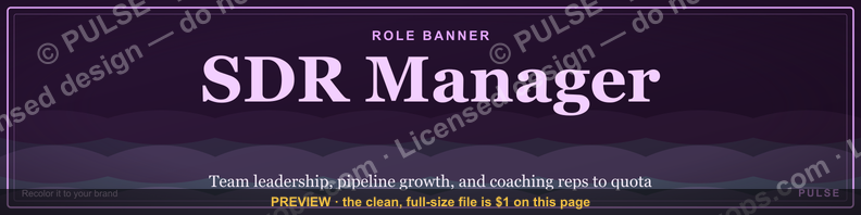
This is a LinkedIn profile banner (1584×396 px) built for an SDR manager's profile, reading "SDR Manager" as the role line with a supporting line naming the team or mission (e.g., "Building Pipeline That Closes"), set in a clean sans-serif on a solid dark or brand-accent background. Download the PNG at the top of this page, upload it as your LinkedIn cover image, and pair it with a headline that states your specialty.
The outcome you should expect
Swapping LinkedIn's default gray cover photo for a purpose-built banner changes how a profile reads in the first two seconds someone lands on it — before they read a single word of your headline or About section. For an SDR manager specifically, the banner does three jobs at once: it confirms the role immediately (so a prospect, candidate, or exec doesn't have to hunt through your experience section to figure out what you do), it signals that you take your personal brand seriously (which matters when SDRs, AEs, and recruiters are evaluating whether to work for you), and it gives you a second surface to say something your headline can't fit — a mission statement, a team name, or a specific specialty like "outbound," "enterprise SDR," or "pipeline generation."
What you should NOT expect is a banner to change your connection acceptance rate or inbound reply rate on its own. It is a supporting asset, not a growth lever by itself. Its job is to remove friction and add credibility once someone is already looking at your profile — from a LinkedIn search result thumbnail, a comment you left, a shared connection's feed, or a candidate researching you before an interview. Manager-level profiles get disproportionately more scrutiny from two groups: SDRs deciding whether to apply to your team, and prospects checking whether the person who just messaged them is legitimate. A banner that looks intentional — rather than the LinkedIn default gray topography pattern — closes a small trust gap with both audiences in the same visual second.

The realistic outcome, stated plainly: a banner upgrades perceived professionalism and role clarity. It does not replace a strong headline, a specific About section, or an active posting cadence. Treat it as one piece of a four-piece profile stack — photo, banner, headline, About — that all needs to point at the same story.
What's on the banner and what drives that outcome
Element by element, the graphic carries four layers. The top layer is the role text — "SDR Manager" — set large enough to read on a phone screen at LinkedIn's cropped mobile display (LinkedIn shows roughly the center 1584×396 canvas differently across desktop and mobile, and mobile crops the vertical edges more aggressively, so anything critical needs to sit in the horizontal center band). The second layer is a supporting line beneath the role — a mission phrase, team name, or specialty tag that gives the viewer one more piece of context without cluttering the primary read. The third layer is the background treatment: a solid or lightly-textured dark field (near-black or a deep brand color) rather than a busy photo, because photographic backgrounds behind text reduce legibility once LinkedIn compresses and re-encodes the upload. The fourth layer, present but restrained, is a small accent mark — a colored bar, a subtle grid line, or a logo mark in a corner — that ties the banner to a broader visual system if the manager or team uses one elsewhere (email signature, deck template, Slack header).
What drives the outcome is contrast and hierarchy, not decoration. A banner with five colors, a stock photo, and three fonts reads as noise at thumbnail size — and most people encounter a LinkedIn banner as a thumbnail (search results, "People You May Know" cards, comment-section avatars) far more often than as a full-width cover image. The design choice that actually moves the needle is: one dominant text element (the role), one supporting text element (the mission or team line), high contrast between text and background, and nothing else competing for attention. Everything beyond that — gradients, icons, secondary logos — is optional polish that helps only if it doesn't dilute the two-second read.
Benchmarks and realistic ranges
LinkedIn's banner canvas is fixed at 1584×396 pixels (a 4:1 aspect ratio), and the platform re-compresses whatever you upload, so export at that exact resolution or a clean multiple of it (3168×792 for a retina-safe 2x export) rather than uploading an odd size and letting LinkedIn's cropper guess your intent. File size should land under roughly 8 MB — PNG for crisp text edges, JPEG only if the file is photo-heavy and you need a smaller footprint. Text should stay inside the center ~60% of the horizontal canvas and the center ~70% of the vertical canvas; LinkedIn's own profile-photo circle overlaps the bottom-left corner of the banner on desktop, and mobile view crops both the top and bottom edges more than desktop does, so anything placed in the outer margins risks being cut off or covered.
On font size: the role text should be large enough to remain legible at a thumbnail width of roughly 200–300 pixels, which in practice means the primary line should occupy no less than about 8–10% of the banner's total height. A supporting line runs smaller — roughly half the primary line's size — so the hierarchy stays obvious even in a quick glance. Two text weights (bold for the role, regular or medium for the supporting line) is a safer range than three or more, since additional weights tend to compete rather than clarify.
Color contrast is the benchmark that gets skipped most often. A dark background (near-black, deep navy, deep green) with white or near-white text reliably holds up under LinkedIn's compression; light backgrounds with light text, or mid-tone backgrounds with insufficient contrast, tend to wash out once the platform re-encodes the image, especially on lower-brightness phone screens. If a team is standardizing banners across multiple SDR managers or an entire sales org, a realistic range is one shared background treatment (color, texture, logo placement) with only the role title and name varying per person — that keeps the team visually consistent without every manager designing from scratch.
Risks, edge cases, and failure modes
The most common failure mode is cropping: a banner designed and previewed on desktop, then uploaded, looks correct in the editor but loses the top or bottom of the text once LinkedIn renders it on a phone. Always preview on both a desktop browser and the LinkedIn mobile app before considering the swap final — the crop behavior differs enough between the two that a banner that looks perfect on one can clip a word on the other.
A second failure mode is message mismatch: a banner that says "SDR Manager — Building Pipeline That Closes" reads as confident and specific, but a banner with a vague, generic phrase ("Sales Leader," "Growth Mindset," or similar filler) actually undercuts credibility rather than adding it, because it signals the manager filled a template without customizing the message. If the supporting line doesn't say something a viewer couldn't have guessed from the job title alone, drop it or replace it — an empty supporting line is safer than a hollow one.
A third risk is staleness. A banner naming a specific team, quota, or company initiative ages out the moment that detail changes — a manager who moves companies, gets promoted, or rebrands the team is left with a banner advertising an old reality. The safer long-term choice is a banner that names the role and a durable specialty ("Outbound," "Enterprise SDR," "Pipeline Generation") rather than a time-bound campaign slogan or a specific quarter's number.
A fourth edge case is brand conflict: if a company has strict brand guidelines (approved colors, logo usage rules, a locked font), an individually-designed manager banner can clash with what marketing or brand teams expect on public-facing profiles, particularly for managers who are customer-facing. Check with a brand or marketing contact before rolling a custom banner out across an entire team, especially if the design pulls in a company logo or wordmark.
Finally, there's an accessibility edge case: text baked directly into an image is invisible to screen readers, so a banner is never a substitute for putting the same information in the headline and About section in actual text form — it's a visual reinforcement, not the primary information channel.
A practical rollout plan
For a single manager updating their own profile, the sequence is straightforward: download the PNG from this page, confirm it renders correctly in a phone preview, upload it as the LinkedIn cover image, then update the headline and About section so the three elements — banner, headline, About — tell the same story instead of three different ones. That's typically a five-minute task once the graphic itself is in hand.
For a manager rolling this out across a team of SDRs or across multiple SDR managers in an org, the plan changes shape: first lock a shared visual system (one background treatment, one font pairing, one accent color) so every profile looks like part of the same team without looking identical; second, generate individual variants where only the name and specific role line change per person; third, stage the rollout in small batches (a pilot group of two or three) to catch cropping or legibility issues on real devices before pushing it to everyone; fourth, pair the banner rollout with a headline and About-section refresh prompt, since a new banner alone without matching text elsewhere creates the same mismatch problem described above; fifth, set a light recurring reminder (quarterly is reasonable) to revisit whether the banner's supporting line still reflects the team's current focus, since roles, quotas, and initiatives shift faster than most people update their LinkedIn profile.
Customizing the underlying wording, colors, or roles is simplest in a layered design file (Canva, Figma, or Adobe Express all support this) rather than a flattened image — that way, swapping "SDR Manager" for "Enterprise SDR Manager" or changing the accent color for a different team takes seconds instead of a full redesign. Keep a master template file, export flattened PNGs per person, and store both so future edits don't start from zero.
Related questions
What size should a LinkedIn banner be?
1584×396 pixels is LinkedIn's standard banner canvas (a 4:1 ratio). Export at that size or a clean 2x multiple (3168×792) for sharper rendering on high-density screens, and keep the file under roughly 8 MB.
Should an SDR use a different banner than an SDR Manager?
Yes — an individual SDR's banner typically emphasizes outreach specialty or a personal pipeline stat, while a manager's banner should signal team leadership and mission, since the manager's profile is evaluated by both prospects and prospective hires.
Can I use a company logo on my personal LinkedIn banner?
Only with brand approval. A small, correctly-licensed logo mark can reinforce team identity, but check with marketing first — unapproved logo use on a personal profile can create brand-guideline conflicts.
Does a LinkedIn banner affect the algorithm or reach?
No direct evidence supports banner images affecting LinkedIn's content distribution algorithm. Its value is in how a profile is perceived by a human visitor, not in feed ranking.
How often should I update my LinkedIn banner?
Whenever the role, team name, or specialty it references changes — a light quarterly check is a reasonable cadence even without a specific change, since stale details on a Manager-level profile look more noticeable than on an individual contributor's.
FAQ
What exact text is on this banner? The primary line reads "SDR Manager," with a customizable supporting line beneath it for a mission statement, team name, or specialty — the download at the top of this page shows the exact current wording and layout.
Can I change the wording before using it? Yes. Treat the downloaded PNG as a starting template — recreate it in Canva, Figma, or Adobe Express to swap the name, supporting line, or accent color to match your own team or brand.
What file format should I download and upload? PNG is best for crisp text edges. Upload the same PNG directly to LinkedIn's cover-image field in your profile settings; no conversion is needed.
Will this banner look right on mobile? Preview it in the LinkedIn mobile app after uploading, since mobile crops the top and bottom edges of the 1584×396 canvas more aggressively than desktop does. Keep critical text centered to avoid clipping.
Is a dark background better than a light one? Generally yes for text legibility — dark backgrounds with light text hold contrast better through LinkedIn's image compression than light or mid-tone backgrounds with light text.
Do I need design skills to customize this? No. Free tools like Canva have LinkedIn-banner-sized templates where you can drag in your own text and colors without any design background, typically in under ten minutes.
Sources
- https://www.linkedin.com/help/linkedin
- https://www.canva.com/create/linkedin-banners/
- https://www.adobe.com/express/create/banner/linkedin
- https://sproutsocial.com/insights/linkedin-banner-size/
- https://blog.hubspot.com/sales/linkedin-profile-tips
- https://www.salesforce.com/resources/articles/social-selling/
Related on PULSE
- How to write a LinkedIn headline for an SDR Manager
- SDR Manager LinkedIn About section examples
- Building a consistent LinkedIn visual identity across a sales team
- LinkedIn profile checklist for sales leaders
- How SDRs should optimize their LinkedIn profile for outbound
- Personal branding for revenue leaders on LinkedIn
This page will be disappearing soon. Save it to your device for $1 — or read it free while it is here.
@Kory-White- · if Venmo asks, the last 4 of my number are 2012
This page is gone.
This one is off the shelf now. $1 keeps it on your phone for good — the whole page, pictures and diagrams included.
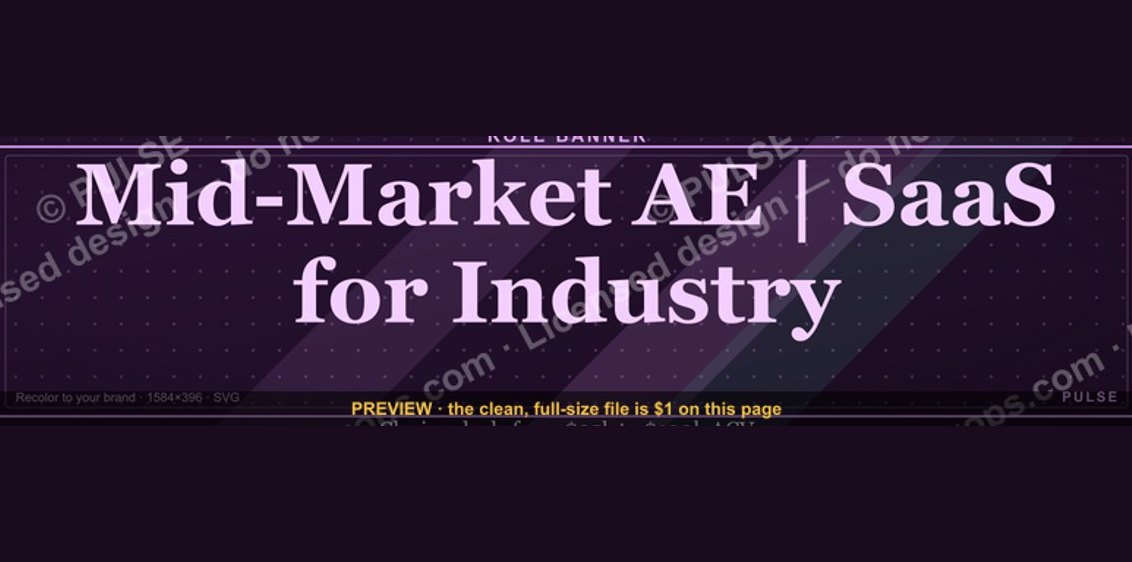 graphicMid-Market Account Executive — LinkedIn Banner
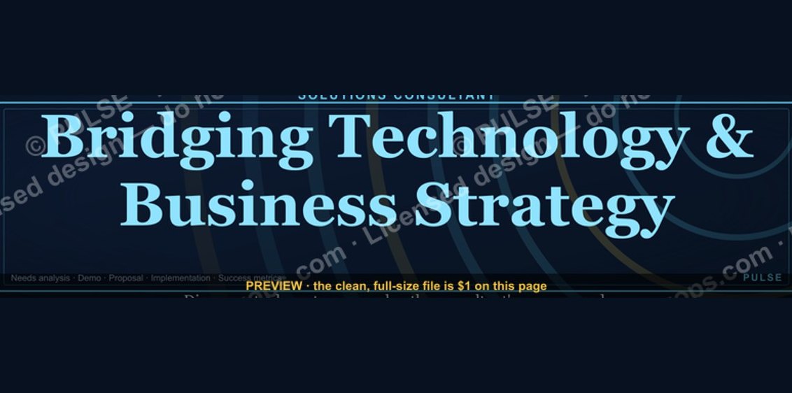 graphicSolutions Consultant — LinkedIn Banner
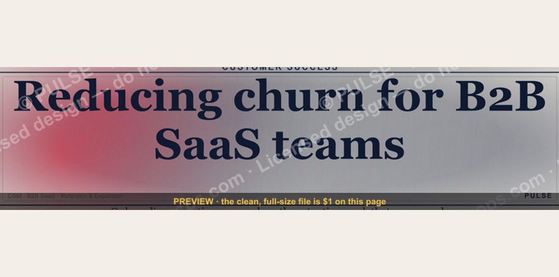 graphicCustomer Success Manager — LinkedIn Banner
 graphicGTM Engineer — LinkedIn Banner
 graphic5 Stages of the Buyer’s Journey — Infographic
 graphicOutreach / Announce Icon — Icon / Clip Art
 graphicThe Ask — Section Divider Slide
 graphicAgenda — Section Divider Slide
 graphicLaunch / Growth Rocket Icon — Icon / Clip Art
 graphic“SHOULD DO IT” — Sales Meme