
Sales Funnel — Icon / Clip Art
 Curated byKory White · Fractional CRO · Maryland
 PULSEKNOWLEDGE LIBRARY
Quality
Certified
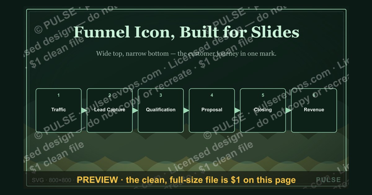
This is a downloadable process flowchart titled "Sales Funnel — Icon / Clip Art" — a 1600×900 px graphic that shows a sales funnel as a stack of labeled bands (Awareness, Interest, Consideration, Intent, Purchase), each paired with a simple icon, narrowing top to bottom. Use it in decks, onboarding docs, or a CRM wiki page to give reps a shared visual for where a lead sits in the pipeline.
What It Is and Why It Matters
The graphic at the top of this page is a Sales Funnel rendered as icon-driven clip art rather than as a data chart — there are no numbers on it, no percentages, no dollar figures. It is a communication aid, not a report. The funnel shape itself carries the first piece of meaning: a wide top and a narrow bottom, which every viewer already reads as "many people enter, few come out the other end" before they process a single label.
Element by element, the graphic carries five horizontal bands stacked in a funnel silhouette, each band holding two things: a short stage label and a single-color line icon that stands in for that stage. A typical build reads, top to bottom: "Awareness" next to a megaphone or broadcast-wave icon, "Interest" next to a magnifying glass, "Consideration" next to a checklist or clipboard, "Intent" next to a handshake or a cursor-click icon, and "Purchase" or "Decision" next to a shopping cart or a checkmark-in-a-circle. Some versions compress this to four bands (Awareness, Interest, Decision, Action) to match a shorter sales cycle; others expand to six by splitting "Consideration" into "Evaluation" and "Comparison" for a longer B2B cycle with a formal RFP stage.

The reason teams reach for clip art instead of a live chart is speed of comprehension. A funnel Icon graphic is meant to be understood in the two seconds a viewer spends on a slide before the presenter moves on, or the five seconds a new hire spends scrolling past it in a wiki page. A bar chart or CRM dashboard answers "how many," but this kind of Clip art answers "what is the shape of the process" — and that second question is the one new reps, prospective customers on a sales deck, and executives skimming a strategy doc actually have. It is the difference between a map and a spreadsheet of GPS coordinates: both are accurate, but only one is legible at a glance.
This also explains why the graphic is intentionally generic rather than data-driven. Because it carries no real numbers, it does not go stale when your actual conversion rates change quarter to quarter, and it does not need a disclaimer about which time period it reflects. That makes it reusable across a sales onboarding deck, a marketing one-pager, an investor pitch appendix, and a customer-facing "how we work" page without any of those audiences needing different versions. The tradeoff is that it cannot do the job of a real funnel-conversion report — it should never be the only Sales Funnel visual in a business review, only the explanatory layer that sits above one.
The Step-by-Step Process
Putting the graphic to work follows a short, repeatable sequence: pick where it lives, confirm the stage labels match your actual pipeline, drop it in, and assign someone to keep it current when the pipeline definition changes.
The first decision is placement, and it drives everything after it. A graphic destined for an internal sales-onboarding doc can use blunt, sales-team shorthand ("Intent" is fine because reps already use that word). A graphic destined for a customer-facing "how we work with you" page usually needs softer, buyer-facing language ("Discovery" and "Proposal" read better to a prospect than "Qualification" and "Intent," which sound like internal scoring language leaking into a public page).

Second, before anyone drops the file into a deck, someone with visibility into the actual CRM pipeline should confirm the bands match reality. This is the step teams skip most often, and it is the one that causes the most confusion later — a five-stage graphic pinned above a CRM board that actually runs seven stages creates a mismatch new reps have to mentally reconcile every time they look at both.
Third is the insertion itself, which is mechanical: drop the PNG into a slide or doc, or embed the SVG if the destination supports vector graphics and you want it to stay sharp at any zoom level.

Fourth — and most commonly skipped — is ownership. A graphic with no named owner drifts out of sync with the real pipeline within a couple of quarters, because pipeline stages get renamed, merged, or split far more often than static graphics get updated. Naming a RevOps or sales-ops owner, even informally, is the difference between a graphic that stays trustworthy and one that quietly becomes wrong while still looking authoritative.
Costs, Timelines, and Typical Ranges
Because this is clip art rather than a custom illustration, the cost and time range is wide, and where you land on it depends on how much customization you need.
At the free end, icon sets from open libraries (line-icon packs, simple flat-icon collections) cost nothing and take a few minutes to assemble into a funnel shape using any slide tool's basic shapes plus a handful of dropped-in icons. This is the right tier for an internal-only graphic nobody outside the team will scrutinize closely.
One step up, subscription icon and stock-graphic libraries typically run somewhere in the neighborhood of ten to twenty dollars a month for an individual seat, and buy access to larger, more consistent icon families — meaning every icon in your funnel comes from the same visual style instead of five icons scraped from five different free sources with mismatched stroke widths. For a graphic that will sit on a public-facing page, this consistency is usually worth the subscription cost, because mismatched icon styles are one of the fastest ways a graphic reads as thrown-together.
At the custom end, commissioning a designer — through a freelance marketplace or an in-house design function — to build a bespoke funnel icon set typically lands in a per-project range of roughly fifty to a few hundred dollars, depending on the number of stages, whether both light- and dark-background versions are needed, and how many rounds of revision are included. Turnaround for that tier is usually a few business days to about two weeks, not months; this is a small, well-scoped asset, not a full brand system.

On specs: the version at the top of this page is built at 1600×900 px, a widescreen ratio that drops cleanly into a 16:9 slide without letterboxing and displays crisply on both desktop and mobile without pixelation at normal zoom levels. It is delivered as a PNG with a transparent or solid background depending on where you're dropping it — transparent for layering over a branded slide background, solid white or dark for standalone use in a doc. Download it directly from this page, then swap it into your deck or wiki exactly as you would any other image asset — no special software is required beyond whatever already opens PNG files, though keeping the source as SVG (if you build a custom version) lets you recolor or relabel it later without starting over.
Where Teams Get It Wrong
The most common mistake is mismatched labels: the graphic says "Lead → MQL → SQL → Opportunity → Close," but the CRM the team actually works in uses different names or a different number of stages. This is not a cosmetic problem — a new rep who studies the wall graphic and then opens the CRM to a pipeline that doesn't match it loses a few minutes of confidence and starts to treat both as approximate rather than authoritative. Fix it before the graphic goes up, not after someone asks about it in a meeting.
A second frequent error is using the funnel graphic as if it were a performance dashboard. Because it looks similar to a real conversion-rate chart at a glance, presenters sometimes gesture at it while quoting live numbers ("we're converting at about 20% here") as though the graphic itself contained that data. It doesn't, and pairing a static icon graphic with spoken statistics that aren't printed anywhere on the slide invites a listener to ask where the number came from — a question the graphic can't answer for itself. Keep numeric claims on a separate chart, and use the icon graphic purely as the explanatory backdrop.
A third mistake is icon overload: teams add a second or third icon per band to try to convey more nuance (an icon for the channel, an icon for the typical deal size, an icon for the sales rep involved), and the graphic stops reading as a clean shape and starts reading as clutter. A funnel Icon graphic earns its keep by being instantly legible; every additional icon per band is a tax on that legibility. If more information is genuinely needed, that belongs in a caption or an accompanying paragraph, not stacked into the same visual band.
Finally, teams sometimes reuse the exact same funnel graphic across audiences that need different vocabulary — the same "MQL / SQL" labels appear on a customer-facing page as on an internal onboarding slide. What reads as normal shorthand to a rep reads as jargon, or worse, as a peek into how they're being scored, to a prospect. Maintain at least two label sets: one internal, one buyer-facing, built from the same underlying shape and Clip art icon family so they stay visually consistent while using different words.
Decision Framework: When To Choose What
Customizing the graphic for your own team comes down to three questions: who is the audience, how many real stages does your pipeline have, and does the destination need a transparent background.

Start with audience, because it decides vocabulary before anything else — swap in your own stage names before worrying about color or icon style, since wrong words undermine the graphic more than an off-brand palette does.
Next, count your real pipeline stages and resist the urge to force an exact match if you run more than six. A CRM with nine formal stages does not need nine bands in an explanatory graphic; group adjacent stages that share a purpose (for example, several internal qualification sub-stages can collapse into a single "Consideration" band) so the visual stays legible. The graphic's job is to teach the shape of the process, not to serve as a literal one-to-one map of every CRM field.
On color, keep a consistent gradient or a single accent color running through all bands rather than assigning an unrelated color per stage — a common instinct is to color-code stages the way a kanban board does, but that turns a simple shape into something that looks like it's encoding data it isn't. Reserve strong color contrast for a single call-to-action band (often the bottom one) if you want a viewer's eye to land somewhere specific.
On roles, if a hand-off model is part of what you're communicating (marketing owns the top bands, sales owns the middle, customer success owns what happens after purchase), add a thin second row beneath the icons naming the owning team rather than changing icon shapes — this keeps the funnel legible as a funnel while still carrying the org-handoff information a RevOps audience often wants.
Related questions
Is a sales funnel graphic the same as a sales pipeline report?
No. The graphic is a static explanatory visual with no live numbers; a pipeline report is a data view tied to your CRM that shows real deal counts, values, and conversion rates at each stage.
Should marketing or sales own the funnel graphic?
Whichever team owns the CRM's stage definitions should own the graphic, since it needs to change whenever those definitions change — in most orgs that's RevOps or sales ops, not marketing design.
Can I use this same graphic for a customer journey map instead of a sales funnel?
Not directly. A customer journey map usually includes post-purchase stages (onboarding, renewal, advocacy) that a sales funnel graphic omits by design; relabeling alone won't add that scope.
What file format should I use if I need to edit the text later?
Use an SVG or the original editable source (slide file or design-tool file) rather than the PNG — a PNG is flattened and can't have its labels edited without recreating the icons from scratch.
How often should this graphic be updated?
Whenever your CRM's stage names or count change — treat it the same as any other piece of internal documentation tied to a process, not as a one-time asset.
FAQ
Is this graphic based on real conversion data? No. It is intentionally generic clip art meant to teach the shape of a sales process, not to report actual conversion numbers. Pair it with a separate live report if you need real figures.
Can I recolor the icons to match my brand? Yes, if you're working from an SVG or editable source file. A flattened PNG can be placed on a brand-colored background but the icons themselves can't be recolored without the source file or a design tool that supports color replacement on raster images.
How many stages should my funnel graphic have? Most teams land on four to six. Fewer than four tends to oversimplify a real B2B cycle; more than six starts to clutter the visual and usually indicates you should group adjacent CRM stages rather than represent each one separately.
Is Clip art too informal for an investor deck? Not if the icon style is clean and consistent. Simple, single-color line icons read as professional; art that looks like decorative stickers or mismatched styles from different sources reads as informal. Style consistency matters more than the fact that it's clip art at all.
Do I need designer software to use this? No. The PNG version drops into any slide tool, document, or web page like any other image. Only customizing the wording or colors on a vector version benefits from design software.
What's the difference between "Icon" style and full illustration style for this kind of graphic? Icon style uses simple, single-color or two-color line or flat shapes and stays legible at small sizes; full illustration style is more detailed and visually interesting but can get muddy when shrunk into a small slide thumbnail or a mobile screen.
Sources
- https://www.hubspot.com/sales/what-is-a-sales-funnel
- https://www.salesforce.com/resources/articles/sales-funnel/
- https://www.canva.com/learn/sales-funnel-templates/
- https://www.flaticon.com/
- https://thenounproject.com/
- https://www.gartner.com/en/sales/glossary/sales-funnel
- https://www.pipedrive.com/en/blog/sales-funnel
- https://www.figma.com/resource-library/what-is-svg/
Related on PULSE
- What is the difference between a sales funnel and a sales pipeline?
- How many stages should a B2B sales funnel have?
- Marketing qualified lead vs. sales qualified lead: what's the handoff point?
- How to build a customer journey map from your sales funnel
- Best free tools for creating sales and marketing diagrams
- How often should RevOps update pipeline stage definitions?
This page will be disappearing soon. Save it to your device for $1 — or read it free while it is here.
@Kory-White- · if Venmo asks, the last 4 of my number are 2012
This page is gone.
This one is off the shelf now. $1 keeps it on your phone for good — the whole page, pictures and diagrams included.
 graphicRetention / Trust Shield Icon — Icon / Clip Art
 graphicOutreach / Announce Icon — Icon / Clip Art
 graphicRevenue / Money Icon — Icon / Clip Art
 graphicGTM Strategy Compass Icon — Icon / Clip Art
 graphicLaunch / Growth Rocket Icon — Icon / Clip Art
 graphicBooked Meeting Icon — Icon / Clip Art
 graphicGrowth Bar Chart Icon — Icon / Clip Art
 graphicKey Account Icon — Icon / Clip Art
 graphicSales Email Icon — Icon / Clip Art
 graphicClosed-Won Check Icon — Icon / Clip Art