

Target / Goal Icon — Icon / Clip Art
Quality
Certified
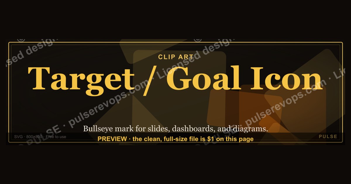
This banner is a 1600x500 px downloadable PNG titled "Target / Goal Icon — Icon / Clip Art." It shows a concentric bullseye with an arrow striking the center, paired with the words "Target" and "Goal," so you can drop a ready-made objective symbol into slides, dashboards, and RevOps docs without hunting for clip art.
Bullseye versus crosshair: the two icon options compared
When teams ask for a "Target / Goal Icon," they are usually picturing one of two distinct symbols, and the difference matters more than it sounds. The first is the concentric bullseye — three to five nested rings with a solid center dot. The second is the crosshair or reticle — a circle with four perpendicular tick marks and a small gap in the middle, sometimes with a center point. Both read as "aim here," but they carry different connotations and render differently at small sizes.
The concentric bullseye is the warmer, more universal option. It reads instantly as "goal" to almost any audience, including people who have never worked in sales or operations. Its weakness is that at very small sizes — say 16x16 px in a favicon or a dense table row — the inner rings can blur into a single blob. You need at least three rings and a clear gap between each for it to stay legible. A good rule: the ring stroke should be no thinner than 1/12th of the icon's total width, and the center dot should be roughly 1/5th of the diameter.
The crosshair is the colder, more technical option. It reads as "precision," "calibration," or "instrumentation" — which is perfect for a quota-attainment gauge or a forecasting accuracy metric, but slightly off for something like "team goals for the quarter." The crosshair also has a cultural association with firearms and hunting in some contexts, which is why many enterprise design systems soften it into a "focus" or "crosshair-in-circle" variant with rounded caps on the tick marks.

There is a third, less common option worth knowing about: the flag-on-a-hill or flag-on-a-pole icon. This is the classic "goal" metaphor in project management and OKR tooling — the thing you plant when you arrive. It is weaker than the bullseye for "aim" but stronger for "achievement" and "milestone reached." If your page or dashboard is about celebrating completion rather than directing effort, the flag is the better pick.
A fourth variant that shows up in RevOps specifically is the target with an arrow already embedded — the arrow is stuck in the center. This is the most literal "we hit the target" symbol, and it is what this banner uses. The trade-off: it is a "done" symbol, not a "do this" symbol. Use it on a results slide, not on a call-to-action button.
For most RevOps uses, the recommendation is simple: bullseye for goals and objectives, crosshair for precision and accuracy metrics, flag for milestones and completion, arrow-in-bullseye for results and attainment. Pick one and use it consistently across a dashboard so the icon itself becomes a legend.
How to decide between them

The decision is not aesthetic — it is functional. Work through the following sequence before you commit to a symbol, because swapping an icon after it has appeared in fifty slides is expensive.
The first fork — aiming versus arriving — eliminates half the options immediately. If your slide says "Q3 Objectives," you are aiming. If it says "Q3 Results," you are arriving. Mixing these is the single most common icon mistake in RevOps decks: a flag icon on a goals slide reads as "already done," which quietly undercuts urgency.
The second fork — aspiration versus precision — is about audience. A bullseye shown to a sales floor says "go get it." A crosshair shown to a forecasting team says "we measure carefully." Both are correct in their place. The failure mode is using a crosshair on a motivational slide, which reads as clinical and slightly threatening.
The size test at the bottom is not optional. Icons that look beautiful at 128 px routinely fall apart at 20 px. Before you finalize, render your candidate at 16, 24, 32, and 64 px and look at each one on both a white and a dark gray background. If the center dot disappears or the rings merge, simplify.
Concrete numbers behind each option

Icon design is full of small numeric decisions that determine whether the result looks professional or amateurish. Here are the ranges that consistently work, drawn from standard icon-grid practice.
Canvas and grid. Design on a 24x24 px grid with a 2 px padding on all sides, giving a 20x20 px live area. This is the de facto standard used by most open icon sets and it makes your icon align cleanly with text and other UI elements. For a hero graphic like this banner, scale that grid up by a factor of 20 to 40 — the banner is 1600x500 px, so the icon itself typically occupies a 300-400 px square within it.
Ring count and stroke. Three rings is the sweet spot. Two rings looks unfinished; five rings turns to mush below 32 px. Stroke width should be 2 px on a 24 px grid, which scales to roughly 1/12th of the icon width. Keep the gap between rings equal to the stroke width — a 1:1 stroke-to-gap ratio is what makes a bullseye look balanced rather than crowded.
Center dot. Make the center dot 1.5x to 2x the stroke width in diameter. On a 24 px grid with a 2 px stroke, that means a 3-4 px dot. Anything smaller vanishes at small sizes; anything larger makes the icon look like a donut.
Arrow geometry. If you include an arrow, angle it at 45 degrees entering from the lower-left or upper-right — never straight down or straight across, which looks static. The arrowhead should be roughly 3x the stroke width. The shaft should stop just short of the center dot so the dot remains visible; a common mistake is burying the dot entirely, which loses the "target" read.

Color contrast. Aim for a contrast ratio of at least 4.5:1 between the icon and its background, which is the WCAG AA threshold for non-text graphical elements. A gold icon on near-black, as this banner uses, typically lands well above 7:1 and is comfortably legible. If you invert to a dark icon on white, keep the same ratio.
File sizes. An SVG of a simple bullseye should be under 3 KB. A 1600x500 PNG at 2x (3200x1000) should land between 80 KB and 250 KB depending on whether the background is flat or has a gradient. If your PNG is over 500 KB, you are probably exporting at an unnecessary resolution or with a lossless setting you do not need.
Export multipliers. Always export at 1x, 2x, and 3x. The 1x is for the web page, the 2x is for retina displays and most slide decks, and the 3x is for print or large-format display. Naming convention: target-goal-icon@1x.png, @2x.png, @3x.png.
Safe area for text. If your banner pairs the icon with a word like "Target" or "Goal," leave a gap of at least 40 px between the icon edge and the first letter at banner scale. Text set closer than that feels cramped and reads as an afterthought.
Implementation details and sequencing

Getting the icon from a design file into daily use follows a predictable path. The sequencing matters because skipping a step usually means redoing work later.
Start by normalizing the artwork to a standard grid. If you drew it freehand or pulled it from a clip art library, redraw the rings as perfect circles with equal spacing. Freehand circles are the fastest way to make an icon look unprofessional, and the fix takes ten minutes.
Next, export the full set of formats before you need them. The most common failure is exporting only a PNG, then discovering six months later that a dashboard needs an SVG so it can inherit the theme color. Export both up front.
Naming is boring and it saves hours. Use a convention like icon-target-goal-bullseye-24.svg and icon-target-goal-bullseye-24@2x.png. Include the grid size in the filename so nobody has to open the file to check.
Upload to a shared asset library — a Figma library, a Google Drive folder, or a wiki page — and make sure at least two people know where it lives. An icon that only one person can find is an icon that will be redrawn badly by someone else within a quarter.
Then wire it into the four places it will actually be used: the slide template, the dashboard theme, the docs/wiki, and any print collateral. Each has different technical needs. Slides want a raster PNG at 2x with alt text set. Dashboards want an inline SVG so it picks up the theme's accent color automatically. Docs want a small, fast-loading PNG. Print wants the highest resolution you have.

Finally, document it. Add a line to the brand asset guide saying "Goal and objective icon: bullseye, gold on dark, see asset library." That single sentence prevents the icon from drifting into five different versions across five different teams.
Customizing the banner for your own team
This banner is a starting point, not a fixed artifact. The three things worth customizing are the wording, the color, and the icon variant itself.
Wording. The banner carries the words "Target" and "Goal." If your team uses different vocabulary — "Objective," "OKR," "Quota," "North Star" — swap the text. Keep it to one or two words; the banner is 1600x500 px and long phrases compress the icon. If you need a three-word phrase, reduce the icon size by about 15% to make room and keep the same 40 px gap.
Color. The gold-on-dark treatment in this banner is a high-contrast, high-visibility combination that works well on screens and in dark-mode interfaces. If your brand palette is different, recolor the rings and arrow to your primary accent and keep the background either near-black or white. Avoid mid-tone backgrounds — a gold icon on medium gray loses most of its contrast and looks muddy.
Icon variant. If your team is precision-focused, swap the bullseye for a crosshair. If your team is milestone-focused, swap in a flag. The banner layout — icon left, text right, generous margins — accommodates any of the three without redesign.

Role-specific versions. Some teams build a small set: a bullseye for company goals, a crosshair for forecasting accuracy, a flag for milestones. Using three distinct symbols consistently turns the icon set into a legend, so a reader can tell at a glance which kind of metric they are looking at. This is a genuinely useful pattern in a metrics-heavy dashboard.
What not to customize. Do not add drop shadows, bevels, or gradients to the rings. Do not rotate the arrow to a non-45-degree angle. Do not add a third word. Each of these makes the banner look busier without making it clearer, and busy icons are the ones that get replaced.
Specs and download
The banner is a PNG at 1600x500 px, which is the standard size for a LinkedIn banner, a blog header, or a slide title strip. It is shown at the top of this page and available as a free download.
Dimensions. 1600x500 px at 1x. Export at 3200x1000 for retina and 4800x1500 for print. The aspect ratio is 16:5, so it scales cleanly to 800x250, 400x125, and so on.
Format. PNG with a transparent background option, plus a flat-background version for platforms that do not support transparency. An SVG source is included so you can recolor and rescale without loss.

Placement. On LinkedIn, upload it as the profile banner — the safe area is the center 1600x400 px, so keep the icon and text away from the top and bottom 50 px. On a blog, use it as the post header at full width. On a slide, place it as a title-band across the top, or crop to the icon square for a corner badge.
Swapping it in. Download the PNG, then replace the existing banner in your platform's settings. For LinkedIn: profile, edit banner, upload. For a slide master: View, Slide Master, replace the header image. For a dashboard: drop the SVG into the theme's asset folder and reference it by filename.
Accessibility. Set alt text on every instance. A good default: "Bullseye target icon representing goals and objectives." If the banner carries custom wording, include that wording in the alt text so screen reader users get the full message.
Related questions
What is the difference between a target icon and a goal icon?
In practice, almost nothing — the bullseye serves both. The subtle distinction is that "target" implies a specific number to hit, while "goal" implies a broader objective. Many teams use the same symbol for both and rely on surrounding text to disambiguate.
Can I use this icon in a commercial product?
Icons of this type — simple geometric bullseyes — are generally not protectable as trademarks in isolation, but you should always check the specific license of the asset you download. When in doubt, draw your own version on a 24x24 grid; it takes about ten minutes.
What size should a goal icon be in a dashboard?

Match it to your body text size. If your dashboard uses 14 px labels, a 16-20 px icon sits well beside them. Anything smaller than 16 px loses the inner rings and reads as a dot.
Why does my bullseye look blurry at small sizes?
Almost always because the ring strokes are thinner than one pixel after scaling. Thicken the strokes to at least 1/12th of the icon width, or reduce the ring count from five to three.
Is a crosshair better than a bullseye for OKRs?
For OKRs specifically, the bullseye is the safer choice because OKRs are aspirational and cross-functional. Reserve the crosshair for metrics where precision and measurement accuracy are the point.
FAQ
What exactly is on this banner? A concentric bullseye with an arrow embedded in the center, rendered in gold on a dark background, with the words "Target" and "Goal." It is 1600x500 px and designed to be dropped into a LinkedIn profile, a blog header, or a slide title band without further editing.

Can I download it and use it for free? Yes — the PNG is available as a free download from this page. You can use it on your own profile, site, or internal decks. Attribution is appreciated but not required.
What if my brand colors are not gold? Recolor the rings and arrow to your primary accent color and keep the background either near-black or white. The SVG source makes this a two-minute edit. Avoid mid-tone backgrounds, which kill the contrast.
Will it look right on a white background? The flat-background version is designed for dark backgrounds. For white, use the transparent PNG and recolor the icon to a dark tone — a deep navy or charcoal works well and keeps contrast above the 4.5:1 accessibility threshold.
How do I make a version with different wording? Open the SVG in any vector editor, select the text layer, and type your replacement. Keep it to one or two words and maintain at least 40 px between the icon and the first letter at full banner scale.
Does the arrow matter, or can I drop it? The arrow turns the icon from "aim here" into "we hit it." Drop the arrow for a goals-and-objectives context; keep it for a results or attainment context. Both versions are useful — just do not mix them on the same slide.
Sources
- Nielsen Norman Group — Icon usability
- W3C — Web Content Accessibility Guidelines, contrast minimum
- Material Design — Icons guidelines
- Apple Human Interface Guidelines — SF Symbols
- LinkedIn Help — Profile banner image guidelines
- Canva Design School — Banner size guide
- Adobe — SVG file format overview
Related on PULSE
- Revenue Operations dashboard icon set
- OKR and goal-tracking templates for RevOps
- Slide deck branding for sales teams
- Free downloadable RevOps graphics library
- Choosing icons for metrics and KPI dashboards
- LinkedIn banner best practices for operators
This page will be disappearing soon. Save it to your device for $1 — or read it free while it is here.
@Kory-White- · if Venmo asks, the last 4 of my number are 2012
This page is gone.
This one is off the shelf now. $1 keeps it on your phone for good — the whole page, pictures and diagrams included.
 graphicRevenue Trend Icon — Icon / Clip Art
 graphicSales Email Icon — Icon / Clip Art
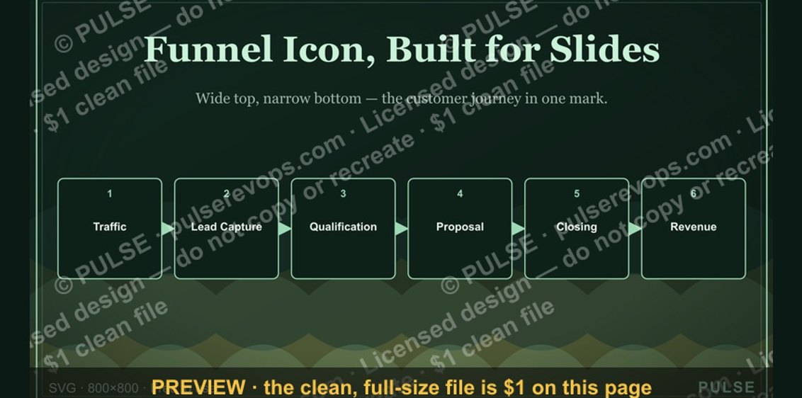 graphicSales Funnel — Icon / Clip Art
 graphicRetention / Trust Shield Icon — Icon / Clip Art
 graphicGrowth Bar Chart Icon — Icon / Clip Art
 graphicLaunch / Growth Rocket Icon — Icon / Clip Art
 graphicMilestone / Goal Flag Icon — Icon / Clip Art
 graphicBooked Meeting Icon — Icon / Clip Art
 graphicOutreach / Announce Icon — Icon / Clip Art
 graphicCold Call / Dialer Icon — Icon / Clip Art