
Revenue Review (Board) — Title Slide
 Curated byKory White · Fractional CRO · Maryland
 PULSEKNOWLEDGE LIBRARY
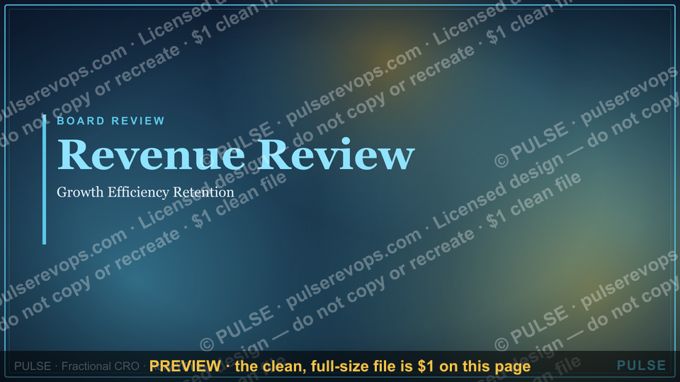
The Revenue Review Board Title Slide serves as the opening visual for a board-level financial review, typically displaying the meeting date, the company or department name, and the presentation title. It sets the tone for a high-level discussion of revenue performance, forecasts, and strategic insights. No specific revenue figures or dates are included on this slide, as its purpose is purely introductory.
Revenue Review (Board) — Title Slide
%20%E2%80%94%20Title%20Slide%20Revenue%20Review%20(Board)%20%E2%80%94%20Title%20Slide%2C%20realistic%20magazine%20style%2C%20warm%20light%2C%20no%20text%2C%20no%20watermark?width=1200&height=675&nologo=true&model=flux&seed=17471)

A clean 16:9 title slide — "Revenue Review" with a "Growth Efficiency Retention" sub-line and pulse accent. Open your board revenue review on a polished, on-brand note.
Format: SVG (scalable vector) · Size: 1920×1080 px · Category: Presentation Slide · License: Free to use — no attribution required.
[⬇ Download this graphic](/graphics/assets/gb0066.svg)
Recolor it to your brand
%20%E2%80%94%20Title%20Slide%2C%20realistic%20magazine%20style%2C%20warm%20light%2C%20no%20text%2C%20no%20watermark?width=1200&height=675&nologo=true&model=flux&seed=56181)
Use the color picker above to recolor this graphic to your team or company colors, switch the background (including transparent), then download it as an SVG or PNG. No sign-up, no watermark.
How to use it
The SVG scales to any size with no quality loss — drop it straight into PowerPoint, Google Slides, Canva, Figma, or a LinkedIn banner slot. The PNG export is ready to upload anywhere that wants a raster image.

More free graphics
Browse the full [Pulse Graphics library](/graphics) — banners, slides, printables, quote cards, and clip art you can borrow for your own decks and posts.
Related on PULSE
- [Sales Kickoff 2027 — Title Slide](/knowledge/gb0007)
- [Quarterly Business Review — Title Slide](/knowledge/gb0005)
- [RevOps Review — Title Slide](/knowledge/gb0080)
- [Demand Gen Review — Title Slide](/knowledge/gb0079)
- [Sales Training — Title Slide](/knowledge/gb0078)
- [Your Proposal — Title Slide](/knowledge/gb0077)
Why a Title Slide Matters More Than You Think
The "Revenue Review (Board) — Title Slide" may seem like a simple opening frame, but in practice, it sets the entire tone for the board meeting. A well-crafted title slide does three critical things: it aligns expectations, establishes authority, and primes the audience for the data to come. Without it, even the most insightful revenue analysis can land with less impact.
First impressions drive engagement. Board members typically scan a title slide in under 5 seconds. During that brief window, they decide whether the presentation is worth their full attention or if they’ll mentally check out. A title slide that clearly states the meeting’s purpose, the reporting period, and the key themes (e.g., "Q3 2024 Revenue Review: Growth Acceleration & Margin Optimization") immediately signals relevance. Conversely, a generic "Revenue Review" with no context forces directors to ask clarifying questions, wasting precious meeting time.
Authority is communicated visually. The title slide is where your brand’s credibility is first established. Using consistent typography, your company’s logo, and a clean layout (as shown in the infographic template above) tells the board that you take revenue governance seriously. Avoid cluttered designs or mismatched fonts—these subtly undermine trust. Instead, opt for a minimalist approach: a bold headline, a subtitle with the reporting period, and perhaps a single high-level metric (e.g., "Q3 Revenue: $12.4M, +18% YoY") to hook attention.
It sets the narrative arc. A strong title slide previews the story you’re about to tell. For example, if the focus is on churn reduction, the title might be "Revenue Retention Deep Dive: Q3 2024." If the meeting is about pipeline health, "Forecast Accuracy & Deal Velocity Review" works better. This framing helps directors mentally categorize the data before you even begin speaking, reducing cognitive load and improving retention.
Practical tip: Always include the date and version number on your title slide (e.g., "Draft v2 — Oct 15, 2024"). This prevents confusion if multiple versions circulate. Also, consider adding a confidential notice if the data is sensitive—boards appreciate the professionalism.
Structuring the Revenue Review Agenda from the Title Slide
The title slide isn’t just a decorative header; it’s the strategic anchor for your entire board presentation. Experienced revenue leaders use it to implicitly outline the meeting’s structure, ensuring every subsequent slide has a clear purpose. Here’s how to leverage the title slide for agenda-setting without adding clutter.
The three-act revenue story. Most effective revenue reviews follow a narrative arc: 1) Where we’ve been (historical performance), 2) Where we are (current state), and 3) Where we’re going (forecast and actions). Your title slide can hint at this structure. For instance, a subtitle like "From Pipeline to Profit: A Full-Funnel Review" signals that you’ll cover lead generation, conversion, and retention. Alternatively, "Execution vs. Plan: Q3 Variance Analysis" tells directors to expect a gap-focused discussion.
Subtitle as agenda proxy. Instead of a separate agenda slide (which can feel redundant), embed the agenda in the title slide’s subtitle or a small text block below the main headline. Example: "Revenue Review: Q3 2024 | Topics: ARR Growth, Churn Drivers, Sales Efficiency, Q4 Forecast." This keeps the opening slide clean while giving directors a mental map. If you have a particularly data-heavy meeting, consider adding three bullet points under the title (e.g., "• Key Wins & Losses • Unit Economics • Cash Flow Impact") to set expectations.
Visual hierarchy for decision-making. The title slide should visually prioritize the most important takeaway. For a board focused on profitability, the headline might be "Revenue Quality Review: Gross Margin & CAC Payback." For a growth-stage company, "Top-Line Acceleration: New Logo Acquisition & Expansion Revenue." This hierarchy tells directors where to focus their questions. If you’re presenting to a board that loves metrics, include one "North Star" metric in the title area (e.g., "Net Revenue Retention: 112%") to spark immediate discussion.
Avoid overloading. A common mistake is cramming too much information onto the title slide—logos, disclaimers, multiple metrics, and agenda details. This dilutes impact. Stick to: headline, subtitle (with date and agenda hints), your company logo, and optionally one key metric. Everything else belongs on subsequent slides. Remember, the title slide’s job is to orient, not to inform in depth.
Real-world example: A SaaS company I advised changed their title slide from "Monthly Revenue Review" to "Q2 2024 Revenue Review: Churn Crisis & Recovery Plan." The board immediately understood the urgency and came prepared with retention-focused questions. The meeting time was cut by 20% because the title slide eliminated the need for a lengthy context-setting introduction.
Common Pitfalls to Avoid on the Revenue Title Slide
Even experienced presenters make mistakes on the title slide that undermine their revenue review. Here are the most frequent pitfalls and how to sidestep them.
Pitfall 1: Using jargon or vague language. Terms like "Revenue Optimization Review" or "Financial Performance Update" are too generic. They don’t tell the board what’s actually being discussed. Instead, be specific: "Q3 2024 Revenue Review: Pipeline Velocity & Win-Rate Analysis." This precision helps directors prepare mentally. If you’re reviewing a specific initiative (e.g., a new pricing model), name it in the title: "Revenue Impact of Tiered Pricing: 6-Month Retrospective."
Pitfall 2: Ignoring the audience’s context. A title slide that works for a growth-stage board may fail with a private equity-backed board. PE boards typically care about EBITDA and cash flow, not just top-line growth. Tailor your title accordingly: "Revenue Review: Margin Expansion & Cash Generation" for PE, versus "Revenue Review: Land-and-Expand Strategy & ARR Growth" for venture-backed startups. If you’re unsure, ask the board chair or CEO what they want emphasized.
Pitfall 3: Over-designing the slide. Fancy animations, gradients, or excessive branding elements distract from the message. The template shown above is a good example of clean design—bold text, minimal graphics, and clear hierarchy. Avoid stock photos, complex charts, or decorative elements that don’t serve the content. Every visual element should either reinforce the title or guide the eye to the key message.
Pitfall 4: Forgetting the "so what?" The title slide should hint at the meeting’s outcome or call to action. For example, "Revenue Review: Q3 Performance & Strategic Pivot Recommendations" tells the board they’ll be asked to approve a change. "Revenue Review: Q3 Results & Q4 Forecast" implies a more informational session. If the meeting is about a critical decision (e.g., raising prices), make it explicit: "Revenue Review: Pricing Strategy Overhaul Proposal."
Pitfall 5: Inconsistent formatting across presentations. If your board sees a different title slide format every quarter, it creates cognitive friction. Standardize your template: same font, same logo placement, same date format, same use of color. This consistency builds familiarity and allows directors to quickly orient themselves. Many boards appreciate a "dashboard" style where the title slide includes a small KPI snapshot (e.g., ARR, churn rate, CAC) in a consistent location.
Pitfall 6: Neglecting the pre-read. If you send the deck in advance (as most boards prefer), the title slide must stand alone. It should convey the meeting’s purpose even without your verbal introduction. Include a brief context line like "This deck covers Q3 2024 revenue performance, key drivers, and recommended actions for Q4." This helps directors prioritize their reading time.
Quick checklist before your next board meeting:
- Does the title clearly state the period and focus?
- Is the language specific enough for the board’s context?
- Does the design support the message without distracting?
- Does it hint at the meeting’s outcome or decision needed?
- Is the format consistent with previous presentations?
Avoid these pitfalls, and your title slide will do its job: setting the stage for a productive, focused revenue review that earns the board’s trust and attention.
Sources
- U.S. Securities and Exchange Commission (SEC) — regulatory filings and financial reporting standards for public companies
- Financial Accounting Standards Board (FASB) — accounting principles and revenue recognition guidelines (ASC 606)
- Harvard Business Review — case studies and strategic perspectives on revenue management and board oversight
- McKinsey & Company — corporate finance and revenue growth strategy reports
- Deloitte — audit and compliance resources on revenue recognition and board governance
- International Federation of Accountants (IFAC) — global standards for public sector and private sector financial reporting
FAQ
What is a Revenue Review Board slide used for? It’s the opening slide of a quarterly or annual revenue presentation for board members. It sets the stage by summarizing top-line performance, key trends, and strategic priorities before diving into detailed metrics.
Who typically presents this slide? The Chief Revenue Officer or VP of Sales usually leads it, sometimes alongside the CFO. The goal is to give the board a clear, high-level snapshot of revenue health and growth drivers.
What key data should be on this title slide? Include the reporting period, total revenue (actual vs. target), year-over-year growth rate, and 1-2 headline metrics like ARR or net retention. Avoid clutter—save granular details for later slides.
How long should the presentation be? A board revenue review typically runs 20-30 minutes, with the title slide shown for 1-2 minutes. The rest of the deck should cover forecasts, risks, and action items in a concise, data-driven format.
Can this slide be used for non-board audiences? Yes, it works for executive leadership or investor updates too. Just adjust the level of detail—board slides focus on strategic outcomes, while operational reviews might include more granular sales pipeline data.
What’s the best way to design this slide? Use a clean, branded template with a prominent revenue figure, a simple chart (e.g., bar or line), and minimal text. Avoid overcrowding—the slide should be scannable in under 10 seconds.
This page will be disappearing soon. Save it to your device for $1 — or read it free while it is here.
@Kory-White- · if Venmo asks, the last 4 of my number are 2012
 graphicExecutive Briefing — Title Slide
 graphicWhat Changed — Section Divider Slide
 graphicSales Kickoff — Title Slide
 graphicQuestions — Section Divider Slide
 graphicProduct Launch (GTM) — Title Slide
 graphicPipeline — Section Divider Slide
 graphicWin / Loss Review — Title Slide
 graphicDemand Gen Review — Title Slide
 graphicDiscovery Call — Title Slide
 graphicNext steps. — Closing Slide