
Account Plan — Title Slide
 Curated byKory White · Fractional CRO · Maryland
 PULSEKNOWLEDGE LIBRARY
Quality
Certified


This is a presentation slide — a 1920×1080 PNG titled "Account Plan — Title Slide" — that opens an Account Plan deck. It carries the account name, the plan period, the owning team, and the plan's single headline objective, set in a clean title layout you can download free and drop straight into your own template.
What it is and why it matters
An Account Plan is a working document, not a report. It states where a named Account is today, where the team intends to take it over a defined period, what has to be true for that to happen, and who owns each move. The Title Slide is the first thing anyone sees when that document is opened, projected, or forwarded, and it does a disproportionate amount of work for the space it occupies.
Think about the actual lifecycle of a plan. It gets built by an account team over two to four weeks. It gets reviewed by a sales leader, sometimes a finance partner, sometimes a customer success lead. It gets presented in a 30- or 45-minute session. Then — and this is the part most authors forget — it gets reopened six weeks later by someone who was not in the room. A new AE inherits the Account. A solutions engineer needs to know the objective before a technical call. An executive asks "what was our plan for this logo again?" The Title Slide is the page that answers that question in under five seconds.
That is the entire design brief. A Title Slide that requires scrolling, squinting, or prior context has failed at its one job. A Title Slide that carries the Account name, the period, the owner, and the headline objective passes.
There is a second reason it matters, and it is organizational rather than aesthetic. Title Slides are the only page in an Account Plan that is guaranteed to be seen by everyone who touches the plan. The competitive landscape page gets skipped. The org chart gets skipped. The Title Slide gets seen every single time, because it is the first thing on screen and the thumbnail in every shared link. If you want one message to survive the whole review cycle, it has to live there.

Practically, this means the Title Slide is a forcing function. You cannot fill it in until you have decided what the plan is actually about. Teams that start with the Title Slide often discover in the first ten minutes that they disagree about the objective — one person thinks the goal is expansion, another thinks it is renewal defense, a third thinks it is a reference win. That disagreement is cheap to find on slide one and expensive to find on slide thirty. Writing the Title Slide first is a diagnostic, not a formality.
The slide also sets the tone for the document's altitude. A Title Slide that reads like a status update ("Q3 Account Review — Acme") signals a retrospective. A Title Slide that reads like a commitment ("Acme — Grow ARR 40% and Land the Platform Team by Q4") signals a plan. Same account, same quarter, completely different conversation when the deck opens.
Finally, consider the Title Slide as an artifact that outlives the meeting. Plans get archived. When someone in year two asks why a particular Account was pursued the way it was, the Title Slide is the fastest reconstruction of intent available. It is a one-page abstract of a twenty-page argument, and abstracts are what people actually read.
The step-by-step process
Building a Title Slide is a short, mechanical process once you accept that it is a compression exercise, not a design exercise. The design is already done for you in the downloadable template. What you are producing is the wording.
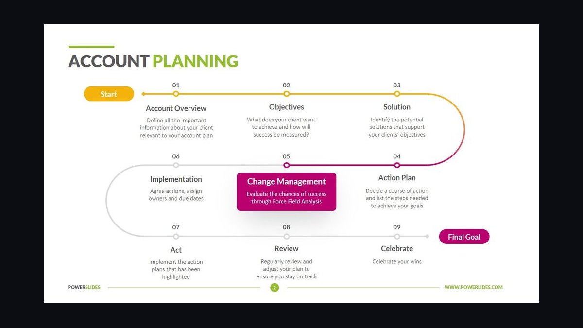
Step 1 — Fix the period first. Decide the exact window the plan covers before anything else. "FY26" is ambiguous across fiscal calendars. "Jan 1 – Dec 31, 2026" is not. If your plan is a rolling two-quarter horizon, say so on the slide: "H1 2026 (Jan–Jun)". The period determines what counts as in-scope and prevents the single most common review objection, which is that two people are arguing about different timeframes.
Step 2 — Write the Account name exactly as the customer writes it. Not the internal shorthand, not the legacy name from before the rebrand, not the parent company when the plan is about a subsidiary. If the Account is a division, name the division and the parent in parentheses. Getting this wrong on slide one undermines everything after it, because it signals the team has not done basic homework.
Step 3 — Name the owning team and the single accountable owner. One name, not three. A Title Slide with four names on it has no owner. Put the accountable owner first and the supporting functions after, or omit them entirely — the org page can carry the full roster.
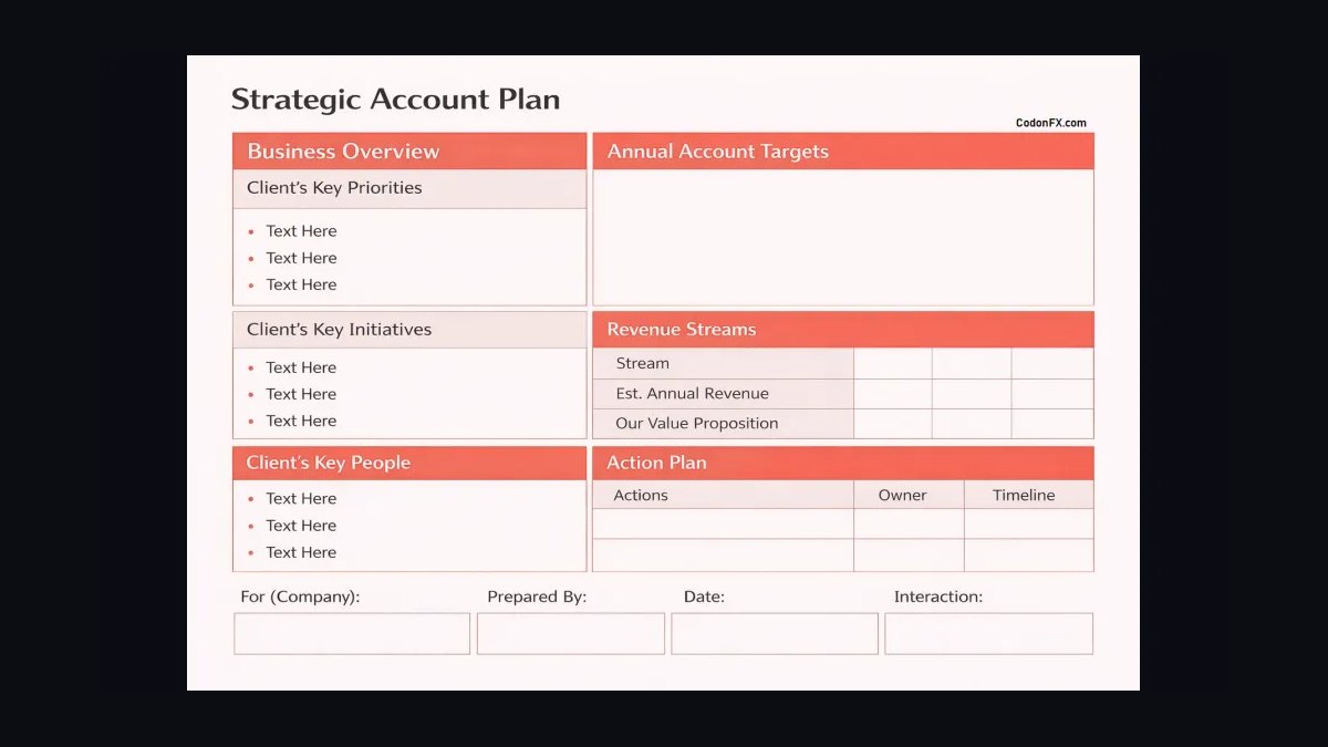
Step 4 — Write the headline objective as one measurable sentence. This is the hard part. The objective should contain a verb, a metric, and a date. "Grow the Account" is not an objective. "Expand platform adoption from 2 teams to 6 teams by Q4" is. "Protect and grow" is not. "Renew at 100% and add the analytics module by Sep 30" is. If you cannot fit it in one sentence, you have two objectives, and the plan needs a decision about which one leads.
Step 5 — Add the classification line. One short line stating the Account's strategic tier and motion — for example "Tier 1 — Land and Expand" or "Tier 2 — Renewal Defense". This is the fastest way for a reviewer to calibrate expectations before reading a single detail.
Step 6 — Add the date the plan was last updated. Plans drift. A reader needs to know whether they are looking at something from last week or last year. A single "Updated: 14 Mar 2026" line solves it.
Step 7 — Apply the template and export. Open the downloadable PNG as a background, or rebuild the layout in your own deck tool, drop in the five text fields, and export at 1920×1080. Do not add logos, stock photography, or decorative graphics. Every element you add competes with the objective sentence, which is the only thing on the slide that must be read.
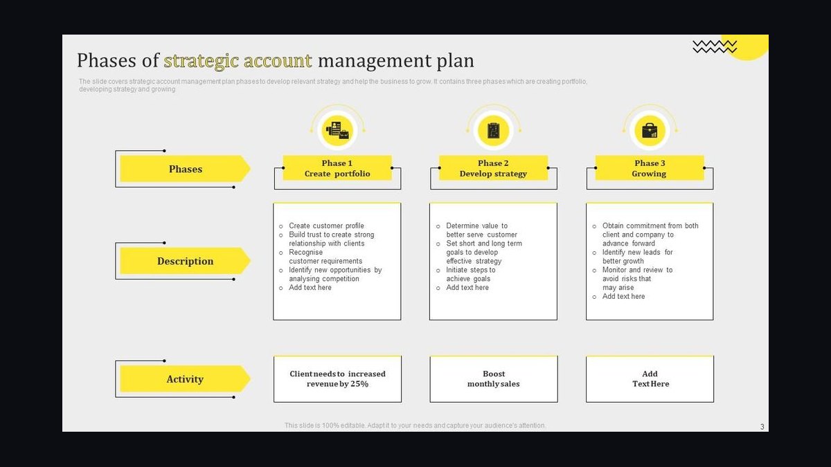
The loop between drafting the objective and checking whether it fits in one sentence is where most of the real work happens. Expect to rewrite the objective three or four times. The first draft is almost always two objectives wearing a trench coat.
Costs, timelines, and typical ranges
The Title Slide itself costs nothing but time, and the time is small — but the inputs it depends on are not, and it is worth being honest about the budget.
Authoring time for the slide: 20 to 45 minutes for a single Account if the objective is already agreed. If the objective is not agreed, budget two to four hours across the account team, because you are really running a scoping conversation. Teams that skip that conversation do not save the time; they spend it later in the review, usually in front of a leader.
Time to a complete Account Plan: for a mid-market Account, a usable plan runs 6 to 12 hours of total team effort spread over one to two weeks. For a strategic or enterprise Account with multiple business units, expect 25 to 60 hours across an AE, a solutions engineer, a customer success manager, and sometimes a partner manager, spread over three to five weeks. The Title Slide is the first hour of that and the last thing you revise.
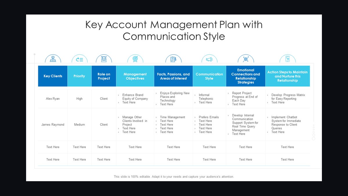
Review cycle: one 30- to 45-minute session for a standard plan, two sessions if the plan crosses functions. Add a week of calendar latency for scheduling. The most common timeline failure is not slow authoring — it is a plan finished on a Thursday that cannot be reviewed until the following Wednesday.
Refresh cadence: quarterly for most Accounts, monthly for Tier 1 Accounts in an active expansion or renewal window. The Title Slide's "Updated" line is what makes the cadence visible. A plan that says "Updated: 14 Mar 2026" in September tells a reviewer immediately that it is stale, which is far better than a plan with no date that quietly misleads.
Typical ranges you will see in real plans: a Tier 1 Account might carry one primary objective and two supporting objectives; a Tier 3 Account often carries one objective and no supporting objectives at all. Three to five named stakeholders on the plan is normal for mid-market; eight to fifteen is normal for enterprise. If your Title Slide's objective list runs past two items, the plan is probably scoped too broadly for the period.
What it costs to get it wrong: the failure mode is not a bad slide, it is a misaligned quarter. If the Title Slide says "expand" and the Account is actually in renewal defense, every downstream section — the stakeholder map, the value narrative, the mutual action plan — is built on the wrong premise. Rebuilding a plan mid-quarter costs far more than the hour it would have taken to align on one sentence up front.
Tooling: no special software is required. A slide tool, a document tool, or a whiteboard export all work. The downloadable PNG is designed so it can be used as a background image in whatever tool the team already uses, which avoids a migration conversation every time someone new joins the account team.
Where teams get it wrong
Writing a status line instead of an objective. "Q3 Business Review — Acme Corp" describes a meeting, not a plan. It tells the reader nothing about intent. The fix is to force a verb into the title area: grow, defend, land, expand, consolidate, migrate. If there is no verb, there is no plan.
Putting the internal nickname on the slide. Internal shorthand is fine in Slack and fatal on a customer-facing or cross-functional artifact. Use the name the customer uses. This is a five-second fix that prevents a recurring credibility problem.
Listing four owners. Shared ownership on a Title Slide reads as unowned work. Name one accountable person. Everyone else belongs on the org page, where the full roster is useful context rather than a diffusion of responsibility.
Burying the objective below the fold. Some teams put a large logo at the top and the objective at the bottom in small type. The visual hierarchy is backwards. The objective is the payload; the Account name is the label. Design accordingly.
Leaving off the period. Without a defined window, a reader cannot tell whether the plan is about this quarter, this year, or an open-ended relationship. Ambiguous periods produce ambiguous reviews.
Never updating the date. An undated plan is worse than a stale one, because a stale one at least announces itself. Add the updated line and actually change it.
Overloading the slide with metrics. A Title Slide with six KPIs on it has no headline. The metrics belong on the goals page, where they can be given context and targets. The Title Slide carries one objective; the rest of the deck carries the evidence.
Treating it as a one-time artifact. The Title Slide should be revised whenever the objective changes, which for an active Account may be twice in a quarter. Teams that treat it as a cover page written once at kickoff end up with a deck whose first page contradicts its last.
Skipping the team review. The Title Slide is the cheapest place to surface disagreement and the most expensive place to discover it late. Circulate the draft objective to the account team before the plan is written, not after.
Assuming the reader has context. The person opening this plan in six weeks may be new to the Account entirely. Every field on the slide should be self-explanatory without a narrator.
Decision framework: when to choose what
Not every Account deserves the same Title Slide, and the differences are mostly about how much the slide has to carry.
When the Account is Tier 1 and in an active expansion motion: lead with the growth objective and put the number in the title area. The reader should see the ambition immediately. Classification line reads something like "Tier 1 — Land and Expand". Supporting objectives can appear as a single subline.
When the Account is in renewal defense: lead with the retention commitment, not the growth number. A Title Slide that opens with expansion language on an Account that is at risk reads as tone-deaf to anyone who knows the situation. Classification reads "Tier 1 — Renewal Defense" and the objective is about protecting and stabilizing.
When the Account is a new logo in the first year: lead with the adoption or time-to-value objective. The plan period is usually shorter — two quarters rather than four — and the Title Slide should say so, because a first-year plan measured on a four-quarter horizon will look like it is behind when it is actually on track.

When the Account is small or transactional: keep the slide minimal. Account name, period, owner, one objective. No classification line, no supporting objectives. Adding structure to a simple plan makes it look inflated.
When the plan is being presented to an executive audience: the Title Slide should be legible from across a room. That means fewer words, larger type, and the objective in the largest text on the slide. Executive reviews are won or lost in the first fifteen seconds, and those fifteen seconds are spent on this slide.
When the plan is a living document rather than a presentation: optimize for the reopen case. The reader is alone, on a laptop, without a narrator. Every field must stand on its own, and the updated date matters more than the visual polish.
The final legibility check applies to every branch. If the objective cannot be read at presentation distance, the branch you chose does not matter — the slide still fails.
Related questions
What exactly goes on the slide?
Five fields: the Account name, the plan period, the accountable owner, one measurable headline objective, and the last-updated date. A tier or motion classification line is optional but recommended for Tier 1 and Tier 2 Accounts. Nothing else is required.
How long should the objective be?
One sentence, ideally under 20 words, containing a verb, a metric, and a date. If it runs past two lines at presentation size, it is too long and probably contains two objectives that need separating.
Can I use the same Title Slide for every Account?
Use the same layout, not the same wording. The template is reusable; the objective, period, owner, and classification are Account-specific and must be rewritten for each plan. Reusing wording is how plans become generic.
Who should own the Title Slide?
The accountable owner of the Account — usually the AE for a sales-led Account or the CSM for a retention-led one. That person drafts it, circulates it to the account team for disagreement, and is responsible for keeping the updated date current.
Does the slide need a customer logo?
No, and in most internal plans it is better without one. Logos consume space and attention that belong to the objective. If your organization requires a logo for brand consistency, keep it small and out of the reading path.
FAQ
Is this the same as an executive summary?
No. An executive summary is a page of prose that argues the plan. The Title Slide is a label that identifies it. They sit next to each other in a well-built deck: the Title Slide names the Account and the objective, the executive summary makes the case for why that objective is the right one.
How often should I update it?
Whenever the headline objective changes, and at minimum once per quarter. The updated date on the slide should always reflect the last real revision, not the last time the file was opened. For Tier 1 Accounts in an active window, monthly is a reasonable cadence.
What if the Account has two equally important objectives?
Pick one as primary and list the other as a supporting objective in a smaller subline. Two co-equal objectives on a Title Slide means the plan has no priority, and reviewers will read it that way. If they genuinely cannot be ranked, the period is probably too long and should be shortened.
Can I use this slide in a customer-facing meeting?
You can, but rewrite the objective for that audience. Internal plans often contain language about defending, displacing, or expanding that reads poorly to the customer. A customer-facing version should state the shared goal in neutral terms.
What size should the file be?
1920×1080 pixels, which is standard 16:9 presentation resolution. The downloadable PNG is built at that size so it can be used as a full-bleed background or dropped into a slide at native resolution without scaling artifacts.
Does it need to be a separate file, or can it live in the deck?
It should be the first slide of the deck. Keeping it as a separate file invites the deck and the cover to drift apart. One document, one first page, one updated date.
Sources
- HubSpot — Account Planning Template and Guide
- Salesforce — What Is Account Planning?
- Gartner — Sales Account Planning Research
- Microsoft — Create a Presentation in PowerPoint
- Atlassian — How to Run an Effective Planning Process
- Harvard Business Review — The Art of the Executive Summary
- Google — Slides Help: Change Slide Size and Dimensions
Related on PULSE
- Account Plan — Executive Summary Page
- Account Plan — Stakeholder Map
- Account Plan — Goals and Success Metrics
- Account Plan — Mutual Action Plan
- Account Plan — Competitive Landscape Page
- Account Plan — Org Chart and Buying Committee
This page will be disappearing soon. Save it to your device for $1 — or read it free while it is here.
@Kory-White- · if Venmo asks, the last 4 of my number are 2012
 graphicWhere We Are — Section Divider Slide
 graphicQuestions — Section Divider Slide
 graphicForecast Call — Title Slide
 graphicPipeline Review — Section Divider Slide
 graphicThe Ask — Section Divider Slide
 graphicNext steps. — Closing Slide
 graphicExecutive Briefing — Title Slide
 graphicAgenda — Section Divider Slide
 graphicPipeline Review — Title Slide
 graphicProduct Launch (GTM) — Title Slide