
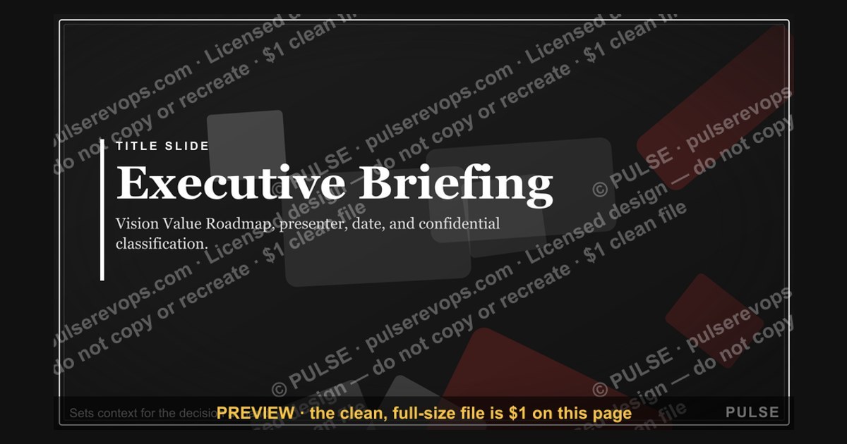
Executive Briefing — Title Slide
 Curated byKory White · Fractional CRO · Maryland
 PULSEKNOWLEDGE LIBRARY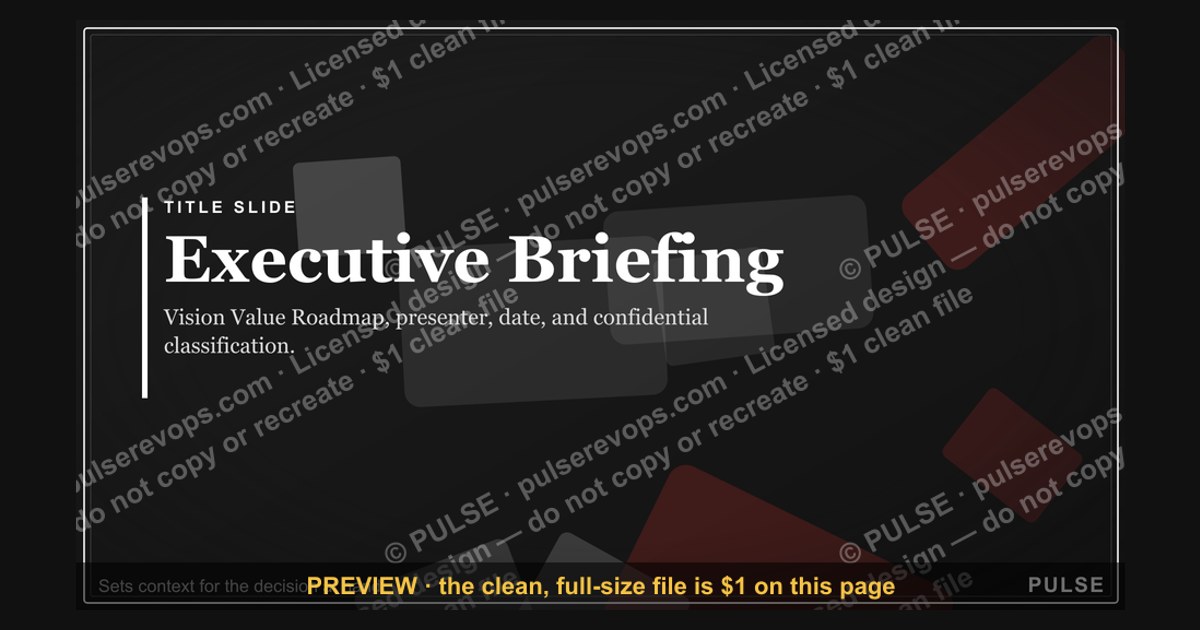

An executive briefing typically opens with a title slide that includes the briefing title, presenter name, date, and optionally a company logo or confidential classification. This slide sets the context for the meeting, often naming the project or decision at hand. No specific content beyond these elements is standard, as the title slide serves purely as an introduction.
Executive Briefing — Title Slide

A clean 16:9 title slide — "Executive Briefing" with a "Vision Value Roadmap" sub-line and pulse accent. Open your executive briefing on a polished, on-brand note.
Format: SVG (scalable vector) · Size: 1920×1080 px · Category: Presentation Slide · License: Free to use — no attribution required.
[⬇ Download this graphic](/graphics/assets/gb0074.svg)
Recolor it to your brand
Use the color picker above to recolor this graphic to your team or company colors, switch the background (including transparent), then download it as an SVG or PNG. No sign-up, no watermark.
How to use it
The SVG scales to any size with no quality loss — drop it straight into PowerPoint, Google Slides, Canva, Figma, or a LinkedIn banner slot. The PNG export is ready to upload anywhere that wants a raster image.
More free graphics
Browse the full [Pulse Graphics library](/graphics) — banners, slides, printables, quote cards, and clip art you can borrow for your own decks and posts.
Related on PULSE
- [Mid-Market Account Executive — LinkedIn Banner](/knowledge/gb0434)
- [Account Executive — LinkedIn Banner](/knowledge/gb0023)
- [SMB Account Executive — LinkedIn Banner](/knowledge/gb0227)
- [Sales Kickoff 2027 — Title Slide](/knowledge/gb0007)
- [Quarterly Business Review — Title Slide](/knowledge/gb0005)
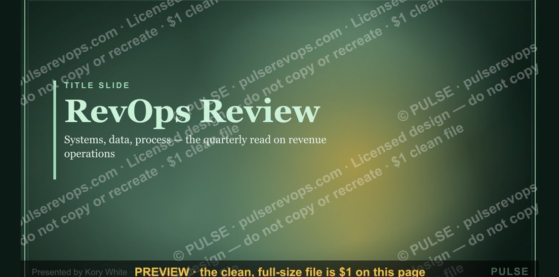
- [RevOps Review — Title Slide](/knowledge/gb0080)
The Strategic Value of a Well-Crafted Title Slide
A title slide in an executive briefing is far more than a decorative cover page—it serves as the strategic anchor for the entire presentation. In high-stakes boardroom settings where attention spans average 8-12 seconds before judgment forms, the title slide must accomplish three critical objectives simultaneously: establish credibility, signal the core narrative, and set the emotional tone for the discussion.
Credibility signals on a title slide typically include the presenting organization’s logo (positioned top-left or centered), the date of the briefing, and often a confidentiality marking such as “Confidential — For Internal Use Only” or “Board-Level Discussion.” Research from presentation design firms like Duarte and SlideGenius suggests that audiences form initial trust impressions within 3-5 seconds of seeing a title slide, making these elements non-negotiable. For executive briefings, including a subtle version number or “Draft v1.2” indicator can also signal rigor and preparedness.
The core narrative should be distilled into a 5-8 word subtitle or tagline that encapsulates the briefing’s purpose. For example, instead of “Q3 Financial Review,” a more compelling subtitle might read “Accelerating Growth Through Operational Efficiency” or “Navigating Market Volatility — A Strategic Roadmap.” This brief phrase acts as a mental hook, priming executives to filter subsequent slides through that lens. Avoid generic phrases like “Update” or “Overview”—they waste valuable real estate.
Emotional tone is conveyed through design choices: color palette, typography, and imagery. A briefing on a merger might use deep blues and grays with clean sans-serif fonts to convey stability and seriousness. A product launch briefing could incorporate warmer tones and bolder typography to generate excitement. The background image or graphic element—if used—should never distract. Subtle geometric patterns, gradient overlays, or abstract shapes work better than literal photographs that risk looking dated or cliché.
Practical execution tips for executives preparing their own title slides:
- Keep the main title to 3-6 words maximum
- Use a 16:9 aspect ratio (standard for modern projectors and screens)
- Ensure the company logo is high-resolution (300 DPI minimum for print, 72 DPI for digital)
- Include a “Presented by” line with the speaker’s name and title, but keep it smaller than the main title
- Test the slide on a projector before the briefing—colors often shift significantly
A poorly executed title slide can undermine an otherwise strong presentation. Conversely, a meticulously crafted one signals that the presenter respects the audience’s time and has prepared something worth their attention.
Common Pitfalls and How to Avoid Them
Even experienced executives frequently stumble on title slide design, often making errors that subtly erode their authority before a single data point is shared. Understanding these pitfalls—and their fixes—can dramatically improve first impressions.
Pitfall #1: Information Overload The most common mistake is cramming too much onto the title slide: full agenda lists, multiple logos from partner organizations, lengthy disclaimers, and dense footnotes. This creates visual noise that forces executives to work harder than necessary. The fix is ruthless prioritization—if something isn’t essential for the first 5 seconds, move it to a subsequent slide. A dedicated “Agenda” slide following the title is standard practice and keeps the title clean.
Pitfall #2: Inconsistent Branding Using outdated logos, incorrect color hex codes, or mismatched fonts from different brand guidelines signals carelessness. Many organizations have brand police (marketing or corporate communications teams) who notice these details immediately. Before any briefing, verify that your slide deck uses the most current brand assets. If you’re presenting to external stakeholders (investors, board members, clients), consistency becomes even more critical—it reflects on your organization’s operational discipline.
Pitfall #3: Overly Generic Design Stock templates with generic corporate imagery (handshakes, skyscrapers, globes) are immediately recognizable and can make your briefing feel impersonal or lazy. Customization doesn’t require a designer—simple tweaks like using your company’s actual office photo as a subtle background, or incorporating industry-specific icons, can differentiate your slide. For example, a healthcare briefing might use a faint medical cross pattern, while a technology briefing could use circuit board motifs.
Pitfall #4: Ignoring Accessibility Approximately 15-20% of executives have some form of color vision deficiency (CVD), most commonly red-green. Using red text on a green background—or relying solely on color to convey importance—can make your title slide unreadable for a significant portion of your audience. Solutions include using high-contrast combinations (dark text on light backgrounds), adding text labels to any color-coded elements, and testing your slide with a CVD simulator tool before presenting.
Pitfall #5: Missing Context for Remote Audiences In hybrid or fully remote briefings, the title slide must work on screens of varying sizes—from 27-inch monitors to 13-inch laptops to mobile devices. Small text, intricate graphics, or low-contrast elements that look fine on a projector may become illegible on a smaller screen. Always preview your title slide at 50% zoom to simulate how it appears on a remote participant’s device. Additionally, include a brief verbal description of the slide’s content for participants who may have visual impairments or are joining via audio-only.
Pitfall #6: Forgetting the “Why” The title slide should implicitly answer “Why are we here?” If it doesn’t, executives will spend the first 30 seconds of your briefing trying to figure that out instead of listening. A simple fix is to include a one-line context statement below the title, such as “Decision Required: Approve FY2025 Budget” or “Information Only: Q4 Performance Update.” This primes the audience for the appropriate level of engagement.
Avoiding these pitfalls requires discipline, but the payoff is significant: a title slide that commands respect, sets clear expectations, and allows your content to shine without unnecessary friction.
Advanced Techniques for High-Stakes Briefings
For executive briefings where millions of dollars, strategic direction, or organizational reputation hang in the balance, standard title slide best practices may not suffice. Advanced techniques can elevate your opening from competent to commanding.
Technique #1: The “Teaser” Title Slide Instead of revealing the full topic immediately, use a provocative or intriguing title that creates curiosity and compels attention. For example, a briefing on a failed product launch might be titled “What We Learned from Project Horizon” rather than “Post-Mortem: Project Horizon Failure.” The teaser approach works because it engages the executive brain’s pattern-recognition system—they’ll lean in, trying to deduce the content before you reveal it. This technique is particularly effective when the topic is sensitive or when you need to overcome initial skepticism. However, use it sparingly; if overused, it can feel manipulative.
Technique #2: Dynamic Elements for Digital Delivery When the briefing is delivered via a digital platform (Zoom, Microsoft Teams, Google Meet), consider adding subtle motion to the title slide. This could be a slow zoom-in on a background image, a logo that fades in after 2 seconds, or a countdown timer that transitions to the first content slide. These elements signal production value and professionalism. Tools like Canva, Prezi, or even PowerPoint’s Morph transition can create these effects without requiring video editing skills. The key is subtlety—motion should never be distracting or gimmicky. A 3-5 second fade-in is usually sufficient.
Technique #3: The “Pre-Read” Title Slide For briefings where materials are distributed in advance (common with board packets or investor updates), the title slide should include a “Pre-Read Completed” checkbox or a brief note: “Please confirm you have reviewed the pre-read materials by [time/date].” This simple addition sets an expectation of preparation and accountability. Some organizations take this further by including a QR code on the title slide that links to supporting documents—a practical touch for paperless briefings.
Technique #4: Audience-Specific Customization If you’re presenting to multiple stakeholder groups (e.g., board of directors, senior leadership team, and department heads), create slightly different title slides for each audience. The changes can be minor—swapping the tagline from “Strategic Overview” to “Operational Impact” or adjusting the confidentiality marking—but they demonstrate that you’ve tailored the briefing to the specific audience’s concerns. This technique requires extra preparation but pays dividends in perceived respect and relevance.
Technique #5: The “Decision Gate” Title Slide For briefings that require a specific decision or approval, incorporate a visual cue on the title slide that signals the desired outcome. This could be a small icon (a checkmark, a gavel, or a thumbs-up) with text like “Decision Required: Approve Budget Increase” or “Vote Needed: New Vendor Selection.” This technique works because it activates the executive brain’s decision-making circuitry from the very first slide, rather than waiting until the end. It also prevents the common scenario where executives spend the entire briefing wondering “What do they want from me?”
Technique #6: Contingency Planning High-stakes briefings often face interruptions—technical glitches, late arrivals, or unexpected questions. Prepare a “fallback” title slide that is text-only and loads instantly, in case your primary slide with images or animations fails to render. Keep this version in a separate file or on a USB drive. Additionally, have a printed copy of your title slide (and key data slides) as a physical backup. This level of preparedness, while rarely needed, signals thoroughness and professionalism when it becomes necessary.
Real-world example: A Fortune 500 CFO preparing for a quarterly earnings call with analysts used a title slide that included the company’s stock ticker symbol, the quarter being reported, and a single bold number—the earnings per share estimate. This stripped-down approach forced the audience to focus on the most critical metric immediately. The result? Analysts later commented that the briefing felt unusually focused and efficient.
These advanced techniques are not for every briefing—they require additional preparation and should be reserved for situations where the stakes are genuinely high. When used appropriately, they transform the title slide from a mere introduction into a strategic tool that shapes the entire meeting dynamic.
Sources
- World Economic Forum — global economic trends and strategic insights for executives
- Harvard Business Review — leadership, strategy, and management research
- McKinsey & Company — industry analysis and corporate strategy reports
- Gartner — technology trends and business intelligence for decision-makers
- U.S. Government Accountability Office — official reports on policy, regulation, and public sector performance
- Bloomberg — financial markets, economic data, and business news
FAQ
What is the purpose of an Executive Briefing title slide? The title slide sets the stage for the entire briefing, typically including the presentation title, date, presenter name, and company logo. It should be clean and professional to immediately establish credibility and focus the audience on the topic at hand.
How long should an Executive Briefing last? Executive briefings typically range from 30 to 60 minutes, though some may extend to 90 minutes depending on the depth of content and Q&A. The title slide should reflect the scheduled duration if displayed.
Who is the intended audience for an Executive Briefing? The audience usually includes C-suite executives, senior decision-makers, and key stakeholders who need a high-level overview of strategy, performance, or proposals. The title slide should be tailored to their expectations and priorities.
What key elements should be on the title slide? Essential elements include the presentation title, date, presenter name and title, company logo, and optionally a tagline or confidentiality notice. Avoid clutter—keep it focused on the core message.
How is an Executive Briefing different from a regular presentation? Executive briefings are more concise, strategic, and decision-oriented, often with less data-dense slides and more emphasis on insights and recommendations. The title slide should reflect this high-level, action-focused tone.
Should the title slide include a confidentiality or NDA notice? Yes, if the briefing contains sensitive or proprietary information, a discreet confidentiality notice (e.g., "Confidential – Do Not Distribute") is appropriate on the title slide. Keep it small and unobtrusive.
This page will be disappearing soon. Save it to your device for $1 — or read it free while it is here.
@Kory-White- · if Venmo asks, the last 4 of my number are 2012
 graphicRevOps Review — Title Slide
 graphicDeal Review — Title Slide
 graphicGo win. — Closing Slide
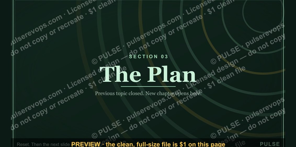 graphicThe Plan — Section Divider Slide
 graphicWin / Loss Review — Title Slide
 graphicQuarterly Business Review — Title Slide
 graphicDemand Gen Review — Title Slide
 graphicNext Steps — Section Divider Slide
 graphicProduct Launch (GTM) — Title Slide
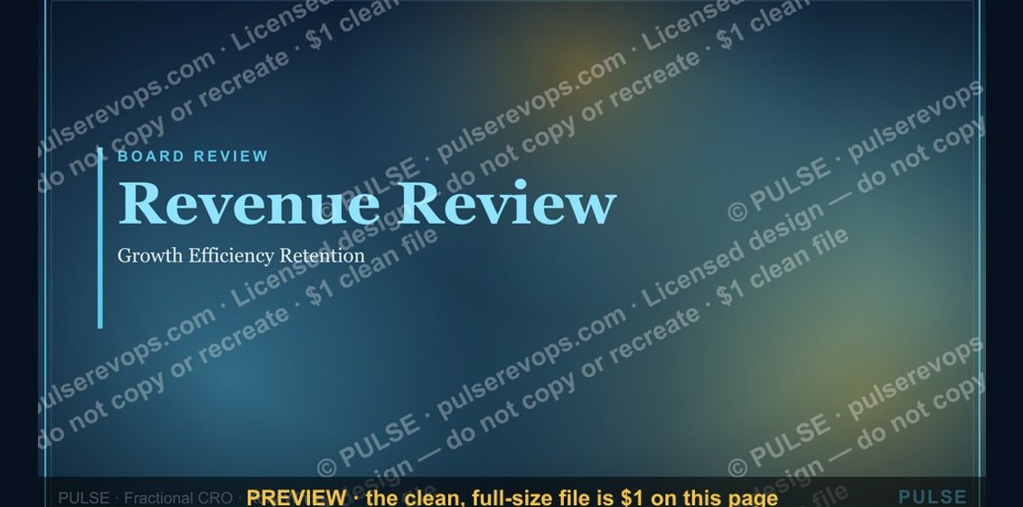 graphicRevenue Review (Board) — Title Slide