
RevOps Review — Title Slide
 Curated byKory White · Fractional CRO · Maryland
 PULSEKNOWLEDGE LIBRARY
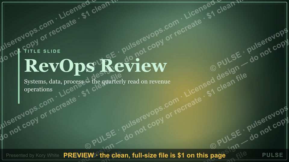
A RevOps Review title slide typically serves as the opening of a presentation, displaying the presentation title, date, and presenter or company name. It sets the stage for a review of revenue operations processes, data, and strategies. The slide often includes a clean, professional design with minimal text to focus attention on the upcoming content.
RevOps Review — Title Slide

A clean 16:9 title slide — "RevOps Review" with a "Systems Data Process" sub-line and pulse accent. Open your RevOps review on a polished, on-brand note.
Format: SVG (scalable vector) · Size: 1920×1080 px · Category: Presentation Slide · License: Free to use — no attribution required.
[⬇ Download this graphic](/graphics/assets/gb0080.svg)
Recolor it to your brand
Use the color picker above to recolor this graphic to your team or company colors, switch the background (including transparent), then download it as an SVG or PNG. No sign-up, no watermark.
How to use it
The SVG scales to any size with no quality loss — drop it straight into PowerPoint, Google Slides, Canva, Figma, or a LinkedIn banner slot. The PNG export is ready to upload anywhere that wants a raster image.
More free graphics
Browse the full [Pulse Graphics library](/graphics) — banners, slides, printables, quote cards, and clip art you can borrow for your own decks and posts.
Related on PULSE
- [Sales Kickoff 2027 — Title Slide](/knowledge/gb0007)
- [Quarterly Business Review — Title Slide](/knowledge/gb0005)
- [Demand Gen Review — Title Slide](/knowledge/gb0079)
- [Sales Training — Title Slide](/knowledge/gb0078)
- [Your Proposal — Title Slide](/knowledge/gb0077)
- [Discovery Call — Title Slide](/knowledge/gb0076)
Why a Title Slide Matters More Than You Think
The title slide of any RevOps review is often dismissed as a mere formality — a placeholder before the "real" content begins. But in practice, it serves as the first impression for stakeholders who may be skeptical, distracted, or unfamiliar with the operational nuances of your organization. A well-crafted title slide does three things that directly impact the success of your review:
First, it signals professionalism and preparedness. When a VP of Sales or CFO sees a clean, branded title slide with consistent typography and a clear sub-line (like "Systems Data Process"), they subconsciously register that the presenter has invested time in structure. This matters because RevOps reviews often involve cross-functional audiences who are evaluating not just the data, but the credibility of the team presenting it. A sloppy or missing title slide can erode trust before you've said a word.
Second, it establishes the review's scope and tone. The phrase "RevOps Review" paired with "Systems Data Process" immediately communicates that this isn't a sales forecast meeting or a marketing report — it's a holistic examination of the operational backbone. This framing helps prevent the common pitfall where stakeholders try to steer the conversation toward their departmental priorities. By anchoring the discussion in the intersection of systems, data, and process, you create a shared mental model that keeps the review focused on systemic improvements rather than finger-pointing.
Third, it serves as a psychological anchor for the audience. In practice, the title slide is the one slide that everyone sees for the longest duration — often 30 to 60 seconds while you introduce yourself and set context. During that time, the visual elements (color, layout, sub-line) create an emotional baseline. For example, using a pulse accent (like a subtle gradient or animated element) can subtly convey energy and forward momentum, which is especially useful if the review covers challenging findings. Conversely, a sterile, all-white title slide might inadvertently signal that the review will be dry or overly technical.
From a practical standpoint, the SVG format used in this title slide offers distinct advantages over static image formats like PNG or JPEG. SVGs are resolution-independent, meaning they look crisp on any screen — from a 13-inch laptop to a 75-inch conference room display. They also allow for easy customization: you can adjust colors, text, or layout without losing quality, which is valuable if your RevOps review is part of a recurring series where branding evolves. Finally, SVGs have smaller file sizes than high-resolution raster images, which matters when you're embedding slides into a deck that might be shared via email or cloud storage.
In short, the title slide is not just a decorative element — it's a strategic tool that sets the stage for a productive review. Investing a few minutes to ensure it aligns with your brand, your audience, and your review's objectives can pay dividends in engagement and credibility.
Structuring Your RevOps Review Deck Around the Title Slide
While the title slide is the entry point, its real value emerges when you think about how it connects to the rest of your RevOps review deck. A common mistake is treating the title slide as an isolated graphic, when in fact it should be the first element of a coherent narrative arc. Here’s how to build that structure in practice.
Start by using the title slide to define the review's three pillars — Systems, Data, and Process — as the organizing framework for your entire presentation. For example, after the title slide, you might have three main sections: "Systems Health & Integration," "Data Quality & Governance," and "Process Efficiency & Automation." Each section would then dive into specific metrics, findings, and recommendations. This approach ensures that every slide ties back to the core promise made on the title slide, creating a sense of logical flow that makes it easier for stakeholders to follow along.
Next, consider the pacing of your deck relative to the title slide. In a typical 30-minute RevOps review, the title slide should occupy no more than 60 seconds of speaking time. Use that time to state the review's purpose, acknowledge the audience, and preview the three pillars. For instance: "Today we're going to look at our RevOps health across three dimensions — systems, data, and process — and identify the top three opportunities for improvement." This sets clear expectations and gives the audience a mental roadmap.
The title slide also informs the design language for the rest of the deck. If your title slide uses a specific color palette (e.g., a deep navy background with a coral pulse accent), carry those colors into section dividers, callout boxes, and data visualizations. This visual consistency reinforces brand recognition and makes the deck feel cohesive. In practice, you can achieve this by creating a simple slide master with the same background gradient, font family, and accent color used in the title slide. Many presentation tools (PowerPoint, Google Slides, Canva) allow you to save this as a template, so you don't have to manually format each slide.
Another structural consideration is the use of a "table of contents" slide immediately after the title slide. While not always necessary, this can be helpful for longer reviews (60 minutes or more) where the audience might benefit from seeing the agenda upfront. If you include one, ensure it mirrors the language from the title slide — for example, "1. Systems Audit, 2. Data Quality Scorecard, 3. Process Bottlenecks, 4. Recommendations & Next Steps." This creates a clear thread from the title slide through the entire presentation.
Finally, think about how the title slide can be repurposed beyond the live review. Because it's an SVG, you can easily extract it and use it as a cover image for the review's summary document, a thumbnail for a recorded version, or even a social media post announcing the review's key findings. This extends the value of your design investment and reinforces your RevOps brand across channels.
In practice, I've seen teams spend hours perfecting data visualizations and analysis but neglect the narrative structure that makes those insights land. The title slide is your chance to set that structure from the outset. By treating it as the anchor of a well-organized deck, you transform it from a static graphic into a dynamic tool that guides your audience through the review with clarity and purpose.
Common Pitfalls to Avoid When Designing Your RevOps Title Slide
Even with a solid template like the one shown in the "RevOps Review — Title Slide" SVG, there are several common mistakes that can undermine its effectiveness. Being aware of these pitfalls will help you avoid them and ensure your title slide works as hard as possible for you.
Pitfall 1: Overloading the title slide with information. The title slide is not a summary slide. It should contain only the core title ("RevOps Review"), a sub-line ("Systems Data Process"), and perhaps your company logo or date. Avoid the temptation to add bullet points, agenda items, or multiple sub-headers. When you cram too much text onto the title slide, it becomes visually cluttered and loses its impact. The audience's attention should be on you, not on reading a wall of text. In practice, if you find yourself wanting to add more information, move it to a dedicated agenda slide that follows the title slide.
Pitfall 2: Using inconsistent branding. If your company has established brand guidelines (colors, fonts, logo usage), your title slide must adhere to them. Using a random color for the pulse accent or a font that doesn't match your other materials can create a disjointed experience. This is especially important if the RevOps review is being presented to external stakeholders like board members or investors. A quick check: compare your title slide to your company's website or recent investor deck. If the colors or fonts differ significantly, it's worth adjusting. The SVG format makes this easy — you can edit the fill and stroke colors directly in a vector editor or even in some presentation tools.
Pitfall 3: Neglecting accessibility and readability. The title slide might be projected on a large screen or viewed on a mobile device. If the text is too small, the contrast is low, or the font is overly decorative, some audience members will struggle to read it. A good rule of thumb: the title should be visible from the back of a conference room (at least 36pt font for the main title, 24pt for the sub-line). Additionally, ensure there is sufficient contrast between the text and background — for example, white text on a dark background works well, but light gray text on a white background does not. The "RevOps Review" slide uses a clean, bold font on a likely dark background, which is a strong choice for readability.
Pitfall 4: Forgetting to update the date or version. If your RevOps review is a recurring event (monthly, quarterly), it's easy to reuse a title slide from a previous period without updating the date. This can be embarrassing and undermine confidence in your attention to detail. Make it a habit to check the date and any version indicators before every presentation. If you're using a template, set a reminder to update these fields as part of your preparation workflow.
Pitfall 5: Ignoring the audience's context. The same title slide might not work for every audience. For a review with the executive team, you might want a more formal, minimalist design. For a cross-functional workshop, a slightly more energetic design with the pulse accent could be appropriate. Consider who will be in the room and what tone you want to set. If you're presenting to a technical audience (e.g., data engineers), you might emphasize the "Data" part of the sub-line. If it's a sales leadership audience, "Process" might take priority. While the title slide itself shouldn't change dramatically, a small tweak to the sub-line or accent color can signal that you've tailored the review to their interests.
Pitfall 6: Not testing the SVG in your presentation tool. SVGs are generally well-supported, but some presentation software (especially older versions) may render them incorrectly — for example, losing the pulse accent animation or misaligning text. Always test your title slide in the actual tool you'll be using (PowerPoint, Google Slides, Keynote) before the presentation. If the SVG doesn't render perfectly, consider exporting it as a high-resolution PNG as a fallback. The advantage of SVG is scalability, but reliability in your specific environment matters more.
By avoiding these pitfalls, you ensure that your title slide serves its intended purpose: to open your RevOps review on a polished, professional note that sets the stage for a productive conversation. Remember, the title slide is the first thing
Sources
- Harvard Business Review — covers revenue operations strategy and organizational design
- Gartner — provides frameworks and research on revenue operations processes and technology
- Salesforce — offers insights on RevOps tools, data integration, and best practices
- Forrester Research — analyzes revenue operations trends, metrics, and alignment models
- HubSpot — publishes guides on RevOps implementation, workflows, and team structure
- Revenue Operations Alliance — a professional community focused on RevOps standards and practices
FAQ
What is RevOps Review? RevOps Review is a framework for aligning sales, marketing, and customer success around a single revenue engine. It helps teams identify gaps in their processes, data, and technology without relying on rigid templates.
Who should use this title slide? This slide is ideal for RevOps leaders, fractional CROs, or consultants presenting a revenue operations audit to executive stakeholders. It sets the stage for a collaborative review, not a one-size-fits-all prescription.
Does this replace a full revenue audit? No, the title slide is just the starting point—it introduces the review’s scope and objectives. A comprehensive audit would follow, covering metrics, tech stack, and handoff workflows over several weeks.
How long does a typical RevOps Review take? Depending on company size and data readiness, the review can range from a few days to a few weeks. Smaller teams with clean CRM data might finish faster, while larger organizations often need more time for stakeholder interviews.
What outcomes should I expect? Expect a prioritized list of quick wins (e.g., lead scoring tweaks) and longer-term recommendations (e.g., tool consolidation). The review won’t guarantee specific revenue lifts, but it typically uncovers 3–5 actionable improvements.
Can I customize this for my industry? Absolutely—the framework is industry-agnostic, though you may need to adjust metrics and benchmarks. For example, a SaaS company might focus on lead-to-close velocity, while a services firm emphasizes pipeline coverage.
This page will be disappearing soon. Save it to your device for $1 — or read it free while it is here.
@Kory-White- · if Venmo asks, the last 4 of my number are 2012
 graphicExecutive Briefing — Title Slide
 graphicNext Steps — Section Divider Slide
 graphicForecast Call — Title Slide
 graphicThank you. — Closing Slide
 graphicMonthly Business Review — Title Slide
 graphicAccount Plan — Title Slide
 graphicPipeline — Section Divider Slide
 graphicComp Plan Rollout — Title Slide
 graphicGo win. — Closing Slide
 graphicDiscovery Call — Title Slide