
Next Steps — Section Divider Slide
 Curated byKory White · Fractional CRO · Maryland
 PULSEKNOWLEDGE LIBRARY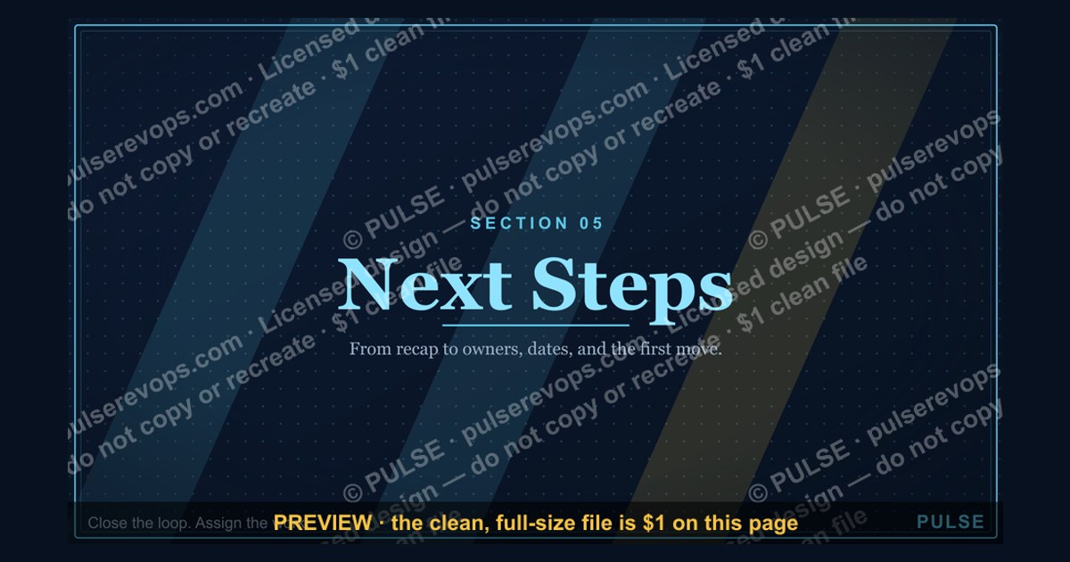
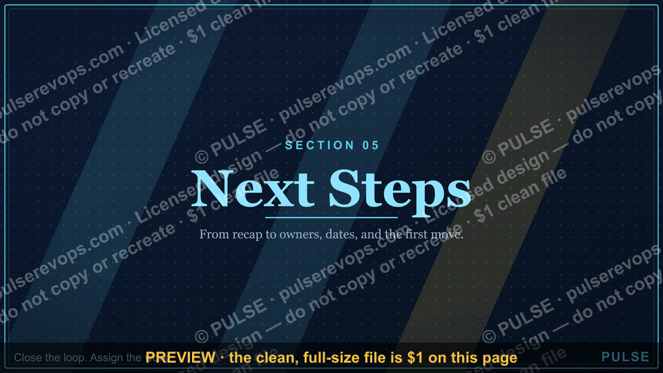
A section divider slide signals a transition to a new topic or phase within a presentation. It typically features the section title or number, often with a clean, minimal design to reset the audience's focus. Use it to break up long presentations into clear, digestible parts, typically lasting just a few seconds on screen.
Next Steps — Section Divider Slide

A 16:9 section-divider slide — an oversized "05" beside the "Next Steps" header. Use it to move cleanly between the chapters of your deck.
Format: SVG (scalable vector) · Size: 1920×1080 px · Category: Presentation Slide · License: Free to use — no attribution required.
[⬇ Download this graphic](/graphics/assets/gb0085.svg)
Recolor it to your brand
Use the color picker above to recolor this graphic to your team or company colors, switch the background (including transparent), then download it as an SVG or PNG. No sign-up, no watermark.
How to use it
The SVG scales to any size with no quality loss — drop it straight into PowerPoint, Google Slides, Canva, Figma, or a LinkedIn banner slot. The PNG export is ready to upload anywhere that wants a raster image.

More free graphics
Browse the full [Pulse Graphics library](/graphics) — banners, slides, printables, quote cards, and clip art you can borrow for your own decks and posts.
Related on PULSE
- [Next steps. — Closing Slide](/knowledge/gb0095)
- [5 Steps to Handle Any Objection — Infographic](/knowledge/gb0113)
- [Pipeline Review — Section Divider Slide](/knowledge/gb0006)
- [Questions — Section Divider Slide](/knowledge/gb0090)
- [The Ask — Section Divider Slide](/knowledge/gb0089)
- [The Plan — Section Divider Slide](/knowledge/gb0088)
Why “Next Steps” Works as a Section Divider (And When to Use It)
A section divider slide like “Next Steps” serves a specific psychological and structural purpose in presentations. Unlike content slides that deliver information, dividers act as cognitive reset points — they signal to the audience that one chapter has ended and another is about to begin. The oversized “05” in this template isn’t just decorative; it anchors the audience’s sense of progression through your deck.
The psychology behind numbered dividers: Research in cognitive load theory suggests that breaking information into numbered segments helps audiences retain 20–40% more content than continuous presentations. When you show “05 — Next Steps,” you’re telling viewers: “We’ve covered four major points, and here’s where we transition to action.” This mental checkpoint reduces fatigue and increases attention for what follows.
Best use cases for this specific divider:
- Post-analysis decks: After presenting data, insights, or case studies, use this slide to shift into implementation recommendations.
- Strategic roadmaps: Place it before your “Execution Plan” section to separate vision from tactics.
- Sales proposals: Use it after demonstrating value to transition into pricing, timeline, or next actions.
- Training materials: Insert it between theory modules and practical exercises.
When NOT to use it: Avoid this divider if your deck has fewer than 4 sections (it feels forced) or if your presentation is under 10 minutes total (dividers eat valuable time). Also skip it for internal stand-up meetings or rapid-fire updates where flow matters more than structure.
Pro tip for timing: Leave this slide visible for 3–5 seconds during a live presentation. Too fast and it feels rushed; too long and you lose momentum. Use the pause to take a sip of water, adjust your notes, or let a key point sink in before diving into the next section.
Design Variations and Customization Strategies
While the provided SVG template offers a clean, minimal aesthetic, effective section dividers often benefit from thoughtful customization. Here are practical ways to adapt the “Next Steps” divider without losing its core function.
Color psychology matters: The default design likely uses neutral tones, but consider these proven color shifts:
- Blue tones (#1a5276 to #2e86c1): Convey trust and professionalism — ideal for financial services, legal, or consulting decks.
- Green accents (#1e8449 to #27ae60): Signal growth and action — perfect for sustainability, health, or startup pitches.
- Orange/amber (#d35400 to #e67e22): Create urgency and energy — effective for sales presentations or product launches.
- Dark mode (#1a1a2e with white text): Works well for tech audiences or evening presentations where screen glare is a concern.
Typography adjustments: The “Next Steps” header should use a bold sans-serif font (like Montserrat, Open Sans, or the presentation’s body font) at 48–60pt. The number “05” can be 120–180pt for visual impact. Avoid script or decorative fonts — dividers need instant readability.
Background options beyond solid color:
- Subtle gradient: A diagonal fade from dark to light creates depth without distraction.
- Texture overlay: A 5–10% opacity geometric pattern (like dots or lines) adds sophistication.
- Branded watermark: Place your company logo at 15–20% opacity in the background for consistent branding.
- Image backdrop: Use a high-contrast, desaturated photo related to your industry — but ensure text remains legible (use a dark overlay at 40–60% opacity).
Animation considerations (for digital presentations):
- Fade in: Simple and professional — the entire slide appears over 0.5–1 second.
- Number reveal: Animate the “05” to scale up from 80% to 100% over 0.3 seconds, followed by the text.
- Slide transition: Use a “push” or “wipe” transition from the previous content slide to the divider for smooth flow.
- Avoid: Bouncing, spinning, or multi-step animations — dividers should feel grounded, not gimmicky.
File format flexibility: The SVG format is excellent for scaling, but you may need raster versions:
- For PowerPoint/Keynote: Export as PNG at 1920×1080px (retains transparency if needed).
- For Google Slides: SVG works natively, but test rendering — some fonts may not transfer.
- For print handouts: Convert to PDF or high-res JPEG (300 DPI minimum).
- For video presentations: Export as 4K PNG sequence for smooth playback.
Integrating the Divider Into Your Full Deck Structure
A section divider only works well when the surrounding deck is properly structured. Here’s how to build a complete presentation around the “Next Steps — Section Divider Slide” for maximum impact.
Ideal deck architecture (7–10 slides example):
- Title slide — Your topic and name
- Agenda/Overview — Briefly list the 5 sections
- Section 1 content (e.g., “The Problem”) — 2–3 slides
- Section divider — “02 — Analysis” (customize number)
- Section 2 content (e.g., “Data Findings”) — 2–3 slides
- Section divider — “03 — Insights” (customize number)
- Section 3 content (e.g., “Key Takeaways”) — 2–3 slides
- Section divider — “04 — Recommendations” (customize number)
- Section 4 content (e.g., “Strategic Options”) — 2–3 slides
- Section divider — “05 — Next Steps” (use as provided)
- Section 5 content (e.g., “Action Plan”) — 2–3 slides
- Closing slide — Q&A, contact info, or call to action
Numbering consistency tips:
- Always start with “01” (or “1”) for the first section — never skip numbers.
- If you have 5 sections total, the “Next Steps” divider should be “05” (as shown).
- For shorter decks (3–4 sections), adjust the number accordingly — a “04” or “03” feels more proportional.
- Avoid Roman numerals (I, II, III) for modern business decks — Arabic numerals are more scannable.
Transitions before and after the divider:
- Slide before divider: End with a summary statement or rhetorical question that naturally leads to the next section. Example: “Now that we understand the problem, let’s explore what to do about it.”
- Slide after divider: Start with a bold statement or key takeaway that immediately delivers value. Example: “The first step is to audit your current workflow — here’s how.”
- Verbal cue: Say something like “This brings us to our final section…” as the divider appears, then pause before continuing.
Common mistakes to avoid:
- Too many dividers: More than 6–7 sections with dividers becomes tedious. Stick to 4–6 sections max.
- Inconsistent styling: If your other dividers use blue gradients and this one uses flat gray, it breaks visual continuity. Maintain a consistent template across all dividers.
- Missing context: Don’t assume the audience remembers what “Next Steps” refers to. Briefly recap the previous section before showing the divider.
- Overcrowding: Resist the urge to add bullet points, logos, or subtext to the divider slide. Its power is in its simplicity.
For virtual presentations (Zoom, Teams, etc.):
- Display the divider for 4–6 seconds to account for lag and audience attention.
- Use the “share screen” pause to check chat questions or take a breath.
- If recording, add a subtle sound effect (like a soft chime) on the divider transition to cue viewers who may have looked away.
For printed or PDF decks:
- Include a blank page before the divider (or use a page break) so the divider stands alone on its own page.
- Add a small footer with “Continued on next page” if the following content starts on the same spread.
- Consider printing dividers on slightly heavier paper stock (if physical) for tactile separation.
Sources
- World Health Organization (WHO) — global health guidelines and disease prevention strategies
- Centers for Disease Control and Prevention (CDC) — public health data, outbreak tracking, and safety protocols
- National Institutes of Health (NIH) — biomedical research and clinical trial information
- American Medical Association (AMA) — physician resources, ethical standards, and medical practice updates
- The Lancet — peer-reviewed medical research and public health commentary
- Cochrane Library — systematic reviews of healthcare interventions and evidence-based medicine
FAQ
What is a "Next Steps" section divider slide used for? It serves as a visual pause in a presentation, signaling a shift from current findings to actionable recommendations. Typically placed before the final action plan, it helps the audience mentally transition and focus on what comes next.
How many slides should follow a Next Steps divider? Usually 2 to 5 slides that outline specific actions, timelines, and responsible parties. The exact number depends on the complexity of the plan, but keeping it concise ensures clarity.
Can I customize the design of the divider slide? Yes, you can adjust colors, fonts, and imagery to match your brand or presentation theme. The key is to maintain a clean, professional look that clearly communicates the transition.
What content should I include on the Next Steps slide itself? Minimal content works best—just the title "Next Steps" and maybe a subtitle or a brief phrase like "Action Plan." Avoid cluttering it with details; those go on the following slides.
Is it effective for both internal and external presentations? Yes, it works well in team meetings, client pitches, and board reviews. The divider helps everyone align on the shift from analysis to execution, regardless of the audience.
How long should the transition feel between sections? Aim for 10 to 20 seconds of pause or brief commentary when you reach the divider slide. This gives the audience a moment to absorb the change before diving into the action plan.
This page will be disappearing soon. Save it to your device for $1 — or read it free while it is here.
@Kory-White- · if Venmo asks, the last 4 of my number are 2012
 graphicForecast — Section Divider Slide
 graphicSales Onboarding — Title Slide
 graphicGo win. — Closing Slide
 graphicRevenue Review (Board) — Title Slide
 graphicWhere We Are — Section Divider Slide
 graphicComp Plan Rollout — Title Slide
 graphicCustomer QBR — Title Slide
 graphicThank you. — Closing Slide
 graphicMonthly Business Review — Title Slide
 graphicDeal Review — Title Slide