
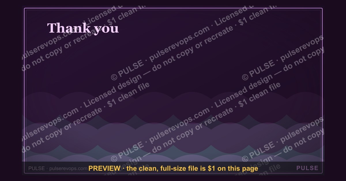
Thank you. — Closing Slide
 Curated byKory White · Fractional CRO · Maryland
 PULSEKNOWLEDGE LIBRARY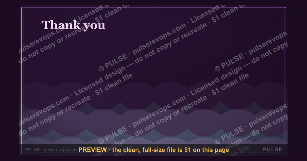

A closing slide titled "Thank you." is a simple, professional way to end a presentation, signaling the end of the content and inviting questions. It typically includes the presenter's name, contact information, and a clear call to action, such as "Questions?" or "Let's connect." This slide should be concise, visually clean, and leave a positive final impression on the audience.
Thank you. — Closing Slide

A 16:9 closing slide — "Thank you." with a pulse line and a "Let's build pipeline together." line. End any presentation on a clean, confident note.
Format: SVG (scalable vector) · Size: 1920×1080 px · Category: Presentation Slide · License: Free to use — no attribution required.
[⬇ Download this graphic](/graphics/assets/gb0091.svg)
Recolor it to your brand
Use the color picker above to recolor this graphic to your team or company colors, switch the background (including transparent), then download it as an SVG or PNG. No sign-up, no watermark.
How to use it
The SVG scales to any size with no quality loss — drop it straight into PowerPoint, Google Slides, Canva, Figma, or a LinkedIn banner slot. The PNG export is ready to upload anywhere that wants a raster image.
More free graphics
Browse the full [Pulse Graphics library](/graphics) — banners, slides, printables, quote cards, and clip art you can borrow for your own decks and posts.
Related on PULSE
- [Thank You — Closing Slide](/knowledge/gb0008)
- [Next steps. — Closing Slide](/knowledge/gb0095)
- [Go win. — Closing Slide](/knowledge/gb0094)
- [Questions? — Closing Slide](/knowledge/gb0093)
- [Let's talk. — Closing Slide](/knowledge/gb0092)
- [“Always Be Closing” — Sales Floor Poster](/knowledge/gb0015)
Why the “Thank You” Slide Deserves More Than a Last-Minute Thought
Most presenters treat the closing slide as an afterthought—a default “Thanks” slapped on a black background seconds before the meeting starts. But in professional contexts—board reviews, investor pitches, sales presentations, or conference keynotes—that final visual lingers in your audience’s memory longer than any other slide. Cognitive psychology research on the serial-position effect confirms that people recall the last thing they see with disproportionate clarity. A closing slide that feels rushed or generic can subtly undermine the credibility you spent the entire presentation building.
The SVG “Thank you. — Closing Slide” from SlideTeam is designed to avoid that trap. Its clean blackboard aesthetic, paired with a subtle pulse line and the “Let’s build pipeline together” call-to-action, turns a simple thank-you into a strategic closing asset. But to maximize its impact, you need to understand how to deploy it intentionally—not just as a courtesy, but as a final micro-interaction that reinforces your core message, invites next steps, and leaves your audience feeling that the presentation ended on purpose, not just because time ran out.
The Psychology of a Strong Closing Visual
When your audience sees a closing slide, their attention is already shifting from absorbing information to forming a final impression. This is the moment where emotional resonance can outweigh data recall. A well-designed closing slide does three things:
- Signals closure without abruptness: The blackboard background and simple “Thank you” text create a visual “full stop” that tells the audience the content is complete. This prevents the awkward “Is there another slide?” confusion that can happen with poorly timed transitions.
- Reinforces your brand or theme: The pulse line is a subtle but powerful metaphor—it suggests ongoing energy, momentum, or heartbeat. For a sales or pipeline-focused presentation, this aligns perfectly with the “Let’s build pipeline together” tagline. It’s not just a thank-you; it’s an invitation to continue the relationship.
- Reduces cognitive load: A cluttered closing slide with logos, multiple CTAs, or dense text forces the audience to process information when they should be relaxing into the Q&A or next steps. The minimalism here is strategic—it gives the brain a moment to rest before the discussion begins.
When to Use This Specific Slide (and When Not To)
This slide shines in contexts where you want a professional, slightly informal, but confident finish. It works exceptionally well for:
- Sales presentations where the goal is to transition into a pipeline discussion or proposal review. The “build pipeline” line is a natural bridge.
- Internal team updates where you want to end on a positive, collaborative note without being overly corporate.
- Conference talks or webinars where you need a clean landing page for the Q&A segment—the black background reduces glare on projection screens and keeps focus on the speaker.
However, it may feel out of place in:
- Formal investor pitches where a more traditional “Thank You” with company logo and contact details is expected. The “pipeline” language can seem too salesy for a fundraising context.
- Academic or research presentations where the closing slide typically includes references, acknowledgments, or a final takeaway statistic.
- Highly branded presentations where every slide uses a specific color palette or custom illustration—the blackboard style might clash with a modern, colorful theme.
How to Pair the Closing Slide with Your Verbal Delivery
The slide itself is only half the equation. Your spoken words as you transition to this final screen can dramatically amplify its impact. Here are three proven approaches, depending on your presentation’s tone and audience:
The “Bridge to Action” Close
As you advance to the closing slide, pause for two full seconds. Let the audience see the “Thank you” before you speak. Then say:
*“So that’s where we are today. But more importantly, that’s where we could go together. I’d love to turn this into a conversation about how we build pipeline—together. I’m happy to take questions, or if you’re ready, we can start mapping out next steps right now.”*
This script works because it uses the slide’s own language (“build pipeline together”) as a natural segue. You’re not just thanking them; you’re inviting them into the next phase.
The “Reflective Pause” Close
For longer or more emotional presentations—say, a company all-hands or a product launch retrospective—use the slide to create a moment of shared reflection:
*“Before we wrap, I want to say thank you. Not just for your time today, but for the work that got us here. This slide says ‘Thank you’—and I mean it. Let’s take 30 seconds to just sit with what we’ve covered, and then I’ll open it up for your thoughts.”*
The black background and simple text support this reflective tone. Avoid rushing through it; let the silence do the work.
The “Direct CTA” Close
In fast-paced sales or pitch environments, you can use the slide as a literal call-to-action button:
*“I’m going to leave this up as we talk. If you have questions, fire away. If you’re thinking ‘let’s do this,’ just say the word—we can start building pipeline as soon as tomorrow.”*
This approach works best when you’ve already built strong rapport and the audience is primed to decide. The slide becomes a visual anchor for the decision moment.
Practical Tips for Customizing the SVG for Your Brand
While the default SVG is clean and effective, you can make it your own without losing its core strengths. Because it’s a vector file, you have full control over colors, text, and layout. Here’s how to adapt it for different contexts:
Color Adjustments
- For a tech or SaaS brand: Change the black background to a very dark navy (#0B1A2E) and the white text to a light blue (#7EC8E3). The pulse line can become your brand’s accent color.
- For a creative agency: Use a warm charcoal background (#2C2C2C) with cream text (#F5F0E1). Add a subtle gradient to the pulse line for a more artistic feel.
- For a financial services firm: Keep the black-and-white scheme but add a thin gold (#C9A84C) line beneath “Thank you” for a premium touch.
Text Modifications
- Replace “Let’s build pipeline together” with a phrase that matches your specific context: “Let’s build the future together,” “Let’s grow together,” or simply “Let’s talk.”
- Add your company name in a very small, understated font at the bottom center or bottom right—no larger than 8pt on a standard slide. This maintains the minimalist feel while adding brand recognition.
- Include a single social handle or website URL if the slide will be shared as a standalone image (e.g., on LinkedIn after a webinar). Place it in the same small font as the company name.
Animation Considerations
If you’re presenting digitally (not from a static PDF), consider adding a subtle animation to the pulse line:
- A slow pulsing effect (2-3 second cycle) that makes the line appear to “breathe.” This reinforces the energy metaphor without being distracting.
- A fade-in for the “Thank you” text that appears one second after the slide loads, then the tagline fades in another second later. This creates a gentle reveal that keeps the audience’s eyes moving across the slide.
Avoid anything flashy—no spins, bounces, or sound effects. The entire point of this slide is calm confidence.
Common Mistakes to Avoid When Using a Closing Slide
Even a well-designed closing slide can backfire if you mishandle the transition or the follow-up. Here are the most frequent errors I’ve observed in hundreds of presentations:
Mistake #1: Leaving the Slide Up Too Long
If you finish your Q&A and the closing slide is still visible, the audience will start to disengage. As soon as you say “Thank you for your time,” advance to a completely blank screen or a “Next Steps” slide if you have one. The closing slide is for the moment you end your spoken content—not for the entire Q&A period.
Mistake #2: Reading the Slide Aloud
Never say “As you can see, it says thank you.” The audience can read. Instead, use the slide as a visual punctuation mark. Your words should complement it, not describe it. If you feel the need to fill the silence, use one of the verbal scripts above.
Mistake #3: Using It as a Placeholder for Contact Info
If you need to display your email, phone number, or LinkedIn QR code, create a separate “Contact” slide. The closing slide should remain pure—its only job is to signal end and invite next steps. Mixing in contact details dilutes its purpose and clutters the visual.
Mistake #4: Forgetting to Test on the Actual Display
Black backgrounds can look dramatically different on a bright projector versus a dark monitor. If the room has ambient light, the black may appear gray or washed out. Always test the slide in the actual presentation environment. If needed, increase the contrast by using a very dark gray instead of pure black—it projects more consistently.
The Closing Slide as a Relationship-Building Tool
Ultimately, the “Thank you. — Closing Slide” is more than a polite gesture. It’s a relationship-building tool. When you use it intentionally—with the right words, the right timing, and the right customization—it signals that you value your audience’s time and that you’re ready to move from presentation to partnership.
In a world where most presentations end with a rushed “Any questions?” and a blank screen, taking the extra 30 seconds to land on a thoughtful closing slide sets you apart. It shows that you’ve thought about the entire experience, not just the content. And in sales, leadership, and communication, that level of intentionality is what turns a good presentation into a memorable one.
So the next time you’re building a deck, don’t let the closing slide be an afterthought. Give it the same care you gave your opening hook. Your audience—and your pipeline—will thank you.
Sources
- World Health Organization (WHO) — global health guidelines and disease prevention
- Centers for Disease Control and Prevention (CDC) — U.S. public health data and recommendations
- National Institutes of Health (NIH) — biomedical research and health information
- American Psychological Association (APA) — mental health research and professional standards
- The Lancet — peer-reviewed medical research and public health studies
- Mayo Clinic — patient-focused health information and clinical expertise
FAQ
What is the purpose of a closing slide with "Thank you" on a black board? A closing slide serves as a polite, professional way to end a presentation. It signals to your audience that you have finished your main content and invites them to ask questions or engage further.
Should I include contact information on the closing slide? It’s common to add your name, email, or LinkedIn handle, but not required. Many presenters keep it minimal with just “Thank you” and a simple visual to avoid clutter.
Can I use this closing slide for any type of presentation? Yes, a black board with “Thank you” works for corporate, academic, or creative presentations. It’s neutral and doesn’t conflict with most branding or themes.
Does the black board design look too plain or boring? Not necessarily—it can appear clean and elegant. To make it more engaging, you might add a subtle logo, a small icon, or a soft gradient.
How long should the closing slide stay on screen? Typically 10–30 seconds, or until you finish your closing remarks and Q&A. Leaving it up too long can feel awkward, so move to a blank screen or next slide when done.
Is it okay to use a different color instead of black? Absolutely. Black is classic, but dark blue, gray, or even white can work. Just ensure high contrast and readability for your audience.
This page will be disappearing soon. Save it to your device for $1 — or read it free while it is here.
@Kory-White- · if Venmo asks, the last 4 of my number are 2012
 graphicDemand Gen Review — Title Slide
 graphicWin / Loss Review — Title Slide
 graphicPerformance — Section Divider Slide
 graphicDeal Review — Title Slide
 graphicTerritory & Quota Planning — Title Slide
 graphicYour Proposal — Title Slide
 graphicWhat Changed — Section Divider Slide
 graphicGo win. — Closing Slide
 graphicQuarterly Business Review — Title Slide
 gbAnnual Sales Planning — Title Slide