
“Ask better questions.” — Quote Card
 Curated byKory White · Fractional CRO · Maryland
 PULSEKNOWLEDGE LIBRARY
Quality
Certified
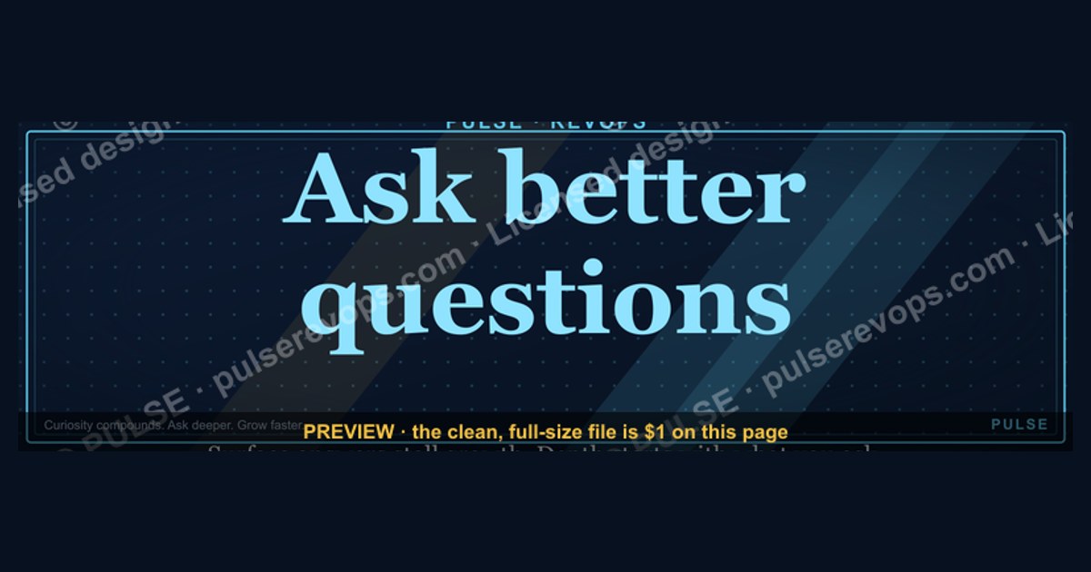
This is a downloadable 1600x500 px LinkedIn banner — a Quote Card — that reads “Ask better questions.” in clean type on a dark background, sized for the top of a profile or a post. It is a quiet reminder graphic: one line, no logos, no clutter, made to be swapped in wherever you want the message to sit.
The outcome you should expect
A Quote Card like this is not a growth hack. It is a positioning asset, and the outcome it produces is slow, cumulative, and easy to measure if you decide in advance what you are measuring. The realistic outcome of putting this banner on a LinkedIn profile or attaching it to a post is threefold: a small lift in profile-to-connection conversion, a modest increase in comment quality on posts where it appears, and a durable shift in how people describe you in replies. None of those happen overnight, and none of them happen at all if the banner is the only thing you change.
Start by naming the behavior you want. If you run a revenue operations team, the behavior is probably “my reps stop pitching on the first call and start diagnosing.” If you are a founder, it is “prospects tell me the real problem instead of the polite one.” If you are a consultant, it is “inbound leads arrive already knowing what I do.” Each of those is a different outcome, and the same 1600x500 banner will serve them differently. The banner does not create the behavior. It signals that you value the behavior, which makes it slightly more likely that the right people self-select toward you.
The honest expectation is this: a Quote Card changes the first impression by a few percentage points, not by a multiple. If your profile currently converts 4% of viewers into connections, a well-placed banner might move that to 4.5% or 5%. If your posts currently average 2 comments, a banner attached to a post might average 3. That is the scale of the effect. It compounds only if you keep the rest of your profile and content aligned with the message, because a banner that says “ask better questions” on a profile whose headline says “I close deals fast” creates dissonance that cancels the signal.

The second outcome to expect is internal. If you download this banner and put it in a team channel, it becomes a shared reference point. Sales managers use it to open a coaching session. Enablement teams use it as a slide divider. That is a legitimate use, and it is often more valuable than the public-facing one, because it gives a name to a behavior the team already knows it needs. The banner is a noun you can point at. “This is the ask-better-questions card” is a sentence a manager can say in a meeting, and that sentence does work that a paragraph of coaching cannot.
The third outcome is the one people underestimate: the banner forces you to decide what “better” means for your context. A generic banner is fine, but the moment you customize the wording — “Ask better discovery questions,” “Ask better questions before you demo,” “Ask better questions in every QBR” — you have written a one-line strategy. That act of narrowing is where the value actually lives. The download is free; the clarity is the product.
What drives that outcome
The mechanism behind a Quote Card is not persuasion. It is recognition. A viewer sees the banner, reads four words, and either recognizes themselves in it or does not. If they recognize themselves — if they are the kind of person who already believes questions matter more than answers — the banner confirms an identity they hold and makes you a member of their tribe. That is why the effect is small but durable: you are not changing minds, you are sorting them.
Three forces drive whether the sorting works. The first is contrast. A dark banner with a single line of type stands out against the pale, busy, logo-heavy banners most profiles carry. Contrast is the entire game on a feed where every element competes for the same half-second of attention. The second is specificity of placement. A banner at the top of a profile is seen by everyone who visits; a banner attached to a post is seen only by the people who stop scrolling. The same asset behaves differently in each position, and you should choose the position based on whether you want breadth or depth. The third is repetition. One impression of a four-word line is noise. Twelve impressions across a quarter, in posts, comments, and profile visits, is a brand. The banner is the anchor; the repetition is the current.
Notice what the diagram does not show: a conversion event. There is no step where the banner alone produces a meeting. The path runs through recognition, then repetition, then association, and only then does it touch pipeline. Practitioners who expect the banner to generate demand directly will be disappointed. Practitioners who treat it as the first link in a longer chain will find it does its job.
There is also a negative driver worth naming. If the banner appears next to content that contradicts it — a profile headline about closing, a post that is a hard pitch, a comment that talks over someone — the contrast works against you. The banner becomes evidence of inconsistency. Viewers notice mismatches faster than they notice matches, so the same asset that builds trust in one context erodes it in another. The driver is not the banner. The driver is alignment between the banner and everything around it.
Finally, the format itself drives behavior. A 1600x500 px banner is a wide, short rectangle. It is designed to be read in one glance, not studied. That constraint forces a single idea. You cannot put a value proposition, a call to action, and a slogan in that space without all three becoming unreadable. The format is a discipline: it makes you choose one line, and the line you choose tells the viewer what you actually care about. That is the real mechanism. The banner is a forcing function for your own clarity.
Benchmarks and realistic ranges
Because this is a design asset and not a campaign, the benchmarks that matter are design benchmarks, not marketing benchmarks. Here are the ranges a practitioner should work inside, stated as ranges rather than single numbers because the right value depends on context.
On dimensions, 1600x500 px is the standard LinkedIn banner ratio of 16:5, which is the same aspect ratio LinkedIn uses for company page banners and for the large image on a personal profile. If you are placing this on a personal profile, the visible area after LinkedIn’s cropping is roughly the center 1584x396 px on desktop, and a narrower slice on mobile. That means any text you add should sit within the central 60% of the width and the central 50% of the height. Text placed near the edges will be cropped on some devices. If you are attaching the banner to a post, the feed renders it at roughly 1200x375 px on desktop and scales down on mobile, so a four-word line at a heavy weight remains legible while a ten-word line does not.
On file size, keep the exported PNG under 2 MB so it uploads cleanly and renders quickly. LinkedIn accepts larger files, but a banner that takes two seconds to load is a banner nobody sees. Export at 1600x500 px, not larger. Uploading a 4000 px image and letting the platform downscale it usually produces softer type than exporting at the target size.
On type size, the rule of thumb for a banner read at arm’s length on a phone is that the cap height of your primary line should be at least 8% of the banner height. On a 500 px tall banner, that is 40 px of cap height, which translates to a font size in the 70-90 px range depending on the typeface. If you shrink below that, the line becomes decoration rather than message. If you go above it, the line starts to feel like a shout, which works for some brands and not others.
On color contrast, aim for a contrast ratio of at least 7:1 between the text and the background for a banner that will be viewed on phones in bright light. A light line on a dark background or a dark line on a light background both work; a mid-tone on a mid-tone does not, no matter how elegant it looks on a large monitor. If you are unsure, convert the banner to grayscale and check whether the line still reads. If it disappears, the contrast is too low.
On placement performance, the honest range is this: a profile banner is seen by a large share of profile visitors but influences a small share of them, while a post image is seen by a small share of your audience but influences a larger share of those who see it. Neither is better in the abstract. If your goal is to be known, use the profile. If your goal is to start conversations, use the post. If you want both, use the profile banner as the anchor and attach the same card to one post per week.
On repetition, the range that produces recognition without fatigue is roughly one appearance per week in a feed context, sustained for a quarter. Fewer than that and the line never accumulates; more than that and it starts to read as a campaign rather than a belief. The banner is not an ad. It should feel like something you happened to have, not something you are running.
On customization time, budget 20 to 40 minutes for a first version and 10 minutes for each variant after that, assuming you have the source file. If you are rebuilding from scratch each time, you will stop after two variants, which defeats the purpose. Keep an editable master — a layered file with the background, the type, and any accent element on separate layers — so that swapping the line or the color is a two-minute job. That master file is the actual asset. The PNG is just one output of it.
Risks, edge cases, and failure modes
The first failure mode is illegibility at mobile scale. A banner that looks crisp on a 27-inch monitor can become a gray smear on a phone, and most feed impressions are on phones. The cause is almost always too much text or too little contrast. The fix is to test the banner at 320 px wide before you publish it. If you cannot read the line at that width, neither can your audience.
The second failure mode is the generic line. “Ask better questions” is a strong line because it is short and true, but it is also widely used, which means it carries less signal than a line that is specific to your work. If you are in a crowded category, consider narrowing the wording: “Ask better questions before you quote,” “Ask better questions in every discovery call,” “Ask better questions, then listen.” The narrower line will reach fewer people and move them more. That trade is usually worth making.
The third failure mode is mismatch. A banner is read in the context of everything around it. If your headline, your about section, and your recent posts all point in a different direction, the banner becomes the odd one out and viewers will trust the majority signal, not the banner. Before you publish, read your profile top to bottom as a stranger would. If the banner is the only place the message appears, either change the banner or change the profile. Do not leave the contradiction.
The fourth failure mode is over-design. The temptation with a Quote Card is to add a logo, a border, a texture, a secondary line, a website, and a small icon. Every added element reduces the weight of the main line. The banner works because it is one idea in a large space. If you find yourself adding a fifth element, you are solving the wrong problem. Cut back to the line and the background, and let the whitespace do the work.
The fifth failure mode is treating the download as the deliverable. The PNG is not the point. The point is the behavior the line names. If you download the banner, post it once, and never change how you run a discovery call, the banner is decoration. The asset only pays off when it is paired with a practice — a question bank your team actually uses, a meeting agenda that starts with a diagnostic question, a QBR template that opens with “what did we learn” instead of “what did we sell.” The banner is the flag. The practice is the territory.

The sixth failure mode is attribution. Because the effect is small and slow, it is easy to credit the wrong thing. If your inbound quality improves after you post the banner, the banner may be the cause, or the three posts you wrote that month may be the cause, or the conference you attended may be the cause. Do not over-claim. Treat the banner as one input among several, and judge it by whether it is consistent with the rest of your presence, not by whether it single-handedly moved a number.
There is one more edge case worth naming: the banner as a substitute for asking. It is possible to spend an afternoon designing a card about asking better questions and never ask one. The asset is a reminder, and reminders only work on people who are already trying. If you are using the banner to signal a value you do not practice, the people closest to you will notice first. The safest way to avoid that failure is to pair the download with one concrete change — one question you will ask in every call this month — so that the banner and the behavior arrive together.
A practical rollout plan
The rollout is a four-week sequence, and the point of the sequence is to move from asset to habit. Week one is production. Week two is placement. Week three is repetition. Week four is review. Each week has one job, and the job is small enough to finish.

Week one: build the master file. Start with the 1600x500 px canvas. Choose a background — a solid dark tone is the safest choice because it maximizes contrast and reads as deliberate rather than decorative. Set the line in a clean sans-serif or a restrained serif, centered, at a size that fills roughly 60% of the width. Export one PNG at the target size and one at 320 px wide for the mobile test. If the 320 px version is unreadable, adjust and re-export. Do not move on until the small version works.
Week two: place it. Put the banner on your profile first, because that is the position with the longest dwell time. Then attach it to one post — not a post about the banner, but a post that demonstrates the behavior. If the line is about asking better questions, the post should be a story about a question that changed a deal, or a short list of questions you use, or a note about a question you wish you had asked. The banner and the post should reinforce each other. A post that says “here is my new banner” is a missed opportunity.
Week three: repeat. Attach the same card to one post per week for four weeks. Vary the content of the posts, not the card. The repetition is what builds the association. If you change the card every week, you are starting over every week. If you keep the card and change the story, the card becomes the constant and the stories become the evidence.

Week four: review. Look at three things. First, did anyone mention the line in a comment or a DM? That is the strongest signal that the card is doing its job. Second, did the quality of your inbound change — not the volume, the quality? Third, did you actually ask better questions in your own meetings? If the answer to the third question is no, the first two do not matter. The card is a mirror before it is a megaphone.
The loop matters more than the plan. If the review says the card is not landing, the fix is almost always one of three things: the wording is too broad, the contrast is too low, or the surrounding profile contradicts it. Change one variable at a time, give it two weeks, and look again. Do not redesign the whole thing after three days. Slow assets need slow feedback.
One more note on the team version. If you are rolling this out to a revenue team, do not distribute the PNG and stop. Distribute the master file, the question bank that goes with it, and a one-page guide to where it belongs — profile banner, internal deck divider, QBR opening slide, onboarding packet. The more places the card appears inside the team, the more it becomes a shared shorthand. The public banner is one output. The internal repetition is where the culture change actually happens.
Related questions
What size should a LinkedIn banner be?
LinkedIn personal profile banners render at a 16:5 ratio, and 1600x500 px is the safe export size. Keep the important text inside the central 60% of the width and 50% of the height so mobile cropping does not cut it off.
Can I use this Quote Card on other platforms?
Yes. The 16:5 ratio suits LinkedIn best, but the same artwork can be cropped to 16:9 for slide decks, 1:1 for internal posts, or 4:5 for other social feeds. Keep the master file layered so each crop is quick.
Does a banner actually change how people respond?
It changes first impressions slightly, not dramatically. Expect a few percentage points of lift in profile engagement and a modest improvement in comment quality. The effect compounds only when the banner matches the rest of your profile and content.
How do I customize the wording?
Open the master file, replace the line, and re-export. Keep the replacement to four to seven words so it stays legible at mobile scale. Narrower lines — “Ask better questions before you quote” — reach fewer people but move them more.
What if I do not have design software?
Use any free editor that supports layers and PNG export. Set the canvas to 1600x500 px, add a solid background, place one line of centered type, and export. The whole job takes under 30 minutes.
FAQ
What exactly is this download? It is a 1600x500 px PNG banner — a Quote Card — carrying the line “Ask better questions.” It is sized for a LinkedIn profile banner or a post image and is free to download from this page.
Is the banner editable? The PNG is a finished image. To change the wording or colors, use the layered master file or rebuild the canvas at 1600x500 px with your own type. Keep any replacement line short so it survives mobile cropping.
Where should I place it first? Start with your profile banner, because that position has the longest dwell time and is seen by everyone who visits. Once it is live, attach the same card to one post per week for a month so the line accumulates recognition.
Will this help my pipeline? Not directly. The banner is a positioning and reminder asset. It supports pipeline by making the right people recognize you, but the questions you actually ask in calls are what move deals. Pair the download with one concrete behavior change.
Can my whole team use it? Yes, and that is often the better use. Distribute the card alongside a question bank and a short guide to where it belongs — profile banners, deck dividers, QBR openers. Shared repetition inside a team turns a line into shorthand.
What if the line feels too generic for my work? Narrow it. “Ask better questions” is broad by design. A version like “Ask better questions before you quote” or “Ask better questions in every discovery call” carries more signal for a specific audience and is usually worth the trade.
Sources
- LinkedIn Help — Profile banner and image size guidance: https://www.linkedin.com/help/linkedin
- Nielsen Norman Group — Legibility and reading on small screens: https://www.nngroup.com
- W3C Web Content Accessibility Guidelines — Contrast minimums: https://www.w3.org/WAI/WCAG21/quickref/
- Canva Design School — Banner and social image sizing basics: https://www.canva.com/designschool/
- HubSpot Blog — Sales discovery question frameworks: https://blog.hubspot.com/sales
- Harvard Business Review — The power of questions in leadership: https://hbr.org
- Gartner — B2B buying behavior research: https://www.gartner.com/en/sales
- Adobe — Color contrast and type legibility fundamentals: https://www.adobe.com/creativecloud/design.html
Related on PULSE
- Discovery question banks for revenue teams
- How to run a QBR that opens with learning
- Profile and banner assets for RevOps leaders
- Building a shared sales vocabulary
- Turning a slogan into a team habit
- Free RevOps templates and downloads
This page will be disappearing soon. Save it to your device for $1 — or read it free while it is here.
@Kory-White- · if Venmo asks, the last 4 of my number are 2012
This page is gone.
This one is off the shelf now. $1 keeps it on your phone for good — the whole page, pictures and diagrams included.
 graphic“The best discovery feels like free therapy.” — Quote Card
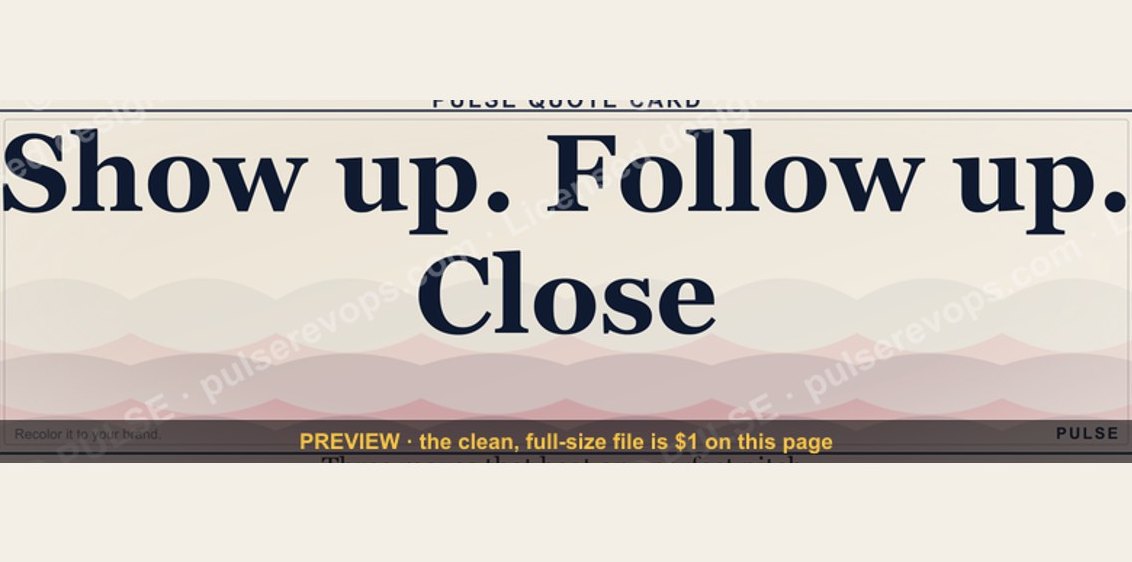 graphic“Show up. Follow up. Close.” — Quote Card
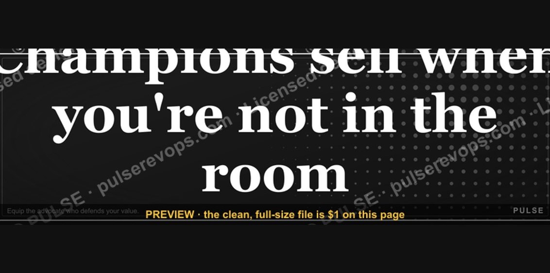 graphic“Champions sell when you're not in the room.” — Quote Card
 graphic“Every no is closer to a yes.” — Quote Card
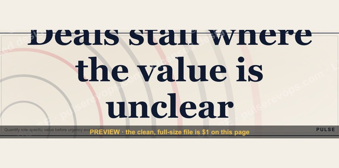 graphic“Deals stall where the value is unclear.” — Quote Card
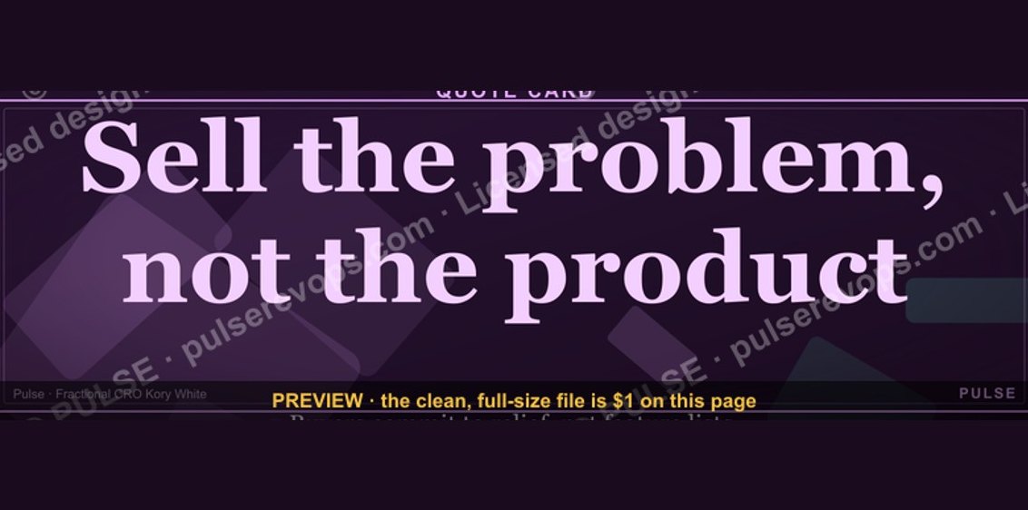 graphic“Sell the problem, not the product.” — Quote Card
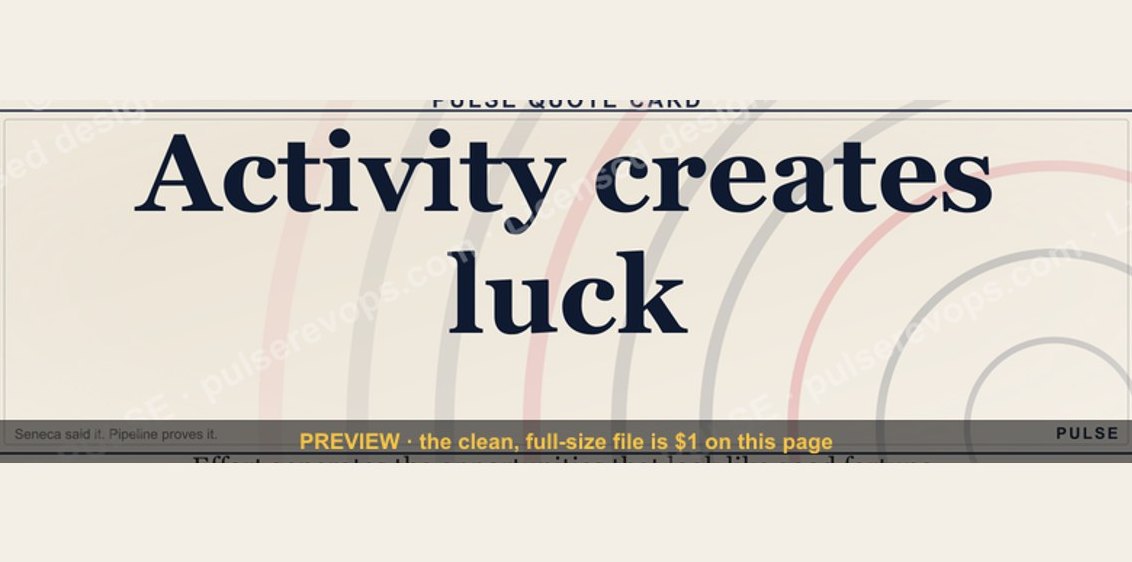 graphic“Activity creates luck.” — Quote Card
 graphic“Listen more. Pitch less.” — Quote Card
 graphic“Sell the meeting, not the demo.” — Quote Card
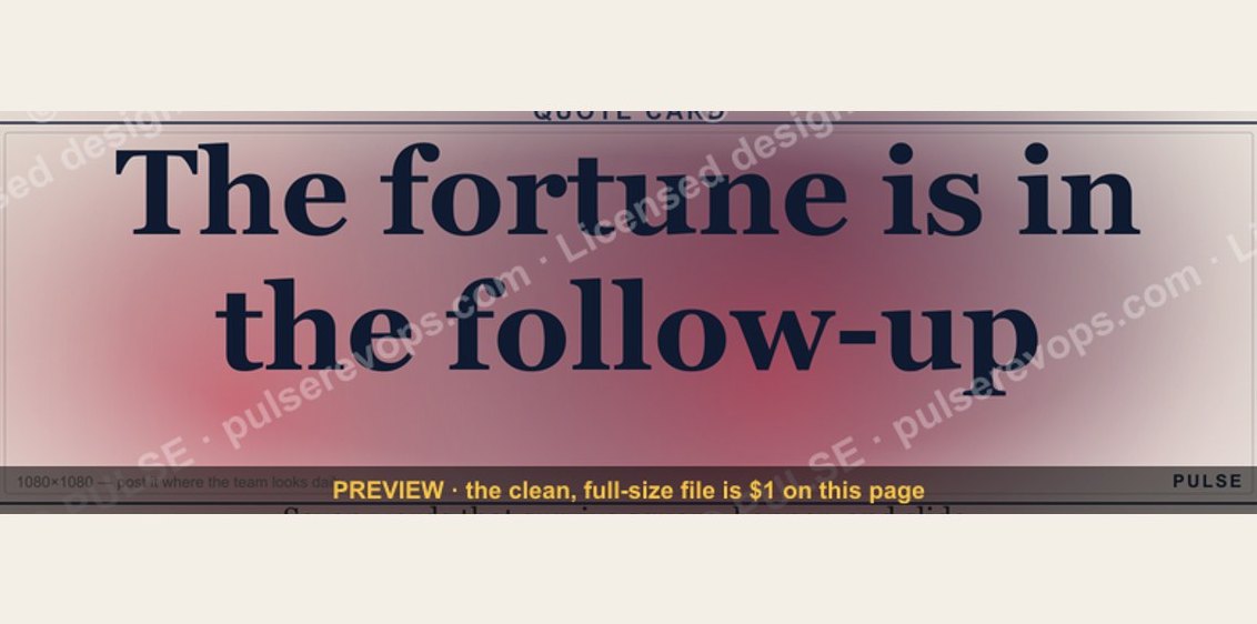 graphic“The fortune is in the follow-up.” — Quote Card