
“TRUST THE PROCESS” — Sales Floor Print
 Curated byKory White · Fractional CRO · Maryland
 PULSEKNOWLEDGE LIBRARY
Quality
Certified
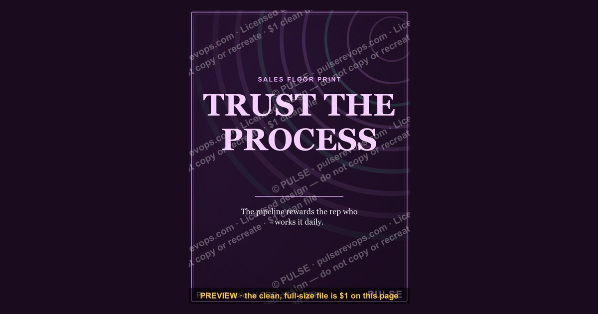
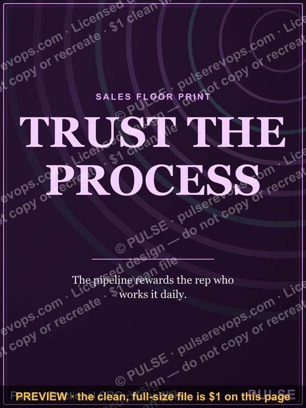
This is a sales-floor print/poster — a 1200x1600 px downloadable PNG titled "TRUST THE PROCESS" — designed to hang where a Sales team walks, stands, or waits. It carries one short line of type plus supporting rules, in plain high-contrast lettering meant to be read from six to ten feet away. It is not a dashboard or a report.
The outcome you should expect
Hanging a poster is not decoration, and it is not culture in a frame. It is a physical behavior nudge, and it should be held to the same standard as any other intervention you run on the floor: a specific, observable change in what reps do in the first and last ten minutes of a shift.
What a well-built version of this print actually buys you is narrow and measurable. First, it removes a decision. A rep who is behind on outreach at 4:40 pm does not have to invent a plan; the print names the next action, in order, so the choice is already made. Second, it creates a shared vocabulary. When a manager says "where are you in the PROCESS?" everyone in earshot knows which three steps are meant, and the conversation skips the preamble. Third, it gives coaching a fixed reference point that is not a person's opinion — the print says it, not the manager, which lowers the temperature of a correction.
What it does not buy you is quota. A poster cannot fix a bad territory, a broken comp plan, an unclear ICP, or a CRM that takes eleven clicks to log a call. If any of those are the actual constraint, the print becomes wallpaper within two weeks and actively damages credibility, because the team learns that leadership's response to a structural problem is a piece of paper. Before you print, ask the blunt question: is the gap here a knowledge gap, a motivation gap, or a systems gap? This print only touches the first two, and only weakly on the second.

The realistic expectation is a small, fast, decaying effect. Expect a visible lift in the specific behavior the print names for roughly two to four weeks, then a fade to baseline unless something reinforces it — a standup that references it, a scoreboard next to it, a manager who quotes it, or a rotation that swaps the print quarterly. Treat it as one input in a stack, not the stack itself. Teams that get durable value from floor prints almost always pair them with a daily huddle cadence and a visible number, so the print is the "how" and the number is the "why."
There is also a second-order outcome worth naming: the print sets the default for new hires. A rep in week one has no instincts yet, and a wall that says the first three things to do in a cold sequence is worth more to that person than to a ten-year veteran. If you are hiring at all, that alone can justify the wall space.
What drives that outcome
Four things determine whether this print changes behavior or becomes invisible. Placement, wording density, reinforcement cadence, and whether the named process is actually the process leadership runs.
Placement is the biggest lever and the one most often botched. The print has to sit in a sightline that exists during dead time — above the coffee station, at the end of the row of desks facing the aisle, next to the printer, or on the wall a rep stares at while a dialer connects. A print hung behind a monitor or on a door that is usually open gets read approximately never. The practical test: stand where reps actually idle and ask whether the title is legible without turning your head. If you have to hunt for it, move it.
Wording density is the second lever. A print that carries a paragraph gets skimmed once and never again. A print that carries a title, three to five steps, and one closing line gets read on the hundredth pass. The rule of thumb for floor signage is that the total word count should be readable in under eight seconds from ten feet. That is roughly a title plus thirty to forty words of body, no more.
Reinforcement cadence is the third. A print that is never mentioned in a huddle is furniture. The cheapest reinforcement is a manager pointing at it once a week during a specific moment — "you're on step two, what's step three?" — which costs ten seconds and reframes the print as a live tool. The second cheapest is pairing it with a physical or digital number nearby, so the process and the result are visible in the same glance.
The fourth driver is honesty. If the print names a five-step process and leadership actually runs a different one, reps notice within a week and the print becomes evidence that the wall and the work are unrelated. The print must describe the process as it is actually executed, including the parts people dislike.
The upper path is the one worth designing for, and every node on it is a choice you control before you send anything to print. The lower path is the default if you skip the work.

Benchmarks and realistic ranges
Because this is a physical artifact rather than a campaign, the useful benchmarks are about production and legibility, not conversion rates. Here are ranges that hold up in practice.
Print size. A 1200x1600 px file at 300 DPI yields a 4x5.33 inch print, which is a desk or cubicle size. Scale the same aspect ratio up for wall use: 18x24 inches, 24x32 inches, or 30x40 inches all preserve the 3:4 ratio cleanly. For a floor where people read from eight to twelve feet, 24x32 inches is the practical minimum; below that, the body text stops resolving at distance. If you want it visible across a whole room, 36x48 inches is the ceiling before it starts to feel like a billboard and loses the "working document" feel.
Viewing distance and type size. A rough and reliable rule is one inch of capital letter height per ten feet of viewing distance for comfortable reading, and about half that for a headline you only need to recognize. So for a print read at ten feet, body text should have capital letters around half an inch tall, which lands near 36-48 pt type in the final print. Headline type at ten feet can be 72-120 pt. If you are printing at 18x24 and hanging it at eye level in a huddle area where people stand three feet away, you can drop body type to 18-24 pt and still be fine.

Contrast and color. The highest-legibility combination for signage at distance remains dark type on a light ground or the inverse, with a contrast ratio well above 7:1. A black or near-black ground with a warm metallic or off-white headline reads as premium and holds up under fluorescent floor lighting, which is the lighting most sales floors actually have. Avoid mid-tone on mid-tone, and avoid thin hairline serifs for anything read past six feet — the strokes disappear. If you use a metallic or gold-look headline, keep the body text a flat high-contrast color so the whole print does not shimmer.
Word count. Title plus 30-40 words of body is the sweet spot. Prints that carry 80+ words get read once. Prints that carry fewer than 15 words read as slogans and get tuned out as motivational noise. The middle band is where a print functions as a reference.

Refresh cadence. Expect the specific behavior to hold for two to four weeks without reinforcement. Rotating the print quarterly keeps it from becoming part of the wall. If you have multiple prints, cap the total at three or four in the same sightline; past that, each one competes and none of them win.
Cost. A single 24x32 inch poster printed on matte or satin stock at a retail print shop typically runs in the range of a modest lunch for two, and a laminated version for a high-traffic wall costs a little more. This is not a budget line that needs approval — which is exactly why the discipline has to come from the design and the reinforcement, not from the spend.
Risks, edge cases, and failure modes
The failure modes here are predictable, and most of them are self-inflicted.

The biggest one is the print that names a process nobody runs. This happens when someone in leadership writes the steps they wish the team followed, prints it, and hangs it. Reps compare the wall to their actual day, find no match, and quietly file the print under "things management believes." From that point on, every subsequent print on that wall is discounted before it is read. The fix is to build the wording from what your best reps actually do, not from the ideal-state playbook. Interview two or three top performers, write down their real sequence, and print that.
The second failure mode is the wall of posters. When a floor has nine prints, every one of them loses. Attention is the scarce resource, and a wall of competing messages reads as noise. Cap it. If you have more than four things you want to say, say them in rotation, not simultaneously.
The third is the print that contradicts the comp plan. If the print says "always book the next meeting before you hang up" and the comp plan pays only on closed revenue with no meeting credit, reps will follow the money, not the wall. Any print that asks for behavior the incentive structure punishes will lose. Before you print, check that the named behavior is at least neutral, ideally rewarded, in the comp plan.
The fourth is a subtler one: the print that becomes a weapon. A manager who points at the print every time a rep misses creates resentment, and the print gets associated with being scolded. The print should be referenced most often when things are going well — "you ran the process, that's why that landed" — so it reads as a tool, not a scoreboard of blame.
Edge cases worth planning for. Remote and hybrid floors: a physical print does nothing for a rep who is home three days a week, so the same artifact needs a digital twin — a desktop wallpaper version, a pinned image in the team channel, or a slide in the huddle deck. Open-plan floors with hot-desking: prints on desks get moved; prints on shared walls survive. Multi-site floors: if you print for three offices, print the same file three times rather than letting each site make its own, or you lose the shared vocabulary that is half the value. Non-English-first teams: a translated version should be a full re-layout, not a paste-over, because the type will not fit the same box.
One more: the print that is too clever. Wordplay, inside jokes, and obscure metaphors test well with the person who wrote them and poorly with a new hire in week one. Plain language beats wit on a floor print every time.
A practical rollout plan
The rollout is a two-week sequence, and the order matters more than the speed.
Week one is discovery and drafting. Pull your top three performers aside for fifteen minutes each and ask them to walk through exactly what they do from the moment a lead lands to the moment it is disqualified or advanced. Write down the sequence in their words. Look for the two or three steps that all three of them do and that weaker reps skip — that intersection is your print. Draft the title and body to fit the word budget, then read it aloud from ten feet away in the actual room. If you cannot read it, the type is too small.
Week two is production and installation. Export at 1200x1600 px minimum, print at the largest size your wall supports, and laminate if the wall is high-traffic. Install it in a sightline that exists during dead time, at eye level or slightly above, and remove or relocate at least one older print so the total count stays under four. Then brief the managers: one sentence on what the print says, one on when to reference it, one on what not to do with it.
Then run it. Reference the print in huddles at a fixed moment — the start of the shift, or the last ten minutes — so it becomes part of the rhythm rather than a random callout. Track the one behavior it names for four weeks, and put that number somewhere visible next to the print. At the four-week mark, decide: keep it, revise the wording, or rotate it out. Do not leave it up indefinitely on autopilot.
If you are running this across multiple teams, stagger the rollout so you can compare a team that has the print against one that does not for the first month. That is the cheapest A/B test you will ever run, and it tells you whether the print is doing anything or whether you are just proud of the design.
Related questions
What size should a sales floor poster be?
For reading at eight to twelve feet, 24x32 inches is the practical minimum and 36x48 inches the practical maximum. Desk-level use works at 4x5.33 inches from a 1200x1600 px file at 300 DPI. Match size to the distance people actually stand, not the wall's empty space.
Should the print name specific steps or just a slogan?
Name the steps. A slogan-only print reads as motivation and gets tuned out within days. Three to five concrete steps plus one closing line gives reps something to act on and gives managers something to reference in a huddle. Keep total body copy under forty words.
How often should floor prints be rotated?
Quarterly is a reasonable default. The specific behavior a print drives tends to hold for two to four weeks before fading without reinforcement. Rotating quarterly keeps the wall from becoming invisible, and it caps the number of competing messages on the floor at any one time.
Does a floor print work for remote teams?
Not on its own. A physical print has no reach into a home office, so pair it with a digital twin — a desktop wallpaper, a pinned channel image, or a huddle slide. The wording should be identical across both so the shared vocabulary survives the split.
FAQ
What exactly is this sales-floor print/poster? It is a 1200x1600 px downloadable PNG titled "TRUST THE PROCESS," designed as a sales-floor print/poster. It carries a short headline plus a small set of supporting steps or rules, set in high-contrast type meant to be legible from six to ten feet. It is a physical artifact, not a report, dashboard, or digital asset.
Can I change the wording, colors, or roles on it? Yes, and you probably should. The value comes from the print describing the process your team actually runs, so rewrite the steps from your top performers' real sequence rather than an ideal-state playbook. Recolor to match your brand, but keep the contrast ratio high and avoid thin hairline serifs for anything read past six feet.
Where should I hang it on the sales floor? In a sightline that exists during dead time — above the coffee station, at the end of a desk row facing the aisle, beside the printer, or on the wall a rep stares at while a dialer connects. Stand where reps actually idle and confirm the title is legible without turning your head. Behind a monitor or on a usually-open door, it will not get read.
What paper and finish should I use? Matte or satin stock is the safe default because it resists glare under fluorescent floor lighting. Laminate anything on a high-traffic wall, since posters get leaned on, taped over, and brushed past. Gloss looks sharper in a photo but throws reflections that hurt legibility at distance.
How do I know if the print is working? Pick the one behavior it names, track it for four weeks, and put that number somewhere visible near the print. Expect a visible lift for two to four weeks, then a fade to baseline without reinforcement. If the behavior never moves, the print is describing a process the team does not actually run, and the wording needs to change.
How many prints should be on the floor at once? Cap it at three or four in the same sightline. Past that, each print competes with the others and none of them win. If you have more than four things to communicate, rotate them on a quarterly cadence rather than hanging them all simultaneously.
Sources
- Salesforce — Sales Process and Pipeline Management
- HubSpot — Sales Process: The 7-Step Framework
- Harvard Business Review — The Right Way to Use Sales Incentives
- Nielsen Norman Group — Legibility, Readability, and Comprehension
- W3C — Web Content Accessibility Guidelines, Contrast Minimum
- American National Standards Institute — ANSI Z535 Safety Signage Standards
- Society for Human Resource Management — Employee Recognition and Behavior Change
- Sales Management Association — Sales Coaching and Reinforcement Research
Related on PULSE
- Sales floor huddle cadence and how to run a ten-minute standup that sticks
- Building a sales process your top performers actually follow
- Comp plan design: when incentives fight your playbook
- Onboarding a new sales rep: the first thirty days
- Digital signage and desk assets for hybrid sales teams
- How to A/B test a sales intervention without a data team
This page will be disappearing soon. Save it to your device for $1 — or read it free while it is here.
@Kory-White- · if Venmo asks, the last 4 of my number are 2012
This page is gone.
This one is off the shelf now. $1 keeps it on your phone for good — the whole page, pictures and diagrams included.
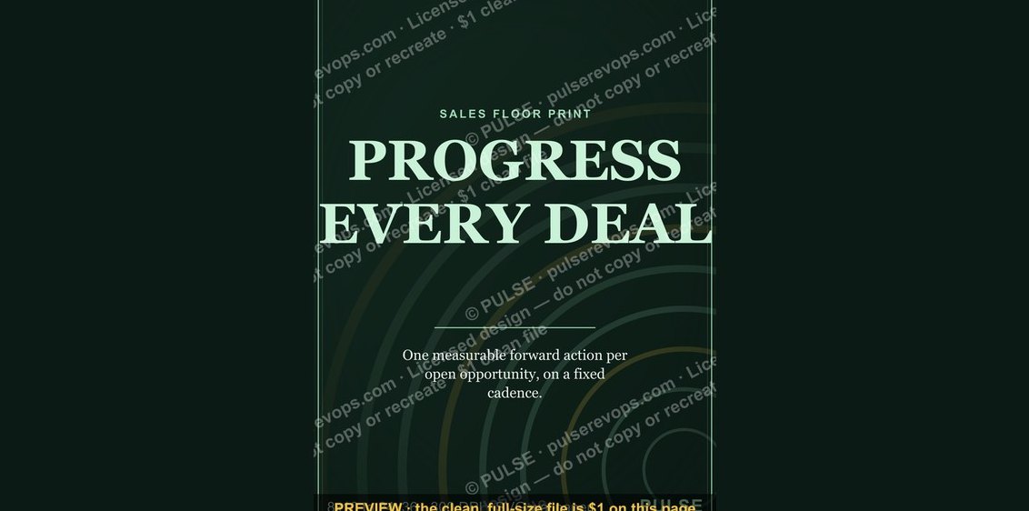 graphic“PROGRESS EVERY DEAL” — Sales Floor Print
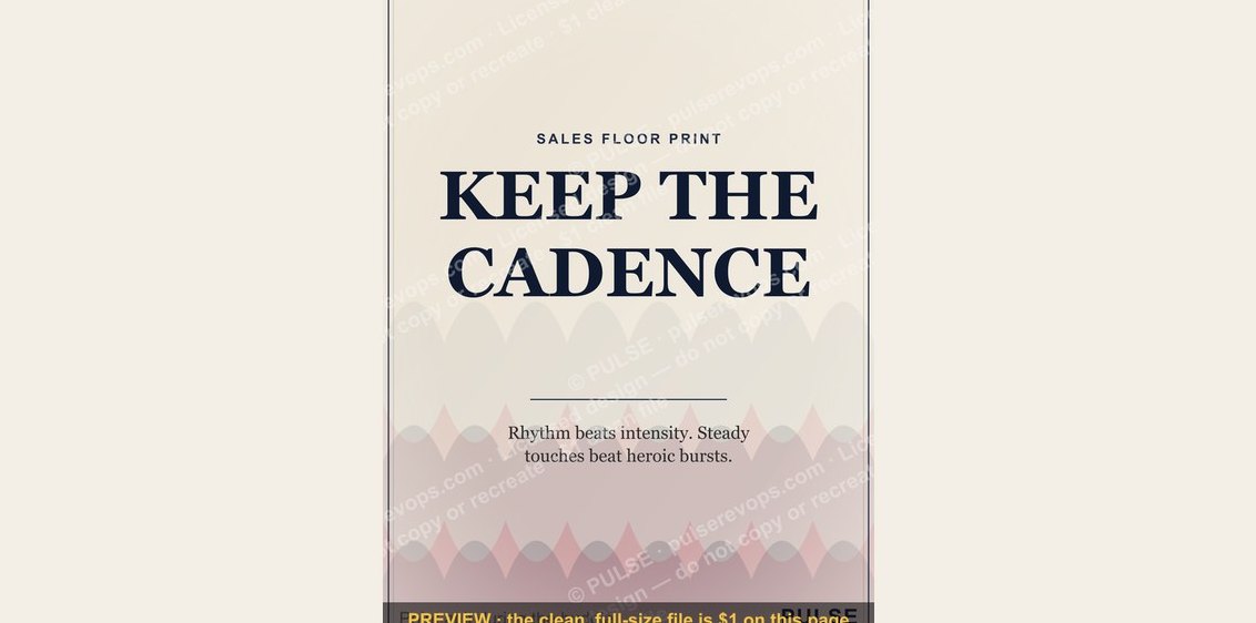 graphic“KEEP THE CADENCE” — Sales Floor Print
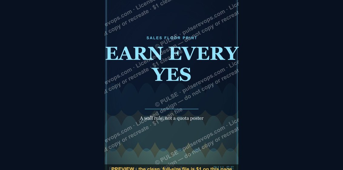 graphic“EARN EVERY YES” — Sales Floor Print
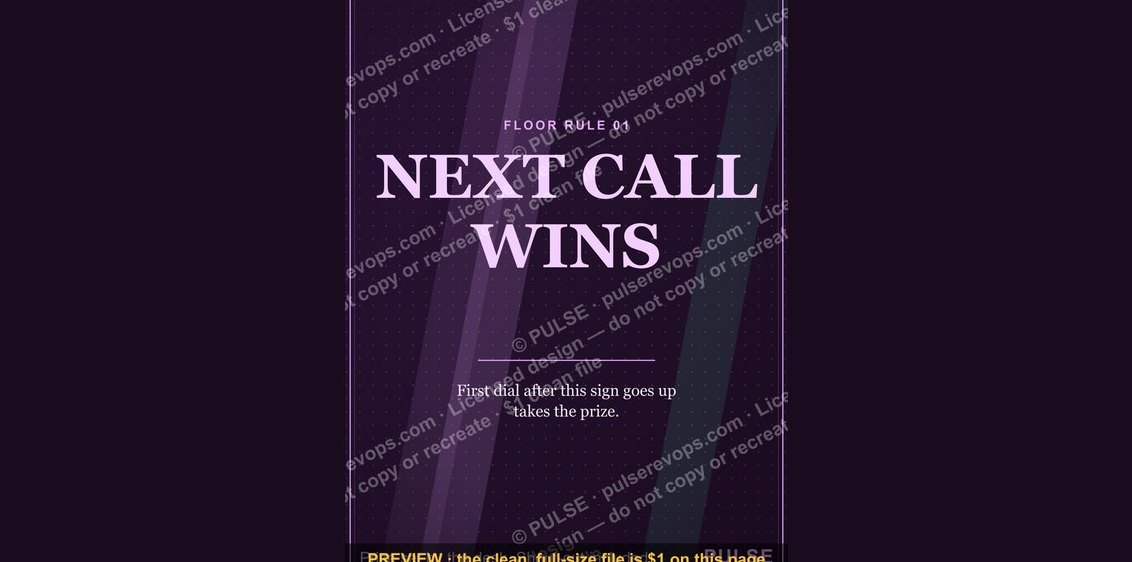 graphic“NEXT CALL WINS” — Sales Floor Print
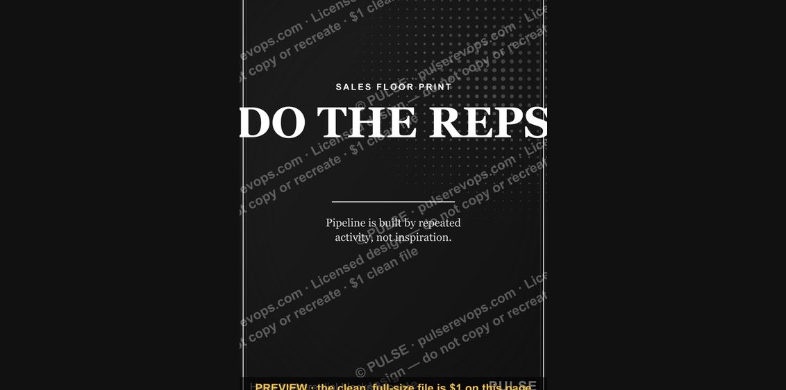 graphic“DO THE REPS” — Sales Floor Print
 graphic“EARN THE RIGHT” — Sales Floor Print
 graphic“STAY IN THE DEAL” — Sales Floor Print
 graphic“Always Be Closing” — Sales Floor Poster
 graphic“OWN THE NUMBER” — Sales Floor Print
 graphic“MAKE THE CALLS” — Sales Floor Print