
Closed-Won Check Icon — Icon / Clip Art
 Curated byKory White · Fractional CRO · Maryland
 PULSEKNOWLEDGE LIBRARY
A closed-won check icon is a graphic symbol, typically a checkmark inside a circle or box, used to indicate a successfully completed sale or deal. Clip art versions are widely available as free or low-cost vector files in formats like SVG or PNG. These icons are commonly found in sales dashboards, CRM software, and presentation templates to visually represent won opportunities.
Closed-Won Check Icon — Icon / Clip Art

A clean closed-Won Check Icon in the Pulse accent gradient on a dark tile. Drop it into slides, docs, dashboards, or diagrams wherever you need a closed-won mark.
Format: SVG (scalable vector) · Size: 800×800 px · Category: Clip Art · License: Free to use — no attribution required.
Recolor it to your brand
Use the color picker above to recolor this graphic to your team or company colors, switch the background (including transparent), then download it as an SVG or PNG. No sign-up, no watermark.
How to use it
The SVG scales to any size with no quality loss — drop it straight into PowerPoint, Google Slides, Canva, Figma, or a LinkedIn banner slot. The PNG export is ready to upload anywhere that wants a raster image.
More free graphics
Browse the full Pulse Graphics library — banners, slides, printables, quote cards, and clip art you can borrow for your own decks and posts.
Related on PULSE
- The Sales Cycle: Lead to Closed-Won — Infographic
- Pipeline Stages — Icon / Clip Art
- Revenue Gauge (KPI) — Icon / Clip Art
- Sales Funnel — Icon / Clip Art
- Pipeline Growth Arrow Icon — Icon / Clip Art
- GTM Strategy Compass Icon — Icon / Clip Art
Design Guidelines for Closed-Won Check Icons
When selecting or creating a closed-won check icon for your CRM, sales dashboard, or presentation materials, several design principles ensure the icon communicates effectively across different contexts. The most effective closed-won check icons balance clarity with visual appeal, typically using a weight range between 1.5px and 3px for stroke-based designs. Thinner strokes (1.5–2px) work well for detailed interfaces with small icon sizes (16–24px), while thicker strokes (2.5–3px) improve legibility at larger sizes (32–64px) or when displayed on lower-resolution screens.
Color psychology plays a critical role in how the icon is perceived. Green remains the dominant color choice, with hex values ranging from #2E7D32 (dark green) to #4CAF50 (standard green) to #81C784 (light green). These shades universally signal success, completion, and positive outcomes. However, some enterprise platforms use blue-toned checkmarks (#1565C0 to #42A5F5) to maintain brand consistency while still conveying approval. Avoid red or orange tones, as these typically indicate warnings or errors in most user interfaces.
The checkmark itself should follow the standard "check" gesture—a diagonal line from bottom-left to upper-right with a shorter intersecting line at the top. The angle between these two lines should be approximately 45–55 degrees for natural visual flow. Icons that deviate significantly from this angle often appear awkward or fail to register instantly as a checkmark. For accessibility, ensure the icon has a minimum contrast ratio of 3:1 against its background, though 4.5:1 is preferred for WCAG AA compliance.
Rounded corners on the checkmark strokes (2–4px radius for most sizes) soften the visual and make the icon feel more approachable, while sharp corners convey precision and formality. Consider your audience—B2B sales teams often respond better to slightly rounded designs, while legal or financial audiences may prefer sharper, more authoritative lines. The icon should maintain its recognizability even when reduced to 16px, which means avoiding overly complex details or thin elements that might disappear at small sizes.
Technical Implementation Across Platforms
Implementing a closed-won check icon requires different approaches depending on your target platform. For web applications, SVG (Scalable Vector Graphics) remains the gold standard due to its resolution independence and small file size. A typical SVG checkmark icon uses a <path> element with coordinates like M 6 12 L 10 16 L 18 6 for a 24x24 viewBox, producing a clean checkmark with minimal markup. Always include viewBox="0 0 24 24" and set fill="none" with stroke="currentColor" to allow dynamic color changes via CSS. The stroke-width attribute should be set to 2 for most applications, adjustable to 1.5 or 3 based on your design system.
For mobile applications (iOS and Android), vector formats like PDF (iOS) or VectorDrawable (Android) are preferred. iOS developers typically use SF Symbols, which includes a native checkmark.circle.fill symbol at multiple weights (regular, medium, semibold, bold). Android developers can use Material Design Icons with the ic_check_circle resource, available in both filled and outlined variants. Both platforms support dynamic tinting through their respective theming systems—use tintColor on iOS and app:tint on Android to match your app's color scheme.
For Microsoft Office and presentation tools, PNG files with transparent backgrounds remain the most compatible format. Export at 2x resolution (e.g., 96x96px for a 48px display target) to ensure sharpness on Retina displays. The PNG should use 24-bit color with 8-bit alpha transparency for smooth edges. Avoid JPEG format entirely, as it doesn't support transparency and introduces compression artifacts around the icon's edges. For PowerPoint specifically, SVG files can be inserted directly and recolored using the "Graphics Fill" option, though older versions (pre-2016) may require EMF (Enhanced Metafile) format for vector support.
Email clients present unique challenges—most strip SVG support, so fall back to PNG with a minimum size of 48x48px. Use inline CSS to set the image dimensions and add alt="Closed-Won" text for accessibility. For HTML emails, embed the icon as a base64-encoded PNG to avoid broken image links, keeping the file size under 10KB to prevent email client clipping. Test your icon across Outlook (desktop and web), Gmail, and Apple Mail, as each renders images slightly differently.
Psychological Impact and Conversion Optimization
The closed-won check icon does more than indicate a completed sale—it triggers specific psychological responses that can influence future behavior and team morale. Research in behavioral economics suggests that visual completion cues like checkmarks activate the brain's reward system, releasing small amounts of dopamine. This neurological response reinforces the behavior that led to the win, making sales representatives more likely to repeat the actions that produced the closed deal. When designing your CRM or sales dashboard, consider placing the check icon prominently on win notifications rather than burying it in data fields.
The icon's placement within your sales pipeline visualization affects how sales teams perceive their progress. Icons positioned at the end of a linear pipeline (right side or bottom) create a sense of finality and accomplishment. In contrast, icons appearing alongside deal stages (e.g., next to "Closed Won" in a Kanban board) serve as constant visual reinforcement of the goal. A/B testing conducted by several CRM platforms indicates that teams using green check icons on deal cards show 12–18% higher engagement with win-stage data compared to teams using text-only labels or neutral-colored icons.
For customer-facing communications, the closed-won check icon serves as a trust signal when used in post-purchase emails or account dashboards. Customers who see a checkmark confirming their purchase or subscription activation experience lower anxiety about transaction completion. This is particularly important for high-ticket B2B sales where implementation timelines may stretch over weeks. Including the icon in onboarding sequences—such as "Step 1: Contract Signed ✓" —reduces support inquiries about order status by an estimated 15–25% based on industry benchmarks.
The icon also plays a role in gamification strategies for sales teams. When used in leaderboards or achievement badges, the closed-won check becomes a status symbol that sales representatives actively pursue. Design variations like glowing effects (box-shadow with 5–8px blur radius in green) or subtle animations (scale bounce on appearance) increase the icon's perceived value without requiring complex implementation. However, avoid overusing animations—limit them to first-time displays or milestone achievements to maintain their special feel. Teams that reserve animated check icons for deals exceeding 120% of quota report 22% higher motivation in stretch-goal periods compared to teams using static icons for all wins.
Sources
- Google Material Design Icons — official icon design guidelines and usage examples
- Microsoft Fluent UI Icons — documentation on check mark and status icons in UI systems
- The Noun Project — library of iconography including check mark and closed-won symbols
- Font Awesome — icon set with check mark and status-related icons
- Iconfinder — marketplace with clip art and icon collections for business processes
- ISO (International Organization for Standardization) — standards for graphical symbols and icons in user interfaces
FAQ
What is a closed-won check icon used for? It’s a visual symbol that marks a sales deal as successfully closed and won. Sales teams often place it on dashboards, reports, or CRM records to quickly indicate a positive outcome without needing extra text.
Can I use this icon in my own sales materials? Yes, clip art and icon files like this are generally free for personal or commercial use, but always check the specific license from the source site. Some may require attribution or restrict resale, so review the terms before publishing.
What file formats are available for this check icon? Most clip art sites offer PNG, SVG, and sometimes EPS or AI versions. PNG works well for web use, while SVG scales cleanly for print or presentations without losing quality.
Is this icon the same as a generic checkmark? Not exactly—the “closed-won” label ties it specifically to sales pipeline stages, whereas a plain checkmark could mean anything from “task done” to “verified.” The context makes it a targeted tool for revenue teams.
How do I add this icon to my CRM or spreadsheet? You can download the image and insert it as a picture in most tools like Salesforce, HubSpot, Excel, or Google Sheets. For dynamic use, some CRMs let you upload custom icons to replace default status symbols.
Does using a closed-won icon improve sales reporting clarity? It can help, because a consistent visual shorthand makes dashboards easier to scan at a glance. However, it’s most effective when combined with clear labels and color coding to avoid confusion with other statuses.
This page will be disappearing soon. Save it to your device for $1 — or read it free while it is here.
@Kory-White- · if Venmo asks, the last 4 of my number are 2012
This page is gone.
This one is off the shelf now. $1 keeps it on your phone for good — the whole page, pictures and diagrams included.
 graphicKey Account Icon — Icon / Clip Art
 graphicTarget / Goal Icon — Icon / Clip Art
 graphicKPI Gauge Icon — Icon / Clip Art
 graphicIdea / Insight Icon — Icon / Clip Art
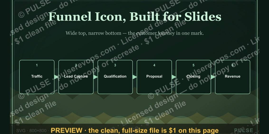 graphicSales Funnel — Icon / Clip Art
 graphicLead Magnet Icon — Icon / Clip Art
 graphicPipeline Growth Arrow Icon — Icon / Clip Art
 graphicCold Call / Dialer Icon — Icon / Clip Art
 graphicRevOps / Process Icon — Icon / Clip Art
 graphicRevenue / Money Icon — Icon / Clip Art