


Revenue / Money Icon — Icon / Clip Art
Quality
Certified
A revenue or money icon is a compact vector symbol — a dollar sign, coin stack, banknote, or upward arrow paired with currency — used to mark financial data in dashboards, decks, and reports. Free clip art covers basic needs; premium sets typically run a few dollars per icon or a monthly subscription for unlimited downloads.
What a revenue mark actually does in a document
An icon is not decoration. In a financial interface or a board deck, a money mark does three measurable jobs: it lets a reader locate the revenue row without reading the label, it groups related metrics visually so MRR, ARR, and expansion revenue read as one family, and it establishes hierarchy so the number that matters sits at the top of the scan path.
The distinction between an "icon" and "clip art" matters more than most teams assume. An icon is a functional UI element — it lives at 16px to 32px, carries a single meaning, and belongs to a consistent set with shared stroke weight, corner radius, and optical sizing. Clip art is illustrative — it lives at 200px and up, can carry detail and personality, and is meant to fill space in a slide or a blog header rather than label a control. Using a clip-art illustration as a table-header icon produces a muddy blob; using a 24px line icon as a slide hero produces a thin, apologetic mark floating in whitespace. Pick by size and by job, not by which file you already have open.
Concretely, revenue symbols cluster into a handful of recognizable forms. The currency glyph ($, €, £, ¥) is the most literal and the least portable — a dollar sign reads as "money" in North America but signals "US dollars specifically" to a European or Asian audience. The coin stack is the most universal money signifier and survives scaling better than a banknote, because three overlapping circles stay legible at 16px while the engraved detail of a bill does not. The upward arrow with a coin or a bar-chart column is the standard mark for revenue *growth* rather than revenue *amount* — a meaningful semantic difference that teams routinely blur. The wallet, piggy bank, and safe read as savings or personal finance, not company revenue; using a piggy bank next to ARR on an investor slide reads as consumer-grade and undercuts the number.
There is also a format dimension. SVG is the correct default for anything on screen: it is a text file, it scales without loss, it can be recolored with a single fill attribute or CSS variable, and a simple icon typically weighs 1–4 KB — smaller than the equivalent PNG at any usable resolution. PNG matters when the destination cannot parse vectors: email clients, some legacy CMS uploaders, and social platforms that flatten everything anyway. EPS and AI files matter for print workflows and for handing an icon to a designer who needs to modify paths. Icon fonts — the older approach of shipping glyphs in a typeface — are largely obsolete for new work because they break with content-blocking, ignore multi-color, and complicate accessibility.
The step-by-step process for choosing and shipping one
Treat icon selection as a short, repeatable workflow rather than a search-and-drag. The sequence below takes about fifteen minutes the first time and under two minutes once your team has a house set.
Step 1 — Define the exact meaning. Write the label the icon sits next to. "Revenue" (an amount), "Revenue growth" (a rate), "Cost" (an outflow), and "Profit" (a difference) each want a different mark. If you cannot write the one-word meaning, the icon will be ambiguous no matter how good the artwork is.
Step 2 — Fix the render size and context. Note the pixel size and the background. A 16px icon in a dense table needs a solid glyph or a heavy line weight; a 48px icon on a dark card can carry a two-tone or gradient treatment. Write this down before you browse, because search results will tempt you toward detailed artwork that dies at small sizes.
Step 3 — Search with the shape, not the concept. Searching "revenue" returns charts, handshakes, and abstract swooshes. Searching "coin stack," "banknote," or "arrow up chart" returns the specific form you already decided on. Shape-first search cuts browsing time dramatically.
Step 4 — Filter by license before you filter by looks. Set the license filter first so you never fall in love with an asset you cannot legally ship. On most libraries this is a single toggle for commercial use or attribution-free.
Step 5 — Download the vector, not the raster. Grab SVG (or EPS/AI for print). If a source only offers PNG, that is a signal to look elsewhere — it usually means the asset was traced or exported from a bitmap and cannot be cleanly recolored.
Step 6 — Normalize it into your set. Open the SVG and check three things: the viewBox is square (typically 0 0 24 24 for UI icons, or 0 0 800 800 for larger clip art), the stroke width matches your other icons (1.5px and 2px are the two common house standards), and the fill is a single value you can override rather than a hardcoded hex baked into every path.
Step 7 — Recolor to brand and export both formats. Replace the fill with your accent color, or set fill="currentColor" so the icon inherits text color automatically — the single highest-leverage trick for dark-mode support. Export a PNG at 2× and 3× for destinations that need raster.
Step 8 — Add the accessible label. An SVG in markup needs role="img" and a <title> element, or aria-hidden="true" if the adjacent text already says "Revenue." An icon with no text and no label is invisible to a screen reader.
Step 9 — Store it in one place. Put the finished file in a shared icon directory or design-system library with a predictable name (icon-revenue.svg, not Group 47 copy 2.svg). The next person who needs a money mark should find yours instead of downloading a fifth variant.
The two steps teams skip most often are 6 and 9. Skipping normalization is why a deck ends up with one icon at 1.5px stroke and another at 3px sitting side by side — the mismatch reads as sloppiness even to viewers who cannot name what is wrong. Skipping the shared library is why the same company ships four different dollar signs across its dashboard, its pricing page, and its investor deck.
Costs, licenses, and what you actually pay

The money icon market splits into four tiers, and the right tier depends far more on where the asset ships than on how it looks.
Free, permissively licensed sets. Open-source icon systems — the widely used UI icon families shipped by Google, the Font Awesome free tier, Bootstrap Icons, Feather, Heroicons, and similar — include basic currency, coin, wallet, and trending-arrow marks. Cost is zero, licenses are typically MIT or Apache 2.0 or CC BY 4.0, and commercial use is generally permitted. The trade-off is ubiquity: these marks appear on thousands of products, so they carry no brand distinctiveness. For internal dashboards, admin tools, and documentation, that is a perfectly good trade.
Free-with-attribution marketplaces. Large clip art and icon marketplaces offer enormous free tiers that require a credit line, usually removable by paying for a subscription. The credit obligation is real and enforceable — it is a license condition, not a courtesy. Attribution is workable on a website footer or an app's About screen; it is awkward inside a client deliverable or a printed report, which is why paid tiers exist.
Paid individual assets and subscriptions. Buying a single premium icon typically lands in the low tens of dollars. Subscriptions to icon and stock-asset marketplaces are the more common purchase — a monthly or annual plan that unlocks unlimited downloads across the library. If your team pulls more than a handful of assets a month, the subscription math wins quickly, and it also removes the attribution overhead across everything you download during the term.
Custom design. Commissioning a designer to draw revenue marks in your house style is the option teams reach for once the icon set becomes part of a design system rather than a one-off need. Freelance marketplaces and independent designers price per icon or per set, with set pricing well below the per-icon rate. The output should be a source file (AI, Figma, or clean SVG), not just exports — insist on that in the brief, because exports without sources mean you pay again for the next variant.
License types, in the terms that matter. CC0 and public domain mean use freely with no attribution and no restriction — rare for polished icon work, common for older or archival imagery. Royalty-free means you pay once and use indefinitely across projects, but it is not the same as unrestricted: most royalty-free licenses forbid redistributing the asset *as an asset*, which is why you cannot put a purchased icon into a template you sell. Attribution licenses (CC BY and similar) are free but require a visible credit. Extended or exclusive licenses buy you either broader use rights — merchandise, resale, embedding in a product sold to others — or exclusivity so competitors cannot license the same mark; these carry a substantial premium and are almost never needed for internal reporting.

The trap that actually bites. The distinction that catches teams is *use in a product versus use in a document*. Putting a money icon on a slide is nearly always fine. Embedding that same icon in a SaaS dashboard you sell, in a mobile app you distribute, or in a template product on a marketplace usually requires a different license tier. Read the clause about "use in an application or product distributed to end users" before you ship, not after a takedown request. The cost of the correct license is trivial next to the cost of stripping an icon out of a shipped product.
Timeline expectations. Grabbing and normalizing a free icon: five to fifteen minutes. Selecting and purchasing a premium set: under an hour including license review. Commissioning a custom set of five to ten marks: typically one to three weeks including concept, revision rounds, and final delivery. Building an internal icon library with naming conventions, a shared file location, and documented usage rules: a day or two of focused work, and it pays back permanently.
Where teams get it wrong
Mixing styles inside one artifact. The most common failure is combining a flat filled coin, a thin line arrow, and a 3D isometric wallet on the same slide. Each may be excellent on its own; together they read as a ransom note. Pick one style — line, filled, duotone, or isometric — and enforce it across the whole document. If you must mix, split by function: filled for active states, line for inactive, never by accident.
Using a currency glyph for a global audience. A dollar sign next to a revenue figure in a deck shown to a European board implies USD reporting. If the number is in euros or is currency-agnostic, use a coin stack or a chart mark instead. This is a correctness problem, not a taste problem.
Choosing detail that dies at render size. An icon that shows a coin with an engraved dollar sign inside it looks sharp in the search results at 400px and turns to gray mush at 20px in a table header. Always preview at the actual size you will ship. The rule of thumb: at 16px an icon can carry roughly one silhouette and one internal detail, no more.
Relying on color alone to carry meaning. Green-arrow-up for growth and red-arrow-down for decline is a fine reinforcement, but if color is the *only* difference the icon fails for the significant share of users with color vision deficiency and for anyone printing in grayscale. The arrows must differ in direction, not just in hue. Keep contrast against the background at or above the 3:1 ratio that WCAG specifies for non-text graphical objects.
Treating the icon as the label. An unlabeled money icon on a KPI card is ambiguous — revenue, cost, budget, and payments all plausibly claim the same symbol. Pair it with text. Icons accelerate recognition of a known label; they do not replace it.
Baking the color into the file. An SVG with fill="#2E7D32" hardcoded on every path is a maintenance liability. It cannot follow a theme, cannot invert for dark mode, and requires a find-and-replace every rebrand. Use currentColor or a single CSS custom property.

Shipping raster where vector belongs. A PNG money icon on a retina display looks soft, and on a high-DPI print job it looks broken. Vector is not an optimization here; it is the baseline. Reserve PNG for destinations that genuinely cannot parse SVG.
Ignoring optical sizing. A circle and a square with identical bounding boxes do not look the same size — the circle reads smaller. Professional icon sets compensate by drawing round forms slightly larger than square ones. When you mix a coin (round) from one set with a banknote (rectangular) from another, the mismatch shows up as one icon looking undersized, and no amount of nudging the CSS fixes the underlying drawing.
Forgetting the license at handoff. The person who downloaded the icon knows its terms; the person who reuses it two years later does not. Record the source URL and license alongside the file — a one-line comment inside the SVG or a README in the icon directory is enough.
Decision framework: which option fits your situation
The choice among free, subscription, and custom collapses to three questions: where does it ship, how many do you need, and does it need to look like *you*.
If the icon appears only in slides, internal dashboards, and documents: use a free permissively licensed set. The ubiquity cost is irrelevant when the audience is your own team or a single client, and you avoid all license overhead. Recolor to brand and move on.
If the icon appears in a product you sell but is not itself the product: a standard royalty-free or subscription license almost always covers it, but verify the clause about distribution in applications. This is the single most important check in the whole process, and it takes two minutes.
If the icon will be redistributed as an asset — inside a template, a themed product, or merchandise: you need an extended license or a custom asset. Standard licenses explicitly exclude this, and it is the scenario that generates actual legal notices.
If you need more than roughly ten marks a month across the team: a subscription pays for itself and eliminates the per-asset decision entirely. The hidden benefit is stylistic consistency — pulling everything from one library means the stroke weights and optical sizing already match.
If the icon set becomes part of a design system: commission it. Custom marks in your line weight, corner radius, and grid are the only way to get a set that looks deliberately yours rather than assembled. Budget one to three weeks and insist on source files.
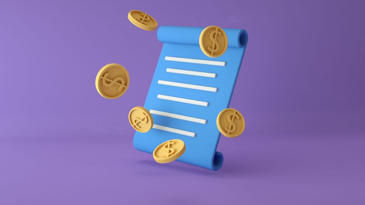
On style, once the source is settled: flat filled icons suit modern web and mobile UI and hold up best at small sizes. Line icons suit minimalist interfaces, dark backgrounds, and dense dashboards where filled shapes would feel heavy. Isometric and 3D icons suit hero slots, annual reports, and marketing pages where the icon is large enough to carry depth — they are a poor fit anywhere under about 48px. Hand-drawn or sketch-style clip art suits educational material and small-business content where approachability beats polish. Match the style to the audience: a corporate finance deck wants restrained line or filled work; an early-stage pitch deck can carry more color and energy without reading as unserious.
Where to place it, practically. On a KPI card, the icon sits above or left of the number at roughly the cap height of the label text. In a table header, it sits inline before the column name at the text size. On a pricing page, a small savings mark next to an annual plan reinforces the value claim without adding a sentence. In a checkout flow, a money-back or secure-payment mark near the submit button does measurable trust work — keep it in the 20–24px range and adjacent to the relevant copy rather than floating alone. In training material, a series of stacking coins reads as recurring revenue and a single coin as one-time — a simple visual grammar worth defining once and reusing everywhere.
Related questions
What is the difference between an icon and clip art?
An icon is a functional UI element at 16–32px carrying one meaning within a consistent set. Clip art is illustrative, larger, more detailed, and meant to fill space rather than label a control. Using one in the other's role produces either a mushy blob or a thin, lost mark.
Should a revenue icon use a dollar sign?
Only if your audience and reporting currency are US-centric. A dollar sign implies USD to international viewers. For global or currency-agnostic contexts, a coin stack, banknote, or chart-arrow mark communicates "money" without asserting a specific currency.
What size should a money icon be in a dashboard?
Table headers and inline labels want 16–20px. KPI card marks work at 24–32px. Hero or section illustrations start around 48px. Always preview at the actual shipped size — detail that survives at 400px routinely disappears at 20px.
Can I recolor a downloaded SVG icon?
Almost always yes technically — open the SVG and replace the fill value, or set fill="currentColor" so it inherits text color. Whether you may is a license question: most permissive and royalty-free licenses allow modification, but some restrict derivatives, so check the terms.
Do I need to credit a free icon?

It depends on the license. MIT, Apache, and CC0 assets require no attribution. CC BY and most marketplace free tiers do — usually a visible credit line in a footer or About screen. Paid tiers typically remove the requirement.
FAQ
What exactly counts as a revenue or money icon?
Any compact graphic symbol standing in for a financial concept: a currency glyph, coin, coin stack, banknote, wallet, safe, piggy bank, or an arrow-and-chart combination indicating growth. In a business context the coin stack and the upward chart arrow are the two most portable choices, because they read as money and momentum without asserting a specific currency or a consumer-savings connotation.
Which file format should I download?
SVG for anything on screen — it scales losslessly, recolors with one attribute, and typically weighs only a few kilobytes. EPS or AI for print and for handing to a designer. PNG only as a fallback for destinations that cannot parse vectors, such as some email clients and legacy uploaders, and then export at 2× or 3× so it stays sharp on high-DPI displays.
Are free money icons safe to use commercially?
Often, but never assume it. Check whether the license is permissive (MIT, Apache, CC0 — safe, no attribution), attribution-required (CC BY — safe with a visible credit), or restricted to personal use. The separate and more important question is whether the license permits embedding the asset in a product you distribute, which many free tiers exclude.
How much should I budget for a proper icon set?
For internal use, zero — free permissive sets cover basic revenue marks. If you download regularly, a marketplace subscription is the efficient choice and removes attribution overhead. If the marks need to be visually yours, commission a custom set; set pricing is meaningfully cheaper per icon than buying individually, and delivery typically runs one to three weeks.
How do I make a money icon accessible?
Give it a text label — icons speed recognition but do not replace words. In markup, use role="img" with a <title>, or aria-hidden="true" when adjacent text already conveys the meaning. Keep contrast at 3:1 or better against the background, and never let color be the only difference between two icons that mean opposite things.
Why do my icons look inconsistent even though each one looks fine?
Almost always a mismatch in stroke weight, corner radius, or optical sizing between sets. Pull every mark from one library, or normalize downloaded files to a shared viewBox and stroke width before use. Round forms also need to be drawn slightly larger than square ones to *look* the same size — professional sets handle this, mixed sources do not.
Sources
- Material Symbols and Icons — Google Fonts
- Font Awesome — Icons
- The Noun Project
- Flaticon
- Iconfinder
- Creative Commons — About CC Licenses
- MDN Web Docs — SVG
- W3C WCAG 2.1 — Non-text Contrast
- Wikimedia Commons
Related on PULSE
This page will be disappearing soon. Save it to your device for $1 — or read it free while it is here.
@Kory-White- · if Venmo asks, the last 4 of my number are 2012
This page is gone.
This one is off the shelf now. $1 keeps it on your phone for good — the whole page, pictures and diagrams included.
 graphicTarget / Goal Icon — Icon / Clip Art
 graphicIdea / Insight Icon — Icon / Clip Art
 graphicKPI Gauge Icon — Icon / Clip Art
 graphicWin / Trophy Icon — Icon / Clip Art
 graphicRevenue Gauge (KPI) — Icon / Clip Art
 graphicKey Account Icon — Icon / Clip Art
 graphicGTM Strategy Compass Icon — Icon / Clip Art
 graphicClosed-Won Check Icon — Icon / Clip Art
 graphicRevenue Trend Icon — Icon / Clip Art
 graphicRetention / Trust Shield Icon — Icon / Clip Art