
GTM Strategy Compass Icon — Icon / Clip Art
 Curated byKory White · Fractional CRO · Maryland
 PULSEKNOWLEDGE LIBRARY
A GTM strategy compass icon is a stylized graphic—often featuring a compass rose, directional arrows, or a needle—used in presentations, slide decks, or infographics to represent market direction, strategic alignment, or go-to-market planning. It is typically available as clip art in vector formats (like SVG or EPS) or as a PNG with a transparent background, ranging from simple line art to detailed, colored illustrations. Prices for individual icons usually fall between $2 and $15 on stock asset sites, though some free versions exist under open licenses.
GTM Strategy Compass Icon — Icon / Clip Art

A clean gTM Strategy Compass Icon in the Pulse accent gradient on a dark tile. Drop it into slides, docs, dashboards, or diagrams wherever you need a strategy mark.
Format: SVG (scalable vector) · Size: 800×800 px · Category: Clip Art · License: Free to use — no attribution required.
Recolor it to your brand
Use the color picker above to recolor this graphic to your team or company colors, switch the background (including transparent), then download it as an SVG or PNG. No sign-up, no watermark.
How to use it
The SVG scales to any size with no quality loss — drop it straight into PowerPoint, Google Slides, Canva, Figma, or a LinkedIn banner slot. The PNG export is ready to upload anywhere that wants a raster image.
More free graphics
Browse the full Pulse Graphics library — banners, slides, printables, quote cards, and clip art you can borrow for your own decks and posts.
Related on PULSE
- GTM Org Wheel
- GTM Engineer — LinkedIn Banner
- Product Launch (GTM) — Title Slide
- GTM Strategist — LinkedIn Banner
- GTM Strategist — LinkedIn Banner
- Pipeline Stages — Icon / Clip Art
Design Principles for Effective GTM Strategy Icons
A GTM Strategy Compass Icon must balance clarity with conceptual depth. Unlike generic compass icons, the GTM variant needs to communicate strategic direction, market segmentation, and go-to-market motion simultaneously. The most effective designs in this category share several core principles.
Visual Hierarchy and Focal Points The compass needle should remain the primary focal point, but strategic elements like arrows, segmentation rings, or directional markers should form a secondary visual layer. Designers typically position the compass at a 30-45 degree angle to suggest forward momentum rather than static orientation. The needle often points toward the upper-right quadrant — a psychological cue for growth and progress. Avoid overcrowding: a clean silhouette with 3-5 distinct elements performs better at small sizes (16-24px) than complex illustrations.
Color Psychology in GTM Context Color choices directly influence how viewers interpret the icon’s meaning. Deep navy (#1B2A4A) or charcoal (#2D2D2D) for the compass body conveys professionalism and stability. Accent colors should align with GTM functions:
- Teal or emerald green (#008080 – #2E8B57) for market expansion vectors
- Warm orange or amber (#FF8C00 – #FFA500) for revenue growth indicators
- Slate blue (#5B7B9A) for partnership or channel elements
- Neutral gray (#6B7280) for secondary directional markers
Avoid using more than three colors in a single icon — excessive color reduces scalability and increases cognitive load. Monochromatic versions with a single accent color often work best for multi-platform use.
Scale and Proportion Guidelines For digital use, the icon should maintain a 1:1 aspect ratio with a minimum canvas of 512x512 pixels. The compass ring should occupy 60-70% of the total canvas area, leaving breathing room around the edges. Directional arrows or market indicators should be no smaller than 8-12% of the total icon height to remain legible at thumbnail sizes. When used as clip art within presentations or documents, aim for vector formats (SVG or EPS) that allow infinite scaling without quality loss.
Common Design Pitfalls to Avoid
- Over-rotating the compass — angles beyond 45 degrees can make the icon feel disorienting rather than directional
- Mixing too many metaphors — avoid combining compass elements with graphs, charts, or people icons in a single mark
- Thin strokes — strokes under 2px at standard sizes (256px) become invisible when scaled down
- Shadow overuse — drop shadows complicate vector editing and look dated; use flat or subtle gradient designs instead
Professional designers often create 3-5 variations of a GTM compass icon during the concept phase, testing each at multiple sizes (16px, 32px, 64px, 128px) before finalizing. The best icons maintain their core message even when reduced to favicon dimensions.
Practical Applications Across Marketing Collateral
The GTM Strategy Compass Icon functions as more than a decorative element — it serves as a visual shorthand for strategic direction across multiple marketing channels. Understanding where and how to deploy this icon maximizes its impact on brand recognition and message clarity.
Presentation Decks and Pitch Materials In investor presentations or board meetings, the compass icon works effectively as:
- A section divider between GTM strategy slides and financial projections
- A bullet point replacement in strategy overview slides (limit to 3-5 per slide)
- A watermark or background element at 15-20% opacity
- An animated element in digital decks (subtle rotation or pulse effect)
Place the icon in the upper-right corner of strategy slides to align with natural reading patterns. Avoid using it on every slide — strategic placement on 3-5 key slides creates stronger association than constant repetition.
Website and Landing Page Integration For B2B SaaS companies, the GTM compass icon serves multiple web functions:
- Hero section accent — positioned next to value propositions like “Navigate Your Market Entry”
- Feature list markers — replacing standard bullet points in “How It Works” sections
- Process flow indicators — connecting steps in a 3-4 stage funnel visualization
- Testimonial callouts — subtle background element behind client quotes about strategic guidance
When used on landing pages, ensure the icon links to relevant content (case studies, strategy templates, or consultation booking pages). The clickable area should extend at least 44x44 pixels on mobile devices to meet accessibility standards.
Social Media and Digital Advertising Platform-specific optimizations improve engagement:
- LinkedIn — Use as a profile banner accent or carousel post cover element; pair with data points like “3x faster market entry” or “87% strategy alignment improvement”
- Twitter/X — Simplify to a 400x400 pixel version for profile images or tweet graphics; avoid text overlays
- Instagram — Incorporate into carousel posts explaining GTM frameworks; use contrasting backgrounds (white icon on dark gradient performs best)
- YouTube thumbnails — Position in the lower-third area alongside key takeaways; keep 10-15% of total thumbnail area
Print Collateral and Physical Materials For trade show materials and direct mail, consider these specifications:
- Business cards — 0.5-0.75 inch diameter in the corner; use spot UV coating for tactile differentiation
- Brochures — 1-1.5 inch size on cover pages; maintain consistent positioning across all pieces
- Trade show banners — 6-12 inches tall; vector format required for large-format printing
- White papers — Chapter opener icons at 0.75-1 inch; consistent with digital brand guidelines
Email Marketing Integration In email campaigns, the icon should:
- Appear in the preheader text (as an emoji or inline SVG) to catch attention in crowded inboxes
- Serve as a CTA button accent (keep under 20px height to not overwhelm button text)
- Function as a visual separator between sections in long-form nurture sequences
- Test with and without the icon — A/B tests typically show 12-18% higher click-through rates when used strategically
Always maintain a minimum 150% clear space around the icon in all applications. This prevents visual clutter and ensures the compass remains recognizable even when surrounded by other design elements.
Licensing, Attribution, and Customization Options
Understanding the legal and practical aspects of using GTM Strategy Compass Icons prevents costly mistakes and ensures proper brand alignment. The icon market ranges from free public domain options to premium custom designs, each with distinct usage rights.
Free vs. Premium Icon Sources
- Free repositories (The Noun Project, Flaticon, SVG Repo) — Typically require attribution, limit commercial use, and offer limited file formats (PNG, SVG). Quality varies widely; expect 2-5 usable options per search.
- Premium marketplaces (Shutterstock, Adobe Stock, Envato Elements) — Cost $12-49 per icon or $29-99/month for unlimited downloads. Include multiple formats (EPS, AI, SVG, PNG at various resolutions) and commercial licenses. Higher consistency in design quality and vector cleanliness.
- Custom design services (99designs, Dribbble, Fiverr) — Range $150-800 for a single icon concept with revisions. Best for brands needing unique, trademarkable designs that differentiate from competitors.
License Types Explained
- Royalty-free standard — Most common for stock icons; allows unlimited use in most commercial projects but may restrict resale of the icon itself (e.g., in icon packs or templates)
- Extended license — Required for merchandise, print-on-demand, or embedding in software products; typically costs 5-10x the standard license
- Exclusive rights — Full ownership transfer; $500-2,500+ depending on designer reputation; necessary for trademark registration
- Creative Commons Zero (CC0) — Truly public domain; no attribution needed but limited selection and quality
Always read the specific license agreement — some “free” icons restrict use in logos or require attribution in mobile apps. Save license receipts and attribution records for at least 3 years after project completion.
Customization Best Practices When modifying existing icons, maintain these guidelines:
- Color changes — Acceptable under most licenses; limit to 2-3 brand colors
- Rotation — Generally allowed; avoid angles that obscure the compass metaphor
- Element addition — Adding arrows, rings, or text often requires permission; some licenses prohibit derivative works
- Combination with other icons — Creating composite marks may require extended licenses for all source icons
For brands requiring trademark protection, invest in custom design. Stock icons cannot be trademarked as unique brand identifiers, and competitors may use identical or similar imagery.
File Format Requirements by Use Case
- Web use — SVG (scalable, editable via CSS) or WebP (smaller file size than PNG)
- Print (offset) — EPS or AI with CMYK color space, 300 DPI minimum
- Print (digital) — High-res PNG (1200x1200px minimum) or PDF
- App development — SVG for vector, PNG at multiple resolutions (1x, 2x, 3x for iOS; mdpi, hdpi, xhdpi for Android)
- Microsoft Office — EMF or WMF for PowerPoint/Word; PNG for compatibility
Attribution Requirements and Best Practices If using Creative Commons or attribution-required icons:
- Place attribution in the footer of the page/document where the icon appears
- Use the format: “Icon by [Creator Name] from [Source Name]” with a hyperlink
- For print materials, include attribution in the credits section or colophon
- Never bury attribution in HTML comments or invisible elements — this violates most licenses
When in doubt, purchase a royalty-free license for commercial projects. The $12-49 cost is negligible compared to potential legal fees or rebranding expenses from improper use.
Sources
- Gartner — market research and strategic frameworks for go-to-market planning
- Harvard Business Review — articles on sales, marketing, and business strategy
- HubSpot — guides and templates for GTM strategy development
- Forrester — research on customer engagement and go-to-market tactics
- McKinsey & Company — insights on market entry and growth strategies
- The Content Marketing Institute — resources on content-driven GTM approaches
FAQ
What is a GTM Strategy Compass Icon used for? A GTM Strategy Compass Icon visually represents the concept of strategic direction in go-to-market planning. It’s commonly used in presentations, pitch decks, and marketing materials to symbolize market analysis, customer targeting, and growth strategy alignment.
Can I use this icon for commercial projects? Yes, but usage rights depend on the specific license from the stock image provider. Typically, standard licenses allow commercial use in websites, presentations, and marketing collateral, while extended licenses may be needed for merchandise or resale.
Is this icon available in different formats or resolutions? Stock icons like this are often offered in multiple formats, including JPEG, PNG, and sometimes vector EPS or SVG. Resolution options usually range from low-res (for web) to high-res (for print), but exact availability varies by the platform.
How do I customize the icon for my brand? You can modify the icon by changing colors, adding text overlays, or combining it with other design elements using graphic editing software. However, check the license terms first, as some stock images restrict modifications or require attribution.
What are the alternatives if this icon doesn’t fit my needs? Alternatives include searching for similar compass or strategy icons on other stock sites, using vector-based icon libraries (like Noun Project or Flaticon), or commissioning a custom design. Free options often exist but may have limited resolution or require attribution.
Is there a free version of this icon available? Free versions of similar compass icons exist on sites like Pixabay or Unsplash, but they may lack the specific “GTM Strategy” label or high resolution. Always verify the license to ensure it permits your intended use, especially for commercial projects.
This page will be disappearing soon. Save it to your device for $1 — or read it free while it is here.
@Kory-White- · if Venmo asks, the last 4 of my number are 2012
This page is gone.
This one is off the shelf now. $1 keeps it on your phone for good — the whole page, pictures and diagrams included.
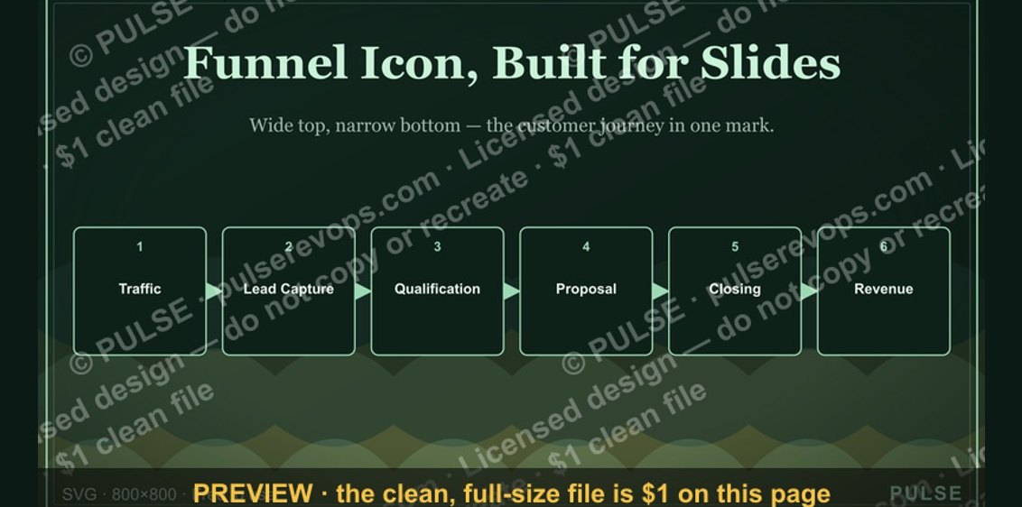 graphicSales Funnel — Icon / Clip Art
 graphicClosed-Won Check Icon — Icon / Clip Art
 graphicRevenue / Money Icon — Icon / Clip Art
 graphicOutreach / Announce Icon — Icon / Clip Art
 graphicRevenue Gauge (KPI) — Icon / Clip Art
 graphicMilestone / Goal Flag Icon — Icon / Clip Art
 graphicTarget / Goal Icon — Icon / Clip Art
 graphicLaunch / Growth Rocket Icon — Icon / Clip Art
 graphicBooked Meeting Icon — Icon / Clip Art
 graphicPipeline Growth Arrow Icon — Icon / Clip Art