
Coach to the top — Sales Leadership Banner
 Curated byKory White · Fractional CRO · Maryland
 PULSEKNOWLEDGE LIBRARY
Quality
Certified
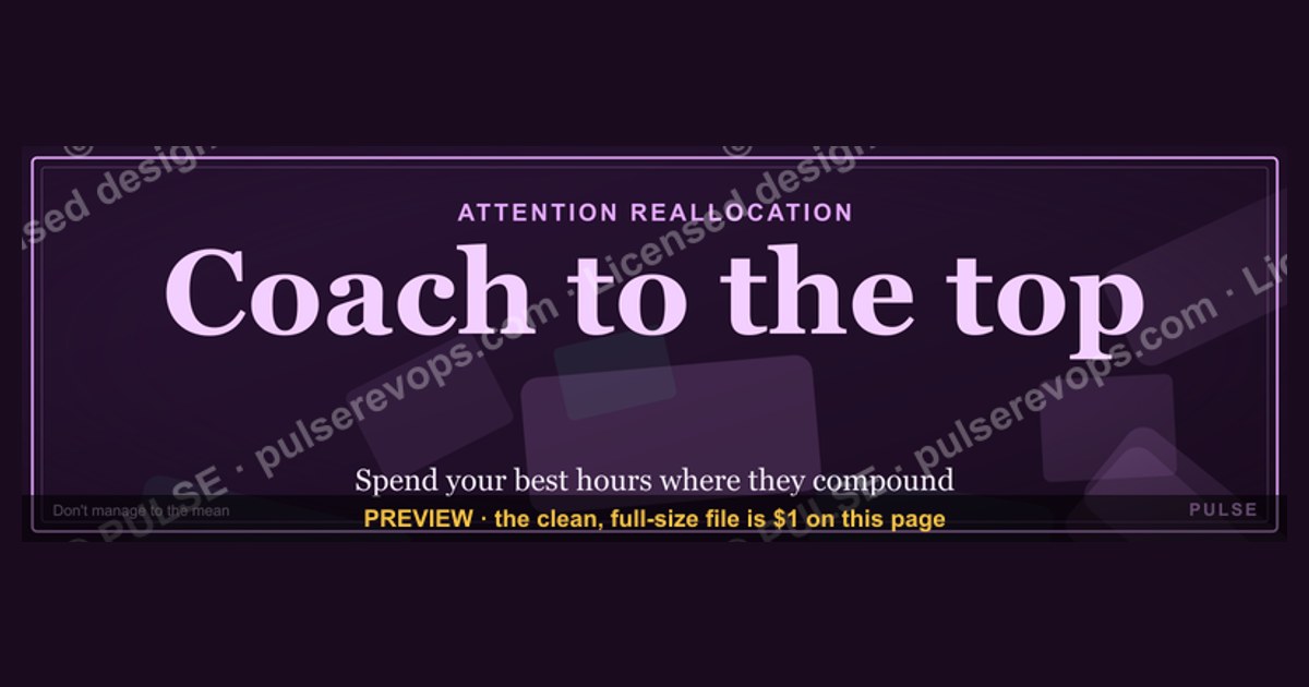
This is the "Coach to the top" Sales Leadership Banner — a 1600×500 px graphic built for a manager or VP's LinkedIn profile, Slack header, or office monitor. It reads a short leadership pledge in bold type over a dark, high-contrast background, signaling that this Sales leader coaches reps toward the top of the leaderboard rather than just tracking their numbers. Download the PNG free from this page and swap it into any profile that needs a visible leadership statement.
The outcome you should expect
Put this banner where a Sales Leadership audience actually looks — a LinkedIn cover photo, a Slack workspace header, or a shared dashboard TV in the bullpen — and the immediate effect is positioning, not performance. A banner does not close deals or shorten ramp time by itself. What it does is compress an identity statement into a glance: anyone landing on that profile or that screen reads "Coach to the top" before they read anything else, and that primes how they interpret everything that follows, from a comment on a deal review to a one-on-one invite.
The realistic outcome falls into three buckets. First, external signaling: prospects, candidates, and peers who view the profile get a fast read on management style before a single conversation happens, which matters most during recruiting conversations and executive-level LinkedIn touches where a visitor spends two or three seconds forming an impression. Second, internal reinforcement: a Slack header or shared-screen placement keeps the phrase in front of the team daily, functioning the same way a mission statement on a break-room wall works — low-intensity, high-frequency reinforcement rather than a one-time announcement. Third, self-commitment: leaders who choose to put a coaching philosophy on their own banner are making a quiet public commitment, and the visible artifact tends to make them more likely to actually behave like a Coach in the next skip-level or pipeline review, simply because the claim is now sitting in view of the whole team.

None of that shows up as a hard KPI. Don't expect the banner to move quota attainment or reduce turnover on its own — treat it as a supporting signal inside a broader coaching program, not a substitute for one. Leaders who pair the banner with actual coaching cadence (regular call reviews, documented one-on-ones, a visible leaderboard) see the phrase land as credible. Leaders who hang the banner and change nothing else get the opposite outcome: the team notices the gap between the stated Leadership philosophy and the daily behavior, and the banner becomes a quiet source of cynicism instead of motivation.
What drives that impact
The banner's effect comes from three layers stacked on top of each other, and understanding the stack helps you decide where to place it and how hard to lean on it.

The first layer is the wording itself. "Coach to the top" is a compact, active-verb phrase — it names a role (Coach) and an aspiration (the top), and it avoids vague corporate language like "excellence" or "synergy" that readers skim past. Short, verb-led phrases like this survive at banner scale because a viewer only has a second or two of attention; anything longer than a single clause gets cropped by the eye before it's read.
The second layer is the visual treatment: dark background, high-contrast type, generous negative space around the words. That treatment matters because a Sales Leadership banner is almost always viewed small — as a LinkedIn thumbnail, a Slack strip, or a TV screen glanced at from across a room — so low-contrast or busy designs disappear at exactly the moments the banner is supposed to work.

The third layer is placement context, which changes what the same graphic communicates. On a personal LinkedIn profile, the banner reads as a personal leadership brand statement aimed at an external audience — recruiters, partners, prospects. On an internal Slack channel or a shared dashboard, the identical graphic reads as a team culture cue aimed at reps who see it dozens of times a week. The graphic doesn't change; the audience and repetition frequency do, and that's what determines whether it functions as branding or as habit-forming reinforcement.
Benchmarks and realistic ranges
Treat the banner as a piece of visual real estate governed by the platform it lands on, and size and placement decisions follow from that. The source file here is 1600×500 px, a wide landscape ratio chosen so the phrase reads cleanly at LinkedIn cover-photo scale without stretching or cropping awkwardly. LinkedIn's own guidance for a personal profile cover photo commonly cites roughly 1584×396 px, and for a Company Page cover photo a narrower strip around 1128×191 px — both noticeably shorter and wider than this banner's native ratio. In practice that means most Sales leaders will crop this 1600×500 asset slightly at top and bottom when uploading to a personal profile, and Company Page use will need a tighter crop or a resized export; keep the "Coach to the top" wording centered so cropping on either edge doesn't clip it.

For Slack, a workspace header image tends to display best as a wide banner strip inside a channel bookmark or pinned post rather than as the workspace icon (which is square and far too small for this design to survive). For a shared office monitor or dashboard TV, native resolution or a simple upscale to fit a 1920×1080 or 1920×600 letterboxed frame both work, since the design's high contrast holds up at large scale as well as small.
On refresh cadence, a realistic range for a personal-brand banner is a few months to a year — long enough to build recognition, short enough that it doesn't calcify into background noise nobody notices anymore. A Slack header or dashboard graphic used for team culture reinforcement tends to get swapped more often, commonly every quarter alongside a new sales theme, contest, or leadership focus, so pair a refresh with a natural milestone (a new quarter, a new leaderboard reset, a promotion announcement) rather than swapping it on no particular signal, which reads as random rather than intentional.

One more range worth planning around: adoption. If you're rolling this banner out to a management layer rather than a single leader, expect uneven uptake — some managers update personal profiles within a day, others take weeks or never do it without a nudge. Budget for a follow-up reminder at the two-week mark rather than assuming a single announcement gets full compliance.
Risks, edge cases, and failure modes
The single biggest failure mode is the credibility gap described above: a leader displays "Coach to the top" while running a management style that's closer to quota enforcement than coaching. Reps notice mismatches between stated values and daily behavior faster than leadership expects, and a banner that oversells a coaching identity the team doesn't experience firsthand can do more damage than no banner at all — it becomes evidence, not aspiration.

A second risk is tone-deaf timing. Displaying a bold "top" and "Coach" message during a bad quarter, right after layoffs, or immediately following a missed forecast can land as out of touch rather than motivating. Read the room before pushing this kind of banner live; a leadership signal that ignores current team morale gets read as leadership that isn't paying attention.
A third edge case is audience mismatch on LinkedIn specifically. A personal profile banner is public by default, which means candidates, competitors, and even current reports' future employers see it. A phrase built for internal team culture ("Coach to the top") can read differently to an external recruiter deciding whether this leader is a fit for their own coaching-heavy sales org — usually still a positive signal, but worth a conscious choice rather than a default one, especially for leaders who prefer to keep personal branding neutral.

A fourth failure mode is technical: dropping the full 1600×500 file into a slot that expects a different aspect ratio without checking the crop first. Because platforms auto-center or auto-crop uploaded images, a leader who doesn't preview the crop can end up with the word "top" cut off at the edge of a LinkedIn cover photo, or the phrase pushed off-center in a Slack bookmark thumbnail. Always preview after upload, not just before.
Finally, watch for staleness. A banner that never changes over multiple years stops functioning as a live signal and starts blending into the background the same way an outdated "under construction" web page does — it's technically still there, but nobody registers it as current or intentional anymore.
A practical rollout plan
Roll this out in five steps rather than a single mass email, since adoption and correct usage both depend on sequencing.
Start by confirming intent with the leader or leadership team the banner is meant to represent — make sure "Coach to the top" actually matches the coaching cadence already in place or genuinely being launched, so the graphic reinforces something real rather than something aspirational-only. If the coaching program isn't live yet, sequence the banner to launch alongside the program's kickoff, not ahead of it.

Next, download the PNG from this page and do a placement test before publishing anywhere. Upload it to a private or draft version of the target surface — a LinkedIn profile preview, a test Slack channel, or a dashboard TV during off-hours — and check the crop, the contrast on the actual screen it'll live on, and legibility from a normal viewing distance.
Third, customize if needed. If your team wants a variant with a different name, role title, or a season-specific phrase swapped in for "Coach to the top," treat the wording as the only thing to touch — keep the dark background and high-contrast type treatment intact, since that's what keeps the design legible at small sizes across LinkedIn, Slack, and dashboard use.

Fourth, publish in a deliberate order: internal team channels first (Slack header, shared dashboard) so the team sees the signal before an external audience does, then personal LinkedIn profiles a few days later once the internal rollout has landed without surprises.
Fifth, follow up. Two weeks after the initial push, check adoption across the management layer if this is a team-wide rollout, and pair the visual with at least one visible coaching action in the same window — a documented one-on-one, a call review, a shout-out tied to coaching rather than just results — so the banner's claim gets reinforced by something the team can actually point to.
Related questions
Should every Sales manager use the same banner or a personalized version?
A shared design with each manager's name or a swapped-in phrase keeps a consistent Leadership brand across the team while still reading as personal. Keep the layout and contrast identical; vary only the text.
Does this banner work as a Company Page cover photo instead of a personal one?
It can, but expect a tighter crop since Company Page covers use a shorter, wider ratio. Preview the crop before publishing so "Coach to the top" isn't clipped.
How often should a Sales Leadership banner change?
A few months to about a year for a personal profile; tie any refresh to a real milestone — a new quarter, a leaderboard reset, a promotion — rather than swapping it on no signal.
What if the team doesn't feel like leadership actually coaches to the top?
Fix the coaching cadence before pushing the banner live, or delay the rollout until it's true. A banner that contradicts daily experience erodes trust faster than no banner at all.
FAQ
What exact size is this Sales Leadership Banner? The source graphic is 1600×500 px, a wide landscape banner sized for LinkedIn cover photos, Slack headers, and dashboard displays. Most platforms will apply a slight crop on upload, so preview before publishing.
Can I change the wording from "Coach to the top" to something else? Yes — swap only the text and keep the dark background and high-contrast type treatment, since that combination is what keeps the design legible at the small sizes most platforms display it at.
Is this banner meant for individual leaders or for a whole Sales team? Both. A single leader can use it as a personal LinkedIn statement; a Sales organization can roll a shared version out across every manager to reinforce one Leadership identity team-wide.
Where should I place it for the biggest internal impact? A pinned Slack header or a shared dashboard TV gets seen daily by the team, which builds more repetition-based reinforcement than a LinkedIn profile that reps rarely revisit.
Will this banner actually improve coaching behavior? Not by itself. Treat it as a visible commitment device that supports an existing or launching coaching program — pair it with real coaching actions in the same rollout window, not as a standalone fix.
What file format can I download, and is it free? The banner downloads as a PNG directly from this page at no cost, ready to upload to LinkedIn, Slack, or a dashboard system without further editing.
Sources
- https://www.linkedin.com/help/linkedin
- https://www.linkedin.com/business/marketing/blog
- https://slack.com/help
- https://www.hubspot.com/sales
- https://www.gartner.com/en/sales
- https://www.canva.com/learn/
- https://www.salesforce.com/resources/articles/sales-coaching/
Related on PULSE
- Sales leaderboard display best practices for the bullpen
- How to structure a weekly one-on-one coaching cadence
- LinkedIn profile optimization for Sales leadership roles
- Building a Slack workspace header that reinforces team culture
- Sales manager coaching frameworks that actually change rep behavior
This page will be disappearing soon. Save it to your device for $1 — or read it free while it is here.
@Kory-White- · if Venmo asks, the last 4 of my number are 2012
This page is gone.
This one is off the shelf now. $1 keeps it on your phone for good — the whole page, pictures and diagrams included.
 graphicMEDDPICC Qualification Framework — Banner
 graphicInspect with rigor — Sales Management Banner
 graphicChampions Close Deals — Banner
 graphicForecast First, Pipeline Second — Banner
 graphicSales Cycles Shrink With Trust — Banner
 graphicICP Discipline: Say No to Win More — Banner
 graphicDiscovery is the Whole Job — Banner
 graphicBANT is Dead — Banner
 graphicNRR Beats New Logos — Revenue Law Banner
 graphicBuild the system — RevOps Mindset Banner