
What are the most common mistakes in Graphics in 2027?
 PULSEKNOWLEDGE LIBRARY
No, graphics mistakes in 2027 are not a single error but a constellation of recurring failures, with the most common including over-reliance on unedited AI-generated visuals, ignoring accessibility standards, cluttered layouts, and inconsistent branding that collectively undermine trust and engagement.
In 2027, graphics are more central than ever to digital communication, yet many teams fall into predictable traps. From neglecting color contrast for readability to misusing typography hierarchies, these mistakes can be avoided with deliberate strategy and user-centered design principles.
What are the primary accessibility failures in modern graphics?
Accessibility is no longer optional, yet many graphics in 2027 still fail to meet basic standards. A common mistake is insufficient color contrast, which makes text unreadable for users with visual impairments or on low-light devices. Designers often choose trendy pastels or low-saturation palettes without checking contrast ratios against WCAG 2.2 guidelines. This excludes a significant portion of the audience and can lead to legal compliance issues under evolving digital accessibility laws. For example, a call-to-action button in light gray on a white background is invisible to someone with low vision, directly reducing conversion rates. Teams should integrate contrast checkers directly into their design workflow, testing every text-background combination before finalizing.
Another frequent error is neglecting alternative text for complex infographics. While AI tools can generate alt text, they often produce generic descriptions that miss key data points. For example, a bar chart showing revenue growth might be described as "a colorful chart" rather than "a bar chart showing 30% revenue increase from Q1 to Q4." This omission frustrates screen reader users and undermines the graphic's purpose. Teams should implement structured data tagging alongside manual review to ensure all visual elements are fully accessible. Additionally, failing to provide text transcripts for video graphics or animated infographics compounds the problem, leaving hearing-impaired users without critical context. For more on building inclusive design systems, see our guide on accessibility in RevOps.

How does overusing AI-generated graphics hurt brand identity?
In 2027, AI generation tools are ubiquitous, but their misuse creates a distinct visual sameness across brands. The most common mistake is relying on default or unmodified AI outputs for marketing materials, resulting in generic imagery that fails to differentiate a company. Audiences quickly recognize the telltale signs of AI art—unnatural lighting, distorted anatomy, or repetitive patterns—which erodes trust and makes a brand feel cheap or lazy. When every competitor uses similar AI-generated backgrounds or character illustrations, the market becomes a sea of indistinguishable visuals, making it impossible for any single brand to stand out.
Beyond aesthetics, there is a deeper strategic error: treating AI as a replacement for human creativity rather than an augmentation tool. Graphics should tell a story or evoke an emotion aligned with brand values, but AI often produces surface-level visuals without context. For instance, a fintech company using an AI-generated image of a smiling person in an office may miss the opportunity to convey innovation or security. Successful teams in 2027 use AI for rapid prototyping and iteration, then apply human oversight to refine messaging, ensure cultural relevance, and maintain brand consistency. This hybrid approach preserves authenticity while leveraging efficiency. Another related mistake is failing to document which assets were AI-generated, leading to confusion during brand audits or when legal questions about copyright arise. A clear tagging system for AI-assisted work is essential for governance.

What layout and composition errors degrade user experience?
Cluttered layouts remain a top mistake in 2027, driven by the urge to include every data point or message in a single graphic. Designers often forget that white space is a functional tool, not wasted area. A crowded infographic with overlapping text, multiple fonts, and competing focal points overwhelms viewers, causing them to abandon the content entirely. This is especially damaging in B2B contexts where clarity and professionalism are paramount. For example, a sales presentation slide crammed with tiny charts, bullet points, and logos forces the audience to work too hard to extract the core insight, leading to disengagement during critical pitches.
Another composition error is ignoring visual hierarchy. When every element is the same size or color, the eye has no clear path to follow. For example, a social media graphic might place the call-to-action button in a low-contrast corner while a decorative element dominates the center. This mistake reduces conversion rates because users cannot quickly identify the next step. Effective graphics in 2027 use size, color, and spacing to guide attention: primary messages first, supporting details second, and CTAs last. A simple test is to squint at the graphic—if the main point isn't immediately obvious, the hierarchy needs work. Additionally, failing to align elements on a grid creates a chaotic, unprofessional appearance. Even subtle misalignments accumulate to make a brand look careless. Explore best practices for data visualization to avoid these pitfalls.

Why do mismatched typography choices undermine messaging?
Typography mistakes are rampant in 2027, often stemming from the desire to be "creative" with font pairings. A common error is combining too many typefaces—more than two—which creates visual noise and suggests a lack of professional polish. For instance, using a decorative script font for headlines, a sans-serif for body text, and a serif for captions can clash and confuse the brand voice. Consistency in typography builds recognition; inconsistency erodes it. Brands that use a different font family for every campaign fragment their visual identity, making it harder for audiences to form a lasting impression.
Another critical mistake is ignoring readability across devices. In 2027, graphics are consumed on everything from smartwatches to large monitors. Fonts that look elegant on a desktop may become illegible on a mobile screen at small sizes. Designers should prioritize web-safe or system fonts for body text and test designs at multiple resolutions. Additionally, poor line spacing (leading) or letter spacing (tracking) can make even a single font look amateurish. The rule of thumb is to optimize for the smallest expected screen first, then scale up. A related oversight is using all-caps for body text, which reduces readability by eliminating the visual cues of ascenders and descenders. This mistake is especially common in social media graphics where designers try to maximize impact but instead create a wall of text that is difficult to scan.

How do inconsistent branding elements cause confusion?
Brand inconsistency is a silent killer of graphic effectiveness in 2027. A frequent mistake is using different color palettes across channels—a blue hex code on Instagram that differs from the one on LinkedIn, or a logo that appears in various sizes and orientations. This fragmentation confuses audiences and weakens brand recall. In an era of rapid content creation, teams often skip brand guidelines reviews, leading to a patchwork of visuals that feel disconnected. For example, a company might use a vibrant, saturated blue in email headers but a muted, desaturated version on their website, creating a jarring experience for users who navigate between channels.
Another issue is misaligned iconography or illustration styles. If a brand uses flat vector illustrations on its website but photographs with heavy filters on social media, the visual identity becomes schizophrenic. Consistency extends to tone: a playful meme format might clash with a serious product announcement. To avoid this, brands should maintain a centralized asset library with approved templates, color codes, and style guides. Regular audits of all visual outputs help catch drift before it becomes systemic. A further mistake is failing to update legacy graphics when brand guidelines change. Old logos, outdated color schemes, or retired taglines can linger in presentations and social media posts, creating a confusing mix of old and new identities. For a deeper dive, read our article on brand governance strategies.

What role does data visualization play in graphic mistakes?
Data visualization is a minefield for errors in 2027. The most common mistake is using the wrong chart type for the data. For example, a pie chart with ten slices is nearly impossible to read, yet it remains a default choice in many tools. Similarly, 3D bar charts or stacked area graphs can distort proportions and create misleading impressions. These errors not only confuse but can also be seen as manipulative, damaging trust. When a chart is difficult to interpret, audiences may assume the data itself is flawed, even if the underlying numbers are accurate.
Another prevalent error is cherry-picking data or truncating axes to exaggerate trends. While this might achieve short-term engagement, it backfires when audiences or stakeholders scrutinize the numbers. Ethical design requires presenting data honestly, with clear labels, source citations, and appropriate scales. In 2027, tools like AI-generated dashboards can automate much of this, but they still require human judgment to ensure accuracy. A good practice is to have a second person review the graphic's data integrity before publication, especially for high-stakes reports or investor materials. Additionally, failing to include error bars or confidence intervals in scientific or survey data gives a false sense of precision. Viewers may assume a single data point is definitive when it is actually an estimate with significant uncertainty.

How does neglecting mobile-first design lead to graphic failures?
In 2027, mobile consumption of graphics dominates, yet many designers still create for desktop first. A common mistake is designing graphics at a desktop resolution and then simply shrinking them for mobile, resulting in tiny text, overlapping elements, and unclickable buttons. For example, an infographic with detailed annotations that is legible on a 27-inch monitor becomes an unreadable blur on a 6-inch phone screen. This forces mobile users to pinch and zoom, a friction that often leads to abandonment.
Another error is ignoring touch targets. Buttons or interactive elements that are too small for finger taps frustrate users and reduce engagement. The recommended minimum touch target size is 48x48 pixels, but many graphics in 2027 still feature CTAs that are smaller than this. Additionally, designers often fail to account for thumb zones—the areas of a mobile screen that are easiest to reach with one hand. Placing critical actions in the top corners, where thumbs struggle to reach, is a subtle but impactful mistake. Mobile-first design should begin with the smallest screen, then scale up, ensuring that every element is functional and readable at all sizes. This approach also forces prioritization, as designers must decide what truly matters when space is limited.

Related questions
How can I fix low contrast in my graphics?
Use a color contrast checker tool to ensure your text-to-background ratio meets WCAG 2.2 AA standards (4.5:1 for normal text, 3:1 for large text). Avoid pairing light grays with white backgrounds.
What is the best way to use AI for graphic design without losing brand identity?
Treat AI as a starting point: generate multiple options, then manually refine them to align with your brand guidelines, add specific context, and ensure cultural sensitivity. Always review outputs for unintended biases.
How do I choose the right font for a business graphic?
Stick to one or two fonts maximum—a clean sans-serif for headlines and a readable serif or sans-serif for body text. Test legibility on mobile screens first, and avoid decorative fonts for important data.
Why is white space important in modern graphic design?
White space reduces cognitive load, guides the viewer's eye, and makes key elements stand out. In 2027's cluttered digital landscape, generous white space signals professionalism and improves comprehension.
How often should I update brand visual guidelines?
Review and update brand guidelines at least annually, or whenever you launch a new product or enter a new market. In 2027, include specific rules for AI-generated graphics and accessibility standards.
FAQ
What is the most common graphic design mistake in 2027? Over-reliance on unedited AI-generated visuals that lack brand consistency and human context is the most frequent error, leading to generic, untrustworthy imagery that fails to differentiate a brand.
How can I make my graphics more accessible? Ensure color contrast meets WCAG standards, add descriptive alt text to all images, use clear typography, and provide text alternatives for complex infographics. Test with actual screen reader users when possible.
Should I use animation in graphics? Yes, but sparingly. Animated elements can enhance engagement if they are purposeful (e.g., revealing data step-by-step) and not distracting. Avoid auto-playing videos or looping animations that cause motion sickness.
What tools can help avoid design mistakes? Use design systems like Figma with brand libraries, accessibility checkers like Stark, and data visualization tools like Tableau that enforce chart best practices. Also employ version control to track changes.
How do I train my team on graphic best practices? Create a one-page style guide covering color, typography, logo usage, and accessibility. Conduct quarterly workshops reviewing recent designs and common errors. Use real-world examples from your own campaigns.
Is it okay to use stock photos in 2027? Only if you heavily customize them to fit your brand—reskin colors, add overlays, or combine with original elements. Generic stock photos are easily recognized and undermine authenticity and trust.
What is the biggest data visualization mistake? Using a pie chart for more than five categories or truncating a Y-axis to exaggerate differences. Always show the full context and label data points clearly. Include source citations for credibility.
Can I reuse graphics across different platforms? No, because platform-specific dimensions and user behaviors differ. A graphic optimized for Instagram Stories will look distorted on LinkedIn. Create platform-specific variants from a master template to maintain consistency.
How do I test if my graphic is effective? Run a five-second test: show it to a colleague and ask them to recall the main message. If they can't, the hierarchy or clarity needs improvement. A/B test different versions with real audiences for quantitative data.
What role does cultural sensitivity play in graphic design? In 2027, global audiences expect visuals that respect cultural norms around color symbolism, gestures, and imagery. A graphic that works in one region may offend in another, so research your target audience thoroughly.
Sources
- WCAG 2.2 Accessibility Guidelines
- Nielsen Norman Group on Visual Hierarchy
- Smashing Magazine on Typography Best Practices
- HubSpot on Brand Consistency
- Data Visualization Society on Chart Selection
- AIGA Design for Understanding
- Google Material Design on Accessibility
- Interaction Design Foundation on White Space
- Adobe on AI in Design Ethics
- RevOps Guide to Visual Communication
Related on PULSE
- [“We’re hiring closers.” — LinkedIn Banner](/knowledge/gb0365)
- [AI Coding Operator Cursor Claude Code — LinkedIn Banner](/knowledge/gb0482)
- [Synthetic Data Generator — LinkedIn Banner](/knowledge/gb0479)
- [LLM Builder AI Engineer — LinkedIn Banner](/knowledge/gb0471)
Recently Added — Related
- [How do you get started with Graphics in 2027?](/knowledge/gb546)
 gbHow do you get started with Graphics in 2027?
 gbWhat should you know before investing in Graphics in 2027?
 gbTop 10 best Graphics options in 2027
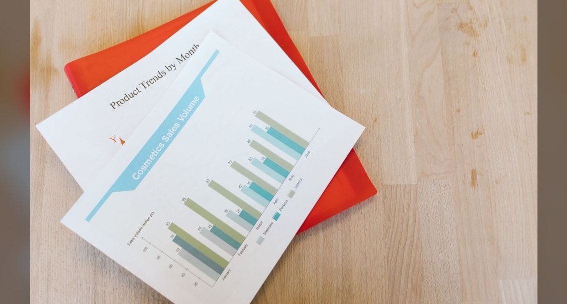 gbAnnual Sales Planning — Title Slide
 gbHow much does Graphics cost in 2027?
 gbIs Graphics worth it in 2027?
 gbWhat is the best way to approach Graphics in 2027?
 pulse-speechesA Graduation Toast From a Proud Parent
 pulse-toolsWhat does a fractional CRO cost in Keedysville in 2027?
 pulse-toolsHow do I hire a fractional CRO in Galena in 2027?