


The SaaS Growth Funnel — Infographic
Quality
Certified
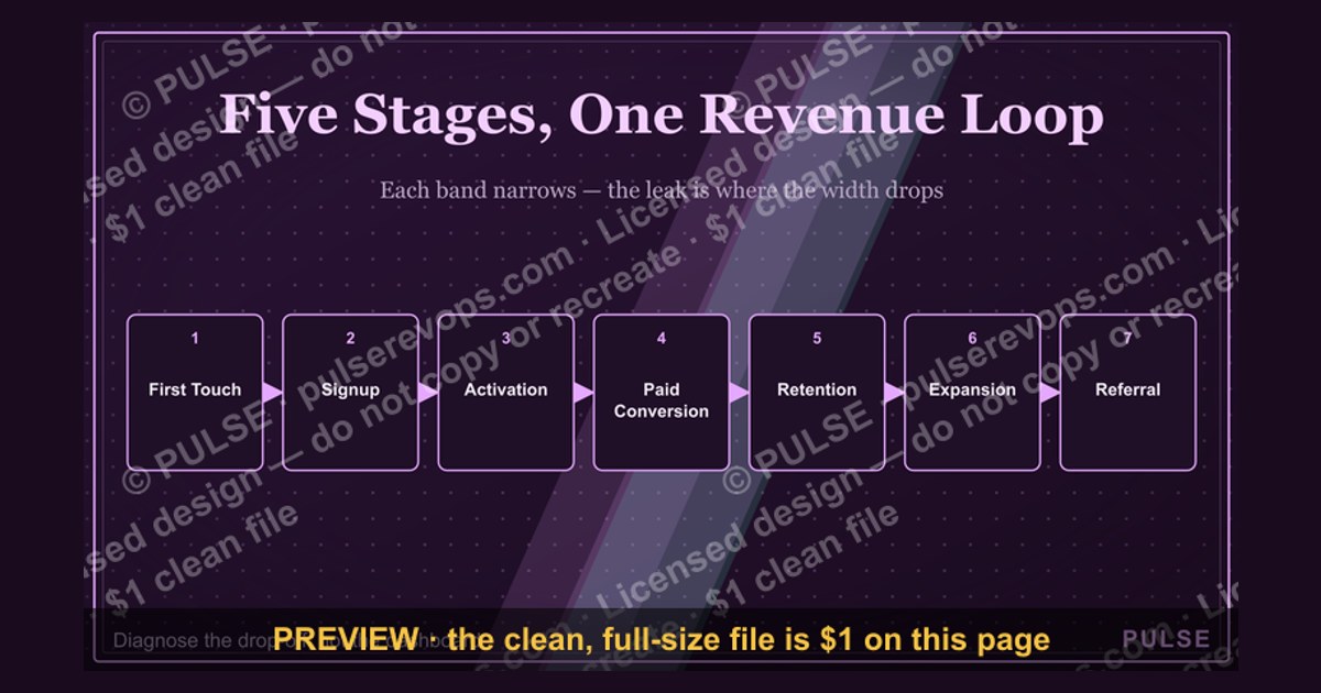
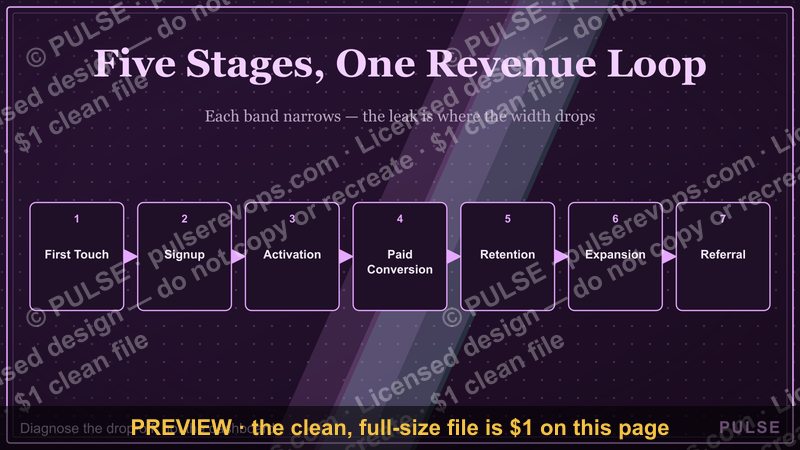
This is a process flowchart titled "The SaaS Growth Funnel — Infographic," rendered at 1600x900 px and downloadable free as a PNG from this page. It maps the journey from anonymous visitor to retained, expanding account across five stages — awareness, acquisition, activation, retention, and expansion — showing the metric that governs each handoff and the leak that typically kills it.
Comparing the two ways to read the SaaS Growth funnel
There are two legitimate ways to read a Growth Funnel, and the Infographic is built to support both without collapsing them into one. Picking the wrong lens is the single most common reason a funnel chart gets ignored after the first week.
The linear stage view. Traffic enters at the top, moves through signup, activation, paid conversion, and retention, and exits as either a churned logo or an expanding account. Each stage is a box, each transition is an arrow, and each arrow has a conversion rate attached. This is the view most teams default to because it maps cleanly onto a marketing automation tool or a CRM pipeline. Its strength is accountability: every arrow has a plausible owner. Its weakness is that it implies a single path, and almost no SaaS business actually has one.
The loop view. The same stages, but expansion and referral feed back into the top of the Funnel rather than terminating at the bottom. In this reading, a retained customer is not an endpoint — it is a new acquisition channel with a materially lower cost per acquisition than paid search. The loop view is harder to draw and harder to instrument, but it is the honest representation of how a subscription business compounds.

The Infographic deliberately renders both: the vertical flow carries the stage view, while a return arrow from the expansion band back to the awareness band carries the loop. That single arrow is the most argued-over element on the graphic, and it is the one worth defending in a review.
Why the distinction matters commercially. A team operating on the linear view tends to over-invest at the top of the Funnel because that is where the biggest absolute numbers live. A team operating on the loop view tends to shift budget toward activation and onboarding, because a two-point improvement in activation compounds through every downstream stage. Neither view is wrong, but they produce different roadmaps, different hiring plans, and different quarterly targets.
A third, less useful reading to avoid. Some teams treat the Funnel as a reporting artifact — a chart that gets screenshotted into a board deck and never touched again. The Infographic is designed to resist this by labeling each stage with the operational metric that governs it, not just the vanity number. If a stage on your version of the graphic does not name a metric an owner can move this quarter, that stage is decoration.
How to decide which reading to use

The decision is not philosophical. It turns on three questions: how long your sales cycle is, whether your revenue is dominated by new logos or by existing accounts, and whether you have reliable event data across the full lifecycle. The flowchart below walks through the branch points.
Reading the branch points. Net revenue retention above 100% means your existing base grows without new logos, which is the precondition for the loop view to be meaningful. If expansion is more than roughly a third of new ARR, the loop is not a theoretical nicety — it is your primary Growth engine, and a linear chart will systematically understate it.
The data branch is the one teams skip. If you cannot reliably join a signup event to a later expansion event in the same account, the loop view is a drawing rather than a measurement. In that case, adopt the linear view now and spend the next quarter building the join. Publishing a loop you cannot measure is worse than publishing a line you can.

A practical compromise. Many teams run the linear view for weekly operating reviews and the loop view for quarterly planning. That is legitimate as long as everyone knows which is which. The failure mode is a team that plans on the loop and operates on the line, then cannot explain why activation investment never shows up in the weekly numbers.
Concrete numbers behind each stage
The Infographic carries a metric label on every stage. What follows is the substance behind those labels — the ranges practitioners actually see, and the reasoning that makes a given range plausible rather than arbitrary. Treat these as orientation, not benchmarks; your segment, price point, and motion will shift them.
Awareness. The governing metric is qualified reach, not raw sessions. A B2B SaaS site converting at 2-3% of sessions into a marketing-qualified lead is performing normally; 5% or above usually means either a narrow, high-intent audience or a lead definition so loose it is measuring curiosity. The trap here is optimizing the top number without checking the qualification rate downstream — doubling traffic at half the qualification rate is a net loss once you account for sales time.

Acquisition. The metric is cost per qualified lead and, later, cost per closed-won logo. For self-serve motions, a common target is a customer acquisition cost that pays back within 12 months of gross margin. For sales-led motions, 18-24 months is often tolerated because contract values are larger. If payback stretches past 24 months in a market with meaningful churn, the model is fragile regardless of how good the top-line Growth looks.
Activation. This is where the widest variation lives, and where the Infographic earns its keep. Activation is not signup — it is the moment a user first experiences the core value. For a collaboration tool that might be inviting a second user; for an analytics product it might be connecting a first data source and running a first query. Teams that define activation precisely and instrument it often find that a 5-10 point improvement in activation rate moves retained revenue more than a 20% increase in top-of-Funnel volume.
Retention. The metric is logo retention and net revenue retention, reported separately. Gross logo retention in the 85-90% annual range is solid for SMB SaaS; enterprise contracts often sit above 95%. Net revenue retention above 100% means the base grows on its own, above 110% is strong, and above 120% is exceptional and usually implies a land-and-expand product with seat-based or usage-based pricing.

Expansion. The metric is expansion ARR as a share of starting ARR, plus the time-to-first-expansion. A useful operational target is that a meaningful fraction of accounts expand within the first two renewal cycles. Expansion that only arrives at renewal is a pricing conversation; expansion that arrives mid-cycle is a product-led signal and is far more durable.
The compounding arithmetic. A simple illustration of why activation deserves the argument. Take 10,000 monthly visitors. At 3% lead conversion you get 300 leads; at 30% lead-to-customer you get 90 customers. Improve activation from 60% to 70% and, holding everything else constant, you retain roughly nine more customers per month from the same spend — and those nine carry expansion and referral potential forward. The top-of-Funnel equivalent would require roughly a 10% traffic increase to achieve the same retained base.
Where the numbers mislead. Blended averages hide the segment that is actually broken. A 90% retention rate sounds healthy until you split it and find 98% in one segment and 70% in another. The Infographic's stage labels are deliberately singular so that the split analysis happens in the review, not on the graphic.
Implementation details and sequencing

Building and deploying the Infographic is a short project with a specific order of operations. Doing it out of order produces a graphic that looks right and gets ignored.
Step one: agree the stage names before drawing anything. Five stages is the working default, but the names must match the words your team already uses in its weekly review. If your team says "onboarding" rather than "activation," put onboarding on the graphic. A chart that renames your own process creates translation work every single meeting.
Step two: assign exactly one owner per transition. Not per stage — per transition. The drop between awareness and acquisition belongs to demand generation. The drop between acquisition and activation belongs to onboarding or product. Ambiguous ownership of a transition is why funnel reviews stall.
Step three: pick the metric per stage and write it in. One metric, not three. If a stage needs three metrics to be understood, the stage is doing too much work and should be split.
Step four: instrument before you publish. Every metric on the graphic should be readable from a dashboard within one week of publication. Publishing a graphic with metrics nobody can pull is the fastest way to have it removed from the wall.

Step five: set the review cadence. Weekly for the transition metrics, monthly for the retention and expansion bands. Quarterly for the stage definitions themselves, because definitions drift as the product changes.
Handoffs are the whole game. In practice, most of the value of this exercise comes from the conversation about who owns the activation transition. That conversation surfaces disagreements that have been costing you revenue quietly for quarters. The graphic is the excuse; the handoff agreement is the deliverable.
Customizing for your team. The stage names, the metric labels, and the owner names should all be edited before you use the graphic internally. Keep the layout and the return arrow; change the words. If your motion is purely self-serve, you may collapse acquisition and activation into one band. If your motion is enterprise, you may split acquisition into marketing-qualified and sales-qualified bands.
Specs and download. The graphic is 1600x900 px, a 16:9 ratio that drops cleanly into slide decks, wiki pages, and wide monitors. It downloads as a PNG from this page. To swap it into your own deck, replace the file and keep the aspect ratio — stretching it will distort the arrows and make the return loop look like a rendering error. For print, export at higher resolution rather than scaling the PNG up.

When the graphic backfires. A funnel chart shown to a team that has no ownership over any transition reads as blame. If you are introducing this to a group that has never seen a funnel review, present the loop view first and the linear view second — leading with the line invites a conversation about who is failing at the top, which is rarely the useful conversation.
Related questions
What is the difference between a Growth Funnel and a marketing funnel?
A marketing funnel typically ends at conversion and is owned by marketing. A SaaS Growth Funnel extends through activation, retention, and expansion, and is owned jointly by marketing, product, and customer success. The extension is what makes it a Growth model rather than a campaign model.
Where does activation sit in the funnel?
Activation sits between acquisition and retention. It is the point at which a new user first gets real value, not the point at which they sign up or pay. Defining it precisely is the highest-leverage edit most teams make to this graphic.
Can a SaaS business skip the expansion stage?

Only if pricing is strictly flat and seat counts are fixed. Most subscription models have some expansion lever — seats, usage, tiers, or modules. Ignoring it usually means leaving compounding revenue on the table, though it is a legitimate choice for very simple products.
How often should the funnel metrics be reviewed?
Transition metrics weekly, retention and expansion monthly, and the stage definitions themselves quarterly. Reviewing retention weekly produces noise; reviewing activation quarterly produces surprises.
FAQ
What exactly is on this Infographic?
It is a process flowchart at 1600x900 px titled "The SaaS Growth Funnel — Infographic." It shows five stages — awareness, acquisition, activation, retention, and expansion — connected by directional arrows, each stage carrying a single governing metric label, plus a return arrow from expansion back to awareness representing referral and expansion-driven acquisition.
Who is this graphic for?
It is built for revenue operations, marketing, product, and customer success leaders who need one shared picture of the customer lifecycle. It works best as a recurring artifact in a weekly or monthly review, not as a one-time slide.

Can I edit the wording or colors?
Yes. The stage names, metric labels, and owner names should be edited to match your team's existing vocabulary. Keep the layout and the return arrow intact; changing the words is expected, changing the structure defeats the purpose.
How do I download it?
The PNG downloads free from this page. Use it at its native 1600x900 aspect ratio. For print or high-resolution display, export a larger version rather than upscaling the PNG.
Why does the graphic include a return arrow?
Because expansion and referral feed new revenue back into the top of the Funnel at a lower acquisition cost than paid channels. Without the return arrow, the chart describes a linear process and understates how a subscription business compounds.
What if my team disagrees about where activation ends?
That disagreement is the most valuable output of adopting this graphic. Resolve it by writing a one-sentence definition of the activation event and instrumenting it. If you cannot write the sentence, you cannot measure the stage.
Sources
- HubSpot — What Is a Sales Funnel?
- Shopify — What Is a Marketing Funnel?
- McKinsey — The State of Fashion and Consumer Goods Analytics
- Harvard Business Review — The Value of Keeping the Right Customers
- Bain & Company — The Economics of Loyalty
- Nielsen Norman Group — Funnel Analysis and UX Metrics
- Sequoia Capital — Writing a Business Plan
- Atlassian — Team Playbook: Metrics and Reviews
Related on PULSE
- SaaS revenue operations metrics glossary
- How to define activation for a subscription product
- Net revenue retention: measuring and improving it
- Building a funnel review cadence that sticks
- Lead qualification models compared
- Designing lifecycle dashboards for revenue teams
This page will be disappearing soon. Save it to your device for $1 — or read it free while it is here.
@Kory-White- · if Venmo asks, the last 4 of my number are 2012
This page is gone.
This one is off the shelf now. $1 keeps it on your phone for good — the whole page, pictures and diagrams included.
 graphicDiscovery Questions That Win — Infographic
 graphic4 Types of Buyers — Infographic
 graphicThe Sales Funnel — Infographic
 graphicThe Perfect Demo — Infographic
 graphicThe Challenger Sale — Infographic
 graphicPirate Metrics (AARRR) — Infographic
 graphicThe Ideal Customer Profile — Infographic
 graphicThe Weekly Rep Cadence — Infographic
 graphic5 Stages of a Healthy Pipeline — Infographic
 graphicMEDDIC Qualification — Infographic