


5 Stages of a Healthy Pipeline — Infographic
Quality
Certified
A healthy pipeline moves through five stages — Prospect, Qualify, Propose, Negotiate, Close — and the infographic maps them as a top-down flow so anyone can see where deals sit. Health is judged by movement between stages, not volume inside them: conversion rate, time in stage, and consistent revenue coverage across the whole funnel.
Two ways to draw the five stages, and why the choice matters
Most teams reach for one of two visual conventions when they build a pipeline graphic, and the pick quietly determines how people read the numbers underneath it. The first is the linear stage flow — five discrete boxes, top to bottom or left to right, each labeled with a stage name and an arrow to the next. This is what the infographic on this page uses: Prospect → Qualify → Propose → Negotiate → Close, rendered as a numbered vertical column at 1080×1350 so it drops cleanly into a slide deck or a LinkedIn carousel slot. The second is the funnel taper — the same five stages, but drawn as a narrowing shape where each band's width encodes how many deals survive that stage.
The linear flow is honest about *process*. It says nothing about volume, which is exactly why it works in onboarding decks: a new rep needs to learn the sequence and the exit criteria for each gate before they need to learn that 70% of their prospects will never reach a proposal. It also survives customization. If your company runs a six-stage process with a separate technical validation step, you add a box. Nothing else in the graphic has to be redrawn or rebalanced.
The funnel taper is honest about *attrition*. It makes the leak visible at a glance, which is why it belongs in a board deck or a quarterly business review where the audience already knows the stage names and cares about where the drop-off is. Its weakness is that the taper is usually decorative rather than data-bound — most funnel graphics are drawn to look like a funnel, not scaled to actual conversion rates, and a stakeholder who assumes the widths are real will draw wrong conclusions from a picture that was never measured.

There is a third convention worth naming because it shows up constantly in RevOps tooling: the horizontal kanban board, where stages are columns and each deal is a card. That is not really an infographic; it is an operational view. It answers "what is in flight right now," while the five-stage infographic answers "what is our process." Don't confuse the two artifacts. The board changes every hour. The infographic should change roughly never — if you are redrawing your stage diagram quarterly, the instability is in your sales process, not your graphic design.
Adjacent to all three sits the buyer's-journey overlay, which maps awareness, consideration, and decision alongside your internal stages. Marketing teams often prefer it because it frames the same motion from the customer's side. If your organization is fighting about whether a lead is "sales-ready," a side-by-side of the internal five stages and the buyer's three phases usually settles the argument faster than another definitions memo, because it forces both teams to point at the same seam.
How to decide between a stage flow and a funnel view
The decision comes down to audience and to what you want the viewer to do after they look at it. Ask three questions in order: who is reading it, what decision follows, and whether you have trustworthy conversion data to render.

If the reader is a new hire, a partner, or anyone learning the process for the first time, use the linear stage flow. Learning requires sequence and exit criteria, and a taper adds visual noise that competes with the labels. If the reader is a VP or a board member reviewing performance, use a funnel — but only if the band widths are computed from real stage-to-stage conversion. A funnel drawn to arbitrary proportions in front of an analytical audience is worse than no graphic, because it invites precise questions about an imprecise picture.
If you don't have at least one full sales cycle of clean stage-transition data, default to the stage flow. You cannot honestly draw attrition you haven't measured, and most CRMs report garbage conversion for the first quarter after a stage redefinition because reps are still backfilling and skipping stages.
One practical note on format. Export the stage flow as SVG rather than PNG whenever the destination allows it. Vector scales from a 200px thumbnail to a projected wall without softening, and it stays editable — you can recolor it to brand palette, swap the background to transparent, or rename a stage in any vector editor without regenerating anything. Raster exports are for surfaces that reject SVG, like most social upload forms and some email clients. Keep both, and treat the SVG as the master.
Concrete numbers behind each stage

A stage diagram is decoration until you attach numbers to the transitions. Here are the ranges practitioners typically work with in B2B — treat them as starting reference points for building your own baseline, not as targets to hit.
Stage-to-stage conversion. In a common B2B pattern, roughly 20–40% of prospects clear qualification, 40–60% of qualified opportunities reach a demo or discovery, 50–70% of those receive a proposal, 60–80% of proposals move to negotiation, and 70–90% of negotiations close. Multiply those through and you get an end-to-end conversion in the low single digits to low teens from raw prospect. Your own figures will differ substantially by deal size, motion, and industry; the number that matters is the deviation from *your* three-to-six-month baseline, not the distance from anyone else's benchmark.
Time in stage. Set an expected duration per stage and a threshold at roughly 1.5x that duration for investigation. Practical starting points for a mid-market motion: no more than about 14 days in qualification and no more than about 30 days in proposal. A deal sitting at two or three times its expected stage duration is not "still working" — it is a data-quality problem or a stalled deal wearing a disguise, and both distort the forecast identically.
Pipeline coverage. The widely used heuristic is 3–5x quota in total open pipeline value for the period you're forecasting. Lower coverage with a high, stable win rate is fine; high coverage with a soft win rate is a warning that the pipeline is padded with deals that will never close. Coverage should skew heavier in early stages and thin toward the close — a pipeline with more value in negotiation than in qualification is about to fall off a cliff next quarter regardless of how good this quarter looks.

Pipeline velocity. The standard formula is (number of opportunities × average deal size × win rate) ÷ average sales cycle length in days. It compresses four variables into one trend line, which makes it useful for spotting direction and useless for diagnosing cause. A quarter-over-quarter drop of more than about 20% warrants a teardown into its components: did opportunity count fall, did deals shrink, did win rate slip, or did the cycle stretch? Each has a different fix, and velocity alone won't tell you which one moved.
Hygiene thresholds. A common discipline is moving any opportunity with no meaningful activity — a call, a reply, a meeting — for 90 consecutive days into a nurture stage, and closing anything stagnant for 120–180 days across multiple outreach attempts as lost. Teams that enforce an inactivity purge generally see meaningfully better forecast accuracy within a couple of quarters, because the forecast stops carrying deals that were dead months ago.
Diagnostic tripwires. Watch stage-to-stage conversion for drops greater than about 20% off baseline. Watch average time in stage against your 1.5x line. Watch where lost deals cluster by stage — a concentration at one gate points to a systemic issue at that gate, not to individual rep performance. And watch touches required per stage; a sudden spike in the number of contacts needed to advance usually means qualification loosened upstream, not that reps got worse.
Where the leaks show up, stage by stage
The value of a five-stage picture is that it gives you named places to point at when something breaks. Each stage fails in a characteristic way.

Prospect fails as a black hole: high volume in, almost nothing out. Symptoms are low reply rates, high unsubscribes, and prospects who never engage a second time. The cause is usually source quality or an ICP defined so loosely that everything qualifies. The fix is tightening the entry gate with a real framework — BANT or MEDDIC applied at the *front* rather than reverse-engineered at forecast time. Counterintuitively, cutting lead volume 30–50% while sharpening targeting often increases throughput, because rep attention is the actual scarce resource.
Qualify fails quietly. Deals pass the gate without a confirmed economic buyer or a real compelling event, then die three stages later where the loss is expensive and the forecast has already counted them. The tell is a healthy qualification conversion rate paired with a poor late-stage win rate. Add hard field requirements — decision criteria, budget confirmed, identified champion — that must be populated before the stage advances.
Propose and the evaluation window are where deals go to linger. Weeks or months of silence usually mean one of three things: you're talking to someone without authority, an objection was never surfaced, or your solution isn't attached to a priority anyone is funded to solve this year. Pull the last five to ten stalled deals and look for the pattern rather than treating each as a one-off. A mutual action plan — a shared document naming next steps, dates, and an owner on each side — surfaces hidden blockers early, because a buyer unwilling to co-sign a timeline is telling you something important.

Negotiate fails as a leaky bucket: strong late-stage volume, disappointing close. Signs include repeated proposal revisions, discount requests beyond your normal band, and new stakeholders appearing late. Remedies that work: a standardized approval threshold (for example, anything past 15% needs VP sign-off) so discounting stops being a reflex, and pulling legal or procurement review earlier so contract objections surface while there's still time to solve them.
Close fails as a slipped date more often than a lost deal. The deal is real, the buyer is willing, and the paperwork sits in someone's queue. Track signature-stage aging separately; if it routinely exceeds a week, the bottleneck is administrative and fixable with process rather than selling.
Implementing the stage model and sequencing the rollout
Publishing a graphic is the last step, not the first. The sequence that holds up looks like this.
Start by writing exit criteria before you draw anything. Each stage needs a single sentence describing what must be objectively true for a deal to leave it — "buyer has confirmed budget and named a decision date," not "rep feels good about it." If two people on your team would categorize the same deal into different stages, the definitions aren't done, and no diagram will fix that.
Next, encode the criteria in the CRM as required fields and stage-validation rules, so advancement is gated by data rather than optimism. Then set automated alerts for opportunities sitting more than 30 days in one stage without activity. Then instrument the reporting: conversion by stage, average age in stage, loss distribution by stage. Only once those three layers exist does the infographic have anything true to depict.

Roll out in that order, and give the change one full sales cycle before judging the numbers. Conversion metrics computed during a stage migration are noise — reps are backfilling old deals into new stages and skipping gates they don't yet trust.
Sustaining it takes two recurring rituals and no more. A weekly review where reps walk stalled opportunities in front of peers — fresh eyes catch the objection the owner has stopped hearing. And a quarterly audit where every deal open past 90 days must be justified or moved to nurture or closed. Both are cheap. Neither works if the stage definitions are ambiguous, which is why definitions come first.
Adjacent uses for the same five-stage graphic
Once the diagram exists, it earns its keep well outside the sales org, and this is where most teams underuse it.
Onboarding and enablement. New reps ramp faster against a picture than a wiki page. Pair each stage box with its exit criteria and the two most common objections at that gate, and you have a one-page ramp asset that stays accurate for years.
Marketing alignment. Overlay campaign types onto stages — content and paid feeding Prospect, case studies and ROI material supporting Propose, reference calls supporting Negotiate. The conversation about lead quality gets far more productive when both teams are annotating the same five boxes instead of arguing in the abstract.

Customer success and expansion. The same five-stage shape maps onto renewals and upsells with different labels: identify expansion signal, qualify the business case, propose the expansion, negotiate terms, close. Reusing the visual grammar means your CS team doesn't have to learn a second mental model.
Partner and channel motions. Co-selling breaks down at the handoff seam. Drawing both organizations' stages side by side makes the seam explicit — usually between your Qualify and their Propose — and gives you a place to define who owns the deal at each point.
Beyond software. The five-stage structure is not SaaS-specific. Agencies, professional services, equipment dealers, and field-service businesses all run a recognizable prospect-to-close motion; only the cycle length and the artifacts change. A services firm's "Propose" is a scope-of-work document; a manufacturer's might be a quote plus a site visit. The stage names travel further than most people assume, which is why a generic five-stage infographic remains useful across wildly different revenue models.
Related questions
How many stages should a pipeline actually have?
Five to seven works for most B2B teams. Fewer than four hides where deals die; more than seven creates stages reps skip or backfill, which corrupts the transition data you need for forecasting. Add a stage only when a real, distinct exit criterion exists for it.
Should the infographic use my company's stage names?
Yes. Generic labels are fine for teaching the concept, but the version reps see daily should mirror the exact stage names in your CRM. Any mismatch between diagram and system creates translation overhead and lets people stage deals by feel.
Is a funnel the same thing as a pipeline?

Not quite. Funnel usually describes the marketing-side narrowing from audience to lead; pipeline describes sales-side opportunities from qualification to close. They overlap at the handoff, and many teams draw one continuous graphic covering both.
How often should I redraw the stage diagram?
Only when the underlying process changes. A stable sales process produces a stable diagram. Frequent redraws signal churn in stage definitions, which is a much bigger problem than an out-of-date graphic and won't be solved by design work.
FAQ
What exactly are the 5 stages of a healthy pipeline?
The common progression is Prospect, Qualify, Propose, Negotiate, and Close, sometimes labeled Lead Generation, Qualification, Proposal, Negotiation, and Closing. The infographic renders that flow as a numbered top-down sequence. Names vary by organization — customize the labels to match your CRM, but keep the underlying sequence and the exit criteria that separate each gate.
How long does it take to move a lead through all five stages?
Anywhere from a few weeks for transactional, low-cost products to six to twelve months for enterprise deals with procurement and security review. Rather than adopting a generic benchmark, measure your own average duration per stage over a full cycle and set investigation thresholds at roughly 1.5x those figures.
How many deals should sit in each stage?
There is no universal count — it derives from your conversion rates and revenue target. The usual coverage heuristic is 3–5x quota in total open value, weighted toward early stages. What matters more than count is movement: consistent stage-to-stage progression beats a large static pool of aging opportunities.
Can a pipeline be too full?
Yes. An overloaded pipeline stuffed with unqualified deals consumes rep attention and obscures the opportunities that can actually close. It also inflates coverage ratios and makes the forecast look safer than it is. Fewer, better-qualified deals with clean stage data produce more reliable revenue than raw volume.
What is the most common reason deals stall?
Stalls cluster in the proposal and negotiation stages, and the underlying cause is usually unclear decision criteria, an unconfirmed economic buyer, or a solution that isn't tied to a funded priority. A mutual action plan agreed during evaluation surfaces most of these before they turn into silence.
How often should pipeline stages be reviewed?
Weekly for deal-level updates — stage changes, risks, forecast adjustments. Quarterly for the structural review: stage definitions, conversion baselines, and purging anything open past 90 days without justification. Stale CRM data is the single biggest threat to pipeline health, so cadence matters more than sophistication.
Sources
- https://www.salesforce.com/resources/articles/sales-pipeline/
- https://blog.hubspot.com/sales/sales-pipeline
- https://hbr.org/2017/03/how-to-improve-your-sales-skills-even-if-youre-not-a-salesperson
- https://www.gartner.com/en/sales/topics/sales-pipeline-management
- https://www.mckinsey.com/capabilities/growth-marketing-and-sales/our-insights
- https://www.pipedrive.com/en/blog/sales-pipeline-stages
- https://www.zendesk.com/blog/sales-pipeline-stages/
- https://www.ama.org/topics/sales/
Related on PULSE
This page will be disappearing soon. Save it to your device for $1 — or read it free while it is here.
@Kory-White- · if Venmo asks, the last 4 of my number are 2012
This page is gone.
This one is off the shelf now. $1 keeps it on your phone for good — the whole page, pictures and diagrams included.
 graphic5 Steps to Handle Any Objection — Infographic
 graphicThe Negotiation Checklist — Infographic
 graphic6 Sales Email Rules — Infographic
 graphicMEDDIC Qualification — Infographic
 graphic4 Forecast Categories — Infographic
 graphic4 Types of Buyers — Infographic
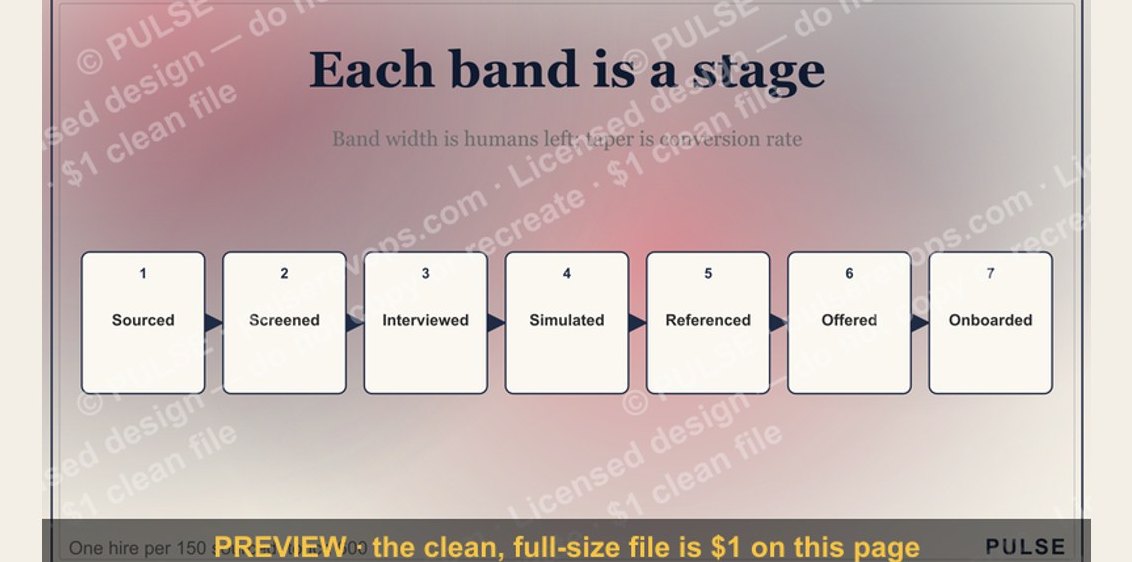 graphicThe Sales Hiring Funnel — Infographic
 graphic5 Stages of the Buyer’s Journey — Infographic
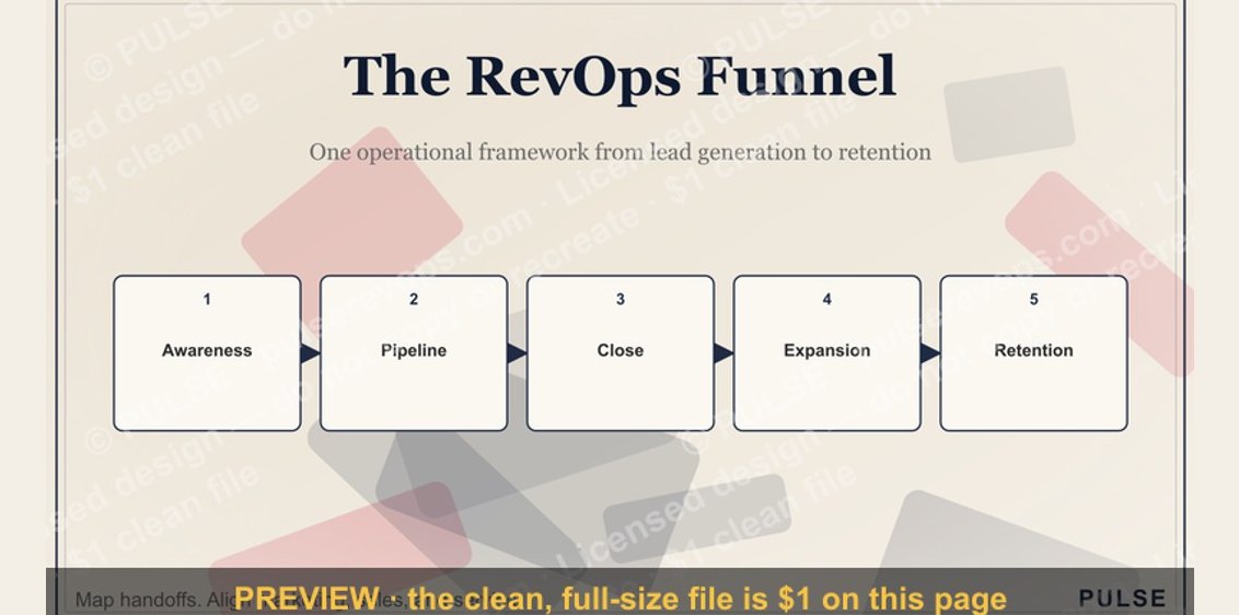 graphicThe RevOps Funnel — Infographic
 graphicThe Ideal Customer Profile — Infographic