


The Perfect Demo — Infographic
Quality
Certified
The Perfect Demo infographic distills a software demonstration into a repeatable sequence — discover, tailor, show, prove, close — so reps stop improvising. Its value is operational, not decorative: it standardizes what a good demo looks like, shortens ramp for new hires, and makes demo-to-close conversion measurable against revenue.
What an infographic actually competes with
Every sales team already owns some artifact that tries to answer "how should we run a demo?" The infographic is one option among four, and the honest comparison matters more than the design work.
The first option is the written playbook — a wiki page or Notion doc running eight to twenty pages, covering discovery questions, feature-to-pain mappings, objection responses, and follow-up templates. Playbooks are the most complete option and the least used. Documentation-adoption patterns in sales enablement are consistent: long-form process docs get read hard during onboarding week and then almost never again. The playbook wins on depth and loses on recall.
The second option is the demo script — a literal turn-by-turn narration, sometimes embedded directly in the demo environment as click-path notes. Scripts produce the fastest ramp for a brand-new rep with zero product knowledge, and they produce the worst demos after month three, because a rep reading a script cannot adapt when the prospect says something the script did not anticipate. Scripts also age badly: every product release invalidates a portion of the click path, and someone has to own that maintenance.
The third option is the recorded gong-style call library — real demos, tagged by segment, that reps watch to learn by imitation. This is the richest signal available and the highest friction to consume. A 35-minute call recording costs a rep 35 minutes; a page of structure costs ninety seconds. Call libraries also encode whatever bad habits your top rep happens to have, which is fine if your top rep is genuinely good and quietly corrosive if they are simply loud.
The fourth option is the infographic — a single portrait-format visual, typically 1080×1350, that names the stages of a demo in order and puts one line of guidance under each. It is the shallowest of the four and the only one a rep can hold in working memory. That is the entire trade. You are buying recall at the cost of nuance.
The practical answer is that these are not mutually exclusive, and treating them as competitors is the mistake most enablement teams make. The infographic is the index. The playbook is the reference the index points into. The script is the scaffold you hand someone in week one and take away in week six. The call library is the evidence layer that proves the other three are describing something real. When a team argues about which artifact to build, they are usually arguing about which one to build *first*, and the answer is almost always the infographic — because it forces the argument about what the stages actually are, and that argument is the real work.

There is a fifth option worth naming even though it sits slightly outside the frame: the interactive demo environment — Navattic, Reprise, Storylane and similar tools that let a buyer click through a guided product tour on their own. These do not replace the live demo, but they change what the live demo is for. If a buyer has already self-served the "what does it look like" question, your live time shifts almost entirely toward "does it fit my situation," which compresses the show phase and expands discovery. Teams that deploy interactive demos and do not update their demo structure end up running the old thirty-minute walkthrough to a prospect who already saw it, and the call goes flat for reasons nobody diagnoses.
Choosing the right artifact for the team you actually have
The decision is not about which artifact is best in the abstract. It is about the shape of your team right now — headcount, tenure distribution, product complexity, and deal size.
Start with tenure spread. If more than a third of your reps have been in seat under six months, structure beats nuance and you want a script plus an infographic. If your median tenure is over two years, a script will be ignored and possibly resented; the infographic plus a curated call library serves better, because experienced reps learn from variation, not instruction.
Then check product surface area. A single-workflow product with one primary screen can be demoed from a five-stage visual with no supporting doc. A platform with six modules and role-based views cannot — you need a modular structure where the infographic covers the meta-sequence and module-specific playbooks cover the branches. The tell is whether two competent reps demoing the same product to the same persona would show substantially different screens. If yes, you need branching, and a single flat infographic will quietly under-serve half your team.
Next, deal size and cycle length. Under roughly $10K ACV with a two-to-three-week cycle, the demo is usually one call and it is close to a closing event; the artifact should optimize for compression and a clean ask. Above roughly $50K ACV with a multi-month cycle and a buying committee, the demo is a sequence — an initial overview, a technical deep-dive, sometimes a security or procurement session — and your artifact needs to describe a demo *program*, not a demo call. Teams that use a single-call structure on committee deals consistently over-show in call one and have nothing left for the deep-dive.
Finally, how fast the product changes. A weekly-release product invalidates click-path scripts faster than anyone maintains them. High-velocity product orgs should invest in stage-level structure that survives UI changes and skip literal scripts entirely.
One caveat on the decision tree: it assumes you know your demo-to-close rate. Many teams do not, because the demo is not a distinct stage in their CRM — it is buried inside "Discovery" or "Evaluation." Before choosing an artifact, make the demo a discrete, timestamped event in your pipeline data. Otherwise you are optimizing something you cannot see.
The numbers that make each option pay for itself

Cost, maintenance load, and expected effect differ enough across these options that the comparison should be quantitative rather than aesthetic.
Build cost. An infographic is roughly four to eight hours of real work — most of it spent arguing about the stages, not drawing. If you start from a free SVG template and recolor it to brand, that drops to under an hour of design and leaves the argument as the only cost. A written playbook is a two-to-four-week project when done honestly, because it requires interviewing top performers, watching recorded calls, and drafting objection responses that survive contact with a real buyer. A demo script is one to two weeks per product line. A curated call library is roughly two to four hours per month, forever — someone has to watch calls, tag them, and prune the stale ones.
Maintenance load. This is where teams get surprised. An infographic built at the stage level survives most product releases untouched; you revisit it when the sales motion changes, maybe once or twice a year. A click-path script needs review on every release that touches a demoed screen. A call library decays fastest — a recording from eighteen months ago shows a UI that no longer exists and pricing that no longer applies, and reps who watch it absorb both errors.
Timing benchmarks worth encoding. A standard discovery-adjacent demo runs 25 to 30 minutes of actual demo time inside a 45-minute booking, leaving buffer for late starts and questions. A technical deep-dive runs 45 to 50 minutes inside a 60-minute slot. Inside the 30-minute version, a defensible allocation is: 5 minutes of agenda-setting and problem confirmation with no product on screen; 15 minutes of demonstration mapped to the pain points just named; 5 minutes summarizing and pressure-testing; 5 minutes on next steps with named dates. Reps almost universally over-spend the middle block and under-spend the last one, which is why so many demos end with "I'll send over some times."
Cognitive limits that constrain the design. Working memory holds roughly four to seven items at once. That is not a soft guideline for an Infographic — it is the reason a five-stage visual works and a fourteen-step one does not. It is also the reason the demo itself should carry no more than three key points per section. If your product has twenty features worth showing, the demo shows three and the follow-up email links the rest.
Attaching it to revenue. The metric that matters is demo-to-closed-won conversion, tracked separately by segment and by rep tenure. Do not chase an industry benchmark number here; conversion varies enormously by ACV, lead source, and whether the demo is gated behind qualification. What matters is your own baseline and its movement. Measure the four weeks before you roll out a demo structure and the eight weeks after, segment out any pricing or lead-source changes in that window, and look at three things: conversion rate, average demo length, and the share of demos that end with a scheduled, dated next step. That last one is the earliest signal — it moves within two weeks of a structural change, well before conversion does.
Ramp time as the second payback lane. For a team hiring more than one rep a quarter, the infographic's return shows up in ramp, not conversion. If a new rep's first solo demo currently happens in week five and structure moves it to week three, you have bought two weeks of selling capacity per hire. At any realistic quota, that is a larger number than a marginal conversion improvement, and it is far easier to attribute.
Rolling it out without it becoming wall art

Most demo infographics die the same way: they get posted in Slack, get eleven reactions, and are never referenced again. The rollout sequence matters more than the artifact.
Week one — derive the stages from your own calls, not from a template. Pull eight to twelve recorded demos, split evenly between closed-won and closed-lost. Watch them at 1.5x with a timestamp log, marking where each call moved from one phase to another. What you will find is that your winning demos share a sequence and your losing ones skip a phase — usually problem confirmation, occasionally the proof step. Name your stages after what your winners actually do. A generic five-stage template that does not describe your motion gets rejected by reps within a week, and they are right to reject it.
Week two — draft, then compress ruthlessly. Write one line of guidance per stage, then cut each line until it is under twelve words. If a stage needs a paragraph to explain, it is not a stage; it is a chapter, and it belongs in the playbook the infographic points to. Keep the format portrait at 1080×1350 so it reads on a phone and drops cleanly into a slide, and export as SVG so it scales into decks, Figma, and banner slots without artifacting. Recolor to brand — a visual in someone else's palette gets read as someone else's advice.
Week three — embed it where the work happens. This is the step teams skip. The infographic belongs pinned in the pre-demo checklist inside your CRM task template, in the onboarding deck, and in the sidebar of whatever call-prep doc reps actually open. It does not belong solely in a shared drive folder. If a rep has to remember it exists, it has failed.
Week four — run structured practice. Certification is unpopular and it works. Each rep runs one demo against the structure to a manager or peer, and the observer scores only whether each stage happened, not whether it was performed beautifully. Binary scoring keeps the exercise from becoming a personality critique. Reps who skip a stage rerun it once. The whole cycle costs about ninety minutes per rep.
Ongoing — audit against real calls quarterly. Sample five recent demos per quarter and check stage adherence. When adherence drops, the usual cause is not laziness — it is that the product or the buyer changed and the structure no longer fits. Treat drift as a signal to revise the artifact, not to discipline the team.
Adjacent workflows the demo structure quietly reshapes

Standardizing the demo has downstream effects that nobody plans for and everybody eventually notices.
Discovery gets stricter. Once the demo structure demands that every feature shown maps to a pain the prospect named out loud, reps discover they do not have enough named pains to fill fifteen minutes. The fix happens upstream: discovery calls get longer and more specific, and qualification criteria tighten. This is the single most common second-order effect of demo standardization, and it is almost entirely positive — though it usually shows up first as a temporary dip in demos booked.
Follow-up becomes a template, not an act of will. If the demo has fixed stages, the recap email has fixed slots: the three things shown, the pain each mapped to, the next step with a date. A recap sent within a couple of hours while the call is still fresh outperforms one sent the next morning, and a templated structure is what makes the fast version possible.
Sales engineering load becomes visible. When demos are unstructured, SE involvement is requested ad hoc and looks like personality. When the structure names which stage requires technical depth, SE staffing becomes a capacity question you can forecast. Teams frequently find they were pulling an SE into calls that did not need one, and skipping SEs on calls that did.
Product feedback gets cleaner. A structured demo produces structured objections. When every rep runs the same sequence, "the prospect stalls at the proof stage" becomes a comparable signal across the team rather than an anecdote. That is the point where demo data starts informing roadmap rather than just coaching.
Marketing inherits the same skeleton. The stage sequence that works in a live demo tends to work in a product page, a webinar outline, and a nurture sequence. Reusing it is not laziness; it means a buyer who sees the website, attends the webinar, and takes the call encounters one consistent story instead of three competing ones. This is also where the infographic earns a second life — as a public-facing asset, an Infographic on a resources page pulls links and impressions from people searching for demo structure, which is a small but real revenue-adjacent channel.
Adjacent industries run the same pattern. The structure is not SaaS-specific. Field-service and home-services companies running in-home estimates use the identical sequence — confirm the problem, show the fix, prove the outcome, price it, schedule it — and the failure mode is identical too: the estimator jumps to price before the homeowner has articulated what is wrong. Equipment vendors running trade-show demos face a compressed version of the same problem, where the discovery phase collapses into two questions and the proof phase has to happen in ninety seconds. If your structure only works when you have thirty uninterrupted minutes, it is not a structure; it is a schedule.
Related questions
How long should a software demo actually run?
Twenty-five to thirty minutes of demo time inside a 45-minute booking for a standard discovery-adjacent demo; 45 to 50 minutes inside an hour for a technical deep-dive. Longer sessions lose attention without adding conviction, and running short is better than running over.
Should pricing come up during the demo?
Only if the prospect raises it, or if you are running a compressed single-call motion where pricing is the natural close. In committee deals, pricing before value is established anchors the conversation on cost and pulls the discussion away from fit.
How much of each demo should be customized?

Customize the examples, data, and sequence emphasis — not the underlying structure. The stages stay fixed; what you show inside them changes per prospect. Using the prospect's own terminology and a data set that resembles theirs matters more than rebuilding the flow.
Do interactive demo tools replace the live demo?
No, they change its job. When buyers self-serve the product tour, live time shifts toward fit, objections, and technical validation. Teams that deploy interactive demos without shortening the live walkthrough end up presenting something the buyer already watched.
What is the fastest way to tell if our demo structure is working?
Track the share of demos that end with a scheduled, dated next step. It moves within about two weeks of a structural change, well ahead of conversion rate, and it is hard to game.
FAQ
What makes a demo "perfect"?
A Perfect demo is not a flawless performance — it is one where every screen shown maps to a problem the prospect articulated in their own words, the session ends inside its scheduled time, and both parties leave with the same understanding of what happens next. Polish is optional; that mapping is not.
Is an infographic enough on its own, or do we need a full playbook?
For a single-workflow product with an experienced team, the infographic alone is usually sufficient. For a multi-module platform or a team with heavy new-hire flow, the infographic works as the index and a playbook carries the branching detail. Build the infographic first regardless — defining the stages is the work the playbook depends on.
How do we keep the infographic from going stale?
Build it at the stage level rather than the click level. Stage names survive UI changes; click paths do not. Then audit it quarterly against five recent recorded demos. If reps are consistently deviating, the artifact is wrong, not the reps.
Our reps say structure makes them sound scripted. How do we respond?
Distinguish structure from script. A structure fixes the order of phases and leaves everything inside each phase to the rep's judgment. A script fixes the words. Reps who resist scripts are usually right; reps who resist structure are usually running a demo whose sequence they cannot articulate.
What format and size should we export it in?
SVG as the master, portrait at 1080×1350 pixels. SVG scales into slides, Figma, and banner slots without quality loss and can be recolored to brand. Export a PNG alongside it for platforms that only accept raster, and keep both in the same place reps already look.
How does demo structure connect to revenue reporting?
Make the demo a discrete, timestamped stage in the CRM so demo-to-closed-won conversion is measurable independently of overall pipeline velocity. Without that, structural changes produce revenue effects you can feel but cannot prove, and the initiative dies at the next budget review.
Sources
- https://www.nngroup.com/articles/ — Nielsen Norman Group research on usability, presentation, and how users process interface walkthroughs
- https://hbr.org/topic/subject/presentation-skills — Harvard Business Review on presentation, persuasion, and business communication
- https://www.gartner.com/en/sales — Gartner research on B2B buying behavior and sales enablement
- https://www.apa.org/ — American Psychological Association on attention, working memory, and retention
- https://www.smashingmagazine.com/category/design/ — Smashing Magazine on data visualization and information design
- https://www.sba.gov/business-guide/manage-your-business — U.S. Small Business Administration guidance on selling and customer communication
- https://www.salesforce.com/resources/ — Salesforce research library on sales process and buyer expectations
- https://blog.hubspot.com/sales — HubSpot Sales Blog on demo structure, discovery, and follow-up practice
Related on PULSE
This page will be disappearing soon. Save it to your device for $1 — or read it free while it is here.
@Kory-White- · if Venmo asks, the last 4 of my number are 2012
This page is gone.
This one is off the shelf now. $1 keeps it on your phone for good — the whole page, pictures and diagrams included.
 graphic5 Stages of the Buyer’s Journey — Infographic
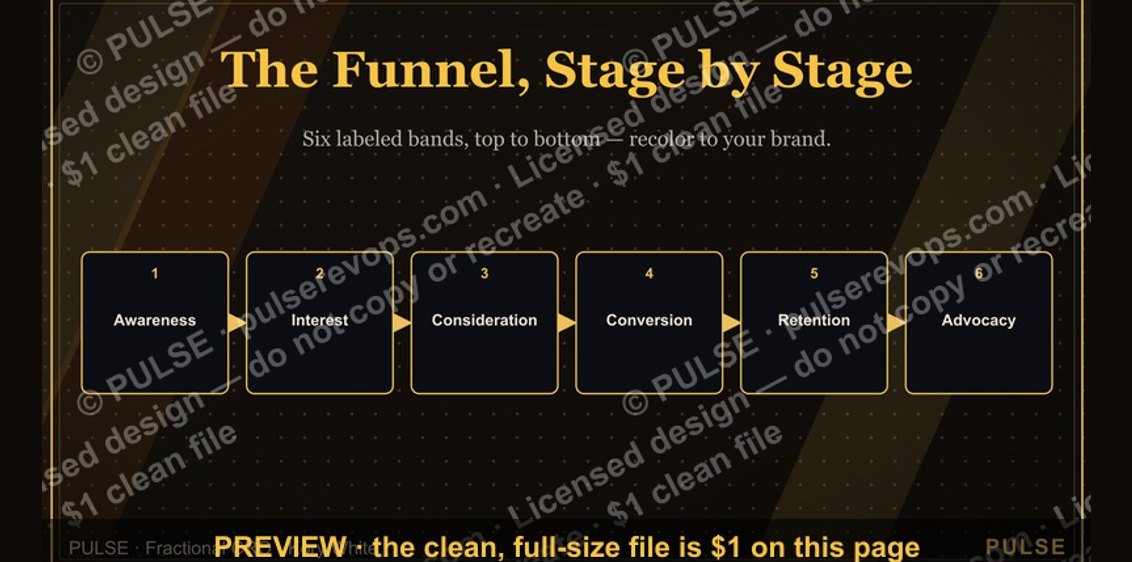 graphicThe Marketing Funnel — Infographic
 graphic5 Signs a Deal Is Real — Infographic
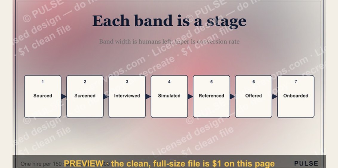 graphicThe Sales Hiring Funnel — Infographic
 graphic4 Forecast Categories — Infographic
 graphicMEDDIC Qualification — Infographic
 graphic6 Sales Email Rules — Infographic
 graphicThe Ideal Customer Profile — Infographic
 graphicThe Sales Cycle: Lead to Closed-Won — Infographic
 graphicThe Demand Waterfall — Infographic