


The Customer Journey — Infographic
Quality
Certified
This is a free downloadable infographic titled "The Customer Journey — Infographic", sized 1080x1620 px and delivered as a PNG. It maps the Customer Journey as a single left-to-right path with five labelled stages, showing what the buyer does, what the vendor owns, and which metric moves at each handoff.
Why a shared journey picture is worth downloading
Consider a mid-market software company three weeks before its annual planning offsite. Demand generation has built its plan around form fills. Sales has built its plan around discovery calls booked. Customer Success has built its plan around renewal dates. Each function is measuring a real thing, and each one is measuring a different segment of the same road. When the three plans are laid side by side, the seams show: nobody owns the two-week gap between a form fill and a first outreach attempt, so leads age in a queue while the demand team reports a great month and the sales team reports a terrible one.
That is the specific failure this infographic is designed to interrupt. It is not a strategy document and it is not a diagnostic. It is a single shared picture that a team can put on a wall, drop into a planning deck, or paste into a Slack channel so that when someone says "the Customer Journey", everyone in the room is pointing at the same set of stages. The value is not in the graphic being clever. The value is in it being identical for everybody.
Practitioners usually reach for a journey artifact in one of four moments: a planning cycle where functions need to reconcile their roadmaps; a handoff audit after a bad quarter where leads or accounts clearly slipped between teams; an onboarding packet for new hires who need to understand where their role sits; or a partner or agency kickoff where an outside team needs the vocabulary fast. In each of those moments, a downloadable PNG beats a slide deck because it can be dropped anywhere — a wiki page, a Notion doc, a printed wall sheet, a QBR appendix — without reformatting.
The infographic also works as a conversation starter precisely because it is static. It does not adapt to the reader. If a stage label does not match how your team actually talks, that mismatch is the useful signal. Teams that customize the graphic usually discover they have three names for the same stage and no name at all for one of the transitions.
How the journey stages connect
The graphic reads left to right across five stages, with a feedback loop drawn underneath returning from the final stage back toward the middle. That return path is the part most teams under-draw on their own whiteboards, and it is the part that carries the most operational weight.

The loop from Advocacy back into Consideration is the referral path: a happy Customer re-enters the market as a proof point for the next buyer. The loop from churn risk back into Consideration is the win-back path, which most teams treat as a separate motion even though it uses the same comparison behavior. Drawing both loops forces an uncomfortable question — who owns the return path? In many organizations the answer is "whoever notices", which is the same as nobody.
Inside each stage the infographic distinguishes two lanes. The top lane describes what the buyer is doing: reading, comparing, asking peers, trialing, adopting, renewing. The bottom lane describes what the vendor owns: which team is accountable, what artifact moves the deal, and which metric is expected to change. Keeping those lanes visually separate is deliberate. Buyer behavior is not something you control; it is something you respond to. Vendor ownership is something you absolutely control, and it is where every planning argument should land.
The three transitions between the middle stages are where the graphic places the heaviest visual weight, because transitions are where accountability breaks. Awareness to Consideration is a qualification question — is this person actually in-market? Consideration to Decision is a proof question — have we removed enough risk? Decision to Onboarding is a continuity question — does the buyer's expectation survive contact with delivery? Each transition has an owner, an artifact, and a failure symptom printed on the graphic so the reader can self-diagnose without a consultant.
What the infographic shows, element by element
The graphic is built from a small number of deliberate elements, and every one of them earns its space.
The title block. The words "The Customer Journey — Infographic" sit at the top in a heavy sans-serif, with a thin rule underneath. The title is intentionally literal. A clever title would date the graphic and make it harder to search for later.

The five stage columns. Each column carries a stage name, a one-line definition, and a short list of three buyer actions. The definitions are written in plain language rather than internal jargon so the graphic survives being shown to someone outside the company.
The ownership lane. Running beneath the stages is a band listing the accountable function for each stage — typically marketing, sales, a shared or hybrid owner, onboarding or implementation, and account management. The band is drawn as a continuous strip rather than five separate boxes, because the point is continuity of ownership across the whole path.
The metric strip. Under the ownership lane sits a row of metric labels, one per stage. These are deliberately generic: reach, qualified interest, committed pipeline, time-to-first-value, net revenue retention. Generic labels are safer than your internal metric names because the graphic is meant to be customized, and swapping a label is a five-minute edit while rewriting a definition is not.
The two return loops. Drawn as thinner lines beneath the main flow, one from advocacy back to consideration and one from churn risk back to consideration. Both are labelled with a single word — referral and win-back — so the reader immediately understands they are re-entry paths, not new stages.
The transition callouts. Three small annotations sit on the arrows between stages, each naming the failure mode: unqualified handoff, unresolved risk, expectation gap. These are the most quoted part of the graphic in practice, because they name problems people recognize instantly.
The footer strip. A slim band at the bottom carries the download note and a placeholder line for a team name or date, so a printed copy can be versioned.
Nothing on the graphic is decorative for its own sake. There are no stock photos, no icons that require a legend, and no data visualization, because there is no dataset behind it. It is a structural diagram, and structural diagrams get worse when you add ornament.
Where and how to use it

The 1080x1620 px portrait format is chosen for a reason: it is a 2:3 ratio, which fits cleanly into a printed letter-size sheet with margins, scales down to a phone screen without horizontal scrolling, and drops into the vertical slide layouts most teams use for internal readouts. It is not a widescreen deck slide, and trying to force it into 16:9 will leave large empty bands on both sides.
Practical placements, roughly in order of how often teams use them:
A wiki or knowledge-base landing page. Drop the PNG at the top of the page that defines your lifecycle vocabulary. Anyone searching for "what is a qualified lead" lands on the picture first, then the definitions. This is the single highest-leverage placement because it becomes the reference everyone links to.
Planning and QBR decks. Insert it as the second slide, right after the agenda, so the rest of the deck can refer back to stage names without re-explaining them. Teams that do this report fewer definitional tangents in the meeting, which is a small but real time saving across a two-hour session.
Printed wall sheets. At letter size or larger, the graphic works as a physical artifact in a team area. The value here is accidental exposure — people walk past it and absorb the stage names without being asked to read anything.
Onboarding packets. New hires in sales, marketing, or success can be given the graphic on day one and asked to mark which stages they touch. That exercise surfaces role confusion in the first week rather than the first quarter.
Partner and agency kickoffs. An outside team needs your vocabulary fast. A single shared image compresses a thirty-minute explanation into a two-minute orientation.
Two placements to avoid. Do not use it as a social media post on its own — it is a reference artifact, not a hook, and it will underperform a narrative post. And do not embed it as the only content in a customer-facing document, because it describes internal ownership and is not written for a buyer's eyes.
The message behind the graphic, and when it backfires

The message is straightforward: the Customer Journey is one continuous path with named owners at every stage and named failure modes at every transition. The graphic argues that most revenue problems are transition problems, not stage problems. Teams rarely fail at the work inside a stage; they fail at the seam between two stages where two functions each assume the other is acting.
That message lands well in three situations. First, when a team is genuinely aligned on goals but disagreeing on vocabulary — the graphic resolves the vocabulary dispute without relitigating strategy. Second, when a new leader needs to establish a shared frame quickly and does not want to spend a quarter on a custom diagnostic. Third, when a cross-functional group needs a neutral artifact that does not belong to any one function, which matters because a graphic owned by sales will be read as a sales argument.
It backfires in three situations worth naming. First, when the real problem is a compensation conflict rather than a vocabulary gap. If sales is paid on bookings and success is paid on retention, a shared picture will not resolve the tension — it will just make the tension more visible, which can be useful but is not the same as fixing it. Second, when the organization has genuinely unusual stages — for example, a marketplace with two-sided acquisition, or a product-led motion where the buyer never speaks to a human. Forcing those into a five-stage linear model creates more confusion than it removes, and the graphic should be redrawn rather than adopted. Third, when it is presented as a mandate rather than a draft. Teams resist a picture that arrives fully formed from above; they adopt one they were invited to edit.
A useful test before rolling it out: ask three people from three functions to name the stage where their work ends. If the answers conflict, the graphic has a job to do. If the answers align and the problem is elsewhere, the graphic is a distraction.
Real numbers, ranges, and benchmarks to expect

The graphic itself carries no statistics, and that is intentional — inventing numbers on a reference diagram is how diagrams get discredited. But teams adopting it usually want to know what normal looks like so they can tell whether their own path is healthy. The following ranges are the kind of planning assumptions practitioners commonly work with. Treat them as starting points to validate against your own data, not as published findings.
Stage duration. In a mid-market B2B motion with an average contract value in the low five figures, awareness to decision commonly runs somewhere between 60 and 180 days, with a wide tail. Enterprise motions with six-figure contracts frequently run 6 to 12 months or longer. Self-serve or product-led motions can compress the same span to days. The spread is enormous, which is exactly why a single benchmark is misleading and why the graphic shows stages rather than timelines.
Transition loss. The heaviest attrition is usually at the awareness-to-consideration seam, where unqualified interest is filtered out, and at the consideration-to-decision seam, where deals stall on unresolved risk. It is common for a large majority of raw interest to never reach a qualified conversation, and for a substantial share of qualified opportunities to stall rather than lose outright. Stalled deals are the expensive ones because they consume forecast confidence without producing revenue.
Time-to-first-value. In onboarding, the interval between contract signature and the customer's first meaningful outcome is the strongest early predictor of renewal in most teams' experience. Compressing that interval is usually a higher-leverage project than adding features, because it acts on every account simultaneously.
Retention and expansion. Net revenue retention above 100 percent means expansion outruns churn, and it is the number most boards ask about first. Gross retention — what you keep before expansion — is the harder and more honest metric, because it cannot be flattered by a few large upsells.

Advocacy conversion. Referral and reference rates vary enormously by segment, but the operational point is stable: advocacy is a stage with an owner, not a happy accident. Teams that ask for referrals on a schedule get more of them than teams that ask when they remember.
Cycle-time variance. The single most useful internal benchmark is not the average, it is the spread. A 90-day average with a 30-to-400-day range describes a process with no control. Narrowing the range is usually more valuable than shaving the mean.
Trade-offs and alternatives to a single linear journey
A five-stage linear model is a simplification, and every simplification has a cost. The honest version of this section is a list of what you give up.
Linear versus bowtie. The linear model is easy to teach and easy to print. A bowtie model splits the path into a wide pre-sale funnel and a wide post-sale expansion shape, joined at the narrow point of purchase. The bowtie is better at showing that retention and expansion are as large as acquisition, but it is harder to draw legibly at infographic size and harder for a newcomer to read in five seconds.
Human-led versus product-led. If your product onboards users without a human, the onboarding stage is not a team handoff at all — it is a product experience. Forcing it into an ownership lane creates a phantom owner. Product-led teams usually redraw the middle stages around activation events instead of meetings.
Single path versus segmented paths. A single path implies all customers travel the same road. In reality, an enterprise buyer and a self-serve signup share almost nothing after awareness. Segmented models are more accurate and considerably more work to maintain; most teams start with one path and split it only when the single version starts causing bad decisions.
Static graphic versus living document. A printed PNG is stable and cheap. A living diagram in a wiki is editable and always current, but it drifts and loses the shared-reference quality that makes a static image useful. The pragmatic answer most teams land on is both: a stable PNG for orientation and a linked living document for detail.

What you give up by adopting the graphic. You give up nuance. You accept that a five-stage picture will be wrong in the details for every team that uses it, and you accept that in exchange for a shared vocabulary that is right about the structure. That trade is usually worth making, but it should be made deliberately rather than by default.
Common pitfalls and how to avoid them
Pitfall: treating the stages as a timeline. The graphic shows sequence, not duration. Readers routinely assume stage widths correspond to elapsed time. Fix: add a note that the columns are not to scale, or annotate typical durations separately if you customize it.
Pitfall: assigning two owners to one stage. A stage with joint ownership has no owner. When accountability is shared, escalation has nowhere to go. Fix: name one accountable function per stage and list contributors separately, in smaller type.
Pitfall: drawing the loops but never staffing them. Referral and win-back paths appear on the graphic and then get ignored in planning. Fix: give each loop a named owner and a review cadence, even if the cadence is quarterly.
Pitfall: using the graphic as the whole onboarding. A picture orients; it does not teach. New hires need the graphic plus a written definition of each stage plus one example per stage. Fix: pair the PNG with a one-page glossary.
Pitfall: customizing the words but not the metrics. Teams often relabel stages to match internal vocabulary and leave the metric strip generic, which produces a graphic that looks bespoke but measures nothing. Fix: if you relabel a stage, relabel its metric in the same edit.
Pitfall: letting the graphic become a compliance artifact. Once a diagram is used to audit teams, people stop being honest about where deals actually stall. Fix: keep the graphic as a shared reference, and do the auditing in a separate, private review.

Pitfall: never revisiting it. A journey graphic that has not been reviewed in two years usually describes a company that no longer exists. Fix: put a review date in the footer strip and honor it.
Pitfall: over-designing the customization. Teams sometimes spend weeks rebuilding the graphic with brand colors, custom icons, and animated transitions. The marginal value of that work is close to zero compared with the value of shipping the plain version in week one. Fix: ship the default, live with it for a quarter, then customize based on what actually confused people.
How to customize the graphic for your own team
Customization should be surgical. The graphic's value comes from its structure, so change labels and colors, not the skeleton.
Step one: map your real stage names. Write down what your teams actually say in meetings. If sales says "discovery" and marketing says "consideration", pick one term and note the alias. Two names for one stage is survivable; two stages sharing one name is not.
Step two: assign one accountable function per stage. Use role names, not people's names, so the graphic survives turnover. If a stage genuinely has no owner today, that is a finding — write "unassigned" on the draft and take it to the planning meeting.
Step three: replace the generic metrics with your own. Use the metric your team already reports, not the metric you wish you reported. A graphic that shows a metric nobody tracks will be ignored within a month.
Step four: rewrite the three transition callouts. These should name the specific failure modes your team has actually experienced in the last two quarters. Generic callouts read as filler; specific ones read as insight.
Step five: adjust color for accessibility. Keep the palette to three or four colors with strong contrast, and do not rely on color alone to distinguish lanes — use position and labels as well, so the graphic survives grayscale printing and color-blind readers.

Step six: add a version footer. Include a team name, a date, and a version number. When someone prints it and pins it up, the date tells them whether it is stale.
Step seven: decide what to remove. If your motion has no meaningful advocacy stage, delete the column rather than leaving it empty. An empty stage invites the question "why is this blank" in every meeting.
Step eight: pilot with one team before rolling out. Give the customized version to a single function for two weeks and ask what they misread. Misreadings are the best customization input you will get.
Related questions
What size is the infographic and what format does it download in?
It is 1080x1620 pixels, a 2:3 portrait ratio, and it downloads as a PNG. That size prints cleanly on letter paper with margins and scales down to a phone screen without horizontal scrolling.
Can I edit the wording or colors?
Yes. The graphic is designed to be customized. Change stage labels, ownership names, and metrics to match your team's vocabulary, and adjust the palette for contrast. Keep the five-stage skeleton intact.
What are the two loops at the bottom?
They are re-entry paths. One carries referrals from advocates back into consideration; the other carries win-back from churn risk back into consideration. Both need a named owner if they are to be used.
Is this a strategy framework or just a picture?
It is a shared-reference picture, not a diagnostic. Its job is to make sure everyone means the same thing when they say "the Customer Journey". The strategy work happens after the vocabulary is settled.
Where should I put it first?
On the wiki or knowledge-base page that defines your lifecycle terms. That placement makes it the canonical reference everyone links to, which is where it does the most work.
FAQ

Does the infographic include any statistics or benchmarks? No. The graphic carries no data, deliberately, because invented numbers on a reference diagram get discredited quickly. Any ranges you see on this page are planning assumptions to validate against your own data, not published findings.
Can I use it in a customer-facing document? It is written for internal audiences and describes internal ownership, so it is a poor fit for buyer-facing material. If you need a customer-facing version, redraw it around the buyer's actions only and remove the ownership lane entirely.
What if our journey does not have five stages? Then redraw it. The five-stage structure is a common default, not a rule. Product-led motions often collapse the middle stages; marketplace motions often need two parallel paths. The graphic is a starting point, and adapting it is expected.
How often should we review the graphic? Once a year at minimum, and any time a major motion changes — a new segment, a new self-serve tier, a reorganized success team. Put the review date in the footer so staleness is visible.
Who should own the graphic internally? Someone in revenue operations or a comparable cross-functional role, because the whole point is that no single function owns the Customer Journey. If one function owns the picture, the other functions will read it as that function's argument.
Can I print it at larger than letter size? Yes. Because it is a PNG at 1080x1620, it scales up acceptably for a wall sheet at roughly 18x27 inches, though it will soften. For larger formats, request a vector version rather than upscaling the raster file.
Sources
- HubSpot Research — customer journey and buyer behavior studies
- McKinsey & Company — growth, marketing and sales insights
- Gartner — customer experience and revenue operations research
- Forrester — customer experience and B2B buying research
- Nielsen Norman Group — customer journey mapping guidance
- Harvard Business Review — customer journey and retention articles
- Salesforce — State of the Connected Customer research
- ChurnZero — customer success benchmarks and resources
Related on PULSE
- What is a customer journey map and when should you build one?
- Defining lifecycle stages across marketing, sales, and success
- Handoff design: the seam between sales and onboarding
- Choosing the metrics that sit on each lifecycle stage
- Running a win-back motion without cannibalizing new business
- Building a shared revenue vocabulary across functions
- How to run a journey review in a quarterly planning cycle
This page will be disappearing soon. Save it to your device for $1 — or read it free while it is here.
@Kory-White- · if Venmo asks, the last 4 of my number are 2012
This page is gone.
This one is off the shelf now. $1 keeps it on your phone for good — the whole page, pictures and diagrams included.
 graphic6 Sales Email Rules — Infographic
 graphic5 Dysfunctions of a Team — Infographic
 graphicThe Value Selling Ladder — Infographic
 graphicThe Demand Waterfall — Infographic
 graphicBANT Qualification — Infographic
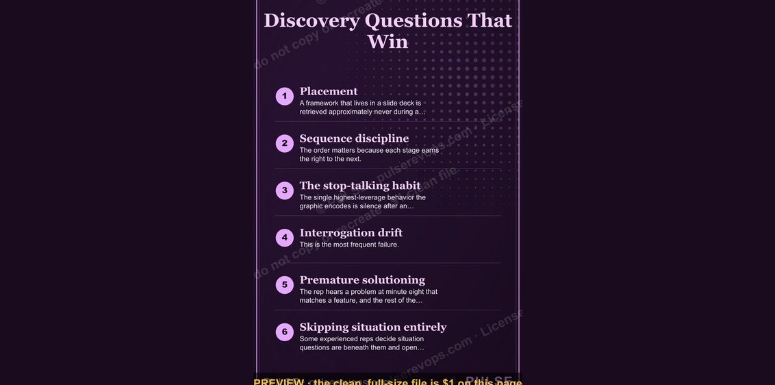 graphicDiscovery Questions That Win — Infographic
 graphic5 Signs a Deal Is Real — Infographic
 graphicThe SaaS Growth Funnel — Infographic
 graphicThe 30-60-90 Ramp — Infographic
 graphic5 Stages of a Healthy Pipeline — Infographic