


“The fortune is in the follow-up.” — Quote Card
Quality
Certified
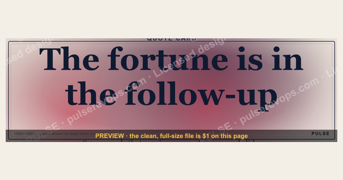
"The fortune is in the follow-up" means most revenue is won after the first contact, not during it. The Quote Card version of this line exists to make that idea shareable — a 1080×1080 square graphic you post, slide, or pin so a team sees the reminder daily instead of reading it once.
The Quote Card versus the LinkedIn banner: two formats, one line
The same sentence ships in two very different asset shapes, and picking the wrong one wastes the placement. The Quote Card is square — 1080×1080 px — built for feed posts, Instagram, Slack channel pins, and slide pull-quotes. The banner version is a wide strip, typically rendered at LinkedIn's 1584×396 profile cover ratio, built to sit behind a headshot and be read in half a second while someone scrolls past a profile.
Those constraints change the typography, not just the crop. A square card can carry the full quote at a large point size plus an attribution line and still leave breathing room; there is vertical space to stack three or four lines of text. A banner has roughly a 4:1 aspect ratio, so the same sentence has to run nearly horizontal — which means either a much smaller type size or aggressive truncation. In practice a banner holds about five to eight words comfortably at readable size; "The fortune is in the follow-up" is seven words, which is exactly why this particular line survives in both formats. A longer quote would not.
The second difference is lifespan. A Quote Card is an event: you post it, it gets impressions for 24 to 72 hours, and then it lives in your archive or gets re-shared quarterly. A banner is ambient: it sits on a profile for months and is seen by everyone who visits, including prospects doing pre-call research. If you are choosing where to spend one design cycle, the banner has a longer tail; the Quote Card has a sharper spike. Most teams want both, and use the card for campaign moments and the banner as the persistent backdrop.

Third, there is the internal-versus-external split. Square cards work as internal artifacts — printed at desk size, dropped into a Monday pipeline review deck, set as a Slack channel topic image for the SDR team. Banners are almost purely external. If your goal is to change rep behavior on Tuesday morning, the card is the tool. If your goal is to signal a philosophy to buyers, the banner is.
Finally, format governs editability. The card is distributed as SVG — scalable vector — which means it re-renders crisply at 200 px in a Slack thread and at 4000 px on a printed poster with zero quality loss, and the fill colors are editable text nodes rather than baked pixels. A PNG export exists for platforms that reject vector uploads, but the SVG is the master. Treat the PNG as a derivative you regenerate, never as the file you edit.
Choosing the right asset for the placement
The decision is mostly mechanical once you know the surface and the audience. Work top-down: what surface, what audience, what lifespan, what edit level. If the surface is a feed or a slide, you want the square. If it is a profile header or an email signature strip, you want the wide format. If you need brand colors, you need the SVG regardless of shape, because recoloring a PNG means re-exporting from a design tool you may not have.
One caveat worth building into the decision: a quote card without a follow-up system behind it is decoration. Before you spend a cycle deciding format, confirm the cadence it advertises actually exists in your CRM. A team that posts this line while letting 60% of inbound leads go untouched after touch one is publishing a claim it cannot back. The card should describe your operating reality, not aspire to it.
Two failure modes show up repeatedly. The first is uploading a square card into a banner slot, where the platform center-crops it and eats the top and bottom lines of the quote — the sentence becomes "fortune is in the" and the asset is worse than nothing. The second is exporting the PNG at 1x for a retina display, which produces visible edge softness on text. Export at 2x minimum (2160×2160 for the square) whenever the destination is a modern screen; the file is still under a couple hundred kilobytes for flat vector art with no photographic content.
The numbers behind the line the card carries

The card's whole job is to compress a real operational fact into seven words, so it is worth knowing what that fact is. The widely repeated figure in B2B sales is that a majority of closed deals require roughly five or more follow-up touches, while a large share of sellers stop after one or two. Treat those as directional rather than precise — they circulate across vendor blogs with inconsistent sourcing — but the shape is consistent with what any CRM will show you when you run the query yourself. That query is the real point: pull your own closed-won opportunities, count activities logged before the close date, and find your own median. A team that discovers its median is 3 and its cadence stops at 2 has found free revenue.
The economics are easier to model than the psychology. Take a team generating 100 inbound leads a month at a $50 blended cost per lead — $5,000 spent. If 10 convert on first contact, your cost per acquisition is $500. The other 90 leads represent $4,500 of already-spent budget sitting idle. If a structured five-touch cadence converts even 10% of that remainder, you add 9 customers at no incremental acquisition cost, and blended CPA falls to roughly $263. You did not buy more traffic; you stopped abandoning traffic you already paid for. Follow-up conversion rates vary widely by motion — low single digits for self-serve SaaS, considerably higher for high-ticket services with a human seller — so run the math with your own recovery rate rather than borrowing one.
On the asset side, the numbers are smaller but real. A flat SVG quote card is typically a few kilobytes; the same card as a 2160 px PNG lands in the low hundreds of kilobytes. That difference matters when the card is embedded in an email footer or a page that is measured on load time. Design time is the other cost: recoloring an existing SVG to brand hex values takes minutes, while commissioning a new card from scratch is a design ticket measured in days. That gap is the entire argument for using a template library rather than briefing each quote card individually — you spend the design budget once on the system and pennies per instance thereafter.

There is also a distribution number worth tracking. If you post the card and it drives profile visits or replies, that is attributable pipeline influence, and it belongs in the same revenue conversation as any other top-of-funnel asset. Tag the post, watch the 72-hour window, and compare against your baseline post performance. A quote card that outperforms your average post by a meaningful margin is a signal to build more of them; one that underperforms twice is a signal that your audience wants substance, not aphorism.
Building the cadence the card is advertising
Publishing the graphic is the easy half. The harder half is making the sentence true inside your CRM, and that is a sequencing problem. Build the cadence first, then publish the card as the public artifact of a system that already works.
A workable default is five touches over roughly 18 days, spaced 2 to 4 days apart, rotating channels so you are not just re-sending the same email. Day 1: initial outreach with a specific, concrete value proposition tied to something you know about their business. Day 4: a connection request or short social message that references the email without re-pitching. Day 7: a follow-up email carrying something genuinely new — a case study, a benchmark, an article that speaks to the problem they raised. Day 12: a phone call and a voicemail, which is the touch most teams skip and the one that most often breaks silence. Day 18: a clean closing-the-loop message that releases them politely and leaves the door open. That last touch converts more often than people expect, because it removes pressure.
Give each touch a distinct job rather than repeating the same ask. Touch one is awareness. Touch two is credibility — proof that other people like them bought. Touch three is relevance — something specific to their situation. Touch four is human — a real question about their priorities, not a pitch. Touch five is closure. If two consecutive touches carry the same job, one of them is filler and should be cut.
Automation handles the timing; it must not handle the words. Use the CRM to enforce the schedule, log every touch, and surface the next action on a rep's queue. Do not let it send generic "just checking in" copy, which is the single most ignored sentence in B2B email. Reference a specific detail from the last interaction — a metric they quoted, a deadline they mentioned, a competitor they named. That specificity is what separates persistence from harassment, and it is the difference between a cadence that generates revenue and one that generates unsubscribes.
Measure touches-to-conversion, not just open and reply rates. Most teams that instrument this find conversions clustering somewhere between touch three and touch seven. Once you know your own cluster, you can size the cadence honestly instead of guessing. Then, and only then, put the card on the wall.
Recoloring, exporting, and shipping the card
Because the master is an SVG, brand adaptation is a find-and-replace on fill values rather than a redesign. Open the file in any vector editor or a plain text editor, swap the accent hex for your primary brand color, and decide on the background: a solid brand color, white for print, or transparent when the card will sit on a colored slide. Transparent backgrounds are the safest default for deck use, because a baked white square on a dark slide looks like a mistake.
Watch contrast when you recolor. If your brand accent is a mid-tone and your text is also mid-tone, the quote becomes unreadable at thumbnail size, which is exactly the size most people will see it. Aim for a clear light-on-dark or dark-on-light relationship, and check it by shrinking the card to about 150 px wide — if you cannot read the line, the contrast is wrong regardless of what a color picker says.

For distribution, keep the SVG as the source of truth in whatever asset store your team uses, and generate PNGs on demand for platforms that reject vector uploads. LinkedIn, Instagram, and most email clients want raster; Figma, PowerPoint, Google Slides, and Canva all accept SVG directly and will keep it sharp at any scale. When you drop the card into a deck, place it as a full-bleed slide rather than a small inset — a pull-quote works because it interrupts, and a postage-stamp version of it does not.
One last operational note: version the file. If you recolor for a rebrand, keep the old variant rather than overwriting it, because old decks and old posts still reference the previous look and you will want to match when you update them. A quote card is cheap to store and annoying to reconstruct.
Related questions
Can I use this Quote Card commercially?
The card is free to use with no attribution required, which covers internal decks, client presentations, and social posts. Recoloring to your own brand is expected. Reselling the graphic itself as a product is the one use that is outside the spirit of a free asset library.
What size should I export for Instagram versus LinkedIn?
Instagram feed posts want the native 1080×1080 square. LinkedIn accepts square images in-feed and will display them well, but its profile cover slot needs the 1584×396 wide variant. Export PNG at 2x for retina sharpness on both platforms.
Should the quote be attributed to a specific person?
The line circulates widely without reliable attribution — it is repeated across sales training and coaching contexts with no single verifiable origin. Presenting it as a general sales maxim rather than assigning it to a named author avoids fabricating a citation you cannot support.
Does a quote card actually drive pipeline?
Indirectly. It drives impressions and profile visits, which feed the top of funnel. Treat it as brand and recall surface, not a conversion asset, and measure it against your baseline post performance rather than against a demo-request page.
FAQ

What is the file format and size of the Quote Card?
It ships as an SVG at 1080×1080 px. SVG is a scalable vector format, so it renders sharp at any size — a Slack thumbnail or a printed poster — and the colors are editable rather than baked into pixels. A PNG export is available for platforms that only accept raster uploads.
How do I change the colors to match my company brand?
Use the color picker on the graphic page to set the accent and background, including a transparent background option, then download the recolored SVG or PNG. If you prefer to work locally, open the SVG in a vector editor or a text editor and replace the fill hex values directly.
Where does this card work best?
Feed posts on LinkedIn and Instagram, Slack channel pins for a sales team, and full-bleed pull-quote slides in a pipeline review deck. It also prints cleanly at desk-frame size. It does not work as a profile banner — that slot needs the wide variant or the platform will crop the quote.
Is there a wide version of the same quote?
Yes. The same line exists as a LinkedIn banner sized for the profile cover slot. Use the square card for feed and slide placements and the banner for the persistent profile header, since the two crops carry very different amounts of readable text.
How many follow-up touches should the cadence behind this card actually have?
Five touches over roughly two to three weeks is a reasonable default, varied across email, phone, and social rather than repeating one channel. The better answer comes from your own CRM: count logged activities on closed-won deals and set the cadence just past your median.
Won't posting this look hypocritical if our follow-up is weak?
It can, and buyers notice. Build the cadence first — define the touches, enforce them in the CRM, measure touches-to-conversion — then publish the card as evidence of how you operate. The graphic should describe your practice, not substitute for it.
Sources
- https://hbr.org/ — Harvard Business Review, sales and customer relationship research
- https://www.sba.gov/ — U.S. Small Business Administration, small business sales and client retention guidance
- https://www.salesforce.com/resources/ — Salesforce, CRM and lead nurturing best practices
- https://blog.hubspot.com/sales — HubSpot Sales Blog, follow-up sequences and email cadence
- https://www.linkedin.com/help/linkedin — LinkedIn Help Center, official image dimension specifications
- https://developer.mozilla.org/en-US/docs/Web/SVG — MDN Web Docs, SVG format reference
- https://www.entrepreneur.com/topic/sales — Entrepreneur, sales follow-up technique coverage
- https://www.forbes.com/sales/ — Forbes, sales persistence and buyer psychology coverage
Related on PULSE
- "The fortune is in the follow-up." — LinkedIn Banner
- "The fortune is in the follow-up." — LinkedIn Banner
- "Sell the Problem, Not the Product" — Quote Card
- "Pipeline Cures All" — Quote Card
- "Revenue Is a Lagging Indicator of Trust" — Quote Card
- "Sell like you'd want to be sold to." — Quote Card
This page will be disappearing soon. Save it to your device for $1 — or read it free while it is here.
@Kory-White- · if Venmo asks, the last 4 of my number are 2012
This page is gone.
This one is off the shelf now. $1 keeps it on your phone for good — the whole page, pictures and diagrams included.
 graphic“Your pipeline is your paycheck.” — Quote Card
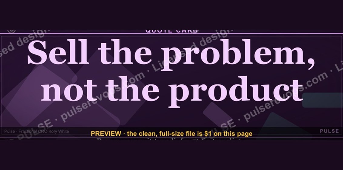 graphic“Sell the problem, not the product.” — Quote Card
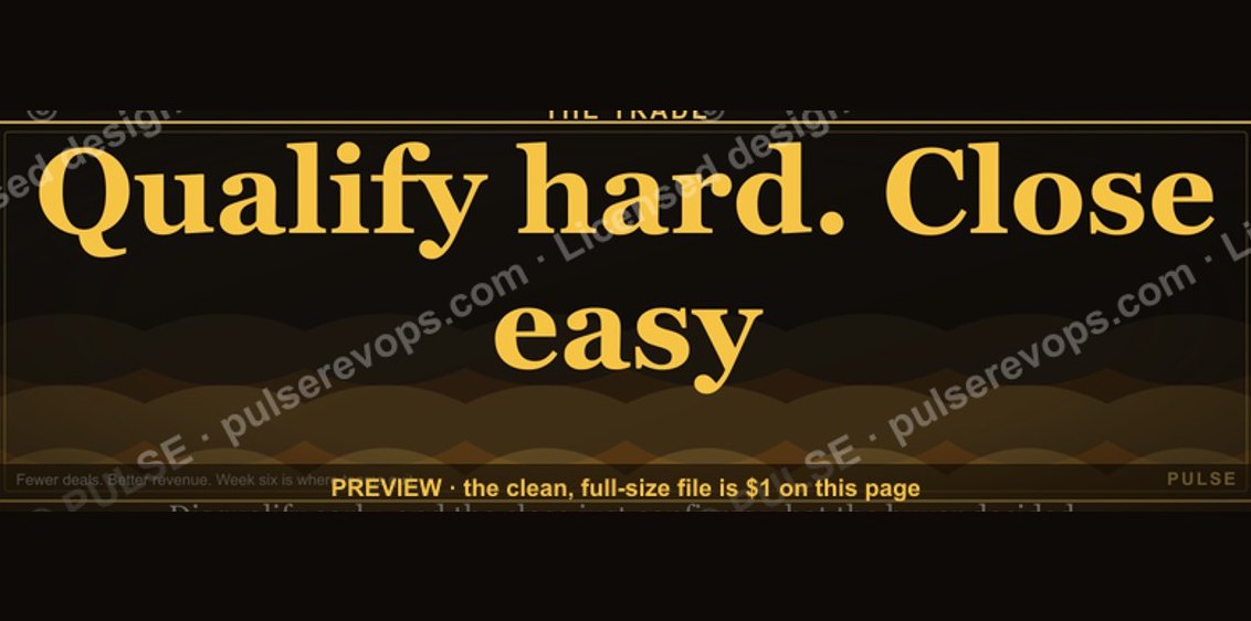 graphic“Qualify hard. Close easy.” — Quote Card
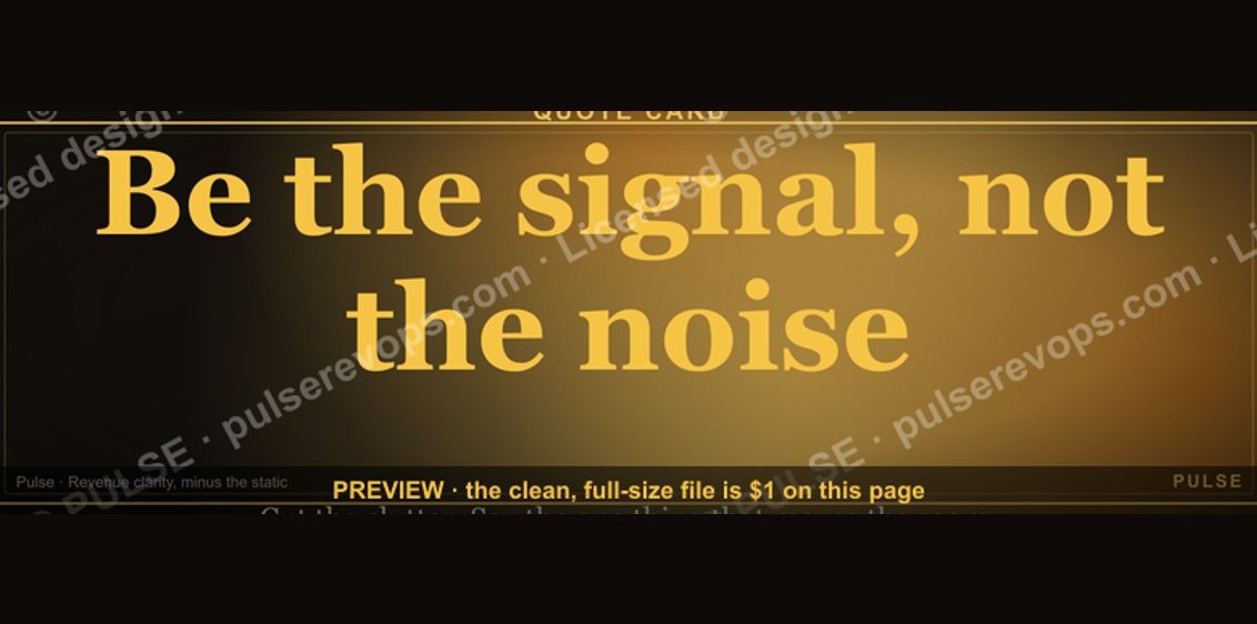 graphic“Be the signal, not the noise.” — Quote Card
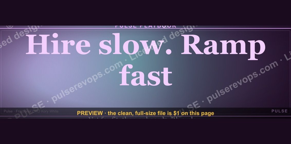 graphic“Hire slow. Ramp fast.” — Quote Card
 graphic“Listen more. Pitch less.” — Quote Card
 graphic“Trust compounds. So does pipeline.” — Quote Card
 graphic“Data beats opinions.” — Quote Card
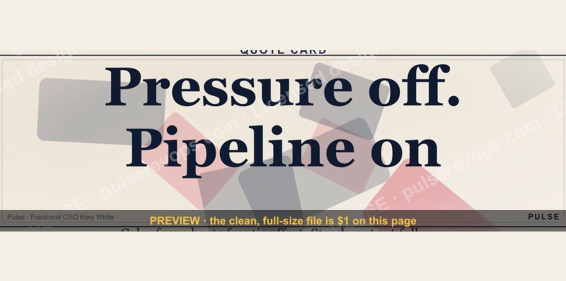 graphic“Pressure off. Pipeline on.” — Quote Card
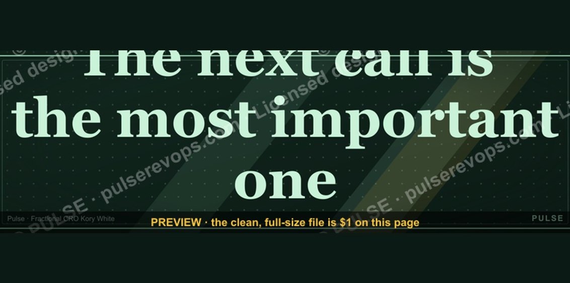 graphic“The next call is the most important one.” — Quote Card