


Revenue Trend Icon — Icon / Clip Art
Quality
Certified
A revenue trend icon is a small vector mark — usually an arrow or line rising across an implied axis — that signals financial direction at a glance in dashboards, decks, and reports. Choose SVG for scalability, green for growth, red for decline, and confirm the license permits commercial use before shipping it.
The Monday-morning board deck that nearly went out wrong
Picture a RevOps lead assembling the quarterly board deck at 11 p.m. on a Sunday. Twelve slides, each with a KPI strip across the top: bookings, net revenue retention, pipeline coverage, CAC payback. Every tile needs a small directional mark so a director scanning the deck on a phone can tell in half a second whether the number is moving the right way. The lead opens a browser, searches "revenue trend icon," downloads eight PNGs from four different sites, and drops them into the slides.
Monday morning, three problems surface at once. First, the icons don't match. One is a thin 1.5-pixel stroke, another is a heavy filled triangle, a third has a drop shadow baked into the raster. On a projector they read as three different design systems collided in one deck. Second, two of the PNGs were exported at 64 pixels wide and now sit in a slide at 200 pixels — they're visibly soft, with the kind of edge fuzz that makes a finance audience quietly discount everything around it. Third, and worst, one of the downloads came from a site whose free tier requires visible attribution, and nobody read the license page. A board deck is a commercial document. That's a licensing exposure nobody wants to explain.
This scenario is not exotic. It is the default outcome when trend marks are treated as a last-minute garnish rather than a component. The fix costs about twenty minutes once: pick a single source, pull SVG rather than raster, define three states (up, down, flat), lock the stroke weight and color tokens, and store the set somewhere the whole team pulls from. Every deck after that inherits consistency for free.
The same failure mode shows up outside slideware. A product team ships a customer-facing revenue dashboard where the "up" arrow is a hand-drawn path in one component and an icon-font glyph in another; they render at different optical weights, and support tickets arrive asking whether the two arrows mean different things. They don't — but the user has no way to know that. A marketing site puts a raster trend mark in a hero section, and it turns to mush on a Retina display because nobody exported the 2x variant. An operations team prints a monthly packet, and the 12-point arrow fills in solid on uncoated stock because the interior counters were too tight for the ink to hold.
Every one of those is the same root cause wearing a different costume: a trend icon was chosen for what it looked like in a search-results thumbnail, not for the medium, size, and license it actually had to survive. The rest of this page works through the mechanism, the numbers, the trade-offs between sourcing routes, and the traps that bite teams most often.
How the mechanism actually works: from vector path to rendered pixel
A trend icon is a set of instructions, not a picture. When you open an SVG, you're looking at XML: a viewBox that defines the coordinate space, one or more path elements with drawing commands, and attributes controlling stroke width, line caps, joins, and fill. The renderer — a browser, PowerPoint, a print RIP — reads those instructions and rasterizes them at whatever size the layout demands. That's why a 400-byte SVG looks identical on a phone and a billboard while a PNG only looks right at the size it was exported for.
The practical consequences follow directly from that model.
The viewBox sets your grid. Most icon systems standardize on a 24×24 viewBox, which means every coordinate in the path is expressed in a 24-unit space. If you mix a 24-grid icon with a 16-grid icon in the same row, the optical weights won't match even when both are displayed at 20 pixels — the stroke in the 16-grid file is proportionally thicker. Normalize the grid before you normalize anything else.

Stroke vs. fill changes how the icon behaves under scaling. A stroked path has a stroke-width that scales with the icon unless you set vector-effect: non-scaling-stroke. A filled path has no stroke at all; its weight is baked into the outline geometry. Stroked icons are easier to restyle (change one attribute, the whole set changes weight) but can hairline out at very small sizes. Filled icons hold up better at 16 pixels and in print, but recoloring a multi-part fill takes more care.
currentColor is the single most useful trick in icon markup. If the path's fill or stroke is set to the literal keyword currentColor, the icon inherits the CSS color of its parent element. One file then serves your green "up" state, your red "down" state, and your muted "flat" state without three separate assets. Downloaded stock icons frequently ship with a hard-coded hex fill instead — swapping that hex for currentColor in a text editor takes seconds and converts a static asset into a themeable component.
Delivery method determines caching and control. An <img src="icon.svg"> is a separate HTTP request and cannot be styled by the host page's CSS. An inline <svg> in the DOM is styleable but adds bytes to every page render. An icon font maps glyphs to characters and is trivially colorable, but it's a poor fit for screen readers and can render as a missing-glyph box if the font fails to load. A CSS mask-image gives you a colorable shape from an external file, which is a reasonable middle ground for a handful of marks.
The flow below traces one trend mark from source to screen.
A few notes on the diagram. The license check sits on the stock-download branch only, because a design-system pull and a custom draw are already cleared. The currentColor step is deliberately placed after normalization and before delivery — it is the hinge that makes one file serve every state. And the terminal test is behavioral, not aesthetic: if a stranger can't name the direction in about a second, the mark has failed regardless of how elegant it looks in isolation.

Accessibility rides along the same path. A decorative icon sitting next to a text label that already says "up 12%" should carry aria-hidden="true" so a screen reader doesn't announce it twice. An icon carrying meaning on its own needs role="img" and a <title> element, or an aria-label on the wrapper. And because roughly one in twelve men has some form of red-green color vision deficiency, direction must never be encoded in color alone — the arrow's geometry has to carry the meaning, with color as reinforcement.
Real numbers, ranges, and benchmarks
Concrete figures make the choices easier. Here's what the practical envelope looks like across the dimensions that matter.
Display sizes. Interface-level trend marks — the little arrow inside a KPI tile or a table cell — typically live between 12 and 20 pixels, with 16 as the most common default. Icons in slide decks generally sit between 32 and 96 pixels depending on whether they're inline with text or anchored to a hero number. Print reports usually specify in points rather than pixels; a 10–14 point mark next to a figure is common in financial packets. If a mark is interactive on touch, platform human-interface guidance has long recommended a minimum target of roughly 44×44 points on iOS and 48×48 density-independent pixels on Android — note that this is the *tap target*, not the drawn icon, so a 16-pixel arrow with generous padding still satisfies it.
Stroke weights. On a 24-unit grid, stroke widths cluster at 1, 1.5, and 2 units — corresponding roughly to "light," "regular," and "bold" in most icon families. Below 1 unit, the stroke hairlines out on standard-density displays and can disappear entirely in print. Above 2.5 units on a 24 grid, interior counters start closing and the icon reads as a blob at small sizes. Pick one weight for the whole set and hold it.

Slope angles. This is a design convention rather than a standard, but it's a consistent one: a roughly 45-degree ascent reads as steady growth and is by far the most common choice. Shallower angles in the 20–30 degree range read as modest or flattening. Steeper angles past 60 degrees read as a spike or a "hockey stick" and carry an implicit claim — use them when the underlying data actually justifies the drama, not as a default.
File sizes. A single-path trend arrow as SVG is genuinely tiny: commonly 300 bytes to 1.5 KB before compression, and SVG gzips extremely well because it's text. A multi-part icon with a chart body and grid marks might reach 2–4 KB. By contrast, a PNG of the same mark at 2x for a 48-pixel display slot lands somewhere in the 2–8 KB range, and you need multiple exports to cover 1x, 2x, and 3x. For a set of three states, SVG is usually one to two orders of magnitude cheaper in total bytes once you account for density variants.
Raster export math. If you must ship PNG, the rule is straightforward: export at the display size multiplied by the maximum device pixel ratio you support. A 48-pixel slot on a 3x display needs a 144-pixel source. For print, 300 DPI is the standard floor for quality reproduction, so a mark printed at half an inch needs 150 pixels of source. Undershoot either number and you get the soft edges from the board-deck scenario above.
Contrast. WCAG 2.1 specifies a 3:1 minimum contrast ratio for non-text content including meaningful graphical objects, and 4.5:1 for normal-size text. A mid-green arrow on a white card frequently fails 3:1 — bright greens are perceptually light. Darkening the green or adding a subtle outline usually resolves it. Run the check; don't eyeball it.

Cost. Free, permissively licensed icon sets are abundant and genuinely production-grade — several widely used open-source families ship under MIT or similar terms with hundreds or thousands of marks. Freemium stock sites layer a subscription over a free tier, where the free tier commonly requires attribution and the paid tier removes it; those subscriptions are typically billed monthly or annually per seat. Commissioning a custom set from a designer is priced by scope and by designer, so treat any specific figure as unverified until you have a quote in hand. The honest guidance: for a trend mark specifically, the free open-source route covers the overwhelming majority of needs, and money is better spent on a full brand-aligned icon system than on three arrows.
Time budget. Standardizing an existing messy set — normalize grid, unify stroke, set currentColor, add ARIA, document usage — is roughly a half-day of focused work for a small set. Drawing three custom states from scratch in a vector tool is a couple of hours for someone comfortable with the pen tool. Neither is a project. Both pay back on the first deck that doesn't need rework.
Trade-offs and alternatives: icon, clip art, sparkline, or plain text
A trend icon is one option among several, and it isn't always the right one. The alternatives differ in information density, production cost, and how much they demand from the reader.
A directional icon carries exactly one bit of information plus an optional magnitude if you pair it with a number. It's the cheapest thing to render, the fastest to read, and the easiest to standardize. Its ceiling is low by design: it cannot show shape, volatility, or where within a period the change happened.
Clip art — a richer illustrative graphic, often with a chart body, figures, or scene elements — buys visual interest at the cost of scan speed and consistency. It works in a title slide, a blog header, or a printed cover. It works badly in a dense table, where it competes with the data for attention. Clip art also tends to carry heavier license terms than a plain icon, because there's more authored craft in it, and it's harder to recolor to brand because it usually has multiple fills.
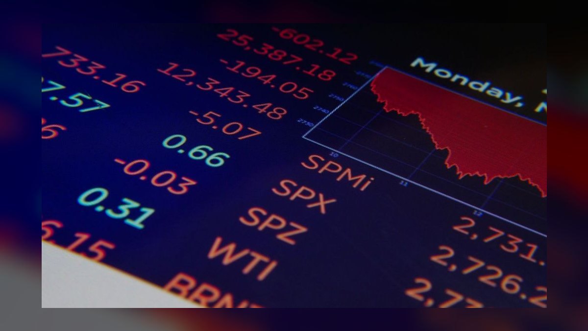
A sparkline — a tiny line chart with no axes — is the middle option and, for many dashboard cases, the better one. It shows shape: a number that's up 8% via a steady climb looks completely different from one that cratered and recovered. It costs more to build (you need real data plumbed to the component, not a static asset) and more to read (a second or two rather than a fraction of one).
Plain text with a sign — "+8.2%" in green — is the most information-dense option per pixel and is fully accessible with zero extra markup. It's underrated. In a table with twenty rows, twenty text deltas often scan faster than twenty arrows, because the eye reads the digits anyway and the arrow becomes redundant decoration.
A conditional-format cell in a spreadsheet or BI tool splits the difference: a background color band plus the number. It's the native idiom in Excel, Google Sheets, and most BI tools, and it requires no asset management at all.
The decision tree below routes among them.
Two trade-offs worth naming explicitly. First, consistency beats optimality — a mediocre icon used everywhere reads better than three excellent icons used inconsistently, because the reader learns one visual grammar instead of three. Second, the more decorative the graphic, the shorter its shelf life; a plain arrow ages quietly, while a stylized 3D chart illustration will look dated in eighteen months and will need re-sourcing across every asset that used it.
There's an adjacent decision that often gets bundled in: whether the mark is static or live. A static icon chosen by the deck author encodes the author's judgment at authoring time. A live indicator bound to a data source updates itself and can therefore be *wrong* in a new way — flipping to green during a partial-period load, or showing "up" against a stale comparison window. If you wire the icon to data, wire the comparison window and the freshness stamp with it.
Common pitfalls and how to avoid them
Mixing icon families. The single most common defect. Two arrows from two libraries have different stroke weights, corner radii, and arrowhead proportions, and the mismatch is visible even to people who can't articulate why the slide feels off. Fix: one family, one weight, documented in a shared location. If you must mix, redraw the outlier to match rather than shipping both.
Raster where vector belonged. PNGs pinned into a deck get resized by whoever edits the deck next, and there's no warning when they're scaled past their native resolution. Fix: paste vector into slideware — both PowerPoint and Google Slides handle SVG — and keep the raster export as a fallback only for surfaces that genuinely can't take vector.
Color as the only signal. An up arrow and a down arrow that differ only in hue are invisible to a red-green colorblind reader and vanish entirely in a grayscale print. Fix: the geometry must carry the meaning. Rotate the arrow, don't just recolor it. Color is the second channel, never the first.
Skipping the license read. Free-tier stock icons frequently carry attribution requirements, and "free for personal use" is a real and common restriction that a board deck or a customer-facing dashboard violates. Fix: before download, read the license page, save a copy of the terms alongside the asset, and record the source URL and date in a short manifest. If the terms are ambiguous, pick a different icon — there are thousands.
Hard-coded hex fills. An icon with fill="#00A86B" baked in cannot serve your dark theme, your print-safe variant, or your down state. Fix: replace the hex with currentColor and control it from CSS or the parent element's color.
Announcing the icon twice. A screen reader that reads "up arrow, revenue up 12 percent" is worse than one that reads "revenue up 12 percent." Fix: aria-hidden="true" on decorative marks that sit beside a text label; a real accessible name only when the icon is the sole carrier of meaning.

Optical misalignment. An arrow's visual center is rarely its bounding-box center, because the arrowhead concentrates mass at one end. Set flush against a number's baseline, it will look like it's floating. Fix: nudge by a pixel or two and trust your eye over the alignment guide, and apply the same nudge consistently across the set.
Overstating the slope. A 70-degree arrow next to a 2% increase is a small, quiet lie that a numerate audience will notice. Fix: keep one neutral slope for all states and let the number carry the magnitude.
No flat state. Teams define up and down, then face a quarter where revenue moved 0.3% and reach for the up arrow. Fix: define a flat mark and a threshold — anything inside ±1%, or whatever band matches your noise floor, gets the flat state.
Losing the source file. Someone leaves, and the only copy of the custom icon is a flattened PNG in an old deck. Fix: the SVG source lives in version control or a shared drive with the license terms, not in a designer's local folder.
Ignoring dark mode. A dark green arrow tuned for a white card becomes nearly invisible on a dark surface. Fix: define light and dark color tokens per state and test both, rather than shipping one hue and hoping.
Related questions
Should a trend icon be SVG or PNG?
SVG in almost every case: it scales without quality loss, weighs well under 2 KB for a simple mark, and can inherit its color from CSS. Keep a PNG export only for surfaces that genuinely cannot accept vector, and export it at the display size times the maximum device pixel ratio.
How do I make a trend icon accessible?
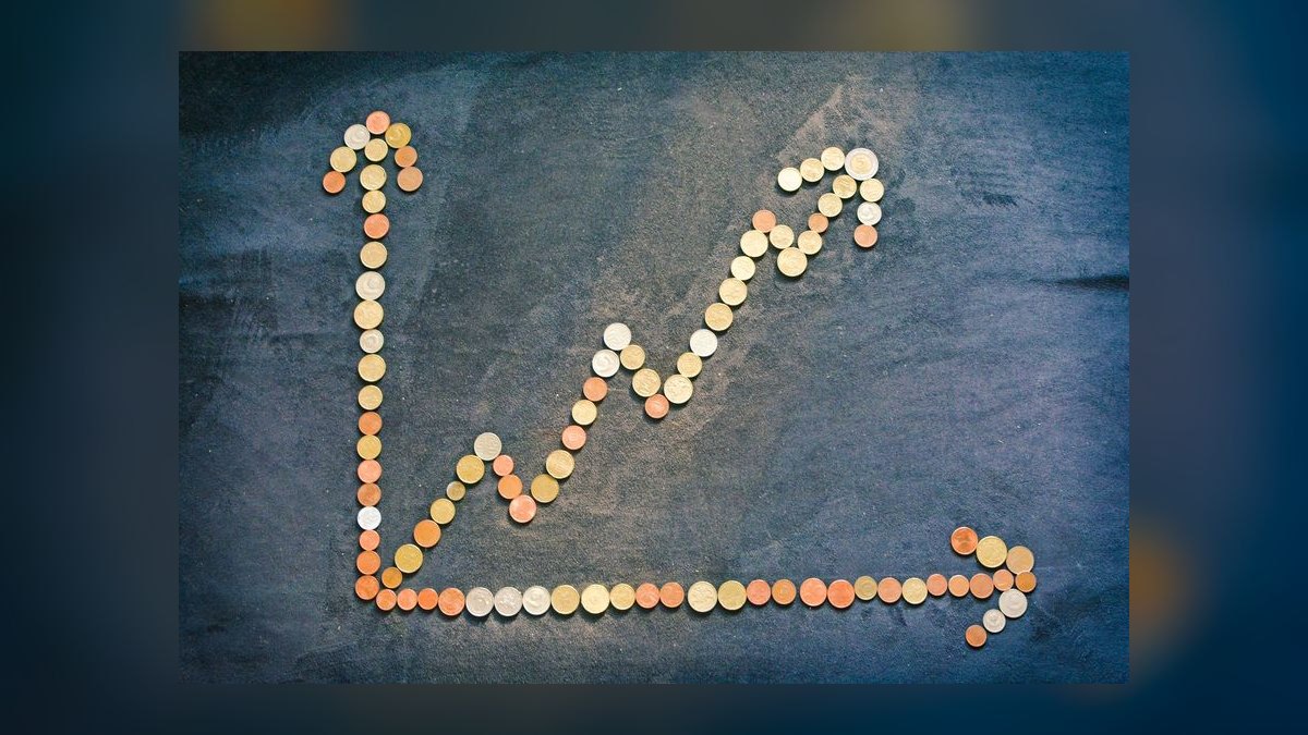
Give it an accessible name only when it carries meaning alone; otherwise mark it aria-hidden="true" beside its text label. Never encode direction in color alone — the arrow's shape must carry it. Verify at least 3:1 contrast against the background for meaningful graphics.
Can I use free clip art in a client deliverable?
Only after reading the license. "Free" often means free for personal use, or free with visible attribution. Client deliverables and board decks are commercial use. Prefer permissively licensed open-source icon sets, save the terms with the asset, and record the source URL.
Icon or sparkline for a dashboard KPI?
Use an icon when direction is the whole story and space is tight. Use a sparkline when the shape of the change matters — a steady climb and a crash-then-recovery can both be "up 8%," and only the sparkline distinguishes them. Sparklines cost real data plumbing.
What size should the icon be inside a KPI tile?
Roughly 16 pixels is the standard default, with 12–20 the usable range. If the mark is tappable, keep the drawn icon small but pad the tap target to about 44 points on iOS or 48 density-independent pixels on Android — the target and the artwork are separate measurements.
FAQ
What exactly is a revenue trend icon?
It's a compact symbol — most often an arrow, a rising line, or a small bar-chart glyph — used in dashboards, reports, and presentations to communicate whether revenue is increasing, decreasing, or holding steady. Its job is to let a reader absorb direction before they read the number, which is why simplicity beats detail.
How is a trend icon different from clip art?
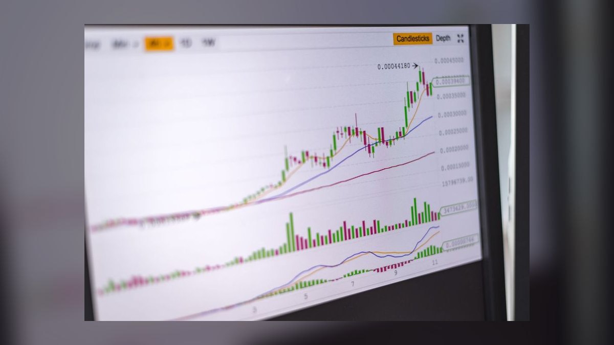
An icon is a minimal, systematized mark built to a grid and intended to repeat across an interface. Clip art is a richer standalone illustration meant to decorate a single spot. Icons prioritize scan speed and consistency; clip art prioritizes visual interest. Use icons in tables and KPI strips, clip art on covers and headers.
Can I recolor an icon I downloaded?
Usually yes for SVG — open the file, replace the hard-coded fill or stroke value with currentColor, and drive it from CSS or your design tool. Whether you're *permitted* to modify it is a license question, not a technical one, so check whether the terms allow derivative works, especially for anything with a share-alike or no-derivatives clause.
What color should an up arrow be?
Green is the near-universal convention for growth in Western business contexts, and red for decline, with amber or blue for neutral. Conventions do vary by region — in parts of East Asia red can signal gains — so if your audience is global, lean on shape and an explicit label rather than relying on hue to carry the message.
Do I need a different icon for flat or no-change revenue?
Yes, and it's the state teams most often forget. Without an explicit flat mark, a 0.3% move gets rounded into an up arrow, which quietly overstates performance. Define a horizontal or double-arrow flat state and a threshold band — often around ±1%, tuned to your own data's noise level — and apply it consistently.
Where can I find free revenue trend icons?
Several well-known open-source icon families ship permissively licensed sets that include arrows, charts, and trend marks, and freemium stock libraries offer large catalogs with a free tier. The catalog matters less than the diligence: confirm the specific license on the specific file, save those terms next to the asset, and prefer sets that ship clean SVG over ones that only offer raster downloads.
Sources
- https://www.w3.org/TR/SVG2/ — W3C SVG 2 specification, covering paths, viewBox, and stroke behavior.
- https://developer.mozilla.org/en-US/docs/Web/SVG — MDN Web Docs reference for SVG elements and attributes.
- https://developer.mozilla.org/en-US/docs/Web/CSS/color_value#currentcolor_keyword — MDN documentation for the
currentColorkeyword. - https://www.w3.org/WAI/WCAG21/Understanding/non-text-contrast.html — WCAG 2.1 non-text contrast requirements for graphical objects.
- https://www.w3.org/WAI/WCAG21/Understanding/use-of-color.html — WCAG 2.1 guidance on not relying on color alone.
- https://developer.apple.com/design/human-interface-guidelines — Apple Human Interface Guidelines, including touch target sizing.
- https://m3.material.io/foundations/accessible-design/accessibility-basics — Material Design accessibility foundations and target sizing.
- https://www.smashingmagazine.com/2021/05/accessible-svg-patterns-comparison/ — Comparison of accessible SVG implementation patterns.
- https://css-tricks.com/using-svg/ — Overview of SVG delivery methods on the web and their trade-offs.
- https://developer.mozilla.org/en-US/docs/Web/API/Window/devicePixelRatio — MDN reference for device pixel ratio and raster export sizing.
Related on PULSE
This page will be disappearing soon. Save it to your device for $1 — or read it free while it is here.
@Kory-White- · if Venmo asks, the last 4 of my number are 2012
This page is gone.
This one is off the shelf now. $1 keeps it on your phone for good — the whole page, pictures and diagrams included.
 graphicBooked Meeting Icon — Icon / Clip Art
 graphicTarget / Goal Icon — Icon / Clip Art
 graphicRetention / Trust Shield Icon — Icon / Clip Art
 graphicLaunch / Growth Rocket Icon — Icon / Clip Art
 graphicGTM Strategy Compass Icon — Icon / Clip Art
 graphicPipeline Stages — Icon / Clip Art
 graphicLead Magnet Icon — Icon / Clip Art
 graphicCold Call / Dialer Icon — Icon / Clip Art
 graphicKPI Gauge Icon — Icon / Clip Art
 graphicSales Funnel — Icon / Clip Art