


“Teach them something new.” — LinkedIn Banner
Quality
Certified
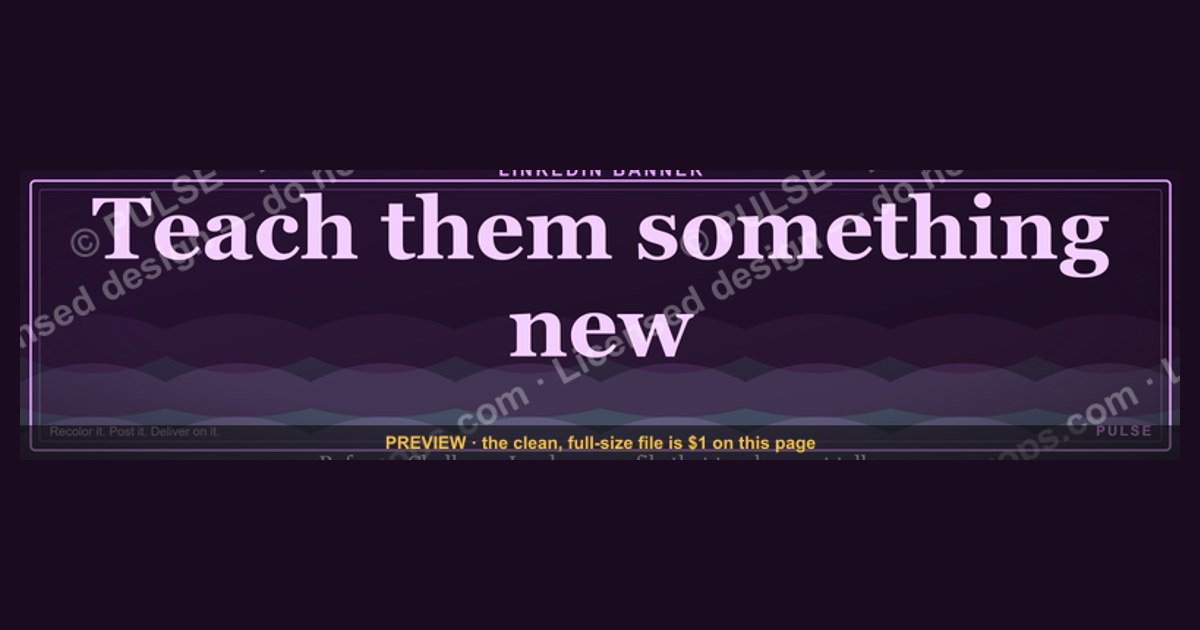
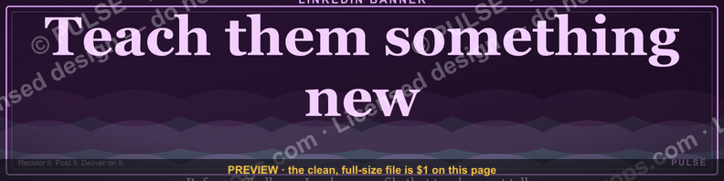
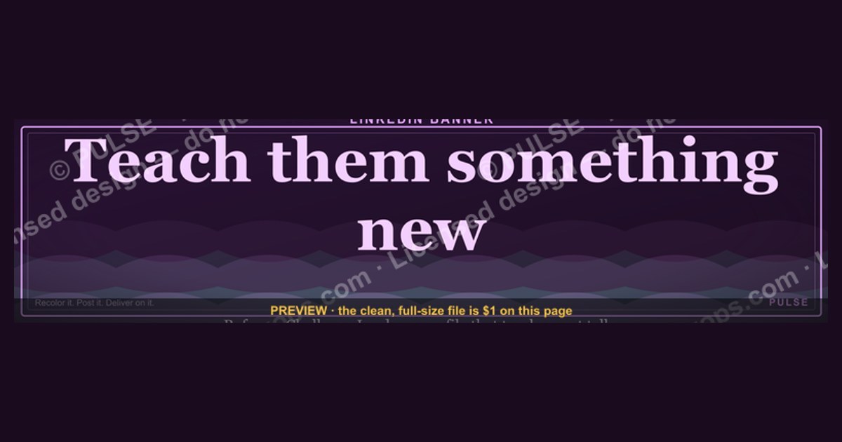
This is a LinkedIn profile banner, 1584×396 px, that reads "Teach them something new." in bold sans-serif type, left-aligned on a dark charcoal background with a single accent-color underline beneath the phrase. It is built for anyone who manages people, mentors, or coaches a team, and signals an open-door, growth-first posture before a visitor reads a single line of your "About" section.
The outcome you should expect
Download this banner expecting a shift in how your profile *reads* before anyone reads your headline. A LinkedIn banner occupies the top ~396 pixels of the page and is the first visual a visitor registers, ahead of your photo, your headline, and your summary. A banner carrying an explicit statement — "Teach them something new." — reframes the profile as belonging to someone in a teaching, coaching, or enablement posture: a sales manager, a RevOps lead, an L&D director, a team captain. It does the positioning work your headline usually has to do alone, freeing your headline text to carry a role or outcome claim instead of a mission statement.
Practically, expect three things to change. First, dwell time on the profile ticks up slightly because a banner with a legible, short phrase gives the eye somewhere to land before it drops to your photo and headline — unlabeled stock-photo banners (skylines, generic handshake photos) give the eye nothing to parse and visitors scroll past faster. Second, the banner becomes a conversation opener in warm contexts: recruiters, direct reports, and peers who land on the profile during a 1:1 scheduling flow or a LinkedIn message thread will often reference it directly ("I like the banner — is that your management philosophy?"). Third, it quietly filters self-selection: people who click through to a profile that says "Teach them something new." and then see a bio confirming a coaching or enablement role experience less friction trusting the fit, because the visual promise and the written promise agree.
What it will not do is replace a complete profile. A strong banner on a thin profile — no headline specificity, no About section, no recent activity — reads as aspirational rather than credible. Treat the banner as the frame, not the content.
What drives that outcome (mermaid)
The effect comes from how LinkedIn's layout forces attention sequencing, combined with how short, declarative phrases process faster than photographic scenes.
Three mechanical factors matter. The banner spans the full width of the profile at both desktop and mobile breakpoints, so there is no competing visual element at the moment it loads — it is seen in isolation before the photo and name render into view on a slow connection, and seen simultaneously with them on a fast one. Short declarative text (five words or fewer, as here) is processed by a reader in well under a second, faster than the visitor decodes a photographic scene, which is why a worded banner outperforms an unworded one for setting a frame quickly. And because the phrase functions as a stance rather than a claim about the viewer, it reads as voice — closer to a tagline a person would actually say — rather than as corporate signage, which keeps it from feeling like an ad.
Benchmarks and realistic ranges
Sizing and placement are fixed by LinkedIn's layout, not by preference, so get these right before worrying about wording:

- Canvas: 1584×396 px is LinkedIn's current desktop banner spec (a 4:1 ratio). Export at this exact size — LinkedIn will crop or letterbox anything off-ratio rather than scale it cleanly.
- Safe zone: keep all text and the phrase itself within the center ~1200×300 px of the canvas. The outer ~190 px on each side is frequently cropped or partially covered by your profile photo circle (which overlaps the bottom-left of the banner) on both desktop and mobile. Text placed in the far left 150 px or far right 150 px risks being clipped on mobile.
- Profile-photo overlap: your circular photo sits roughly 10–15% up from the bottom edge, left-aligned, overlapping the banner's bottom-left corner. Left-aligned banner text (as this one is) should start clear of that zone — generally after the first ~300 px from the left edge — so the phrase doesn't collide with your face.
- Contrast ratio: aim for at least 4.5:1 between the text color and background for legibility at small preview sizes (the banner renders much smaller in search results and the mobile app than on your own profile page). White or near-white text (around #F2F2F2) on a dark charcoal (around #121212–#1A1A1A) comfortably clears this.
- File size and format: export as PNG for crisp text edges; keep the file under 8 MB, which is LinkedIn's upload ceiling, though a well-compressed PNG at this resolution typically lands between 200 KB and 1.5 MB.
- Font size: for a five-word phrase like this one, 60–80 px is a realistic range for the primary line at 1584×396 — large enough to read in a shrunk search-result thumbnail, not so large it crowds the safe zone.
Outside these mechanical ranges, there isn't a reliable published benchmark for "engagement lift from a worded banner" — treat any specific percentage claim you see elsewhere skeptically; LinkedIn does not publish banner-level click-through data, and claims to the contrary are typically anecdotal.
Risks, edge cases, and failure modes
A text-forward banner like this one fails in a few predictable ways.
Mismatch with the rest of the profile. If the banner says "Teach them something new." but the headline is generic ("Sales Professional at X") and the About section is empty, the banner reads as decoration rather than identity — visitors notice the gap. Fix this by making sure at least one other profile element (headline, About, or a pinned post) explicitly names the teaching/mentoring/enablement angle the banner implies.
Wrong context for the role. This banner fits people whose job genuinely involves coaching, training, mentoring, or enabling others — managers, team leads, sales enablement, L&D, educators, coaches. On a profile for an individual contributor with no direct reports or teaching function, the phrase can read as aspirational or even slightly off, especially to a recruiter scanning quickly. If the role doesn't involve teaching anyone anything, swap the phrase rather than force the fit.
Cropping on mobile. Roughly half of LinkedIn traffic is mobile, and mobile crops the banner more aggressively — less horizontal canvas is visible, and the photo overlap is proportionally larger. A phrase placed too close to either edge, or sized too small, can lose a word or become unreadable. Always preview the exported banner at a simulated mobile width (LinkedIn's mobile banner crop is tighter — effectively closer to the center 1200 px than the full 1584 px) before publishing.
Stale or generic phrasing fatigue. "Teach them something new" is a strong, specific line, but any single-phrase banner degrades in impact if it becomes one of dozens of near-identical "inspirational quote" banners a recruiter scrolls past in one session. Differentiate by pairing it with a visual identity (consistent accent color, consistent typography) that reappears in your posts and featured content, so the banner is part of a recognizable personal system rather than a one-off download.
Low contrast after platform re-compression. LinkedIn re-compresses uploaded images, which can slightly soften fine text edges or thin strokes. Avoid very thin font weights or small secondary text; a bold or semi-bold weight at the sizes above survives compression better.
Overwriting brand or company banners inconsistently. If you manage a company page banner as well as your personal one, keep the personal "Teach them something new." framing distinct from company messaging — mixing a personal mission statement with company branding on the same banner usually reads as confused rather than aligned.

A practical rollout plan (mermaid)
Step by step: download the PNG from this page at its native 1584×396 resolution — do not resize it in a way that changes the aspect ratio, or LinkedIn will crop unpredictably. If you want to customize the wording (your own phrase), the color palette (to match a personal or team brand), or the accent underline, open it in Canva, Photoshop, Figma, or even macOS Preview's markup tools, keep any new text inside the ~1200×300 px safe zone described above, and re-export as PNG. If using the banner as-is, skip straight to upload: on desktop, go to your profile, click the pencil/camera icon on the existing banner area, and upload the file; on mobile, tap your profile photo, then the banner image, then "Edit." Immediately check both the desktop view and the mobile app view — these crop differently, and a banner that looks right on desktop can clip a word on mobile. If anything is clipped or the contrast looks weak in the smaller preview thumbnail (visible in search results), go back to the editor and adjust before re-uploading. Once the banner looks correct everywhere, do the one step most people skip: update your headline or the first line of your About section so it doesn't contradict the banner's framing — a banner promising to "teach them something new" lands strongest when the very next thing a visitor reads confirms it.
Related questions
What size should a LinkedIn banner be?
1584×396 px (4:1 ratio), exported as PNG, under LinkedIn's roughly 8 MB upload limit. Keep text inside the center ~1200×300 px to avoid cropping on mobile and overlap with your profile photo.
Should my LinkedIn banner match my headline?
Yes — a banner making a claim (like a teaching or coaching stance) works best when the headline or About section backs it up specifically, rather than contradicting or ignoring it.
Does a LinkedIn banner affect how often I get messaged?
There's no published data quantifying this, but a legible, intentional banner sets a frame before a visitor reads further, which plausibly lowers friction to connecting — treat it as a first-impression tool, not a guaranteed metric.
Can I use the same banner for a company page and my personal profile?

You can, but keep the messaging distinct — a personal mission statement like "Teach them something new" reads best as personal voice, while a company banner should carry company branding; mixing the two on one banner usually confuses both.
How often should I update my LinkedIn banner?
There's no fixed cadence; update it when your role, focus, or message changes meaningfully — a banner tied to a stance like teaching or mentoring can stay relevant for years if the role doesn't change.
FAQ
What exact text is on this banner? "Teach them something new." in bold sans-serif type, left-aligned, in light text on a dark charcoal background, with a thin accent-color underline beneath the phrase.
Is this banner editable? Yes — download the PNG and open it in any standard image editor to change the wording, color, or typography, then re-export at 1584×396 px before uploading to LinkedIn.
Who should use a banner like this? Managers, mentors, coaches, team leads, and anyone in an enablement, training, or L&D role whose day-to-day genuinely involves teaching or developing other people — it's a role-fit statement, not a generic motivational graphic.
Will LinkedIn crop or distort the image? Not if you upload it at the exact 1584×396 px ratio. LinkedIn will crop (not stretch) anything off-ratio, which is why keeping text inside the safe zone matters more than hitting the exact pixel count.
Does the banner work on mobile? Yes, but mobile shows a tighter horizontal crop than desktop. Preview the banner in the LinkedIn mobile app after uploading to confirm no words are cut off at the edges.
Can I use a different phrase instead of "Teach them something new"? Yes — the template (dark background, bold left-aligned type, accent underline) works with any short, five-to-seven-word declarative phrase; just keep new text inside the same safe-zone boundaries described above.
Sources
- https://www.linkedin.com/help/linkedin/answer/a566416 (LinkedIn profile photo and background photo guidelines)
- https://business.linkedin.com (LinkedIn Business — profile and page best practices)
- https://www.canva.com/create/linkedin-banners/ (Canva LinkedIn banner templates and sizing)
- https://www.adobe.com/express/create/cover/linkedin (Adobe Express LinkedIn banner specs)
- https://www.hootsuite.com/platforms/linkedin (LinkedIn profile and content best-practice reference)
- https://sproutsocial.com/insights/linkedin-stats/ (LinkedIn usage and mobile-traffic statistics)
- https://www.hubspot.com/linkedin (LinkedIn marketing and profile optimization guides)
Related on PULSE
- How to write a LinkedIn headline that converts profile visits into messages
- The ideal structure for a LinkedIn About section for managers and coaches
- LinkedIn profile photo guidelines: sizing, background, and expression
- How often should you post on LinkedIn to stay visible to your network
- Building a personal brand system across LinkedIn banner, headline, and featured content
- What recruiters actually scan first on a LinkedIn profile
This page will be disappearing soon. Save it to your device for $1 — or read it free while it is here.
@Kory-White- · if Venmo asks, the last 4 of my number are 2012
This page is gone.
This one is off the shelf now. $1 keeps it on your phone for good — the whole page, pictures and diagrams included.
 graphicHow do you build a Champions sell motion from scratch in 2027?
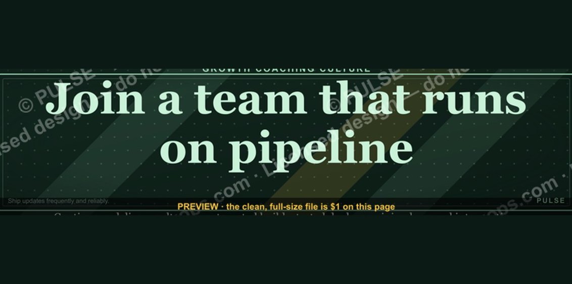 graphic“Join a team that runs on pipeline.” — LinkedIn Banner
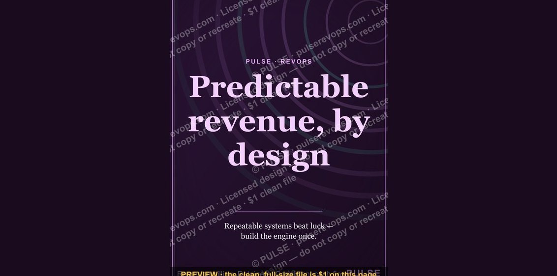 graphicPredictable revenue, by design. — LinkedIn Wallpaper
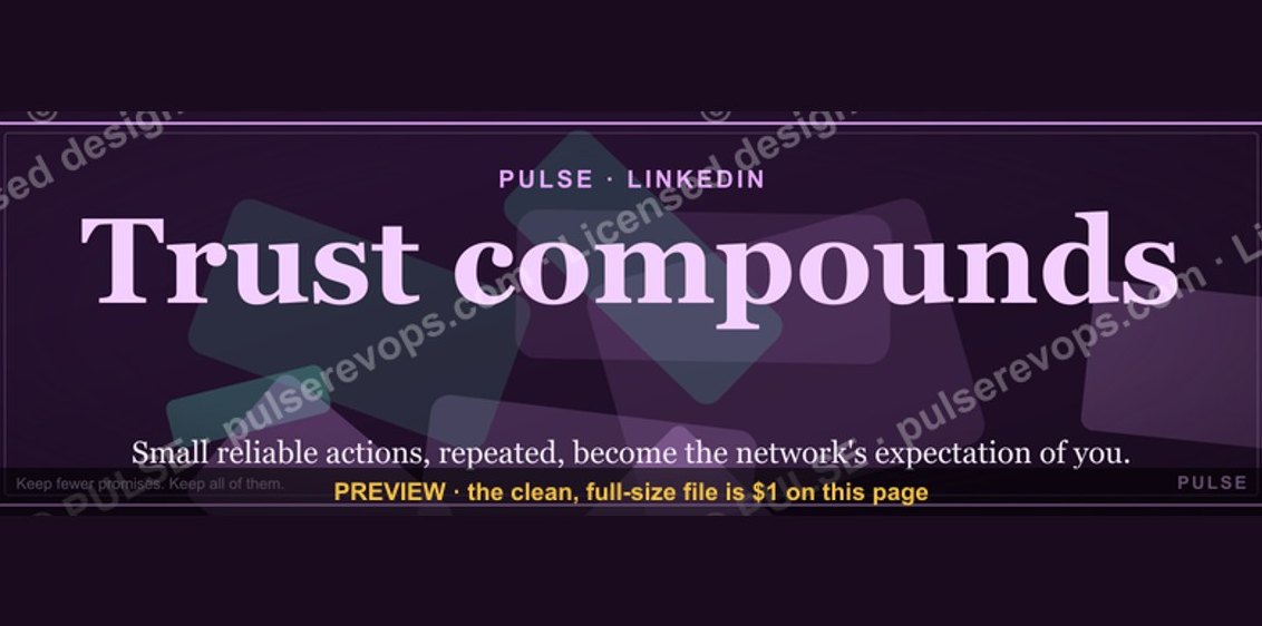 graphicTrust compounds. — LinkedIn Wallpaper
 graphicSpeech-to-Text Operator — LinkedIn Banner
 graphicFaster deals, fewer leaks. — LinkedIn Wallpaper
 graphicLLM Builder AI Engineer — LinkedIn Banner
 graphicRevOps Manager — LinkedIn Banner
 graphic“A confused buyer never buys.” — LinkedIn Banner
 graphicStay in the deal. — LinkedIn Wallpaper