


RevOps Manager — LinkedIn Banner
Quality
Certified
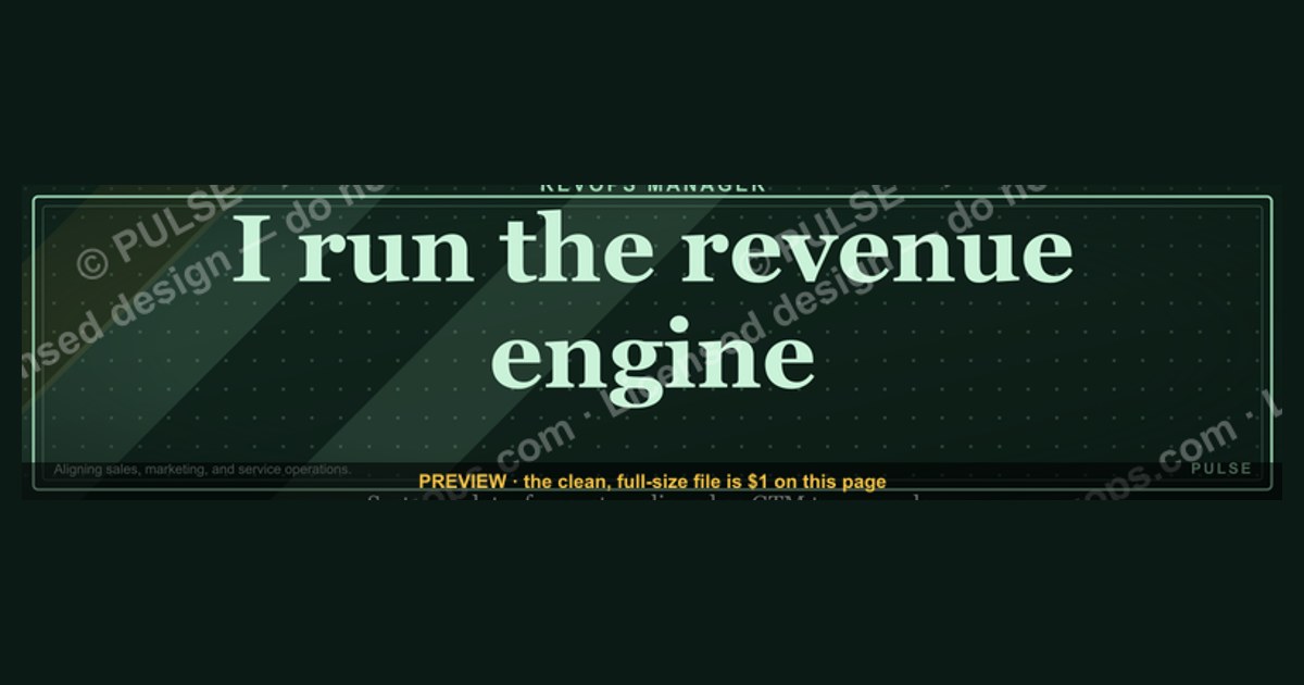
This is a LinkedIn profile banner sized 1584×396 px for a RevOps Manager. It reads "REVOPS MANAGER" in bold sans-serif type, left-aligned, over a dark navy-to-charcoal gradient, with a thin accent line separating the title from a secondary line naming the core function — pipeline, forecasting, and systems alignment. Download the PNG and upload it directly as your LinkedIn cover photo.
What it is and why it matters
A LinkedIn banner is the widescreen image that sits behind your profile photo — the single largest piece of visual real estate on your profile, and the most underused. Most RevOps Managers leave it blank or default to whatever stock texture LinkedIn assigns, which wastes a slot that shows up every time someone views your profile, comments on a post, or gets served your name in a search result preview. This graphic fills that space with role-specific signaling instead of decoration.
The banner is built around one word choice: "RevOps Manager" as the headline, not "Revenue Operations Manager" spelled out in full, because the banner is read at a glance — often on a phone, often for under two seconds — and abbreviation reads faster than precision. Below it, a secondary line does the work of context: something like "Pipeline · Forecasting · Systems" or "Aligning Sales, Marketing & CS," depending on which variant you download. That second line is what turns the banner from a name tag into a positioning statement. A recruiter or prospect scanning your profile gets the title and the scope in the same glance, before they've read a single line of your headline or About section.

Why this matters specifically for RevOps: the function is still young enough that plenty of people outside the discipline don't know what it means. Sales leaders, CS leaders, and even some HR business partners hiring for the role conflate "RevOps" with "Sales Ops" or "a data analyst who's good at Salesforce." A banner that visually anchors the title next to a short, specific function line does more disambiguation work in one glance than a paragraph of bio copy buried below the fold. It's also a low-effort signal of role maturity — a manager who has bothered to brand their own profile reads as someone who takes operational polish seriously, which is exactly the trait a RevOps hiring manager is screening for.
There's a secondary use case worth naming: internal visibility. If you work inside a company with more than a couple hundred employees, most of the people who'd want to know "who's the RevOps Manager" have never met you. Slack profile photos are tiny; LinkedIn is where they'll actually look you up before a meeting. A banner that states the title and scope clearly reduces the number of "wait, what do you actually do" conversations you have in your first weeks on a new team, or after a reorg moves RevOps under a different VP.
The step-by-step process

Getting the banner live takes about five minutes end to end, and the process is identical whether you're using the stock version or a customized one.
Step one is the download itself — the PNG sits at the top of this page at native resolution, no watermark, ready to use as-is. Step two, open your LinkedIn profile on desktop (the upload flow is more reliable there than in the mobile app, which sometimes compresses aggressively before you get a preview). Step three, click the pencil/camera icon on the existing cover photo area — LinkedIn puts this in the top-right of the banner strip when you hover over your own profile. Step four, upload the file. LinkedIn's editor will show you a crop frame; because this banner is pre-sized to LinkedIn's exact aspect ratio, you should be able to accept the default crop without adjustment, but check it anyway — LinkedIn occasionally shifts the visible window depending on your profile photo size, which eats into the left third of the banner.

Step five is the one people skip: after saving, open your own profile in an incognito or logged-out window and check how the banner renders on both a desktop browser and a phone screen. LinkedIn's mobile app crops banners more aggressively than desktop, sometimes cutting 10-15% off each side to fit the narrower viewport. If your headline text sits close to the edges, it can get clipped on mobile even though it looked fine on desktop. If that happens, the fix is straightforward: re-export the graphic (or ask for a re-export) with the text pulled in from the edges, or sized up slightly so it survives a tighter crop.
Costs, timelines, and typical ranges
The stock version of this banner — the one generated and shown on this page — costs nothing and takes under a minute to download and upload. That's the realistic baseline for the vast majority of RevOps Managers who just want a clean, professional banner up today rather than a bespoke one next month.
If you want something more tailored — your actual name instead of just the title, a specific company's brand colors, or a headshot-adjacent design element worked into the layout — you're looking at either a DIY pass in Canva (free tier is sufficient for this; a paid Canva Pro seat runs roughly $10-15/month if you don't already have one) or a freelance designer. Freelance banner/cover-image work on platforms like Fiverr or Upwork typically runs $15-75 for a single static banner, with turnaround of 1-3 days for a first draft and same-day revisions after that. Anything priced meaningfully above that range for a single static image usually reflects a broader personal-branding package (multiple templates, a style guide, social post templates bundled in) rather than the banner alone.
Timeline-wise: using the stock graphic as-is is a same-minute task. A DIY Canva edit — swapping the secondary line, adjusting a color to match your company's palette — is a 10-20 minute task if you're comfortable with basic layout tools, longer if you're learning Canva from scratch. A freelance commission, from posting the job to having a finished file, typically lands in 2-4 days including one revision round. There's no ongoing cost — once uploaded, the banner sits on your profile indefinitely with no subscription, no renewal, and no dependency on the tool that made it.
One more range worth knowing: if you're rebranding your banner as part of a broader job search or a personal-brand push, most career coaches suggest budgeting no more than 30-45 minutes total across headline, About section, and banner combined for a first pass — the banner should not become the bottleneck. It's a high-visibility, low-effort asset; treat it that way rather than over-iterating on font choices.
Where teams get it wrong
The most common mistake is text that's too small to read at LinkedIn's actual display size. Designers working in full-resolution tools (Figma, Photoshop, Canva at 100% zoom) routinely produce banners that look sharp and balanced on a large monitor, but LinkedIn displays the cover photo at a fraction of that size in the feed and on profile previews — often under 500px wide in practice. Type that reads comfortably at full size can shrink to illegible at profile-preview size. The fix is to design for the smallest realistic viewing size first, then confirm it still looks intentional at full size, not the other way around.
The second mistake is over-crowding the banner with information that belongs in the About section instead — a full job history, a list of five certifications, a company logo plus a personal logo plus a slogan. A banner with more than a title line and one short context line stops reading as a banner and starts reading as an ad; it also becomes the first thing to break when LinkedIn's crop or your profile photo size shifts the visible window, since more elements means more things that can get clipped.
The third mistake is mismatching the banner's tone to the rest of the profile. A dark, bold, high-contrast banner paired with a casual headline and no About section reads as unfinished — the banner promises a level of polish the rest of the profile doesn't deliver. If you're going to invest in a strong banner, spend the extra ten minutes making sure your headline and top three About lines match that same level of intentionality; otherwise the banner just highlights the gap.
The fourth, more RevOps-specific mistake: naming the wrong scope in the secondary line. "RevOps Manager" paired with a line like "CRM Admin" undersells the role and can actively hurt you with recruiters searching for cross-functional operators — the whole value of the RevOps title is the breadth across sales, marketing, and customer success, and a secondary line that narrows it back down to a single-system admin function contradicts the headline above it. Keep the secondary line at the level of outcomes or functions ("Forecast Accuracy · Pipeline Velocity · Systems Alignment"), not tools.
Fifth: forgetting to update the banner after a role or scope change. RevOps titles shift fast — Manager to Senior Manager, or a scope expansion from "Sales Ops" to full "RevOps" — and a stale banner with an old title sitting behind an updated headline is a small but visible inconsistency that attentive readers (recruiters, in particular) do notice.
Decision framework: when to choose what
Not every RevOps Manager needs the same version of this banner. The decision mostly comes down to how much time you want to spend and whether you're optimizing for internal visibility, external job search, or personal brand-building.
If the goal is simply making sure coworkers and cross-functional partners know your role at a glance, the stock banner is genuinely sufficient — don't over-invest here. If you're actively job searching, it's worth the extra ten minutes to swap the generic secondary line for something closer to a results statement ("Scaled Pipeline Coverage 3x in 18 Months"), because recruiters sourcing RevOps candidates respond to specificity. If you're building a longer-term personal brand — writing on LinkedIn regularly, speaking at RevOps events, aiming for a Director-level jump in the next year or two — that's the case where a custom, on-brand banner (your own color scheme, possibly a subtle logo mark) earns its cost, because it'll be seen repeatedly across a much longer window and by a much wider audience than a single job search.
Related questions
Should the banner include my company's logo?
Only if you're not job searching and your company is fine with employee-branded profiles. A logo ties the banner to a single employer, which becomes a liability the moment you're evaluating other roles or the company changes its brand.
What file format and size does LinkedIn actually require?
LinkedIn accepts JPG and PNG; the officially recommended banner dimensions are 1584×396 px, and files display best under 8MB. This graphic is delivered pre-sized to that exact ratio.
Can I use the same banner across LinkedIn, a resume header, and a personal site?
Yes, and it's a smart consistency play — using matching visual branding across LinkedIn, your resume, and any personal site reinforces recognition, as long as none of the platforms crop it awkwardly.
Does a banner actually affect profile views or recruiter response rates?
There's no controlled data specific to this, but LinkedIn's own guidance and most career-coaching sources agree that a complete, intentional-looking profile — banner included — correlates with higher engagement than an incomplete one; treat the banner as part of "profile completeness," not a standalone growth lever.
How often should I update it?
Whenever your title, scope, or key metric changes meaningfully — most people update every 12-18 months or at a role transition, whichever comes first.
FAQ
Is this banner free to use? Yes. The PNG shown on this page is free to download and use directly as your LinkedIn cover photo, with no attribution required.
Will LinkedIn crop or distort the image after I upload it?
LinkedIn may crop the edges slightly depending on your profile photo size and whether you're viewed on desktop or mobile, but it will not stretch or distort the image since it's pre-sized to LinkedIn's native 1584×396 ratio.
Can I edit the text on the banner myself? Yes — download the PNG and open it in a free tool like Canva or Photoshop to swap the name, title, or secondary line; keep the same font weight and contrast so the edit doesn't hurt legibility.
What if I'm a Senior RevOps Manager or Director instead? Use the same layout logic — headline title, short scope line beneath it — just swap "RevOps Manager" for your accurate title; the design principles in this page apply at any seniority level.
Does this work for other Ops titles like Sales Ops Manager or CS Ops Manager? Yes, the same template structure works for any single-function or cross-functional Ops title — the headline and secondary-line format is title-agnostic.
Should I match the banner colors to my current company's brand? Only if you're not planning to change jobs soon; a neutral, non-company-specific color scheme (like the dark navy used here) ages better across job transitions than one tied to a specific employer's palette.
Sources
- https://www.linkedin.com/help/linkedin/answer/a566276
- https://business.linkedin.com/marketing-solutions/success/best-practices/linkedin-profile-best-practices
- https://www.canva.com/create/linkedin-banners/
- https://www.forbes.com/sites/forbescoachescouncil/
- https://www.themuse.com/advice/how-to-optimize-your-linkedin-profile
- https://www.themuse.com/advice/linkedin-profile-photo-cover-photo-tips
- https://www.upwork.com/hire/linkedin-banner-design/
- https://www.fiverr.com/gigs/linkedin-banner
Related on PULSE
- What should a RevOps Manager's LinkedIn headline say?
- RevOps Manager vs. Sales Ops Manager: what's the actual difference?
- How to write a RevOps resume summary that gets past recruiters
- RevOps Manager career path: what comes after this title?
- Best LinkedIn About section structure for operations roles
- How to explain RevOps to someone outside the function
This page will be disappearing soon. Save it to your device for $1 — or read it free while it is here.
@Kory-White- · if Venmo asks, the last 4 of my number are 2012
This page is gone.
This one is off the shelf now. $1 keeps it on your phone for good — the whole page, pictures and diagrams included.
 graphicVP of Sales — LinkedIn Banner
 graphic“The next call is the most important one.” — LinkedIn Banner
 graphic“Sell the problem, not the product.” — LinkedIn Banner
 graphicReady reps win. — LinkedIn Wallpaper
 graphicSales Coach — LinkedIn Banner
 graphicPipeline cures all. — LinkedIn Wallpaper
 graphicWhat do top-performing graphic designers do differently in 2027?
 graphicSales Enablement — LinkedIn Banner
 graphicOne team. One number. — LinkedIn Wallpaper
 graphicHead of Sales — LinkedIn Banner