


Be the signal, not the noise. — LinkedIn Wallpaper
Quality
Certified
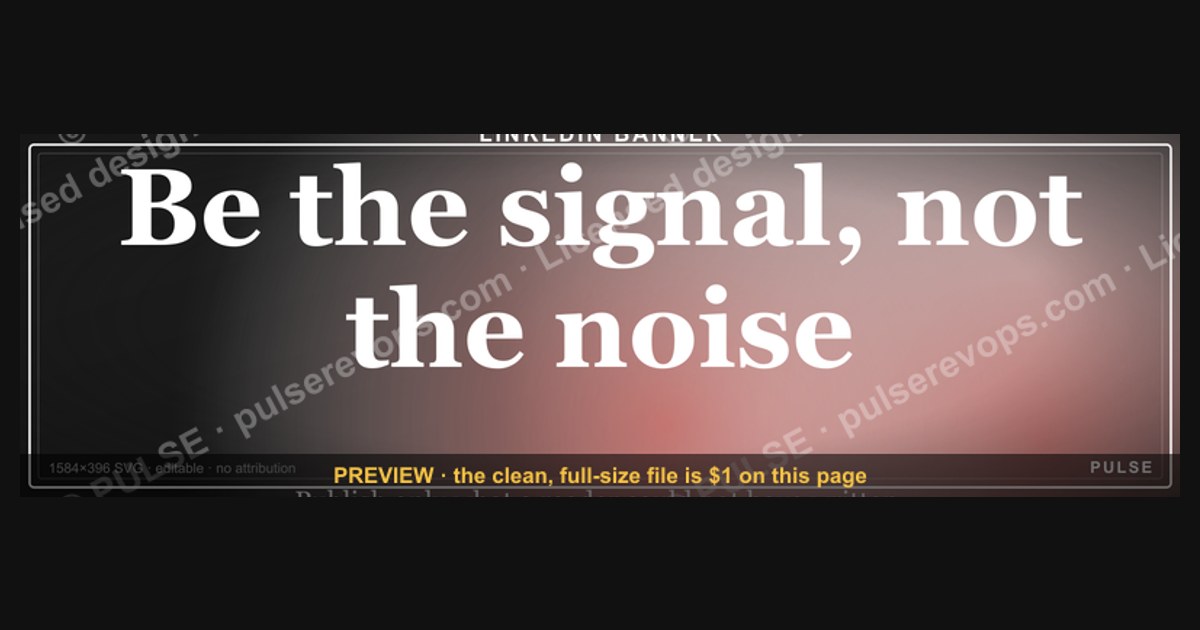
"Be the signal, not the noise" is a LinkedIn cover wallpaper reminder to publish only what a reader could not have written themselves. Signal means specific numbers, named trade-offs, and repeatable frameworks; noise means generic encouragement. The banner sits at 1584×396 above your headline, setting the standard your posts have to meet.
What the wallpaper is and why the line does work
The asset itself is a dark, on-brand LinkedIn cover graphic — a bar-chart skyline backdrop, the line "Be the signal, not the noise." set in the foreground, and the Pulse mark. It ships as an SVG (scalable vector), sized to the LinkedIn cover slot at 1584×396 px, categorized as a LinkedIn Banner, and licensed free to use with no attribution required. Because it's a vector rather than a flattened raster, it re-renders sharp at any zoom level, on any display density, and stays editable — you can open it in Canva, PowerPoint, or Figma and add your name, a metric, or a company mark without the edge-fuzzing you get from resizing a JPEG.
The reason this particular line earns the cover slot instead of a generic motivational quote is that it's a standard rather than a sentiment. Most banner copy — "Dream big," "Hustle harder," "Let's connect" — makes no claim you can fail. "Be the signal, not the noise" does. It sets a bar that every subsequent post either clears or doesn't, and because the banner sits directly above your headline and immediately below your name in the profile hierarchy, it's the first thing a visitor reads before they scroll into your activity feed. You are publicly committing to a filter, in the exact place where a visitor will check whether you honor it.
That matters because of how attention actually gets allocated on a feed. A LinkedIn visitor arriving from a post is running a fast, largely unconscious triage: headline, banner, then two or three recent posts. If the banner announces a standard and the recent posts are congratulations comments and reshared platitudes, the mismatch reads as noise louder than a blank banner would have. The wallpaper is therefore a commitment device — it raises the cost of low-effort posting by making the gap visible. Used well, it functions the way a mission statement pinned above a sales floor functions: not as decoration, but as an argument you have to keep winning.
For revenue-facing professionals — RevOps leads, sales managers, founders selling their own product — the stakes are concrete rather than aesthetic. Your LinkedIn presence is a top-of-funnel channel whether you treat it as one or not. Buyers research individuals before they research companies. A profile that reads as signal produces inbound conversations; a profile that reads as noise produces nothing, and the cost of nothing is invisible, which is exactly why most people tolerate it for years.
There's a second, less obvious function. A banner that states a standard gives you something to point at when you're deciding whether to publish. Writers who set an explicit bar publish less and land harder. The wallpaper is the cheapest possible version of that bar: free, instantly installed, and visible to the one audience whose opinion enforces it.
Installing it and running the first signal audit
Start with the file. Download the SVG from the graphics library, and if you want it in your own colors, use the recolor picker to set the accent and background — including transparent — then export as SVG or PNG. There's no sign-up and no watermark. Keep the export at the native 1584×396; LinkedIn will letterbox or crop anything with a different aspect ratio, and the crop is unforgiving on mobile, where the center is roughly all that survives. Keep the text in the middle third horizontally and the middle half vertically and it will survive every viewport.
Practical export note: LinkedIn accepts PNG and JPG for the cover, not SVG, so the SVG is your master and the PNG is your upload. Export at 1584×396 exactly, or at 2× (3168×792) if you want extra crispness on retina displays — LinkedIn will downscale cleanly. Keep the file under 8 MB, which a flat vector export will never approach.
Then run the audit, because installing a banner that states a standard you don't meet is worse than leaving the default gradient. Pull your last 30 days of posts into a spreadsheet — one row per post — and tag each one against three questions:
Is it non-obvious? If most people in your field already know it, it's noise. "Follow up with your leads" is noise. "Our reply rate on day-3 follow-ups ran roughly double our day-1 rate, so we moved the first touch back" is signal, because it contains a specific finding someone can test.
Is it backed by something concrete? A number from your own pipeline, a named example, a framework you actually use. Advice without an artifact behind it is noise wearing a suit.
Does it change a decision? Signal makes someone do something differently on Monday. If a reader finishes the post and nothing about their week changes, it was entertainment at best.
Score each post pass/fail on all three. A post has to clear all three to count as signal. Then compute the ratio. Most professionals running this for the first time land somewhere between 20% and 40% signal, and the discovery is uncomfortable in a useful way: the majority of what they've published was congratulatory comments, reshares with a one-line "great insight," and generic advice they'd have skipped in someone else's feed.
The fix is almost never "post better," which is not an instruction. The fix is "post less until the ratio clears 70%, then hold." If you were posting four times a week at 30% signal, that's roughly one real post per week hidden inside three that trained your audience to scroll past you. Publish only the one. The engagement math usually improves rather than degrades, because a feed algorithm and a human reader are both, in their way, running the same filter you just ran.
Set a recurring calendar block — 20 minutes, first Monday of the month — to re-run the audit. It takes about that long once the sheet exists, and the ratio is the only LinkedIn metric that reliably predicts whether the channel produces conversations.
What it actually costs: time, cadence, and the ranges to expect
The wallpaper is free, and the honest accounting is that the file is the cheapest input in the whole system. Downloading, recoloring, exporting, and uploading takes about five minutes. Everything expensive comes after.
Capture time: 10–15 minutes a week, spread thin. Signal is a byproduct of work you're already doing. A client objection you handled unexpectedly, a number in a QBR that contradicted the forecast, a framework you sketched on a whiteboard — these are the raw material, and they decay fast. Capture them within about 30 seconds of noticing, into whatever tool is already open: a notes app, a voice memo, a private Slack channel to yourself. The cost isn't the capture, it's remembering to. Budget nothing but attention.
Drafting time: 45–90 minutes per genuine post. This is where people underestimate badly. A post with a real number, a specific example, and a defensible claim takes roughly an hour to write if you're honest about checking the number. A generic post takes four minutes. That ratio — call it 15:1 — is the entire economics of signal, and it's why most people drift back to noise within about six weeks of deciding to change.
Yield: expect to publish 1 in 4 or 1 in 5 captured ideas. If you capture twenty raw observations in a month, five will survive the three-question filter, and two or three of those will be worth the drafting hour. That's normal, not failure. Scarcity is the definition of the thing.
Cadence: one to two posts per week is the realistic sustainable rate for someone with a full-time revenue job. Daily posting is achievable only by dropping the standard, which defeats the purpose of the banner. Batching helps — spend two weeks capturing, then publish three or four pieces across five to seven days, then go quiet and refill. The quiet weeks feel like failure and aren't; they're the capture phase.
Time to signal on results: 60–90 days minimum. Nothing meaningful happens in the first month. The pattern most people report is a slow shift in the *kind* of response rather than the volume: fewer likes, more saves, more direct messages that start with a specific question about something you wrote. Track those. Saves and DMs are the leading indicators that matter; likes are the noise metric inside the metrics.
Optional spend: effectively zero. You do not need a design tool subscription, a scheduling platform, or a ghostwriter. The SVG is free and editable in tools you already have. If you're evaluating a paid tool, evaluate it against the only bottleneck that's real — drafting hours — and most tools don't touch that.
One trade-off worth naming honestly: raising your bar will cost you reach in the short term. Fewer posts means fewer impressions, and impressions are what most dashboards show. If you or your leadership are measured on post volume or raw reach, the signal strategy will look like underperformance for a quarter before it looks like anything else. Decide in advance which number you're actually optimizing, because you cannot optimize both.
Where this goes wrong
Installing the banner and changing nothing else. The most common failure by a wide margin. The wallpaper becomes a claim you're publicly not honoring, which is a worse position than a default background. If you're not going to run the audit, use a plain graphic that promises nothing.
Confusing contrarianism with signal. "Everything you know about cold calling is wrong" is not signal — it's noise with better packaging. Signal violates expectations *usefully*, meaning the reader ends up with a testable claim. Contrarianism violates expectations *decoratively*, and audiences learn to discount it within about a dozen posts.
Hoarding the number. People with genuinely interesting data often refuse to publish it, worried about exposing something proprietary. Usually the fix is a ratio instead of an absolute: "reply rates roughly doubled" rather than "reply rates went from 4% to 8% on 12,000 sends." The insight survives, the confidential figure doesn't leave the building. Do not, under any circumstance, solve this by inventing a number — a fabricated statistic that gets challenged in the comments costs more credibility than the post ever earned.
Treating the profile copy as exempt. People clean up their posts and leave a headline reading "Marketing Professional | Digital Strategist | Content Creator" — roughly 60 characters that communicate nothing distinguishing. The headline is the highest-traffic text you own. It should name who you help, what changes, and roughly by how much. Same for the About section: "passionate about helping businesses grow" is a phrase that appears in an enormous number of profiles, which is definitionally noise. Replace it with a sentence containing an outcome, a segment, and a timeframe.
Posting into a vacuum and calling it discipline. Signal that nobody sees isn't signal, it's a diary. Timing matters less than people claim, but it isn't nothing — mid-week mornings in your audience's timezone are a reasonable default, and it costs nothing to test two windows over a month. More important: reply to every substantive comment in the first hour or two. That's the cheapest reach you will ever buy.
Optimizing the banner instead of the posts. Some people will spend three hours recoloring the wallpaper and zero hours on the audit. The graphic takes five minutes. If you find yourself iterating on hex codes, you are avoiding the actual work, and the actual work is the hour-long draft.
Letting the wallpaper drift out of sync with your positioning. If you change roles or focus, the banner should change with you — or at minimum, the standard it sets should still be one you're meeting in the new context. A cover graphic that matches a job you left two years ago reads as inattention.
Choosing what to publish: a decision path
The path above is the whole system compressed. A few notes on the branches that people get wrong.
The first gate — "could most people in my field state this already?" — is the one that kills the most drafts, and it should. The instinct is to answer it generously about your own work. Answer it as if a skeptical peer were reading. If a competent person at a competitor could have written the sentence without access to your data or your accounts, it's noise.
The "hold until I have the artifact" branch is underused. There is nothing wrong with a captured idea sitting for six weeks while you wait for the quarter to close and the number to firm up. A held post is not a lost post. Most people either publish the idea prematurely without the number, or discard it entirely; the third option — park it, publish it in November when the data exists — produces the strongest pieces.
The "convert to a ratio" branch exists because the confidentiality objection is real and usually solvable. Directionality and magnitude carry almost all of the insight. "Roughly tripled," "cut about in half," "took us two quarters" — all of these are publishable, none of them expose a contract.
The last loop matters most. Sixty to ninety days is the honest window before you can read the signal in your own results, and the metrics to read are saves and inbound messages, not likes. If those aren't moving after a quarter of genuine effort, the answer is almost never "post more often." It's that the specificity isn't high enough yet — the posts are clearing your bar but not a stranger's. Raise the bar again, publish less, and re-read in another 60 days.
One structural note on format, since it affects whether the signal lands: lead with the specific claim rather than building to it. A post that opens with the number and then explains it outperforms a post that narrates for four paragraphs and reveals the number at the end, because the feed truncates and most readers never expand. Put the signal above the fold. End with a question that requires the reader to apply the idea to their own numbers, not "thoughts?"
Related questions
What size should a LinkedIn cover image be?
1584×396 pixels, uploaded as PNG or JPG. Keep critical text in the center third horizontally — mobile crops the edges aggressively. Exporting at 2× (3168×792) from a vector master gives extra sharpness on high-density displays; LinkedIn downscales cleanly.
Can I edit this wallpaper to add my own name or metric?
Yes. The file is an SVG, so it opens editable in Canva, PowerPoint, or Figma. Use the recolor picker for brand colors and background (transparent included), then export SVG or PNG. Free to use, no attribution required, no watermark.
Does posting less often hurt LinkedIn reach?
Short-term, usually yes — fewer posts means fewer impressions. The trade is fewer, higher-quality posts that generate saves and inbound messages rather than passive likes. Expect a reach dip for roughly a quarter before the quality signal compounds.
How do I measure whether my content is signal?
Track saves and direct messages, not likes. A save means someone intends to return to it; a DM means it prompted action. Run a monthly pass/fail audit against three questions — non-obvious, concrete, decision-changing — and compute the percentage clearing all three.
What if I'm early-career and don't have proprietary data yet?
Publish the learning process itself: what you tested, what the result was, what surprised you. A specific small experiment beats a general large opinion. Amplifying someone else's work with your own added analysis also clears the bar.
FAQ

What does "be the signal, not the noise" actually mean on LinkedIn?
It means every post should carry something a reader could not have generated themselves — a specific number from your own work, a framework you use, a trade-off you've actually navigated. Noise is the generic layer: congratulations without context, reshared platitudes, advice with no artifact behind it. The line is a filter, not a slogan.
Is the wallpaper free, and can I use it commercially?
Yes. It's licensed free to use with no attribution required. Download the SVG, recolor it to your brand or keep the dark default, switch or remove the background, and export SVG or PNG. No sign-up, no watermark. You can put it on a company profile as easily as a personal one.
How often should I actually post if I'm holding this standard?
One to two posts a week is realistic for someone with a full-time revenue role. Batching works well: capture for two weeks, publish three or four pieces over five to seven days, then go quiet and refill. Daily posting is only achievable by lowering the bar, which makes the banner a claim you're not honoring.
How long before I see results from this approach?
Plan on 60 to 90 days minimum before the pattern is readable, and watch the right metrics. The early shift usually shows up as composition rather than volume — fewer likes, more saves, more direct messages that reference something specific you wrote. Likes are the noisiest metric on the platform; ignore them for this purpose.
What if my best data is confidential?
Convert it to a ratio or a directional claim. "Reply rates roughly doubled after we moved the first follow-up to day three" carries nearly all the insight of the raw figures and exposes nothing. Never solve this by estimating a number and presenting it as measured — a fabricated statistic that gets challenged publicly costs more than the post could ever return.
Does this principle apply outside LinkedIn?
Yes, and the same three-question filter works. Internal email, QBR decks, Slack updates, customer calls — anywhere attention is finite and the default is generic. A revenue team that applies the non-obvious/concrete/decision-changing test to its own reporting cuts meeting length noticeably, because most status updates fail all three questions.
Sources
- https://www.linkedin.com/help/linkedin/answer/a570397 — LinkedIn Help: profile background photo requirements and dimensions
- https://hbr.org/2017/09/how-to-build-your-personal-brand-at-work — Harvard Business Review on personal brand and professional visibility
- https://www.pewresearch.org/internet/fact-sheet/social-media/ — Pew Research Center: social media use fact sheet
- https://www.apa.org/monitor/2022/04/tech-multitasking — American Psychological Association on attention and digital multitasking
- https://www.w3.org/Graphics/SVG/ — W3C: SVG specification and scalable vector fundamentals
- https://developer.mozilla.org/en-US/docs/Web/SVG — MDN Web Docs: SVG reference and editing basics
- https://www.nngroup.com/articles/how-users-read-on-the-web/ — Nielsen Norman Group on scanning behavior and above-the-fold content
- https://www.forbes.com/sites/forbescommunicationscouncil/ — Forbes Communications Council: personal branding and content strategy coverage
Related on PULSE
- "Be the signal, not the noise." — Quote Card
- "Be the signal, not the noise." — LinkedIn Banner
- Sell outcomes, not features. — LinkedIn Wallpaper
- "Sell like you'd want to be sold to." — LinkedIn Banner
- "Sell like you'd want to be sold to." — Quote Card
- "Always Be Closing" — Sales Floor Poster
This page will be disappearing soon. Save it to your device for $1 — or read it free while it is here.
@Kory-White- · if Venmo asks, the last 4 of my number are 2012
This page is gone.
This one is off the shelf now. $1 keeps it on your phone for good — the whole page, pictures and diagrams included.
 graphic“Trusted advisor, never a vendor.” — LinkedIn Banner
 graphicWhat do top-performing graphic designers do differently in 2027?
 graphicVector Database CTO — LinkedIn Banner
 graphicSales Recruiter — LinkedIn Banner
 graphic“Process over pressure.” — LinkedIn Banner
 graphic“Speed to lead wins.” — LinkedIn Banner
 graphicOne team. One number. — LinkedIn Wallpaper
 graphicRenewals Manager — LinkedIn Banner
 graphic“Available for sales consulting.” — LinkedIn Banner
 graphicRegional Sales Director — LinkedIn Banner