
How Do I Make My Sales Goals Visible to the Whole Team in 2026?
 Curated byKory White · Fractional CRO · Maryland
 PULSEKNOWLEDGE LIBRARY
Quality
Certified
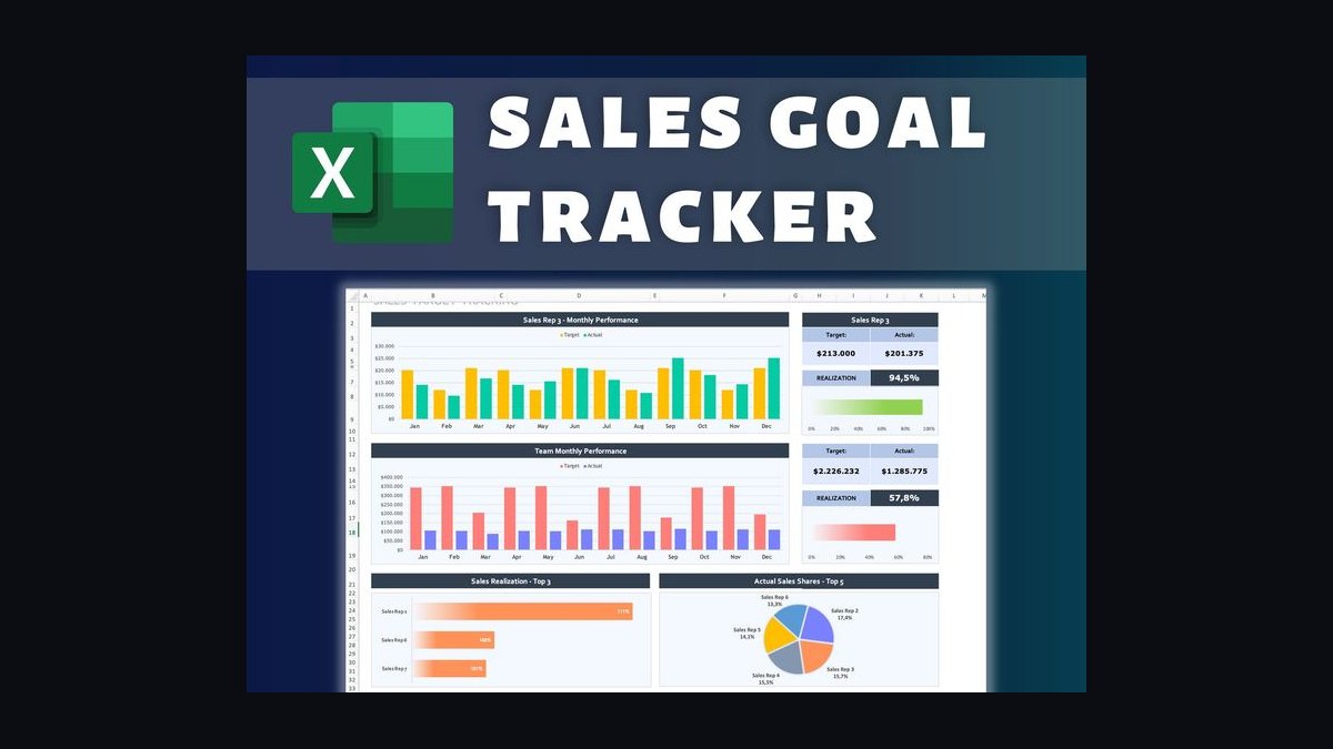
Make Sales Goals Visible to the Whole team by publishing one shared, weighted scorecard every rep can see — not a single revenue number buried in a private file. List eight or nine core Goals, weight each by importance, score reps 1–5 per line, and display the composite where everyone can view it daily.
The outcome you should expect
When you publish a weighted, team-visible scorecard rather than keeping targets locked in a manager's private workbook, the first measurable change is the quality of daily conversation. Reps quit asking where they stand and start asking which specific line they need to move next. That is the entire point of visibility: a lone revenue figure tells someone whether they are ahead or behind, but it never explains why or what action closes the gap. A weighted composite does both in one glance.
Expect three outcomes within the first 60 to 90 days. First, a drop in "how am I doing?" interrupts — most managers report fielding far fewer status questions because the answer is already on the wall or the screen. Second, a shift in what reps optimize. When activity carries a 10% weight and revenue carries 30%, nobody can coast on call volume alone; the scorecard makes that arithmetic public property. Third, faster priority pivots. If leadership re-weights the matrix mid-quarter — say, moving expansion from 15% to 25% because retention slipped — the team re-aims the next morning instead of waiting for a quarterly kickoff.
The outcome you should *not* expect is automatic motivation. Visibility exposes the gap; it does not close it. Pair the published scorecard with a coaching cadence and a compensation link, or you have built a scoreboard for a game nobody is playing. Teams that wire the composite to commission or bonus see the strongest behavior change, because the paycheck and the scoreboard finally point in the same direction.
One more realistic expectation: friction in week one. Some reps will read a low composite as a personal verdict rather than a diagnostic. Plan for that conversation before you publish, and frame every level as a next move, not a grade.
What drives that outcome
Four mechanics drive whether a visible scorecard actually changes behavior, and each one is a design decision you control.
Selection. Which Goals land on the matrix determines what the team can see. Include eight or nine lines spanning new revenue, expansion, retention, pipeline created, forecast accuracy, and the two or three core activity metrics. If a goal is not on the matrix, the team cannot see it, and reps will not chase what nobody is watching. Cap it at nine; beyond that, attention fragments and the composite becomes noise.
Weighting. Assign each line a weight with leadership input, and make the weights sum to 100%. Revenue and retention usually carry the heaviest weights (25–35% each), pipeline and expansion sit mid-range (10–20%), and activity lines carry lighter weights (5–15%) because they are inputs, not outcomes. Weights are your steering wheel: change them and the whole team re-aims.

Scoring. Score every rep 1–5 on every line using objective thresholds you define in advance — for example, level 3 = 90–100% of quota, level 5 = 120%+. The composite is the sum of (weight × level) across all KPIs. A rep at level 5 on activity but level 1 on the lines that pay the rent lands a low composite, and publishing it makes the gap impossible to hide.
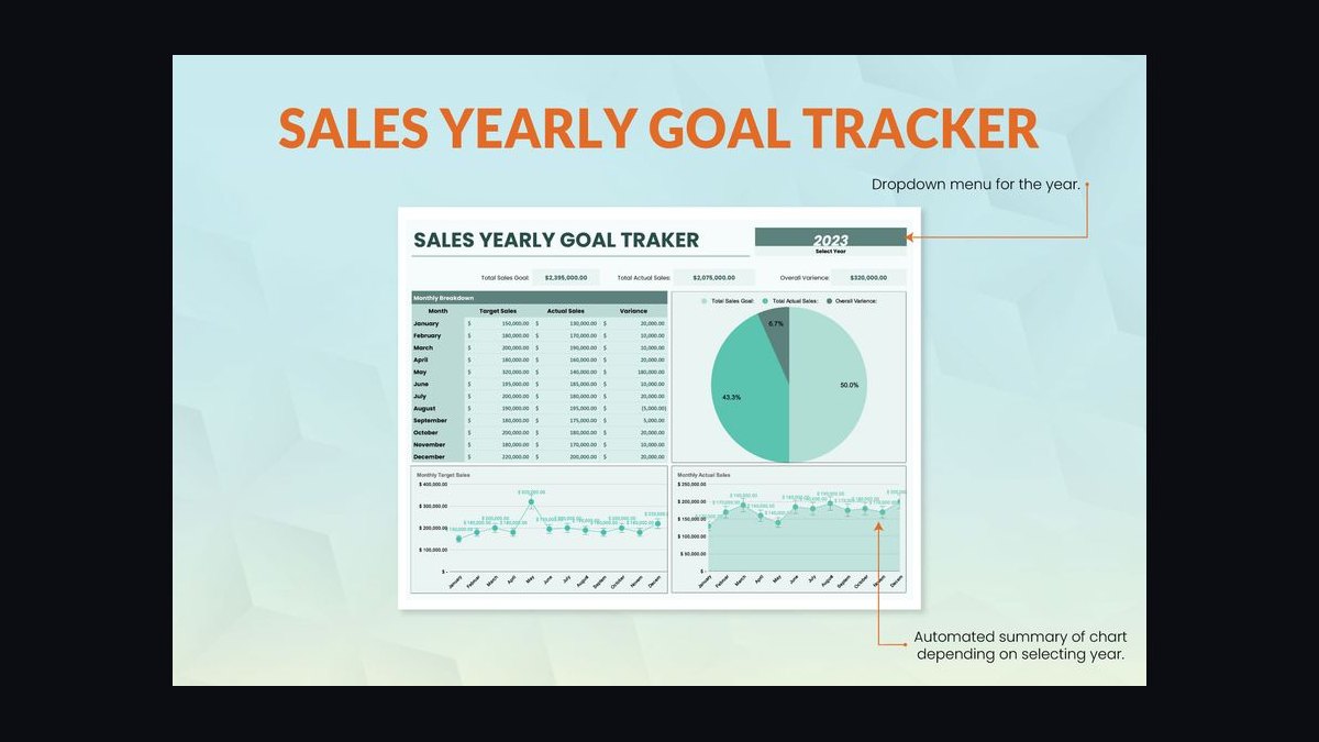
Publication. Where the number lives determines whether it drives behavior. A dashboard nobody opens is decoration. A screen in the team's line of sight, a channel post every Monday, or a whiteboard updated in a five-minute standup creates a ritual. The act of watching the number move — and seeing a teammate two levels higher on the same line — converts a vague sense of falling behind into a specific, closable target.
Notice the loop at the bottom. Visibility is not a one-time launch; it is a cycle. Priorities shift, weights change, the published picture updates, and the team re-aims. A scorecard frozen in January is stale by March.
Benchmarks and realistic ranges
Practitioners consistently land in similar ranges, which gives you a sanity check on your own design.
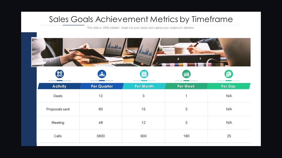
Number of KPIs: 8–9 is the sweet spot. Fewer than six and you miss a dimension of the role; more than twelve and reps stop reading the matrix. If you genuinely need thirteen metrics, you probably need two scorecards — one for the rep and one for the manager.
Level distribution: In a healthy team, roughly 60–70% of reps sit at level 3 (solid but not elite), 10–15% reach level 4–5, and 15–30% fall at level 1–2 on at least one line. If 90% of your team is at level 4–5, your thresholds are too soft. If 60% is at level 1, your thresholds are unrealistic or your ramp is broken.
Composite spread: Expect composites to cluster between 2.8 and 4.2 on a 1–5 scale. A spread narrower than 0.5 suggests the weights are flattening real differences. A spread wider than 2.0 usually means one KPI is mis-scored or a rep is genuinely mis-hired.
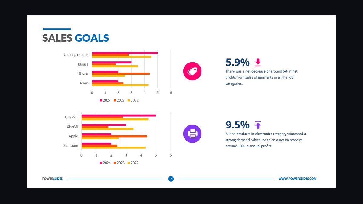
Update cadence: Weekly is the standard. Daily updates create noise and encourage gaming on small samples. Monthly is too slow — by the time a rep sees red, the quarter is half gone. Weekly hits the balance: enough signal to act, enough lag to be meaningful.
Time to first behavior change: 30–60 days for visible shifts in what reps prioritize. Full cultural adoption — where reps check the scorecard unprompted — typically takes one full quarter.
Coaching time saved: Managers who publish a scorecard commonly report cutting one-on-one prep time substantially, because reps arrive already knowing their own gaps. The meeting shifts from "here is where you stand" to "here is how we close line four."
Cost range: You can run this for free with a shared spreadsheet or a whiteboard. Paid scorecard and dashboard tools commonly range from roughly $10 to $70 per user per month depending on tier and whether they automate CRM ingestion. The method matters far more than the price tag.
Weight-shift frequency: Re-weight no more than once per quarter in normal conditions, more often only when a genuine strategic pivot occurs. Constant re-weighting destroys trust in the scorecard.
Risks, edge cases, and failure modes
Visibility cuts both ways. A published scorecard that is poorly designed does more damage than a private one, because everyone can see the flaw at once.
The single-metric trap. Publishing only revenue or only activity is the most common failure. It teaches the team to optimize one number and neglect everything else. A rep who dials 200 calls a week but never closes looks like a hero on an activity board. The weighted composite exists precisely to prevent this.
Weight opacity. If reps cannot see how weights were set, they assume the game is rigged. Publish the weights next to the scorecard and explain the reasoning once per quarter. Transparency about the formula is what makes the number feel fair even when it is unflattering.
Public shaming. A scorecard that names the bottom performer in red without a coaching path turns visibility into punishment. Pair every red zone with a specific next action and a manager conversation. The red zone is a coaching trigger, not a verdict.
Gaming the inputs. Any metric that is self-reported or easily manipulated will be manipulated once it is visible and weighted. Forecast accuracy is a classic example — reps learn to sandbag. Audit inputs monthly and rotate which lines you inspect closely.
Stale weights. A matrix that still weights a deprecated product line six months after the strategy changed will actively misdirect the team. Assign an owner and a quarterly review date.
Small-team distortion. On a team of four, publishing individual composites can feel like a public ranking with nowhere to hide. Consider publishing team-level composites plus individual levels only in one-on-ones for very small teams.
Ramp and leave distortion. A rep returning from parental leave or a new hire mid-ramp will show a low composite that reflects circumstance, not capability. Flag ramp status on the scorecard so the team reads it correctly.
Disagreement without process. If a rep disputes a level and there is no review path, trust erodes fast. Build a simple appeal step: rep reviews the underlying data with the manager, and if a weight or threshold is genuinely wrong, the team adjusts it openly — but the agreed formula holds once set.

Over-frequency. Updating the scorecard daily on thin data produces wild swings that feel random. Stick to weekly unless a specific metric genuinely moves daily.
A practical rollout plan
Rolling this out in one big-bang announcement is the fastest way to create resistance. Sequence it over roughly six weeks.
Week 1 — Design. Pull your leadership team into a single working session. List every goal a complete rep should hit and cap the list at nine. Agree on weights that sum to 100%. Define the 1–5 threshold for each line in writing, using real historical data so the levels are grounded rather than guessed.

Week 2 — Backtest. Score the last two quarters of data against your new matrix. Check the distribution: are 60–70% of reps landing at level 3? If not, adjust thresholds before anyone sees the scorecard. This step prevents the embarrassment of publishing a model that misclassifies your best people.
Week 3 — Socialize. Walk the team through the method in a live session. Show the formula, show the weights, show two worked examples. Invite objections now, while the model is still editable. Reps who help shape the weights defend the scorecard later.
Week 4 — Publish. Put the composite where the team can see it: a shared screen, a pinned channel post, or a whiteboard in the room where the team sits. Start with a weekly update ritual — a five-minute standup every Monday where the numbers go up and the gaps get named.
Week 5 — Connect to consequences. Tie the composite to something that matters — commission, bonus, or a visible recognition cadence. Visibility without consequence fades within a month. This is the step most teams skip and the reason most scorecards die.

Week 6 — Review and tune. Gather feedback, check for gaming, and confirm the distribution still looks healthy. Lock the formula for the quarter. Set the next re-weight review date on the calendar.
Ongoing cadence. Weekly publication, monthly input audits, quarterly weight review. Keep a single owner — usually a RevOps lead — accountable for the scorecard staying current. When the owner role is unclear, the scorecard quietly rots.
What to measure about the rollout itself. Track how many reps can state their composite and their weakest line from memory. If fewer than 80% can do that after 60 days, the scorecard is visible on paper but not in practice. That single check tells you whether the rollout actually worked.
Related questions
Should the scorecard be public to the whole company or just the Sales team?
Start with the Sales team. Company-wide publication raises privacy and comparison issues across functions with different metrics. Expand visibility once the internal cadence is stable and the team trusts the numbers.
How do I handle a rep who is strong in one area but weak overall?
Show the composite and the specific weak line, then build a 30-day improvement plan around that one line. The scorecard names the gap; coaching closes it. Never let a single strength mask a structural weakness.
Can I run this without buying software?
Yes. A shared spreadsheet, a pinned channel post, or a whiteboard all work. The method — selection, weighting, scoring, publication — is what drives the outcome. Software only automates the arithmetic and the display.
How do I keep the scorecard from feeling like surveillance?
Focus on levels and next moves, not rankings and blame. Publish weights openly, give every red zone a coaching path, and celebrate movement up a level as much as absolute position.
FAQ
What exactly is a weighted scorecard? It is a shared table listing eight or nine core Goals, each with a weight and a 1–5 performance level per rep. The composite score is the sum of weight times level across all lines, producing one number that reflects balanced performance rather than a single metric.
How many KPIs should I include? Eight or nine. That is enough to cover revenue, expansion, retention, pipeline, forecast accuracy, and core activity without fragmenting attention. Beyond twelve lines, reps stop reading and the composite loses meaning.
How often should the scorecard update? Weekly is the standard cadence. Daily updates create noise on small samples; monthly is too slow to act on. Weekly gives enough signal to change behavior while staying statistically meaningful.
What if a rep disagrees with their score? Walk through the underlying data together. Because the formula and weights are public, the conversation is about inputs, not opinions. If a weight or threshold is genuinely wrong, adjust it openly as a team — but keep the agreed formula stable once set.
Does this replace one-on-one coaching? No. The scorecard shows the what; coaching addresses the how. Use the composite to identify which line to work on, then spend the one-on-one on skills, strategy, and removing obstacles.
Will publishing individual scores demotivate weaker reps? It can if handled poorly. Frame every level as a next move, pair red zones with coaching, and celebrate upward movement. Reps who see a teammate two levels higher on the same line get a specific target rather than a vague sense of falling behind.
Sources
- Harvard Business Review — sales performance and goal alignment
- Salesforce — sales dashboard and reporting documentation
- HubSpot — sales goal setting and team target guides
- SHRM — employee motivation and goal transparency resources
- Tableau — data visualization for sales KPI dashboards
- Microsoft Power BI — dashboard and reporting documentation
- Gallup — workplace engagement and performance research
- McKinsey — sales growth and commercial performance insights
Related on PULSE
This page will be disappearing soon. Save it to your device for $1 — or read it free while it is here.
@Kory-White- · if Venmo asks, the last 4 of my number are 2012
This page is gone.
This one is off the shelf now. $1 keeps it on your phone for good — the whole page, pictures and diagrams included.
 pulse-qWhy Should I Start Charging Service Fees in 2026?
 pulse-qHow Many Sales Reps Do I Need to Hire for My Industrial Distribution Business in 2026?
 pulse-qHow Many Employees Should I Schedule Each Shift at My Wine Bar in 2026?
 pulse-qHow Many Employees Should I Schedule Each Shift at My Brewery Taproom in 2026?
 pulse-qWhat Add-On Fees Should I Be Charging That I'm Not in 2026?
 pulse-qHow Do I Make a Service Fee Tangible So It Adds Real Value in 2026?
 pulse-qHow Many Sales Reps Do I Need to Hire for My Dental Equipment Company in 2026?
 pulse-qWhat Service Fees Should a Painting Contractor Charge in 2026?
 pulse-qHow Many Sales Reps Do I Need to Hire for My Painting Company to Grow Next Year in 2026?
 pulse-qHow Do I Set Attach Rates for My Service Fees in 2026?