
Pipeline — Section Divider Slide
 Curated byKory White · Fractional CRO · Maryland
 PULSEKNOWLEDGE LIBRARY
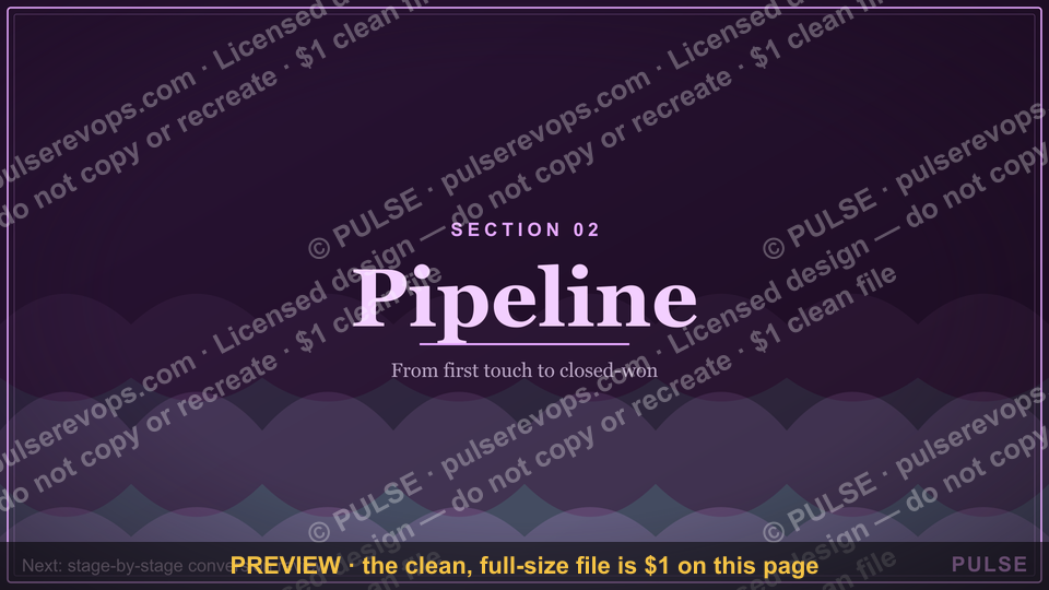
A Pipeline — Section Divider Slide is a presentation slide used to visually separate different sections or stages of a process, typically in a business or sales context. It usually displays a horizontal bar or graphic representing a progression, such as from lead generation to closing, without detailed data. This slide serves as a clear, high-level transition point, often featuring only the section title and a simple pipeline icon or shape. It helps maintain audience focus by breaking complex information into digestible parts.
Pipeline — Section Divider Slide

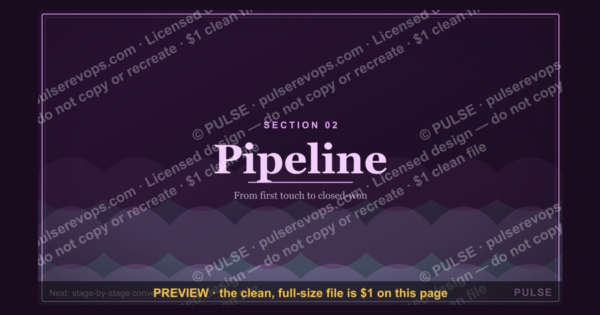
A 16:9 section-divider slide — an oversized "02" beside the "Pipeline" header. Use it to move cleanly between the chapters of your deck.
Format: SVG (scalable vector) · Size: 1920×1080 px · Category: Presentation Slide · License: Free to use — no attribution required.
[⬇ Download this graphic](/graphics/assets/gb0082.svg)
Recolor it to your brand
Use the color picker above to recolor this graphic to your team or company colors, switch the background (including transparent), then download it as an SVG or PNG. No sign-up, no watermark.
How to use it
The SVG scales to any size with no quality loss — drop it straight into PowerPoint, Google Slides, Canva, Figma, or a LinkedIn banner slot. The PNG export is ready to upload anywhere that wants a raster image.
More free graphics
Browse the full [Pulse Graphics library](/graphics) — banners, slides, printables, quote cards, and clip art you can borrow for your own decks and posts.
Related on PULSE
- [Pipeline Review — Section Divider Slide](/knowledge/gb0006)
- [Questions — Section Divider Slide](/knowledge/gb0090)
- [The Ask — Section Divider Slide](/knowledge/gb0089)
- [The Plan — Section Divider Slide](/knowledge/gb0088)
- [What Changed — Section Divider Slide](/knowledge/gb0087)
- [Where We Are — Section Divider Slide](/knowledge/gb0086)
Using the Pipeline Section Divider Slide to Structure Your Sales Deck
The Pipeline section divider slide serves a strategic purpose beyond simple decoration: it acts as a cognitive reset for your audience, signaling a shift from one major theme to the next. In a well-architected sales presentation, section dividers like this one help maintain narrative flow while giving viewers a moment to absorb what they’ve just seen before moving on. The oversized “02” paired with the “Pipeline” header creates a clear visual anchor that tells your audience, “We’ve finished the foundation—now we’re moving into the engine of your revenue growth.”
When placing this slide in your deck, consider the natural progression of a revenue-focused presentation. Typically, you’d use it after an opening section covering market context, company overview, or problem definition. The “01” section might cover why your prospect needs a better pipeline approach, while “02” dives into how your solution actually builds, manages, and accelerates that pipeline. This divider gives your audience a mental bookmark—they know exactly where they are in the story.
For maximum impact, pair the divider with a brief verbal transition. Something like, “Now that we’ve aligned on the challenge, let’s walk through how our pipeline framework turns that challenge into measurable revenue.” This bridges the gap between sections and reinforces the divider’s role as a guidepost. Avoid rushing past it; let the slide sit for 3–5 seconds while you take a breath or sip water. That pause signals confidence and gives the visual weight to sink in.
The 16:9 format is ideal for modern widescreen displays, and the SVG vector ensures crisp rendering at any resolution—from laptop screens to 4K conference room projectors. Because it’s vector-based, you can also resize it for handouts or digital distribution without quality loss. Keep the background consistent with your brand colors to maintain cohesion; the divider should feel like a natural part of your deck, not a jarring insert.
Best Practices for Customizing the Pipeline Section Divider
While the default “02” and “Pipeline” text works for many standard sales decks, you can—and should—customize this slide to match your specific presentation needs. The SVG format makes editing straightforward with tools like Adobe Illustrator, Figma, or even free alternatives like Inkscape. Here are practical ways to tailor it without breaking the design integrity:
Change the section number. If your deck has more than two sections, swap “02” for the appropriate number. For a five-section deck, you might have dividers for 01 through 05. Keep the numbering sequential and consistent in style. If you’re using a different numbering system (e.g., “Phase 2” or “Step 2”), update the text accordingly. Just ensure the font weight and placement mirror the original for visual harmony.
Adjust the header text. “Pipeline” is a strong, action-oriented word, but it might not fit every context. If your section covers “Forecasting,” “Deal Velocity,” or “Revenue Operations,” change the header to match. The key is brevity—one or two words max. Anything longer dilutes the divider’s impact. Use title case for consistency, and avoid punctuation that might clutter the clean design.
Incorporate brand elements. Add your company logo in a subtle position—typically the bottom-right corner or centered below the main text. Keep it small (around 10–15% of the slide height) so it doesn’t compete with the section number. You can also adjust the color palette to match your brand guidelines. If your brand uses a specific accent color, apply it to the number or a thin horizontal line beneath the header.
Consider animation (sparingly). In digital presentations (PowerPoint, Keynote, Google Slides), a subtle fade-in or slide-from-left animation can make the divider feel dynamic. Avoid flashy effects like spins or bounces—they distract from the slide’s purpose. A 0.5-second fade works well. For printed decks or PDFs, skip animation entirely.
Test readability at different sizes. Because the divider is designed for projection, ensure the text is legible from the back of a room. The oversized “02” should be at least 120–150 points, while the header should be 60–80 points. If you’re presenting in a small conference room, you might scale slightly down, but never below 80 points for the number. Use high-contrast colors—dark text on a light background or vice versa—to maintain clarity.
Common Mistakes to Avoid When Using Section Dividers
Even a well-designed section divider can undermine your presentation if used incorrectly. Here are pitfalls to watch for, based on feedback from sales professionals and presentation designers who work with decks daily:
Using too many dividers. One divider per major section is ideal. If you have a 20-slide deck, you might use 3–4 dividers. More than that, and the audience starts to feel like they’re watching a slideshow rather than a cohesive story. Each divider should mark a meaningful shift in content—not just a pause between every few slides. A good rule of thumb: if you can’t summarize the section in one sentence, you probably don’t need a divider for it.
Placing dividers too close together. If your deck has multiple short sections (e.g., 3–4 slides each), consider merging them under a single divider. For example, instead of separate dividers for “Pipeline Overview” and “Pipeline Metrics,” combine them into “Pipeline Fundamentals.” This keeps the narrative tight and prevents the audience from feeling jerked between topics.
Ignoring the visual hierarchy. The section number should dominate the slide—it’s the first thing viewers see. The header text is secondary. Don’t make the header larger than the number, and avoid adding subheadings, bullet points, or images that clutter the space. The divider’s power lies in its simplicity. If you need to add context, save it for the first content slide after the divider.
Skipping the verbal transition. A section divider without a spoken bridge is like a chapter heading with no text beneath it. Always pair the divider with a sentence that connects the previous section to the next. For example: “We’ve seen how the market is shifting. Now let’s look at how our pipeline solution addresses that shift directly.” This reinforces the divider’s role and keeps the audience engaged.
Using low-resolution versions. Because the divider is SVG, it should always be crisp. But if you’ve exported it as a raster image (JPEG or PNG) at a low resolution, it will look pixelated on large screens. Always use the SVG file directly in your presentation software, or export at 1920×1080 pixels minimum. Test it on the actual projection setup before the meeting to catch any rendering issues.
Forgetting to match the deck’s pacing. If your deck is fast-paced (e.g., a 10-minute pitch with 15 slides), a single divider might be enough. For longer, more detailed presentations (30–60 minutes), you can use dividers more liberally—but keep them brief. The divider should not slow down the presentation; it should enhance the flow. Practice your timing to ensure the divider doesn’t become a dead spot where you lose momentum.
Sources
- American Petroleum Institute — standards and data on oil and gas pipeline infrastructure
- Pipeline and Hazardous Materials Safety Administration (PHMSA) — U.S. regulations and safety statistics for pipelines
- National Association of Corrosion Engineers (NACE) — technical guidelines for pipeline corrosion prevention
- Energy Information Administration (EIA) — reports on pipeline capacity, usage, and energy transport trends
- International Pipeline Conference (IPC) — proceedings on pipeline engineering, design, and risk management
- Occupational Safety and Health Administration (OSHA) — safety requirements for pipeline construction and maintenance
FAQ
What is a section divider slide used for in a presentation? A section divider slide signals a clear transition between major topics or chapters in your deck. It helps the audience mentally reset and focus on the upcoming content, typically featuring a bold title and minimal visuals.
How many slides should a section divider include? Usually just one slide per major section, placed right before the new content begins. Overusing dividers can break flow, so limit them to 3–6 per presentation depending on length.
Can I customize the design of a section divider slide? Yes, you can adjust colors, fonts, and imagery to match your brand or theme. Keep the layout clean and avoid clutter—the goal is clarity, not decoration.
Should a section divider slide contain any data or details? No, it should only display the section title or a short label. Save detailed information for the following content slides to maintain the divider’s purpose as a visual pause.
Is it okay to use animations on a section divider slide? Subtle animations like a fade-in or slide-up can add polish, but avoid distracting effects. The transition should feel smooth and professional, not gimmicky.
How do I choose the right title for a section divider? Use concise, descriptive titles that summarize the upcoming section in 2–5 words. For example, “Market Analysis” or “Implementation Roadmap” works better than vague phrases like “Next Steps.”
This page will be disappearing soon. Save it to your device for $1 — or read it free while it is here.
@Kory-White- · if Venmo asks, the last 4 of my number are 2012
 graphicQuarterly Business Review — Title Slide
 graphicWin / Loss Review — Title Slide
 graphicSales Onboarding — Title Slide
 graphicThank you. — Closing Slide
 graphicSales Training — Title Slide
 graphicTerritory & Quota Planning — Title Slide
 graphicCustomer QBR — Title Slide
 graphicNext Steps — Section Divider Slide
 graphicThe Plan — Section Divider Slide
 gbAnnual Sales Planning — Title Slide