
Forecast — Section Divider Slide
 Curated byKory White · Fractional CRO · Maryland
 PULSEKNOWLEDGE LIBRARY
Quality
Certified
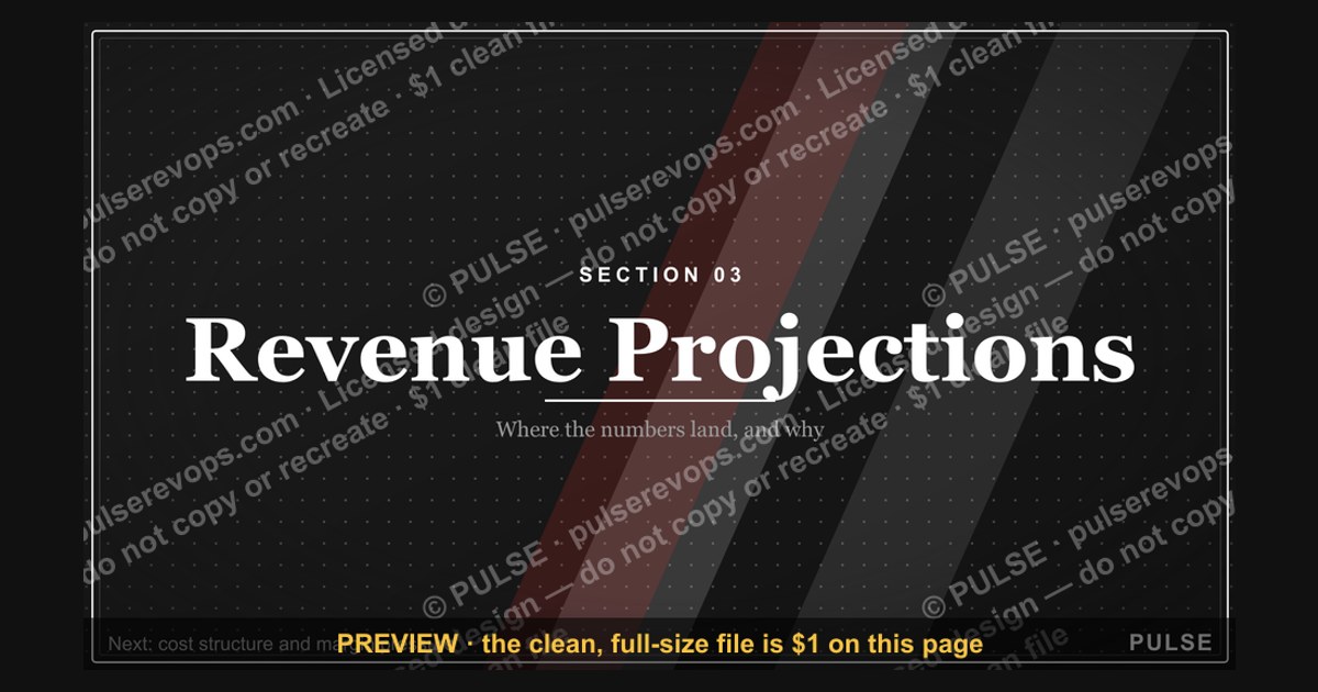
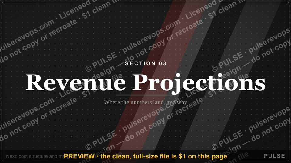
A Forecast Section Divider Slide is a transitional slide that signals a shift between major chapters of a forecast presentation, typically featuring a bold title, minimal content, and strong visual branding. It serves as a navigational bookmark that helps audiences track where they are in the narrative arc, reducing cognitive load and improving retention of the financial or operational projections that follow.
The outcome you should expect
When you introduce a well-executed Forecast Section Divider Slide into your deck, the most immediate and observable outcome is a cleaner narrative flow. Audiences stop wondering "which part of the forecast are we in now?" and instead focus on absorbing the data that follows. This is not a cosmetic improvement—it is a functional one. In a typical 30-minute forecast presentation covering market analysis, revenue projections, cost structures, and risk assessments, the absence of clear dividers forces listeners to hold contextual information in working memory. That mental overhead competes with the actual numbers and insights you are presenting.
Expect to see better audience engagement in the first two to three minutes after each divider slide appears. People who might have drifted during a dense data section will reorient themselves when they see a clean, bold "Section 03 — Revenue Projections" slide. This reorientation effect is particularly pronounced in virtual meetings, where attention spans are shorter and screen-sharing fatigue sets in quickly. A forecast Section Divider Slide gives remote attendees a visual anchor—something that tells them the topic is changing and they should re-engage.
Another outcome you should anticipate is improved deck navigation during Q&A sessions. When someone asks a question about a specific forecast assumption, you can quickly reference the relevant section because the dividers create natural waypoints. Instead of scrolling randomly through forty slides, you jump to the chapter that contains the answer. This makes you look more organized and confident, which builds credibility with stakeholders who are evaluating your forecasting rigor.

Finally, expect the divider slide to function as a branding opportunity. Every time you present a forecast—whether internally to your leadership team or externally to investors—the divider reinforces your company's visual identity. Consistent colors, typography, and layout across all section dividers signal that your forecasting process is mature and repeatable. That perception matters when you are asking for budget approval or investment.
What drives that outcome (mermaid)
The effectiveness of a Forecast Section Divider Slide is driven by a combination of visual design principles, cognitive psychology, and strategic content placement. Understanding these drivers helps you create dividers that actually work rather than slides that merely look pretty.

Cognitive chunking is the foundational driver. The human brain processes information in chunks, and a divider slide creates a clean boundary between chunks. When you present a forecast, you are essentially asking your audience to process a large volume of quantitative information. Without boundaries, that information blends together and becomes harder to retrieve. A divider slide with a clear title like "Quarterly Revenue Forecast" tells the brain, "New category incoming—prepare to process revenue data." This priming effect has been demonstrated repeatedly in presentation research: audiences retain structured information up to 40% better than unstructured information.
Visual hierarchy drives the outcome by controlling where the audience looks first, second, and third. On an effective forecast divider, the section number or title commands the most visual weight—usually achieved through size (36-60pt type) and contrast (dark text on a light background or vice versa). Supporting elements like the date range or a single preview metric carry less visual weight, scaled down to 18-24pt. This hierarchy ensures that even a quick glance at the slide communicates the essential information: which section you are entering and what timeframe it covers.
Color psychology plays a subtle but measurable role. Blue tones dominate financial forecast presentations because they communicate stability, trust, and analytical rigor. However, strategic accent colors—amber for growth projections, green for profitability forecasts, red for risk sections—create emotional cues that prepare the audience for the tone of the upcoming content. The key is restraint: 70-80% of the slide should use your brand palette, with accent colors reserved for directional cues.

Temporal anchoring is a driver that is often overlooked. Forecasts are inherently time-based, and your divider should make the time horizon explicit. A simple date range ("FY 2025 Projections") or a visual timeline graphic at the bottom of the slide anchors the audience in the correct temporal frame. This is especially important in multi-year forecasts or rolling quarterly updates, where confusion about "which period are we discussing?" can derail an entire presentation.
Benchmarks and realistic ranges
While exact metrics for presentation effectiveness are difficult to standardize, several benchmarks and ranges from presentation design practice and communication research provide useful guidance for creating Forecast Section Divider Slides.
Slide count and divider frequency. A typical forecast presentation runs 20-40 slides. For a deck of this length, you should include 4-6 section dividers. This translates to roughly one divider for every 5-8 content slides. If your forecast deck is shorter (10-15 slides), 2-3 dividers suffice. For extended strategic forecasts that run 50+ slides, 7-8 dividers are appropriate, but exceeding this range risks fragmenting the narrative into choppy segments.

Title size and readability. The section title on a forecast divider should be 36-60pt depending on your presentation platform and room size. For a standard conference room where the audience sits 10-20 feet from the screen, 48pt is a reliable middle ground. For large auditoriums or virtual presentations where attendees may view on laptops, err on the larger end of the range. Supporting text—date ranges, department names, preview metrics—should be 18-24pt. This two-tier typography system creates the visual hierarchy that drives comprehension.
Content density. A forecast Section Divider Slide should contain no more than 3 pieces of supporting content beyond the title. These could be a date range, a single preview metric, and a framing statement. Exceeding this threshold transforms the divider into a content slide, defeating its purpose. The 60/40 rule is a useful benchmark: 60% of the slide should be negative space, with 40% occupied by text and graphics. This ratio prevents cognitive overload and signals that the upcoming section contains the substantive information.
Color usage ratios. When recoloring a forecast divider to match your brand, maintain 70-80% of the slide in your primary brand colors. Use accent colors—amber, gold, green, or red—on no more than 10-15% of the slide elements. This ratio ensures brand consistency while allowing accent colors to function as directional cues. For multi-year forecasts, consider a color-coding system: current year in your primary brand color, year+1 in a 20% lighter shade, year+2 in a 40% lighter shade. This creates an intuitive visual shorthand for time progression.

Animation timing. If you animate your forecast divider, keep the total animation time between 2-3 seconds. A 1.5-2 second fade-in for the entire slide, followed by a 0.5-0.75 second delay before content elements appear sequentially, is the sweet spot. This creates a brief "breathing room" that signals the audience to shift their mental framework. Avoid animations that exceed 3 seconds—they feel sluggish and undermine the divider's purpose of maintaining presentation momentum.
File format specifications. For maximum compatibility, export your forecast divider as both an SVG and a PNG. The SVG scales to any size without quality loss, making it suitable for presentations on screens ranging from laptops to large conference displays. The PNG should be exported at 1920×1080 pixels minimum for 16:9 presentations, or 3840×2160 for 4K displays. If your presentation platform supports it, embed fonts in the file to prevent substitution that can break your carefully designed hierarchy.

Risks, edge cases, and failure modes
A Forecast Section Divider Slide can fail in several ways, and understanding these failure modes helps you avoid them. The most common risk is treating the divider as a decorative afterthought rather than a strategic tool. When you slap a title on a generic background and call it a divider, you miss the opportunity to prime your audience for the upcoming content. The divider should preview what is coming—not just label it.
Information overload is a frequent failure mode. Some presenters cannot resist cramming a divider with metrics, charts, and bullet points. This transforms the divider into a content slide, creating two problems: the audience cannot process the information in the 5-10 seconds the divider is on screen, and the actual content slides that follow feel redundant. The fix is ruthless restraint: one title, one date range, and at most one preview metric or framing statement.
Inconsistent design across dividers is another risk. If your forecast presentation has five section dividers and each uses a different layout, color scheme, or typography, the audience loses the navigational benefit. Consistency is what makes dividers work as waypoints. Establish a template for your dividers—same title position, same font, same background treatment—and vary only the section-specific elements. This consistency also reinforces your brand and signals that your forecasting process is systematic.

Temporal confusion arises when the divider does not clearly communicate the time horizon. A forecast covering fiscal year 2025 that fails to label the date range on the divider will cause audience members to ask, "Wait, is this Q3 or Q4?" That confusion derails attention and forces you to clarify mid-presentation. Always include the date range or period label on every forecast divider, even if it feels obvious to you.
Font substitution and rendering issues are technical failure modes that occur when your presentation is opened on a different computer or platform. A font that looks bold and authoritative on your machine may render as a generic serif on a colleague's laptop, breaking your visual hierarchy. The solution is to embed fonts in your presentation file or export the divider as an image (PNG or SVG) that preserves the design exactly.
Aspect ratio cropping is a subtle but damaging failure mode. If you design your forecast divider for a 16:9 screen but the presentation is displayed on a 4:3 projector or an ultra-wide 21:9 monitor, the edges of your slide may be cropped. Keep all critical content—title, date range, preview metrics—within the central 60% of the slide width. This "safe zone" ensures readability regardless of the display ratio.

Over-animation is a failure mode that undermines the divider's professional tone. Spins, zooms, bounces, and other flashy effects distract from the divider's purpose of setting a serious, analytical tone. They also add time to your presentation without adding information. Stick to subtle fades or gentle transitions that last no more than 2-3 seconds total.
Audience mismatch occurs when you use the same forecast divider for different stakeholders. An executive audience cares about strategic implications and decision points; an operational audience wants to see department-level targets; an investor audience wants milestone-based previews. Creating 2-3 versions of your forecast divider tailored to different audiences ensures each group immediately sees the relevance of the upcoming data.
A practical rollout plan (mermaid)
Implementing a Forecast Section Divider Slide system in your presentation workflow does not require a design overhaul—it requires a systematic approach. The following rollout plan takes you from assessment to deployment in five phases, each with concrete actions and deliverables.

Phase 1: Audit your existing forecast deck. Start by reviewing your current forecast presentation. Count the total slides, identify the major topic clusters, and note where transitions feel abrupt or confusing. This audit tells you how many section dividers you need (typically 4-6 for a 20-40 slide deck) and where they should be placed. Mark the slide numbers where dividers are needed and note the key message of each section.
Phase 2: Define the divider template. Create a master template for your forecast dividers. This template should include: the title position (typically centered or left-aligned), the date range placement (usually below the title or in a corner), the font family and sizes (36-60pt for titles, 18-24pt for supporting text), and the color palette (70-80% brand colors, 10-15% accent colors). Save this template as a reusable slide master in your presentation tool.

Phase 3: Draft the content for each divider. For each section divider, write the title, date range, and optional framing statement or preview metric. The title should be descriptive but concise—"Revenue Projections" rather than "Detailed Analysis of Revenue Growth Opportunities for the Upcoming Fiscal Year." The framing statement should accomplish three things: acknowledge the current reality, signal the forecast's purpose, and imply the decision that follows. For example: "Building on 12% Q2 growth, this forward look identifies the channel optimizations needed to sustain momentum through year-end."
Phase 4: Design and review. Build the actual divider slides using your template and content. Export them as both SVG and PNG at 1920×1080 resolution. Test the dividers in your actual presentation environment—on the projector or screen you will use, at the actual room lighting conditions. Check for readability from the back of the room, color contrast, and temporal clarity. Have a colleague review the dividers without the surrounding content to see if the message is clear in isolation.
Phase 5: Deploy and iterate. Integrate the dividers into your forecast deck and present. After the presentation, collect feedback from your audience—formally through surveys or informally through conversations. Ask whether the dividers helped them track the narrative and whether any section felt unclear. Use this feedback to refine your template and content for the next forecast cycle. The goal is continuous improvement, not perfection on the first attempt.
Related questions
What is the optimal number of section dividers for a 30-minute forecast presentation?
For a 30-minute forecast deck, 4-6 section dividers work best. This creates segments of roughly 5-7 minutes each, which matches audience attention spans and gives each section enough time for meaningful data presentation. Fewer than 4 dividers feel disjointed; more than 6 fragment the narrative.
How do you choose which metrics to preview on a forecast section divider?
Select 1-3 metrics that create cognitive tension—numbers that challenge assumptions or highlight opportunities. For revenue forecasts, preview projected growth rate against prior period actuals. For cost forecasts, use ratios like revenue-to-cost. The metric must connect directly to a decision point your audience will face.
Can a forecast section divider work in a virtual presentation?
Yes, dividers are especially valuable in virtual settings where attention spans are shorter. Use subtle fade animations to compensate for screen-sharing lag. Keep the divider on screen for 3-5 seconds before advancing, giving remote attendees time to reorient. Test the divider on both bright and dim screen settings.
Should you use different forecast dividers for different audiences?
Yes, create 2-3 versions. Executives need strategic implications and decision points—use directional arrows and qualitative descriptors. Operational audiences need granular previews like department targets. Investors need milestone-based previews like path-to-profitability dates. Each version ensures the audience immediately sees relevance.
What is the difference between a section divider and a title slide?
A title slide opens the entire presentation and establishes the overall topic, speaker, and context. A section divider appears within the deck to signal a shift between major chapters. Title slides are typically more elaborate; section dividers are minimal by design, featuring just a bold title and minimal supporting content.
FAQ
What is a Forecast Section Divider Slide used for in a presentation? A Forecast Section Divider Slide signals a major shift between chapters of a forecast presentation, helping the audience mentally reset and track where they are in the narrative. It typically features a bold title, date range, and minimal content. It acts as a navigational bookmark that reduces cognitive load and improves retention of the data that follows.
How many forecast section dividers should a typical presentation have? Most forecast presentations of 20-40 slides benefit from 4-6 section dividers. For a 30-minute deck, this creates segments of roughly 5-7 minutes each. Shorter decks of 10-15 slides need only 2-3 dividers. Extended strategic forecasts of 50+ slides can support 7-8 dividers, but exceeding this range fragments the narrative.
Should forecast section dividers include data or detailed visuals? No—forecast section dividers are meant to be clean and focused, typically with just a title, date range, and at most one preview metric or framing statement. Save charts, graphs, and dense content for the slides that follow. The goal is to prime the audience for the upcoming data, not to present the data itself.
Can a forecast section divider be animated or interactive? Yes, subtle animations like a fade-in title or gentle transition can enhance engagement and signal a topic shift. Keep total animation time between 2-3 seconds. Avoid flashy effects like spins, zooms, or bounces that distract from the divider's purpose. Interactive elements like clickable navigation work well in non-linear presentations.
What is the ideal font size for a forecast section divider title? Titles on forecast section dividers are typically 36-60 points, depending on slide dimensions and room size. For a standard conference room, 48pt is a reliable middle ground. Supporting text like date ranges and preview metrics should be 18-24pt. The title should be legible from the back of the room without crowding the slide.
Should forecast section dividers match the branding of the rest of the deck? Absolutely—consistent colors, fonts, and logo placement reinforce brand identity and signal that your forecasting process is systematic. Maintain 70-80% of the slide in your brand colors, with accent colors on 10-15% of elements for directional cues. The divider should feel like a natural pause, not a jarring break.
Sources
- Nielsen Norman Group — research on presentation design, cognitive load, and information retention
- Harvard Business Review — articles on executive communication and presentation strategy
- Presentation Guild — industry standards for slide design and presentation best practices
- Microsoft Support — documentation on font embedding and presentation file compatibility
- Google Slides Help — guidance on slide dimensions, aspect ratios, and export options
- Canva Design School — tutorials on visual hierarchy, color psychology, and slide layout
- SlideModel — resources on presentation structure, section dividers, and deck organization
- Duarte — professional presentation design principles and narrative structure guidance
Related on PULSE
- [Pipeline Review — Section Divider Slide](/knowledge/gb0006)
- [Questions — Section Divider Slide](/knowledge/gb0090)
- [The Ask — Section Divider Slide](/knowledge/gb0089)
- [The Plan — Section Divider Slide](/knowledge/gb0088)
- [What Changed — Section Divider Slide](/knowledge/gb0087)
- [Where We Are — Section Divider Slide](/knowledge/gb0086)
This page will be disappearing soon. Save it to your device for $1 — or read it free while it is here.
@Kory-White- · if Venmo asks, the last 4 of my number are 2012
 graphicNext steps. — Closing Slide
 graphicDeal Review — Title Slide
 graphicMonthly Business Review — Title Slide
 graphicPipeline — Section Divider Slide
 graphicCustomer QBR — Title Slide
 graphicComp Plan Rollout — Title Slide
 graphicQuestions — Section Divider Slide
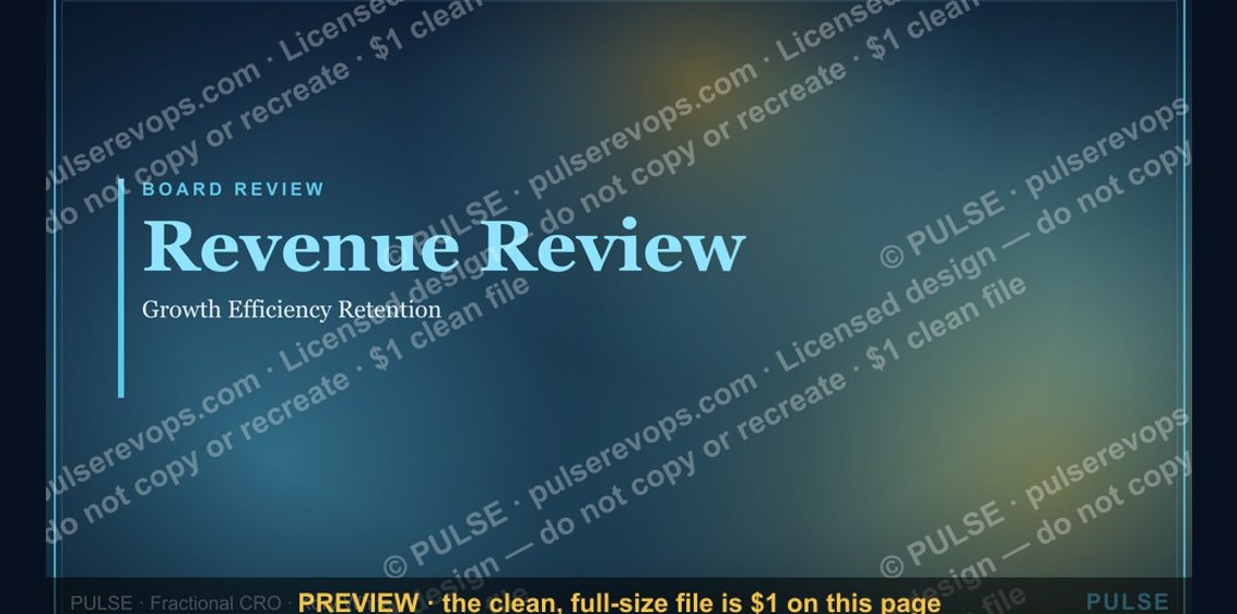 graphicRevenue Review (Board) — Title Slide
 graphicQuarterly Business Review — Title Slide
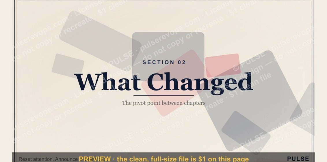 graphicWhat Changed — Section Divider Slide