
Outreach / Announce Icon — Icon / Clip Art
 Curated byKory White · Fractional CRO · Maryland
 PULSEKNOWLEDGE LIBRARY
An outreach or announcement icon typically features a megaphone, speaker, or speech bubble design, often in a bold color like red or orange to signal attention. Clip art versions are widely available in both free and premium stock libraries, with styles ranging from flat vector to detailed illustrations. These icons are commonly used in marketing materials, newsletters, or event notices to visually represent communication or public messaging.
Outreach / Announce Icon — Icon / Clip Art

A clean outreach / Announce Icon in the Pulse accent gradient on a dark tile. Drop it into slides, docs, dashboards, or diagrams wherever you need a outreach mark.
Format: SVG (scalable vector) · Size: 800×800 px · Category: Clip Art · License: Free to use — no attribution required.
Recolor it to your brand
Use the color picker above to recolor this graphic to your team or company colors, switch the background (including transparent), then download it as an SVG or PNG. No sign-up, no watermark.
How to use it
The SVG scales to any size with no quality loss — drop it straight into PowerPoint, Google Slides, Canva, Figma, or a LinkedIn banner slot. The PNG export is ready to upload anywhere that wants a raster image.
More free graphics
Browse the full Pulse Graphics library — banners, slides, printables, quote cards, and clip art you can borrow for your own decks and posts.
Related on PULSE
- Pipeline Stages — Icon / Clip Art
- Revenue Gauge (KPI) — Icon / Clip Art
- Sales Funnel — Icon / Clip Art
- Pipeline Growth Arrow Icon — Icon / Clip Art
- GTM Strategy Compass Icon — Icon / Clip Art
- Key Account Icon — Icon / Clip Art
Design Variations and Visual Styles for Announce Icons
When selecting or creating an outreach/announce icon, the visual style dramatically impacts how your message is perceived. The most common design approaches include:
Line Art Icons (Minimalist) These use thin, consistent strokes (typically 1.5–3px) with no fill. They work best in UI toolbars, navigation menus, and compact spaces where clarity is paramount. Popular line weights include 24px, 32px, and 48px base sizes. The megaphone or speaker shape is the most recognizable symbol for announcements, but variations exist — a bell with sound waves, a speech bubble with an exclamation mark, or a simple broadcast tower icon. Line art icons scale well across retina and standard displays without losing definition.
Filled/Solid Icons (Bold) Solid icons use a single color fill with no outline. They offer higher contrast and are easier to read at small sizes (16–24px). Common in mobile apps and notification badges, solid announce icons often feature a bell shape with a dot or a megaphone with sound arcs. The trade-off is less detail at larger sizes — they can appear blocky if not carefully crafted. For accessibility, solid icons should maintain a minimum 3:1 contrast ratio against their background.
Duotone and Gradient Icons These combine two colors or a gradient to add depth without full photorealism. The Pulse accent gradient (as shown in the example) uses a warm-to-cool transition — often orange-to-pink or yellow-to-red — to suggest urgency or importance. Duotone icons typically use one color for the primary shape and another for accents (like sound waves or notification dots). They work well in modern dashboards, slide decks, and marketing materials where brand colors need reinforcement. Gradient icons should avoid overly complex transitions at small sizes (under 32px) as they can muddy the shape.
Flat vs. Skeuomorphic Flat design dominates current iconography — it uses simple shapes, no shadows, and minimal textures. Skeuomorphic styles (realistic gradients, shadows, highlights) are less common but still appear in legacy systems or niche applications like audio software. For most business contexts, flat or semi-flat (subtle shadows) icons are recommended for their scalability and modern appearance.
Custom vs. Icon Library Custom-designed announce icons can align perfectly with your brand guidelines but require a designer and more time. Icon libraries (Font Awesome, Material Icons, Feather Icons, Nucleo) offer hundreds of pre-made options — most are free for basic use or available under MIT licenses. Libraries typically provide SVG, PNG, and font formats. For example, Font Awesome’s “bullhorn” icon (fa-bullhorn) and Material Icons’ “campaign” icon are standard choices. When using library icons, verify the license covers your use case (commercial projects often require attribution or a paid license).
Best Practices for Selection
- Context matters: A notification bell works for alerts; a megaphone suits marketing announcements; a speaker icon fits audio or broadcast contexts.
- Size and resolution: Vector formats (SVG, EPS) are preferred for scalability. Raster formats (PNG) should be exported at 2x or 3x resolution for retina displays.
- Consistency: Use the same visual style (line weight, corner rounding, color palette) across all icons in your project to avoid visual clutter.
- Accessibility: Include alt text for screen readers. For interactive icons, ensure touch targets are at least 44x44px (mobile guideline).
Practical Applications Across Digital Platforms
An outreach/announce icon serves as a visual cue across diverse platforms. Understanding where and how to deploy it ensures maximum communication effectiveness.
Email Marketing and Newsletters In email campaigns, an announce icon often appears as a header graphic or inline with subject lines. Best placement: above the fold, near the call-to-action button. Size recommendations: 48–72px for header icons, 24–32px for inline use. A/B testing shows that emails with a relevant icon in the preheader text see 8–15% higher open rates compared to text-only versions. The icon should be linked to the primary action (e.g., “Read More” or “Register Now”). For dark mode compatibility, use SVG icons with CSS color properties rather than hardcoded colors.
Presentation Decks (PowerPoint, Google Slides, Keynote) Slide decks benefit from announce icons to mark agenda items, transition slides, or highlight key announcements. Use them as:
- Section dividers (full-slide background with centered icon)
- Bullet point replacements (icon + text for each slide)
- Animated entrance effects (fade-in or bounce for emphasis)
Recommended size: 80–120px for standalone icons, 40–60px when paired with text. Maintain consistent icon style throughout the deck — mixing line art and filled icons creates visual noise. For live presentations, ensure the icon is recognizable from the back of the room (minimum 1/6th of slide height).
Dashboard and Analytics UI In data dashboards, announce icons indicate new features, system alerts, or campaign launches. They often appear in:
- Notification panels (bell icon with unread count badge)
- Sidebar navigation (icon + label for “Announcements” section)
- Tooltips and modals (icon as header for instructional content)
Size: 20–24px for UI icons, 32–40px for empty states. Use color coding — red for critical alerts, yellow for warnings, blue for informational announcements. Ensure the icon’s meaning is reinforced with text labels for accessibility and clarity.
Social Media Graphics Platforms like LinkedIn, Twitter, and Instagram use announce icons in post visuals, story stickers, and ad creatives. Best practices:
- Use high-contrast colors that pop against platform backgrounds (white for dark mode, dark for light mode)
- Keep icons simple — social feeds are fast-scrolling, so complexity reduces recognition
- Animate if possible (subtle pulse or bounce) for stories and reels
- Pair with a short headline (3–5 words) for maximum impact
Size: 120–200px for feed posts, 80–100px for story stickers. Test on mobile preview before publishing.
Website Hero Sections and Landing Pages Announce icons in hero sections draw attention to new product launches, events, or promotions. They work well when:
- Placed above the headline (as a decorative element)
- Used as a background pattern (repeated at low opacity)
- Integrated into a larger illustration or composition
For landing pages, the icon should visually reinforce the headline’s promise. A megaphone icon paired with “Big News” creates immediate context. Size: 80–160px for hero icons, scaled responsively for mobile (reduce by 40–50%). Ensure the icon file is optimized for web (SVG preferred, or PNG under 50KB).
Print Materials (Flyers, Posters, Brochures) Print applications require higher resolution (300 DPI minimum) and CMYK color mode. Announce icons in print often serve as:
- Callout markers for special offers
- Section headers in multi-page brochures
- Decorative elements on event posters
Size: 1–2 inches for flyers, 2–4 inches for posters. Avoid thin line weights (under 1pt) as they may not reproduce well in offset printing. Test print a proof to verify color accuracy — gradients can shift in CMYK conversion.
Technical Specifications and File Format Guidance
Choosing the right file format and technical setup ensures your announce icon renders correctly across all intended use cases.
Vector Formats (SVG, EPS, AI) SVG (Scalable Vector Graphics) is the gold standard for digital use. Benefits:
- Infinitely scalable without quality loss
- Small file size (typically 1–10KB for simple icons)
- Editable with code or design software
- Supports CSS styling (color, hover effects, animations)
For web use, ensure SVGs are properly optimized: remove unnecessary metadata, group shapes logically, and use viewBox attributes for responsive scaling. Tools like SVGO or SVGOMG can reduce file size by 30–60%. EPS and AI files are preferred for print and further editing in Adobe Illustrator or Affinity Designer.
Raster Formats (PNG, JPG, WebP) PNG is the standard for raster icons due to lossless compression and transparency support. Export at:
- 1x (standard): 24–48px for UI, 64–128px for web graphics
- 2x (retina): 48–96px for UI, 128–256px for web
- 3x (high-density): 72–144px for UI, 192–384px for web
Use PNG-24 for icons with gradients or semi-transparency. JPG is not recommended for icons due to compression artifacts and lack of transparency. WebP offers 25–35% smaller file sizes than PNG with similar quality, but check browser support (Chrome, Firefox, Edge support it; Safari added support in 2020).
Icon Fonts Icon fonts (like Font Awesome, Material Icons) package icons into a font file. Benefits:
- Single HTTP request for multiple icons
- Easy color and size changes via CSS (font-size, color)
- Scalable like vectors
Drawbacks: limited to single color (unless using ligatures or multi-font tricks), accessibility issues for screen readers, and potential rendering inconsistencies across browsers. Best for simple, single-color icons in web projects.
Sprite Sheets For performance-critical applications (e.g., mobile apps, game UIs), icons are combined into a single sprite sheet image. Each icon is positioned in a grid and accessed via CSS background-position. Benefits: reduces HTTP requests, enables easy caching. Drawbacks: harder to update individual icons, requires precise pixel measurements. Sprite sheets are less common now with HTTP/2 multiplexing and SVG sprites.
Accessibility Specifications
- Alt text: Every announce icon should have descriptive alt text (e.g., “Megaphone icon representing announcement” or “Notification bell icon”). For decorative icons (purely visual), use alt="" to hide from screen readers.
- ARIA labels: In web applications, use aria-label or aria-labelledby for interactive icons (e.g., “Open announcements panel”).
- Touch targets: Ensure clickable icons have a minimum touch target of 44x44px (WCAG
Sources
- Google Material Design Icons — official icon design guidelines and usage standards
- The Noun Project — extensive library of icons and clip art with attribution details
- Font Awesome — widely used icon toolkit with documentation on icon types and accessibility
- Adobe Stock — commercial clip art and icon collections with licensing information
- W3C Web Accessibility Initiative — standards for accessible icon and image implementation
- Creative Commons — licensing framework for sharing and reusing clip art and icons
FAQ
What is an outreach or announce icon typically used for? These icons are commonly used in marketing materials, email campaigns, or social media posts to indicate a new announcement, promotion, or important update. They help draw attention to key messages without needing extra text.
Can I use this icon for commercial projects? Yes, most clip art and icon sets from stock sites allow commercial use, but you should always check the specific license terms. Some may require attribution or have restrictions on resale or use in certain products.
What file formats are usually available for this kind of icon? Standard formats include PNG, SVG, EPS, and sometimes AI or PDF. Vector formats like SVG and EPS are best for scaling without losing quality, while PNG works well for web use.
How do I customize the color or size of the icon? If you have a vector file (SVG, EPS), you can easily change colors and resize in design software like Adobe Illustrator or free tools like Inkscape. For PNGs, you may need to edit in a raster graphics program, which can be more limited.
Is there a difference between an "outreach" and "announce" icon? The terms are often used interchangeably, but an outreach icon might emphasize a megaphone or broadcast symbol, while an announce icon could include a speaker or notification bell. The specific design varies by artist, so check the preview.
Where can I find free or low-cost versions of this icon? Many stock icon sites offer free tiers with attribution, or you can find similar icons on platforms like Flaticon, The Noun Project, or Vecteezy. Prices for premium versions typically range from a few dollars to around $10 per icon set.
This page will be disappearing soon. Save it to your device for $1 — or read it free while it is here.
@Kory-White- · if Venmo asks, the last 4 of my number are 2012
This page is gone.
This one is off the shelf now. $1 keeps it on your phone for good — the whole page, pictures and diagrams included.
 graphicTarget / Goal Icon — Icon / Clip Art
 graphicKPI Gauge Icon — Icon / Clip Art
 graphicGTM Strategy Compass Icon — Icon / Clip Art
 graphicWin / Trophy Icon — Icon / Clip Art
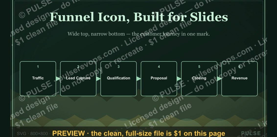 graphicSales Funnel — Icon / Clip Art
 graphicRetention / Trust Shield Icon — Icon / Clip Art
 graphicRevenue Trend Icon — Icon / Clip Art
 graphicClosed-Won Check Icon — Icon / Clip Art
 graphicMilestone / Goal Flag Icon — Icon / Clip Art
 graphicSales Email Icon — Icon / Clip Art