
Cold Call / Dialer Icon — Icon / Clip Art
 Curated byKory White · Fractional CRO · Maryland
 PULSEKNOWLEDGE LIBRARY
A cold call or dialer icon is a simple graphic symbol, typically a stylized telephone handset or a keypad, used in software, websites, or documents to represent outbound calling or telemarketing features. These icons are often found in clip art collections or icon sets, available in various styles such as flat, outline, or solid designs. Common color choices include blue, green, or gray, and they are used to visually indicate a call-to-action or a dialer function in user interfaces.
Cold Call / Dialer Icon — Icon / Clip Art

A clean cold Call / Dialer Icon in the Pulse accent gradient on a dark tile. Drop it into slides, docs, dashboards, or diagrams wherever you need a call mark.
Format: SVG (scalable vector) · Size: 800×800 px · Category: Clip Art · License: Free to use — no attribution required.
Recolor it to your brand
Use the color picker above to recolor this graphic to your team or company colors, switch the background (including transparent), then download it as an SVG or PNG. No sign-up, no watermark.
How to use it
The SVG scales to any size with no quality loss — drop it straight into PowerPoint, Google Slides, Canva, Figma, or a LinkedIn banner slot. The PNG export is ready to upload anywhere that wants a raster image.
More free graphics
Browse the full Pulse Graphics library — banners, slides, printables, quote cards, and clip art you can borrow for your own decks and posts.
Related on PULSE
- The Cold Call Framework — Infographic
- Pipeline Stages — Icon / Clip Art
- Revenue Gauge (KPI) — Icon / Clip Art
- Sales Funnel — Icon / Clip Art
- Pipeline Growth Arrow Icon — Icon / Clip Art
- GTM Strategy Compass Icon — Icon / Clip Art
Design Variations and Visual Semantics
Cold call and dialer icons come in a wide range of visual styles, each carrying different connotations and use cases. Understanding these variations helps you select the right icon for your specific context—whether it’s a sales dashboard, a mobile app, or a marketing collateral piece.
Flat vs. Glyph Styles Flat icons use solid shapes with minimal detail, often in a single color or two-tone palette. They’re ideal for modern, clean interfaces where clarity and quick recognition matter. Glyph icons, by contrast, are outlined or hollow, making them lightweight and scalable for small sizes like app toolbars or notification badges. A glyph cold call icon might show a phone handset with subtle sound waves, while a flat version could feature a bold receiver with a dial pad overlay.
Isometric and 3D Renderings For presentations, landing pages, or printed materials, isometric or 3D cold call icons add depth and professionalism. These often depict a phone receiver angled in perspective, sometimes with a glowing dial pad or a subtle “call” button. The 3D effect can convey modernity and sophistication, but be cautious—overly detailed 3D icons can lose clarity at small sizes or when printed at low resolution.
Line Art and Minimalist Approaches Line art icons use thin, consistent strokes and are popular in SaaS dashboards and enterprise software. A minimalist cold call icon might be a simple phone receiver with a single curved line representing a dial tone. This style works well for monochrome branding or when you need to pair the icon with text-heavy layouts. The key is ensuring the stroke weight is thick enough to remain legible at 16–24px.
Color Psychology in Dialer Icons Color choices in cold call icons aren’t arbitrary—they influence user perception. Green is the most common color for call-related icons, signaling “go,” “active,” or “success.” Red often indicates a missed call, a busy line, or an alert. Blue conveys professionalism and trust, making it popular in B2B sales tools. Orange or yellow can suggest urgency or a “hot lead.” When designing or selecting an icon, consider your brand palette and the emotional response you want to trigger.
Animated and Interactive Icons For digital products, animated cold call icons can enhance user experience. A subtle pulsing effect on the phone receiver mimics a ringing tone, while a spinning dial pad suggests an outgoing call. These micro-interactions are effective in call-to-action buttons or loading states. Keep animations short (0.5–1.5 seconds) and loop them smoothly to avoid distracting users.
Cultural and Contextual Considerations The classic rotary dial phone icon is still widely recognized, but younger audiences may associate it with vintage or retro themes. A smartphone silhouette with a call icon overlay is more contemporary. If your audience spans multiple regions, test whether a handset icon (common in North America) or a call button icon (more universal) performs better. In some cultures, a phone icon with a handset tilted at a 45-degree angle is the standard for “call,” while others use a straight vertical receiver.
Technical Specifications and File Formats
When sourcing or creating cold call and dialer icons, technical specifications matter for both digital and print applications. Here’s what you need to know to ensure your icons look crisp and function properly across all mediums.
Vector vs. Raster Formats Vector icons (SVG, EPS, AI) are resolution-independent, meaning they scale infinitely without losing quality. For web and app development, SVG is the gold standard—it’s lightweight, editable via CSS, and supports animations. EPS and AI are preferred for print design and illustration software like Adobe Illustrator. Raster formats (PNG, JPG, WebP) are pixel-based and best for fixed-size use cases like app icons or email signatures. Always request or export vector versions when possible, as they allow for easy color changes and resizing.
Resolution and Size Guidelines For screen use, icons should be at least 48x48px for standard displays and 96x96px for retina/high-DPI screens. A common practice is to design at 256x256px and then scale down. For print, aim for 300 DPI (dots per inch) at the final output size—a 1-inch print icon would need to be 300x300px. Icon sets often include multiple sizes (16, 24, 32, 48, 64, 128, 256px) to cover all use cases. When downloading from stock sites, check if the file includes multiple size variants or if you’ll need to resize manually.
Color Modes and Transparency Web icons typically use RGB color mode, while print icons require CMYK. Most stock icon providers offer RGB by default, so convert to CMYK if you’re using the icon in a brochure or poster. Transparency support is critical—PNG-24 and SVG both support alpha channels, allowing the icon to sit seamlessly on any background. Avoid JPG for icons, as it doesn’t support transparency and can introduce compression artifacts around edges.
File Naming and Organization If you’re building an icon library, consistent naming conventions save time. Use descriptive names like cold-call-flat-green.svg or dialer-glyph-blue.png. Include the size in the filename for raster files (e.g., dialer-icon-48px.png). Group icons by style (flat, glyph, line) and by use case (call, dial, voicemail). Many designers also include a unique ID or version number to track updates.
Licensing and Usage Rights Always verify the license of any icon you download. Free icons from sites like Flaticon or The Noun Project often require attribution. Premium icon sets may grant unlimited commercial use but restrict resale or redistribution. For enterprise projects, consider purchasing an extended license or commissioning custom icons to avoid legal issues. Some stock sites offer royalty-free icons with no attribution needed, but read the fine print—some licenses prohibit use in logos or trademarks.
Optimization for Web Performance Large icon files can slow down page load times. Minimize SVG file size by removing unnecessary metadata, grouping paths, and using simple shapes. Tools like SVGO or online compressors can reduce SVG size by 30–70%. For raster icons, use WebP format for modern browsers (it offers 25–35% better compression than PNG) and fall back to PNG for older browsers. Lazy-load icons that appear below the fold to prioritize above-the-fold content.
Practical Applications and Integration Tips
Cold call and dialer icons are versatile assets, but their effectiveness depends on how and where you use them. Here are actionable tips for integrating these icons into real-world projects.
Sales and CRM Dashboards In a CRM like Salesforce or HubSpot, cold call icons are often used for “Log Call” buttons or activity feeds. Place the icon inside a button with a clear label like “Log Call” or “Start Call” to avoid ambiguity. Use a green icon for active calls and a gray icon for completed or missed calls. For dialer functionality, a phone receiver with a numeric keypad overlay works well—consider adding a tooltip that says “Click to dial” when users hover over it.
Mobile App UI/UX In mobile apps, dialer icons should be large enough to tap easily (minimum 44x44px touch target). Place the icon in the bottom navigation bar or as a floating action button (FAB). For call-to-action screens, use a pulsating animation on the icon to draw attention. If the app includes a keypad, the dialer icon should transition smoothly to the keypad view. Test the icon on different screen sizes—a 24px icon on a 5-inch phone might be too small, while 48px could be too large on a tablet.
Marketing Collateral and Landing Pages For printed materials like brochures or flyers, use high-resolution vector icons to ensure sharpness. Pair the icon with a headline like “Ready to Talk?” or “Schedule Your Call.” On landing pages, a cold call icon next to a “Book a Demo” button can increase click-through rates by visually reinforcing the action. Consider using a two-tone icon that matches your brand colors—for example, a blue phone receiver with a green dial button.
Email Signatures and Newsletters In email signatures, a small dialer icon (16–24px) next to your phone number makes it scannable. Use a PNG with transparent background to avoid white boxes in dark mode email clients. For newsletters, a cold call icon can serve as a visual anchor for a “Call Us” section. Keep the icon simple—a phone receiver without extra details—since email clients may strip CSS or SVG support.
Social Media and Ad Creatives For social media posts or digital ads, use a bold, high-contrast icon that stands out in a feed. An isometric or 3D dialer icon can grab attention, but ensure it loads quickly—compress the file to under 100KB. A/B test different icon styles: flat icons often perform better on LinkedIn (professional context), while illustrated icons may work better on Instagram (engagement-focused). Always include a text overlay or caption to clarify the action.
Customization and Brand Alignment Don’t settle for generic icons—customize them to match your brand. Change the color to your primary brand color, add a subtle gradient, or incorporate a unique shape (e.g., a rounded square instead of a circle). If you have a mascot or logo element, consider merging it with the dialer icon (e.g., a phone receiver with your brand’s character holding it). For consistent branding, create an icon style guide that specifies stroke width, corner radius, and color palette for all icons.
Accessibility Considerations Ensure your cold call icon is accessible to all users. Provide alt text that describes the icon’s function (e.g., “Click to initiate a cold call” rather than just “Phone icon”). Use sufficient color contrast—a green icon on a white background should have a contrast ratio of at least 4.5:1. For users with visual impairments, pair the icon with a text label. Avoid relying solely on color to convey meaning (e.g., don’t use only red to indicate a missed call—add a “Missed” label).
Testing and Iteration Before finalizing an icon, test it with real users. Show them the
Sources
- Federal Communications Commission (FCC) — regulations and consumer information on telemarketing and robocalls.
- National Do Not Call Registry — official U.S. government site for registering phone numbers to reduce unwanted calls.
- Adobe Stock — repository of icon and clip art assets, including dialer and cold call imagery.
- The Noun Project — library of icons and symbols, including phone and dialer designs.
- Shutterstock — stock image and clip art platform with telemarketing and phone icons.
- Consumer Reports — independent organization providing guidance on avoiding scam calls and telemarketing.
FAQ
What is a cold call/dialer icon used for? A cold call or dialer icon typically represents outbound sales calls, telemarketing, or customer outreach in apps, websites, and presentations. It often features a phone receiver with motion lines or a dial pad to suggest active calling.
Can I use this icon for commercial projects? Yes, most clip art icons from stock sites like Vecteezy are available for commercial use, but always check the specific license terms. Some may require attribution or have restrictions on resale.
What file formats are available for this icon? Common formats include SVG, PNG, and EPS, with vector files (SVG, EPS) being scalable without quality loss. Raster PNGs come in various sizes, typically from 128x128 to 1024x1024 pixels.
How do I customize the icon’s colors? Vector formats like SVG allow easy color changes using design software (e.g., Adobe Illustrator, Figma) or by editing the code directly. For PNGs, you may need to recolor in an image editor.
Is this icon suitable for mobile app interfaces? Yes, the glyph two-color style is designed for clarity at small sizes, making it ideal for app buttons, toolbars, or notification badges. Test it at your target resolution to ensure legibility.
Can I find similar icons in different styles? Stock platforms offer variations like flat, outline, or filled styles, often under related keywords such as “telephone,” “outbound call,” or “sales icon.” Browsing by category can help match your design theme.
This page will be disappearing soon. Save it to your device for $1 — or read it free while it is here.
@Kory-White- · if Venmo asks, the last 4 of my number are 2012
This page is gone.
This one is off the shelf now. $1 keeps it on your phone for good — the whole page, pictures and diagrams included.
 graphicRevenue / Money Icon — Icon / Clip Art
 graphicWin / Trophy Icon — Icon / Clip Art
 graphicPipeline Growth Arrow Icon — Icon / Clip Art
 graphicIdea / Insight Icon — Icon / Clip Art
 graphicRevOps / Process Icon — Icon / Clip Art
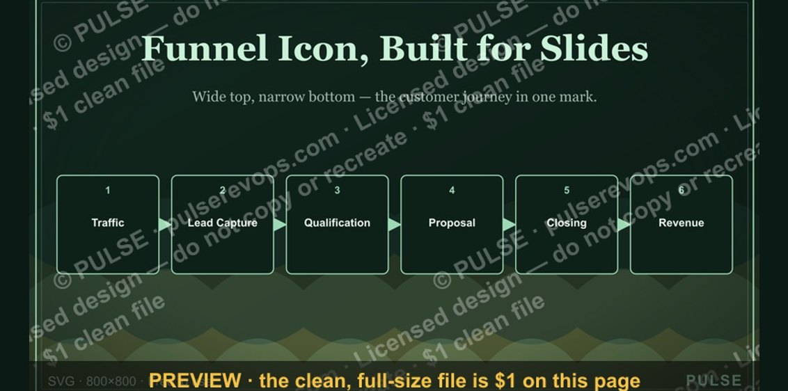 graphicSales Funnel — Icon / Clip Art
 graphicGrowth Bar Chart Icon — Icon / Clip Art
 graphicLead Magnet Icon — Icon / Clip Art
 graphicRevenue Trend Icon — Icon / Clip Art
 graphicMilestone / Goal Flag Icon — Icon / Clip Art