
Sales Consultant — LinkedIn Banner
 Curated byKory White · Fractional CRO · Maryland
 PULSEKNOWLEDGE LIBRARY
A Sales Consultant's LinkedIn banner should state the specific problem you solve, not just your job title, paired with a clean visual system — one accent color, one motif, generous negative space — that reads clearly at both desktop and mobile crop sizes. Skip stock handshake photography and generic taglines; a Banner that names the outcome (e.g., "I fix broken sales motions") outperforms one that only restates "Sales Consultant" under a stock skyline.
A concrete scenario that frames the problem
Picture two Sales Consultants with nearly identical backgrounds — both spent six years in enterprise SaaS, both now run independent consulting practices, both have LinkedIn profiles with roughly 2,000 connections. The first uses LinkedIn's default banner: the pale blue gradient every unedited profile ships with. The second built a dark, purpose-designed Banner with a one-line value statement and a subtle diagnostic motif — a heartbeat or signal-wave graphic that visually echoes "diagnosing" a sales process.
A prospect scanning search results or a mutual connection's comment section sees both profiles in the same few seconds. The first Consultant's profile reads as unfinished — the visual equivalent of a business card with no logo. The viewer's brain has to do all the work of guessing what this person actually does day-to-day, and on a platform where attention spans a scroll rather than a page, most viewers won't bother. The second Consultant's profile does the work for the viewer: the Banner names the "who" (a sales fixer), implies a process (diagnose, redesign, deliver), and creates enough visual distinctiveness that the profile is memorable after the tab closes.

This gap compounds over time. LinkedIn is not a static resume — it is a discovery surface a Consultant revisits weekly for warm outreach, comment engagement, and inbound curiosity clicks from posts. Every one of those touchpoints routes back through the profile, and the Banner is the first full-width visual a visitor sees, above even the headline text in some layouts. A generic or default Banner is a repeated missed opportunity, not a one-time cosmetic gap — it under-communicates on every single visit rather than once.
How the mechanism actually works
The Banner functions as a pre-filter, screening viewers into "worth reading further" or "scroll past" before a single sentence of the About section is read. That filtering happens through a short, largely subconscious sequence: contrast draws the eye, motif signals category, and text confirms specificity. Understanding that sequence is what separates a Banner that looks nice from one that actually converts profile views into connection requests or replies.

The first stage, contrast, is almost entirely a design decision independent of your industry. A dark background against LinkedIn's white feed and light-gray profile chrome creates immediate visual separation — the eye is drawn to areas of highest contrast before it processes any content. This is why a well-executed dark Banner tends to outperform a busy, bright one: it isn't that dark is inherently better, it's that it stands out against a predictable, mostly-light interface.
The second stage, motif recognition, happens fast and coarsely. A viewer doesn't consciously analyze a heartbeat line or a funnel graphic — they pattern-match it to a category (health/diagnostics, sales/pipeline, growth/upward trend) in a fraction of a second, well before they've read your headline. This is why the visual motif should reinforce, not contradict, your text. A Consultant whose Banner mixes a finance-chart motif with a sales-coaching headline creates cognitive friction the viewer resolves by simply moving on.

The third stage, text confirmation, is where most Banners fail even when the first two stages succeed. "Sales Consultant" alone confirms a job title but not a value proposition — it answers "what are you" but not "what do you do for me." A headline framed as an outcome ("I fix broken sales motions") or a process ("Diagnose, Design, Deliver") gives the viewer a reason to keep reading rather than simply cataloging your title and moving to the next profile in their search results.
Real numbers, ranges, and benchmarks
Banner dimensions are the first fixed constraint: LinkedIn's desktop cover photo renders at 1584×396 pixels, a roughly 4:1 aspect ratio, while the mobile crop shows a narrower center band — commonly cited around 1584×396 with the outer edges trimmed on phones, since more than half of LinkedIn sessions happen on mobile. Any text or logo placed in the outer 15-20% of the Banner's width risks being cropped on a phone screen, so critical elements (your headline, your CTA, a logo) belong in the center 60-70% of the canvas.

File format matters for quality retention. An SVG (vector) source scales without pixelation and is the safest format to design in, but LinkedIn's upload accepts standard raster formats (JPG, PNG, GIF) at the target pixel dimensions — export your vector design to a PNG at the full 1584×396 resolution rather than uploading a low-resolution raster that LinkedIn will stretch and soften. File size caps sit in the low single-digit megabytes, well above what a well-compressed banner needs, so compression artifacts from over-aggressive file-size reduction are avoidable.
On text sizing, a footer-style contact strip (URL, phone, or a short tagline) reads clearly at roughly 14-16px equivalent within the banner's proportions — small enough to avoid competing with your headline, large enough to remain legible when the banner renders at a fraction of its native size in a feed thumbnail or search result. A primary headline, by contrast, typically needs to occupy 8-12% of the banner's height to remain readable when LinkedIn compresses the image for its various display contexts.

For engagement expectations, treat any specific percentage lift as directional rather than guaranteed — results depend heavily on your existing network size, industry, and how much of your traffic comes from search versus warm referral. What is broadly consistent across profile-optimization efforts is the pattern: a profile view that previously ended at the banner (no click, no request) is the failure mode you're correcting, and any Banner change that measurably reduces that drop-off is worth keeping regardless of the exact percentage. Track your own before/after profile-view and connection-acceptance trends over a 30-day window rather than anchoring to any single external benchmark number.
Trade-offs and alternatives
There is a real trade-off between a highly specific, niche-signaling Banner and a broader, more general one. A Sales Consultant who names a narrow specialty ("I fix SaaS sales cycles over 90 days") on the Banner itself will resonate strongly with prospects in that exact situation but may read as irrelevant to a prospect just outside that niche — even if the Consultant would happily take that work. A broader Banner ("I build revenue systems that scale") casts a wider net but risks blending in with hundreds of similarly-worded consultant profiles.

A second trade-off sits between a static banner and a periodically refreshed one. A static, well-designed Banner is low-maintenance and consistent — useful if your positioning is stable and you don't want to spend design time revisiting it. A refreshed Banner (updated quarterly, tied to a current offer, a recent result, or a seasonal campaign) signals an active, current presence to repeat visitors, but requires ongoing design attention and risks looking unfinished if updates are rushed rather than deliberate.
A third alternative worth weighing is using the Banner purely for branding (logo, color, motif, no direct CTA) versus using it as a direct response tool (an explicit "Book a call" or "Free audit" prompt). The branding-only approach ages better and feels less salesy on a platform where overt pitches can read as try-hard, but it asks the viewer to take an extra step to find your contact path. The direct-response approach can shorten the path from profile view to booked call, but it needs restraint in execution — a banner that reads as an advertisement rather than a professional signal can undercut the credibility it's trying to build.
Finally, there's a build-it-yourself versus use-a-template trade-off. A custom-designed Banner (built in Figma, Canva, or by a designer) can precisely match your brand and message, but takes real time to get right, including testing at mobile crop sizes. A quality free or paid template shortcuts the design work and often already accounts for LinkedIn's dimensions and cropping behavior, but requires you to personalize it enough that it doesn't read as an obviously recycled design many other consultants are also using.
Common pitfalls and how to avoid them
The most frequent mistake is designing only for the full desktop canvas and never checking the mobile crop. Because LinkedIn trims the banner's edges on phone screens, a headline or logo placed near the left or right border can vanish entirely for the majority of viewers who see your profile on mobile. Before finalizing any Banner, view it on an actual phone or resize a preview to the narrower mobile aspect ratio and confirm every essential element still sits inside that trimmed frame.

A second common error is a mismatch between the Banner's headline and the profile photo's tone. If your headshot is bright, casual, and set against a light background, but the Banner is heavily dark and formal, the two elements fight each other visually instead of forming one cohesive first impression. A simple fix is a soft dark vignette or gradient behind the area where your photo will sit, so the transition from photo to banner reads as intentional rather than accidental.
A third pitfall is overloading the Banner with too much text or too many competing visual elements — a headline, a tagline, a CTA, a logo, and a background pattern all fighting for attention in a 1584×396 space. Because the Banner is viewed for a matter of seconds, it should carry one primary message and, at most, one secondary element (a CTA or contact line). Anything beyond that gets skimmed past rather than read.

A fourth mistake is using low-resolution or upscaled source images, which produce visible blur or pixelation once LinkedIn compresses the upload further. Starting from a vector (SVG) source or a high-resolution raster export avoids this — never take a small image and stretch it to fit the banner dimensions, since upscaling degrades quality rather than improving it.
Finally, many Consultants set the Banner once during initial profile setup and never revisit it, even as their positioning, target industry, or flagship offer changes. A Banner describing "sales training" when your practice has shifted to "revenue operations consulting" creates a quiet inconsistency between what a prospect sees and what you actually pitch on the first call — worth auditing anytime your core offer changes, not only when you remember to.

Related questions
Should a Sales Consultant use a headshot or a logo as the profile photo alongside the banner?
A real headshot generally builds more trust than a logo for an individual Consultant, since LinkedIn is a person-to-person network — reserve logo-only photos for company pages, and use the Banner (not the profile photo) to carry your brand mark or motif.
How often should the LinkedIn banner be updated?
A quarterly review is a reasonable cadence — check whether your headline still matches your current offer and industry focus, and refresh sooner if your positioning changes materially, such as shifting target company size or specialty.
Does the LinkedIn banner affect search ranking within LinkedIn's search results?
LinkedIn's search ranking relies primarily on profile text, keywords, and activity rather than banner imagery, but a stronger Banner can improve click-through and response rates once a viewer has found you, which indirectly supports network growth.
What's the difference between a LinkedIn banner and a LinkedIn featured section for showcasing consulting work?
The Banner is a single always-visible visual impression at the top of the profile, while the Featured section lets you pin multiple pieces of content (case studies, articles, testimonials) further down — the two serve complementary purposes, first impression versus deeper proof.
Can a Sales Consultant use the same banner across LinkedIn, a website, and email signatures for consistency?
Reusing a consistent color palette, motif, and headline style across platforms strengthens brand recognition, though each platform's exact dimensions differ, so the source design should be built to re-export cleanly at each platform's specific size.
FAQ
What size should a Sales Consultant's LinkedIn banner be? The standard LinkedIn cover photo size is 1584×396 pixels. Keep essential text and logos within the center 60-70% of that width so nothing important is lost when LinkedIn crops the image for mobile display.
Is a dark banner always better than a light one for a Sales Consultant? Not universally — a dark banner tends to stand out against LinkedIn's light interface and reads as premium, but a light or brand-colored banner can work equally well if it's distinctive and legible; the key factor is contrast and clarity, not darkness specifically.
Should the banner include a call-to-action like "Book a call"? It can, placed subtly rather than as an obvious advertisement — a short CTA in the lower portion of the banner can shorten the path to booking, but an overly salesy banner risks undercutting the professional credibility it's meant to build.
What file format should I use to design and upload a LinkedIn banner? Design in a scalable vector format like SVG for crisp editing, then export a high-resolution PNG or JPG at the full 1584×396 dimensions for upload, since LinkedIn accepts standard raster formats rather than SVG directly.
Can I use a stock photo as my LinkedIn banner? You can, but generic stock imagery (handshakes, skylines) blends into the sea of similar consultant profiles; a custom design with your own headline and a simple motif differentiates you far more effectively than repurposed stock photography.
How do I know if my banner is actually working? Track profile views and connection-acceptance or reply rates over roughly a 30-day window before and after a banner change, and pay attention to qualitative feedback — asking new connections what prompted them to reach out can reveal whether the banner itself is doing any of the work.
Sources
- https://www.linkedin.com/help/linkedin
- https://business.linkedin.com/marketing-solutions/blog
- https://www.canva.com/learn/
- https://blog.hubspot.com/marketing/personal-branding
- https://www.forbes.com/sites/forbescoachescouncil/
- https://helpx.adobe.com/creative-cloud.html
- https://www.shrm.org/topics-tools
Related on PULSE
- [Solutions Consultant — LinkedIn Banner](/knowledge/gb0431)
- [Pre-Sales Consultant — LinkedIn Banner](/knowledge/gb0254)
- [SaaS Sales Cycle Stages](/knowledge/gb0539)
- [Sales KPI Dashboard — Top 9](/knowledge/gb0517)
- [PLG Sales Overlay Org Chart](/knowledge/gb0513)
Read it free — or make it yours for $1.
@Kory-White- · if Venmo asks, the last 4 of my number are 2012
 graphic“Modernizing insurance sales.” — LinkedIn Banner
 graphic“Quota is a floor, not a ceiling.” — LinkedIn Banner
 graphicAI Image Engineer — LinkedIn Banner
 graphicSolutions Architect — LinkedIn Banner
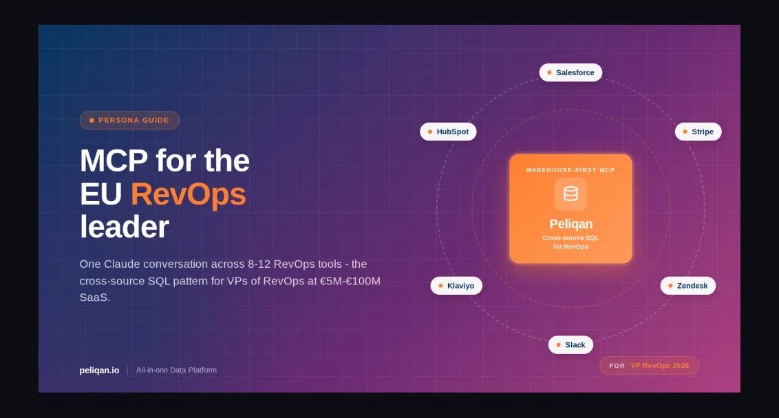 graphicRevOps Leader — LinkedIn Banner
 graphicHow do you build a Champions sell motion from scratch in 2027?
 graphicDocument Intelligence AI Engineer — LinkedIn Banner
 graphic“Ready for my next challenge.” — LinkedIn Banner
 graphic“Open to Customer Success roles.” — LinkedIn Banner
 graphicMarketing Operations — LinkedIn Banner