
Document Intelligence AI Engineer — LinkedIn Banner
 Curated byKory White · Fractional CRO · Maryland
 PULSEKNOWLEDGE LIBRARY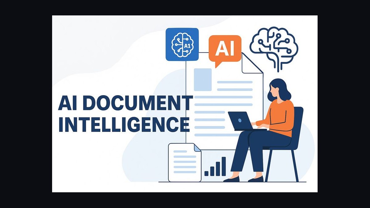
A Document Intelligence AI Engineer's LinkedIn banner should visually signal one specialization — turning unstructured documents into structured data — through either a clean typographic layout or an illustrated document-pipeline graphic. The right choice depends on your audience: recruiters scanning fast favor bold text; peers and hiring managers in AI/ML favor a banner that shows the extraction pipeline itself. Either way, keep it legible at 1584×396px, high-contrast, and free of literal software screenshots.
Two banner approaches: typographic vs. pipeline-illustrated
There are really only two workable design directions for a Document Intelligence AI Engineer banner, and picking between them up front saves hours of revision later.
Option A — the typographic banner. This approach leans entirely on words and color blocking: a large role title ("Document Intelligence AI Engineer"), a supporting tagline ("Automating Extraction from Unstructured Data"), and a restrained background — usually a two-tone gradient or a single accent color panel. There is no illustration of documents, pipelines, or icons at all. The visual weight comes from typography scale (headline at 96px in a 2x SVG canvas, tagline at 36px) and negative space. This style reads fastest — a recruiter scrolling a search results page absorbs the role title in under a second because nothing competes with it for attention.
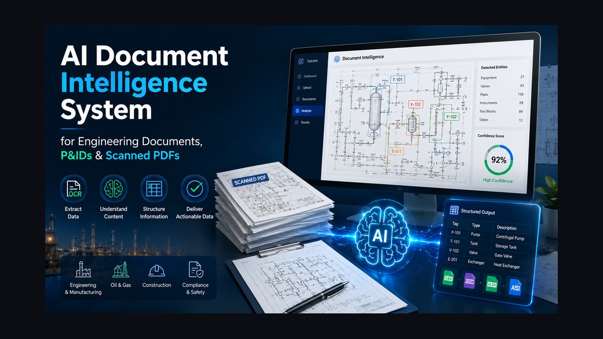
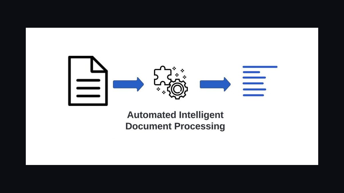
Option B — the pipeline-illustrated banner. Here the right two-thirds of the canvas carries an abstract representation of the document-to-data workflow: a stylized document icon feeding into a parsing/OCR symbol, then into a data-structure or table icon, connected by thin flow lines or arrows. The left third still carries the title and tagline, but the illustration does secondary work — it signals *how* you do document intelligence, not just that you do it. This style takes longer to parse (2–4 seconds instead of under 1) but rewards that time with more information: a viewer who lingers understands you work across the full pipeline, not just one stage of it.
The trade-off is fundamentally about audience composition. If your LinkedIn traffic skews toward recruiters and non-technical hiring coordinators doing keyword scans, Option A wins because it optimizes for the first-second glance. If your audience skews toward technical hiring managers, peer engineers, or people who will actually click through to your profile and read your experience section, Option B's illustration functions as a pre-qualifier — it filters for viewers who care about the *how*, and those viewers tend to be more relevant connections.
There is a hybrid third path worth naming even though it is not a distinct "option" in the strict binary sense: a typographic banner with one small, restrained pipeline icon (not a full illustration) tucked into the upper-right corner as an accent rather than a focal element. This captures most of Option A's speed while hinting at Option B's specificity. Engineers early in a job search, where volume of recruiter views matters most, tend to prefer Option A or the hybrid. Engineers who are passively browsing or building thought-leadership presence tend to prefer Option B, since their banner is doing brand work over a longer horizon rather than optimizing a single application cycle.
How to decide between the two
The decision hinges on three questions, each of which points you toward one option or the other. First: are you actively job-searching this month, or building long-term visibility? Active searches favor speed (Option A); long-term brand-building favors depth (Option B). Second: does your current role or target role sit closer to applied engineering (shipping pipelines, on-call, production systems) or closer to research/architecture (designing extraction systems, evaluating models)? Applied roles read well with the direct typographic approach; research-adjacent roles benefit from showing systems thinking through the illustration. Third: what does the rest of your profile already communicate? If your profile photo, headline, and featured posts are already text-heavy and direct, a pipeline-illustrated banner adds welcome visual variety. If your profile is already visual (a technical diagram in your featured section, for instance), a typographic banner avoids redundancy.
A practical tie-breaker: if you cannot decide, default to the typographic banner first. It is faster to build correctly, faster for viewers to parse, and easier to keep consistent with your profile photo and featured-post visuals. You can always add a pipeline illustration in a later revision once you have a sense of how your current banner is performing in terms of profile views and connection requests.
Concrete numbers behind each option
The technical specifications differ meaningfully between the two approaches, and getting them wrong is the most common reason a banner looks unprofessional even when the design concept is sound.
For the typographic banner: author the SVG at 2x resolution, meaning a canvas of 3168×792px even though LinkedIn's display size is 1584×396px — this keeps text crisp on Retina and high-DPI screens. Headline text should sit at 90–100px in that 2x canvas (rendering at roughly 45–50px), with font-weight 700 and slightly negative letter-spacing (-0.02em) for a tight, modern look. Tagline text should run 32–40px in the 2x canvas (16–20px rendered), font-weight 400, with positive letter-spacing (0.01–0.02em) for readability at small sizes. Contrast ratio between text and background should be at least 4.5:1 — most dark-navy-background-with-white-text combinations clear 10:1 or higher, giving you margin even after LinkedIn's own compression. Total file size should stay under 50KB; a well-built typographic SVG with a gradient background and two text blocks typically lands between 8KB and 20KB.
For the pipeline-illustrated banner, the same 3168×792px 2x canvas and text sizing apply, but you add the illustration budget: the pipeline graphic itself should occupy roughly 400–500px of width (in 2x terms) positioned in the right half of the canvas, built from SVG primitives (rectangles with rounded corners, circles, thin connecting paths) rather than embedded raster images. Icon opacity for secondary decorative elements should sit between 0.15 and 0.4 so they read as texture rather than competing with the primary text. Because the illustration adds path data, expect the final file size to land higher — typically 20–35KB — but it should still stay comfortably under the 50KB ceiling if you avoid embedding any JPEG or PNG data.
Both approaches must reserve the same dead zones: LinkedIn overlays your profile photo in the lower-left corner (roughly the bottom-left 200×200px at 1x scale, so 400×400px in your 2x source), and interface buttons can overlay parts of the lower-right on some views. Keep your headline in the upper-left quadrant and your tagline centered-to-upper-right on both designs — this constraint doesn't change based on which option you pick, only how much decorative content you're fitting around it.
Implementation details and sequencing
Regardless of which option you choose, the build sequence is the same, and skipping steps is what produces banners that look fine on a desktop preview but break on mobile or after LinkedIn's compression pass.
Start by defining your canvas and background in a <defs> block — a linear gradient from a darker edge color to a slightly lighter center color reads better than a flat fill and costs almost nothing in file size. Next, lock your typography: pick one font family with solid fallbacks ('Plus Jakarta Sans', 'Inter', -apple-system, 'Segoe UI', Roboto, sans-serif), and place your headline and tagline as <text> elements with explicit x/y coordinates rather than relying on any auto-layout, since SVG text positioning is absolute and inconsistent auto-layout behavior across renderers is a common source of misalignment. Third, if you're building Option B, construct the pipeline illustration as a separate grouped element (<g>) positioned and scaled independently from the text layer, so you can nudge or resize it without touching your typography. Fourth, run the finished SVG through an optimizer (SVGO or equivalent) to strip metadata, merge redundant paths, and reduce coordinate precision — this is what gets a hand-coded SVG from 60–80KB down into the 15–35KB target range without any visible quality loss.
After the file is built, sequence your testing before you upload anything permanently. Preview the banner at both 1x and 2x zoom, check it against a light-mode and dark-mode LinkedIn view if you toggle between them, and specifically check the lower-left corner against a placeholder profile photo circle to confirm nothing important is obscured. Upload to LinkedIn, which will rasterize your SVG to PNG on its servers — download what LinkedIn actually serves back and inspect it, since compression artifacts sometimes appear on gradients or thin lines that looked clean in your source file. Only after this check should you treat the banner as final and move on to keeping the rest of your profile (photo tone, featured post graphics) visually consistent with it.
Related questions
How often should I update my LinkedIn banner as a Document Intelligence AI Engineer?
Revisit it every 3–6 months, or whenever your specialization shifts (e.g., moving from OCR-focused work into broader multimodal document understanding). Frequent changes without a reason can look unsettled; a stale banner that still describes a role you left a year ago looks worse.
Should my banner mention specific tools like AWS Textract or Azure Document Intelligence?
Avoid spelling out tool names directly in the banner text. Use color-coded accents or abstract icons instead — vendor names date quickly and clutter a design meant to be read in under three seconds.
Can I use the same banner style across LinkedIn, GitHub, and a personal site?
Yes, and it's advisable for consistency, but scale the composition rather than reusing the exact SVG — GitHub's profile banner conventions and personal-site hero sections have different aspect ratios than LinkedIn's 1584×396px.
Does a pipeline-illustrated banner actually help with recruiter response rates?
There's no universal answer here since response rates depend heavily on your experience and target role; treat the illustration as a signal to technical reviewers rather than a guaranteed differentiator with recruiters doing rapid keyword scans.
FAQ
Do I need design software to build this banner, or can I hand-code the SVG? Both work. Hand-coding gives you precise control over file size and text positioning, which matters for the sub-50KB target. Design tools like Figma or Canva are faster for the illustration elements in Option B but often export bloated SVGs that need a pass through an optimizer afterward.
What file format should I actually upload to LinkedIn — SVG or PNG? LinkedIn accepts image uploads and will rasterize whatever you provide internally, so export a PNG from your SVG source at 1584×396px (or 2x at 3168×792px if file size allows) for the actual upload, while keeping the SVG as your editable master file.
Is a dark background always the right choice for this type of banner? No — dark navy or charcoal backgrounds work well for a technical, trustworthy tone, but a light background with dark text and a single accent color can work equally well and sometimes stands out more against the sea of dark banners common in AI/ML profiles.
How do I keep the banner from looking cluttered if I want to list certifications too? Represent certifications as small geometric badges (a hexagon, square, or circle in each certifying body's accent color) rather than spelling out acronyms in text, and confine them to a single corner rather than spreading them across the banner.
Should the tagline focus on tools or outcomes? Favor outcomes. A tagline like "Automating Document Workflows with AI" communicates business value faster than a list of frameworks, and it ages better as your specific toolset changes over time.
What's the biggest mistake engineers make with this type of banner? Embedding a literal screenshot of a tool interface (Textract console, a Jupyter notebook, a model dashboard). It dates the design almost immediately, increases file size dramatically since screenshots require raster embedding, and reads as less polished than an abstract illustration or clean typography.
Sources
- https://engineering.linkedin.com/blog
- https://learn.microsoft.com/en-us/azure/ai-services/document-intelligence/
- https://ieeexplore.ieee.org/
- https://blog.google/technology/ai/
- https://dl.acm.org/
- https://openai.com/research
- https://www.w3.org/TR/SVG2/
- https://developer.mozilla.org/en-US/docs/Web/SVG
Related on PULSE
- [Document Capture CRO — LinkedIn Banner](/knowledge/gb0452)
- [AI Translation Engineer — LinkedIn Banner](/knowledge/gb0489)
- [AI Image Engineer — LinkedIn Banner](/knowledge/gb0486)
- [TTS Voice AI Engineer — LinkedIn Banner](/knowledge/gb0485)
- [AI Video Engineer — LinkedIn Banner](/knowledge/gb0487)
Read it free — or make it yours for $1.
@Kory-White- · if Venmo asks, the last 4 of my number are 2012
 graphicAI Translation Engineer — LinkedIn Banner
 graphic“Revenue in regulated markets.” — LinkedIn Banner
 graphic“We’re hiring closers.” — LinkedIn Banner
 graphic"Win the quarter." — LinkedIn Banner
 graphicBusiness Development — LinkedIn Banner
 graphicYour pipeline is your paycheck. — LinkedIn Wallpaper
 graphicHow to identify the champion in a sales meeting in 2027?
 graphicSell the future. — LinkedIn Wallpaper
 graphicStay in the deal. — LinkedIn Wallpaper
 graphicSolutions Architect — LinkedIn Banner