
“More pipeline, less panic.” — LinkedIn Banner
 Curated byKory White · Fractional CRO · Maryland
 PULSEKNOWLEDGE LIBRARY
Quality
Certified

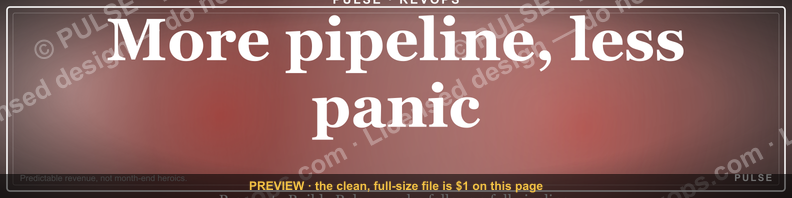
This is a LinkedIn profile banner (1584×396 px) that reads "More pipeline, less panic." in bold white sans-serif type set against a dark charcoal background, with a thin gold underline beneath the second line for emphasis. It's built for sales leaders, account executives, and RevOps professionals whose LinkedIn presence should signal calm, process-driven pipeline management rather than reactive scrambling. Download the PNG below and drop it into your LinkedIn cover photo slot in under two minutes.
What this banner is and why it matters
The graphic itself is simple by design: a dark, near-black background (roughly #14161B) fills the full 1584×396 canvas, and the headline "More pipeline, less panic." sits left-of-center in two stacked lines — "More pipeline," in a lighter weight, "less panic." in a heavier weight directly below it, both in a clean sans-serif (something in the Inter/Helvetica Neue family reads correctly at LinkedIn's compressed display size). A thin gold-to-amber rule sits under the words "less panic" to anchor the eye. The right third of the canvas is left intentionally empty so your profile photo circle — which LinkedIn overlays on top of the banner — doesn't collide with the text. There is no logo, no photograph, and no secondary tagline; the phrase carries the entire message.
Why a banner like this matters more than it looks: LinkedIn's profile photo and headline get the first glance, but the banner is the largest single visual element on your profile page, and it's the one asset most professionals never touch — the vast majority of LinkedIn users are still running the default blue geometric pattern that ships with every new account. A banner that says something specific about how you work does two things a blank default banner can't. First, it gives a visiting prospect, hiring manager, or peer a one-line summary of your operating philosophy before they read a single word of your headline or About section. Second, it reinforces a message you're already saying out loud — in your headline, in your posts, in your DMs — so the visual and the verbal are pulling in the same direction instead of the banner sitting there as wasted real estate.

"More pipeline, less panic." specifically targets an audience that lives inside forecast anxiety: sales managers who dread the Friday pipeline review, AEs who've been burned by a deal that "felt solid" and then vanished, RevOps leads who spend more time explaining variance than preventing it. The phrase works because it names the two states everyone in that world recognizes — the volume problem (not enough pipeline) and the emotional problem (panic when the number doesn't move) — and implies a causal fix: more of the first cures the second. It's not a claim about your product or your quota attainment; it's a claim about your operating posture, which is exactly what a banner should communicate since it has no room for nuance or proof points.
Putting it on your profile: the step-by-step process
Applying the banner takes five steps, and the only one people get wrong is the crop.
Start by saving the PNG at full resolution — don't screenshot it, since a screenshot recompresses the file and softens the gold underline into a blur. Open your LinkedIn profile in edit mode and click the small camera icon that appears when you hover over the existing banner area (on mobile, tap the banner itself). Upload the file directly; LinkedIn will present a crop window that's slightly different in aspect ratio from the source file, which is the one place this process goes wrong — LinkedIn's crop tool doesn't show you the desktop and mobile versions simultaneously, so what looks perfectly centered on one device can crowd the profile photo circle on the other.
After uploading, don't save immediately. Drag the crop window so the empty right-third of the banner — the space intentionally left blank around the profile photo — actually lines up with where your photo circle will sit. Save, then open your profile in a new incognito or private browser tab to see exactly what a visitor sees, and separately check it on the LinkedIn mobile app, since mobile renders a taller, narrower crop of the same image than desktop does. If either view clips the words "less panic," go back into edit mode and nudge the crop rather than re-uploading a new file — the source PNG is already sized correctly at 1584×396, so the fix is almost always positioning, not the image itself.
Costs, timelines, and typical specs
There's no cost to using this banner — it's a free download, delivered as a standard PNG, and applying it to your profile takes LinkedIn's native upload tool, not a third-party app. The entire process, from download to a saved, verified banner, runs two to five minutes for most people; the variance is almost entirely in how long it takes to check the mobile crop, since that's the step people skip and then have to redo.
If you want to customize the wording, colors, or add a role/title line (covered in more detail below), expect a slightly longer timeline depending on your tool: a free design tool like Canva or Figma can reproduce the same 1584×396 canvas and layout in five to fifteen minutes if you're comfortable dragging text boxes, since you're not building the layout from scratch — you're swapping the copy and re-exporting. If you're commissioning a designer to build a custom variant — say, one that adds your team's name or a role-specific line under the headline — a simple text-and-color edit like that typically runs in the same range freelance designers quote for a single static social graphic, often delivered same-day, since there's no illustration work involved, just typography and a flat background.
Keep the export spec fixed regardless of who builds it: 1584 pixels wide by 396 pixels tall, PNG format (JPEG is acceptable but will show more compression artifacting on the gold underline and the edges of the text), and RGB color mode, since LinkedIn will reject or auto-convert CMYK files in ways that shift the color unpredictably. File size should stay under 8MB, which a banner this simple will hit easily — a flat dark background with two lines of text typically compresses to well under 500KB as a PNG.
Where sales teams get it wrong
The single most common mistake is treating the banner as a one-time install-and-forget asset instead of syncing it with what's actually true about your pipeline. A banner that says "more pipeline, less panic" reads as confident and grounded when your forecast genuinely reflects steady, well-qualified pipeline; it reads as ironic or even a little sad when your CRM tells a different story and a prospect who's done five minutes of research can see the mismatch. If you're going to put a claim about your operating state on your profile, it should be aspirational-but-honest, not a wish dressed up as a fact — teams that update or retire the banner when their pipeline health genuinely shifts get more credibility mileage out of it than teams that install it once during a good quarter and never revisit it.
The second mistake is copy-pasting the exact same banner across an entire sales team. When five AEs on the same team all run the identical graphic with the identical phrase, it stops reading as a personal philosophy and starts reading as a mandated brand asset — which undercuts the entire point of a banner that's supposed to communicate an individual's operating posture. Teams that get more value from a shared banner concept customize at least one element per person: their name, their role, their specific book of business, or a variant phrase that still fits the "calm process over reactive scrambling" family without being a literal duplicate.
Third, people skip the mobile check described in the step-by-step section above, and it shows: on mobile, LinkedIn crops the banner tighter and centers differently than desktop, so a banner that reads perfectly on a laptop can clip "less panic" down to "less pan" on a phone. Since the majority of LinkedIn profile views now happen on mobile, this isn't a minor cosmetic risk — it's the more common viewing context, not the exception.
Fourth, some teams over-design the banner past what a 1584×396 strip can actually hold. Adding a logo, a headshot, a QR code, and a tagline on top of the two-line headline turns a banner that's legible at a glance into a cluttered strip that nobody reads at LinkedIn's compressed display size. The version that works keeps the headline as the only real content and lets the empty space do the rest of the work.
Decision framework: when this banner works and when to swap it
Use this banner as-is when you're in a genuinely pipeline-facing role — AE, SDR manager, sales leadership, or RevOps — and your current pipeline state actually supports the claim: reasonable coverage ratio, deals with real next steps, not a forecast held together by hope. In that case the banner is simply an honest, well-designed signal of how you operate, and there's no reason to customize beyond making sure the mobile crop is clean.
Customize it when you're rolling it out to more than one person on a team. The fix doesn't need to be elaborate — swapping in a name, a title, or a one-word variant on "panic" (calm, chaos, guesswork) is enough to keep each profile visually distinct while preserving the shared message. This is also the moment to decide whether everyone gets the identical color treatment or whether each person gets a small palette variation, which is a fast edit in Canva or Figma once the base layout exists.
Hold off, or pick a more neutral banner, when your actual pipeline situation is genuinely rocky. This isn't about hiding a bad quarter — it's that a banner making a confidence claim you can't currently back up tends to draw more attention to the gap than silence would. A blank or simply branded banner is a safer choice until the claim is true again, and this same banner remains available to reinstall the moment it is.
Finally, if your role isn't pipeline-owning at all — you're in engineering, finance, or a function adjacent to but not inside the sales motion — this specific phrase may not represent you accurately even if you like the design. In that case the better move is a role-relevant variant of the same visual system (same dark background, same typography, same gold underline) with a phrase that actually reflects what you do, rather than borrowing a sales-specific claim.
Related questions
Can I change the wording on this banner myself?
Yes. Open the same 1584×396 canvas in a free tool like Canva or Figma, keep the dark background and gold underline, and swap the two lines of text. Most people finish a wording edit in under ten minutes without design experience.
What LinkedIn banner size should I use if I'm building my own from scratch?
1584×396 pixels is LinkedIn's current standard desktop cover photo size. Keep primary text within the center-left two-thirds of the canvas so it isn't clipped by the profile photo overlay or LinkedIn's mobile crop.
Does a LinkedIn banner actually affect whether someone messages me or connects?
There's no public LinkedIn data quantifying banner impact specifically, but a banner is one of the largest visual elements on a profile page, and a customized one signals more intentionality than the default pattern nearly everyone else is still running.
Should sales reps and their managers use the same banner?
Not identically. Shared visual language (colors, typography, layout) keeps a team cohesive, but identical text across every profile reads as mandated branding rather than personal philosophy — customize at least the name or a phrase variant per person.
How often should I update my LinkedIn banner?
Update it when what it claims about you stops being true, when you change roles, or roughly every few quarters regardless, since a static profile can read as neglected even when the content underneath is accurate.
FAQ
Is this banner free to download and use? Yes. It's provided as a standard 1584×396 PNG with no licensing fee or attribution requirement, ready to upload directly to LinkedIn's cover photo slot.
Will this banner look right on both desktop and mobile LinkedIn? It's designed to, but LinkedIn crops desktop and mobile views differently, so always preview both after uploading and adjust the crop position if "less panic" gets clipped on either device.
Can I add my name or title to the banner? Yes — open the file in Canva, Figma, or any editor that supports PNG layers, add a text line in the empty right-third of the canvas (leaving room for your profile photo circle), and re-export at the same 1584×396 dimensions.
What font is used in the banner, and can I match it? The headline uses a clean sans-serif in the Inter/Helvetica Neue family. Any similar geometric or humanist sans-serif will match closely enough for a personal edit; exact font matching only matters if you're producing an official team-wide version.
Why is there empty space on the right side of the banner? That space is reserved so LinkedIn's circular profile photo overlay doesn't sit on top of the headline text. Removing or filling that space risks the photo circle covering part of the message.
Can I use this same banner on other platforms like X or a personal website header? The file will technically display, but the 1584×396 ratio is sized specifically for LinkedIn's cover photo. Other platforms use different banner dimensions, so you'd get letterboxing or an off-center crop — resize the canvas for each platform rather than reusing the export as-is.
Sources
- https://www.linkedin.com/help/linkedin/answer/a566417
- https://business.linkedin.com/marketing-solutions/success/best-practices/linkedin-profile-best-practices
- https://www.canva.com/create/linkedin-banners/
- https://www.figma.com/community/tag/linkedin%20banner
- https://blog.hubspot.com/marketing/linkedin-cover-photo
- https://www.hootsuite.com/social-media-resources/linkedin-banner-size
- https://sproutsocial.com/insights/linkedin-image-sizes/
- https://www.gartner.com/en/sales/topics/pipeline-management
Related on PULSE
This page will be disappearing soon. Save it to your device for $1 — or read it free while it is here.
@Kory-White- · if Venmo asks, the last 4 of my number are 2012
This page is gone.
This one is off the shelf now. $1 keeps it on your phone for good — the whole page, pictures and diagrams included.
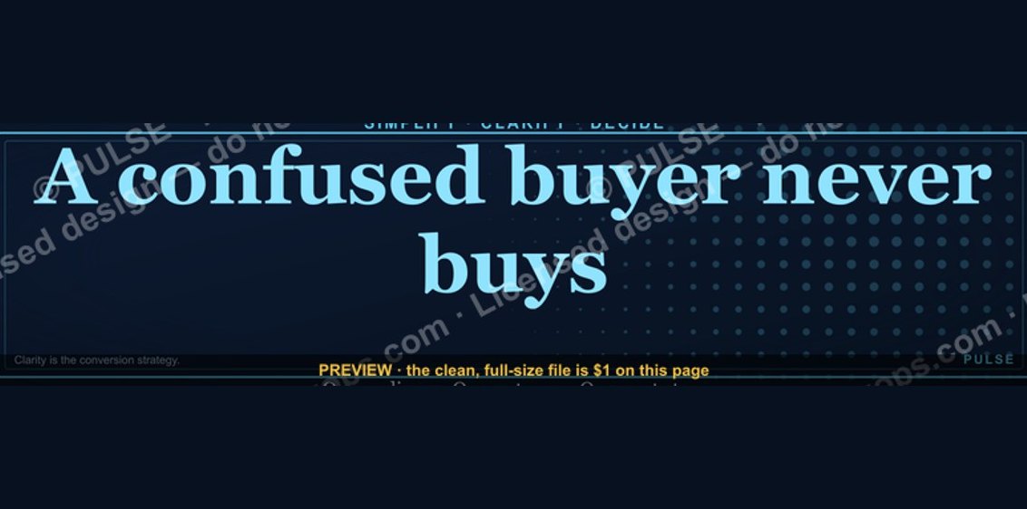 graphic“A confused buyer never buys.” — LinkedIn Banner
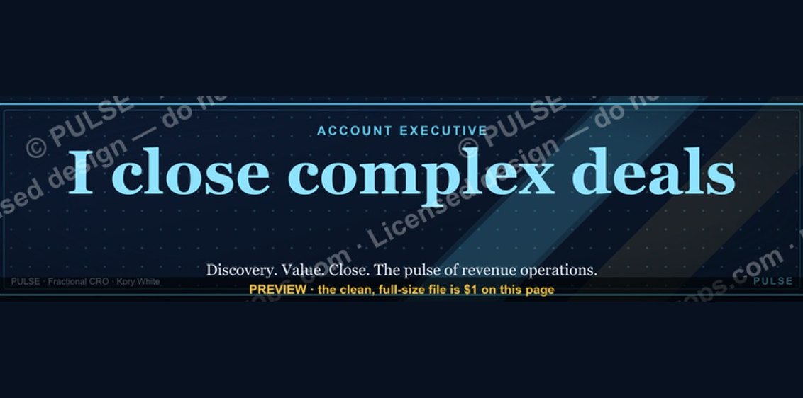 graphicAccount Executive — LinkedIn Banner
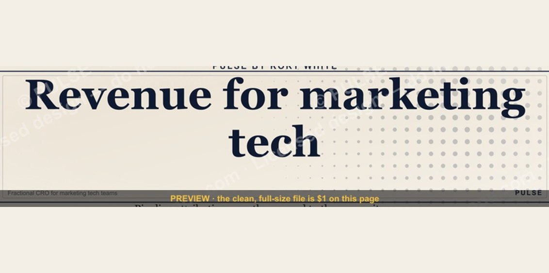 graphic“Revenue for marketing tech.” — LinkedIn Banner
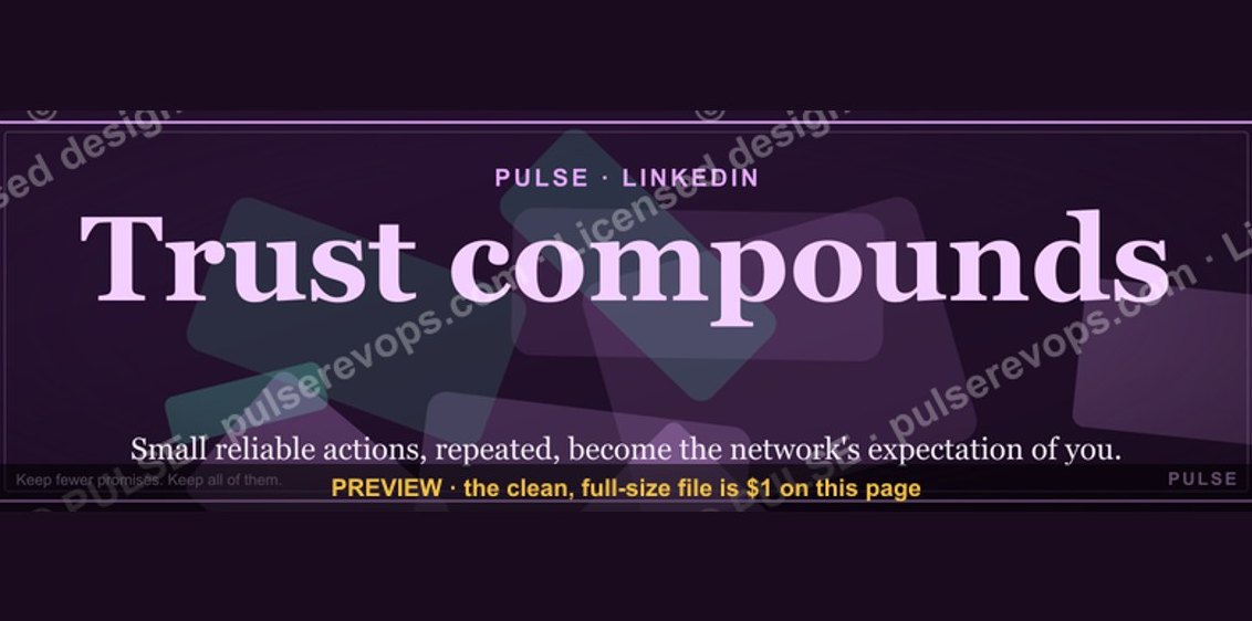 graphicTrust compounds. — LinkedIn Wallpaper
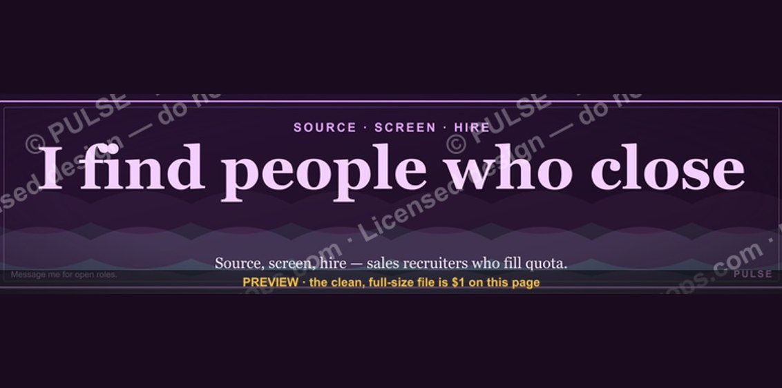 graphicSales Recruiter — LinkedIn Banner
 graphicLLM Builder AI Engineer — LinkedIn Banner
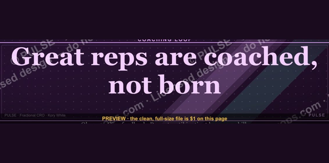 graphic“Great reps are coached, not born.” — LinkedIn Banner
 graphicWhat do top-performing graphic designers do differently in 2027?
 graphicHow do you build a Champions sell motion from scratch in 2027?
 graphicRenewals Manager — LinkedIn Banner