


“Sell things worth buying.” — LinkedIn Banner
Quality
Certified
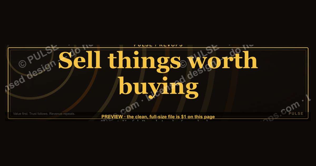
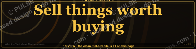
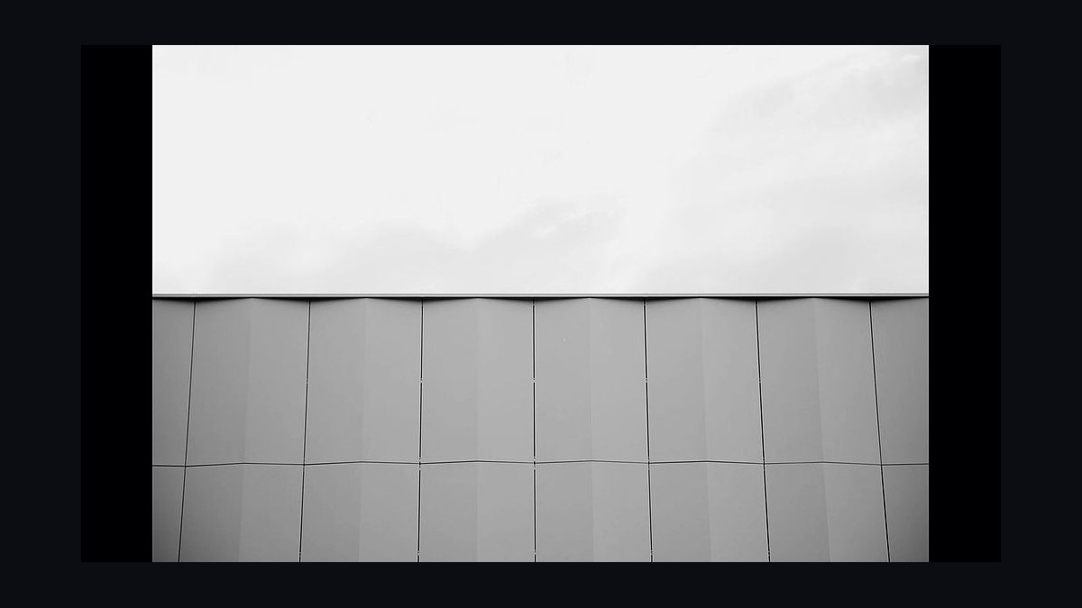
This is a LinkedIn profile banner, sized 1584×396 pixels, that reads "Sell things worth buying." in bold serif type set against a solid charcoal-black background. It functions as a positioning statement above your headline — a filter that tells a buyer, before they read a single line of copy, that this profile belongs to someone who sells with conviction rather than volume.
The two ways to use this banner
There are really two live versions of this LinkedIn banner, and which one belongs on your profile depends on what your headline is already doing for you.
The first is the quote-only version — just "Sell things worth buying." centered or left-aligned, in generous negative space, with nothing else competing for attention. This is the right call when your headline (the 220-character line under your name) already carries your title, your company, and a value proposition. In that case the banner doesn't need to work hard; it needs to set a tone. A recruiter, a prospect, or a hiring manager scrolling past sees five words that read like a philosophy, not a slogan, and moves on to the headline to get the specifics. The quote-only version is deliberately underspecified — it's a mood, not a pitch.

The second is the quote-plus-line version, where the same statement anchors the banner but a smaller line sits beneath or beside it — a role, a specialty, or a short call to action like "DM me if your pipeline is full of maybes." This version earns its keep when your headline is generic (default LinkedIn headlines like "Account Executive at [Company]" are common and forgettable) or when you're actively prospecting and want the banner itself to do conversion work, not just branding work. The trade-off is real: the moment you add a second line, the banner stops being a clean statement and starts being a mini ad. Some viewers respond to that; others feel the CTA cheapens the line above it.
Neither version is objectively better. The quote-only banner reads as more senior — it assumes the viewer already cares who you are. The quote-plus-line banner reads as more active — it assumes the viewer needs a reason to care right now. Sales leaders and consultants pitching authority tend toward quote-only. Individual reps and account executives running high-volume outbound tend toward the second, because their LinkedIn traffic is colder and needs a next step spelled out.

There's a third, quieter variant worth naming even though it isn't a separate download: swapping the static color field behind the text for a subtle texture (brushed metal, dark gradient, a faint grid) while keeping the typography identical. This doesn't change the message, but it changes how "designed" the profile feels, and on a platform where most banners are either the LinkedIn default sky-blue pattern or a stretched company logo, even a flat, confident color field already reads as intentional.
How to decide between them
The decision isn't really about aesthetic preference — it's about what your headline already does and how cold your typical profile visitor is.
Walk it in order. First, look at your actual headline text, not what you assume it says — open your own profile and read it as a stranger would. If it already names your role, who you help, and what outcome you drive, the banner's job is done the moment it sets tone; adding a CTA line under the quote would be redundant and would visually compete with the headline sitting right below it.

If the headline is thin — a bare job title, or LinkedIn's auto-generated "[Title] at [Company]" — the banner has to pick up slack, but only if it's actually being seen by strangers. Check where your profile traffic comes from. If most viewers are people who already know you (former colleagues, warm intros, people who met you at a conference and are looking you up afterward), a CTA line is unnecessary noise; those viewers don't need to be told what to do next, they already have context. In that case, the better fix is rewriting the headline itself, and the banner stays in its clean, quote-only lane.
The CTA line earns its place specifically when both conditions hold at once: a generic headline and cold traffic. That's the combination where a stranger lands on your profile with zero context and the banner is the only asset on the page actively trying to move them forward. Everywhere else, restraint reads better than urgency.
Concrete numbers behind each option
The banner ships at 1584×396 pixels, which is LinkedIn's current recommended upload size for the desktop profile background image — a 4:1 aspect ratio. LinkedIn accepts JPG, PNG, or GIF, with a file-size ceiling around 8MB; a PNG export of this banner (solid color field, single typeface, no photography) typically lands well under 1MB, so file size is never the constraint here — legibility is.
Safe-zone math matters more than raw dimensions. On desktop, your profile photo overlaps the bottom-left corner of the banner, covering roughly the leftmost 300–360 pixels of width in the bottom third of the image. Anything essential — the quote, a CTA line — placed in that corner will be partially hidden behind your headshot circle. The practical fix is to keep primary text either centered in the image or shifted right of that 360px mark, and vertically anchored in the upper two-thirds.
Mobile is the second constraint, and it's the one most people ignore. LinkedIn's mobile app doesn't show the full 1584×396 canvas — it crops in, showing roughly the center 60–70% of the width at a taller effective aspect ratio, which means text placed near the left or right edges on desktop can be cropped out entirely on a phone. For a single centered line like "Sell things worth buying." this is low risk since the text already sits mid-canvas, but for the quote-plus-CTA version, keep the second line close to the same horizontal center as the main quote rather than stacking it off to one side.

Type size is the last lever. At 1584px wide, a headline-weight serif set around 90–110px tall for the primary quote reads clearly at both the full-size desktop view and the roughly 400px-wide thumbnail LinkedIn renders in feed previews and search results. Drop below roughly 60px and the statement starts to disappear at thumbnail size, which defeats the purpose of a banner meant to be legible in a half-second scroll.
Implementation details and sequencing
Getting this banner onto a live profile is a short sequence, but the order matters — doing the steps out of order is the most common reason people end up with a banner that looks fine in the editor and wrong on the actual profile.
Start by downloading the PNG at full 1584×396 resolution rather than a scaled-down preview — uploading a smaller file forces LinkedIn to upscale it, which softens the type edges and makes serif fonts look faintly blurry, especially on high-DPI screens. Before uploading anywhere, hold the exported image up against your current profile photo, even just by eyeballing both in an image viewer side by side, to confirm the text doesn't fall into the bottom-left overlap zone described above.
Upload through your own profile, not through LinkedIn's company-page banner tool — they use different crop ratios. From your profile, open "Edit intro," tap the camera icon on the existing banner area, and select the new file. LinkedIn will drop you into its own light repositioning and crop interface; this is a second checkpoint, not a redundant one, because LinkedIn's editor can shift the visible crop slightly from what you saw in your export, particularly if your original canvas wasn't exactly 4:1.
Once it's saved, don't stop at the desktop browser view — open the LinkedIn mobile app and look at your own profile as a visitor would, and also glance at how the banner's thumbnail renders in a search result or in someone's "People you may know" feed card, since that's a smaller, cropped-further render than the profile page itself. If the quote is still legible at that size, you're done. If it's mushy or the CTA line has vanished off the edge, go back to the export step, bump the type size or re-center the secondary line, and re-upload — this loop usually only takes one pass.
If you're rolling this banner out across a sales team rather than a single profile, sequence the headline change alongside the banner change, not after it. A visitor who sees "Sell things worth buying." on the banner and then reads a stale, unrelated headline underneath it gets a small moment of dissonance — the two elements should read as one voice, so update both in the same sitting rather than treating the banner as a separate, later task.
Related questions

Should the banner match my company's brand colors or stand on its own?
Either works, but they serve different goals. Brand-matched colors reinforce "I represent this company," while a neutral dark field makes the statement itself the focal point — better when you want the line to feel personal rather than corporate-issued.
Can I use this same banner on Twitter/X or other platforms?
Not without re-cropping. LinkedIn's 1584×396 ratio is roughly 4:1; X's header is closer to 3:1, so the same export will either letterbox or crop awkwardly — re-export at the target platform's native size rather than stretching.
Does changing my banner affect who sees my profile in search?
No — LinkedIn's search and SSI ranking don't weight banner images. The banner affects conversion once someone lands on your profile, not discovery before they get there.
How often should I refresh this banner?

There's no fixed cadence; refresh it when your role, positioning, or the audience you're speaking to changes — a banner that stops matching your current headline does more harm than an old one that's simply plain.
FAQ
What is this LinkedIn banner actually for? It's a visual positioning statement that sits above your headline on your LinkedIn profile, communicating a sales philosophy — sell things worth buying, not just things that are easy to sell — before a visitor reads any other text on the page.
Do I need design skills to customize it? No. The layout is a single typeface on a flat color field, so customizing it is limited to swapping the wording, adjusting the color, and re-centering text — achievable in any basic image editor or design tool without illustration or photo-editing skill.
Will this banner look right if I have a company logo watermark requirement? If your employer requires a logo on all public-facing assets, place it small and in a lower corner clear of the profile-photo overlap zone, and keep it visually secondary to the quote — a banner where the logo competes with the statement undercuts the point of the line.
What file format should I download and upload? Download and upload as PNG for the crispest text edges, since PNG doesn't introduce the compression artifacts JPG can add around fine serif strokes; LinkedIn accepts both, but PNG holds up better at the small thumbnail sizes the banner gets rendered at elsewhere on the platform.
Can I add my name or job title directly onto the banner instead of relying on the profile fields below it? You can, but it's generally redundant — LinkedIn already displays your name and headline directly under the banner in large text, so duplicating that information on the image itself uses space that could instead reinforce the positioning statement or a single call to action.
Is a plain black background too stark, or should I use a photo behind the text? A flat dark field is the safer default because it guarantees legibility at every size the banner gets rendered at, including the small feed-thumbnail crop; a photo background risks the text losing contrast against busy areas of the image, especially once LinkedIn's own crop and compression are applied on top of it.
Sources
- https://www.linkedin.com/help/linkedin/answer/a563918
- https://business.linkedin.com/marketing-solutions/success/best-practices/linkedin-image-specs
- https://www.canva.com/create/linkedin-banners/
- https://www.hootsuite.com/social-media-image-size-guide
- https://sproutsocial.com/insights/social-media-image-sizes-guide/
- https://www.adobe.com/express/create/banner/linkedin
Related on PULSE
- What should my LinkedIn headline say if I'm in sales?
- How do I write a LinkedIn banner that gets replies, not just views?
- What makes a sales positioning statement memorable?
- How often should reps update their LinkedIn profile for prospecting?
- What's the difference between a personal brand and a sales pitch on LinkedIn?
This page will be disappearing soon. Save it to your device for $1 — or read it free while it is here.
@Kory-White- · if Venmo asks, the last 4 of my number are 2012
This page is gone.
This one is off the shelf now. $1 keeps it on your phone for good — the whole page, pictures and diagrams included.
 graphic“Trusted advisor, never a vendor.” — LinkedIn Banner
 graphicSales Enablement — LinkedIn Banner
 graphicStay in the deal. — LinkedIn Wallpaper
 graphic“Never give without a get.” — LinkedIn Banner
 graphicHow to build a champion seller playbook in 2027
 graphicFractional CRO — LinkedIn Banner
 graphicPipeline cures all. — LinkedIn Wallpaper
 graphicHow to design a LinkedIn banner that converts viewers into leads in 2027?
 graphicRevOps Manager — LinkedIn Banner
 graphic“The next call is the most important one.” — LinkedIn Banner