
“Bring the energy every call.” — LinkedIn Banner
 Curated byKory White · Fractional CRO · Maryland
 PULSEKNOWLEDGE LIBRARY
Quality
Certified
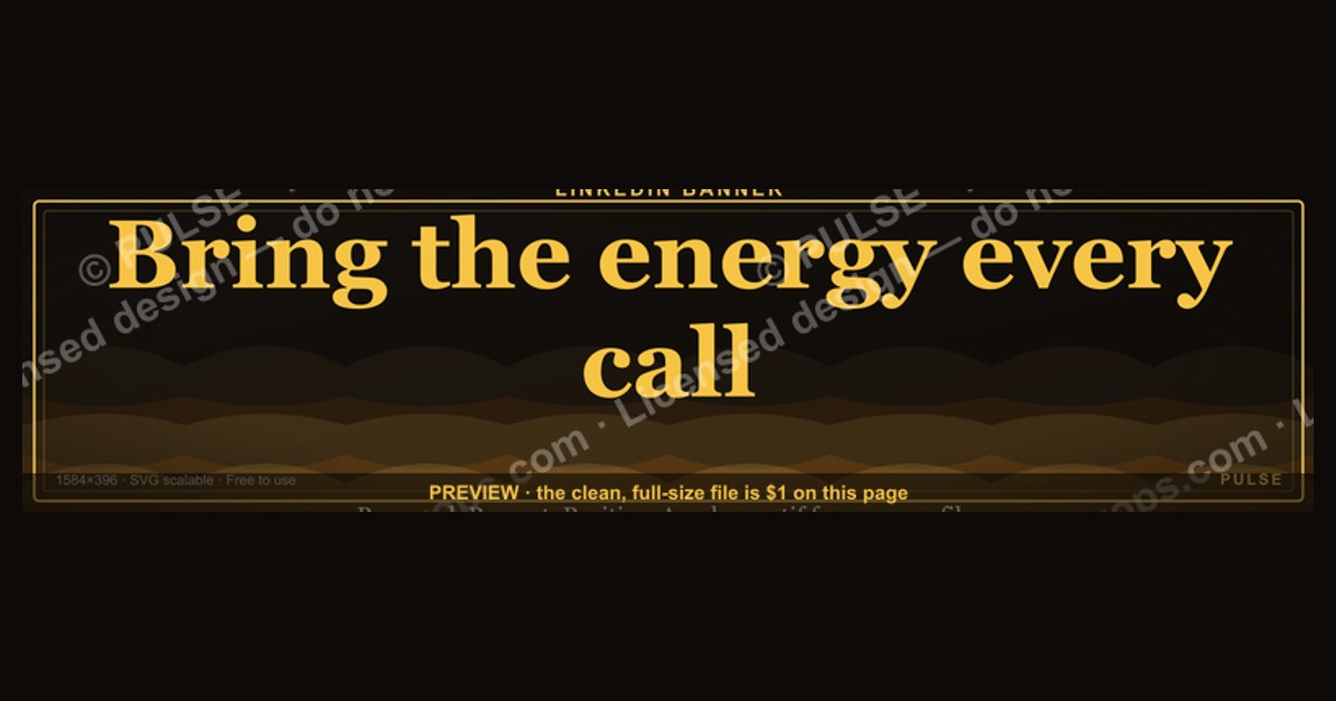
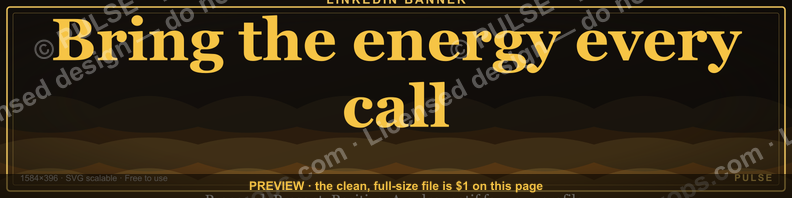
This is a LinkedIn profile banner, sized 1584×396 px, that reads "Bring the energy every call." in bold white or gold type against a dark charcoal-to-black background. It's built as a downloadable PNG for sales reps, SDR teams, and managers who want their profile to broadcast a call-energy standard before a prospect ever hits "connect."
The outcome you should expect
Swap the default LinkedIn banner — that flat blue texture every unedited profile ships with — for this one, and the visible change is immediate: a visitor lands on the profile and reads a directive before they read a single bullet point in the About section. The banner does the job a tagline usually does, except it does it in the one piece of real estate on the page that nobody else on a sales team bothers to customize. Most reps leave the top third of their profile blank or, worse, populated with whatever LinkedIn auto-generated. "Bring the energy every call." fills that space with a single, memorable line that functions less like decoration and more like a standing order.
The practical outcome falls into two buckets. First, external signaling: a recruiter, a prospect doing pre-call research, or a peer scrolling a mutual connection's activity sees a profile that looks deliberately built, not defaulted into. That read-as-finished effect matters disproportionately for outbound-heavy roles — SDRs and BDRs whose profiles get a five-second glance before a cold LinkedIn message lands or before a prospect checks "who is this person" ahead of a discovery call. Second, internal signaling: when a whole team adopts the same banner with the same wording (or a role-specific variant), it turns individual profiles into a visible culture marker. A manager scrolling the team's LinkedIn presence sees a matched set of banners the way a manager might notice matched pit-crew uniforms — not the point of the job, but a low-cost tell that the team holds a shared standard.

What you should NOT expect: a measurable lift in connection-request acceptance rates, reply rates, or pipeline. No credible study isolates banner copy as a causal driver of those numbers, and any page claiming a specific percentage lift from a banner change is guessing. Treat this as a branding and culture asset, not a conversion lever. Its value is qualitative — it shapes the first impression and reinforces an internal norm — and it should be evaluated on those terms, not backed into a fake ROI number.
What drives that outcome
The banner works because of where it sits and what LinkedIn's layout does with it, not because of the slogan alone. LinkedIn renders the banner as the widest, highest-contrast block on the entire profile page — wider than the headline, wider than the About section, unbroken by other UI elements except the circular profile photo that overlaps its bottom-left corner. That overlap matters: LinkedIn's own crop clips roughly the left 200–250px and bottom 100px behind the avatar, headline, and "Open to work" badge on both desktop and mobile, so anything critical — the full sentence, in this case — has to sit centered or right-of-center, clear of that zone.
Three design mechanics do the actual work. Contrast: black or deep charcoal background against white or gold serif/sans type reads clearly at the small sizes LinkedIn actually renders the banner at — full 1584×396 only shows on desktop profile views; mobile and the activity feed crop it much smaller, so low-contrast pastel-on-pastel combinations that look fine in a design tool disappear on a phone. Placement: text sits in the safe zone, roughly the center-right two-thirds of the canvas, never behind where the avatar and name card sit. Repetition: a phrase that also shows up in the headline, in a pinned post, or in a team's shared vocabulary compounds — the banner isn't a one-off asset, it's the visual anchor for a phrase the person already says out loud on calls.
Benchmarks and realistic ranges
The hard specs are fixed by LinkedIn, not up for interpretation. The banner canvas is 1584×396 px (a 4:1 aspect ratio), LinkedIn accepts JPG, PNG, or GIF, and the platform caps upload size at 8MB — a PNG at these dimensions with a solid dark background and clean type typically lands well under 1MB, so file size is rarely the constraint; legibility is. Keep body text no smaller than roughly 60–72px at full resolution if you want it to survive LinkedIn's mobile downscale, and keep your primary line under about 45 characters so it doesn't wrap or shrink to fit.
Adoption ranges vary by role. Individual contributors on outbound-heavy teams (SDR, BDR, inside sales) get the most relative value from a customized banner because their profile is visited cold, often within seconds of a connection request going out — that's the highest-leverage moment for a first impression to do work. Account executives and customer success managers, whose LinkedIn profile is usually a secondary touchpoint after an email or a call already happened, get comparatively less lift from the banner alone, though it still reinforces brand consistency once the prospect does look. Leadership and manager profiles benefit differently: a manager's banner sets tone for how the team profiles look, functioning more as a style reference than a direct sales tool.
On the "who else changes their banner" question: most individual professionals never touch the default. Customized banners cluster heavily among recruiters, sales teams, agency founders, and personal-brand-focused creators — categories where the profile itself is a marketing surface. Outside those groups, a custom banner is still uncommon enough that having one at all, regardless of wording, puts a profile in a small minority that looks intentionally maintained.
Risks, edge cases, and failure modes
The most common failure is a mismatch between the banner's tone and the seller's actual calling style. "Bring the energy every call." reads as an asset for high-volume, high-energy outbound motions — SDR cold-calling, retail and consumer sales, or coaching-heavy team cultures where hype is part of the pitch. It reads as tone-deaf on a profile that otherwise signals enterprise, technical, or consultative selling, where a prospect expects calm, methodical, evidence-based conversation rather than energy. A VP evaluating a six-figure software deal is not looking for hype; a banner promising it can undercut credibility before the first call happens. Match the banner to the actual buying motion, not just to internal team culture.
A second failure mode is legibility loss on mobile. Because LinkedIn crops the banner differently across desktop, mobile app, and the activity feed thumbnail, text placed too close to any edge — especially the left third, which the avatar and name overlay obscure on phones — either disappears or collides with UI chrome. Always preview the exported PNG at actual size on a phone before publishing; a design that looks balanced in a full-size editor can crop badly once LinkedIn's own layout engine gets involved.
A third, subtler risk is staleness. A banner tied to a specific internal campaign, a sales contest, or a slogan that only makes sense with context ages badly — six months later it reads as an orphaned in-joke to anyone outside the team. "Bring the energy every call." is durable because it's self-explanatory to an outside viewer with zero internal context, but any customized variant that references a specific quota period, contest name, or manager's catchphrase should be revisited and refreshed on a schedule, the same way a stale "Open to work" badge left up for a year signals neglect rather than status.
Finally, a team-wide rollout risk: if the banner is mandated top-down without buy-in, reps treat it as compliance theater and either ignore it or petition to revert it within weeks. The banners that stick are the ones tied to a phrase the team already uses unprompted — the graphic should document an existing culture, not manufacture one.
A practical rollout plan
Start with one download and one profile — yours, or a single volunteer's — before pushing it to a whole team. Confirm it renders cleanly on both desktop and mobile, sits correctly behind your specific profile photo and headline length (longer headlines and titles shift where LinkedIn overlays the name card), and doesn't clash with your existing headline copy. Only after that spot-check should it go wider.
For a team rollout, distribute the raw PNG rather than a link to a hosted image — LinkedIn requires a direct upload, and giving reps a file (not a screenshot-and-crop job) keeps quality consistent across the team instead of degrading with each re-save. If you want role-specific variants — "Bring the energy every call." for SDRs, a calmer line for enterprise AEs — build those as separate exports from the same template so the visual family (same font, same dark background, same safe-zone rules) stays consistent even when the wording changes. Put a re-check on the calendar: every two to three quarters, confirm the banner still matches current team language, current campaign focus, and that nobody's profile photo or title length has shifted enough to break the layout. Treat it the same way you'd treat any other branded asset with a shelf life, not a one-time upload you forget about.
Related questions
What size should a LinkedIn banner image be?
1584×396 pixels is LinkedIn's required banner dimension, a 4:1 aspect ratio. Files can be JPG, PNG, or GIF up to 8MB, though a clean PNG at this size is typically well under 1MB.
Does a custom LinkedIn banner actually improve response rates?
There's no reliable data isolating banner copy as a driver of reply or acceptance rates. Its proven value is in first impression and brand consistency, not measurable conversion lift.
Should every rep on a sales team use the same banner?
Only if the wording and tone genuinely match the team's calling style and buying motion. A banner that fits SDR cold-calling can undercut a consultative or enterprise seller's credibility.
How often should a team refresh its LinkedIn banners?
Every two to three quarters is a reasonable cadence — enough to catch staleness (an outdated campaign or contest reference) without turning it into a constant maintenance task.
FAQ
What exact dimensions does this banner use? 1584×396 pixels, LinkedIn's standard banner canvas, exported as a PNG so the text edges stay sharp at full resolution and after LinkedIn's own compression pass.
Where does the text sit so it doesn't get covered by my profile photo? The wording is placed center-right, clear of the bottom-left zone where LinkedIn overlays your avatar, name, and headline badge on both desktop and mobile layouts.
Can I change the wording to fit my own team's phrase? Yes — treat the file as a template. Keep the dark background and high-contrast type for legibility, swap in your own line, and keep it under roughly 45 characters so it doesn't wrap or shrink on mobile.
Is this banner appropriate for an enterprise or technical sales role? Not by default. Its high-energy tone fits outbound, retail, and coaching-heavy cultures better than consultative or enterprise selling, where prospects expect a calmer, evidence-led tone.
How do I install it on my profile? Download the PNG, open your LinkedIn profile, select "Edit background photo" (or the pencil icon on the banner area on mobile), and upload the file directly — no cropping tool required since it's pre-sized to spec.
Will this banner look the same on mobile as it does on desktop? Close, but not identical — LinkedIn crops more aggressively on mobile and in the activity feed thumbnail. Always preview on a phone before rolling it out to a full team.
Sources
- https://www.linkedin.com/help/linkedin/answer/a566491
- https://business.linkedin.com/marketing-solutions/success/best-practices/linkedin-profile-best-practices
- https://www.linkedin.com/business/talent/blog/talent-strategy/tips-for-optimizing-linkedin-profile
- https://www.canva.com/create/linkedin-banners/
- https://www.adobe.com/express/create/cover/linkedin
- https://www.hubspot.com/linkedin-banner
- https://sproutsocial.com/insights/linkedin-image-sizes/
Related on PULSE
- How to write a LinkedIn headline that actually gets replies
- The best LinkedIn banner size and format for sales teams
- How to build a personal brand as an SDR on LinkedIn
- What to put in your LinkedIn About section as an AE
- How often should a sales team update its social profiles
This page will be disappearing soon. Save it to your device for $1 — or read it free while it is here.
@Kory-White- · if Venmo asks, the last 4 of my number are 2012
This page is gone.
This one is off the shelf now. $1 keeps it on your phone for good — the whole page, pictures and diagrams included.
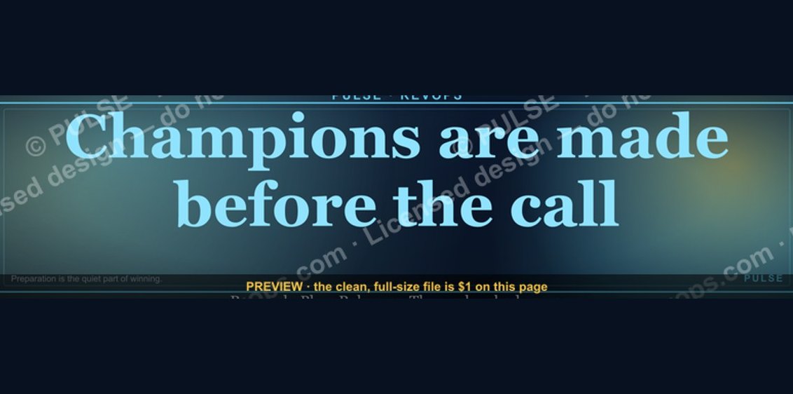 graphic“Champions are made before the call.” — LinkedIn Banner
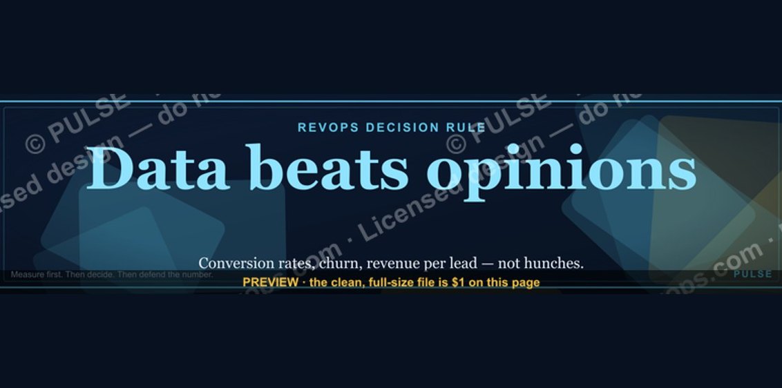 graphic“Data beats opinions.” — LinkedIn Banner
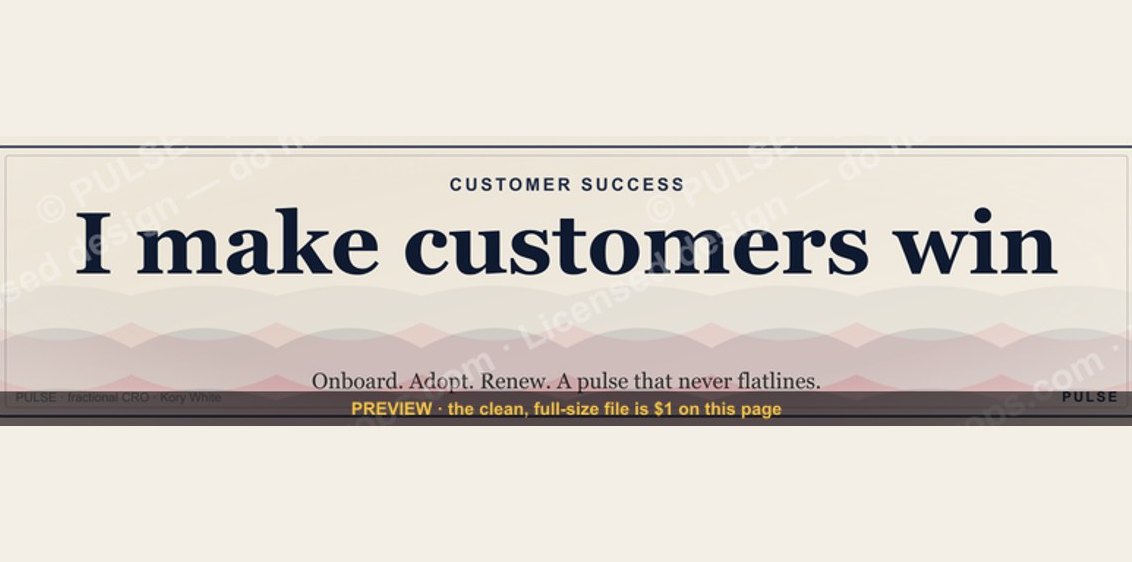 graphicCustomer Success — LinkedIn Banner
 graphic“Hire slow. Ramp fast.” — LinkedIn Banner
 graphic“Looking for my next quota.” — LinkedIn Banner
 graphic“Selling science and scale.” — LinkedIn Banner
 graphic“Stay in the deal.” — LinkedIn Banner
 graphic“Clarity closes.” — LinkedIn Banner
 graphicReady reps win. — LinkedIn Wallpaper
 graphicSIEM and Data Lake CRO — LinkedIn Banner