


“The next call is the most important one.” — LinkedIn Banner
Quality
Certified
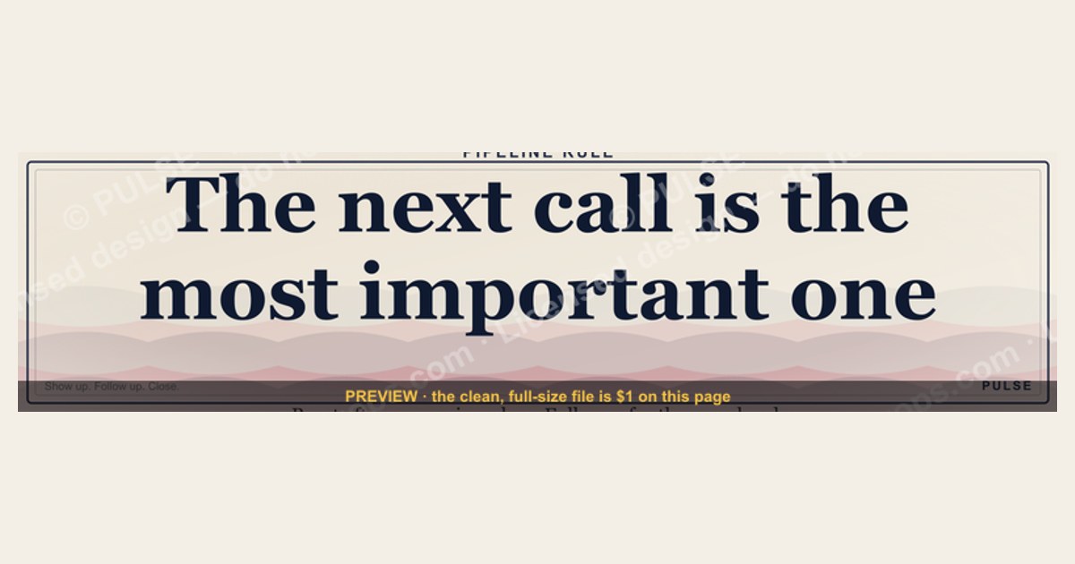
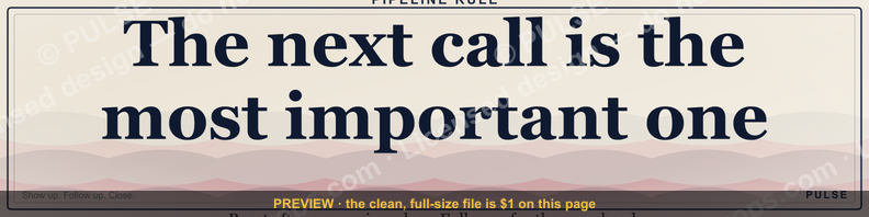
This is a LinkedIn profile banner graphic, 1584x396 pixels, that carries one line of copy: "The next call is the most important one." It is a plain, high-contrast strip designed to sit behind your headshot and tell anyone who lands on your profile that you treat every conversation as if it could close the quarter.
What the banner is and why the message lands
The graphic itself is deliberately unglamorous. A wide horizontal band, 1584x396 pixels — a 4:1 ratio — with a short sentence set large enough to read at thumbnail size. That ratio is not arbitrary. LinkedIn's own cover-image guidance specifies a 1584x396 pixel upload, and anything outside that ratio gets cropped from the center, which is exactly how a carefully centered tagline ends up with its first and last words amputated.
So what does the sentence actually do? "The next call is the most important one" is a rep statement about sequencing. It says the rep is not coasting on pipeline, not treating Tuesday's discovery call as a formality, not assuming the deal in stage four is safe. It is a small public commitment device. Anyone who reads it — a prospect, a peer, a hiring manager, a former colleague — now knows what this person claims to believe about their own calendar.
Why does that matter for revenue operations specifically? Because the most expensive failure mode in a sales org is not a bad quarter. It is a good quarter followed by a complacent one. Reps who believe the pipeline is already won stop doing the unglamorous work: the pre-call research, the multi-threading, the mutual action plan, the follow-up within twenty minutes of a demo. The banner is a cheap, permanent reminder that the work is always the next conversation, not the last one.
There is a second, subtler reason it matters. A tagline on a profile banner is one of the few pieces of a seller's personal brand that a buyer can see before the first meeting. Buyers arriving at a rep's LinkedIn profile between a demo and a decision are doing informal diligence. A banner that says the rep treats every call as consequential is a small, low-cost signal of how they will behave in the next one. It is not proof. It is a claim. But claims made publicly are harder to violate privately, and that friction is the entire point.

Three audiences read it differently, and all three readings are useful:
- Prospects read it as a promise about attention. They expect to be taken seriously on the next call, and they often show up slightly more prepared because of it.
- Peers and managers read it as a values statement. It signals a rep who is not resting on the largest deal in the forecast.
- Candidates and recruiters read it as a working style. It tells them this is someone who will pick up the phone rather than send a seventh email.
None of those readings require the banner to be clever. In fact the plainness helps. A banner with a stock photo of a handshake and the word "HUSTLE" gets read as noise. A banner with one declarative sentence in a serif face gets read as a position.
Step-by-step: from blank canvas to a live banner
Getting this onto a profile is a short, mechanical process, but the order matters because LinkedIn's cropping behavior will punish you if you design before you know the frame.
Walk through it with the reasoning at each step:

- Start from the 1584x396 file, not from a template you resized. Re-exporting a smaller source up to 1584 wide softens the type. Type that looks crisp in a design tool looks mushy on a retina display.
- Open your profile and click the pencil icon on the cover area. On desktop this is the small edit affordance in the upper-right of the cover region. On mobile the path differs, so do the upload from a desktop browser if you can.
- Upload and look at the preview before you save. LinkedIn renders a preview that approximates the crop. If any word of the sentence touches the edge, stop.
- Respect a safe margin of roughly 120 pixels on all four sides. Your headshot sits in the lower-left on desktop and covers a meaningful chunk of the banner. Text placed in that zone will be hidden behind your own face.
- Save, then check the mobile crop. On a phone the banner is displayed at a much narrower width and the visible window is a center slice. If "next call" survives the mobile crop and the rest gets trimmed, you have designed it wrong.
- Update the headline directly beneath the banner. This is where most people fumble the handoff. A banner that says "the next call is the most important one" paired with a headline reading "Seeking new opportunities" is a contradiction. The headline should name the role and the buyer: something like "Enterprise AE — manufacturing" or "RevOps lead for Series B SaaS."
- Set a calendar reminder for 90 days. A banner that never changes reads as abandoned. A banner that changes every quarter reads as active.
The whole loop takes under twenty minutes the first time and about three minutes on each subsequent revision. There is no cost beyond your time, no subscription, no design tool required if you are working from a pre-built file.
Costs, timelines, and the ranges to expect
The direct cost of this graphic is zero. LinkedIn does not charge for cover-image uploads, and the file itself is downloadable from this page as a PNG. But "free" is not the same as "costless," and it is worth being honest about what the real budget lines are.
Time cost. First-time setup, including a headline rewrite and a mobile check, runs 15 to 30 minutes. If you are commissioning a designer to build a custom variant — your own colors, your own sentence, your own typeface — expect a freelance rate somewhere between $50 and $250 depending on the designer and whether you are getting one revision or three. Agencies will quote more, often $300 to $800, which is almost never worth it for a single 1584x396 strip.
Refresh cadence. A reasonable rhythm is once per quarter, or whenever your role changes. Reps who change territories, move from SMB to enterprise, or shift from IC to manager should treat the banner as part of the same update as the headline and the featured section.
Downstream cost of getting it wrong. This is the line item people miss. A banner with clipped text, a banner whose sentence contradicts the headline, or a banner that has been the same for two years all cost you credibility with the exact audience you were trying to impress. The recovery cost is not money; it is the second look you do not get.
Comparable ranges across adjacent assets. For context, here is how this banner sits next to the other profile surfaces a seller maintains:
- Profile photo: free to shoot, but a professional headshot typically runs $150 to $400 in most metros. Higher perceived impact than the banner, so do this first.
- Custom banner design: $0 if you use a provided file, $50 to $250 if commissioned.
- Featured section assets: one-pagers, case studies, or a short video. Production cost varies wildly, from $0 for a PDF to several thousand for a produced video.
- Headline rewrite: free, but the highest-leverage fifteen minutes on the entire profile.
If you only have twenty minutes and no budget, the correct order is: fix the headline, then upload this banner, then leave everything else alone. A great banner under a vague headline is a waste. A plain banner under a precise headline still works.
Where teams and individuals get it wrong
The failure modes here are consistent enough that they are worth naming individually, because each one has a cheap fix.
Treating it as decoration instead of positioning. The most common mistake is picking a banner because it looks nice — an abstract gradient, a city skyline, a mountain range — and then bolting a slogan onto it. The image competes with the words. This banner works because it is mostly empty space with one sentence in it. If you customize it, protect the emptiness.
Letting the banner and the headline disagree. The banner makes a claim about how you work. The headline makes a claim about what you do. If those two claims point in different directions, the profile reads as incoherent, and incoherent profiles get skipped. Every revision of one should trigger a check of the other.
Designing for desktop only. More than half of LinkedIn browsing happens on mobile, and the mobile crop of a 1584x396 banner is a narrow center slice. Anything important placed in the outer thirds of the canvas disappears on a phone. The fix is to keep the sentence centered and keep the outer 200 pixels of each side free of critical content.
Forgetting the headshot collision. On desktop, your profile photo overlaps the lower-left of the cover image. Designers who work from the raw canvas and never preview the live profile routinely put text directly under where the face will sit. Always preview after upload, before you save.

Overwriting the sentence. Teams sometimes want to add a second line — a phone number, a website, a call to action. Resist it. One sentence at 1584x396 reads at a glance. Two sentences read at nothing, because the type has to shrink and the contrast drops. If you need a call to action, put it in the headline or the featured section, not on the banner.
Using it as a substitute for pipeline discipline. This is the one that actually costs money. A banner is a statement of intent, not a behavior change. A rep whose banner says the next call is the most important one but who shows up to that call without having read the prospect's last earnings call has made the banner a lie. The graphic is the cheapest part of the commitment. The expensive part is the preparation.
Ignoring the audience mismatch. The sentence is calibrated for a seller talking to buyers. If you are in customer success, recruiting, or finance, the same words may read as odd. A CSM might prefer something about the next check-in. A recruiter might prefer something about the next conversation with a candidate. The template is a starting point, not a universal law.
Decision framework: when this banner is the right move
Not every profile should carry this sentence. The decision depends on role, audience, and what the rest of the profile already says.
The logic behind the branches:
Role first. Quota-carrying reps, SDRs, AEs, CSMs, and anyone whose job is measured in conversations should consider it. Individual contributors in engineering, design, or finance usually should not, because the sentence is about a call-driven workflow that does not describe their day.

Headline before banner. A banner is a supporting asset. It amplifies whatever the headline already establishes. If the headline is vague, the banner amplifies vagueness. Fix the headline, then upload.
Photo before banner. A profile photo is seen in every comment, every message, every search result. The banner is seen only when someone opens the full profile. If you have one hour to spend, spend it on the photo.
Signal choice. Some sellers want to differentiate on responsiveness, some on technical depth, some on industry expertise. This banner differentiates on preparation and seriousness. If that is not your differentiator, the banner will feel borrowed. Use a quieter option — a plain color band, a company logo, or a team name — and let the headline carry the positioning.
Alignment after upload. Once the banner is live, the About section should support it. A sentence or two about how you run a call — the agenda you send beforehand, the mutual action plan you build during it, the recap you send within an hour — turns the banner's claim into evidence. Profiles that make a claim and then substantiate it convert far better than profiles that make a claim and stop.
Customizing the wording, colors, and roles
The provided file is a starting point. Teams often want a version that matches their brand or speaks to a specific segment. Here is how to do that without wrecking the thing that makes it work.
Wording swaps that keep the meaning. The sentence has three moving parts: the frame ("the next"), the object ("call"), and the claim ("most important"). You can swap any one and keep the other two.

- For a CSM: "The next check-in is the most important one."
- For a recruiter: "The next conversation is the most important one."
- For an SDR: "The next dial is the most important one."
- For a manager: "The next coaching session is the most important one."
- For a founder: "The next customer call is the most important one."
Notice that none of these add a second clause. The power is in the single declarative sentence. Every word you add dilutes it.
Color choices. The default high-contrast treatment — light type on a dark ground, or dark type on a light ground — is the safest because it survives compression and thumbnail scaling. If you are matching a brand palette, keep the contrast ratio high. Muted mid-tones on mid-tones look sophisticated on a monitor and illegible on a phone.
Typeface. A serif face reads as considered and slightly formal. A geometric sans reads as modern and direct. Both work. A novelty or script face does not, because at banner scale it becomes a texture rather than a sentence.
Team variants. Some revenue teams standardize on a shared banner with a shared sentence and a small team mark in one corner. This works when the team genuinely operates that way — when there is a shared call-prep standard, a shared CRM hygiene expectation, a shared follow-up SLA. If the team does not actually work that way, the shared banner becomes an inside joke, and buyers who have spoken to three reps from the same team will notice the gap between the claim and the experience.
What not to customize. Do not add a phone number, an email address, a QR code, or a website URL. Do not add a stock photo of a handshake, a skyline, or an abstract waveform. Do not add a second sentence. Each of these has been tried and each one degrades legibility at the exact moment legibility matters most.
Specs, download, and swapping it in

The file is a PNG at 1584x396 pixels, which is the native LinkedIn cover-image size. PNG is the right format here because the graphic is type-heavy and flat-colored; a JPEG would introduce compression artifacts around the letterforms at exactly the size where sharpness matters. The file is downloadable free from this page.
Upload sequence, condensed. Download the PNG. Open your LinkedIn profile in a desktop browser. Click the pencil icon on the cover image. Choose upload, select the PNG, and inspect the preview. If any word is clipped or sits under where your headshot will render, do not save — go back and re-export with a wider safe margin. If the preview looks clean, save.
What to pair it with. The banner is one of four surfaces that should tell the same story:
- Headline — role and buyer, stated plainly.
- Banner — the working principle, stated plainly.
- About — two or three sentences of evidence for the principle.
- Featured — one asset that proves you do the work: a call framework, a case study, a short write-up.
Mobile verification. After saving, open your own profile on a phone. The banner will render as a narrow center slice. Confirm that the sentence still reads. If it does not, the fix is to re-export with the text closer to center and more empty space on the outer edges.
Refresh discipline. Revisit every 90 days. If your role changed, update the sentence. If your team standardized on a shared banner, use that one instead. If the banner has been untouched for more than a year, assume it is reading as stale and either refresh it or replace it with something quieter.
Archiving the old file. Keep the previous version. If you change roles and later return to a quota-carrying seat, you will want the original file back without having to rebuild it.
Related questions

Does the banner size have to be exactly 1584x396?
No, but straying from it costs you. LinkedIn crops to that ratio from the center, so a taller or narrower upload loses its edges. If you must deviate, keep the ratio close and keep all text within the central 60% of the canvas.
Will this banner help me get more replies?
Indirectly, and only if the rest of the profile supports it. The banner does not send messages. It changes how a prospect reads your profile when they check you out between the demo and the decision. That read influences whether they take the next call seriously.
Can I use the same banner on other platforms?
Yes, with resizing. X, YouTube, and Facebook all use different cover ratios, so a direct upload of the 1584x396 file will crop. Re-export at each platform's native size rather than stretching the original.
What if my company requires a branded banner?
Use the branded version. A standardized team banner with a role-specific sentence in the headline is a better combination than a personal banner that contradicts a mandated one. Align with your marketing team on whether a variant is permitted.
How often should I change the sentence?
Once a quarter at most, and only when something real changed — a new role, a new segment, a new team standard. Changing it weekly signals restlessness rather than discipline.
FAQ
Is this banner free to use? Yes. The PNG is downloadable from this page at no cost. There is no license fee, no attribution requirement, and no subscription. If you commission a custom variant from a designer, that is a separate cost you control.
What if my headshot covers part of the text? Move the text, not the headshot. The headshot renders in the lower-left on desktop, so keep the sentence centered and leave the outer 120 to 200 pixels of each side free of critical content. Always check the live preview before saving.
Does the sentence work for non-sales roles? It works for any role measured in conversations — customer success, recruiting, partnerships, founder-led sales. It does not fit roles where the primary output is code, design, or analysis. For those, a quieter banner is better.
Can I put my company logo on it? A small mark in one corner is fine. A large logo competes with the sentence and shrinks the type. If the logo must be prominent, use a company-issued banner and let the headline carry your personal positioning.
Will this look unprofessional to a hiring manager? Only if the rest of the profile is thin. A clear sentence, a current photo, and a specific headline read as intentional. The same sentence over a vague headline and a five-year-old photo reads as noise.
How do I know if it is working? Watch profile views from target accounts and whether prospects reference your positioning in the first call. Neither is a clean metric, but both move when the profile is coherent and stay flat when it is not.
Sources
- LinkedIn Help — Cover image upload guidance and recommended dimensions: https://www.linkedin.com/help/linkedin/answer/a563589
- LinkedIn Help — Edit your profile headline and photo: https://www.linkedin.com/help/linkedin/answer/a507508
- LinkedIn Marketing Solutions Blog — Profile best practices: https://business.linkedin.com/marketing-solutions/blog
- Harvard Business Review — Research on first impressions and preparation in professional settings: https://hbr.org
- Nielsen Norman Group — Legibility and contrast guidance for on-screen type: https://www.nngroup.com
- W3C Web Content Accessibility Guidelines — Contrast minimums: https://www.w3.org/WAI/WCAG21/quickref/
Related on PULSE
- How to write a LinkedIn headline that names your buyer
- Profile photo standards for quota-carrying sellers
- Building an About section that substantiates your positioning
- Using the Featured section to prove your call framework
- Quarterly profile refresh checklist for revenue teams
- Personal branding vs. company branding on seller profiles
This page will be disappearing soon. Save it to your device for $1 — or read it free while it is here.
@Kory-White- · if Venmo asks, the last 4 of my number are 2012
This page is gone.
This one is off the shelf now. $1 keeps it on your phone for good — the whole page, pictures and diagrams included.
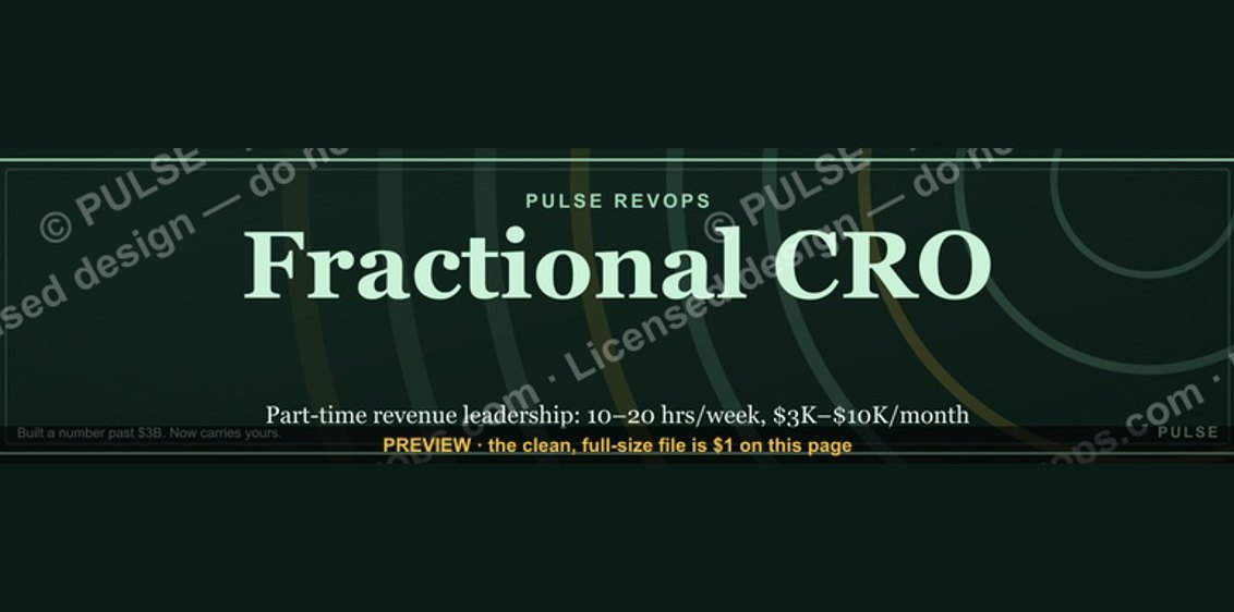 graphicFractional CRO — LinkedIn Banner
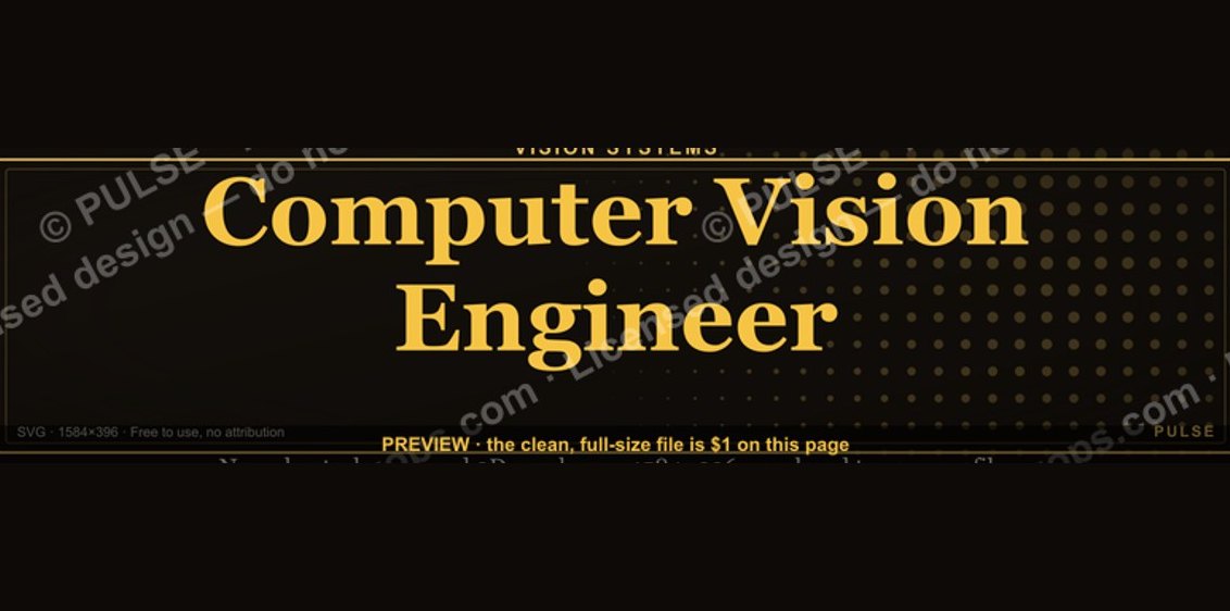 graphicComputer Vision Engineer — LinkedIn Banner
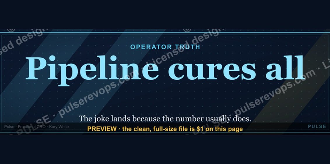 graphicPipeline cures all. — LinkedIn Wallpaper
 graphicRevOps Manager — LinkedIn Banner
 graphicAI Observability Operator — LinkedIn Banner
 graphicReady reps win. — LinkedIn Wallpaper
 graphicRenewals Manager — LinkedIn Banner
 graphicCalm closers win. — LinkedIn Wallpaper
 graphicCommercial Director — LinkedIn Banner
 graphic“Stay in the deal.” — LinkedIn Banner