
How to build a sales pipeline dashboard in Salesforce?
 Curated byKory White · Fractional CRO · Maryland
 PULSEKNOWLEDGE LIBRARY
Quality
Certified

To build a sales pipeline dashboard in Salesforce, create reports from the Opportunity object, then add a dashboard from the Dashboards tab and choose a folder. Add components—a funnel for stages, a bar chart for amount by close date, and a summary table—each sourced from a saved report. Filter by owner and date, then save and share.
A revenue meeting where the dashboard says nothing
Picture the Monday forecast call. A rep has a $250K opportunity sitting in "Negotiation," and the standard Salesforce pipeline dashboard shows it as a fat green segment of the funnel, contributing its full amount to the quarter. Everyone nods. Three weeks later the deal slips, because the economic buyer was never engaged and the opportunity had been stuck in the same stage for 41 days. The dashboard never surfaced any of that—it showed dollars, not health.
This is the failure mode most teams build straight into their first dashboard: they treat the pipeline as a pile of money rather than a set of deals moving (or not moving) through stages. The default "Opportunities" report type in Salesforce gives you Amount, Stage, Close Date, and Owner. Drop those onto a funnel and a bar chart and you have a dashboard that looks complete and answers almost nothing a sales leader actually asks in a pipeline review: *Which deals are stalling? Who is over- or under-covered against quota? Where does conversion leak between stages?*
A dashboard worth building starts from those questions and works backward to the reports and fields that answer them. Before you touch the Dashboards tab, write down the three to five questions your weekly pipeline review must answer. Every component you add should map to one of them. If a chart looks impressive but nobody changes a decision because of it, cut it. The goal is a tool that triggers action—reassign a deal, escalate a stalled opportunity, launch a prospecting blitz—not a wall of pretty charts.
Salesforce is capable of all of this out of the box on most editions, but the capability is inert until you configure the underlying data model deliberately. The dashboard is the last mile; the reports, custom fields, and report types are the road. Skip the roadwork and you will spend months rebuilding.
How dashboards are actually assembled in Salesforce
A Salesforce dashboard is not a data source—it is a visual layer that sits on top of reports. Every single component you place on a dashboard reads from exactly one underlying report, and the component can only visualize columns and groupings that already exist in that report. This is the mechanical fact that trips up most people who try to build a pipeline dashboard: they open the Dashboards tab first, when the real work happens in the report builder.

The build order runs source object → report type → report → dashboard component → dashboard. Get the reports right and the dashboard almost assembles itself. Here is the sequence the software enforces:
To build the report, go to the Reports tab, click New Report, and select the "Opportunities" report type (or a custom report type you have created). Add a filter for open opportunities—Stage not equal to Closed Won or Closed Lost—and a date filter on Close Date, typically "Current and Next Fiscal Quarter." Group the rows by Stage to get a funnel-ready structure, and add Amount as a summarized column (Sum). Save the report into a folder that the whole team can access, because a dashboard can only reference reports stored in folders, not private ones.

Then go to the Dashboards tab, click New Dashboard, name it, and pick a folder. Click the "+ Component" button, and Salesforce prompts you to select a source report. Pick your saved pipeline report, then choose the visualization—Funnel for stage progression, Vertical Bar for amount by close month, or Lightning Table for a ranked deal list. Each additional component repeats this: bind a report, pick a chart. A dashboard can hold many components, each pointing at a different report, which is how one dashboard shows stages, aging, and coverage side by side. Finally, set the running user (see the trade-offs section) and click Save.
Real numbers, ranges, and benchmarks to configure
Vanity thresholds sink dashboards. The numbers below are practical starting ranges you can encode as filters, formula fields, and conditional formatting—tune them to your own historical close rates rather than treating them as universal law.

Pipeline coverage ratio. The standard rule of thumb is 3x to 4x open pipeline against the quota you need to close in a period. A metric component that divides Sum of Amount by the quota target tells you at a glance whether you are covered. Below roughly 3x, you likely have a top-of-funnel generation problem; well above 5x with low win rates usually signals inflated or poorly qualified pipeline rather than genuine health.
Days in stage. Build a formula or workflow-maintained number field—commonly named Days_in_Stage__c—that counts days since the last stage change. Set conditional formatting so deals under your median stage duration show green, deals approaching roughly 1.5x the median show yellow, and anything past that shows red. Many teams use bands like 0–14, 15–30, and 30+ days for early stages, but derive your own bands from the Opportunity Field History or Opportunity History object, which records every stage transition with a timestamp.

Stage conversion rates. A pipeline dashboard should expose the drop-off between adjacent stages, not just counts. If historically 100 opportunities enter Discovery and 40 reach Proposal, that 40% conversion is a benchmark. When a new cohort converts at 25%, the funnel component makes the leak visible immediately. Track these off a report grouped by Stage with record counts, and watch the ratios quarter over quarter.
Refresh cadence. Standard Salesforce dashboards do not stream live—they snapshot when refreshed. You can schedule automatic refreshes (availability and frequency vary by edition, commonly daily), refresh manually before a review, or use dynamic gauges. For most sales teams a daily refresh with a manual refresh right before the Monday review is sufficient; sub-hourly real-time reporting generally requires CRM Analytics (formerly Tableau CRM) rather than standard dashboards.
Encode these as reusable filters and formula fields once, and every future dashboard component inherits them. That reuse is what separates a maintainable build from a one-off screenshot.

Trade-offs: standard dashboards, dynamic dashboards, and CRM Analytics
Salesforce gives you more than one way to build a pipeline dashboard, and the right choice depends on edition, audience, and how much real-time or predictive depth you need. The main decision is which running-user model and which analytics engine to use.
Standard dashboard with a fixed running user. Every viewer sees the data visible to one designated "running user." Simple, but it means a rep could see the whole team's pipeline, or a manager could see only one rep's, depending on whom you pick. Best for a single executive rollup where everyone should see the same aggregate.

Dynamic dashboards. These render data through the lens of the logged-in viewer, so each rep sees only their own opportunities and each manager sees their team via the role hierarchy—from one dashboard definition. This avoids cloning a dashboard per person. The trade-off is availability: dynamic dashboards are limited to higher editions (Enterprise, Performance, Unlimited) and each org has a cap on how many you can create. They also cannot be scheduled for automatic refresh the same way static ones can.
CRM Analytics (Einstein). When you need live-ish data, predictive scoring, or blends of Salesforce data with external software and sources, the standard report-and-dashboard engine hits its ceiling. CRM Analytics offers richer interactivity, larger data volumes, and Einstein prediction fields, but it is a separately licensed product with a steeper learning curve. Reach for it only when standard dashboards genuinely cannot answer the question—most pipeline reviews never need it.

The pragmatic path for most teams: build on standard dashboards, use dynamic dashboards for rep-versus-manager personalization if your edition allows, and treat CRM Analytics as an upgrade you justify with a specific unmet need rather than a default.
Common pitfalls and how to avoid them
Building the dashboard before the reports. The most frequent mistake is opening the Dashboards tab first. Because every component binds to a saved report, you cannot visualize a grouping or field that the report does not already contain. Fix: design and save your reports first, verify each one answers a review question, then assemble the dashboard. The dashboard is a rendering layer, not a query tool.

Reports saved in private folders. A dashboard can only source reports stored in folders that the dashboard's viewers can access. If your source report sits in "My Personal Custom Reports," teammates see broken or empty components. Always save both the reports and the dashboard into shared, appropriately permissioned folders, and align folder sharing with your role hierarchy.
Ignoring the running user. A dashboard showing "wrong" numbers is almost always a running-user problem, not a data problem. If a manager swears the pipeline is bigger than the dashboard shows, check whose data lens the dashboard renders through. Set it deliberately, and use dynamic dashboards when different people legitimately need different scopes.
Measuring only Amount. A funnel of total dollars hides stalled deals, aging risk, and conversion leaks. Add components for days-in-stage, stage-to-stage conversion, and coverage ratio so the dashboard drives intervention, not just admiration. A deal's dollar value tells you what you win *if* it closes; velocity and engagement tell you *whether* it will.

Dirty stage data. Every velocity and conversion metric depends on reps updating Stage honestly and promptly. If deals jump from Discovery to Closed Won in a day because reps update the CRM only at the finish line, your history-based metrics are fiction. Pair the dashboard build with a lightweight hygiene process—validation rules that require key fields per stage, and a norm that stages move when reality moves.
Over-building. Twelve components on one screen means nobody reads any of them. Keep the primary pipeline dashboard to the handful of charts that answer your core review questions, and push edge-case analysis into separate drill-down dashboards. Clarity beats completeness. A dashboard you build and then actually use every week is worth more than an exhaustive one that overwhelms the room.
Related questions
How do I create a custom report type for pipeline reporting?
Go to Setup → Report Types → New Custom Report Type. Choose Opportunity as the primary object, then relate secondary objects like Opportunity History (for stage changes) or Opportunity Contact Roles (for buying-committee coverage). Deploy it, and it becomes selectable when you build a new report.
Why does my dashboard show different numbers than my report?
Almost always the running user. A dashboard renders through one user's data visibility (or the viewer's, if dynamic), while the report you opened uses your own access. Check the dashboard's running-user setting and folder sharing before assuming the data is wrong.
Can I see each rep's own pipeline from one dashboard?
Yes, with a dynamic dashboard on Enterprise, Performance, or Unlimited editions. It renders data relative to the logged-in viewer, so reps see their own opportunities and managers see their teams through the role hierarchy—no need to clone a dashboard per person.
How often does a Salesforce dashboard refresh?
Standard dashboards snapshot on refresh, not in real time. You can refresh manually or schedule automatic refreshes (frequency depends on edition). For live or near-real-time pipeline views you generally need CRM Analytics rather than a standard dashboard.
FAQ
What's wrong with a standard Salesforce pipeline dashboard? Nothing inherently, but the defaults only show Amount, Stage, and Close Date. That masks stalled deals, aging, and stage conversion leaks. Add days-in-stage, coverage ratio, and conversion components so the dashboard drives intervention instead of just displaying a total.
Which report type should I start from? The standard "Opportunities" report type covers most pipeline needs. Move to a custom report type when you need related data—Opportunity History for stage-change timing, or Opportunity Contact Roles for buying-committee coverage—that the standard type does not expose.
How many components should one dashboard have? Enough to answer your core review questions and no more—often five to eight. Each component binds to a report and should map to a decision your team actually makes. Push deep drill-downs to secondary dashboards so the primary view stays readable.
Do I need CRM Analytics to build a good pipeline dashboard? No. Standard reports and dashboards handle stages, aging, coverage, and conversion well. Reach for CRM Analytics (Einstein) only when you need live data, very large volumes, predictive scoring, or blends with external software sources the standard engine cannot handle.
Why can't my team see the dashboard I built? Check folder sharing. A dashboard and its source reports must live in folders your teammates can access; reports in a private folder produce broken components. Align folder permissions with your role hierarchy, then reshare.
How do I track days a deal has been stuck in a stage? Create a formula or automation-maintained number field (commonly Days_in_Stage__c) that counts days since the last stage change, sourced from Opportunity History. Add it as a column and apply conditional formatting to flag deals past your median stage duration.
Sources
- https://help.salesforce.com/s/articleView?id=sf.dashboards.htm — Salesforce Help: creating and managing dashboards
- https://help.salesforce.com/s/articleView?id=sf.reports_builder_overview.htm — Salesforce Help: report builder overview
- https://trailhead.salesforce.com/content/learn/modules/reports-dashboards — Salesforce Trailhead: Reports & Dashboards for Lightning Experience
- https://help.salesforce.com/s/articleView?id=sf.dashboards_dynamic_reading_your_dashboard.htm — Salesforce Help: dynamic dashboards
- https://www.salesforce.com/products/crm-analytics/ — Salesforce CRM Analytics (Einstein) product overview
- https://help.salesforce.com/s/articleView?id=sf.reports_report_type_create.htm — Salesforce Help: creating custom report types
- https://www.salesforce.com/resources/articles/sales-pipeline/ — Salesforce: sales pipeline fundamentals
Related on PULSE
- [How does HubSpot CRM compare to Salesforce for small business sales pipeline management?](/knowledge/sw0015)
- [How to create a custom dashboard in Tableau that pulls live data from both Salesforce and Zendesk?](/knowledge/sw0114)
- [How to integrate Salesforce with LinkedIn Sales Navigator for prospecting?](/knowledge/sw0075)
- [What are the real differences in email sequencing between Outreach and SalesLoft for enterprise sales?](/knowledge/sw0111)
- [How to migrate all my contacts and deals from Pipedrive to Salesforce without losing data?](/knowledge/sw0109)
This page will be disappearing soon. Save it to your device for $1 — or read it free while it is here.
@Kory-White- · if Venmo asks, the last 4 of my number are 2012
 softwareShould I pick HubSpot CRM over a spreadsheet once I'm tracking more than 50 leads a month in 2027?
 softwareHow much does Software cost in 2027?
 softwareTop 10 HubSpot CRM onboarding services for new teams in 2027
 softwareTop 10 AI tools for content creation in 2027
 softwareShould I add HubSpot's Service Hub once my support ticket volume passes 100 a month in 2027?
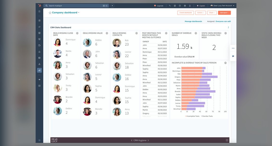 softwareTop 10 HubSpot CRM data hygiene tools in 2027
 softwareTop 10 HubSpot CRM agencies to hire for custom implementation in 2027
 softwareTop 10 HubSpot CRM training courses for beginners in 2027
 softwareShould I upgrade to HubSpot Enterprise once I need more than 10 custom objects in 2027?
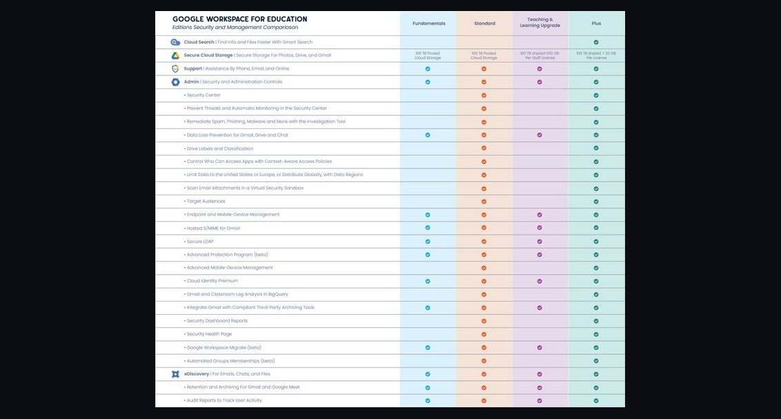 softwareHow does Google Workspace compare to Microsoft 365 for collaboration?