


Sales Engineer — LinkedIn Banner
Quality
Certified

A Sales Engineer LinkedIn banner is a 1584×396 px header that states your technical niche and the commercial outcome you drive. Keep the message inside the center-safe zone, use one dark background with a single accent, and pair three specialty keywords with one proof metric. It sets expectations before anyone reads a word.
The outcome you should expect
Be clear-eyed about what a banner does and does not do. A banner is a positioning asset, not a lead generator. It does not send messages, it is not clickable on LinkedIn, and it does not rank in search. What it does is compress your entire value proposition into the two seconds between someone landing on your profile and deciding whether to keep scrolling. For a Sales Engineer, that compression matters more than for almost any other go-to-market role, because "Sales Engineer" is a title that means four different things at four different companies.
The realistic outcome ladder looks like this. First, a higher rate of profile visitors who read past the fold. Someone who arrives from a technical comment thread and immediately sees "Kubernetes migrations for regulated healthcare" now has a reason to read your About section instead of bouncing. Second, better-qualified inbound. When your banner names the environment you work in — data platforms, industrial IoT, payments infrastructure, identity — the connection requests you receive skew toward people who actually have that problem, and the recruiter InMails skew toward roles you would actually take. Third, faster warm-up in active deals. Buyers routinely check the profile of the SE assigned to their evaluation before the first technical call. A banner that reads "200+ enterprise POCs, security-first architectures" starts that call from a different baseline than a default blue-gradient placeholder.
What you should not expect is a step-change in raw traffic. The widely repeated claims about custom banners multiplying profile views by double-digit factors are marketing folklore, not measured causation — profiles that get a custom banner are usually maintained by people who also post, comment, and optimize their headline, and those behaviors do the heavy lifting. Treat the banner as the conversion layer on traffic you generate elsewhere, not the traffic source itself.
There is a second, quieter outcome that matters inside your own company. Sales Engineers are frequently invisible in revenue conversations because the CRM attributes wins to the account executive. A profile that publicly and specifically states what you do — "technical validation lead, 40+ enterprise evaluations a year" — is a durable artifact you control. When you negotiate comp, interview internally for a principal SE or solutions architect track, or get referred by a partner rep at a technology alliance, that artifact is doing work you are not present for. Set the expectation at that level: the banner is one of maybe five assets that shape how the market reads you, and it is the cheapest of the five to fix.
Practically, budget 60 to 120 minutes for a first version if you are designing it yourself in Canva or Figma, or roughly $50 to $150 for a freelance designer on a marketplace. Either path is a rounding error against the value of one additional qualified technical conversation. The failure mode is not spending too much — it is shipping a banner that says nothing and then never revisiting it for three years.

What drives that outcome
Five variables do essentially all the work. Everything else is decoration.
Specificity of niche. The single highest-leverage element is naming the environment you sell into. "Sales Engineer" describes a function; "pre-sales for streaming data platforms in financial services" describes a person. Pick a vertical, a technology domain, or a deal shape — enterprise, mid-market, public sector — and commit to it in the banner copy. If you genuinely span several, pick the one you want more of, because the banner is a filter, not an inventory list.
Center-safe composition. LinkedIn renders the banner at 1584×396 on desktop, but the mobile app crops toward the center and the profile photo overlays the lower-left corner. Anything critical in the outer thirds or the bottom-left quadrant is at risk. Keep your headline text, your metric, and any logo inside roughly the middle 60% horizontally and above the bottom third vertically. Design the desktop version, then screenshot the mobile app view before you commit.
Contrast and legibility at small sizes. The banner is often first seen at a fraction of its native size — in a search result preview or a narrow browser window. Test by zooming to 50% on desktop. If the headline is not readable, the type is too small or the background is too busy. Dark backgrounds (charcoal, navy, deep teal) with one accent color solve this reliably: they give you high contrast without needing heavy outlines or drop shadows.
One proof point, not a résumé. A single number is memorable; five numbers are noise. Choose one that is true and verifiable — number of technical evaluations you have led, a retention or win-rate figure you can actually defend, a scale metric from the systems you support. Never invent a statistic. If a hiring manager asks about the number on your banner and you cannot substantiate it in one sentence, remove it.
Alignment with the rest of the profile. The banner sets an expectation that the headline, About, and experience sections must immediately confirm. If the banner says "enterprise cloud migrations" and the headline says "Sales Engineer at Acme," you have created a gap the reader has to close themselves. Most will not bother.
The flow above is worth reading as a diagnostic. If you are getting profile views but few conversations, the break is usually between D and F — the banner promises one thing and the headline delivers another. If you are getting neither views nor conversations, the banner is not your problem; your posting and commenting cadence is.
Benchmarks and realistic ranges

Concrete numbers you can design against, all of them mechanical rather than speculative.
Canvas and export. The banner slot is 1584×396 pixels, a 4:1 ratio. LinkedIn accepts PNG, JPG, and GIF up to 8 MB. Export at 2× (3168×792) and let LinkedIn downscale — this survives the platform's recompression far better than uploading at exactly 1584×396, especially for text edges and thin vector strokes. If you are working from an SVG source, export the raster at 2× rather than uploading the SVG, since the banner slot does not accept vector files.
Safe zone. Plan for the mobile crop by keeping essential content within roughly the center 640×360 region of the canvas. The profile photo overlays the lower-left; on desktop it occupies roughly the leftmost 200 pixels and hangs below the banner's bottom edge, and on mobile the overlap is proportionally larger. Practical rule: nothing you need read goes in the left 20% or the bottom 25%.
Type sizes. At the native 1584×396 canvas, a primary headline in the 60–90 px range reads cleanly at typical display sizes; a supporting line at 28–40 px works as a subhead; anything under 24 px is decorative and will be illegible on mobile. Cap the headline at six to eight words. Two font families maximum, and if your company publishes a brand font, use it for the headline — it buys instant coherence with any deck you screen-share.
Color count. One background, one accent, one neutral for body text. Three total. Dark backgrounds in the #10–#25 luminance range keep white text at comfortable contrast without glare. Avoid saturated red and yellow unless they are literally your brand colors; in B2B contexts they read as alarm states, which is an odd note for someone whose job is de-risking a technical evaluation.
Keyword count. Three specialty terms, maximum. "Cloud Infrastructure · Enterprise Security · Technical Validation" is a position. Ten terms separated by bullets is a tag cloud and signals that you have not chosen. If you need a fourth, it belongs in your About section.
Refresh cadence. Update on any role change, product-line change, or focus shift, and otherwise review every 6 to 12 months. More frequent than quarterly is churn; less frequent than annual and you risk showing a product screenshot from a version that no longer exists, which quietly undermines the technical credibility the whole banner exists to establish.
Time and cost. First design: 60–120 minutes in Canva or Figma using a template, or 3–4 hours from a blank canvas if you are particular. Freelance design typically runs $50–$150 for a single banner with a couple of revision rounds. Revisions after the first version usually take 15–20 minutes because you are only swapping copy, not rebuilding layout.
A/B reality check. LinkedIn gives you no native A/B testing for banners and no per-banner analytics. The only signal available is the trend in profile views and search appearances in your dashboard, which is confounded by everything else you do on the platform. Change one thing at a time, leave it up for at least four weeks, and treat the read as directional rather than statistically meaningful.
Risks, edge cases, and failure modes
Employer brand collisions. If you use your company's logo, wordmark, or product screenshots, you are using assets governed by someone else's brand guidelines. Most companies are fine with an employee-designed banner that includes a logo at reduced prominence, but some marketing teams are strict about lockups, clear space, and color treatment. Check for an internal brand kit before you publish, and place the logo at 20–30% opacity in a corner rather than making it the centerpiece. This also future-proofs you: a banner that is 80% your positioning and 20% employer branding survives a job change with a ten-minute edit.
The job-change lag. The most common stale-banner scenario is not laziness, it is timing. You change companies, update your headline and experience the same day, and forget the banner for six months — during which every recruiter and prospect sees your old employer's colors under your new title. Add "update banner" to your own onboarding checklist alongside updating your email signature.
Unverifiable metrics. A number on a public profile is a claim you may be asked to defend in an interview or a QBR. "300% pipeline growth" invites the question "over what baseline, and what was your specific contribution?" If the honest answer involves a lot of caveats, the number is a liability. Prefer metrics that are countable and personally attributable: evaluations led, integrations built, certifications held, years in a specific stack.
Over-designed clutter. Sales Engineers have a specific failure mode here: the temptation to render an actual architecture diagram in the banner. It looks technically credible in Figma at 100% zoom and turns into gray mush on a phone. Abstract suggestion of a system — a subtle topology motif, a data-flow gesture, a muted grid — communicates the same thing and survives compression. If a viewer would need to squint to trace an edge, it is decoration pretending to be information.
Mobile crop discovered too late. Design left-aligned with your name in the corner, publish, and then open the mobile app to find your name is gone. This is the single most common technical error and it is entirely preventable with a two-minute check. Keep a phone screenshot of the mobile view in the same folder as the design file so future edits get checked against reality rather than the desktop preview.

Accessibility gaps. Low-contrast text — mid-gray on dark charcoal, thin light weights on a photographic background — fails for a meaningful share of viewers and looks washed out on low-brightness screens. Aim for a contrast ratio comfortably above 4.5:1 for the headline. Also remember LinkedIn does not expose alt text for the banner, so any information that exists *only* in the image is invisible to screen-reader users; anything load-bearing must also appear in your headline or About text.
Stock-photo credibility damage. Handshakes, generic server rooms, and people pointing at laptops actively hurt a technical seller. Your audience is engineers and technical buyers who see through it instantly. If you cannot produce or license something specific, a clean typographic banner on a solid dark field outperforms any stock image.
Compression artifacts. Uploading a JPEG at exactly 1584×396 with fine text often produces visible ringing around letterforms after LinkedIn recompresses it. PNG at 2× resolution avoids this. If you must use JPEG — for a photographic background, for example — export at maximum quality and 2× dimensions.
Over-optimization. Rewriting your banner monthly chasing a metric LinkedIn does not report is a waste of time that could go into technical content, which actually drives the profile traffic your banner then converts. Ship a good version, verify the mobile crop, and move on.
A practical rollout plan
A sequence you can complete in a single working session, with a verification gate at each step.
Step 1 — Define the one sentence (15 minutes). Before opening a design tool, write the sentence: "I help [buyer type] in [industry or environment] [achieve outcome]." Example: "I help platform teams at regulated insurers migrate off legacy ETL without failing an audit." That sentence is the source material for every element that follows. If you cannot write it, no amount of design will rescue the banner.
Step 2 — Extract three keywords and one metric (10 minutes). From the sentence, pull three specialty terms and one number you can defend in a single sentence under questioning. Write them down separately. These are the only pieces of copy that go on the canvas besides the headline.
Step 3 — Build on the correct canvas (30–60 minutes). Start a 1584×396 artboard. Draw a guide box marking the center 640×360 safe zone and a second box marking the lower-left profile-photo overlap. Place the headline inside the safe zone at 60–90 px, the keyword line beneath at 28–40 px, and the metric as a distinct visual anchor. Dark base, one accent, one neutral. Company logo at 20–30% opacity in an upper corner if you are including one.

Step 4 — Verify at three sizes (10 minutes). View at 100%, at 50%, and as a 300 px-wide thumbnail. If the headline fails at 50%, increase the type size or cut words. This is the step people skip and then regret.
Step 5 — Export and upload. PNG at 3168×792, under 8 MB. Upload via the profile edit panel. Do not upload multiple candidates in quick succession — pick one before you touch the platform.
Step 6 — Mobile verification (5 minutes). Open the LinkedIn mobile app on a phone, not the responsive web view, and load your own profile. Confirm the headline, keywords, and metric are all visible after the crop. Screenshot it and save it next to the design file. If anything is cut, go back to Step 3 — do not rationalize it.
Step 7 — Align the surrounding profile (20 minutes). Update your headline so it echoes the banner's language, and make sure the first two lines of your About section — the part visible before "see more" — restate the same positioning. The banner promises; these sections must confirm within the same screen.
Step 8 — Set a review reminder. Calendar a check at six months, plus an immediate trigger on any role or product change. Keep the source file — Figma, Canva, or SVG — somewhere you will find it in a year, because the expensive part of the next revision is rebuilding a layout you already solved.
Run this end to end once and the banner stops being a nagging open item. The discipline that makes it stick is Step 6 — the mobile check is the gate that catches the error class that accounts for most bad Sales Engineer banners in the wild.
Related questions
Should the banner name my current employer?
Include the logo at low opacity if brand rules allow, but build the banner around your own positioning. An employer-centric banner becomes obsolete the day you change jobs; a positioning-centric one needs only a logo swap.
What if I do both pre-sales and post-sales work?
Lead with the one you want more of. The banner is a filter, not a job description. Put the secondary motion in your About section, where a reader who is already interested will find it.
Does the banner affect LinkedIn search ranking?
No. LinkedIn's search indexes text fields — headline, About, experience, skills — not image content. Keywords that matter for discovery must appear as text somewhere on the profile, not only in the banner.
Can I reuse the banner elsewhere?

Yes, with resizing. The same layout adapted to 1200×630 works for link previews and slide headers. Keep the source file editable so you are re-exporting rather than redesigning each time.
Is a plain typographic banner good enough?
Often better than a busy one. Clean type on a dark field with three keywords and one metric outperforms stock imagery with technical buyers, who read decorative visuals as a lack of substance.
FAQ
What size should a Sales Engineer LinkedIn banner be?
1584×396 pixels, a 4:1 ratio, in PNG or JPG under 8 MB. Export at 2× (3168×792) so the file survives LinkedIn's recompression with sharp text edges, and keep the essential message inside roughly the center 640×360 region so the mobile crop does not remove it.
What should the banner actually say?
Three things, maximum: a six-to-eight-word headline naming your niche, three specialty keywords, and one defensible proof metric. Everything else — certifications, contact details, a full skills list — belongs in the profile text where it is searchable and where you have room to give it context.
Should I include a call to action?
A short directional line like "open to technical discovery calls" is fine, but remember the banner is not clickable on LinkedIn. Treat any CTA as a tone-setter rather than a conversion mechanism, and keep it in the safe zone so mobile viewers actually see it.
How do I avoid the mobile crop problem?
Design with a visible guide box marking the center 640×360 area and the lower-left profile-photo overlap, then verify on the actual LinkedIn mobile app before you consider the banner finished. Never trust the desktop preview alone — it is the source of the most common banner error.
Is it worth paying a designer?
If you are not comfortable with layout and type, yes. Freelance banner design typically runs $50–$150 with a couple of revision rounds, which is trivial against the value of one additional qualified technical conversation. Bring the designer your one-sentence positioning, keywords, and metric already written — that is the part they cannot do for you.
How often should I update it?
On every role, product, or focus change, and otherwise a review every 6 to 12 months. The most common stale-banner case is a job change where the headline gets updated the same day and the banner does not, leaving your previous employer's branding under your new title for months.
Sources
- https://www.linkedin.com/help/linkedin/answer/a566307 — LinkedIn Help: profile background photo requirements and specifications
- https://www.linkedin.com/help/linkedin/answer/a563036 — LinkedIn Help: adding or editing your profile photo and background image
- https://business.linkedin.com/sales-solutions — LinkedIn Sales Solutions: professional brand and social selling guidance
- https://www.w3.org/WAI/WCAG21/quickref/ — W3C WCAG 2.1 quick reference, including text contrast minimums
- https://www.bls.gov/ooh/sales/sales-engineers.htm — U.S. Bureau of Labor Statistics: Sales Engineers occupational profile
- https://blog.hubspot.com/sales — HubSpot Sales Blog: sales enablement and personal-brand practices
- https://hbr.org/topic/subject/sales — Harvard Business Review: sales and go-to-market research
- https://www.figma.com/resource-library/ — Figma resource library: layout, type, and export fundamentals
- https://developer.mozilla.org/en-US/docs/Web/Media/Formats/Image_types — MDN: image format characteristics and compression trade-offs
Related on PULSE
This page will be disappearing soon. Save it to your device for $1 — or read it free while it is here.
@Kory-White- · if Venmo asks, the last 4 of my number are 2012
This page is gone.
This one is off the shelf now. $1 keeps it on your phone for good — the whole page, pictures and diagrams included.
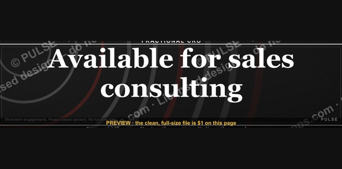 graphic“Available for sales consulting.” — LinkedIn Banner
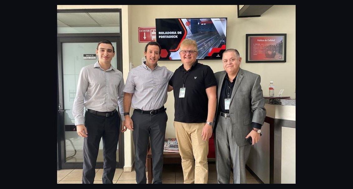 graphicCommercial Director — LinkedIn Banner
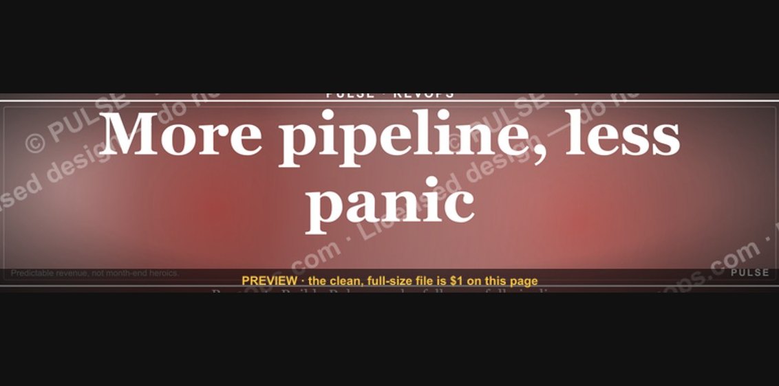 graphic“More pipeline, less panic.” — LinkedIn Banner
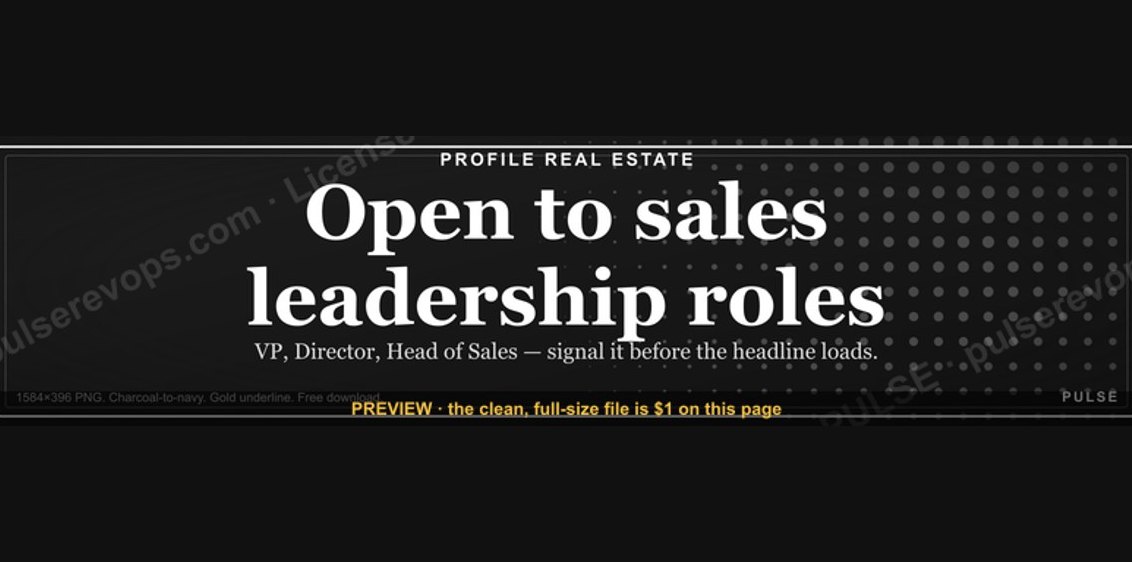 graphic“Open to sales leadership roles.” — LinkedIn Banner
 graphicFaster deals, fewer leaks. — LinkedIn Wallpaper
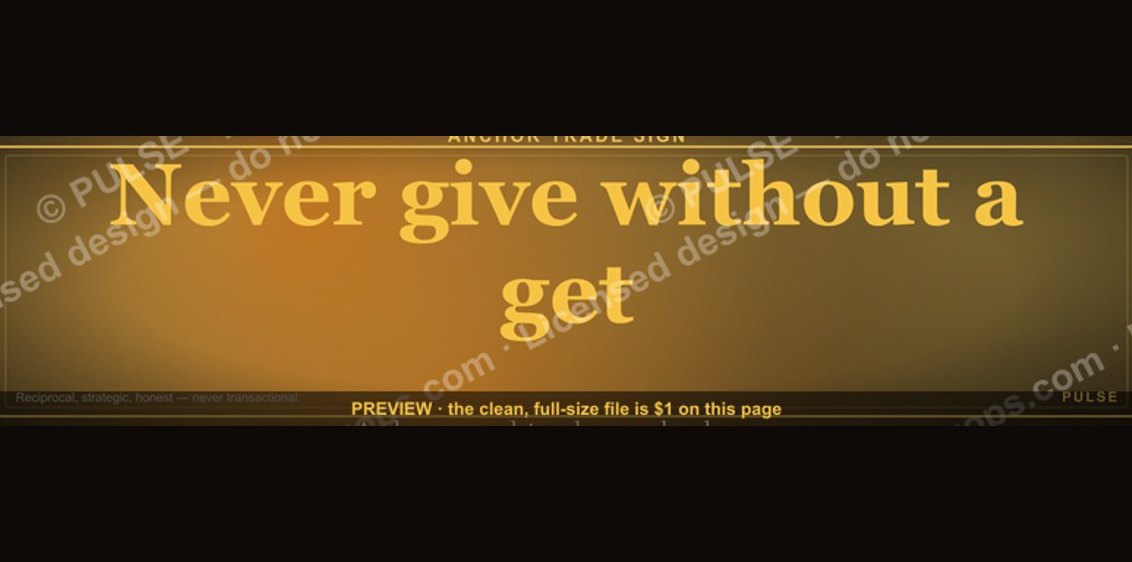 graphic“Never give without a get.” — LinkedIn Banner
 graphicSpeech-to-Text Operator — LinkedIn Banner
 graphic"Pipeline is the product." — LinkedIn Banner
 graphicSales Ops Analyst — LinkedIn Banner
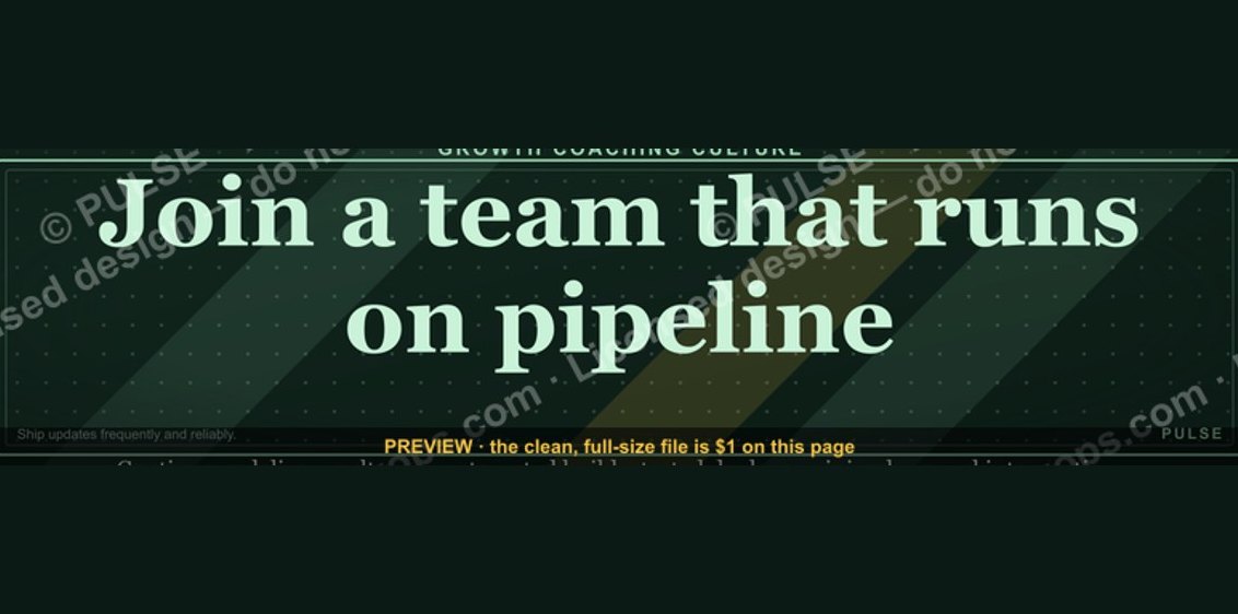 graphic“Join a team that runs on pipeline.” — LinkedIn Banner