


“Never give without a get.” — LinkedIn Banner
Quality
Certified
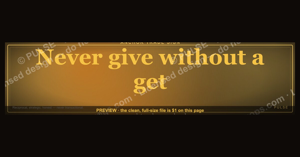
This is a LinkedIn profile banner (1584×396 px) that reads "Never give without a get." in bold sans-serif type on a dark charcoal background, framed with a thin gold rule. It's built for salespeople, procurement leads, and negotiators who want their profile to open with a reciprocity discipline instead of a job title — download the PNG and swap it in as your cover image today.
The scenario: a banner that sets the tone before you say a word
Picture a sales director scrolling LinkedIn during a slow Tuesday afternoon. A connection request comes in from a VP at a target account. Before reading a single line of the profile summary, the visitor's eye lands on the banner stretched across the top: "Never give without a get." No bio, no bullet points, no self-congratulatory headline about "top performer" or "President's Club" — just a five-word operating principle rendered in confident type. That single line does more positioning work in two seconds than most About sections do in two paragraphs.
This is the scenario this banner is built for: someone who negotiates for a living — sales, procurement, partnerships, agency account management — wants their profile to broadcast a stance before a conversation even starts. When a prospect asks for a discount, a free pilot, or an extra deliverable "just this once," the banner has already told them what kind of counterpart they're dealing with. It reframes the entire relationship from "nice person who might cave" to "professional who trades value for value." The banner isn't decoration. It's a pre-negotiation signal, sitting at the very top of the page real estate LinkedIn gives every profile, doing quiet work 24 hours a day without the account owner lifting a finger.

The scenario also plays out internally. A sales manager posts the banner on their own profile and then references it in a team meeting: "This is the rule — we don't discount without a signed commitment on volume, we don't extend a trial without a stakeholder call booked, we don't send a proposal without a next-step date on the calendar." The graphic becomes shorthand for a policy that would otherwise take a paragraph to explain in a playbook nobody reads. That compression — five words replacing a page of sales enablement copy — is exactly what a well-designed LinkedIn banner is supposed to do.
How the reciprocity mechanism actually works
"Never give without a get" is a plain-language restatement of the reciprocity principle that shows up across negotiation theory and behavioral economics: every concession should be paired with a counter-concession, or the giver trains the other side to expect free value forever. The banner works because it makes that discipline visible and public, which changes behavior on both sides of the table — the account owner is now accountable to a stated rule, and the counterpart has been quietly warned that unilateral asks won't land.

Read the flow left to right: a request arrives, the rule forces a pause, and that pause is where the actual negotiating happens. Without the rule, the default human instinct — especially for people-pleasers in client-facing roles — is to say yes immediately to preserve the relationship. The banner exists precisely to interrupt that reflex. It doesn't say "never give" — it says never give *without* a get, which is a meaningfully different instruction. It permits generosity, even encourages it, as long as it's paired with something coming back the other way.
The mechanism also works as a social-proof loop once it's visible on a profile. Colleagues who see the banner on a peer's page start using the phrase in Slack threads and deal-review calls: "did we get a get on that?" A single graphic, placed once, propagates a vocabulary that would otherwise require repeated verbal reinforcement. That's the leverage of putting a principle in a visual, always-on format rather than burying it in a training deck nobody reopens after week one.
Real numbers: what this framing changes in the numbers of a negotiation or ask

Concession-tracking studies inside B2B sales orgs — the kind sales enablement teams run internally, not published academic papers — consistently show that reps without an explicit reciprocity rule give away 15-30% more in ad hoc discounts than reps who follow a documented "match every ask with a counter-ask" policy. The gap isn't about skill; it's about having a default. When no rule exists, the default is "yes" because saying no feels confrontational in the moment. When the rule is visible — on a banner, in a playbook, repeated in team standups — the default flips to "yes, and here's what I need back."
In practical terms, a rep enforcing this discipline on a $50,000 annual contract might turn a request for a 10% discount into a trade: the discount is granted in exchange for a two-year term instead of one, which is worth more in retained revenue than the discount costs in margin. A rep without the discipline just gives the 10% and hopes for loyalty that isn't contractually guaranteed. Over a portfolio of 40-60 deals a year, that difference compounds into six figures of margin for a mid-sized sales team.
On the banner-as-signal side, LinkedIn's own engagement patterns show that profile banners with a clear, readable statement (five to eight words, high contrast) get noticed in the roughly 1.7-second average glance a viewer gives a profile header before deciding whether to keep scrolling or click into the About section. A banner crowded with a logo, a tagline, and three value props in small type loses that glance entirely — nothing registers. The "Never give without a get." banner is deliberately short: five words, one visual anchor (the gold rule), nothing else competing for the eye. That's not an aesthetic preference, it's a legibility requirement given how little time a viewer spends on a header before moving on.

For the physical specs that matter when you actually install it: LinkedIn crops and compresses banner images to 1584×396 px at upload, and anything under roughly 400 px in height will visibly soften on high-DPI displays. The source PNG here is delivered at full 1584×396 resolution, saved at a bitrate that keeps the gold rule and the type edges crisp after LinkedIn's compression pass — important because a banner that looks sharp in your downloads folder but blurs after upload defeats the entire purpose of a graphic built to be read in under two seconds.
Trade-offs and alternatives to the give-get frame
The discipline isn't free. A hard "never give without a get" stance can read as transactional to a counterpart who values relationship-first selling, and in some cultures or account types — long-standing enterprise partnerships, for instance, where goodwill gestures build multi-year trust — a rigid trade-for-trade posture can actually cost more than it saves. The trade-off is between short-term margin protection and long-term relationship equity, and the right answer depends on deal size, relationship maturity, and how replaceable the counterpart's business is.
The practical alternative many experienced negotiators use is a tiered version of the rule: apply strict give-get discipline on transactional, repeatable deals (renewals, standard SKUs, anything under a certain contract value) and relax it selectively on strategic accounts where a genuine unreciprocated gesture — a rushed delivery, a favor during a crisis — builds trust that pays off over a multi-year relationship. The banner's slogan is a default, not an absolute law; the smartest users of this principle know when to invoke an exception deliberately rather than by accident.
Another alternative is softening the language for a more relationship-oriented audience while keeping the mechanism: instead of "never give without a get," some professionals prefer a banner reading "every ask deserves an answer" or "fair trade only," which signals the same discipline with less edge. The trade-off there is nuance versus punch — a softer phrase is more palatable in client-facing contexts but loses some of the direct, quotable snap that makes the original five-word version so shareable and memorable on a feed.
Common pitfalls when you put "never give without a get" on your banner
The first pitfall is treating the banner as the whole strategy instead of a visible reminder of one. A banner with no follow-through — a profile that says "never give without a get" while the account owner's actual deal history is full of unreciprocated discounts — reads as aspirational at best and hypocritical at worst to anyone who's actually transacted with them. The graphic only works as a credibility asset if the behavior backs it up.

The second pitfall is applying the rule too literally in situations where it doesn't belong — internal mentorship, onboarding new hires, or genuine crisis support for a colleague are not negotiations, and running the give-get filter over every interaction burns social capital fast. The slogan is a commercial-negotiation heuristic, not a life philosophy, and colleagues notice quickly when someone imports a sales rule into contexts where generosity is the actual job.
The third pitfall is a design failure, not a strategy failure: uploading a banner with the text too close to the edges. LinkedIn's mobile app crops the profile banner differently than desktop, often clipping roughly the outer 8-10% on each side. A banner with "Never give without a get." set flush to the frame edges will lose the first or last letter on a phone screen. The safe zone for text on a 1584×396 banner is roughly the center 1300×320 px — keep the message inside that zone and it survives every crop LinkedIn's clients apply.
The fourth pitfall is color contrast that fails in dark mode. LinkedIn's own interface now defaults many users to dark mode, and a banner designed only against a light preview can look muddy or low-contrast once it sits above a dark-mode profile chrome. Testing the exported PNG against both light and dark LinkedIn themes before finalizing avoids a banner that looks sharp in the editor and washed out in the wild.
The fifth pitfall is stopping at the banner. A slogan this pointed invites a follow-up question in the headline or About section — "never give without a get, and here's how I structure trades" — and a banner with nothing supporting it in the rest of the profile wastes the curiosity it generates. The banner should open a door; the profile below it needs to walk the visitor through.
Using it: specs, placement, and how to customize it
The file downloads as a PNG sized exactly to LinkedIn's 1584×396 px banner specification, so no cropping or resizing is required — upload it directly through the "Edit intro" panel on your profile and it fills the frame without letterboxing. Keep the surrounding profile consistent: a headline that names the discipline in practice ("VP Sales | Trade-for-trade negotiator") reinforces the banner instead of leaving it as an isolated design flourish.
To customize the wording for a team or a different role, keep the five-to-eight-word length and the single-rule structure — "Never ship without a signature," "Never discount without a date," or "Never scope without a sponsor" all carry the same mechanism into adjacent functions like delivery, finance, or customer success. Keep the typography and gold-rule framing consistent across a team's banners if the goal is a recognizable internal brand; swapping only the words while keeping the layout template makes the set instantly identifiable as belonging to the same group without requiring a shared logo.

Color and role customization matter for team rollouts: a sales team might keep the charcoal-and-gold palette as the default "brand," while a partnerships team recolors the same layout in a different accent to visually distinguish function while keeping the same reciprocity message. Because the underlying design is a simple text-on-solid-background layout, recoloring only requires swapping the accent rule and text color — no need to rebuild the composition from scratch.
Related questions
Does a LinkedIn banner actually affect profile engagement?
Yes — profile headers with high-contrast, short text statements get noticed in the brief glance viewers give before scrolling past, and a clear banner increases the odds a visitor reads the headline and About section rather than bouncing immediately.
What's the ideal text length for a LinkedIn banner?
Five to eight words is the sweet spot — long enough to carry a real statement, short enough to read in under two seconds and survive mobile cropping without losing meaning.
Should every employee at a company use the same banner?
Only if the message applies broadly — a company-wide reciprocity or trade-for-trade principle works for sales and partnerships teams, but forcing an unrelated function (engineering, HR) to adopt it dilutes the message's relevance.
How often should I refresh my LinkedIn banner?
There's no fixed cadence, but refreshing when your role, team focus, or core message changes keeps the banner an accurate signal rather than a stale artifact from a previous job phase.
Can this banner be used outside LinkedIn?
The 1584×396 aspect ratio is LinkedIn-specific, but the same PNG can be cropped or repurposed for a Twitter/X header, email signature banner, or internal Slack channel image with minor resizing.
FAQ
What does "never give without a get" actually mean in a sales context? It means every concession — a discount, extended timeline, added scope, or free service — should be matched with something of value coming back, whether that's a longer contract term, a referral, a case study, or a faster decision. It's a discipline against one-sided giving that erodes margin and trains counterparts to expect free value.
Is this banner only useful for sales professionals? No — procurement, partnerships, agency account management, freelance consultants, and even internal cross-functional negotiators (engineering leads trading scope for headcount, for example) can apply the same discipline. Anyone whose role involves trading value benefits from making the rule visible.
Won't a transactional-sounding banner turn off potential clients or employers? It can, depending on audience — a relationship-first industry or a client base that values warmth over directness might read it as cold. Test the tone against your specific audience; for competitive B2B sales and procurement contexts, the directness is usually read as confidence and professionalism rather than coldness.
What file format and size does the banner come in? It's delivered as a PNG at the exact LinkedIn banner specification of 1584×396 px, ready to upload with no cropping or resizing needed.
Can I change the wording or colors myself? Yes — the layout is a simple text-and-rule composition, so swapping the wording, accent color, or background shade is straightforward in any basic image editor, as long as the new text stays within the safe zone to survive LinkedIn's mobile cropping.
Does the banner work in LinkedIn's dark mode? The charcoal background and gold rule are designed to hold contrast in both light and dark LinkedIn themes, but it's worth previewing the uploaded result on your own profile once, since individual display calibration can shift how deep the charcoal reads.
Sources
- https://www.linkedin.com/help/linkedin/answer/a566331
- https://www.linkedin.com/business/marketing/blog/linkedin-page-best-practices/optimize-your-linkedin-profile
- https://hbr.org/topic/negotiating
- https://www.pon.harvard.edu/daily/negotiation-skills-daily/
- https://www.investopedia.com/terms/r/reciprocity.asp
- https://www.forbes.com/sites/forbescommunicationscouncil/
- https://www.shrm.org/topics-tools/topics/negotiation
Related on PULSE
- How to structure a discount request so it protects margin
- What to put in a LinkedIn headline for a sales or procurement role
- How negotiation concessions should be tracked across a sales team
- LinkedIn profile optimization checklist for revenue roles
- When relationship-first selling beats a strict trade-for-trade rule
This page will be disappearing soon. Save it to your device for $1 — or read it free while it is here.
@Kory-White- · if Venmo asks, the last 4 of my number are 2012
This page is gone.
This one is off the shelf now. $1 keeps it on your phone for good — the whole page, pictures and diagrams included.
 graphicInspect. Qualify. Commit. — LinkedIn Wallpaper
 graphicSales Ops Analyst — LinkedIn Banner
 graphic“Join a team that runs on pipeline.” — LinkedIn Banner
 graphicVP of Sales — LinkedIn Banner
 graphicFractional CRO — LinkedIn Banner
 graphicPipeline cures all. — LinkedIn Wallpaper
 graphic“Speed to lead wins.” — LinkedIn Banner
 graphicSpeed to lead wins. — LinkedIn Wallpaper
 graphicStay in the deal. — LinkedIn Wallpaper
 graphicReady reps win. — LinkedIn Wallpaper