


Sales Coach — LinkedIn Banner
Quality
Certified
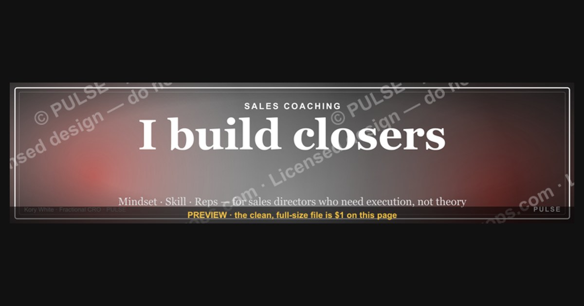
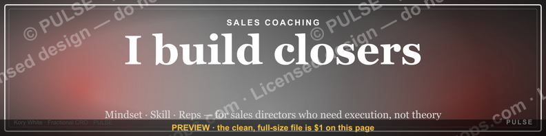
This is a LinkedIn profile banner sized 1584×396 px, titled "Sales Coach — LinkedIn Banner." It presents the role title SALES COACH as the dominant text element against a clean, high-contrast background, with room for a supporting line of positioning copy. Use it as a profile cover image for anyone coaching, training, or leading a sales team who wants their LinkedIn presence to read as credible at a glance.
The outcome you should expect
A LinkedIn banner does one narrow job: it turns the seven seconds someone spends skimming your profile into a correct first impression instead of a blank one. For a Sales Coach, that means a visitor who lands on the profile — a hiring manager, a prospective client, a rep considering whether to take advice from you — should be able to state your role and your value proposition without reading a single line of the About section. That is the realistic outcome of installing this banner: faster role recognition, not more profile views and not more inbound messages by itself. The banner does not drive traffic; it converts traffic that was already arriving.
The practical effect shows up in three places. First, the "who is this person" gap closes immediately, because most LinkedIn visitors read the banner and the headline before they read anything else — the profile photo confirms a face, the banner and headline together confirm a role. Second, a coherent banner reduces the cognitive tax of a cluttered or default-blue profile, which unconsciously reads as unfinished or inactive, even if the person behind it is neither. Third, for a Sales Coach specifically, the banner functions as a credibility signal in a category where credibility is the entire product — coaching is intangible, so anything that visually signals "this person has their presentation together" does real work toward "this person probably has their methodology together too."

What it will not do is compensate for a weak headline or an empty About section underneath it. The banner sets a visual frame; the words around it still have to close the loop. A visitor who sees a sharp SALES COACH banner and then finds a headline that just says a job title with no specialization, and an About section that is three sentences long, will discount the banner's signal within a few more seconds of scrolling. The banner buys attention and momentum, not conversion in isolation. Coaches who see the best results treat it as the top of a stack — banner, headline, About, featured section, recent posts — that all say the same thing in different formats, rather than as a one-off decoration that carries the whole profile on its own.
There is also a secondary, slower-moving outcome worth expecting: consistency over time. Because this is a static downloadable asset rather than something rebuilt from scratch each time, a coach can reuse it across multiple properties — LinkedIn, a personal site header, a proposal deck's cover slide — and get the compounding benefit of a repeated visual mark. People who see the same clean SALES COACH treatment across three different touchpoints in the same week start to register it as a brand, even an informal one, faster than they would from any single instance.
What drives that outcome

The outcome above is driven by a small number of design mechanics, and understanding them is what separates a banner that reads instantly from one that needs a second look. The first mechanic is contrast hierarchy: the role title SALES COACH is set larger and bolder than any supporting text, so the eye resolves "what this is" before "who this is" or "what this offers." Banners that give equal visual weight to a title, a tagline, and a call-to-action end up with no clear entry point, and a viewer scanning for under two seconds will register noise rather than a message.
The second mechanic is legibility at small size. LinkedIn renders the banner at full width on desktop but compresses it substantially on mobile, and a large share of profile views now happen on a phone. Text that looks confidently sized on a 1584px-wide desktop mock can shrink to something barely readable on a 390px-wide phone screen. That is why the title text on this banner is set heavy and short — a single word-pair, SALES COACH, rather than a full sentence — so it survives the compression that kills longer taglines.

The third mechanic is negative space around the profile photo zone. LinkedIn overlays the circular profile photo on the bottom-left portion of the banner, and any banner that places critical text or imagery in that exact region gets partially obscured on both desktop and mobile. This design keeps the primary text clear of that overlap zone and uses the surrounding space deliberately, so nothing important disappears behind the photo circle regardless of which device is rendering it.
The fourth mechanic is color and brand alignment. A banner that clashes with the coach's own brand palette, or that borrows saturated colors that fight with a professional headshot, reads as generic stock decoration rather than as an intentional identity choice. Muted, high-contrast palettes consistently outperform busy or neon ones for this exact reason — they let the words do the work instead of competing with them.
Put together, these four mechanics — hierarchy, mobile legibility, photo-zone clearance, and palette discipline — are what make a banner "drive" the outcome described above rather than just decorate the top of a page. Remove any one of them and the banner still displays, but it stops doing the specific job of fast, accurate role recognition.
Benchmarks and realistic ranges

LinkedIn's published cover-image specification is 1584×396 pixels, and that is the canvas this banner is built to. Uploading anything smaller forces LinkedIn to stretch the file, which visibly softens text edges; uploading anything larger gets downsampled, which is safer but wastes file size. Staying close to the native 1584×396 ratio (4:1) is the range worth targeting for any custom or edited version, and PNG is the safer export format over JPEG for banners that carry sharp text edges, since JPEG compression introduces artifacting around hard letterforms that PNG avoids.
File size in practice tends to land in the low hundreds of kilobytes to a few megabytes for a banner like this, well within LinkedIn's accepted upload limits, so file size is rarely the constraint — legibility and cropping are. The real variable to benchmark against is how much of the banner survives the mobile crop. Desktop shows close to the full 1584×396 canvas; the mobile app and mobile web view show a narrower vertical slice centered on the middle of the image, and the photo-overlap zone described above eats a meaningful chunk of the bottom-left on both. A safe working assumption is that only the middle 60–70% of the banner's width is reliably visible across both desktop and mobile without cropping into edge content, which is why this design keeps its primary title text centered rather than pushed to either edge.
For refresh cadence, there is no fixed rule, but coaches who treat their profile as an active marketing surface typically revisit the banner whenever they change positioning — a new coaching focus, a new certification, a new target audience — rather than on a fixed calendar. A banner that has not changed in years alongside a profile that is otherwise active can read as neglected by comparison, even if the content itself still holds up visually.
Risks, edge cases, and failure modes
The most common failure mode is text that was legible on a large monitor but collapses into an unreadable smear once LinkedIn compresses it for the mobile feed. Any customization of this template that adds a longer tagline, a phone number, or a second line of small print is the most likely source of this problem — the fix is to keep the mandatory text to the role title and, at most, one short supporting phrase, and to test the rendered result on an actual phone before publishing.
A second failure mode is the photo-overlap collision described earlier: a coach swaps in their own background image or repositions the text without accounting for where LinkedIn will place the profile photo circle, and a word, a logo, or a face in a background photo ends up half-hidden behind their own headshot. This is easy to miss when previewing the raw 1584×396 file in an image editor, because the editor does not show the photo circle at all — the only reliable check is uploading it to a real LinkedIn profile (or a draft/test account) and looking at the rendered result.
A third failure mode is brand or tone mismatch: a Sales Coach whose actual delivery style is casual and conversational but whose banner uses a stiff, corporate palette sends a mixed signal, and prospects who book a call expecting one tone and get another tend to disengage faster, not slower. The banner should match the coaching style being sold, not just look generically "professional."
A fourth, subtler failure mode is over-claiming. Because the banner is the first thing a visitor sees, there is a temptation to load it with a bold promise — a specific outcome, a specific number, a specific guarantee — text that the rest of the profile then has to justify. A banner that promises something the About section and Featured content do not back up creates a credibility gap the moment the visitor scrolls past the fold, which is worse than a plainer banner that promises nothing and simply states the role clearly.
Finally, there is a technical edge case worth flagging: LinkedIn periodically adjusts how much of the banner it displays across surfaces — company pages, personal profiles, and the mobile app have each changed their crop behavior over time. A banner that was cropped correctly last year is not guaranteed to render identically after a LinkedIn layout update, so it is worth a periodic visual check rather than assuming a one-time upload is permanent.
A practical rollout plan

Getting from "downloaded the file" to "banner is doing its job" is a short sequence, but skipping steps is where most of the failure modes above creep in. Start by downloading the PNG at its native 1584×396 resolution rather than a resized copy, since resizing after the fact is where soft, blurry text usually originates. If the banner is being customized — a different name, a different specialization line, a different accent color — make those edits in the original layered file if one is available, rather than painting over the flattened PNG, so text stays crisp.
Next, upload it to LinkedIn through the profile edit flow and check the live preview LinkedIn shows during upload — this preview approximates but does not perfectly match the final render, so it is a first pass, not the final check. After publishing, open the profile in a separate mobile session (not just a resized desktop browser window) to confirm the title text is still legible and that nothing critical sits behind the profile photo circle. This step catches the two most common failure modes — mobile compression and photo overlap — before real visitors see them.
Once the banner is live, align the rest of the profile to it within the same session: the headline directly under the profile photo should state the specialization the banner implies, and the About section's opening line should not contradict or repeat the banner verbatim but should expand on it. This is the step coaches most often skip, and it is the one that determines whether the banner's first impression actually converts into a read-through of the rest of the profile.

Finally, set an informal review trigger rather than a fixed schedule: revisit the banner whenever the coaching offer changes, whenever a rebrand happens, or roughly once a year as a baseline check against LinkedIn's evolving crop and layout behavior. Treat the banner as a living asset tied to current positioning, not a one-time install-and-forget graphic.
Related questions
Does a LinkedIn banner actually affect profile views?
Indirectly. It does not generate traffic on its own, but it improves how visitors who already arrived interpret the profile, which can increase how long they stay and how far they scroll before deciding to connect or message.
What image format should a LinkedIn banner be exported as?
PNG is generally preferable for banners with sharp text or logos, since it avoids the compression artifacting JPEG introduces around hard edges. JPEG is acceptable for photo-heavy banners with no fine text.
Can the same banner be reused across other platforms besides LinkedIn?
Yes, with a caveat: other platforms use different aspect ratios, so a 1584×396 file designed for LinkedIn will need to be recropped, not just re-uploaded, to fit something like a website header or a different social network's cover size.
How often should a Sales Coach update their LinkedIn banner?

There is no fixed interval; the practical trigger is a change in positioning, offer, or brand, with a periodic check roughly once a year even without a change, since platform rendering behavior can shift.
What is the safe zone to avoid on a LinkedIn banner?
The bottom-left region where the circular profile photo overlays the banner, and the outer 15–20% of the width on each side, which can be cropped or partially hidden depending on desktop versus mobile rendering.
FAQ
What exact dimensions does this LinkedIn banner use? 1584×396 pixels, matching LinkedIn's official cover-image specification for personal profiles. This ratio (4:1) is what keeps the file from being stretched or awkwardly cropped when LinkedIn processes the upload.
Is this banner editable, or is the text fixed?
The layout is built to be customized — the role title, supporting line, and color accents can be swapped for a coach's own name, specialization, or brand palette, as long as edits keep text out of the profile-photo overlap zone and keep the title short enough to survive mobile compression.
Why does the banner say "Sales Coach" instead of a more specific title? "Sales Coach" is used here as the clear, broadly recognized role label; a coach can replace it with a more specific variant — for example a niche or methodology name — as long as the replacement stays short and legible at small mobile sizes.
Will this banner work if my profile photo is not professional-looking? The banner and the profile photo are read together, so a strong banner cannot fully offset a low-quality or overly casual photo. They work as a pair; both should be intentional and consistent in tone.
Does LinkedIn charge for uploading a custom banner image? No. Uploading a custom cover/banner image is a standard, free feature of any personal LinkedIn profile, available without a premium subscription.
Can I use this banner on a LinkedIn Company Page instead of a personal profile? Company Pages use a different banner specification and layout than personal profiles, so this file would need to be recropped and is best treated as personal-profile-specific rather than dropped directly onto a Page.
Sources
- https://www.linkedin.com/help/linkedin/answer/a542914
- https://business.linkedin.com/marketing-solutions/success/best-practices/linkedin-profile-best-practices
- https://www.linkedin.com/pulse/
- https://www.adobe.com/express/create/banner/linkedin
- https://www.canva.com/create/linkedin-banners/
- https://www.hubspot.com/linkedin-banner-size
- https://www.socialpilot.co/blog/linkedin-image-sizes
- https://sproutsocial.com/insights/social-media-image-sizes-guide/
Related on PULSE
- What size should a LinkedIn banner be for a personal profile?
- How do I write a LinkedIn headline that matches my banner's positioning?
- What belongs in the About section under a coaching-focused LinkedIn profile?
- How do sales coaches use LinkedIn to generate inbound client interest?
- What's the difference between a LinkedIn banner and a LinkedIn Featured section image?
- How often should a sales professional refresh their LinkedIn profile assets?
This page will be disappearing soon. Save it to your device for $1 — or read it free while it is here.
@Kory-White- · if Venmo asks, the last 4 of my number are 2012
This page is gone.
This one is off the shelf now. $1 keeps it on your phone for good — the whole page, pictures and diagrams included.
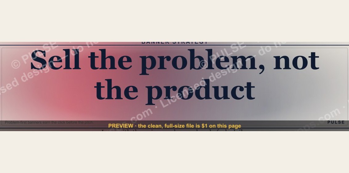 graphic“Sell the problem, not the product.” — LinkedIn Banner
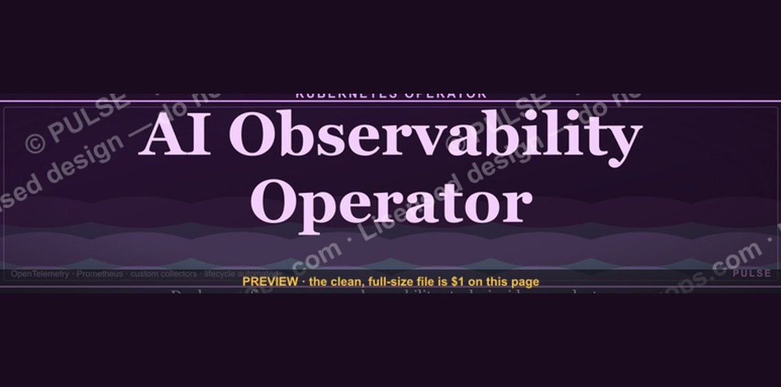 graphicAI Observability Operator — LinkedIn Banner
 graphic“The next call is the most important one.” — LinkedIn Banner
 graphicField Sales Rep — LinkedIn Banner
 graphicComputer Vision Engineer — LinkedIn Banner
 graphic“Available for sales consulting.” — LinkedIn Banner
 graphicPredictable revenue, by design. — LinkedIn Wallpaper
 graphicReady reps win. — LinkedIn Wallpaper
 graphicHead of Sales — LinkedIn Banner
 graphic"Pipeline is the product." — LinkedIn Banner