


"Build, don't chase." — LinkedIn Banner
Quality
Certified
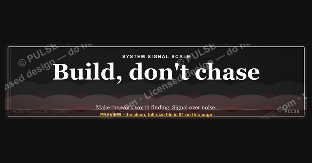
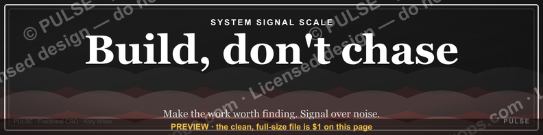
This is a LinkedIn profile banner, sized 1584×396px, that reads "Build, don't chase." in a bold serif-on-dark treatment, designed to run behind your profile photo as a silent positioning statement. It replaces the default LinkedIn banner so the first visual a visitor absorbs — before your headline, before your About section — signals a builder's posture: you create demand and ship work instead of running down every lead or opportunity that crosses your feed.
The outcome you should expect
Swapping your stock LinkedIn banner for this one does not change your reach, your search ranking, or your connection requests in any mechanical sense — LinkedIn's algorithm does not read banner text. What it changes is the first three seconds of a profile visit, and that is where the real effect lives. A visitor's eye moves in a predictable order on a LinkedIn profile: photo, banner, name, headline, then About. The banner sits in that second slot, full-width, above everything else you've written. When it says "Build, don't chase.", it pre-frames how the rest of the profile gets read — a headline like "Account Executive" reads differently underneath a banner that already told the visitor you don't operate as a chaser.
The realistic outcome is a shift in *perceived posture*, not a lead-generation lift you can attribute in a CRM. Recruiters scanning dozens of profiles an hour register banner text almost subliminally; a founder or sales leader lands on a confident, outcome-oriented frame rather than a generic stock photo of a skyline or a conference stage. For salespeople specifically, this banner works as a counter-signal: it tells prospects, before a single DM is sent, that you're not going to flood their inbox with cold outreach — you're going to build something (content, a product, a case study, a pipeline) that pulls interest toward you instead of pushing toward them.

Expect the effect to compound slowly. A banner alone rarely drives a measurable spike in profile views or inbound messages in the first week. What it does is raise the floor on every subsequent touchpoint — a shared post, a comment, a connection request — because the visual context underneath your name is already doing positioning work. Think of it as the equivalent of a well-designed business card: nobody buys because of the card stock, but a cheap card quietly taxes every interaction that follows it, and a strong one quietly removes that tax.
What drives that outcome
Three design choices in this banner do the actual work, and understanding them matters if you plan to adapt the graphic rather than use it as-is.
Wording — "Build, don't chase." is a four-word imperative with a built-in contrast (build vs. chase), which is the single most reliable structure for a banner slogan to be read in under a second. LinkedIn banners are consumed at a glance, often on a phone, so any phrase longer than six or seven words loses most of its audience before they finish reading it. The period after "chase" is deliberate — it reads as a closed statement, not a tagline trailing off into a logo.
Typography and contrast — the phrase sits in a bold serif face against a dark, low-texture background. Serif type at banner scale reads as deliberate and editorial rather than corporate-template; a dark background with high text contrast is what survives LinkedIn's automatic cropping and compression without the words washing out. Sans-serif condensed fonts or busy photographic backgrounds are the two most common reasons slogan banners become illegible once LinkedIn resizes them for mobile.
Composition and safe zone — the text sits inside the horizontal band that survives cropping on every device, because your profile photo covers the bottom-left corner of the banner on desktop and a wider swath on mobile. A banner designed without accounting for that occlusion zone frequently gets its first word clipped behind the circular profile photo, which is the single most common visible defect in home-made LinkedIn banners.
Benchmarks and realistic ranges
LinkedIn's banner canvas is 1584×396 pixels — an exact 4:1 aspect ratio — and the platform has historically accepted PNG or JPG files up to roughly 8MB. Anything uploaded outside that ratio gets auto-cropped or letterboxed by LinkedIn's own resizer, which is why exporting at the native 1584×396 size, rather than letting LinkedIn crop a larger image down, is the only reliable way to control what the final banner shows.
On desktop, close to the full 1584×396 canvas is visible, with roughly the left two-thirds clear of your profile photo. On mobile, LinkedIn shows a cropped, narrower slice of the same image — typically closer to a 3:1 or tighter ratio depending on device and app version — and the profile photo occupies a proportionally larger share of the visible width. The practical range to design within: keep all text and any logo mark inside the center 60-70% of the horizontal canvas and the top two-thirds vertically, so it survives both the desktop and mobile crop without edits.
For file weight, a clean PNG export of a simple text-on-background banner like this one typically lands well under 1MB, far inside LinkedIn's ceiling — there's no benefit to pushing file size up, and a smaller file loads faster on mobile connections, which matters because a slow-loading banner briefly shows a gray placeholder on first profile load.
In terms of behavioral range, treat this as a context asset, not a conversion asset: a realistic expectation is a modest, hard-to-isolate increase in the quality of first impressions rather than any trackable click or reply-rate number. Anyone citing a precise percentage lift from a banner swap alone is not measuring something LinkedIn actually exposes — there's no banner-level analytics event, so any such figure is not verifiable and shouldn't be trusted or reproduced.
Risks, edge cases, and failure modes
The most common failure mode is a mismatch between the banner's claim and the rest of the profile. "Build, don't chase." underneath a headline and About section that reads like a standard outbound-heavy sales pitch creates a credibility gap — visitors notice the contradiction faster than they notice the slogan itself. The banner should describe a posture the rest of the profile actually backs up with evidence: shipped work, a portfolio link, case studies, original posts — not just the phrase on its own.
A second failure mode is overuse of the slogan format generally. Terse, contrast-structured slogans ("Build, don't chase," "Ship, don't stall," and similar constructions) have become common enough on LinkedIn that a visitor who has seen several variants in the same week may read it as templated rather than authentic. This risk is highest in crowded niches — sales, startups, recruiting — where banner slogans circulate fast. Pairing the banner with a specific, personal About section is the main defense against it reading as generic.
Mobile cropping is a recurring technical edge case: because mobile shows a tighter crop than desktop, text placed too close to the left or right edge on desktop can be cut off entirely on a phone. Always preview the export in LinkedIn's own upload tool — which shows a live crop preview before you save — rather than trusting how the file looks in a design tool.
Accessibility is a real and frequently ignored edge case: dark-on-dark or low-contrast color swaps (a common customization mistake when changing the palette to match a brand) can make the text fail basic contrast standards, which matters for visitors using screen magnification or who simply have a dim or glare-affected screen. Stick to a contrast ratio that reads clearly even on a washed-out laptop display outdoors.
Finally, a role or employer mismatch is worth flagging: some employers have brand guidelines that restrict personal LinkedIn banners, particularly for employees who post as a visible representative of the company. Check before publishing if your role is one where personal branding assets need sign-off — this isn't a LinkedIn platform rule, it's a workplace-policy edge case that trips people up after the fact.
A practical rollout plan
Treat the rollout as a five-step sequence rather than a single upload-and-forget action.
First, confirm the wording fits your actual role before you touch the design. "Build, don't chase." reads naturally for founders, builders, product people, and outbound-averse salespeople leaning into inbound and content; it reads oddly for roles where "chasing" (active, scheduled follow-up) is literally the job description, like certain BDR or collections functions. Swap the verb pair to match your reality rather than forcing the stock phrase.
Second, choose a color and type treatment that matches your existing brand or industry norm — dark serif-on-black works broadly, but a designer, a creative-industry profile, or a highly technical role might warrant a different palette. Keep the same compositional rule regardless: text clear of the bottom-left photo zone, high contrast, nothing smaller than roughly 36-40px effective height at export resolution so it survives mobile downscaling.
Third, export at the native 1584×396px canvas as a PNG, keep the file under roughly 2MB even though the ceiling is higher, and run it through LinkedIn's own banner upload preview — not just a design tool's preview — before publishing, since that's the only preview that applies LinkedIn's actual crop.
Fourth, update your headline and the opening line of your About section in the same sitting, so the banner's claim and the surrounding text reinforce each other on the same day rather than the banner sitting alone for weeks looking disconnected from the copy around it.
Fifth, revisit it after roughly two to three weeks. Banners are cheap to iterate on — unlike a resume or a pinned post, there's no history or engagement lost by swapping the image again. If the wording stops matching your current focus (a new role, a new product focus, a shift from individual contributor to leadership), update it rather than letting a stale slogan sit behind an evolved profile.
Related questions
What size should a LinkedIn banner be?
1584×396 pixels, a 4:1 aspect ratio, exported as PNG or JPG. Keep text and logos inside the center 60-70% of the width so neither desktop nor mobile cropping clips them.
Does a LinkedIn banner affect search ranking or algorithm reach?
No. LinkedIn's feed and search ranking do not parse banner image text. Its effect is purely on human visitors' first impression, not on discoverability.
Should my LinkedIn banner match my company's branding?
Only if your role is customer- or brand-facing in a way your employer governs explicitly. Otherwise a personal positioning banner like this one is standard and widely used alongside a company-branded headline.
How often should I change my LinkedIn banner?
Whenever your role, focus, or positioning genuinely shifts — there's no fixed cadence. A banner that still matches your current work after a year needs no change; one that's stale after a role change should be swapped promptly.
FAQ
Is "Build, don't chase." a real marketing or sales philosophy, or just a slogan? It's a condensed version of a broader inbound-versus-outbound framing used across sales and founder communities — favoring demand you create (content, product, reputation) over demand you pursue (cold outreach, chasing leads). The banner compresses that philosophy into four words for glance-speed reading.
Can I use this banner if my actual job involves a lot of outbound prospecting? You can, but it works best when framed as a mindset about *how* you prospect — building relationships and value before asking — rather than a literal claim that you never do outreach. If the contradiction with your daily work is too sharp, adjust the wording instead.
Will changing my banner notify my LinkedIn connections?
LinkedIn does not send a dedicated notification for a banner-only change the way it does for a new job or anniversary, though profile edits can appear in some connections' activity feeds depending on their settings. It's a low-visibility change, not a broadcast.
What file format should I download this banner in? PNG, at the native 1584×396px canvas, is the safest default — it preserves sharp text edges better than JPG compression does, and stays well under LinkedIn's upload size limit at this resolution.
Can I customize the colors or wording for my team instead of using it as-is? Yes — keep the compositional rules (safe zone clear of the photo, high contrast, short imperative phrasing) and swap the palette or the verb pair to fit your team's brand or role. The underlying design logic, not the exact wording, is what carries the effect.
Does a banner like this actually get me more profile views or messages? There's no LinkedIn-reported metric isolating banner impact, so treat any specific percentage claim skeptically. The realistic effect is qualitative — a stronger first impression — not a measurable view-count lift you can attribute to the image alone.
Sources
- https://www.linkedin.com/help/linkedin
- https://business.linkedin.com/marketing-solutions/blog
- https://www.canva.com/learn/
- https://blog.hootsuite.com/
- https://sproutsocial.com/insights/
- https://blog.hubspot.com/marketing
- https://later.com/blog/
- https://www.adobe.com/express/learn
Related on PULSE
- How do I write a LinkedIn headline that matches my banner's positioning?
- What makes a sales rep's LinkedIn profile convert prospects into replies?
- How do I build an inbound pipeline instead of relying on cold outreach?
- What's the difference between personal branding and company branding on LinkedIn?
- How often should I update my LinkedIn About section?
- What graphics should a founder's LinkedIn profile include besides a banner?
This page will be disappearing soon. Save it to your device for $1 — or read it free while it is here.
@Kory-White- · if Venmo asks, the last 4 of my number are 2012
This page is gone.
This one is off the shelf now. $1 keeps it on your phone for good — the whole page, pictures and diagrams included.
 graphicHow do you build a Champions sell motion from scratch in 2027?
 graphicOffensive Security Pentest CRO — LinkedIn Banner
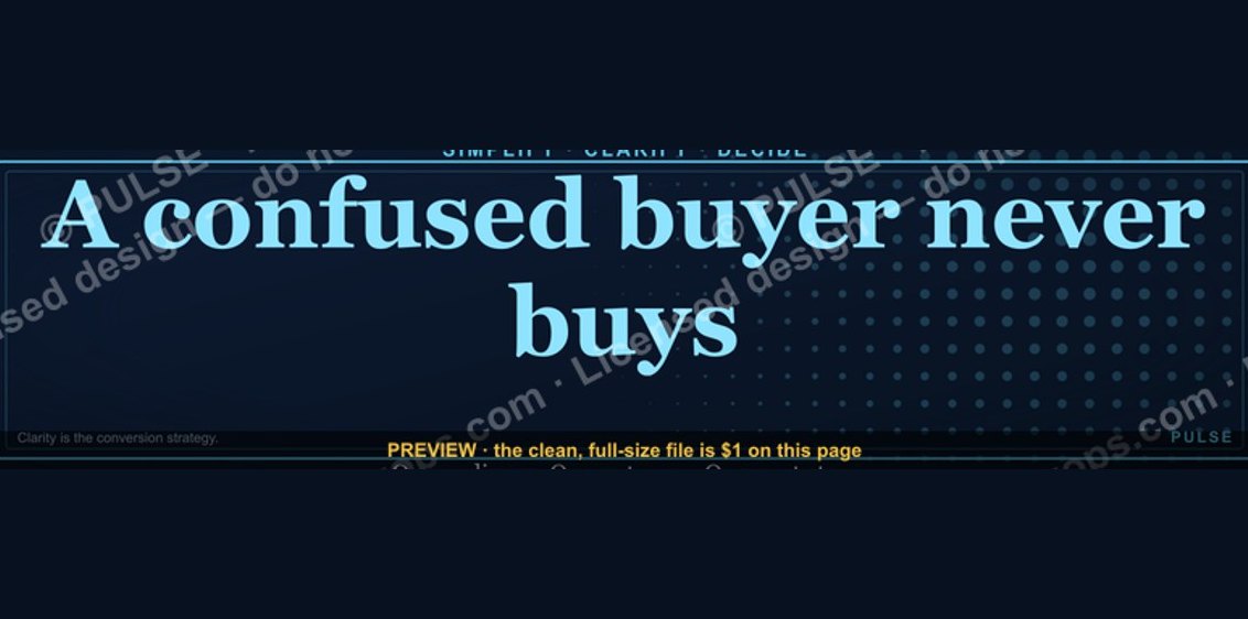 graphic“A confused buyer never buys.” — LinkedIn Banner
 graphic"Pipeline is the product." — LinkedIn Banner
 graphicFaster deals, fewer leaks. — LinkedIn Wallpaper
 graphicAI Legal Operator — LinkedIn Banner
 graphic“Sell the problem, not the product.” — LinkedIn Banner
 graphicVP of Sales — LinkedIn Banner
 graphicLLM Builder AI Engineer — LinkedIn Banner
 graphicWhat do top-performing graphic designers do differently in 2027?