


AI Legal Operator — LinkedIn Banner
Quality
Certified
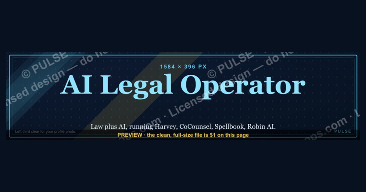
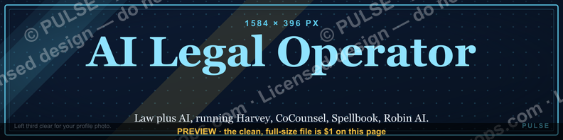
This is a downloadable LinkedIn profile banner (1584×396 px) titled "AI Legal Operator." It reads the role title in bold caps against a dark charcoal-to-navy background, with a short supporting line beneath it and a thin structural motif (a scale-and-circuit mark) anchored to the right edge. Use it as your LinkedIn cover image when your headline positions you as the person running AI tooling inside a legal function.
Two ways to brand the AI Legal Operator role
Anyone putting "AI Legal Operator" on a LinkedIn profile is making a bet about how a stranger reads that title in the two seconds before they decide to click through to the headline. There are really only two credible ways to spend the banner's real estate, and this graphic is built around the first one, with the second available as a swap.
The first approach is the title banner. The banner text is the role itself — "AI LEGAL OPERATOR" — set large, left-aligned in the top third, with a one-line descriptor underneath ("Contracts, compliance, and workflow automation for legal teams"). The visual weight goes entirely to naming the function clearly. This works because "Legal Operator" is not yet a title most recruiters or GCs parse instantly the way they parse "Paralegal" or "Legal Ops Manager." A banner that just says the words, in a legible serif or heavy sans, does the job of a dictionary entry: it tells a visitor what box to file this person in before they've read a single line of the profile.

The second approach is the results banner, where the headline space is spent on an outcome instead of a job title — something like "Cut contract turnaround from 9 days to 36 hours" — with the role name shrunk to a small tag in the corner. This is the format experienced operators graduate to once their title alone is doing enough work in the industry, or once they have a specific number they can defend in an interview. It trades clarity of function for proof of impact.
This particular banner ships as the title version because it is meant for the front half of a career transition — someone moving into an "AI Operator" style role inside a legal department, corporate legal team, or law firm operations group, who needs the title itself to register before they've built a track record of quantified wins under it. The layout is not locked, though: the same file structure supports dropping in a results-first variant later, which the customization section below covers directly.
Both versions share the same underlying grid: a left-weighted text block, a right-side graphic accent that never crosses into the zone LinkedIn's own profile photo overlaps, and a background dark enough that white or gold text holds full contrast at both desktop and mobile crop ratios. The choice between the two formats is a communication decision, not a design one — the mechanics stay identical either way.
Choosing between a title banner and a results banner
The decision between the two formats comes down to one question: does your headline (the text line directly under your name, not the banner) already carry a specific, defensible number? If it does, the banner is free to reinforce identity instead of repeating a stat that's already visible. If it doesn't, the banner is the only surface on the page doing clarity work, and it should not be spent on a number nobody has context for yet.
A second factor is audience. If the profile is mostly seen by people inside the same legal-ops circles — CLOC members, in-house counsel, legal tech vendors — the title alone often lands fine, because "AI Legal Operator" is legible jargon to that audience already. If the profile is being surfaced to generalist recruiters, hiring managers outside legal, or founders evaluating a fractional hire, the title banner buys clarity that a results banner would spend on a number those viewers can't yet benchmark.
The third factor is how new the title is on your profile. A banner that just changed to reflect a new role benefits from a grace period where the title version does the introducing; swapping straight to a results banner on day one, before connections have registered the new function, tends to read as unearned. A rough rule that holds up across LinkedIn profile changes generally: run the title version for at least one full cycle of profile views — commonly 60 to 90 days — before switching to a results-led version, so the identity change has time to register with your existing network before you start asking it to also process a metric.
The numbers behind each banner style
The banner file itself is built to LinkedIn's documented cover-image spec: 1584×396 px, a 4:1 aspect ratio, exported as JPG or PNG, kept under LinkedIn's 8 MB upload ceiling. That ratio matters more than the raw pixel count — uploading anything off-ratio forces LinkedIn's own cropping, which is what most broken legal-tech banners on the platform are actually suffering from, not bad design.
The desktop safe zone is the harder constraint. On a standard desktop view, the circular profile photo sits left-of-center and overlaps roughly the bottom-left 300×300 px block of the banner. Any text placed in that corner gets partially covered. This banner keeps its title block starting at roughly 8% in from the left edge and vertically centered in the upper two-thirds, which clears the overlap with margin on both standard and ultrawide desktop renders.
Mobile is the stricter test. LinkedIn's mobile app crops the banner to a narrower visible strip — roughly the center 60-65% of the full width is what most viewers actually see on a phone, with both edges trimmed. A banner with its message pinned to the far left or far right edge often reads as empty on mobile even though it looks complete on desktop. That's why the title text here sits inside the center two-thirds of the frame rather than flush to an edge, and why the right-side accent mark is decorative rather than load-bearing — it can get cropped on mobile without losing the message.
On text sizing: a title line around 28-40 characters ("AI LEGAL OPERATOR" is 18) holds legibility at the thumbnail size LinkedIn renders in search and connection-request previews, where the banner shrinks to well under 200 px wide. Anything past roughly 45-50 characters on the headline line starts to blur at that size on standard mobile screens. The supporting descriptor line, being secondary, can run longer — up to 60-70 characters — since it's read at full banner size on a profile visit, not at thumbnail size.
Building and installing the banner, step by step
Getting this banner from download to live profile is a five-step sequence, and the order matters because two of the steps are verification steps, not production steps — skipping them is what causes the cropped-title problem described above.
Step one is downloading the PNG from this page at full 1584×396 resolution — never a screenshot of the on-page preview, which is rendered smaller and will look soft when blown back up on upload. Step two is the crop-check: open the file and confirm no text sits inside that bottom-left 300×300 px danger zone before you touch LinkedIn at all; this banner ships pre-checked, but it's the first thing to re-verify if you customize the layout. Step three is a mobile preview — either LinkedIn's own upload preview or a quick resize in any image tool to roughly 60% width — to confirm the title survives the center crop.
Step four is the actual upload, done through the profile edit screen (pencil icon on the banner area, not the photo). LinkedIn will offer its own crop tool on upload; leave it at the default full-frame placement rather than nudging it, since the file is already built to the platform's native ratio and any manual adjustment there re-introduces the exact crop risk step two just cleared. Step five is pairing the banner with a headline that matches its mode — if you're running the title version of this banner, your headline is the place to put the specific outcome or scope the banner deliberately left out, so the two surfaces divide the work instead of repeating each other.
To customize the banner for your own team or title — swapping "AI Legal Operator" for "AI Contracts Operator," "Legal Ops Technologist," or a firm-specific variant — the same 1584×396 canvas, left-weighted text block, and dark background hold up; only the title string, the descriptor line, and optionally the accent color (the default is a muted gold on charcoal, which swaps cleanly to a firm's brand navy or a law-adjacent deep green) need to change. Keep the character-count ranges from the numbers section above regardless of what text goes in, since those limits come from LinkedIn's rendering behavior, not from this specific wording.
Related questions
What size should a LinkedIn banner be?
1584×396 px, a 4:1 ratio, JPG or PNG, under 8 MB. Matching the native ratio avoids LinkedIn's automatic crop, which is the most common cause of banners that look fine in the editor but broken once live.
Should the AI Legal Operator title go on the banner or just the headline?
Put it in at least one of the two. New or unfamiliar titles benefit from being on the banner, where they register before a click; established titles can move to the headline and free the banner for a results-led message instead.
Can I use this banner for a law firm's company page instead of a personal profile?
The file works technically (company page covers use the same 1584×396 spec), but the wording should shift from a first-person role title to a team or practice-area framing, since a company page is describing a function, not a person.
How often should I change my LinkedIn banner?
Roughly every 60-90 days, or immediately after a title, role scope, or major outcome changes — whichever comes first. A banner that's stale relative to your current headline undercuts the credibility both are supposed to build together.
Does the banner need to match my LinkedIn profile photo style?
Not exactly, but contrast matters more than style-matching: since the photo overlaps the bottom-left corner of the banner, keep that corner visually quiet (this banner's dark, low-detail background does that) so the photo doesn't fight the banner for attention.
FAQ
What does the AI Legal Operator banner actually say? The title "AI LEGAL OPERATOR" in bold caps in the upper-left two-thirds of the frame, a one-line descriptor beneath it describing the function (contracts, compliance, or workflow automation, depending on the variant), and a small accent mark on the right edge that's decorative rather than text-bearing.
Is this banner free to download and use? Yes — it's provided on this page as a downloadable PNG at full 1584×396 resolution, ready to upload directly as a LinkedIn cover image without additional editing.
Will the text get cut off on mobile? Not with the default layout, which keeps the title inside the center two-thirds of the frame specifically because LinkedIn's mobile app crops both edges. Custom edits that push text toward the far left or right edge risk a mobile crop and should be mobile-previewed before uploading.
Can I change the color scheme to match my firm's branding? Yes. The background-and-accent structure holds up with a swapped accent color — muted gold is the default, but a firm navy, deep green, or brand-specific tone drops in without needing to rebuild the layout, as long as text contrast against the background stays high.
Why does the banner use a title-first layout instead of showing a specific result or number? Because "AI Legal Operator" is still an unfamiliar title to much of the audience most profiles reach. Spending the banner on a metric assumes the viewer already knows what role produced it; the title-first version does the identifying work first, with a results-led swap available once that title has had time to register.
Does this banner work for a company page as well as a personal profile? The file dimensions are identical for both, so it uploads cleanly either way, though the wording should be adjusted from a personal role title to a team-level description if used on a company page.
Sources
- https://www.linkedin.com/help/linkedin/answer/a542918
- https://business.linkedin.com/marketing-solutions/best-practices
- https://blog.hootsuite.com/social-media-image-sizes-guide/
- https://sproutsocial.com/insights/social-media-image-sizes-guide/
- https://www.canva.com/create/linkedin-banners/
- https://www.cloc.org/
- https://www.americanbar.org/groups/law_practice/
- https://www.adobe.com/express/create/banner/linkedin
Related on PULSE
- AI Compliance Officer — LinkedIn Banner
- RevOps Architect — LinkedIn Banner
- Fractional General Counsel — LinkedIn Banner
- Chief of Staff — LinkedIn Banner
- Legal Ops Technologist — LinkedIn Banner
This page will be disappearing soon. Save it to your device for $1 — or read it free while it is here.
@Kory-White- · if Venmo asks, the last 4 of my number are 2012
This page is gone.
This one is off the shelf now. $1 keeps it on your phone for good — the whole page, pictures and diagrams included.
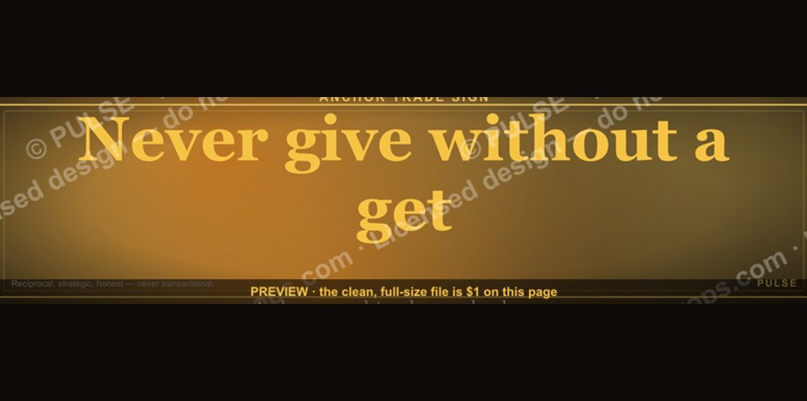 graphic“Never give without a get.” — LinkedIn Banner
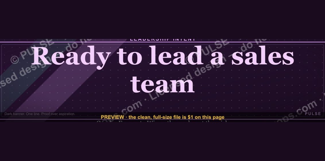 graphic“Ready to lead a sales team.” — LinkedIn Banner
 graphicRenewals Manager — LinkedIn Banner
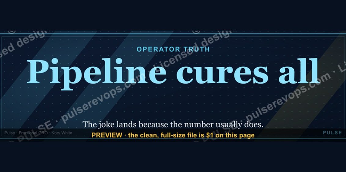 graphicPipeline cures all. — LinkedIn Wallpaper
 graphicVP of Sales — LinkedIn Banner
 graphic“Sell the problem, not the product.” — LinkedIn Banner
 graphic“Open to sales leadership roles.” — LinkedIn Banner
 graphic“Speed to lead wins.” — LinkedIn Banner
 graphicSales Coach — LinkedIn Banner
 graphic“A confused buyer never buys.” — LinkedIn Banner