


The Marketing Funnel — Infographic
Quality
Certified
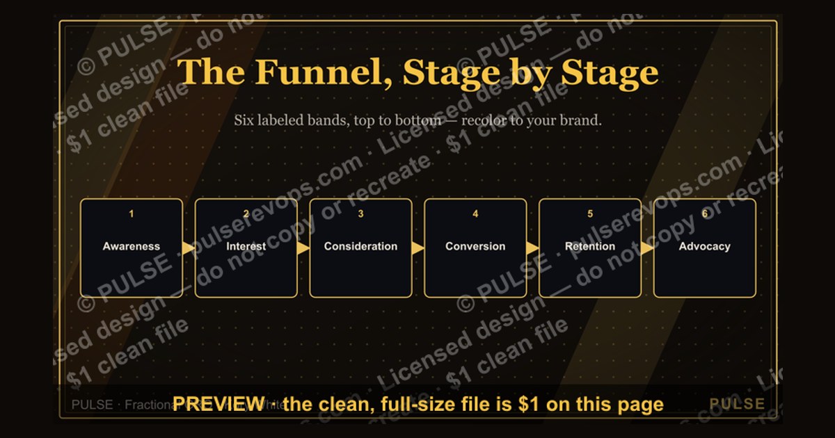
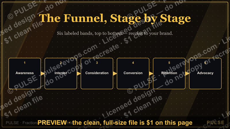
This is a marketing funnel process flowchart, sized 1600x900 px, showing how prospects move through five labeled stages — Awareness, Interest, Consideration, Conversion, and Retention/Advocacy — with example channels and handoff owners at each stage. Download the PNG free from this page and drop it into a deck, onboarding doc, or team alignment meeting to show, in one glance, how leads actually travel through your pipeline.
A Sales Meeting Where Nobody Agrees Where Leads Are Dying
Picture a Tuesday pipeline review. Marketing says the top of the funnel is healthy — traffic is up, form fills are up, the newsletter list grew again. Sales says the opposite: the reps are drowning in unqualified names and nobody upstream is filtering them. Six people are looking at the same numbers and describing two different funnels, because nobody in the room is looking at the same picture. This is the exact moment this infographic earns its place on a shared screen instead of staying a slide buried in a quarterly deck. A marketing funnel graphic works because it forces everyone — marketing, sales development, sales, and leadership — to agree on the stage names and the stage boundaries before they argue about the numbers inside them. Without a shared visual, "lead" means five different things to five different people: a form fill to marketing, a qualified conversation to an SDR, a signed contract to an account executive. The graphic exists to kill that ambiguity in under ten seconds of looking at it. When a VP of Marketing pulls this up in a QBR, the conversation changes shape immediately — instead of debating whose fault a soft quarter is, the room can point at the exact stage where the drop-off is steepest and ask a narrower, more answerable question: is this a volume problem at Awareness, a messaging problem at Interest, or a follow-up speed problem between Consideration and Conversion? The same graphic works just as well one level down, inside a single campaign retro, where a demand-gen manager uses it to show why a webinar generated a lot of Interest-stage engagement but almost nothing that reached Conversion.
What the Infographic Actually Shows, Stage by Stage
The graphic is built as a narrowing set of horizontal bands, widest at the top and narrowest at the bottom, echoing the classic funnel silhouette so the shrinking-volume message reads instantly even before anyone reads a label. Each band carries three fixed elements: the stage name in bold sans-serif type, a short one-line definition underneath it in a lighter weight, and a row of small channel tags — Awareness carries tags like "SEO," "Paid Social," and "PR/Earned Media"; Interest carries "Content Offers," "Webinars," and "Email Nurture"; Consideration carries "Case Studies," "Product Demos," and "Comparison Pages"; Conversion carries "Sales Calls," "Proposals," and "Free Trials"; Retention & Advocacy carries "Onboarding," "Customer Success," and "Referrals." A thin arrow runs down the center connecting every band to the next, and a dashed arrow loops from the bottom band back up to the top, because the intended message is that advocacy feeds new awareness rather than the funnel being a one-way, disposable pipe. Along the right edge, each band has a small metric callout box — not filled with invented numbers on the master graphic, but formatted as an empty bracket like "[Conv. Rate: __%]" so a team can hand-write or digitally overlay their own stage-to-stage conversion rate before presenting it. That detail matters: the graphic is a template built to be annotated, not a finished report. The color treatment moves from a cool, saturated tone at Awareness to a warmer tone at Conversion, then to a distinct accent color at Retention & Advocacy to visually separate "new business" motion from "existing customer" motion. The title bar at the top carries the exact wording "The Marketing Funnel" in the primary heading weight, with "An Infographic" as a smaller kicker line above it.

Where This Flowchart Fits in Your Workflow
The intended use sequence has an owner at every handoff, which is part of why teams that adopt this graphic stop losing leads in the gaps between departments. Step one: marketing ops or a demand-gen lead pulls the graphic into the campaign-planning stage, before a quarter starts, and assigns each channel tag to a specific campaign owner — so the "Webinars" tag at Interest has a named person attached to it, not just a category. Step two: as campaigns run, that same owner reports weekly volume into the stage they're responsible for, using the graphic as the shared dashboard skeleton rather than a one-off spreadsheet tab that only they can read. Step three: at the Consideration-to-Conversion boundary, ownership formally passes from marketing to sales — this is the single most important handoff on the entire graphic, and teams that print it out or pin it in a shared channel usually add a literal handoff marker (a stamp, a colored line, an SLA note) right at that seam, because it's the point where leads most commonly go quiet. Step four: sales runs its own motion through Conversion and hands qualified closed-won accounts to customer success at the entry to Retention & Advocacy, another explicit ownership change. Step five: leadership reviews the whole graphic monthly or quarterly, not to micromanage any single stage, but to spot which band is chronically the widest relative to the one below it — that's the stage getting disproportionate spend without matching output. A useful habit some teams borrow: laminate or pin the graphic near the SDR desk pod, with the actual current-quarter numbers grease-penciled or sticky-noted onto each metric callout, so the funnel stops being an abstract concept in a deck and becomes the thing reps glance at between calls.
Benchmarks Behind Each Stage of the Funnel
While this page never invents a specific study or vendor statistic, it's worth grounding the graphic in the general shape that most B2B and B2C funnels take, because that shape is exactly what makes the infographic's narrowing visual honest rather than decorative. Visitor-to-lead conversion (Awareness into Interest) is commonly the steepest single drop on the whole funnel — a large share of anonymous traffic simply never identifies itself, which is normal and not, by itself, a sign of a broken funnel. Lead-to-MQL and MQL-to-SQL transitions (roughly the Interest-to-Consideration and Consideration-to-Conversion boundaries on this graphic) tend to be where the most operational variance shows up between companies, because they depend heavily on how strict or loose a team's lead-scoring definitions are — a team with a tight, well-enforced scoring model will show a smaller number of SQLs than a team that scores loosely, even with identical raw traffic, so this boundary is where the graphic's callout boxes are most useful for spotting definition drift over time rather than for comparing your numbers against an outside benchmark. The Conversion-stage close rate is usually the most stable of the bunch quarter over quarter for an established company, because by the time a deal reaches proposal or trial stage, most of the volatility has already been filtered out upstream; wide swings at this specific stage are usually a signal worth investigating rather than normal noise. The Retention & Advocacy loop is the one most organizations under-measure relative to its value — expansion revenue and referral-sourced pipeline typically cost far less to generate than new-logo pipeline at the top of the funnel, which is exactly why the graphic draws that dashed feedback arrow instead of letting the funnel dead-end. When you annotate your own copy of the graphic, the most useful discipline is tracking the ratio between adjacent stages over multiple quarters rather than chasing an absolute number pulled from someone else's industry report — your own trend line, stage over stage, is a better diagnostic than a borrowed external benchmark.
Trade-offs: Funnel vs. Flywheel, and When the Diagram Backfires

A linear funnel graphic like this one is the right tool when a team's core problem is stage-by-stage attrition and they need a shared, easy-to-scan diagnostic — it is fast to read, fast to annotate, and fast to explain to an executive who has thirty seconds of attention to give it. Where it backfires is in businesses where growth is driven mostly by expansion, renewal, and referral rather than new-logo acquisition; a strictly top-down, one-way funnel image implicitly treats existing customers as the finish line rather than the engine, and teams that lean on product-led growth or a subscription renewal motion often find the flowchart understates the value of the bottom loop. The alternative many teams reach for is a flywheel diagram — a circular model built around Attract, Engage, and Delight stages that feed back into each other with no clear start or end — and it's a legitimate alternative when the honest story of your business is that a delighted customer becomes a new source of Awareness more often than any paid channel does. The trade-off is that a flywheel is genuinely harder to put concrete stage-conversion numbers on, because there's no obvious "top" to measure inflow at, which is exactly why the linear funnel remains the default choice for anything sales-and-marketing-alignment related, where the whole point is to locate a specific leak in a specific stage. A second trade-off worth naming honestly: this graphic, like any funnel image, can mislead a room into thinking the customer journey is strictly sequential and single-threaded, when in reality most buyers bounce backward and forward — someone at Consideration frequently returns to Awareness-stage content, and a customer well into Retention will often re-enter Interest-stage material when evaluating a new product line. Use the funnel graphic to diagnose stage-to-stage friction; don't mistake it for a literal map of how any individual buyer actually behaves.
Customizing, Downloading, and Swapping This Graphic Into Your Own Deck
The PNG on this page renders at 1600x900 px, a 16:9 ratio that drops cleanly into a slide deck, a wiki page, or a printed one-pager without cropping or stretching. To customize it for your own team, start with the stage labels before touching anything else — if your organization uses different terminology (some teams say "Top of Funnel / Middle of Funnel / Bottom of Funnel" instead of the five named stages here, others add a distinct "Qualification" stage between Interest and Consideration), relabel the bands to match language your sales and marketing teams already use in weekly standups, because a graphic that introduces new vocabulary on top of an alignment problem tends to add confusion instead of removing it. Next, swap the channel tags inside each band for the actual channels your team runs — if you don't run PR or earned media, drop that tag rather than leaving a channel nobody owns sitting on the graphic; an unused tag quietly signals to a new hire that a channel exists when it doesn't. Colors are the easiest layer to change and the one most worth matching to brand guidelines before this goes in front of a customer or a board — keep the visual logic of "cool to warm to accent" as you move down the funnel, since that gradient is what makes the narrowing message land even for someone skimming quickly, but there's no reason the specific hex values need to match this default palette. Assign a named owner to each stage boundary directly on your working copy — write the owner's name or title into the metric callout box at the seam between two stages, especially the Consideration-to-Conversion handoff, since that's the boundary most likely to have no clear owner in an unedited version of any funnel diagram. A common pitfall worth naming explicitly: teams download this once, fill in real numbers, present it, and then never touch it again — the graphic loses almost all of its value if it isn't refreshed at least quarterly, because a funnel snapshot from three quarters ago actively misleads a room that thinks it's looking at current reality. A second pitfall is over-cropping the PNG to fit a narrow slide template and losing the channel-tag row entirely, which strips out exactly the detail that makes the graphic actionable rather than decorative — if space is tight, drop a metric callout box before you drop a stage label or a channel tag. To swap the file into an existing deck, replace the image placeholder at full resolution rather than scaling a smaller export up, since scaling up will visibly blur the stage-label type; if you need a taller or narrower crop for a specific slide master, crop from the outer margins first and never from inside the funnel bands themselves.
Related questions

What's the difference between a marketing funnel and a sales funnel?
A marketing funnel typically spans Awareness through early Consideration, tracking how strangers become interested prospects; a sales funnel usually starts at Consideration and runs through Conversion, tracking how a qualified prospect becomes a closed deal. Many teams use one combined graphic, like this one, to avoid the handoff getting lost between the two.
How often should a team update its funnel benchmarks?
Quarterly is the most common cadence for reviewing stage-to-stage ratios, since monthly data is often too noisy from seasonality and campaign timing to reveal a real trend, while annual reviews are too slow to catch a stage that's quietly degrading.
What replaces the funnel model for subscription or PLG businesses?
Many product-led and subscription businesses lean on a flywheel model instead, emphasizing Attract, Engage, and Delight as a continuous loop rather than a one-way narrowing path, since renewal and expansion revenue matter as much as new acquisition.
Who should own the funnel graphic once it's adopted?
Marketing operations or revenue operations usually owns the master version and update cadence, while each individual stage's numbers are owned by whichever team runs the channels feeding that stage — sales owns Conversion, customer success owns Retention & Advocacy.
FAQ
Is this graphic specific to B2B companies, or does it work for B2C too? The five-stage shape works for both, though B2C businesses often compress Consideration and Conversion into a much shorter window — sometimes minutes rather than weeks — and lean more heavily on the Awareness and Retention bands where B2B leans on Consideration.
Can I add a stage to the graphic, like a dedicated "Qualification" band? Yes — the template is meant to be edited. Insert a new band between Interest and Consideration if your process has a distinct qualification step with its own owner and metric, and narrow the funnel silhouette slightly at that new band to keep the shrinking-volume visual honest.
Does the dashed feedback arrow from Retention back to Awareness mean existing customers are literally new leads? Not literally — it represents the fact that referrals, reviews, and case studies sourced from happy customers commonly become new Awareness-stage content or word-of-mouth, feeding new prospects into the top of the funnel indirectly rather than customers re-entering the funnel themselves.
What file format is best for embedding this in a live dashboard instead of a static deck? The PNG on this page is built for decks, docs, and printouts. For a live dashboard where the stage numbers update automatically, most teams recreate the same five-band layout as an SVG or a chart-library component so the callout boxes can bind to real data instead of being hand-edited.
How do I know if a stage on the graphic is genuinely broken versus just naturally the steepest drop? Compare the stage-to-stage ratio against your own historical trend for that same boundary, not against an outside benchmark — a boundary that has always converted at a certain rate is a stable pattern, while a boundary that's degrading quarter over quarter against its own history is the one worth investigating first.
Should sales and marketing use separate copies of this graphic, or one shared copy? One shared copy, ideally version-controlled somewhere both teams can see updates land, since the entire value of the graphic comes from both sides agreeing on the same stage boundaries and the same handoff point rather than each team quietly maintaining its own definitions.
Sources
- https://blog.hubspot.com/marketing/marketing-funnel
- https://www.salesforce.com/resources/articles/marketing-funnel/
- https://www.gartner.com/en/marketing
- https://contentmarketinginstitute.com/
- https://www.forrester.com/
- https://www.mckinsey.com/capabilities/growth-marketing-and-sales/our-insights
- https://www.linkedin.com/business/marketing/blog
Related on PULSE
- What is a marketing qualified lead (MQL) vs. a sales qualified lead (SQL)?
- How to build a lead scoring model that matches your funnel stages
- The flywheel model, explained for teams outgrowing a linear funnel
- How to run a monthly pipeline review without pointing fingers
- What conversion rate benchmarks actually mean across funnel stages
- How customer success and marketing should share ownership of retention
This page will be disappearing soon. Save it to your device for $1 — or read it free while it is here.
@Kory-White- · if Venmo asks, the last 4 of my number are 2012
This page is gone.
This one is off the shelf now. $1 keeps it on your phone for good — the whole page, pictures and diagrams included.
 graphic6 Sales Email Rules — Infographic
 graphicThe Sales Cycle: Lead to Closed-Won — Infographic
 graphicThe 30-60-90 Ramp — Infographic
 graphicBANT Qualification — Infographic
 graphicDiscovery Questions That Win — Infographic
 graphicThe Demand Waterfall — Infographic
 graphicThe SaaS Growth Funnel — Infographic
 graphic4 Types of Buyers — Infographic
 graphicThe Perfect Demo — Infographic
 graphicThe Challenger Sale — Infographic