


Inspect. Qualify. Commit. — LinkedIn Wallpaper
Quality
Certified
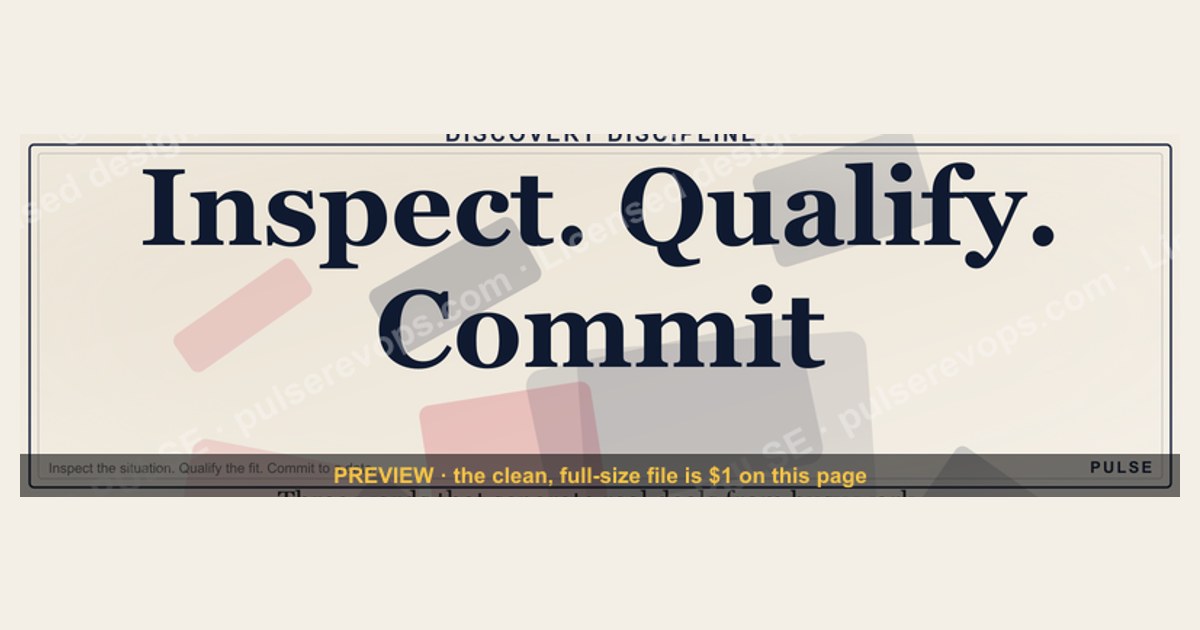
This is a LinkedIn banner — a 1600x500 px downloadable PNG — that reads "Inspect. Qualify. Commit." as three stacked imperative verbs. The Inspect line carries a magnifier glyph, the Qualify line a filter glyph, the Commit line a checkmark glyph, all in gold serif on near-black. Use it on a profile, company page, or event header to signal a disciplined, stage-gated revenue process.
The scenario that makes this banner earn its keep
Picture a mid-market SaaS revenue org that just came out of a brutal quarter. Forecast was 71 percent of what leadership committed. The post-mortem finds the usual suspects: reps self-reported deals as "Commit" because that is what the CRM dropdown defaulted to, managers never pushed back, and the pipeline review was a 45-minute recital of hopeful language rather than a stress test. Nobody in that room could point to a written definition of what "Qualify" even meant for their product, their average contract value, or their buyer committee.
The VP of Revenue Operations decides the fix is not another dashboard. It is a shared vocabulary. She wants three words that every rep, every SDR, every CSM, and every executive can repeat back without checking a wiki: Inspect, Qualify, Commit. She puts them on a slide, then on a Slack channel topic, then — because the team lives in LinkedIn for prospecting and employer branding — on the company page banner and each AE's profile header.
That is the moment this Wallpaper becomes operational rather than decorative. A banner is ambient. It sits behind every message a prospect reads, every InMail a candidate opens, every post a customer scrolls past. If the words on it match the words in your CRM stage names and your pipeline review agenda, the banner is doing quiet reinforcement work eight hours a day for free. If they do not match, the banner is wallpaper in the pejorative sense — pretty, inert, and eventually invisible.
The test is simple. Can a new hire, three weeks in, explain what Inspect means at your company without opening a doc? If yes, the banner is pulling weight. If no, the banner is decoration and you should fix the process before you fix the pixels.

What is actually on the graphic, element by element
Before you download or resize anything, know exactly what you are working with so you can decide what to keep and what to change.
The canvas is 1600 by 500 pixels, a 16:5 ratio. That is wider and shorter than LinkedIn's own recommended 1584x396 for a personal profile background, which means the file will be letterboxed or cropped slightly depending on where you place it. The safe zone — the region that survives cropping on both desktop and mobile — is roughly the center 60 percent horizontally and the middle 70 percent vertically. Anything you care about should live inside that band.
The background is a near-black, not pure #000000. A near-black reads as intentional and premium on an OLED phone screen while avoiding the harsh contrast banding that pure black sometimes produces against LinkedIn's own light-gray page chrome. If you are matching it to a brand palette, sample the hex from the file rather than guessing; a two-point drift is invisible in isolation but obvious when the banner sits directly above a logo.
The type is a serif, set in three lines, stacked and left-aligned or centered depending on the export. "Inspect." occupies the top line. "Qualify." the middle. "Commit." the bottom. Each word is followed by a period, which matters more than it looks: the period turns a label into a sentence fragment, an instruction, a command. "Inspect" is a noun-ish label. "Inspect." is something you are being told to do. That single character is the difference between a mood board and a mandate.

The color is gold — a warm, slightly desaturated gold rather than a bright yellow. Gold on near-black is the highest-legibility combination available for thin serif strokes, and it also carries a connotation of standard, benchmark, or bar. It reads as "this is the level we hold ourselves to," which is exactly the emotional register a revenue process banner wants.
Each line is accompanied by a small glyph. The Inspect line takes a magnifier — the universal sign for examination, audit, discovery. The Qualify line takes a filter or funnel mark — narrowing, screening, threshold. The Commit line takes a checkmark — affirmation, lock-in, signature. These glyphs are doing real work: they let the banner communicate to someone who reads English as a second language, or who is glancing at it for 400 milliseconds on a phone, without requiring them to parse the serif.
There is no logo, no URL, no tagline, no date, and no quotation marks. That restraint is deliberate. A banner with five elements communicates nothing; a banner with three words and three glyphs communicates one idea three ways.
Where and how to actually use it
The banner is built for LinkedIn, but "LinkedIn" is not one surface — it is at least six, and the file behaves differently on each.
On a personal profile, the background image sits behind your headshot at the top of your page. Desktop renders it at 1584x396; mobile crops aggressively toward the center. If you upload the 1600x500 file directly, LinkedIn will let you reposition it with a drag tool. Drag so the three words sit in the upper-middle band, because your profile photo and name overlay the lower-left quadrant on most viewports. The single most common mistake here is centering the text perfectly and then discovering your own face covers "Commit."
On a company page, the banner sits above the logo and tagline and below the page name. Company page banners are seen by a different audience than personal ones — more candidates, more press, fewer active buyers — so the Inspect/Qualify/Commit framing reads as a statement of operating culture rather than a sales pitch. That is a feature, not a bug, if you are hiring revenue talent.
On a LinkedIn Event or a Live header, the banner becomes a title card. Events crop to a wider ratio, so the safe zone tightens further; test the file on a dummy event before you commit it to a flagship webinar.
Beyond LinkedIn proper, the same 1600x500 file drops cleanly into a Zoom waiting room, a Google Meet background, a Slack channel canvas, an email signature strip, a Notion page header, and a slide master. The ratio is close enough to common 3:1 and 16:5 slots that you rarely need to re-export. If you do need a square, crop to the center 500x500 and accept that you will lose two of the three words — better to re-typeset than to crop a sentence in half.
One placement deserves a warning. Do not use this banner as a paid ad creative. It has no call to action, no offer, and no brand identifier, so it will underperform almost any purpose-built ad unit. Its job is ambient identity, not conversion.
How the mechanism actually works
The reason a three-word banner changes behavior at all is not magic and it is not branding in the soft sense. It is a specific cognitive mechanism: shared vocabulary compresses coordination cost.

When a revenue team lacks a common language for deal stages, every pipeline conversation pays a translation tax. The rep says "it's looking good." The manager hears "it's looking good" and has to guess whether that means the economic buyer has signed off or the champion is enthusiastic. The forecast call becomes an exercise in inference. Multiply that ambiguity across 40 deals and 12 reps and you get the forecast miss from the opening scenario.
A three-word ladder collapses that ambiguity. Inspect is a verb with a defined output: evidence. Qualify is a verb with a defined output: a yes/no on whether the deal meets threshold. Commit is a verb with a defined output: a date and a signature path. Each word implies a gate, and each gate implies a question that must be answered before the deal advances.
The banner is the visible artifact of that flowchart. It does not create the discipline; it reminds people the discipline exists, in the same way a gym membership card on the counter does not make you fit but does make skipping the gym a conscious choice rather than a default.
There is a second mechanism at work, and it is the one most teams miss. A banner is public. Prospects see it. That means the words become a small promise you have made to the outside world. A rep whose profile says "Inspect. Qualify. Commit." and who then pushes a deal into Commit without buyer-signed mutual actions has created a visible inconsistency. Most people will not call it out, but the rep knows. That mild accountability pressure is worth more than any internal compliance dashboard, because it operates on identity rather than surveillance.
Real numbers, ranges, and benchmarks
No banner changes a number by itself, but the process the banner points at does move real metrics, and it helps to know what "good" looks like so you can tell whether the words are landing.

Start with stage conversion. In most B2B SaaS funnels, roughly 100 raw leads become somewhere between 20 and 35 qualified opportunities, depending on how strict the qualification bar is. Of those qualified opportunities, somewhere between 15 and 25 percent close in a given quarter for a mid-market motion, higher for self-serve and lower for enterprise with long procurement cycles. If your "qualified" bucket converts at 8 percent, your Qualify gate is too loose — you are calling things qualified that are really just inspected.
Inspect-to-Qualify is where most leakage hides. A useful diagnostic: count how many deals moved from your discovery stage to your qualified stage in the last 90 days, then count how many of those had a documented business metric, an identified economic buyer, and a stated decision date at the moment of the move. If the second number is below 70 percent of the first, your Inspect step is producing activity rather than evidence.
Commit accuracy is the metric executives actually feel. A well-run Commit category should land within plus or minus 10 percent of the number it represents by end of quarter. Best-in-class teams run tighter, in the 5 percent range, but 10 percent is a realistic target for a team that has just introduced stage definitions. If your Commit category lands at 70 percent of its stated value, the problem is almost never forecasting skill — it is that Commit is being used as a synonym for "I feel good about this."
Forecast category distribution is another sanity check. In a healthy pipeline, Commit should be a minority of the total forecast. A common shape is Commit at roughly 40 to 50 percent of the number, Best Case at 25 to 35 percent, and Pipeline covering the remainder. If Commit is 80 percent of your forecast, you have not built a forecast — you have built a wish list with a formal name.
Pipeline coverage rounds this out. Three-to-one coverage of the quarterly number is the conventional floor; four-to-one is comfortable for a team with a new process, because the new gate will disqualify more deals than the old one did and you need the buffer.

Finally, time-in-stage. If deals sit in Qualify for 40 days on average, your qualification criteria are unclear and reps are stalling rather than deciding. A crisp Qualify gate should resolve in days, not weeks, because it is a yes/no question, not a negotiation.
Trade-offs and alternatives
This banner is one option among several, and it is worth being honest about when it is the wrong one.
The core trade-off is memorability versus specificity. Three words are memorable and portable; they are also vague enough that two people can read them differently unless you define them. A banner that says "Inspect. Qualify. Commit." with no accompanying definition doc is a slogan. A banner plus a one-page stage definition is a system. Budget for the one-pager.
The second trade-off is internal versus external audience. The same banner on a rep's profile speaks to buyers and candidates simultaneously. Buyers may read "Qualify" as "we are deciding whether you are worth our time," which is honest but can feel transactional if your brand positioning is warm and consultative. If that is a concern, consider a variant that swaps Qualify for a softer verb while keeping the three-beat rhythm.
A third trade-off is permanence. A profile banner is sticky — people notice when you change it, and changing it every quarter dilutes the signal. If your process language is still in flux, wait. Shipping a banner for a vocabulary you will abandon in six weeks is worse than shipping nothing, because it teaches the team that the words are decorative.
Alternatives worth considering: a single-word banner ("Inspect.") for teams that want maximum ambiguity-free recall; a numbered ladder (1-2-3) for teams that respond to sequence; a plain-text banner with no glyphs for maximum accessibility; and a no-banner approach where the vocabulary lives only in the CRM and the review deck. The last option is the most common and the least effective, because it has no ambient reinforcement.
Adjacent workflows that benefit from the same three-word frame: customer success renewal motions (Inspect the account, Qualify the expansion, Commit the renewal date), partner and channel pipelines, and recruiting funnels where Inspect/Qualify/Commit maps cleanly onto screen, interview, and offer.
Common pitfalls and how to avoid them
The first pitfall is vocabulary drift. You ship the banner, then three months later someone renames a CRM stage to "Discovery Complete" and the banner no longer matches the system. Fix: treat the three words as a governed artifact. Any stage rename requires a banner review. Put it in the same change-control doc as your lead scoring thresholds.
The second pitfall is banner-as-substitute. A team adopts the words, feels the satisfaction of having "fixed the process," and never writes the definitions. Six months later the forecast is still off and nobody can explain why. Fix: the banner ships on the same day as a one-page definition with a concrete test for each gate. For Inspect, the test might be "three of five evidence items documented." For Qualify, "meets ICP band and has an identified economic buyer." For Commit, "buyer-signed mutual action plan with a dated paper process."
The third pitfall is crop blindness. You upload the 1600x500 file, it looks fine on your 27-inch monitor, and it is unreadable on a phone. Fix: preview on an actual phone before you publish, and keep all critical type inside the center 60 percent.
The fourth pitfall is over-rotation on the metaphor. Someone decides Inspect/Qualify/Commit should also govern hiring, expense approvals, and office plant selection. The words lose specificity and become corporate wallpaper. Fix: scope the vocabulary to the revenue motion. Let other functions have their own three words.

The fifth pitfall is gold-on-black legibility at small sizes. Gold serif on near-black is beautiful at 1600 pixels wide and muddy at 400 pixels wide in a Slack unfurl. Fix: export a second, higher-contrast variant for small placements, or use the banner only where it will render at full width.
The sixth pitfall is treating the banner as a launch instead of a habit. The words get announced in an all-hands, everyone nods, and by week three nobody has said "Inspect" out loud. Fix: put the three words at the top of the pipeline review agenda as standing headers, and require each deal discussed to be explicitly placed in one of the three stages with the evidence named. The banner reminds; the agenda enforces.
A seventh, subtler pitfall: using Commit language before you have earned the right to be strict. If your team has never had a defined Commit category, introducing one with a hard gate will initially shrink the forecast and produce an uncomfortable quarter. That is the process working. Warn your executive sponsor in advance so the first dip is read as correction rather than failure.
Related questions
Does a LinkedIn banner actually change pipeline outcomes?
Not directly. It reinforces vocabulary that, when paired with written stage definitions and a review agenda that enforces them, reduces forecast variance. The banner is the reminder; the definitions and the agenda do the work.
What size should a LinkedIn profile banner be?
LinkedIn recommends 1584x396 pixels for personal profile backgrounds. This banner ships at 1600x500, which is close enough to upload directly with minor repositioning. Keep critical text in the center 60 percent so mobile cropping does not clip it.
Should the three words match my CRM stage names exactly?
Yes, or as close as your CRM allows. If your CRM says "Discovery," "Solution Fit," and "Negotiation," either rename the stages or accept that the banner is aspirational rather than operational. Matching is what turns a slogan into a system.
Can I change the colors or wording?
Yes. The composition — three stacked imperative verbs with glyphs — is the reusable part. Swap the gold for your brand primary, swap the serif for your brand typeface, and swap the verbs if your motion calls for different stages. Re-export at 1600x500.
Is this banner useful for non-sales teams?
It maps cleanly onto any gated funnel: recruiting (screen, interview, offer), customer success (inspect account health, qualify expansion, commit renewal), and partner pipelines. The three-beat rhythm is the portable element.
FAQ
What exactly does "Inspect" mean in this framework? Inspect is the evidence-gathering gate. Before a deal can be called qualified, someone must have documented the buyer's pain, the metric that pain affects, the stakeholders involved, and the timeline driving urgency. Inspect produces artifacts, not opinions. If you cannot point to a note, a recording, or a document, you have not inspected — you have chatted.
How is "Qualify" different from "Inspect"? Inspect gathers; Qualify decides. Qualify is a yes/no judgment against a written threshold — typically an ideal customer profile band plus a set of qualification criteria such as budget, authority, need, and timing. A deal can be thoroughly inspected and still fail to qualify. That is a good outcome, because it removes a deal from the forecast before it wastes a quarter of selling time.
What makes a deal genuinely "Commit"? A committed deal has a buyer-signed mutual action plan with dated steps, including the paper process and the signature path. It has an identified economic buyer who has confirmed the business case. It has a close date the buyer has agreed to, not one the rep assigned. Anything less belongs in Best Case or Pipeline, no matter how enthusiastic the champion sounds.
Why put this on a LinkedIn banner instead of just a slide? A slide is seen once, in a meeting, by people already paying attention. A banner is seen continuously, by prospects, candidates, and customers, in a context where they are already reading. It creates ambient reinforcement and a small public commitment. The cost is zero after the first export, which makes it one of the highest-leverage placements available.
Will this work for a team with a long enterprise sales cycle? It works better there, if anything. Long cycles are where stage discipline pays the most, because the cost of carrying an unqualified deal for nine months is enormous. The one adjustment: enterprise Inspect gates need more evidence items, since the buying committee is larger and the paper process is heavier. Add committee mapping to your Inspect checklist.
How do I know if the banner is working? Measure three things quarterly: time-in-stage for the Qualify gate, the percentage of stage advances with documented evidence, and Commit forecast accuracy. If time-in-stage drops, evidence coverage rises, and Commit accuracy tightens toward 10 percent, the vocabulary is landing. If none of those move, the banner is decoration and the process needs attention.
Sources
- LinkedIn Help — Profile background photo and banner size guidance: https://www.linkedin.com/help/linkedin/answer/a563659
- LinkedIn Marketing Solutions — Company page and banner best practices: https://business.linkedin.com/marketing-solutions
- HubSpot Blog — Sales qualification frameworks and MEDDICC overview: https://blog.hubspot.com/sales/meddicc
- Gartner — B2B sales forecasting and pipeline management research: https://www.gartner.com/en/sales
- Salesforce — Opportunity stage and forecast category documentation: https://help.salesforce.com/s/articleView?id=sf.opportunity_stages.htm
- Harvard Business Review — Articles on sales process discipline and forecasting: https://hbr.org/topic/sales
- Forrester — Revenue operations and pipeline management research: https://www.forrester.com/research/
- Nielsen Norman Group — Legibility and contrast guidance for text on dark backgrounds: https://www.nngroup.com/articles/legibility-readability/
Related on PULSE
- Building a stage-gated pipeline review agenda that reps do not dread
- MEDDICC versus MEDDPICC: choosing a qualification frame for mid-market
- Forecast categories explained: Commit, Best Case, Pipeline, and Omitted
- Why your CRM stage names are quietly wrecking your forecast
- Designing revenue vocabulary that survives a reorg
- LinkedIn banner specs, safe zones, and mobile cropping explained
This page will be disappearing soon. Save it to your device for $1 — or read it free while it is here.
@Kory-White- · if Venmo asks, the last 4 of my number are 2012
This page is gone.
This one is off the shelf now. $1 keeps it on your phone for good — the whole page, pictures and diagrams included.
 graphicOffensive Security Pentest CRO — LinkedIn Banner
 graphicVector Database CTO — LinkedIn Banner
 graphicSales Enablement — LinkedIn Banner
 graphicIndustrial Robotics CRO — LinkedIn Banner
 graphic“Bring the energy every call.” — LinkedIn Banner
 graphicHow to build a champion seller playbook in 2027
 graphicPredictable revenue, by design. — LinkedIn Wallpaper
 graphicWhat do top-performing graphic designers do differently in 2027?
 graphicCommercial Director — LinkedIn Banner
 graphic“Great reps are coached, not born.” — LinkedIn Banner